🥹Nano-Banana PRO VS. Nano-Banana
Hoy toca poner a prueba el nuevo generador de Google 🙊 Es tan bueno que tienes que verlo para creerlo…
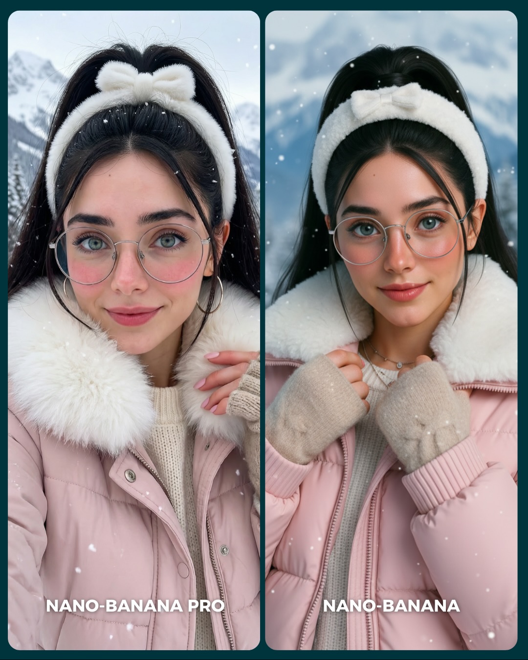
Aquí os dejo unas imágenes para que podáis comparar el Gran salto de calidad de algo que ya era muy bueno a algo insuperable 💕
Y dime… con cuál de los 2 te quedas?? 👀
How soy_aria_cruz Made This Nano Banana Face Closeup Comparison Image — and How to Recreate It
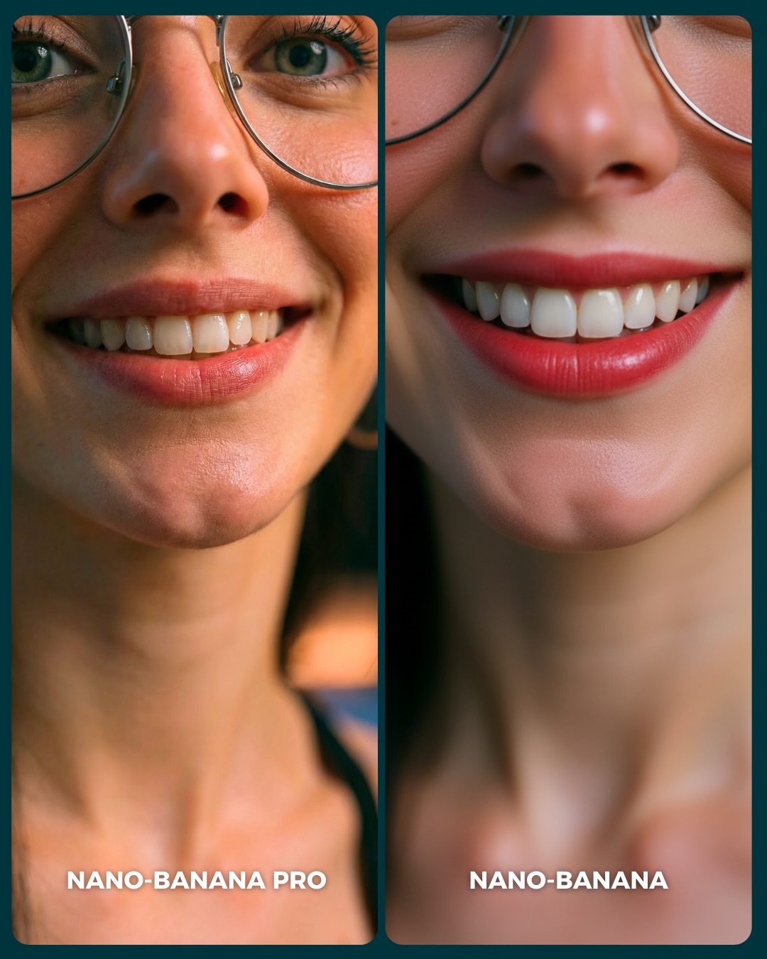
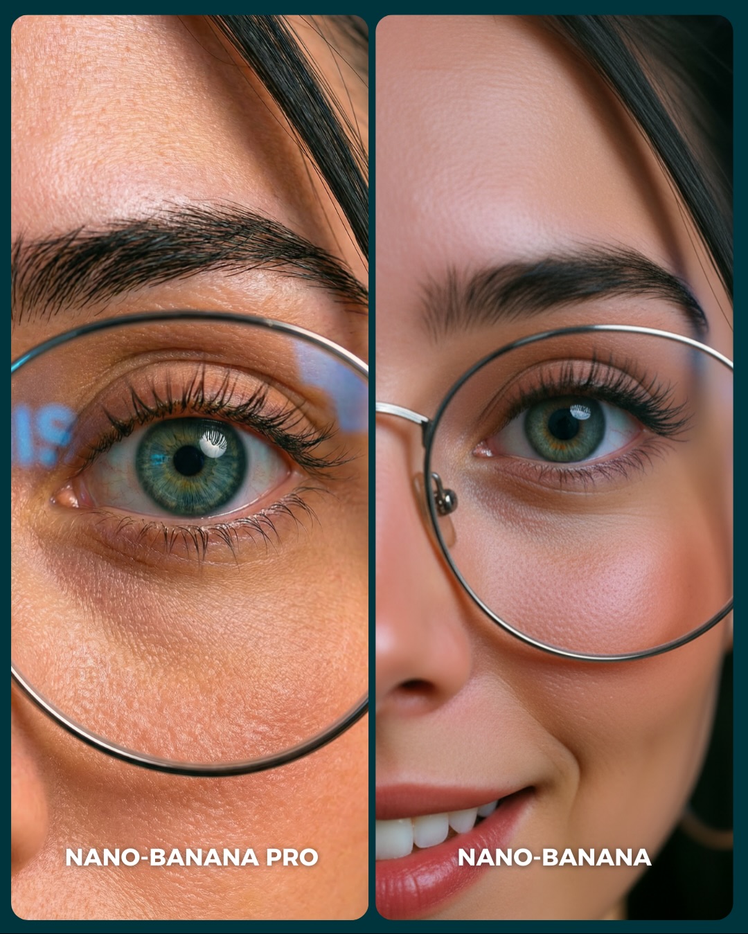
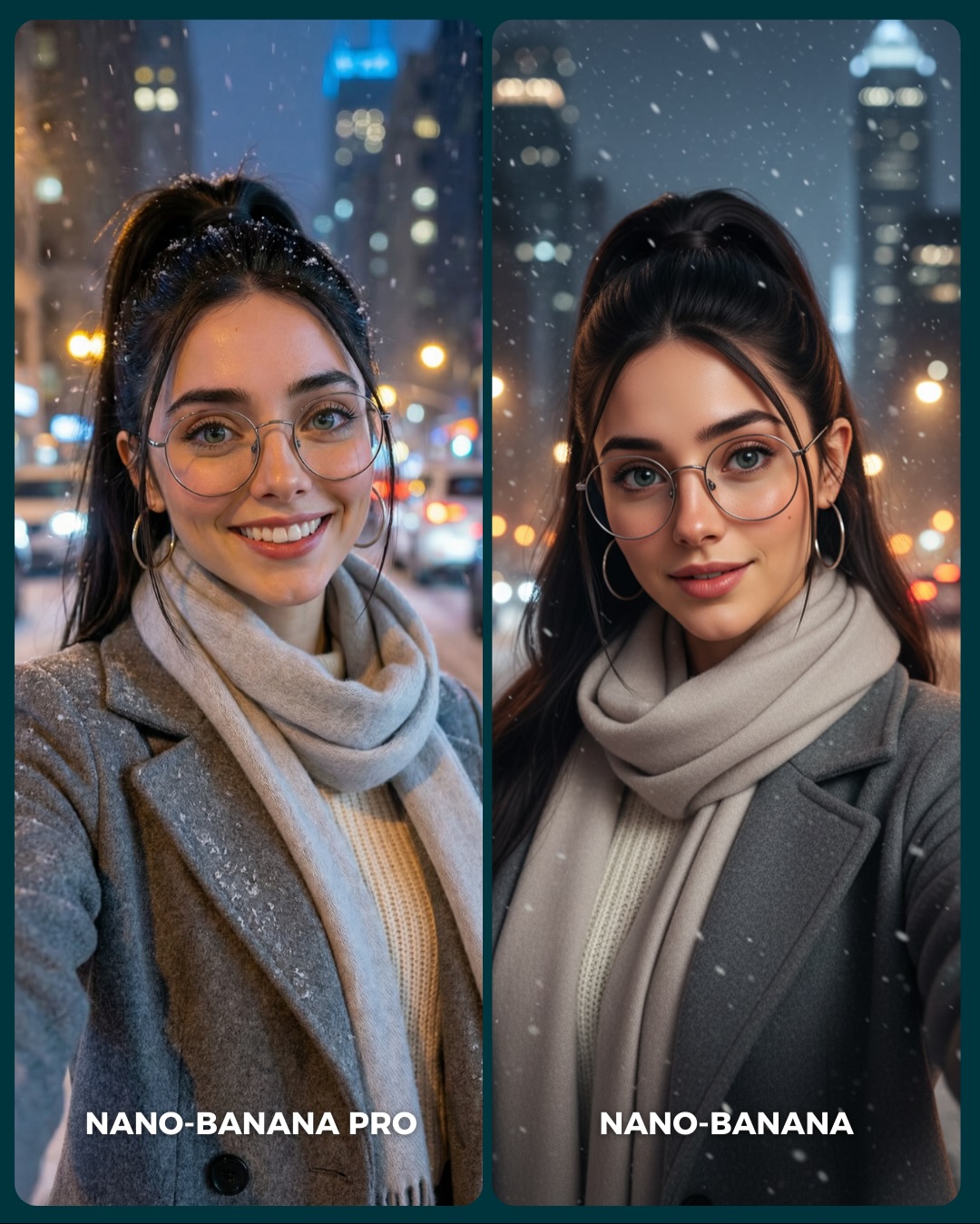
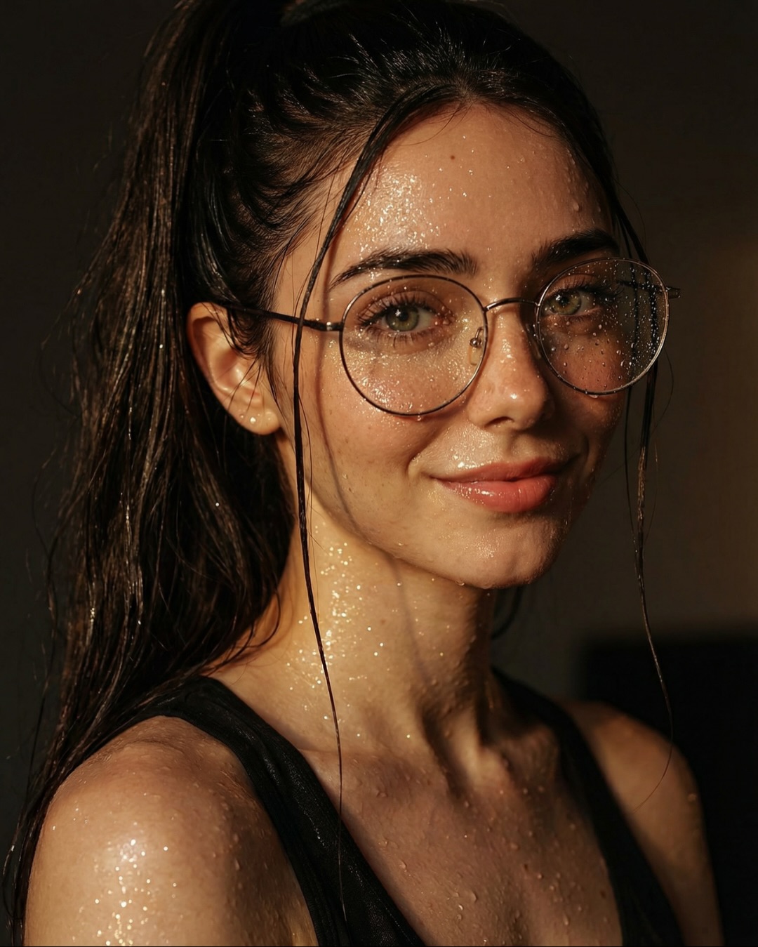
This image works because it makes the benchmark painfully simple. Same face type, same smile, same crop, same glasses, same general lighting. Once those variables are held still, the viewer is forced to look at what actually matters: skin texture, lip edges, teeth realism, nose shading, and whether the eyeglass frame sits on the face like a real object or like a smooth overlay. That is why the post lands so fast. You do not need to explain the test for long. The format explains itself.
For creators, that is the bigger lesson. Most model comparisons fail because they compare two totally different scenes, two different poses, or two different styling choices. Then people are reacting to taste, not quality. This one avoids that trap. It uses an extreme close crop where small rendering differences become impossible to ignore. In other words, the image is built like a microscope, not like a moodboard.
The left panel feels stronger because realism usually wins in the details viewers barely name out loud. Skin does not read as one flat surface. Lip texture looks hydrated instead of painted on. Teeth do not feel cut-and-pasted. Even the metal glasses have slightly more believable contact with the face. Those are micro-signals, but they accumulate fast. When a comparison image is designed well, people do not need technical vocabulary to spot the gap.
Signal
Evidence (from this image)
Mechanism
Replication Action
Controlled identity
Both panels show the same woman, same smile, same glasses, same crop logic
Removes taste-based distraction and isolates model quality
Lock identity, pose family, crop, and wardrobe before testing model differences
Texture stress test
The crop magnifies pores, lips, teeth, nose, and lens-edge rendering
Face realism breaks first in ultra-close shots, so quality gaps become obvious
Use an extreme close-up when benchmarking realism claims
Readable packaging
Two equal columns with direct labels at the bottom
Fast comparison design increases retention and comments
Add simple labels and keep layout symmetrical so viewers decide instantly
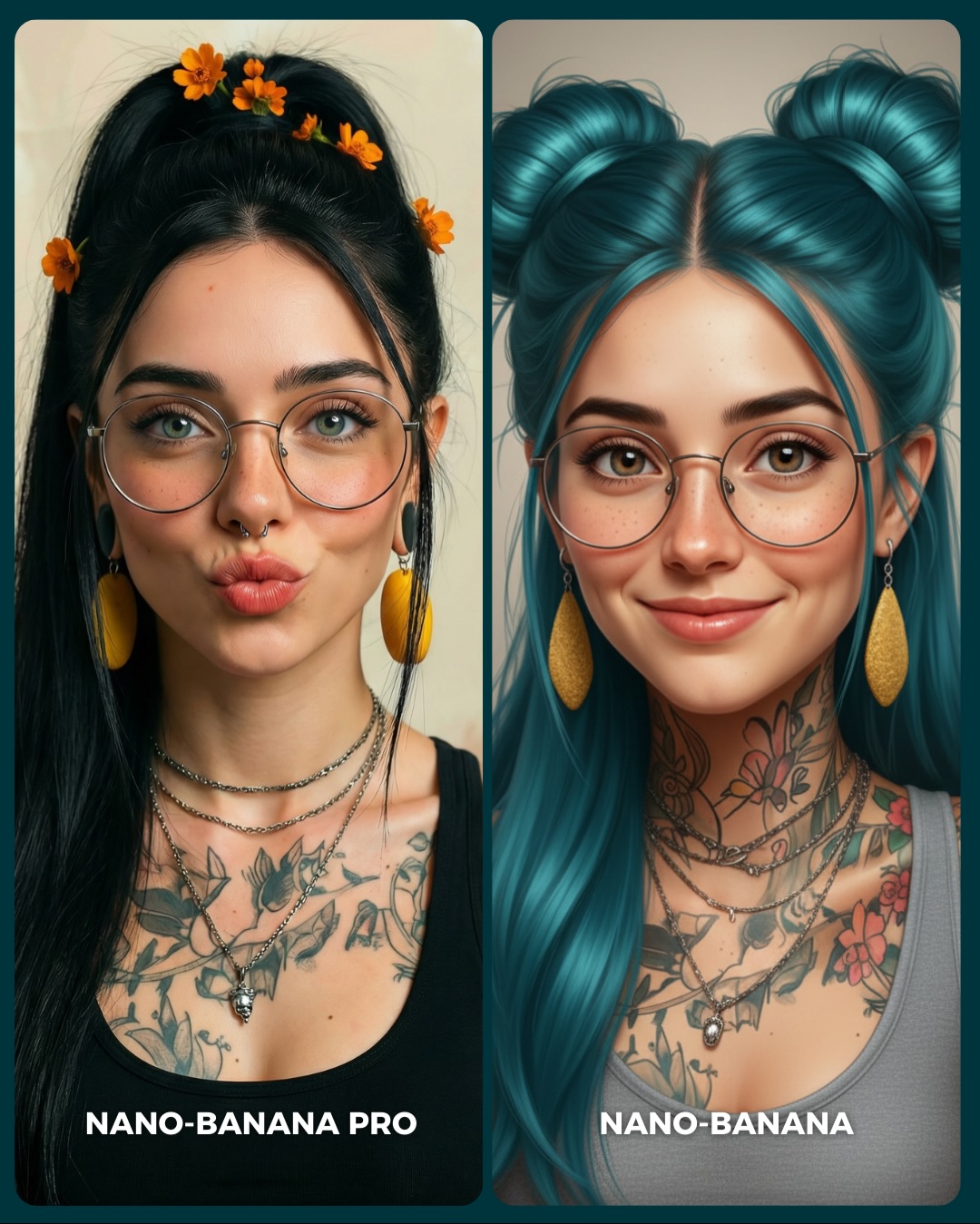
Best use cases for this format
Model-vs-model comparison posts, because equal framing turns subjective debate into visual evidence.
Beauty-realism prompt testing, because faces reveal drift faster than most other subjects.
Educational carousel covers, because one frame can preview the whole lesson.
Creator trust-building content, because audiences like seeing why one tool upgrade matters in practice.
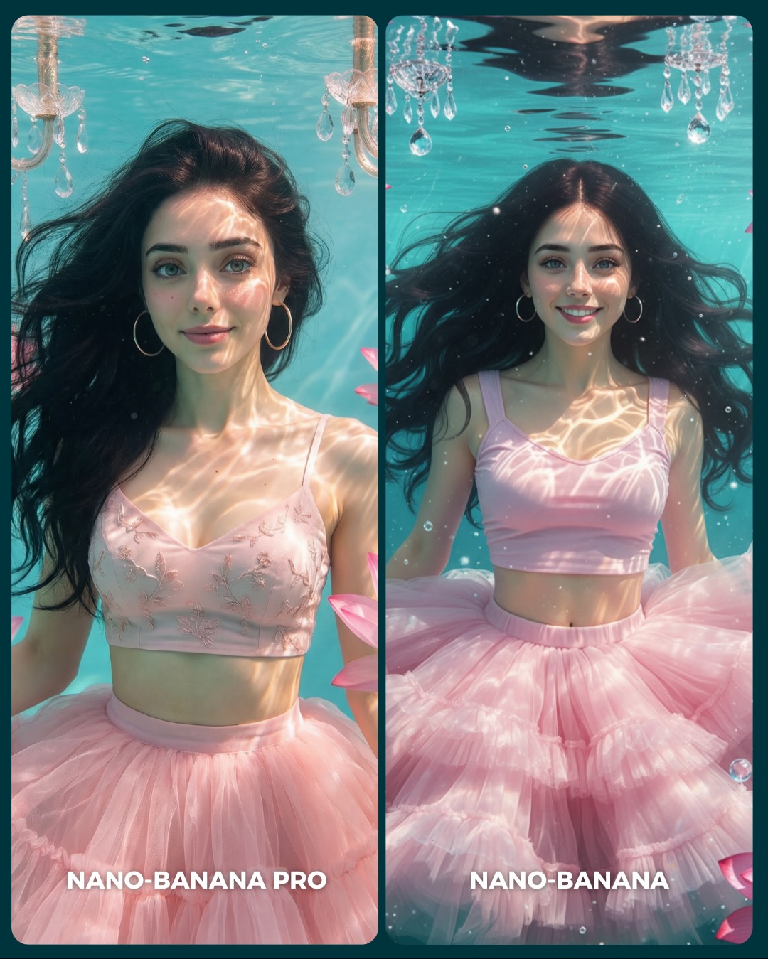
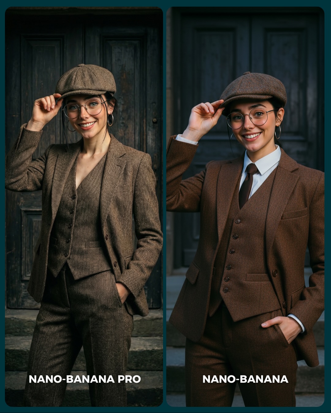
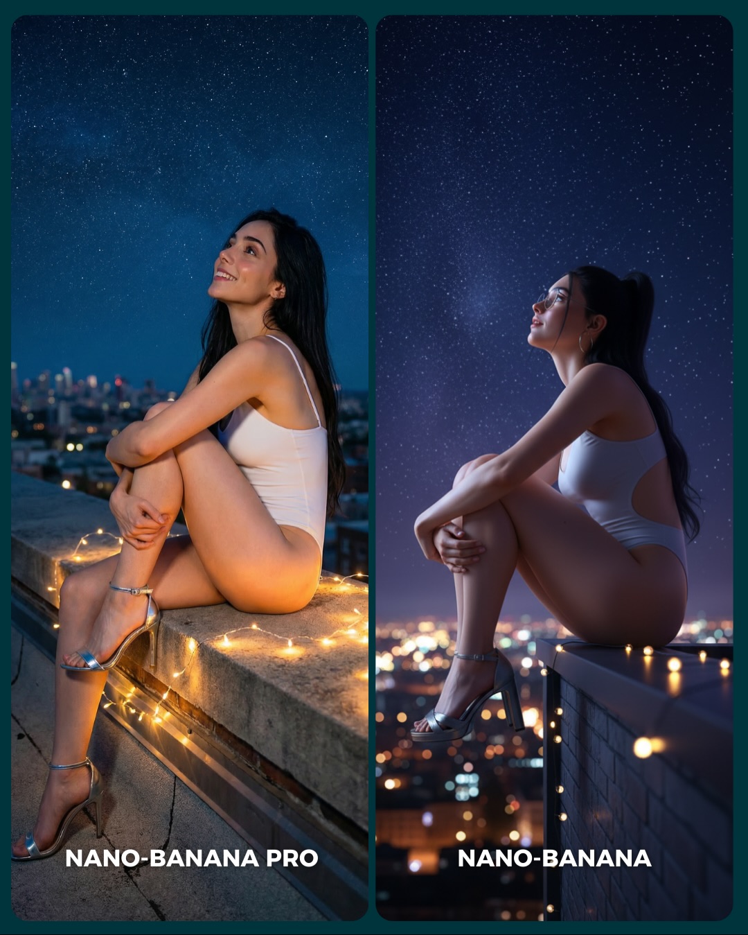
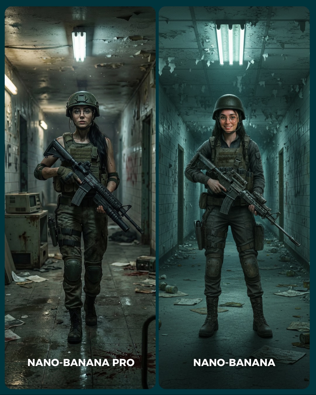
Less ideal use cases: cinematic storytelling posts, environment-heavy fantasy scenes, or wardrobe-driven fashion images. This layout is for inspection, not atmosphere.
If you want to transfer the structure, keep the split layout, keep one identity, and keep one ultra-specific stress point. Then change the test category. You can do the same thing for hands, hair detail, jewelry realism, typography inside scenes, or fabric folds. Transfer template: {same subject} + {same crop} + {same lighting} + compare one fragile realism zone.
Aesthetic read: why the crop is so effective
The design choice that makes this image powerful is reduction. It is not trying to be beautiful in a broad editorial sense. It is trying to be unforgiving. By pushing the frame this close, the image removes most opportunities for the model to hide behind good composition or a flattering scene. That is why the comparison feels honest. There is nowhere for the renderer to cheat.
It also uses a soft beauty-light setup very intelligently. Harsh light would create dramatic shadows that distract from the test. Soft frontal light makes the render explain itself. You can see where the skin transitions are natural, where the gloss is overdone, where the teeth are too perfect, and whether the glasses integrate with the face properly. This is exactly the kind of aesthetic choice creators should make when the goal is proof rather than drama.
Observed
Why it matters
Extreme close-up on mouth, nose, cheek, eye, and glasses rim
Forces attention onto the fragile realism zones
Same subject identity across both panels
Makes the benchmark feel fair
Soft low-drama portrait light
Lets texture and shading differences stay visible
Dark neutral background and simple divider
Prevents the scene from competing with the face
Bold bottom labels
Turns the image into a social-ready comparison asset
Prompt blocks to control deliberately
Prompt chunk
What it controls
Swap ideas (EN, 2–3 options)
same woman, same smile, same glasses, same face angle
Identity consistency across both panels
same hand pose, same jacket fold, same hairstyle silhouette
Lock these three things first: identity, crop, and lighting. If any of those drift, the comparison becomes noisy. Then change only one test dimension at a time.
Baseline run: compare both models on the exact same smiling close-up.
Second run: keep everything identical but switch to a neutral non-smiling mouth to test lip and tooth behavior under less flattering conditions.
Third run: keep the same face but add stronger glasses reflections to test lens-edge realism.
Fourth run: move from face realism to another fragile surface, such as wet hair, satin fabric, or fingers holding jewelry.
The important part is discipline. Benchmark images work when the viewer can feel that the creator did not rig the result. The more controlled the frame, the more persuasive the conclusion.