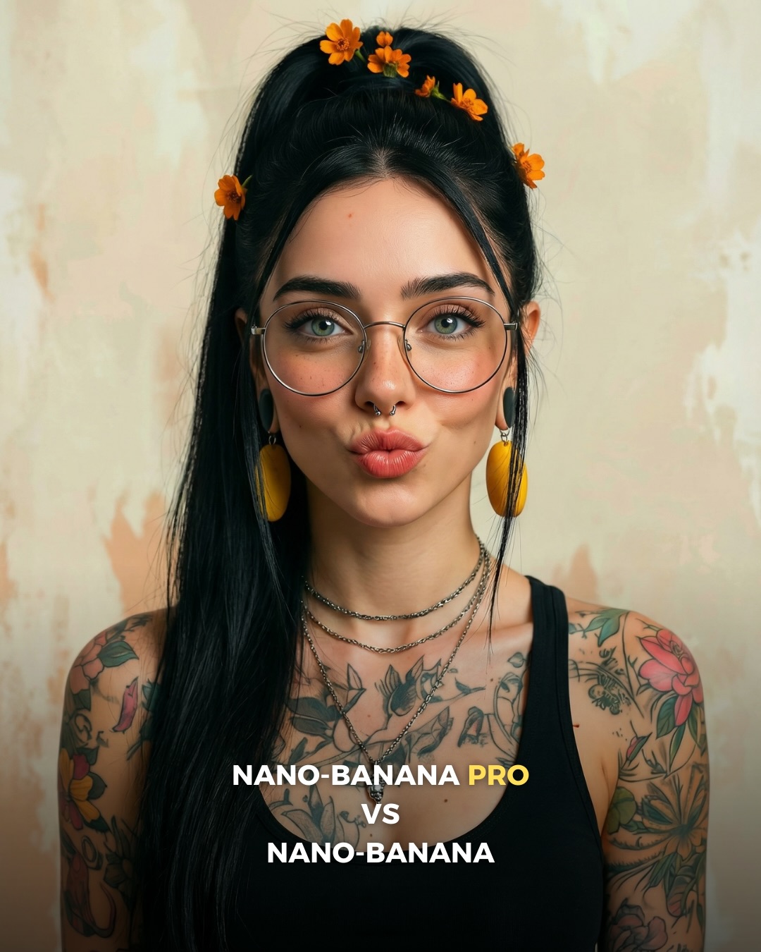
🥹Nano-Banana PRO VS. Nano-Banana
Hoy toca poner a prueba el nuevo generador de Google 🙊 Es tan bueno que tienes que verlo para creerlo…
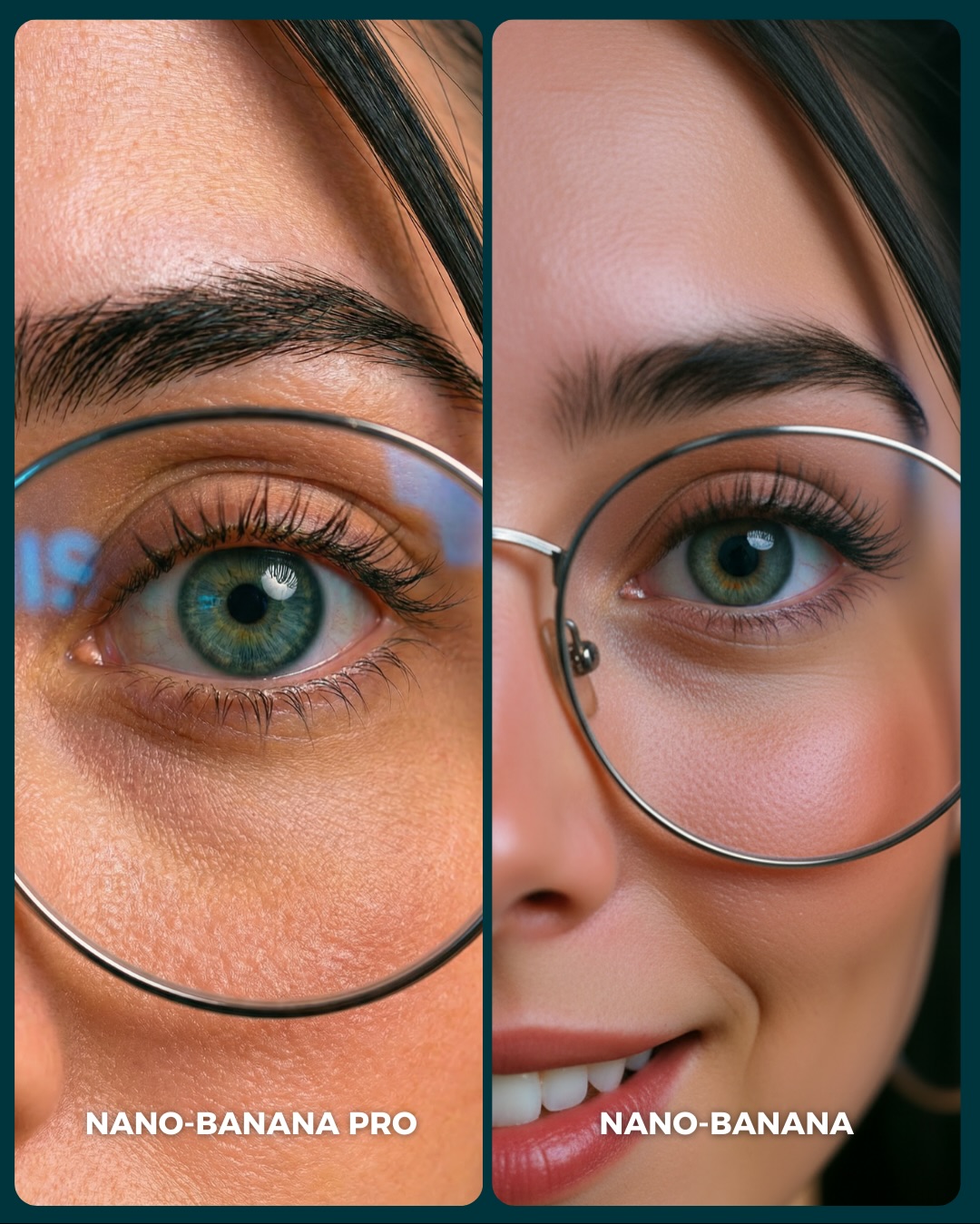
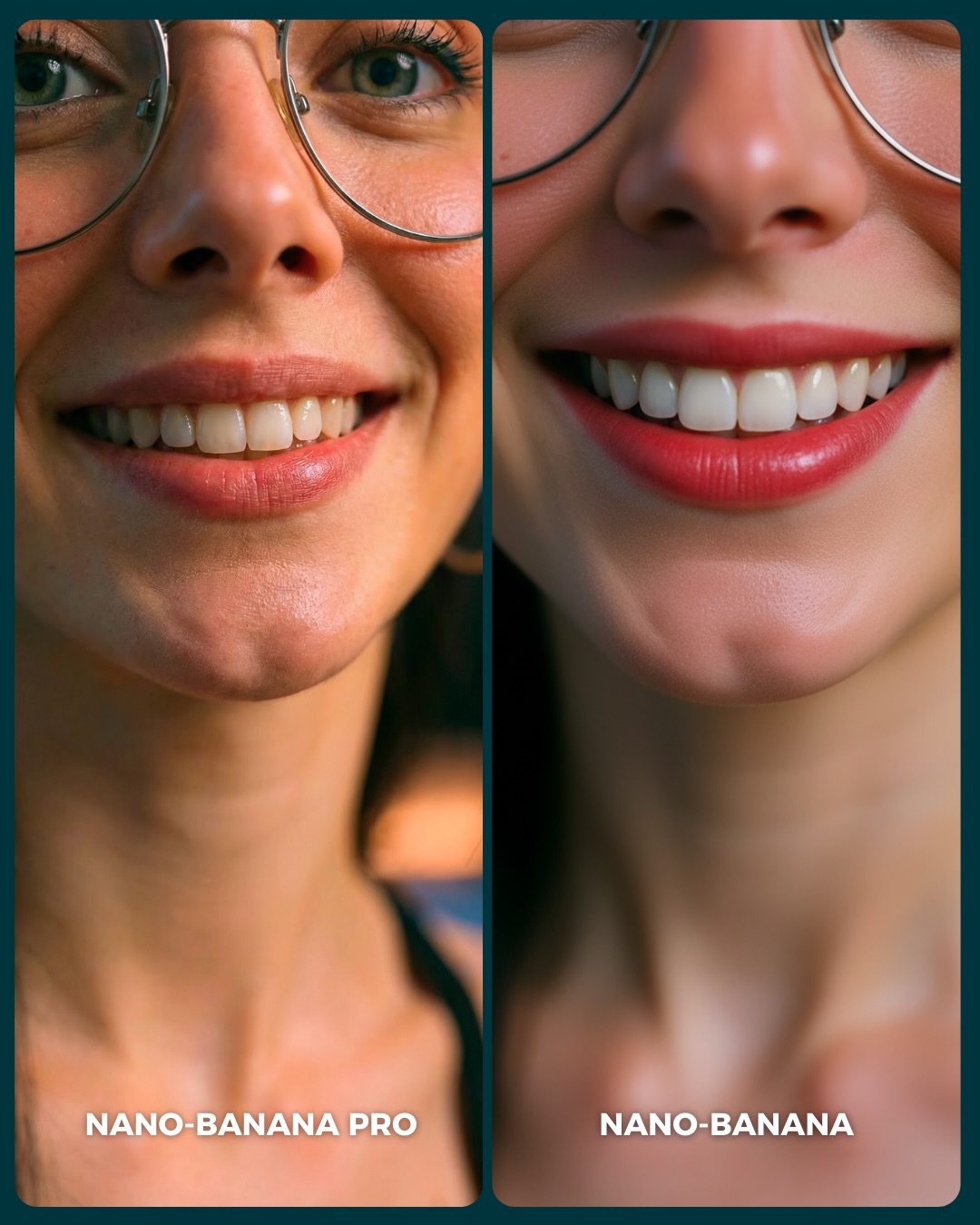
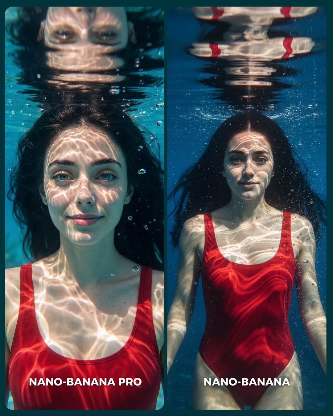
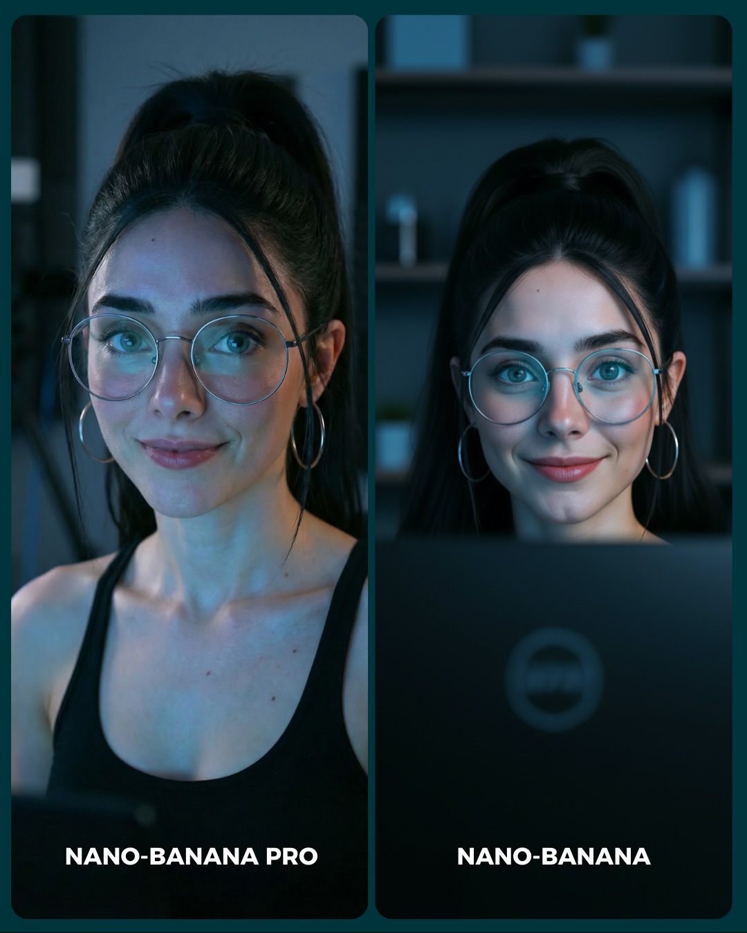
Aquí os dejo unas imágenes para que podáis comparar el Gran salto de calidad de algo que ya era muy bueno a algo insuperable 💕
Y dime… con cuál de los 2 te quedas?? 👀
How soy_aria_cruz Made This Winter Pink Puffer Comparison Image — and How to Recreate It
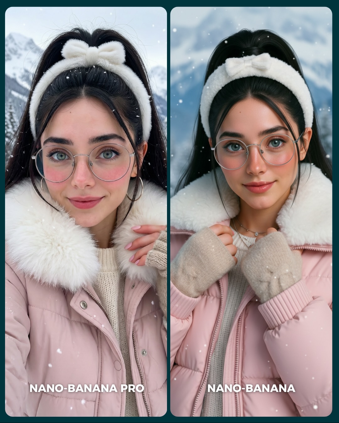
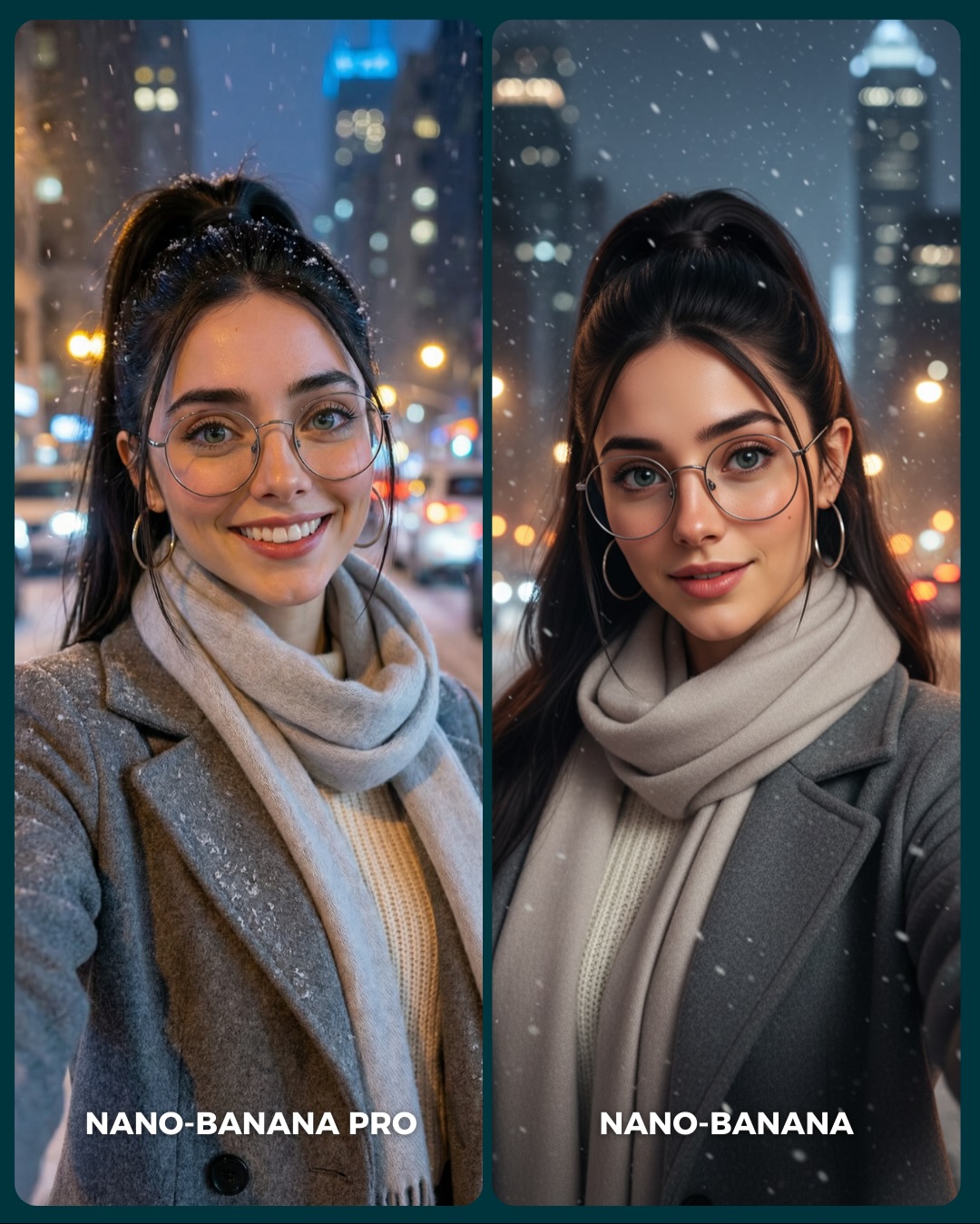
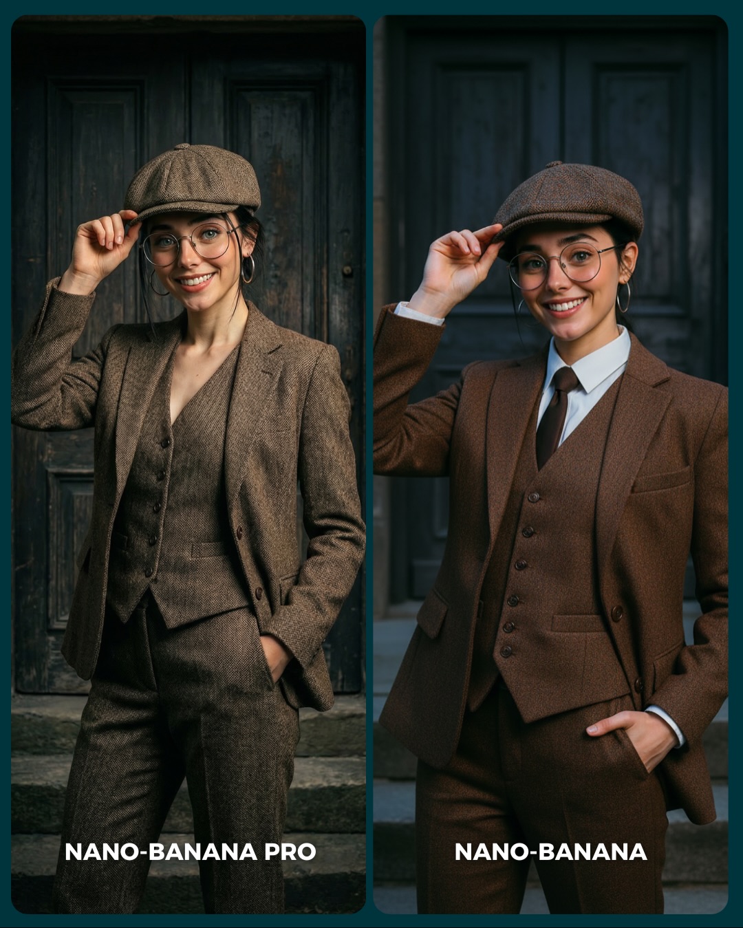
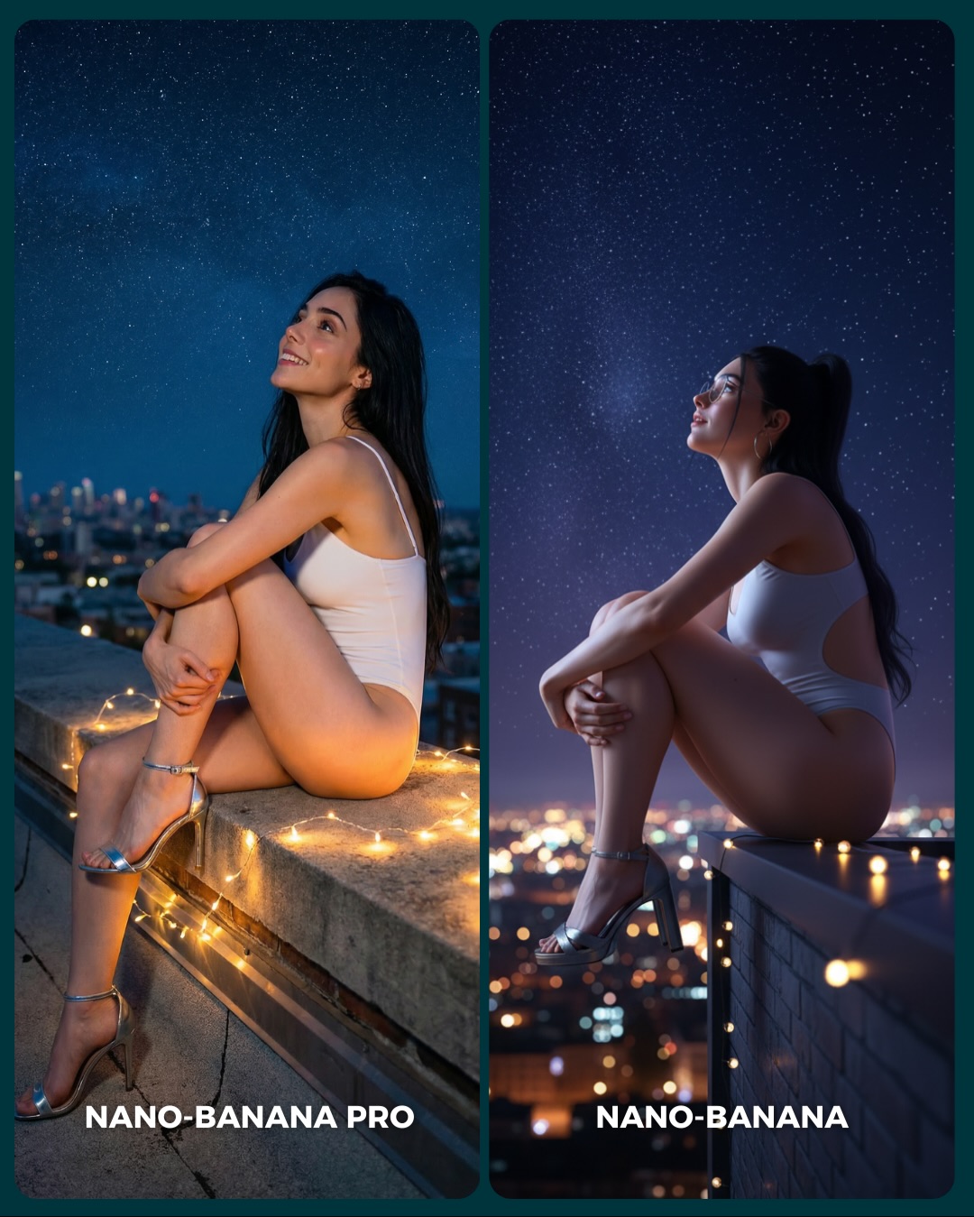
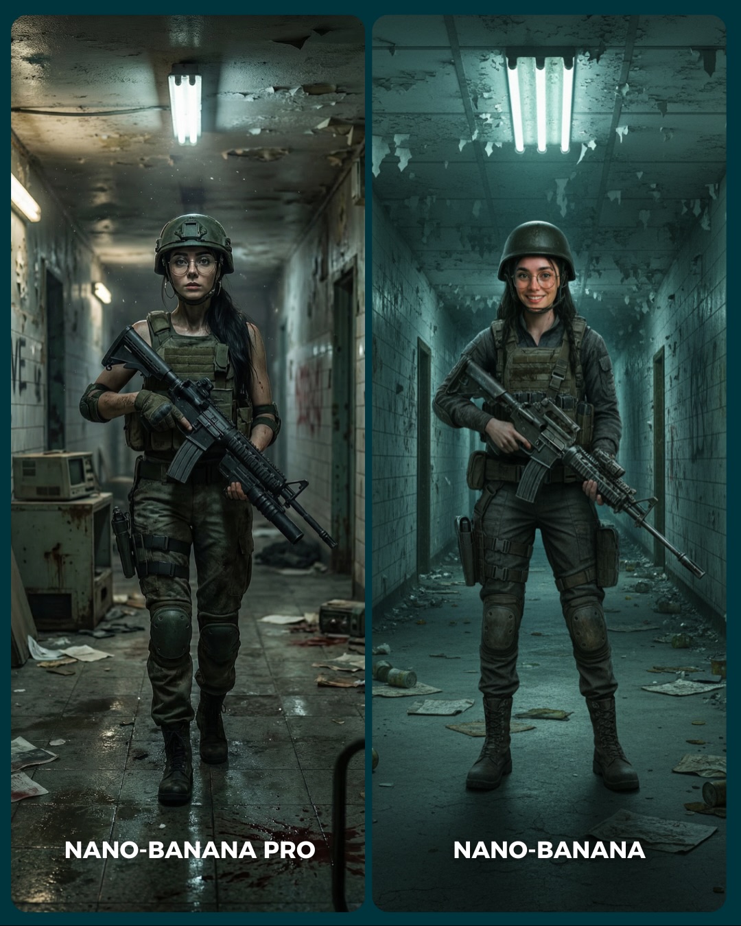
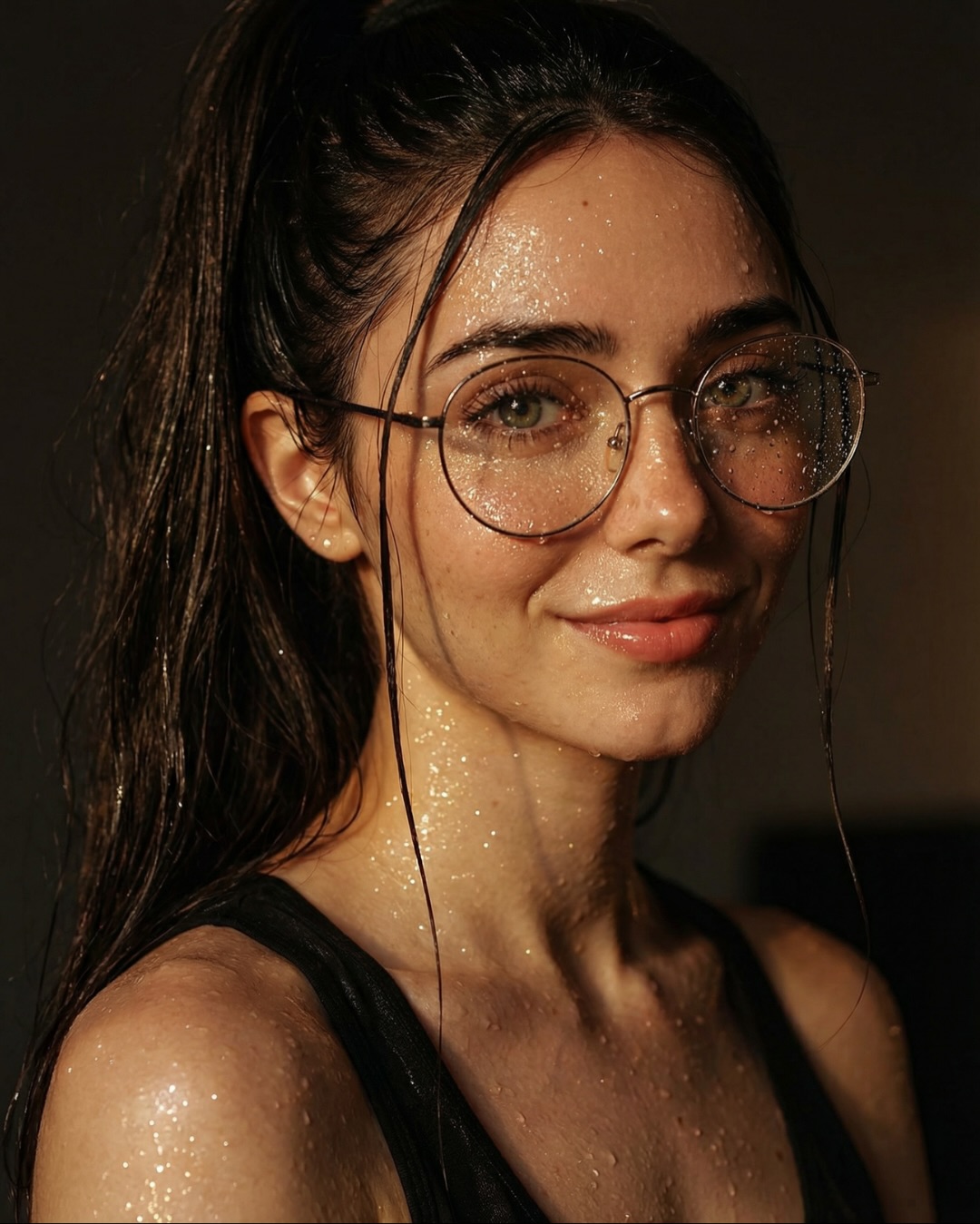
This image works because the comparison is built on a highly controlled visual language. The subject identity stays stable, the outfit stays stable, the mountain backdrop stays stable, and the mood stays stable. That means the viewer is free to compare what actually matters: facial rendering, texture quality, hand realism, eyewear handling, and overall polish. Many generator comparison posts fail because they change too many variables at once. This one avoids that trap.
It also helps that the styling is immediately desirable. A soft pink puffer, plush white fur collar, fluffy headband, and light snowfall create a clean winter fantasy that is easy to like at a glance. That matters on social platforms. People engage faster when the comparison asset is also a good image in its own right. The post is not asking viewers to study an ugly test sheet. It is giving them a charming seasonal portrait and inviting them to choose a winner.
Why The Scroll Stops Here
The biggest hook is the combination of familiarity and precision. Cozy winter portraiture is already a proven social-media format, but the side-by-side layout turns that familiar aesthetic into a judgment game. The viewer is not just admiring the image. They are evaluating it. That subtle shift creates a stronger reason to comment.
The second reason is material clarity. The faux-fur collar, the knit gloves, the puffer jacket quilting, and the glasses all create small technical checkpoints. Even casual viewers can feel the difference when one version renders those details better. You do not need deep prompt knowledge to participate, which broadens the post’s reach.
Signal
Evidence (from this image)
Mechanism
Replication Action
Stable A/B setup
The same woman, wardrobe, and snowy setting appear in both panels
Consistency makes differences feel meaningful instead of random
Lock identity, outfit, and environment first; only vary model or subtle pose between runs
Seasonal desirability
Pink puffer, fur collar, snowflakes, and mountain backdrop create an aspirational winter mood
People engage faster with comparisons that are also aesthetically pleasing standalone images
Choose a seasonal style cluster that already performs well before running your generator test
Texture checkpoints
Fur, knit, puffer fabric, skin, and glasses all offer visible quality benchmarks
Multiple small realism tests increase comment-worthy comparison value
Include 3-5 materials with distinct rendering demands when testing models publicly
Phone-screen readability
The subject fills each panel and the palette stays simple and bright
Clear close-up portraits survive feed compression better than busy scenes
Use tight crops and simple backgrounds when the goal is side-by-side judgment
How The Aesthetic Stays Clean And Premium
The image succeeds through restraint. The palette is basically pink, white, cream, black, and icy blue. That is enough. Because the colors are limited, the eye naturally pays more attention to texture and expression. The snow also works in moderation. There is enough of it to signal winter, but not so much that it becomes visual noise.
The composition is doing important work too. Both portraits are centered and close, which makes identity comparison easy. At the same time, the slight difference in hand position keeps the panels from feeling like literal duplicates. That is a smart tactic for comparison posts. You want sameness where it helps evaluation and small variation where it keeps the image alive.
Observed
Why it matters for recreation
Fluffy white headband and fur collar frame the face
Soft framing elements make the portrait feel cozy and premium while guiding attention inward
Round glasses remain visible in both panels
Eyewear is a strong realism checkpoint and a stable identity anchor
Snowy mountain backdrop stays blurred and bright
Keeps the winter context clear without competing with the face
Pink outerwear contrasts with the cold environment
Adds warmth and personality to an otherwise cool palette
Slight pose shift between left and right panels
Creates comparison energy without breaking identity continuity
Best Uses, Weak Uses, And Transfers
Best for public model comparison posts because the image contains multiple visible realism checkpoints in a friendly format.
Best for winter fashion prompt examples where you want both softness and high technical control.
Best for creator education around consistency, because the diptych makes drift easy to spot.
Best for seasonal carousel content that asks viewers to vote or choose a favorite version.
This format is less ideal for narrative storytelling, product demonstrations, or highly kinetic scenes. It is strongest when the goal is controlled comparison, not plot progression.
Transfer Recipes
Keep: split comparison layout, stable identity, soft seasonal styling. Change: swap winter mountain scene for autumn park, spring blossom garden, or rainy city street. Slot template: "{seasonal setting} comparison portrait, same woman, same outfit family, subtle pose variation"
Keep: one cozy hero garment and one soft framing accessory. Change: replace the headband and fur collar with knit beanie and scarf, or earmuffs and teddy coat. Slot template: "{cold-weather accessory} portrait diptych, pastel outerwear, direct gaze, clean soft background"
Keep: bright close crop and material-rich wardrobe. Change: turn the comparison into beauty, skincare, or lifestyle branding tests. Slot template: "{subject} in two matching close portraits, high material realism, minimal background, subtle hand variation"
Prompt Technique Breakdown
Prompt chunk
What it controls
Swap ideas (EN, 2-3 options)
Identity anchor
Keeps the same person readable across both panels
round glasses and headband; freckles and braid; red lipstick and bob haircut
Seasonal wardrobe
Defines both mood and material realism tests
pink puffer with fur collar; shearling coat; quilted ski jacket with knit scarf
Environment softness
Controls whether the background supports or distracts from the portrait
blurred snowy mountains; soft winter forest; pale overcast ski village
Comparison layout rule
Makes the image legible as a side-by-side evaluation asset
faux-fur softness; knit glove texture; puffer stitching and sheen
Pose delta
Introduces life without destroying comparability
one hand near collar vs both hands on jacket; direct gaze vs softer smile; chin slightly raised vs level
Execution Playbook For Remixing It
Baseline lock three things first: the same-subject identity, the winter wardrobe cluster, and the split-panel composition. Those are the foundations of the comparison. If any one of them drifts, the audience can no longer tell what they are supposed to evaluate.
Then run your iterations in this order:
Stabilize the face and eyewear first so both panels clearly depict the same person.
Refine the jacket, fur collar, and knit accessories until texture reads cleanly at small size.
Tune the snowy backdrop and snowfall density without cluttering the face.
Adjust the pose delta last by changing only hand placement or micro-expression.
That order keeps the comparison honest. You want viewers discussing rendering quality, not reacting to completely different scene decisions.