Why soy_aria_cruz's Nano-Banana Pro vs Nano-Banana Vintage Brown Suit Comparison Went Viral — and the Formula Behind It
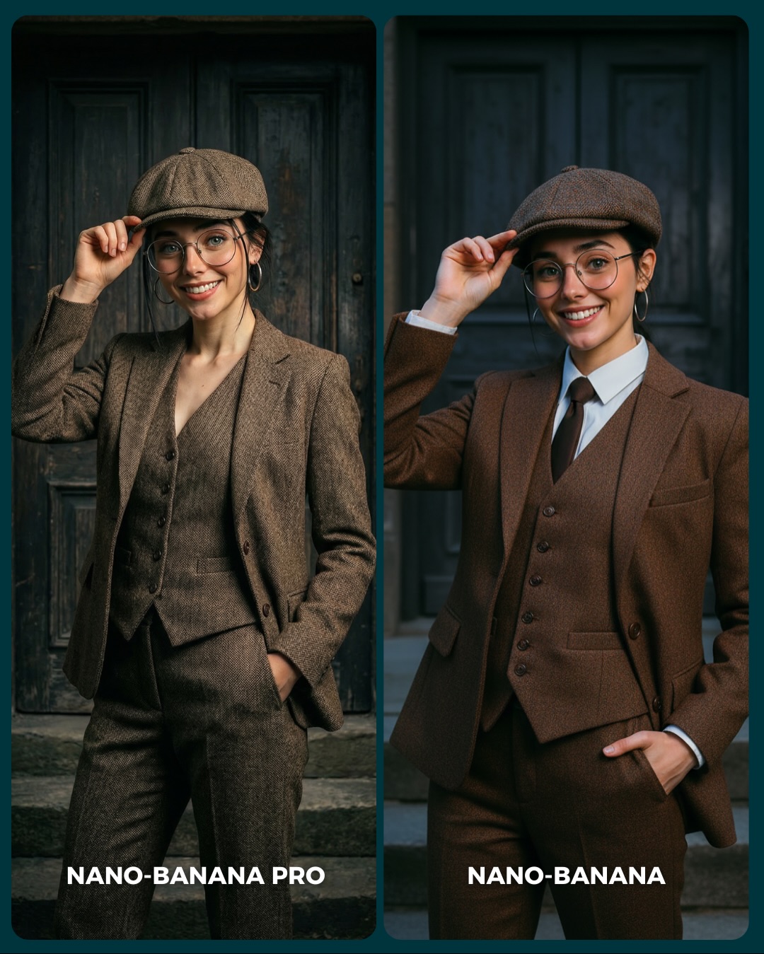
This image works because the subject matter is more difficult than it looks. At first glance it is just a woman in a brown suit and cap. But that combination quietly tests several things at once: tailoring accuracy, fabric texture, facial consistency under a hat brim, accessory retention, and the difference between grounded realism and cleaner stylization. That makes the benchmark more useful than a generic beauty portrait.
For creators, this is a good reminder that clothing can be a benchmark variable, not just decoration. Structured garments reveal model quality differently from skin-heavy beauty shots. A suit has seams, lapels, buttons, pocket placement, and fit lines. When you compare models on those features, you learn more about control than you would from a softer dress portrait alone.
Why the comparison reads well in a feed
The strongest mechanism here is matched posture. Both versions keep the same hand-on-cap gesture, the same general smile, and the same heritage-inspired scene. That consistency lets the viewer focus on the actual differences: one side feels more tactile and grounded, the other feels smoother and more polished. Because the framework stays stable, the comparison feels fair.
The second strength is tonal discipline. Brown suit, dark wood, and muted stone keep the frame coherent. There is enough visual interest to stop the scroll, but nothing shouts over the benchmark. That is what makes the post effective for people who actually want to judge output quality, not just admire a pretty image.
| Signal | Evidence (from this image) | Mechanism | Replication Action |
|---|
| Tailoring as a test surface | Lapels, vest buttons, pockets, and trouser fit are clearly visible | Structured clothing exposes model control better than loose garments | Use tailored outfits when you want to compare construction and realism accuracy |
| Same pose across panels | Both subjects touch the cap and keep the other hand in a pocket | Matched posture makes differences in rendering easier to see | Keep gesture and crop consistent when testing style quality |
| Subtle style split | Left side feels rougher and more realistic, right side cleaner and more polished | Viewers can debate realism versus refinement without the image becoming chaotic | Compare outputs where the difference is visible but the scene remains controlled |
Where this format fits best
This structure is especially useful for creators benchmarking fashion realism, tailoring fidelity, or commercial portrait quality. It is also a strong fit for prompt educators who want to show how the same styling concept can drift between “more realistic” and “more beautified” outputs.
It is less useful for audiences who care only about dramatic visual impact. This is a comparison built on subtle quality signals, not spectacle. That makes it more informative, but also a little quieter than fire scenes or fantasy benchmarks.
- Best fit: fashion-realism benchmark posts. Why fit: structured garments expose rendering quality very clearly. What to change: vary suit material, gender styling, or pose complexity.
- Best fit: prompt educators. Why fit: the image shows how wardrobe construction and realism interact. What to change: isolate which prompt phrases control tailoring versus face polish.
- Best fit: creator comparison carousels. Why fit: the outfit is elegant enough to attract attention while still supporting evaluation. What to change: keep the same scene but rotate garment types.
- Not ideal: fantasy or narrative pages. Reason: the scene is too controlled and non-story-driven.
- Not ideal: highly casual social audiences. Reason: the benchmark differences are subtle and reward closer looking.
Transfer recipes
- Keep: matched pose, heritage backdrop, and split-screen layout. Change: brown suit to pinstripe, linen, or velvet tailoring. Slot template: "{same subject} in {structured garment} compared across {model A} and {model B}"
- Keep: one formal look and one style split. Change: the cap to hat, beret, or slicked-back hair while preserving the same tailoring benchmark logic. Slot template: "{tailored portrait comparison} testing {style realism variable}"
- Keep: neutral architecture and consistent crop. Change: the subject gender presentation or age styling while holding the rest constant. Slot template: "{controlled fashion benchmark} with {garment complexity} and {matched gesture}"
What the image gets right aesthetically
The image succeeds because the environment supports the wardrobe without competing with it. Dark wooden doors and stone steps create a timeless mood, but they stay quiet. That is exactly what you want when the real benchmark target is fabric, fit, and face.
The brown palette is also effective. Because everything lives in a restrained warm-neutral range, differences in texture and polish become more noticeable. This is a helpful prompt lesson: benchmark scenes do not need loud colors if the goal is comparing material quality and realism.
| Observed | Why it matters for recreation |
|---|
| Two matched vintage-suit portraits with identical gesture logic | Make differences in realism easier to inspect |
| Brown tailoring against dark wooden doors | Creates cohesion without distracting from the garment |
| Flat cap and glasses retained in both panels | Provide stable identity markers across the comparison |
| One hand on cap, one hand in pocket | Adds a clear posture benchmark for anatomy and styling |
| Muted heritage palette | Helps viewers notice texture and finish instead of color noise |
Prompt chunks worth locking first
If you want this kind of comparison to work, start with the garment structure and pose. Those are the real benchmark anchors. Without them, the image turns into a generic portrait instead of a useful fashion-quality comparison.
| Prompt chunk | What it controls | Swap ideas (EN, 2–3 options) |
|---|
| two equal portrait comparison panels | Benchmark clarity and fairness | dual-column suit test, side-by-side outfit benchmark, split tailoring comparison |
| same woman in brown three-piece suit and flat cap | Identity retention and clothing consistency | same man in tailored suit, same person in trench coat set, same subject in uniform look |
| hand touching cap, other hand in pocket | Pose challenge and repeatability | lapel touch, cuff adjustment, jacket-button gesture |
| dark wooden doors and stone step backdrop | Subtle heritage atmosphere | arched entryway, brick facade, neutral paneled wall |
| left panel more textured, right panel more polished | Style split for evaluation | realistic vs beautified, rougher fabric vs smoother finish, grounded vs commercial-clean |
| clear model labels at the bottom | Feed comprehension | PRO vs BASE, MODEL A vs MODEL B, REALISM vs POLISH |
An iteration path that keeps the benchmark sharp
Lock these three things first: the same tailored outfit, the same cap-touching pose, and the same background. Those are the control variables. After that, refine fabric texture, facial polish, and fit-line realism in small steps.
- Run 1: stabilize identity, cap shape, and the overall three-piece suit structure.
- Run 2: refine tailoring details such as lapels, vest buttons, and trouser drape.
- Run 3: tune the style split between realistic texture and smoother commercial polish.
- Run 4: remix the outfit category while preserving the same controlled comparison format.
If the result feels too plain, increase garment complexity slightly. If it feels too fashion-y and less useful, simplify the styling back down. The best version stays elegant but testable.