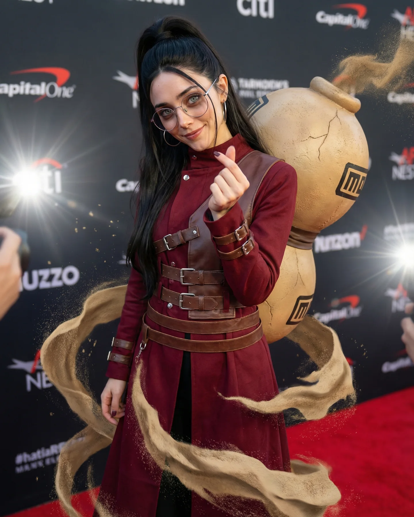
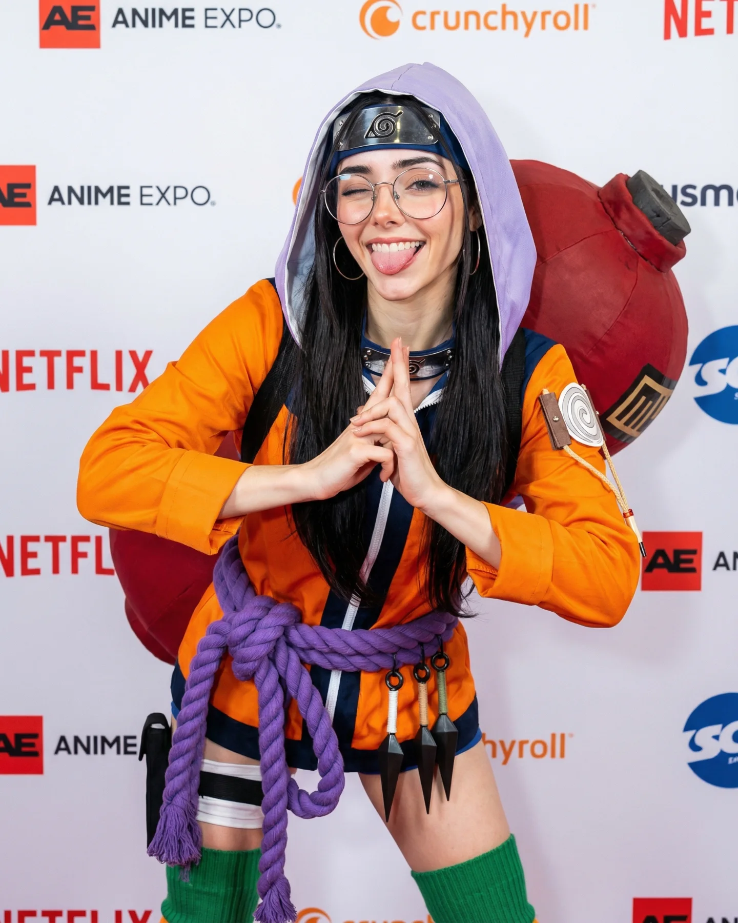
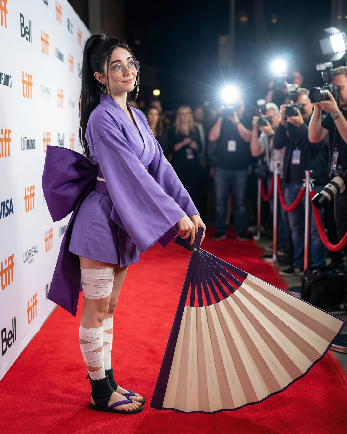
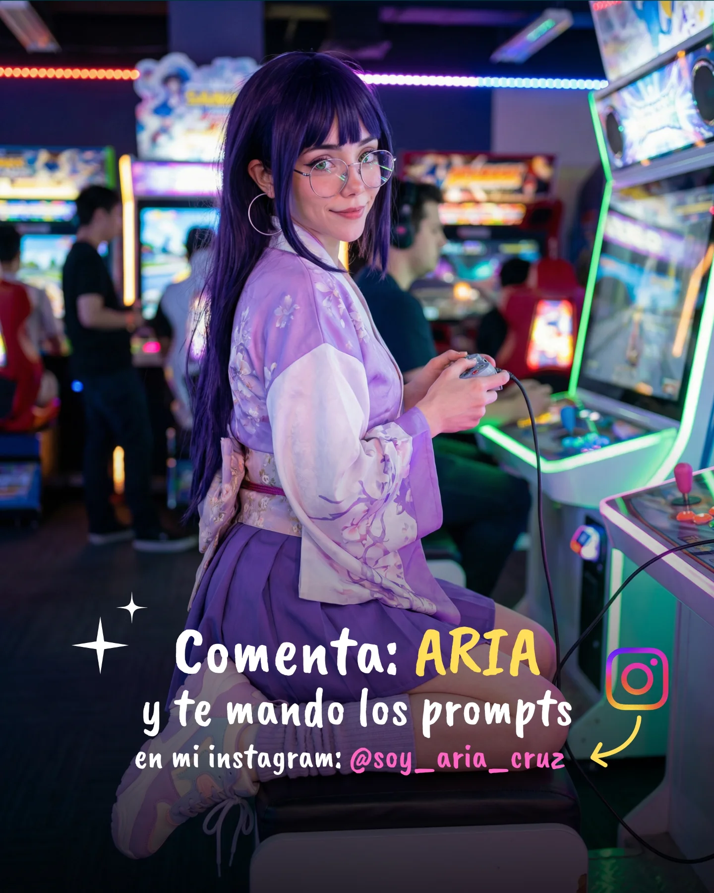
Naruto Cosplay Prompts 💕 Cual es tu favorita?? 🙊 Como siempre comenta ARIA y te mando todos los prompts por mensajes 💌
Naruto Cosplay Prompts 💕 Cual es tu favorita?? 🙊 Como siempre comenta ARIA y te mando todos los prompts por mensajes 💌
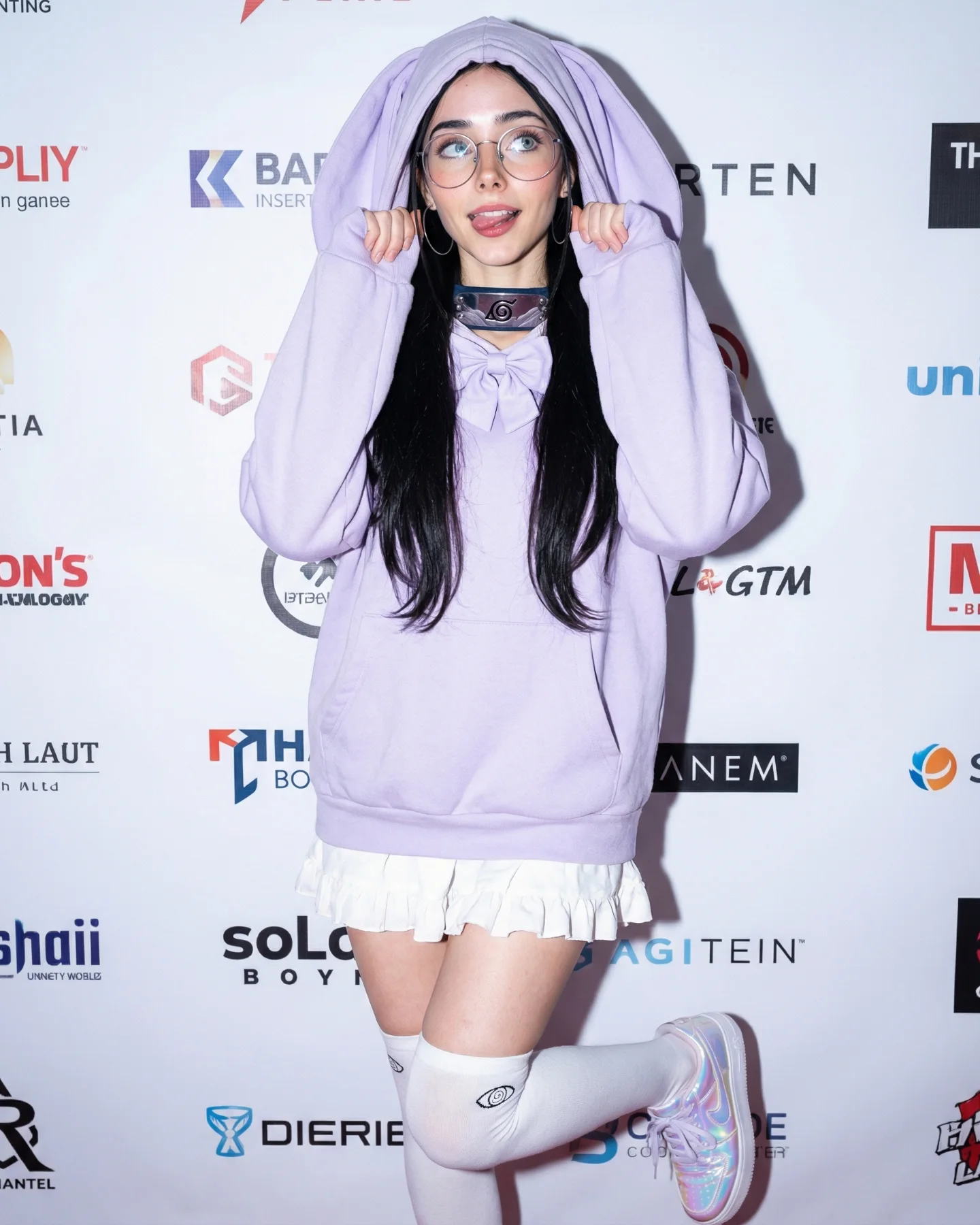
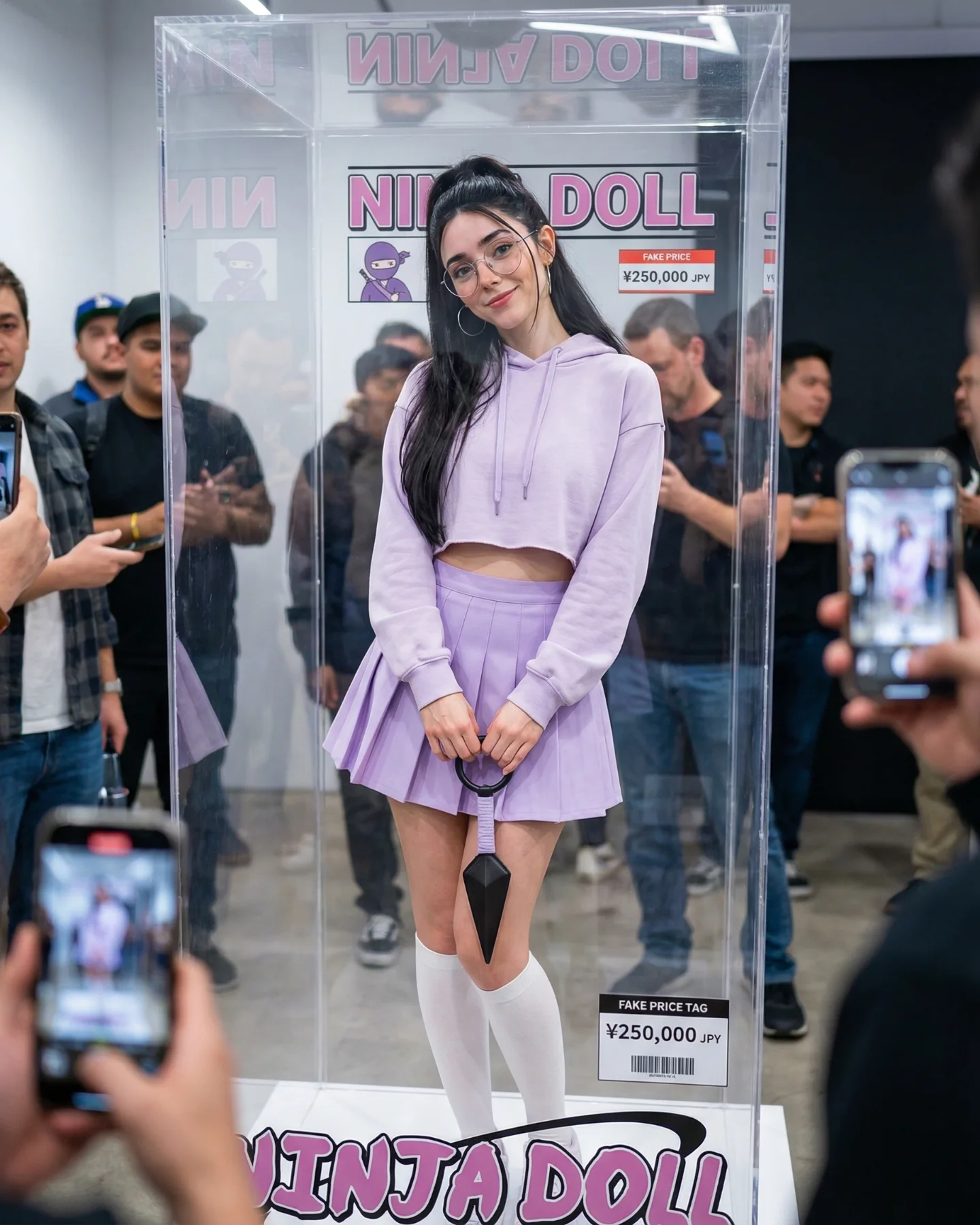
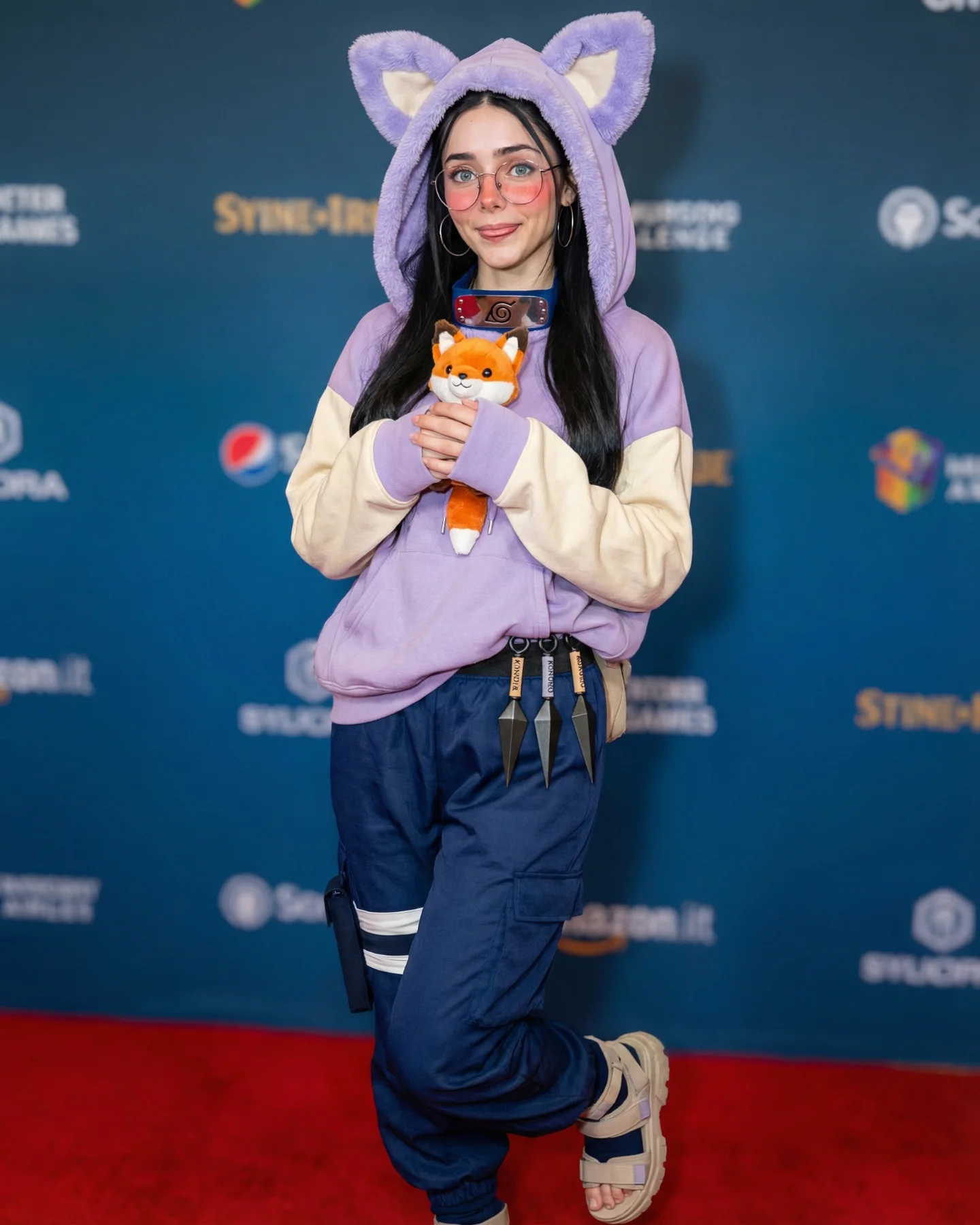
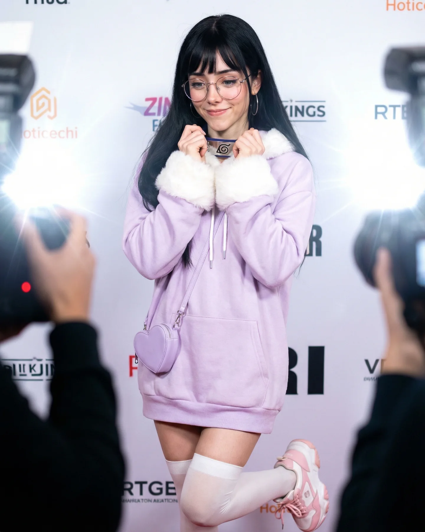
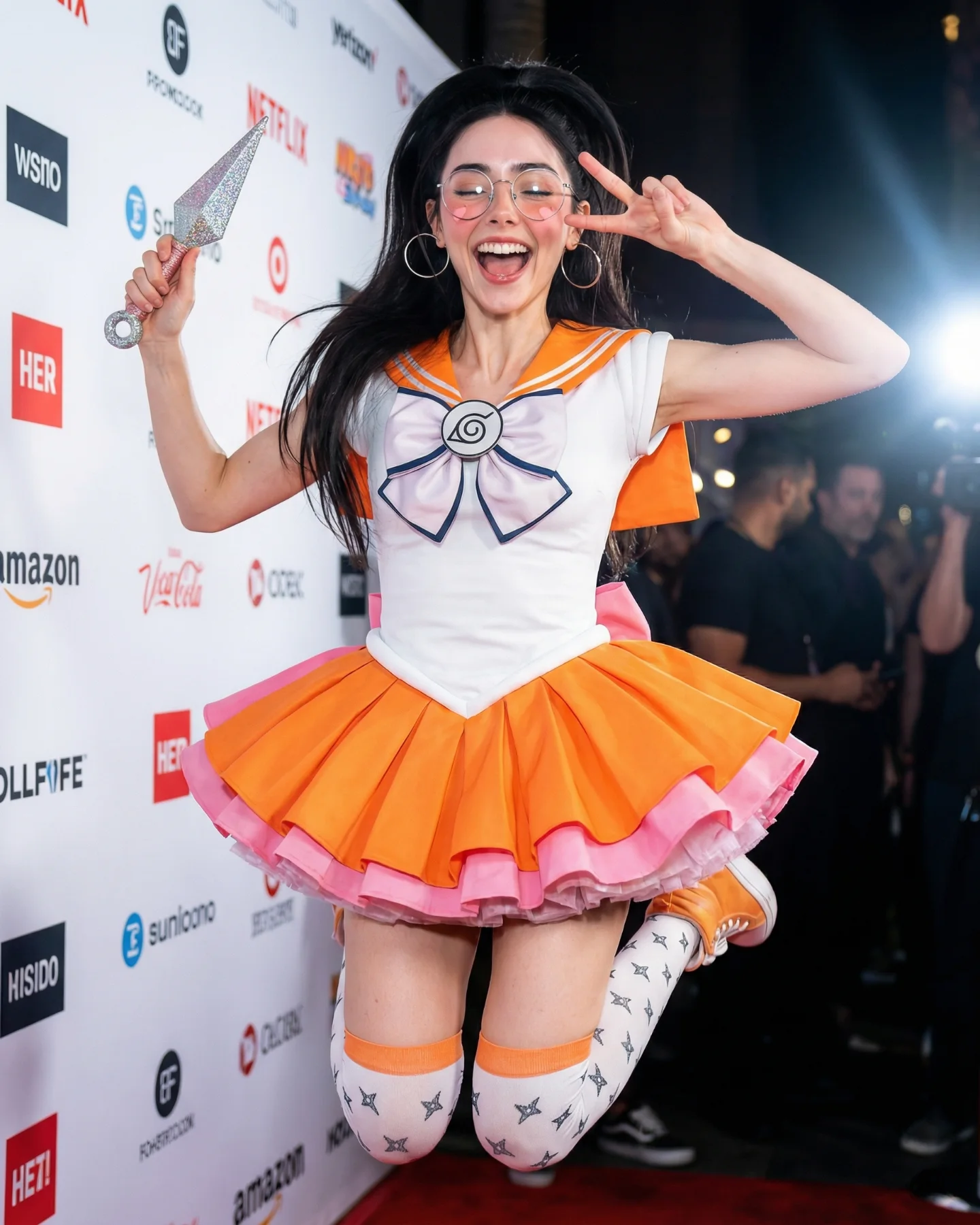
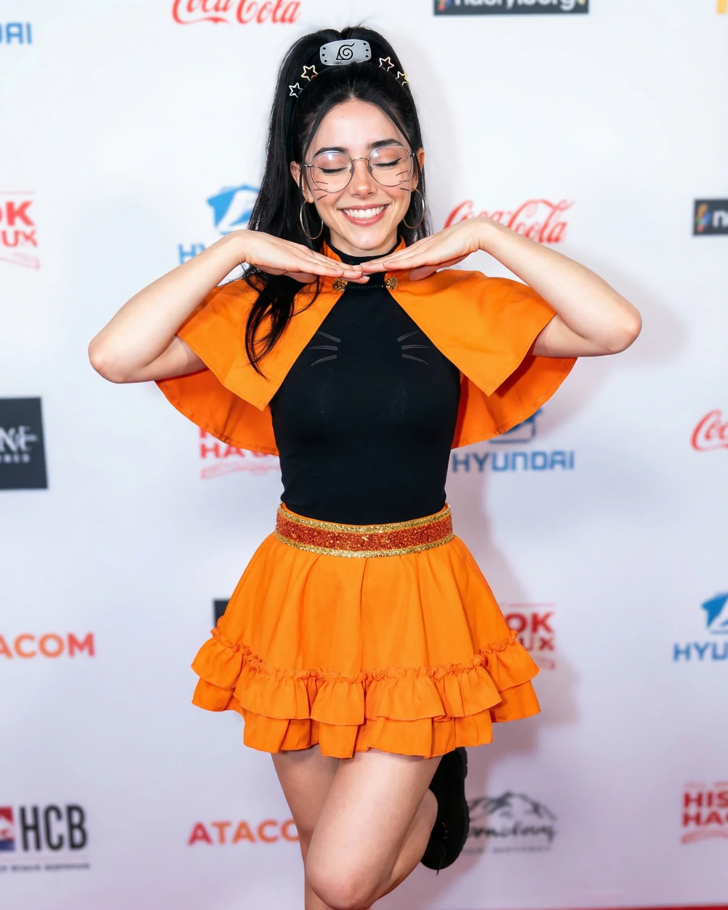
This portrait stands out because it takes a franchise known for combat, rivalry, and dramatic action, then deliberately moves in the opposite direction. Instead of battle energy, the image leans into softness: pastel lavender, oversized hoodie shape, a gentle expression, and a pose that feels playful rather than aggressive. That contrast is exactly what gives the image its hook.
For creators, this is a useful reminder that cosplay does not always need to copy the loudest part of a franchise. Sometimes the smarter move is to preserve just enough identity markers for recognition, then rebuild the mood around a completely different emotional register. That is what happens here. The Leaf symbol and styling cues keep the fandom link alive, but the image is really selling approachability.
The hoodie is doing most of the work. It makes the silhouette bigger, softer, and more contemporary, which helps the image feel wearable and creator-friendly instead of strictly costume-bound. That matters because fans often share the versions of cosplay they can imagine adapting into their own content, not only the versions that look museum-accurate.
| Signal | Evidence (from this image) | Mechanism | Replication Action |
|---|---|---|---|
| Soft-franchise reinterpretation | Pastel hoodie styling replaces action-heavy ninja styling | Unexpected mood contrast refreshes a familiar franchise | Keep one or two core fandom symbols, then shift the overall emotional tone deliberately |
| Event-photo clarity | Sponsor wall and direct flash keep the frame simple and legible | Clean documentation makes the styling easy to read at first glance | Use a flat event backdrop when the outfit silhouette is the main story |
| Cute pose logic | Hands lifting the hood, bent knee, upward gaze | Pose reinforces softness and makes the portrait feel more interactive | Choose one pose that supports the emotional direction instead of fighting it |
This kind of image works especially well for character reinterpretations, “soft cosplay” carousels, fandom x streetwear hybrids, and prompt pages aimed at creators who want recognizability without needing armor, weapons, or action staging. It is also strong for convention content because the sponsor wall keeps the image grounded while the outfit carries the whole idea. It is less suitable for hard-action franchise scenes, because the softness is the central point here.
Three transfer recipes work well here. Keep the soft oversized silhouette, one fandom-signature metal symbol, and one cute pose. Change the franchise, the pastel color, and the lower-body styling. Template one: {franchise cue} reinterpreted as {soft oversized streetwear look} in {clean event portrait setting}. Template two: {hooded silhouette} + {single iconic symbol} + {gentle pose} + {bright event flash}. Template three: {anime-inspired styling} made wearable through {soft fabric choice} and {friendly expression}.
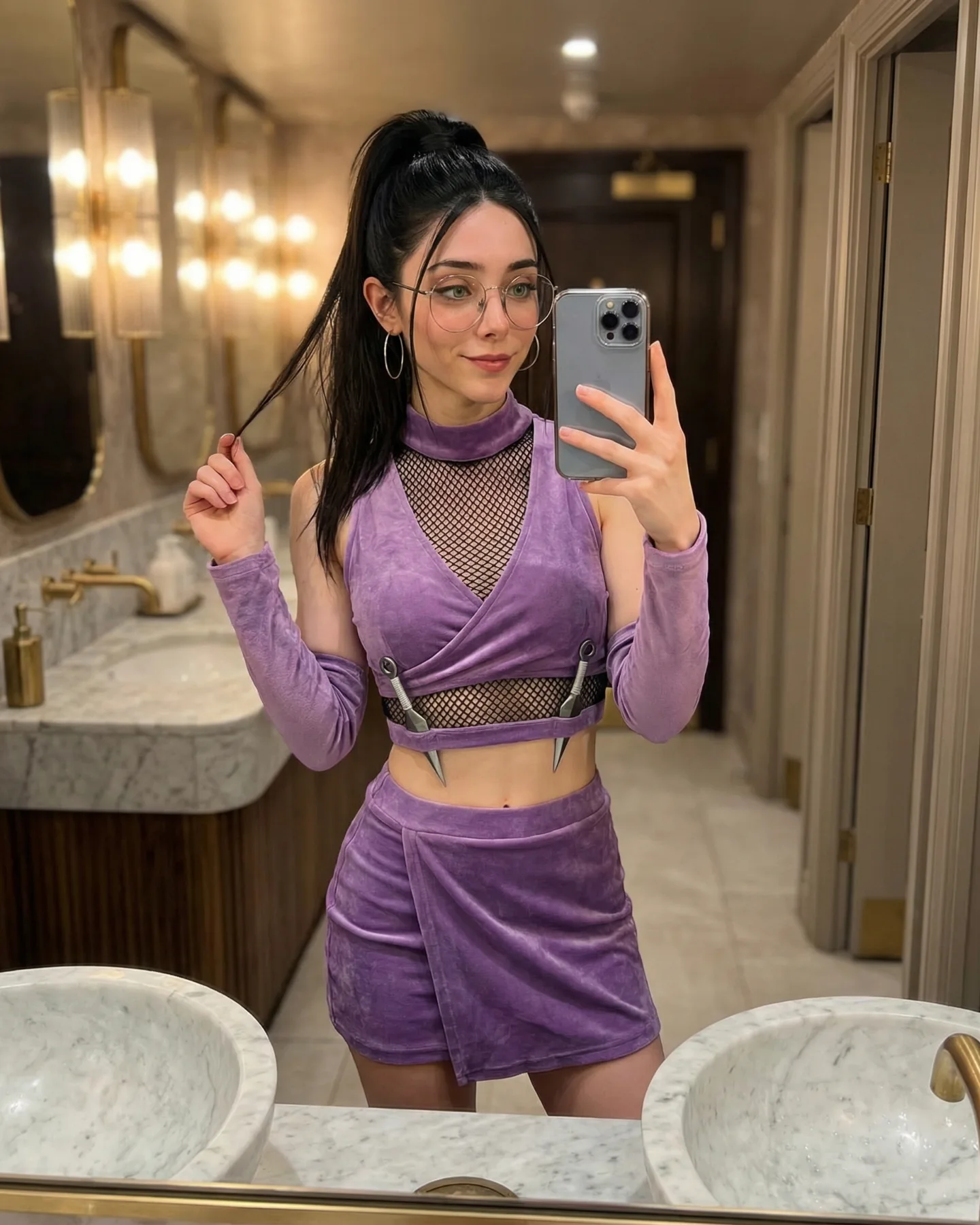
Aesthetically, the portrait succeeds because it stays disciplined. Lavender carries the whole look, white supports it, and the sponsor wall remains visually quiet. That color restraint keeps the outfit feeling intentional instead of costume-heavy. The shiny shoes and metallic Leaf symbol then provide just enough contrast to stop the image from becoming too soft or flat.
The pose is also important. Hands on the hood instantly make the garment part of the expression, and the bent leg keeps the body from feeling stiff. That is a useful trick whenever the styling is minimal: if the clothes are simple, the pose has to help carry the personality.
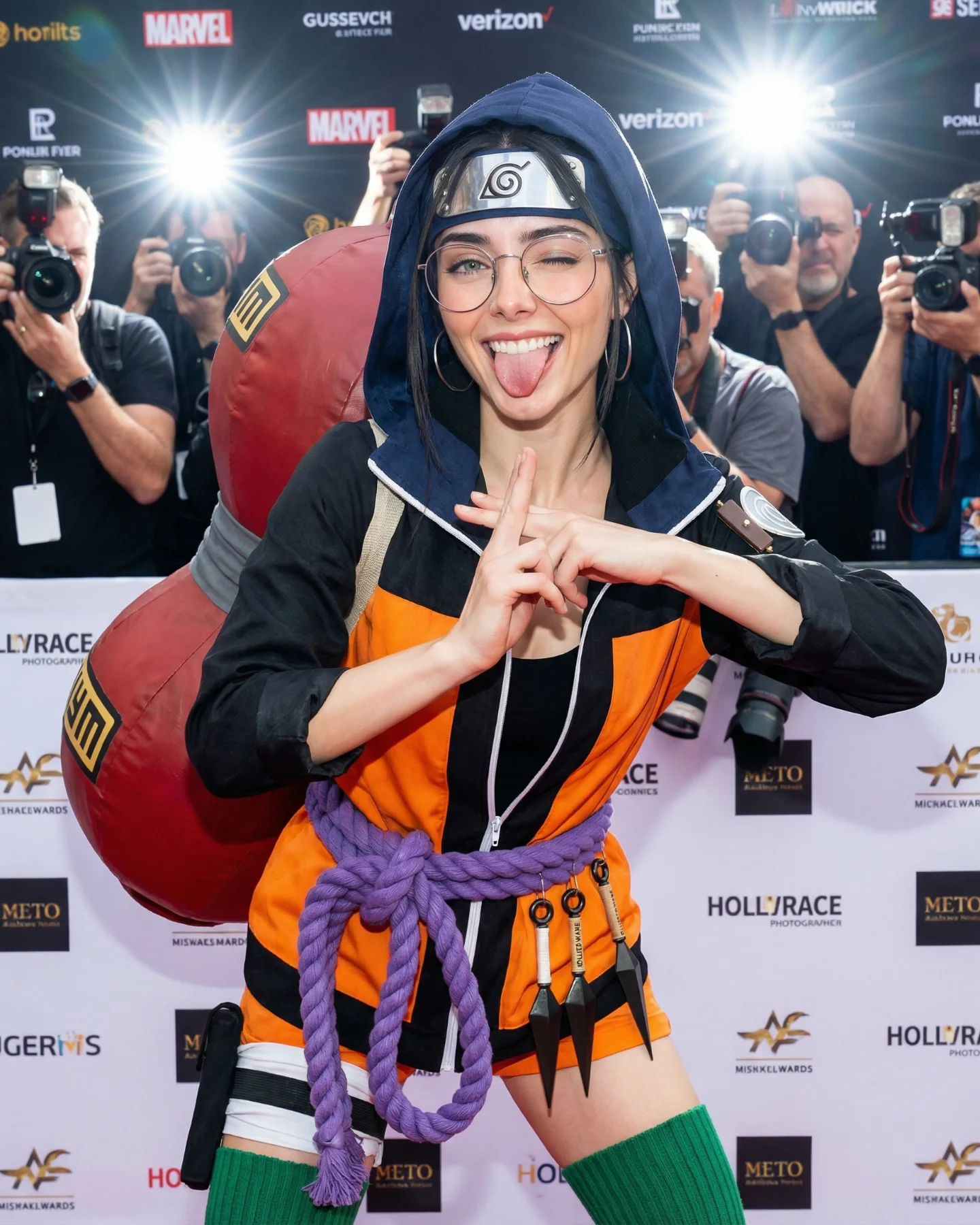
| Observed | Why it matters |
|---|---|
| Oversized lavender hoodie dominates the silhouette | Establishes the soft reinterpretation immediately |
| Metal Leaf symbol worn at the neck | Provides quick fandom recognition without needing a full action costume |
| Bright direct flash and flat logo wall | Keep the outfit easy to scan and platform-friendly |
| Bent knee and hood-grab pose | Add movement and character to a simple front-facing portrait |
| Prompt chunk | What it controls | Swap ideas (EN) |
|---|---|---|
| oversized pastel hoodie silhouette | Main mood and softness level | pink hoodie, cream knit hoodie, cropped sporty hoodie |
| Leaf symbol metal neck accessory | Franchise recognition cue | forehead protector, engraved belt plate, wrist guard symbol |
| event media-wall portrait | Clean public setting and readability | convention booth, fan expo wall, branded step-and-repeat |
| hands holding hood and bent-knee pose | Body language and personality | peace sign, shy wave, hands-in-pocket stance |
| white skirt, thigh-high socks, iridescent sneakers | Lower-half styling balance and youthful detail | shorts and boots, pleated skirt and loafers, leggings and trainers |
Lock three things first: the oversized pastel silhouette, the clear Naruto symbol, and the clean event-portrait setup. Then change one variable at a time. A good sequence is:
This order matters because the image wins by coherence. Once the softness, the fandom cue, and the clean portrait grammar all align, small changes are enough.