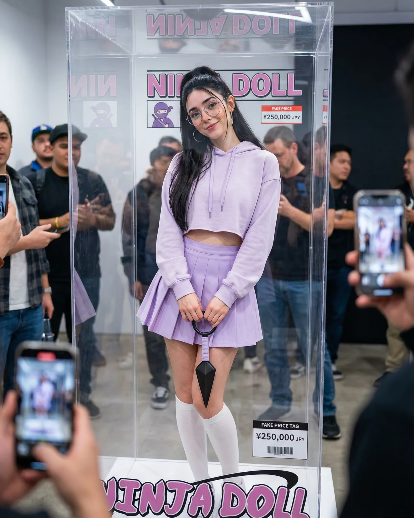
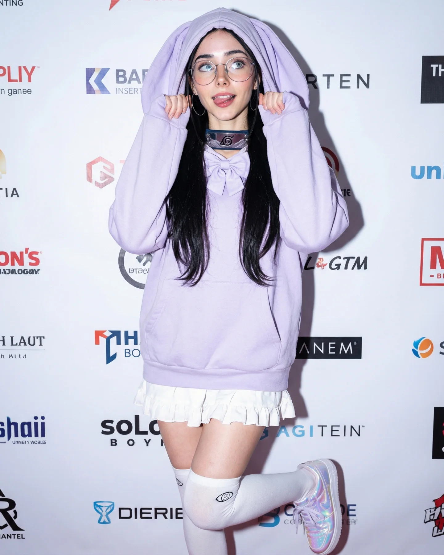
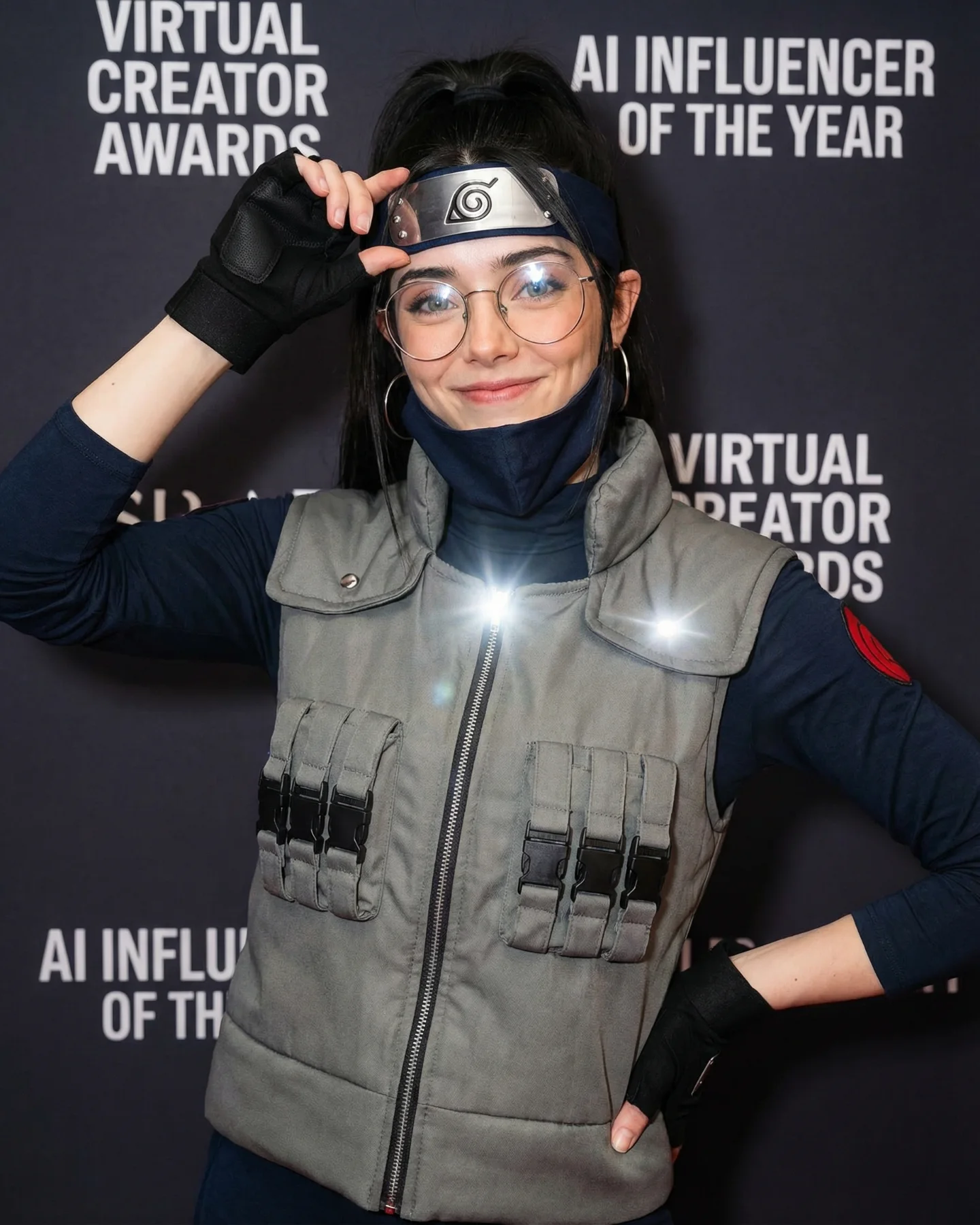
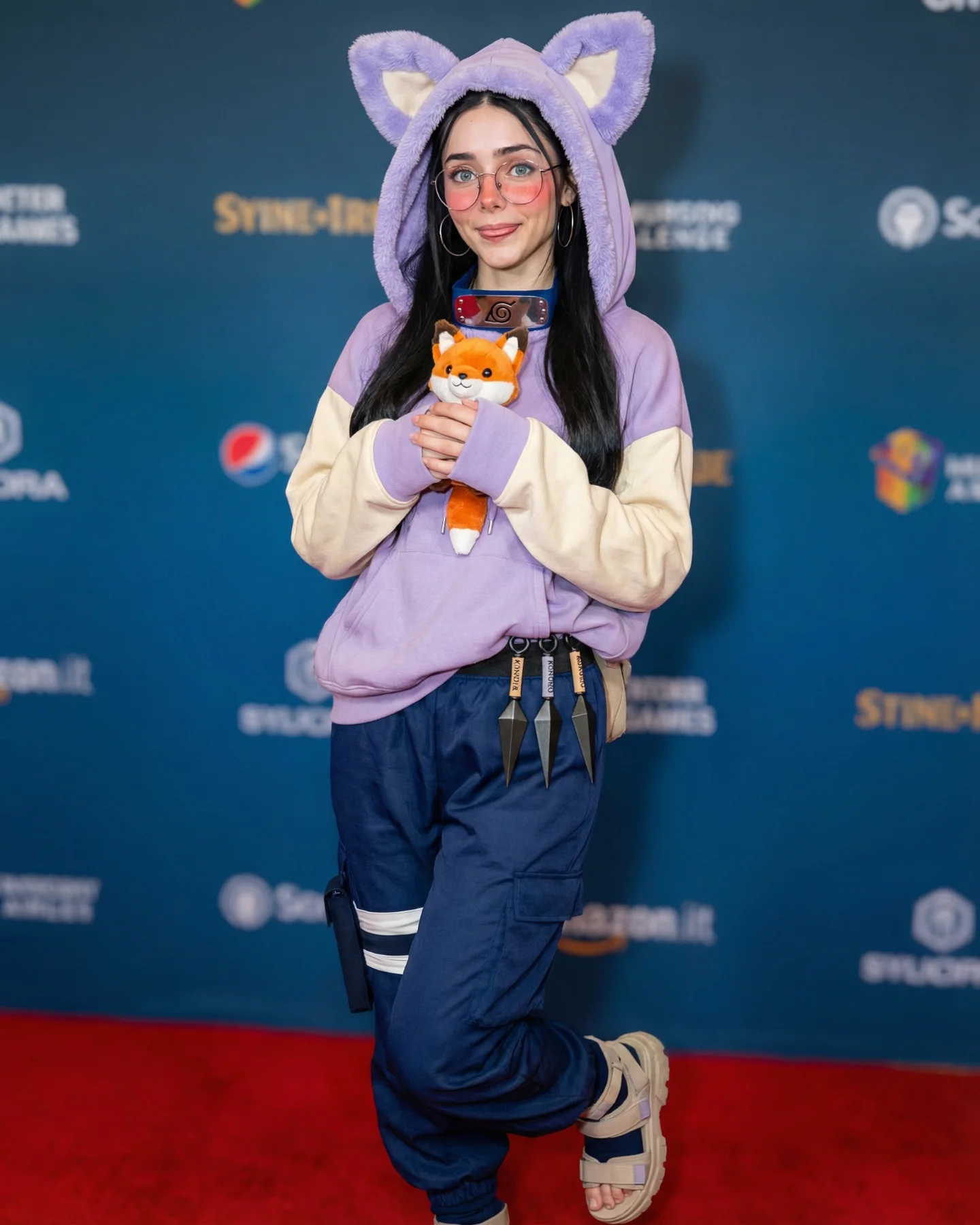
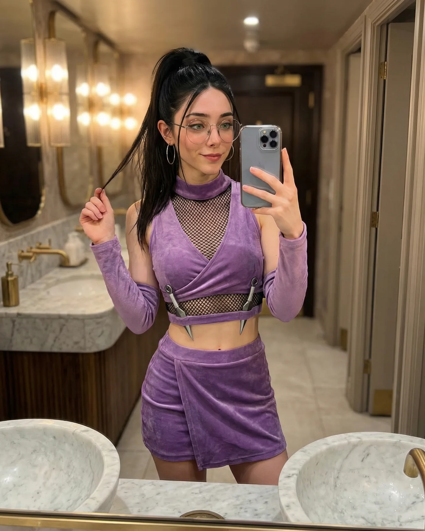
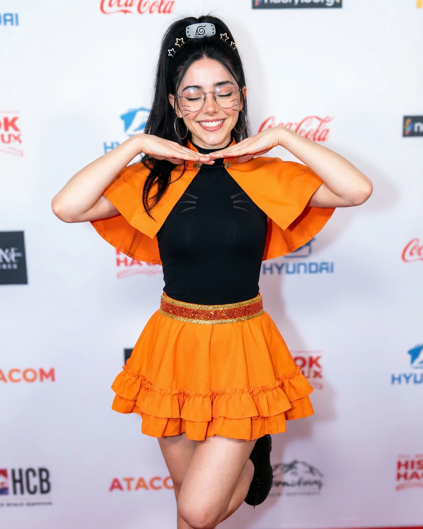
Naruto Cosplay Prompts 💕 Cual es tu favorita?? 🙊 Como siempre comenta ARIA y te mando todos los prompts por mensajes 💌
Naruto Cosplay Prompts 💕 Cual es tu favorita?? 🙊 Como siempre comenta ARIA y te mando todos los prompts por mensajes 💌
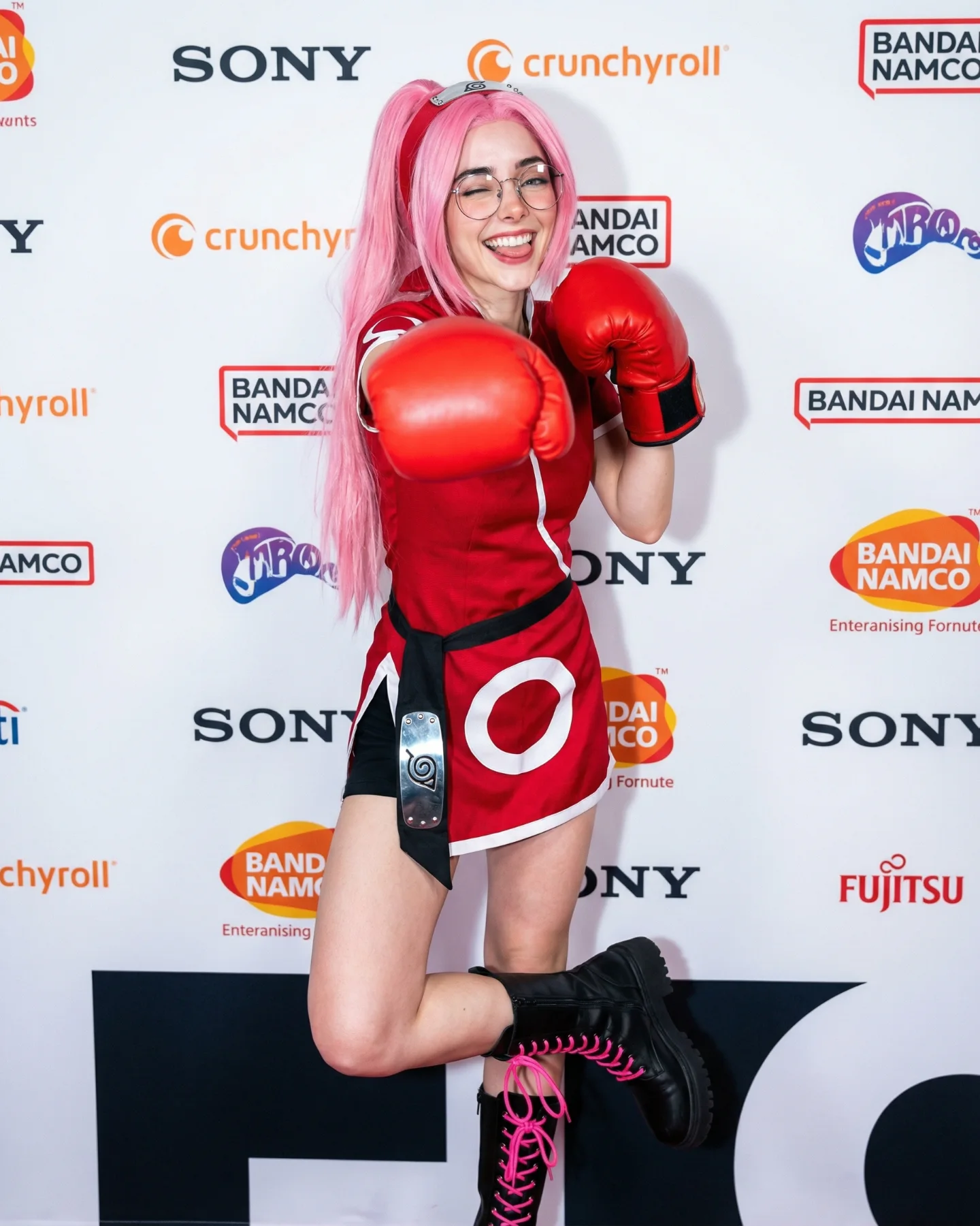
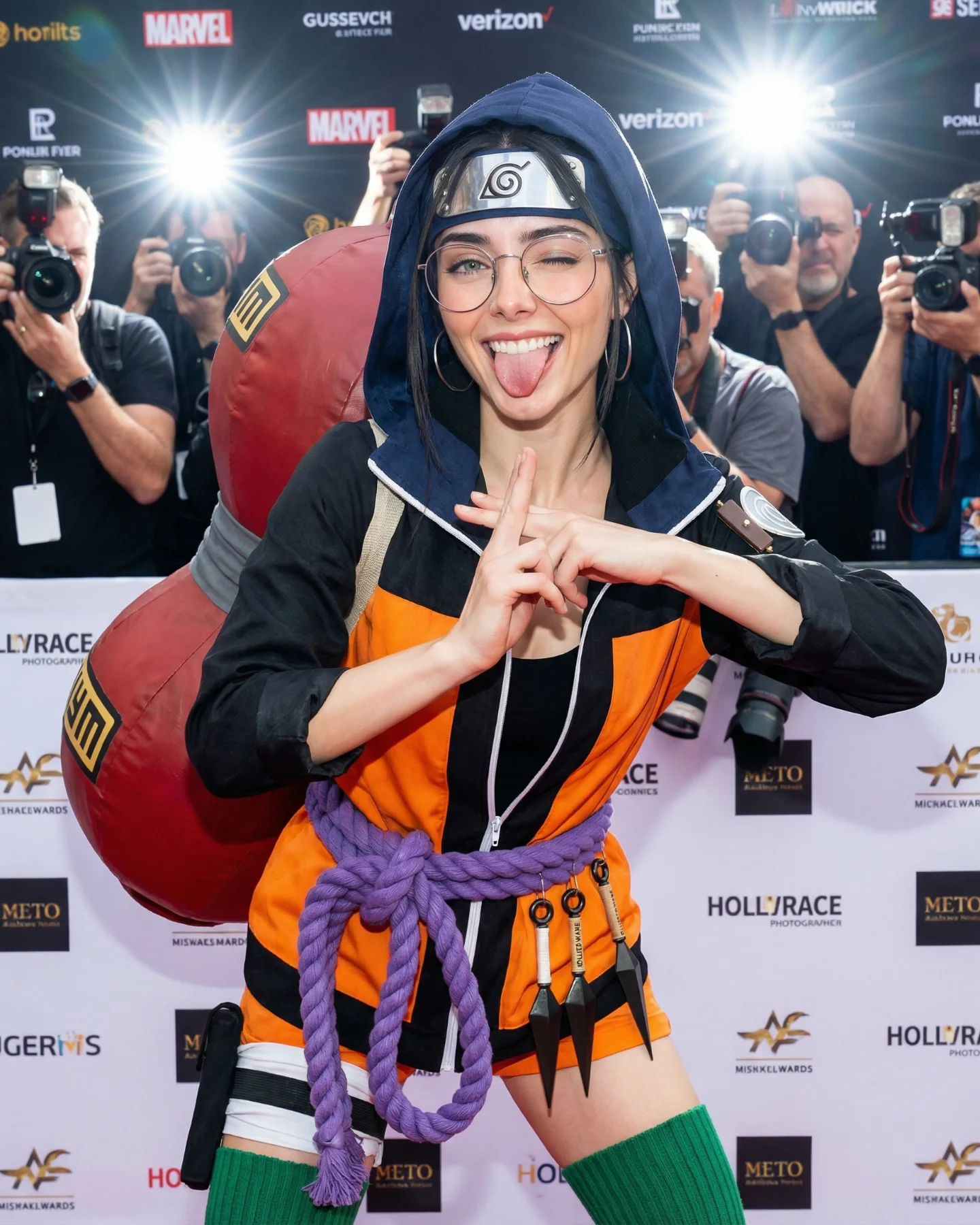
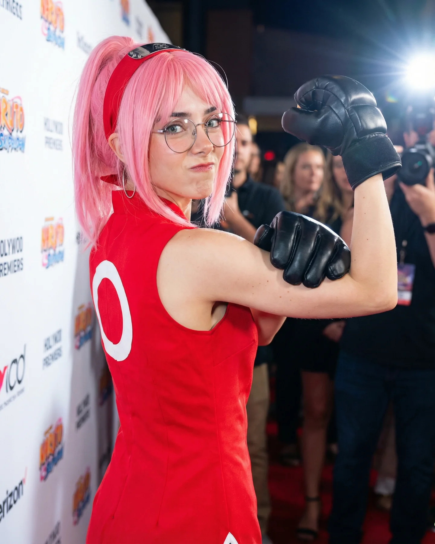
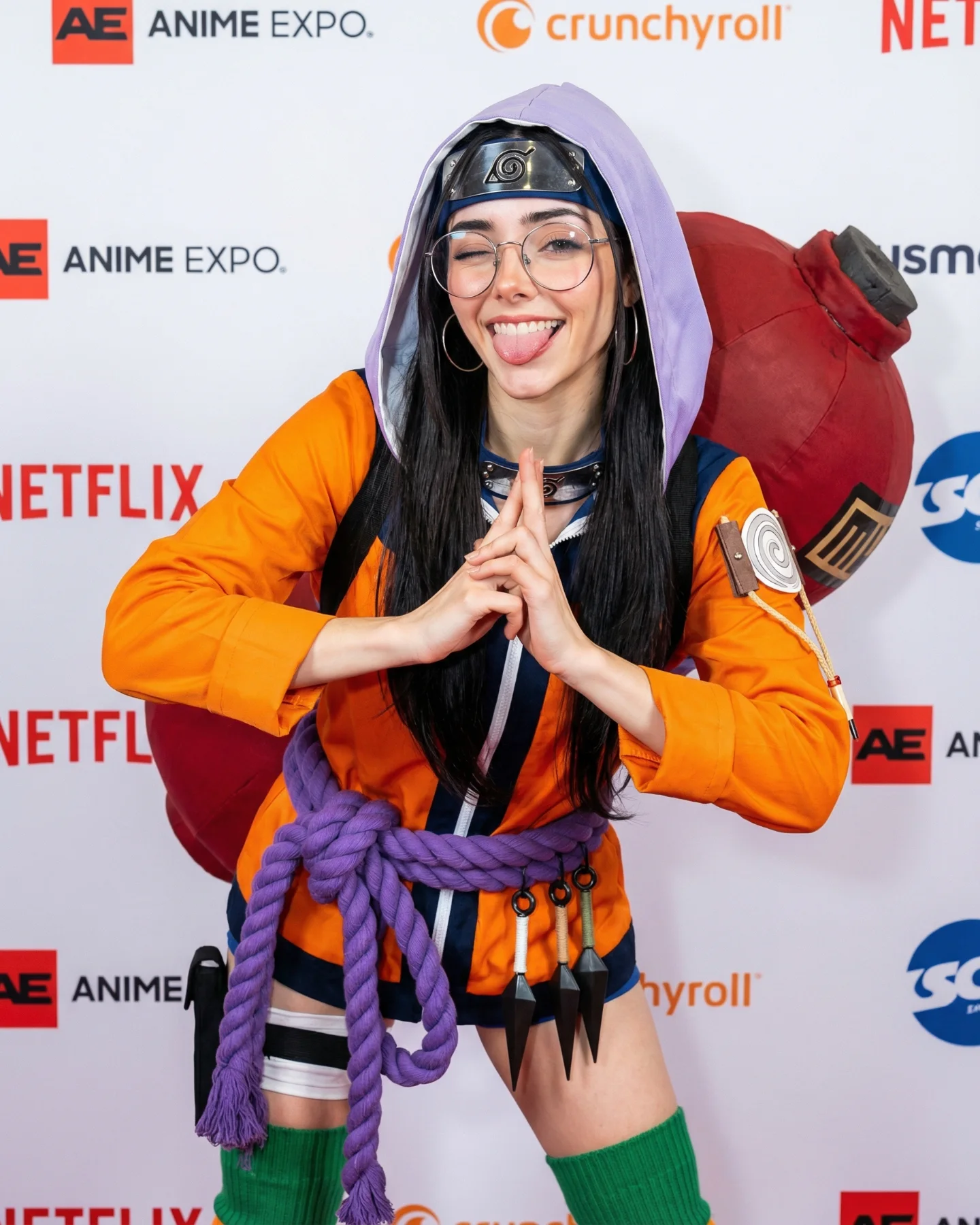
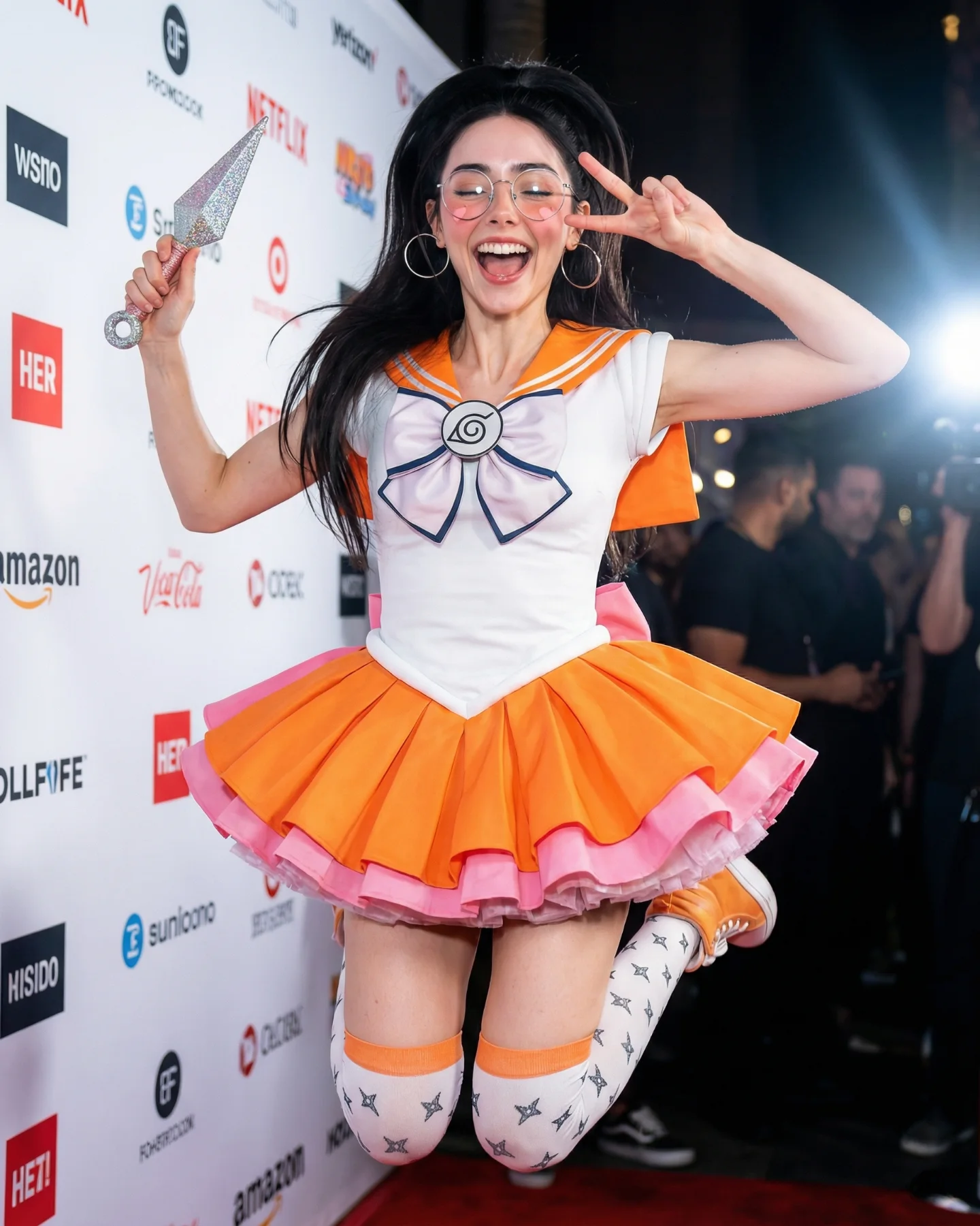
The reason this image feels easy to share is that it does not depend on hardcore Naruto knowledge to work. Yes, the pink hair, forehead protector, and red outfit clearly point to Sakura. But the real growth move is the decision to frame the cosplay inside a branded entertainment photo-call. The white sponsor wall, the clean direct-flash lighting, and the centered full-body pose make it feel like an event image first and a costume image second. That order matters.
The boxing gloves are the smartest twist in the frame. They exaggerate Sakura’s punch-heavy identity without requiring a literal fight scene. Instead of building a complicated anime environment, the image compresses the character into one visual joke that even a casual viewer can understand. Big red gloves, big smile, pink hair, and a polished sponsor backdrop are enough to create both fandom recognition and broad social readability.
That is why the image has crossover value. It speaks to cosplay audiences, anime fans, beauty and fashion viewers, and anyone who responds to bright, cheerful flash photography. The post is not trying to prove screen accuracy. It is trying to make the character portable. For creators, that is often the better growth decision.
| Signal | Evidence (from this image) | Mechanism | Replication Action |
|---|---|---|---|
| Immediate character read | Pink hair, Leaf forehead protector, red Sakura-coded outfit | The viewer understands the reference in under a second | Pick 2-3 iconic identifiers and make them impossible to miss |
| Pop-event legitimacy | Crunchyroll, Bandai Namco, Sony logos on a white step-and-repeat wall | Moves the image from “costume” into “public moment” territory | Place fandom styling inside a sponsor-wall, premiere, or convention photo-call setup |
| Single visual gimmick | Oversized glossy red boxing gloves raised in front of the body | Creates a memorable hook tied directly to character energy | Choose one amplified prop that translates personality instantly |
| Cheerful flash clarity | Bright frontal lighting, crisp exposure, saturated reds against white | Makes the post thumb-stopping and easy to parse on mobile | Use direct event-style light instead of moody cinematic setups |
This structure is less effective for dark villain looks, fight-scene storytelling, or lore-heavy worldbuilding. The clean sponsor wall strips out environment drama on purpose. If the character depends on scenery, mood, or combat context, a press-line image will flatten the story too much.
The strongest choice is the color architecture. Pink hair and red wardrobe could easily become chaotic, but the white sponsor wall gives the whole frame room to breathe. That neutral background isolates the costume colors and makes the gloves feel intentional instead of noisy. The color contrast is simple enough for fast scrolling, which is exactly what you want if the image has to work as a social post before anyone reads the caption.
The second win is the emotional temperature. This is not stoic cosplay. The smile is huge, the body language is playful, and the lifted knee adds bounce. That matters because many fandom posts die in the uncanny zone between serious roleplay and flat portraiture. This one avoids that problem by choosing joy over intimidation.
The third win is shape design. Round glasses, rounded gloves, straight pink hair panels, and the circular white motif on the dress all repeat curved visual forms. That repetition makes the image feel more cohesive than it first appears. It is not just “a costume plus gloves.” It is a tightly grouped set of readable shapes.
| Observed | Why it matters |
|---|---|
| White sponsor wall with sparse colorful logos | Creates clean separation and premium event context |
| Red gloves and red outfit against neutral background | Improves instant stop power on mobile feeds |
| Large smile and lifted-knee stance | Makes the character feel approachable and energetic |
| Round glasses and circular costume motif | Adds repeated shapes that unify the composition |
| Direct flash clarity instead of cinematic mood | Keeps every franchise cue easy to decode quickly |
To reproduce this well, the best approach is to control the public-event system first and the fandom details second. If you reverse that order, the result usually looks like a costume snapshot rather than a shareable anime-event image.
| Prompt chunk | What it controls | Swap ideas (EN, 2–3 options) |
|---|---|---|
| “Sakura-inspired cosplay with long pink hair and Leaf forehead protector” | Primary franchise recognition | “Hinata-inspired soft-purple look”, “Asuka-inspired red suit”, “Jinx-inspired blue braid styling” |
| “white anime event sponsor wall with Crunchyroll and Bandai Namco style logos” | Public-event legitimacy and backdrop cleanliness | “comic-con photo wall”, “game launch sponsor wall”, “film festival anime premiere backdrop” |
| “oversized glossy red boxing gloves” | Single memorable hook and character attitude | “giant microphone prop”, “oversized wand”, “hero helmet under arm” |
| “bright frontal flash, crisp convention press-photo look” | Clarity, mobile readability, and event realism | “on-camera flash portrait”, “clean trade-show lighting”, “front-lit celebrity photo-call” |
| “full-body vertical portrait, one knee lifted, playful fighting stance” | Readable movement and social energy | “hero pose with hand on hip”, “laughing over-shoulder stance”, “one-foot-forward power pose” |
Baseline lock first: the sponsor wall, the pink hair plus headband combo, and the oversized gloves. Those three elements create almost all of the image’s identity. Once they are stable, everything else becomes refinement.
Change only one or two knobs per pass. If the image loses event credibility, fix the backdrop and lighting before touching the costume again. If the image looks like generic boxing cosplay, reinforce the Sakura-specific color blocks and forehead protector. The fastest path to a strong result is not “add more detail.” It is “protect the three cues that make the scroll stop.”