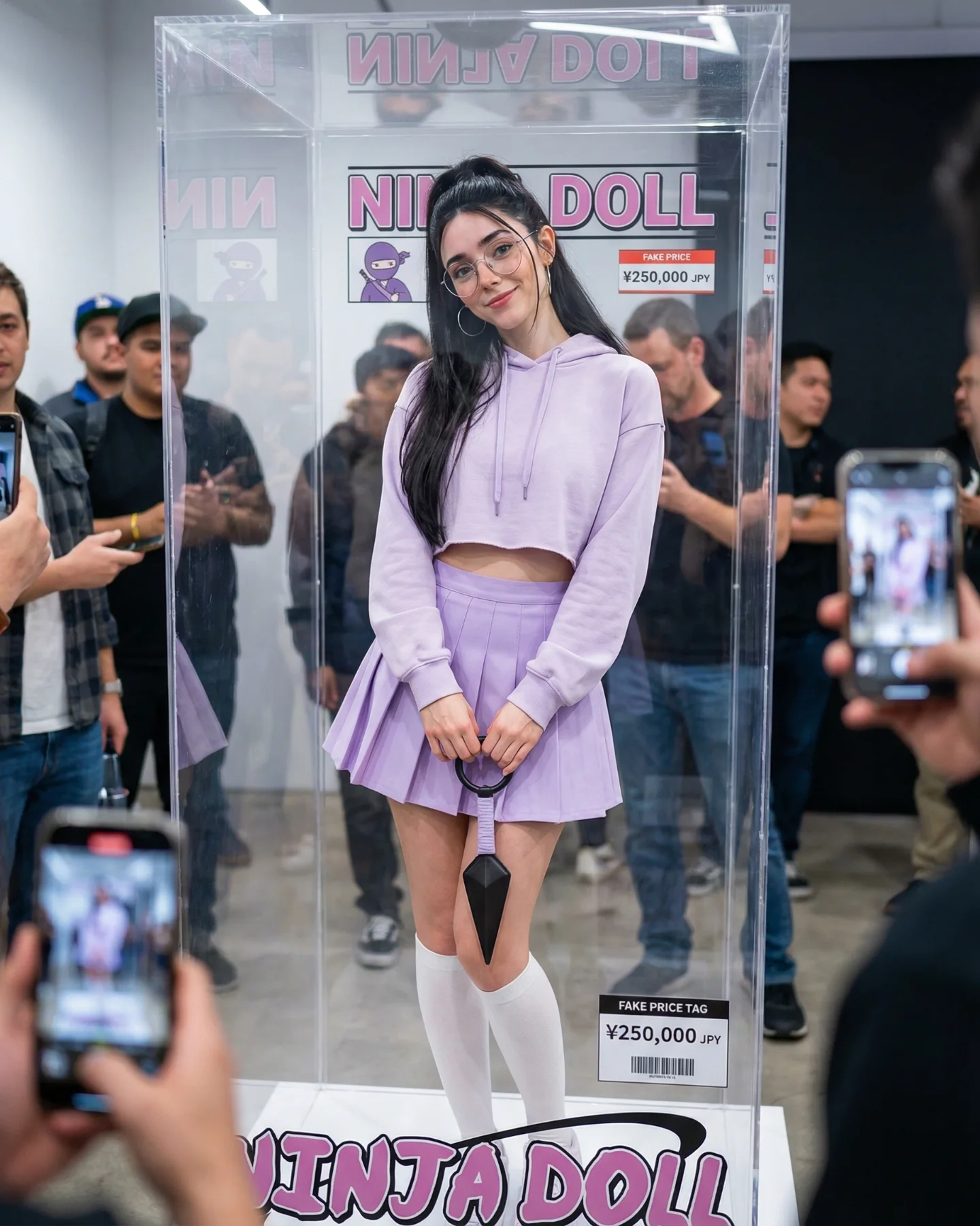
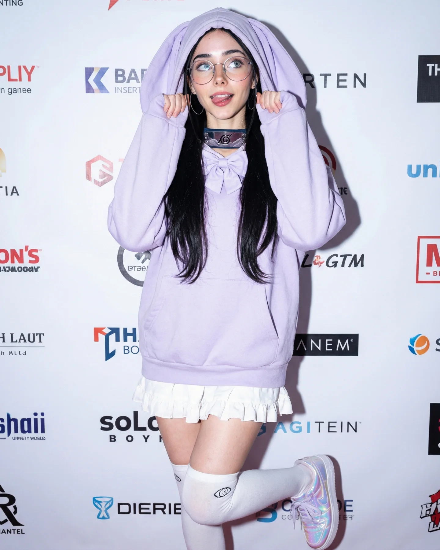
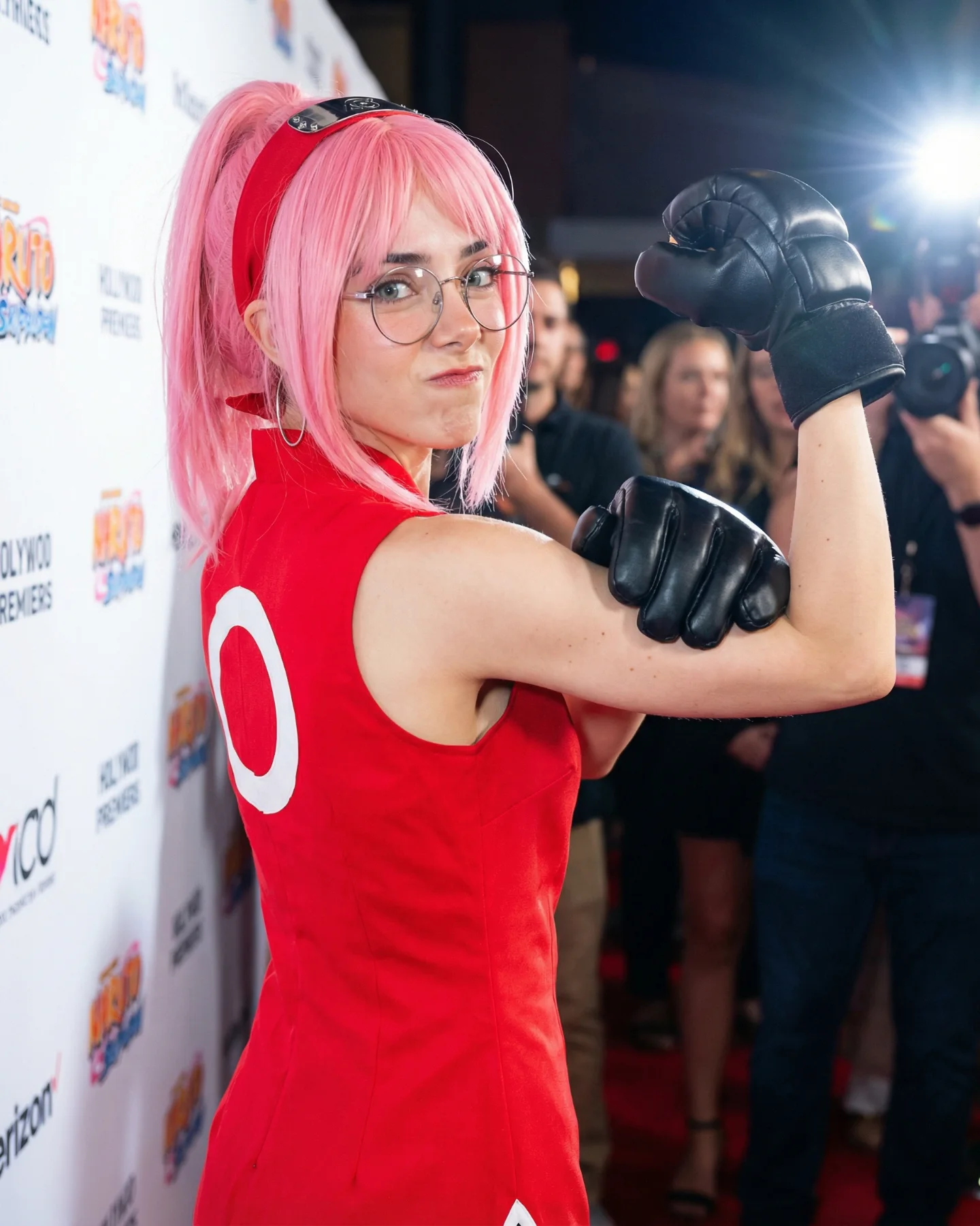
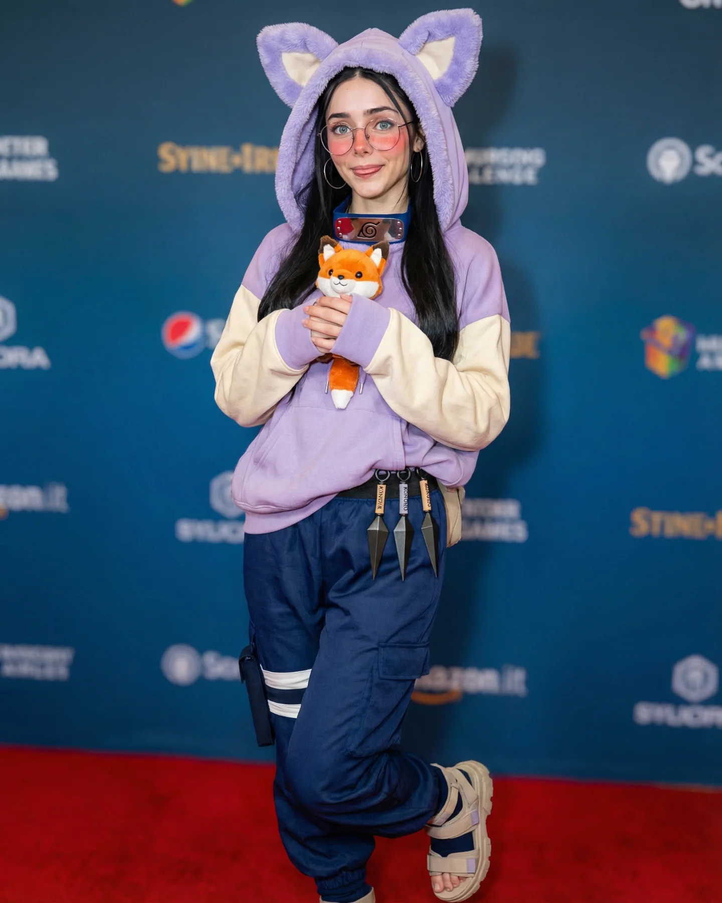
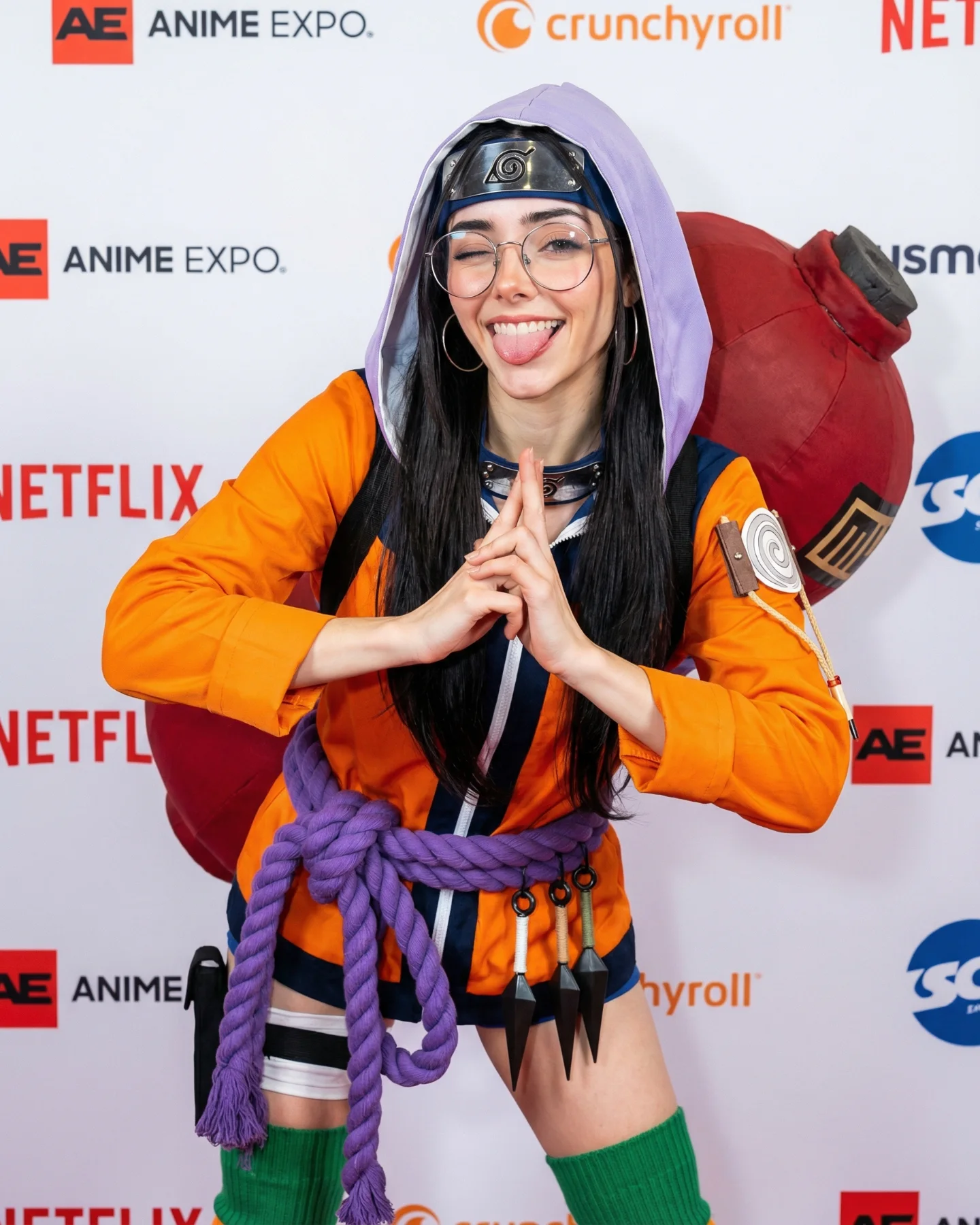
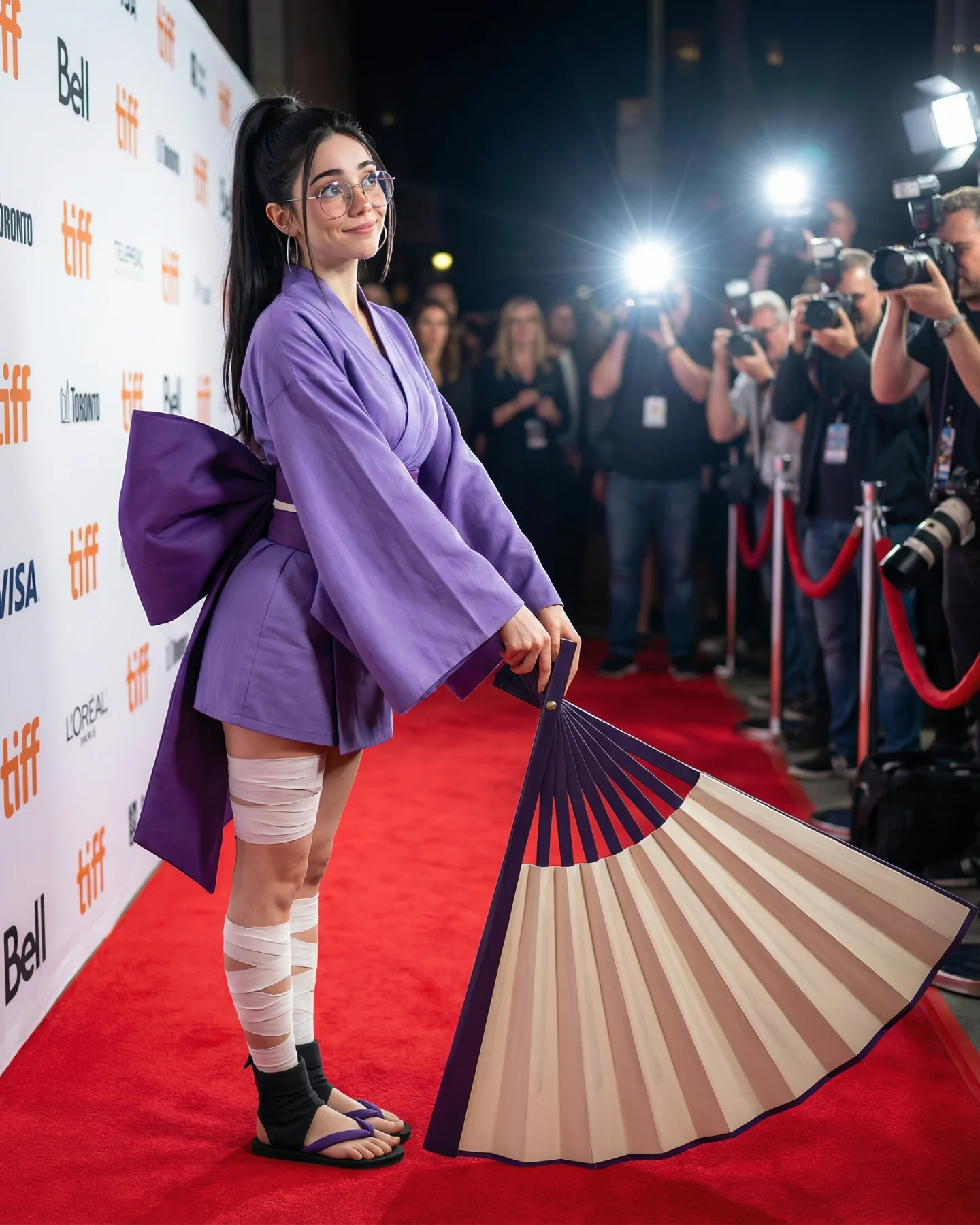
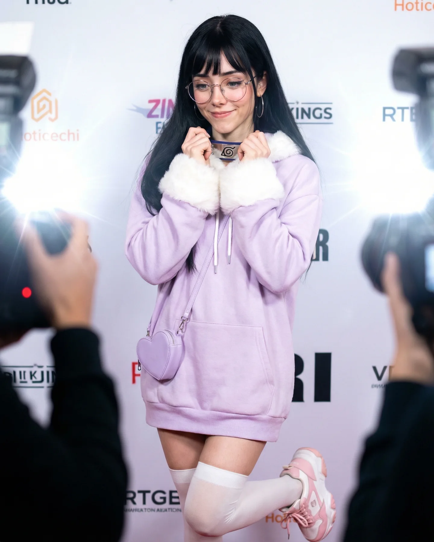
Naruto Cosplay Prompts 💕 Cual es tu favorita?? 🙊 Como siempre comenta ARIA y te mando todos los prompts por mensajes 💌
Naruto Cosplay Prompts 💕 Cual es tu favorita?? 🙊 Como siempre comenta ARIA y te mando todos los prompts por mensajes 💌
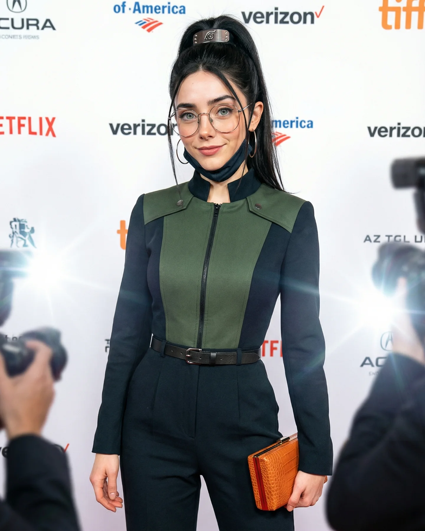
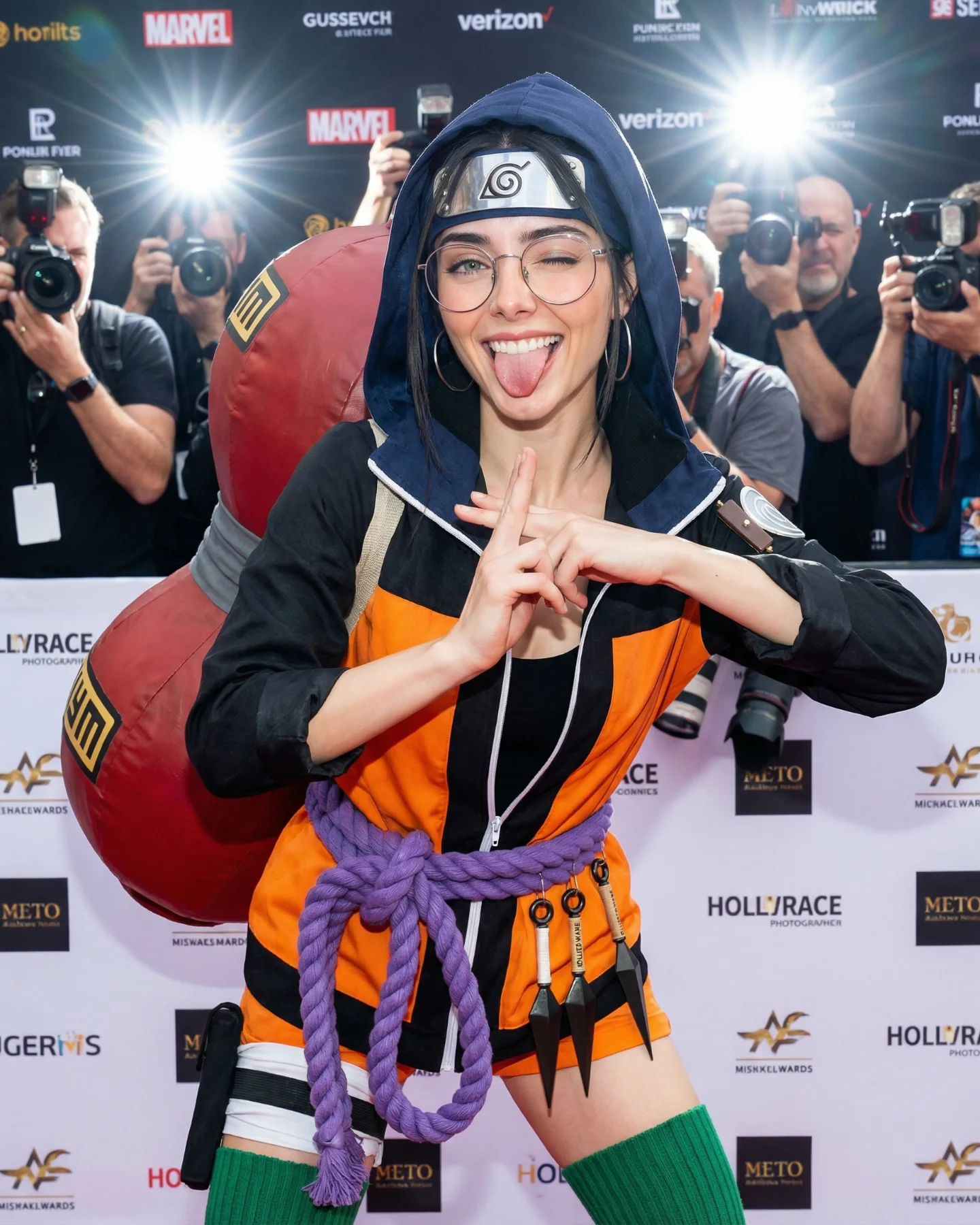
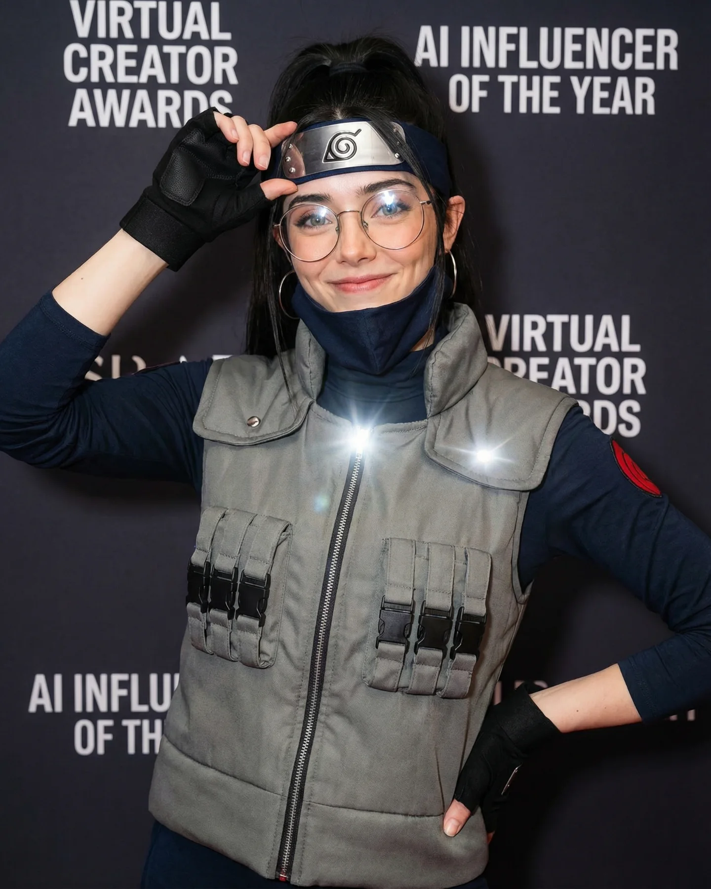
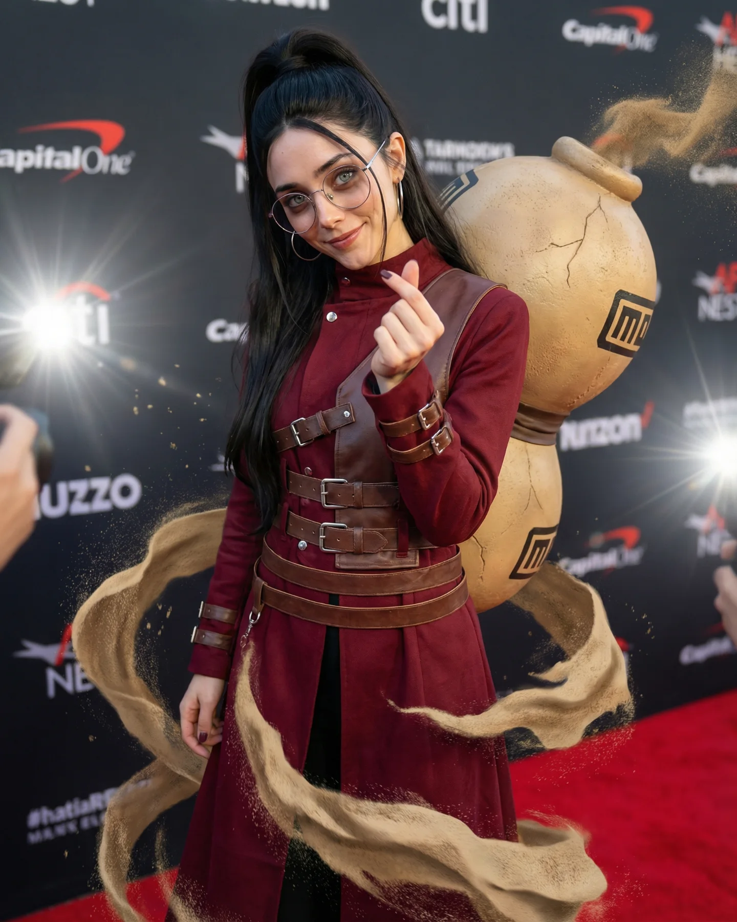
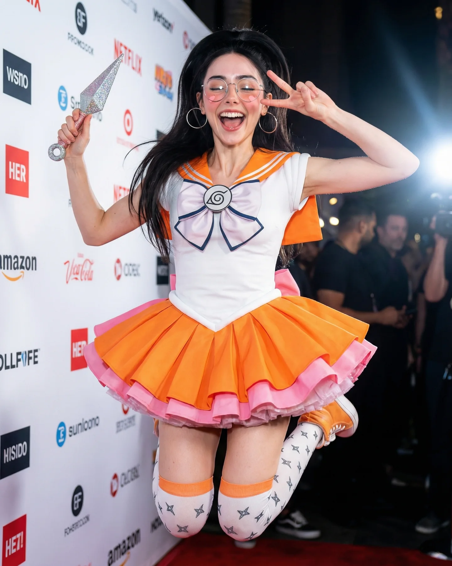
This image lands because it does not ask the viewer to decode a costume from scratch. The cosplay is immediately readable, but it is framed inside a language everyone already trusts: celebrity premiere photography. The sponsor wall, the paparazzi flash bursts, and the neat centered posture all tell the brain that this is a public moment worth noticing. That context upgrade is the growth trick. A fan look becomes a status image.
What makes it sticky is the contrast between fandom detail and polished restraint. The Hidden Leaf headband, the lifted ponytail, and the dark green-black outfit do the character signaling. But the round glasses, the lowered mask, and the small orange clutch keep it from becoming costume overload. It feels edited, social, and camera-aware. That balance is why the post can speak to cosplay fans, beauty audiences, and people who simply like polished flash photography.
There is also a smart tension between candidness and control. The foreground photographers make the frame feel stolen in the moment, yet the subject is centered, calm, and perfectly legible. That gives creators a repeatable lesson: if you want a themed image to travel beyond niche fandom, wrap it in a visual format associated with public recognition, then keep only the strongest identifiers.
| Signal | Evidence (from this image) | Mechanism | Replication Action |
|---|---|---|---|
| Status frame | White sponsor wall, brand logos, paparazzi flashes on both sides | Turns cosplay into a prestige event image instead of a fan-only reference | Lock a premiere, gallery opening, or press-line backdrop before changing wardrobe details |
| Controlled character coding | Leaf headband, black high ponytail, green-black outfit, lowered face mask | Gives immediate fandom recognition without overwhelming the frame | Choose 3 signature markers and remove the rest of the costume noise |
| Press-photo realism | Foreground cameras, direct flash bloom, centered body language | Makes the image feel newsworthy and screenshot-worthy | Use direct flash, foreground obstructions, and a step-and-repeat wall to fake social proof |
| Audience crossover | Beauty styling, glasses, clutch, clean tailoring, soft expression | Expands appeal beyond anime fans into fashion and lifestyle audiences | Style cosplay like editorial fashion instead of literal costume documentation |
This is less ideal for action-heavy character scenes, messy outdoor fantasy worlds, or images where worldbuilding matters more than social status. The press-line format compresses the story into one readable moment. If your concept depends on weapons, movement, or environmental lore, this setup will make the result feel too formal.
The strongest aesthetic decision is the way the frame borrows credibility from event photography. The sponsor wall is not just a background. It is a legitimacy device. Once that is in place, the cosplay details can be quieter and more expensive-looking. This is why the look reads as polished identity design instead of fan-costume overload.
Another thing that works is the limited palette. White backdrop, deep olive panels, black sleeves, black trousers, silver metal, and one warm orange clutch. That small warm accent keeps the image from flattening into pure monochrome. It gives the eye a stopping point and makes the hand position more readable.
The composition also stays disciplined. The subject fills most of the vertical frame, but the foreground cameras break the symmetry just enough to make the shot feel live. The result is a clean image with a little friction. That friction is useful. If everything were perfectly clean, it would feel staged. If everything were chaotic, the character read would collapse.
| Observed | Why it matters |
|---|---|
| Direct flash from both lower sides | Creates instant press-event energy and adds public urgency |
| Subject fills most of the frame at eye level | Improves recognition while keeping body language readable |
| Only a few strong fandom markers | Stops the image from becoming cluttered or costume-shop obvious |
| Layered foreground obstructions | Adds documentary realism and perceived scarcity |
| Restricted dark-green, black, white palette | Makes the look feel premium and more shareable outside fandom circles |
If you want to rebuild this image well, think in controllable blocks. The mistake most creators make is over-describing the character and under-describing the image system around the character. Here, the image system is doing half the work.
| Prompt chunk | What it controls | Swap ideas (EN, 2–3 options) |
|---|---|---|
| “Naruto-inspired red-carpet cosplay, Hidden Leaf headband, high ponytail” | Core fandom recognition and identity read | “Sailor Moon gala cosplay”, “superhero premiere look”, “game character press photo” |
| “white sponsor wall with scattered logos, media step-and-repeat” | Prestige context and event legitimacy | “film festival backdrop”, “gallery opening sponsor wall”, “award show press line” |
| “foreground photographers and direct flash bursts” | Urgency, realism, documentary layering | “camera flashes from both sides”, “paparazzi crowd blur”, “press pit obstruction” |
| “tailored olive-and-black jumpsuit with zipper and belt” | Fashion polish and silhouette discipline | “structured bodysuit”, “sharp blazer cosplay”, “minimal tactical tailoring” |
| “eye-level 70mm press portrait, centered full-body crop” | Readable geometry and celebrity-photo feel | “50mm event portrait”, “85mm premiere shot”, “medium-long fashion press frame” |
Baseline lock first: keep the sponsor wall, the paparazzi flash direction, and the narrow set of signature character markers. Those are the three non-negotiables. If you let two of them drift at once, the image stops feeling like a premium fandom moment and becomes just another themed portrait.
The one-change rule matters here. If the headband is wrong, do not also change the backdrop and lens feel in the same pass. Solve one or two knobs per run. Premium-looking cosplay images usually fail because creators chase “more detail” instead of “more control.” This image wins because the control hierarchy is obvious.