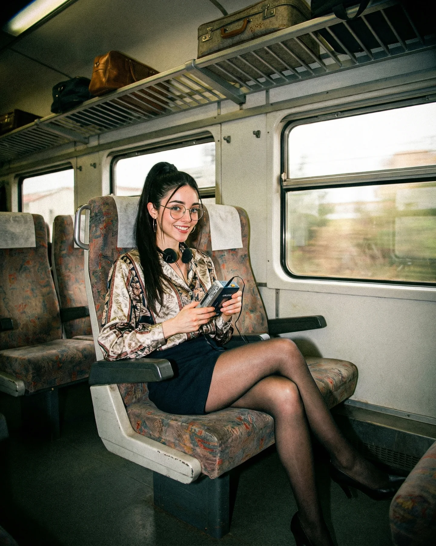
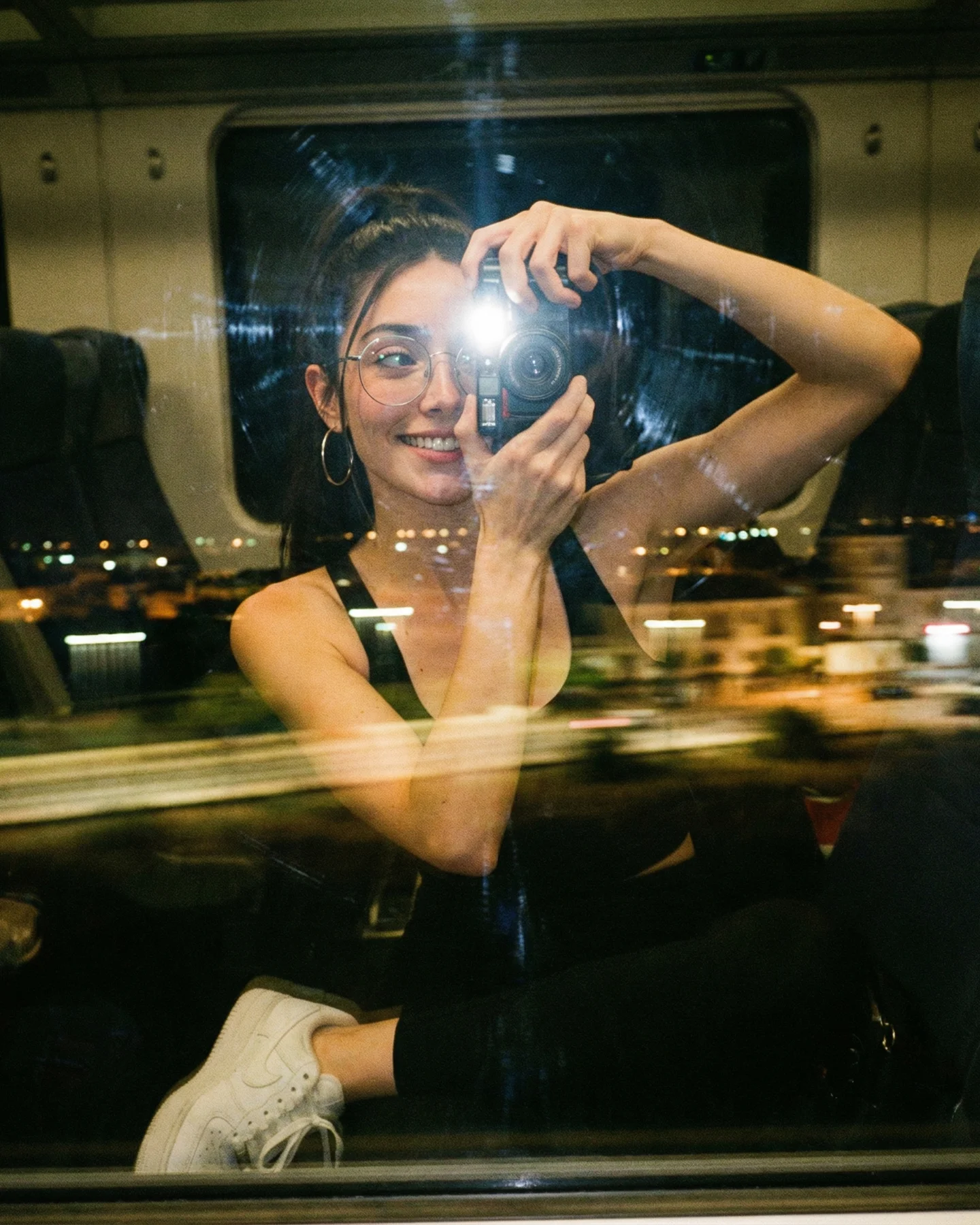
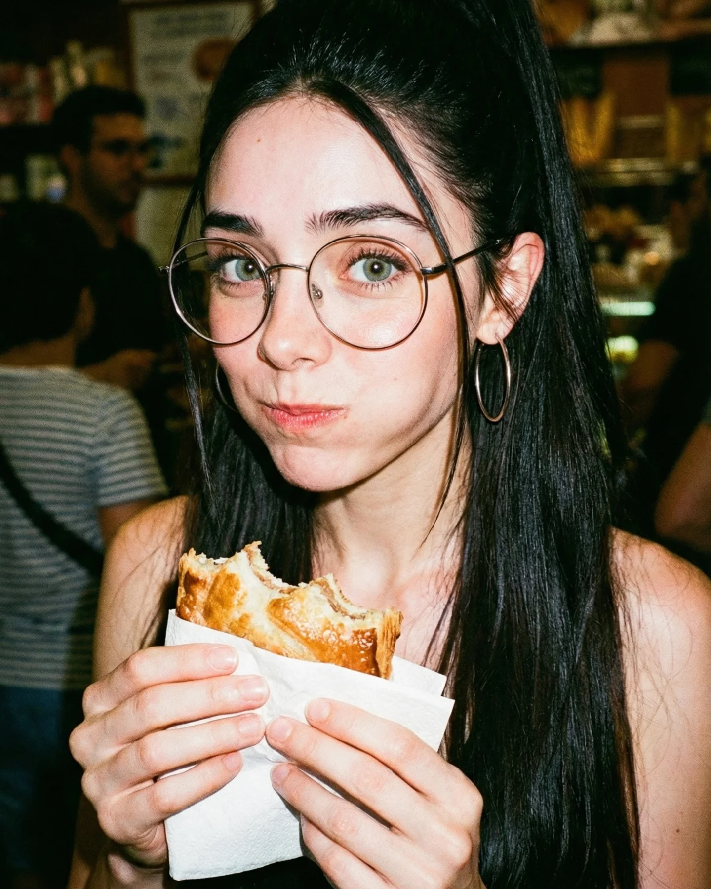
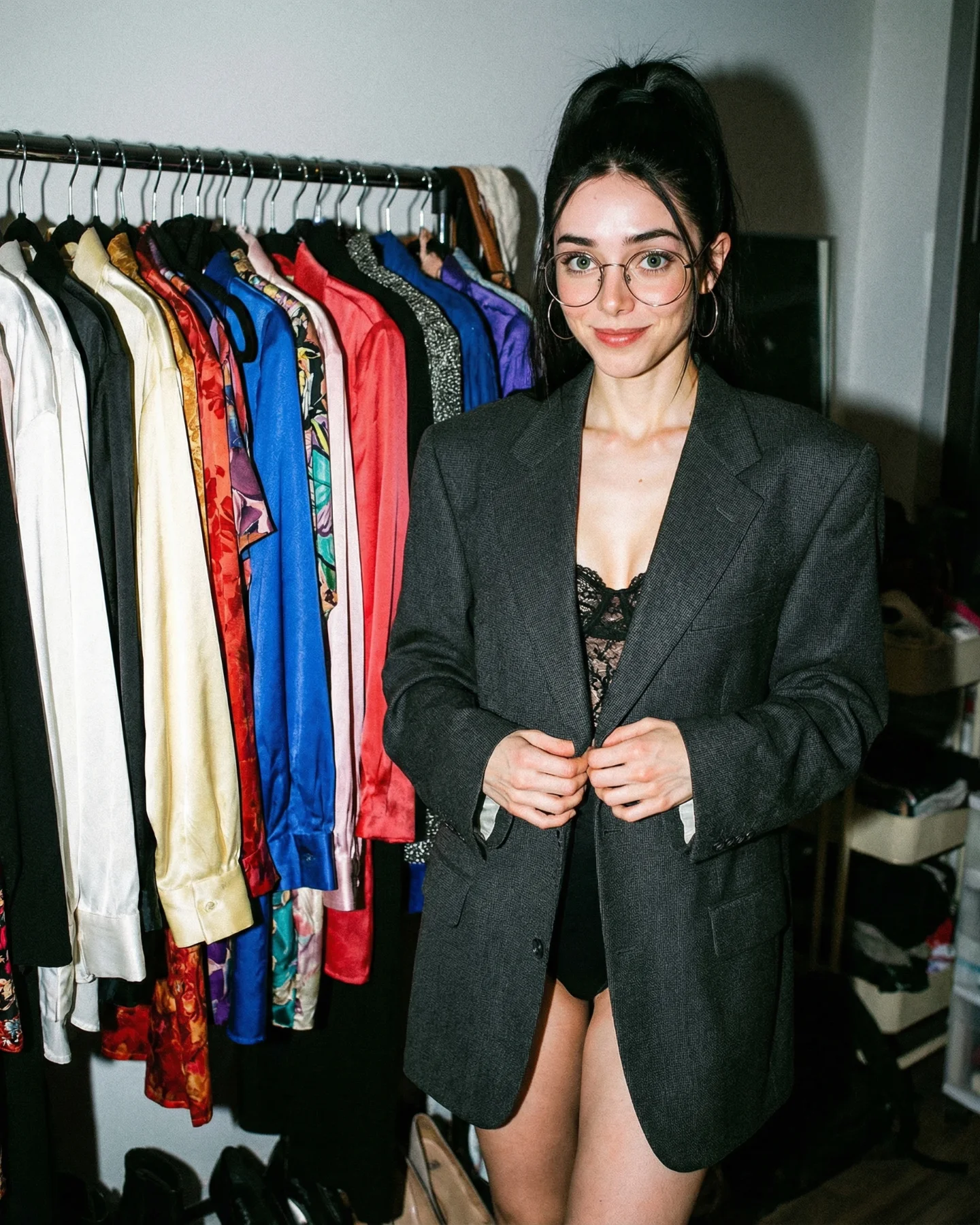
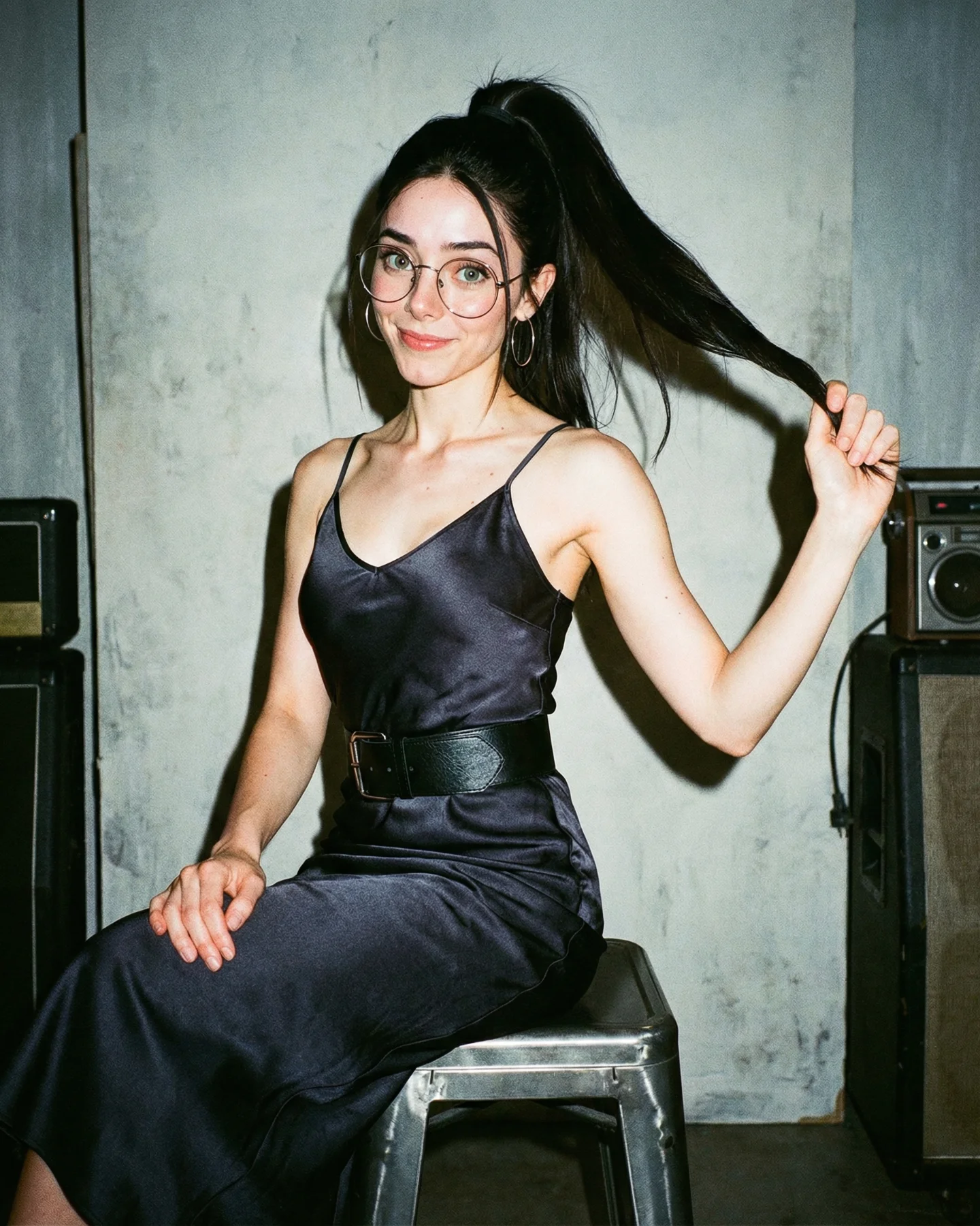
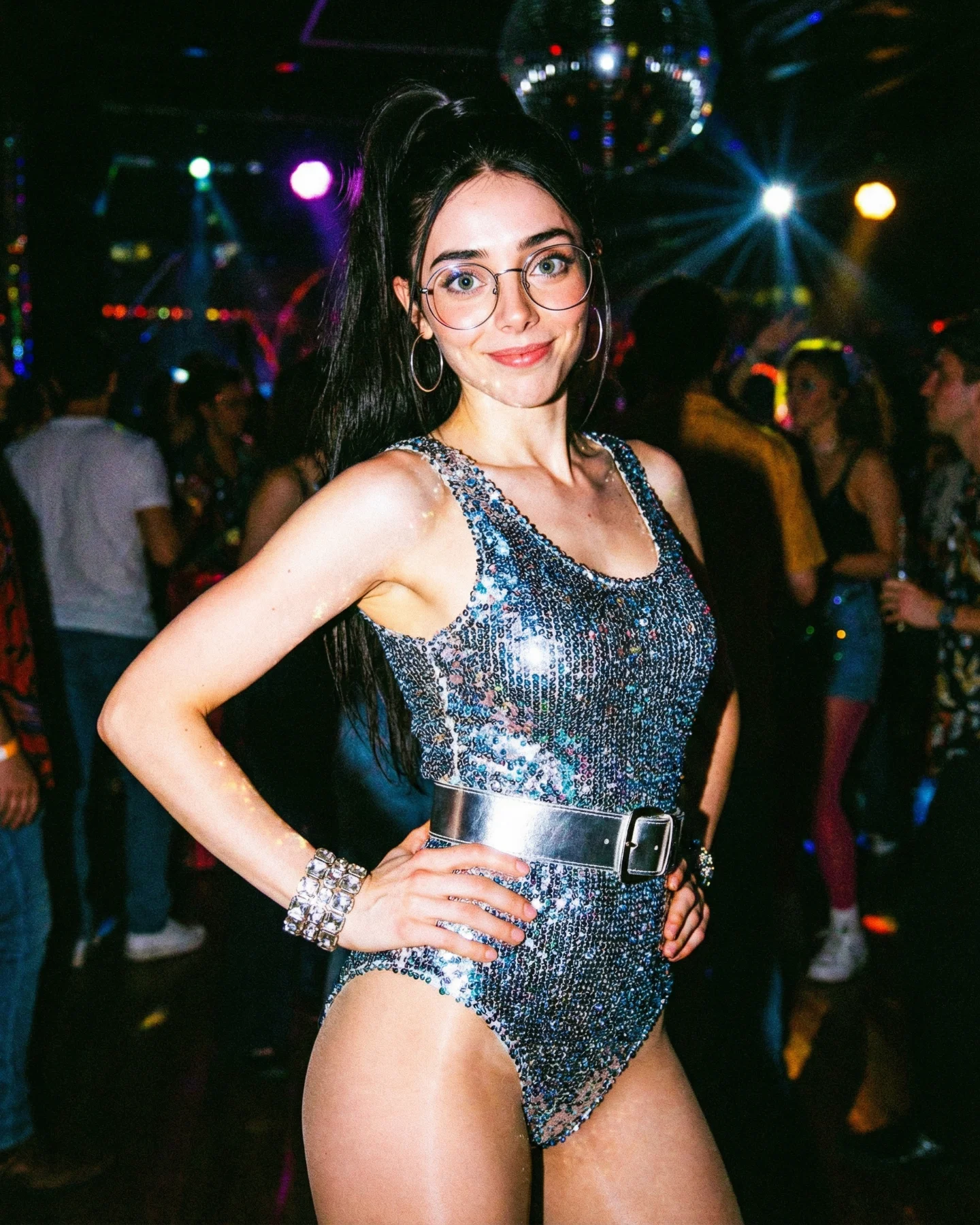
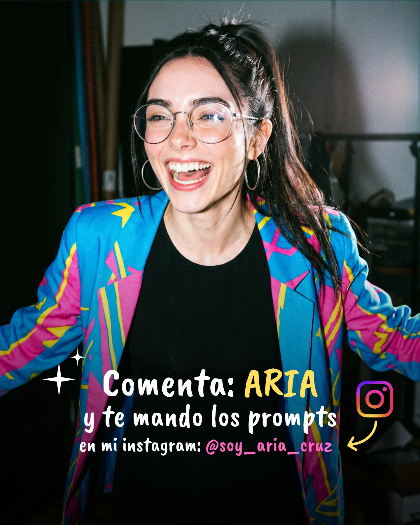
Fotografía estilo 1980s - Prompts 💕
Os dejo por aquí una colección de prompts de imágenes al estilo de los años 80 🫶🏽
La IA que usé para crear este tipo de imágenes es Nano Banana Pro 🙊
Feliz vacaciones a todos, espero que lo paséis genial con la familia y amigos 🥰
Comenta "ARIA" si quieres los prompts y te los mando por mensaje 💌
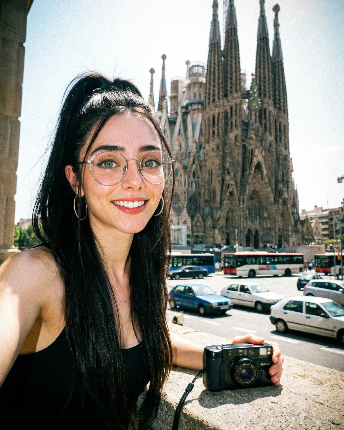
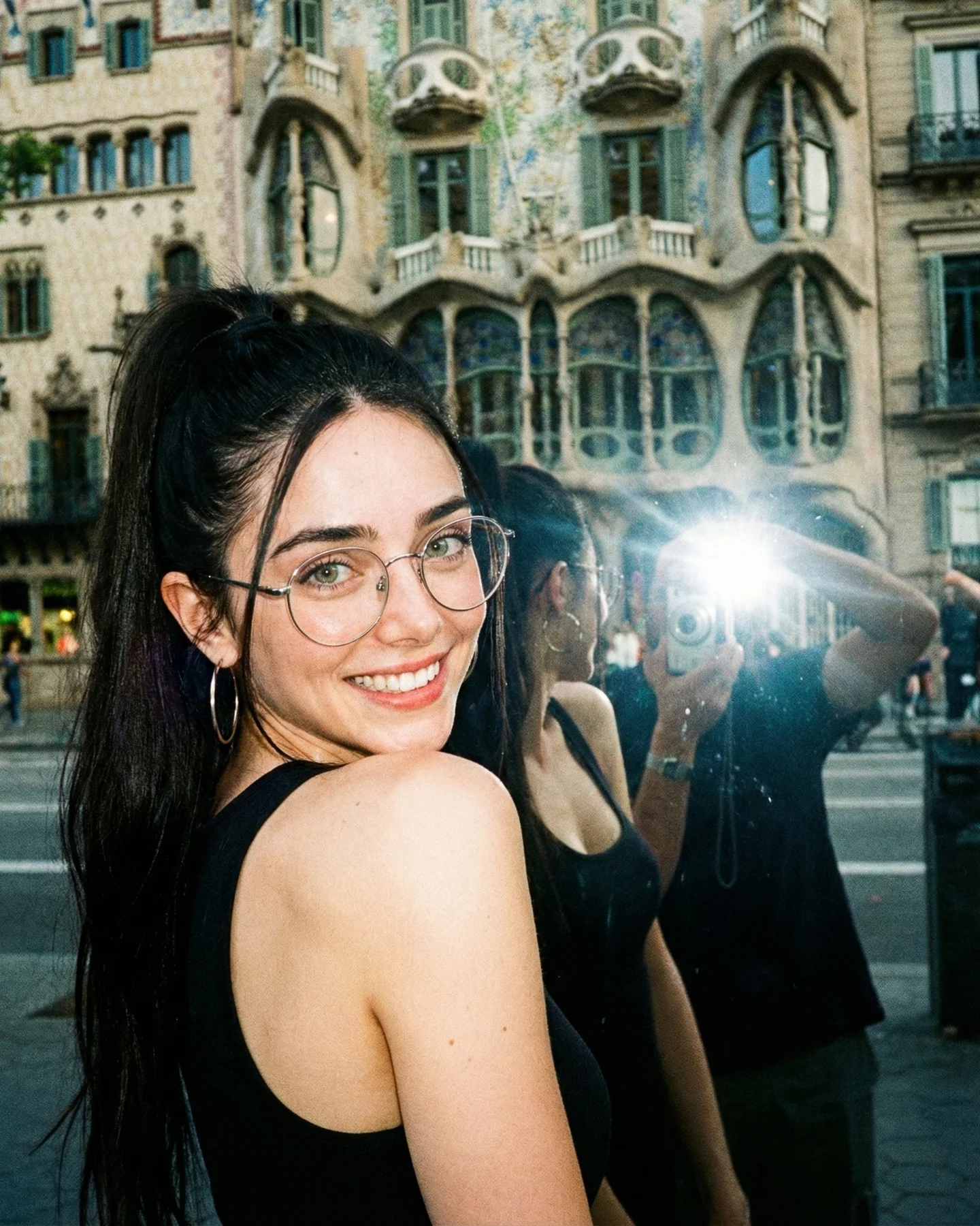
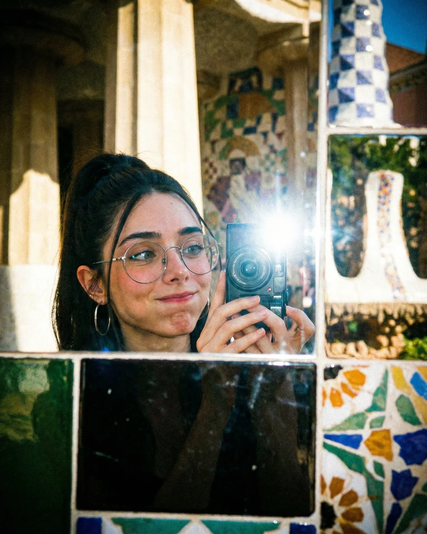
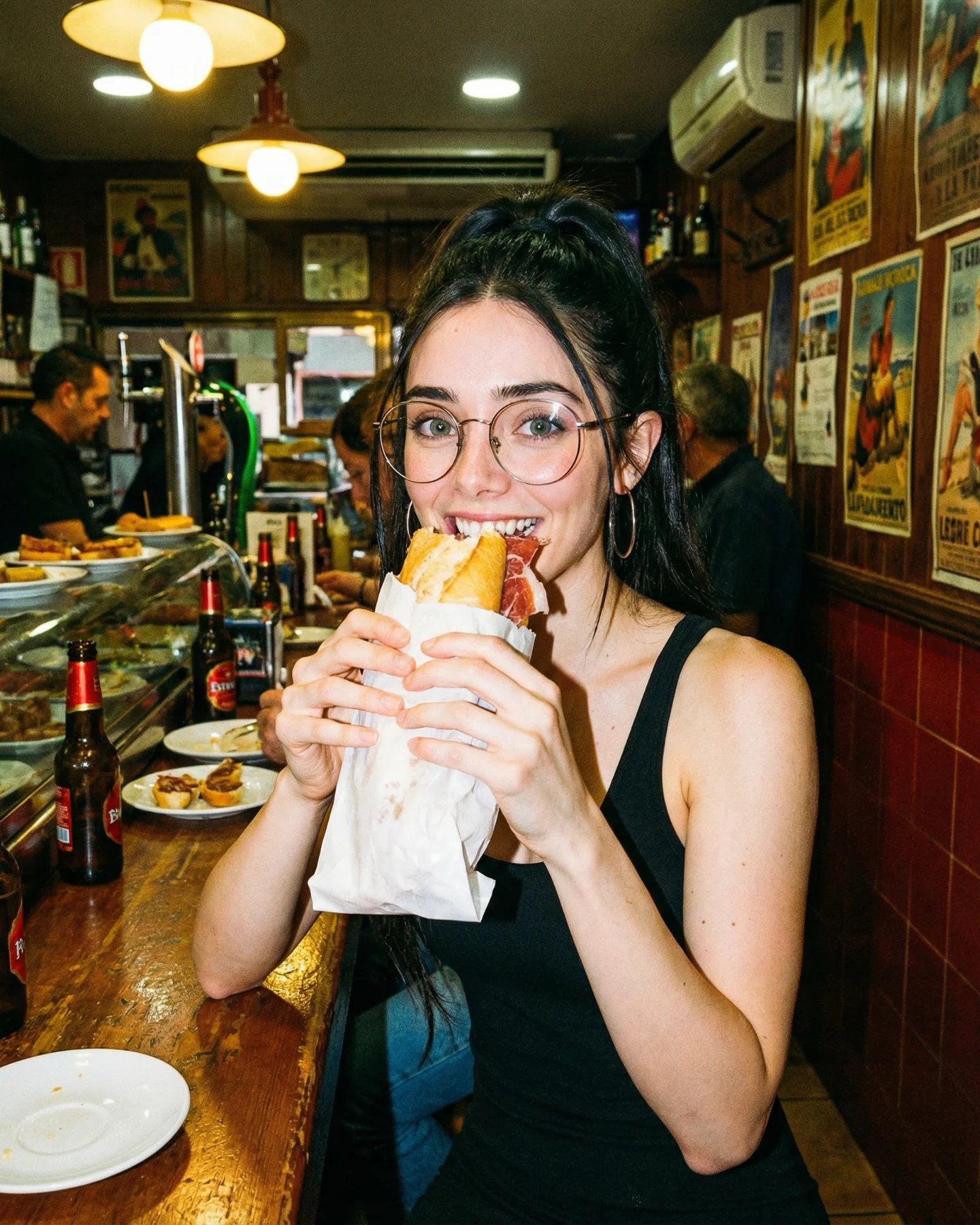
Soy_aria_cruz's 1980s Sagrada Familia Travel AI Image
A lot of retro AI imagery leans too heavily on dramatic styling. This image does something smarter: it applies the retro feeling to an everyday travel moment. The result is much more convincing. It feels like a vacation memory, not a moodboard exercise pretending to be one.
The caption frames the image as part of an 1980s-style prompt collection, and that helps explain why it works. Instead of relying only on color shifts, the image rebuilds the visual logic of an old travel photo: casual pose, bright sun, landmark in the background, small camera in hand, and just enough imperfection to suggest an analog print. That is exactly the kind of specificity creators can learn from.
Why the image likely performed well
The first reason is familiarity. Everyone understands the travel-photo pose. Landmark behind, smile in front, camera nearby. Because the structure is so recognizable, the retro treatment has a stable base to work on. Viewers do not need to decode the scene before they can enjoy it.
The second reason is the location proof. The Sagrada Familia is instantly identifiable, which gives the image a stronger memory hook. Famous landmarks work well in retro experiments because they connect personal nostalgia with collective recognition.
The third reason is the balance between polish and casualness. The image is attractive, but it still feels like a snapshot. That is the sweet spot. If it were more glamorous, it would lose the old-vacation authenticity that makes it engaging.
Signal
Evidence (from this image)
Mechanism
Replication Action
Recognizable travel grammar
Close smiling subject in front of a famous landmark with a compact camera in hand
Familiar structure makes the retro styling easy to read
Use one iconic travel-photo setup before adding decade styling cues
Landmark credibility
The Sagrada Familia anchors the scene with instant place recognition
Specific place identity increases memorability and shareability
Choose landmarks with strong silhouettes when building nostalgic travel images
Casual analog imperfection
Bright daylight, simple pose, and slight vintage softness mimic a scanned vacation print
Small imperfections make the image feel remembered instead of manufactured
Prompt mild grain and washed highlights instead of extreme retro filters
Prop-supported storytelling
The compact camera reinforces the travel-memory concept
One relevant object can carry a lot of narrative weight in a simple scene
Include a single era-appropriate travel prop near the body or in the foreground
Where this style works best
This format works especially well for retro prompt packs, travel-style collections, city postcard concepts, and creator content that wants to feel personal rather than editorial. It is also useful for building SEO pages around place-based image generation because the landmark provides clear context.
Best fit: vintage travel prompt sets. Why fit: the image is easy to understand and easy to remix across cities. What to change: swap the landmark and city traffic while preserving the snapshot pose.
Best fit: nostalgic holiday or vacation posts. Why fit: the photo feels like a personal memory. What to change: adjust wardrobe and weather to match season, but keep the casual analog energy.
Best fit: city-style series. Why fit: landmarks give each image distinct identity while the retro treatment unifies the series. What to change: hold the same framing logic and rotate only location and prop.
Best fit: AI tutorial examples. Why fit: the image makes it easy to explain how world cues, props, and camera feel create “retro” more effectively than filters alone. What to change: pair it with prompt notes on landmark readability and analog imperfections.
This style is less ideal for luxury tourism, minimalist landscape work, or fashion-first campaigns. Its strength is memory texture and personal presence. If you over-stylize it, the travel authenticity disappears.
Three transfer recipes are especially useful. Keep the close left-side portrait, the famous landmark in the background, and the small travel prop in the hand or foreground. Change the city. A Rome version can swap in the Colosseum and warmer stone tones. A Paris version can replace the cathedral with the Eiffel Tower and add cooler morning light. A Tokyo version can keep the casual pose while switching the landmark to a neon district or temple gate and adjusting the traffic cues. Slot template: {casual traveler portrait} with {small travel prop} in front of {recognizable landmark} under {bright analog-style daylight}.
The aesthetic lessons worth borrowing
The strongest decision here is using the landmark as a real background element, not a backdrop graphic. The city feels lived in because there is traffic, distance, and scale. That helps the image feel like a real trip instead of a composite.
Another smart move is the simple black top. It does not compete with the architecture or the camera prop. That restraint is important in travel imagery, where too much wardrobe styling can make the place feel secondary.
The analog feeling is also handled with discipline. The image suggests older photography through color and softness, but it does not bury the subject under fake scratches or heavy fades. That moderation is why it still feels usable and contemporary.
Observed
Why it matters
How to recreate it
Foreground portrait with landmark clearly visible
Balances human presence with travel context
Keep the person near one side and allow the landmark to breathe behind them
Compact camera on the ledge
Supports the memory-taking narrative without clutter
Use one era-appropriate object to reinforce the travel story
Bright midday sun with light grain
Feels like an authentic old vacation print
Use clean daylight and subtle analog softness instead of heavy dramatic grading
Street traffic below the landmark
Adds realism and urban energy
Include believable city movement to avoid a postcard-static scene
Simple casual wardrobe
Keeps the focus on expression and place
Choose understated clothing when the environment is the hero
Prompt technique breakdown
To reproduce this style reliably, separate the prompt into travel pose, landmark identity, prop cue, daylight character, and analog finish. Most retro travel images fail because they over-describe “vintage” and under-describe how actual tourist photos are composed.
Prompt chunk
What it controls
Swap ideas (EN, 2-3 options)
Travel pose block
Sets the image as a personal memory rather than a formal portrait
arm-length smile, leaning on railing, shoulder-turn snapshot
buses and cars, scooters and pedestrians, tram lines
A practical remix sequence
Baseline lock first: keep the close casual portrait, keep the recognizable landmark, and keep the bright daylight snapshot feel. Those three choices create most of the image's value. After that, change only one or two controls per run.
Run 1: solve subject placement, landmark clarity, and the compact-camera prop until the travel memory reads immediately.
Run 2: refine daylight balance, skin tone, and subtle analog texture without changing the overall composition.
Run 3: test one city swap while preserving the same framing logic and retro-snapshot treatment.
Run 4: build a retro-travel series by keeping the pose and prop consistent while rotating only landmark and traffic cues.
The larger lesson is that convincing nostalgia often comes from ordinary structure, not exaggerated styling. This image gets that exactly right. It behaves like a real memory first, and a retro aesthetic second.