How soy_aria_cruz Made This Gladiator Lion Colosseum AI and How to Recreate It
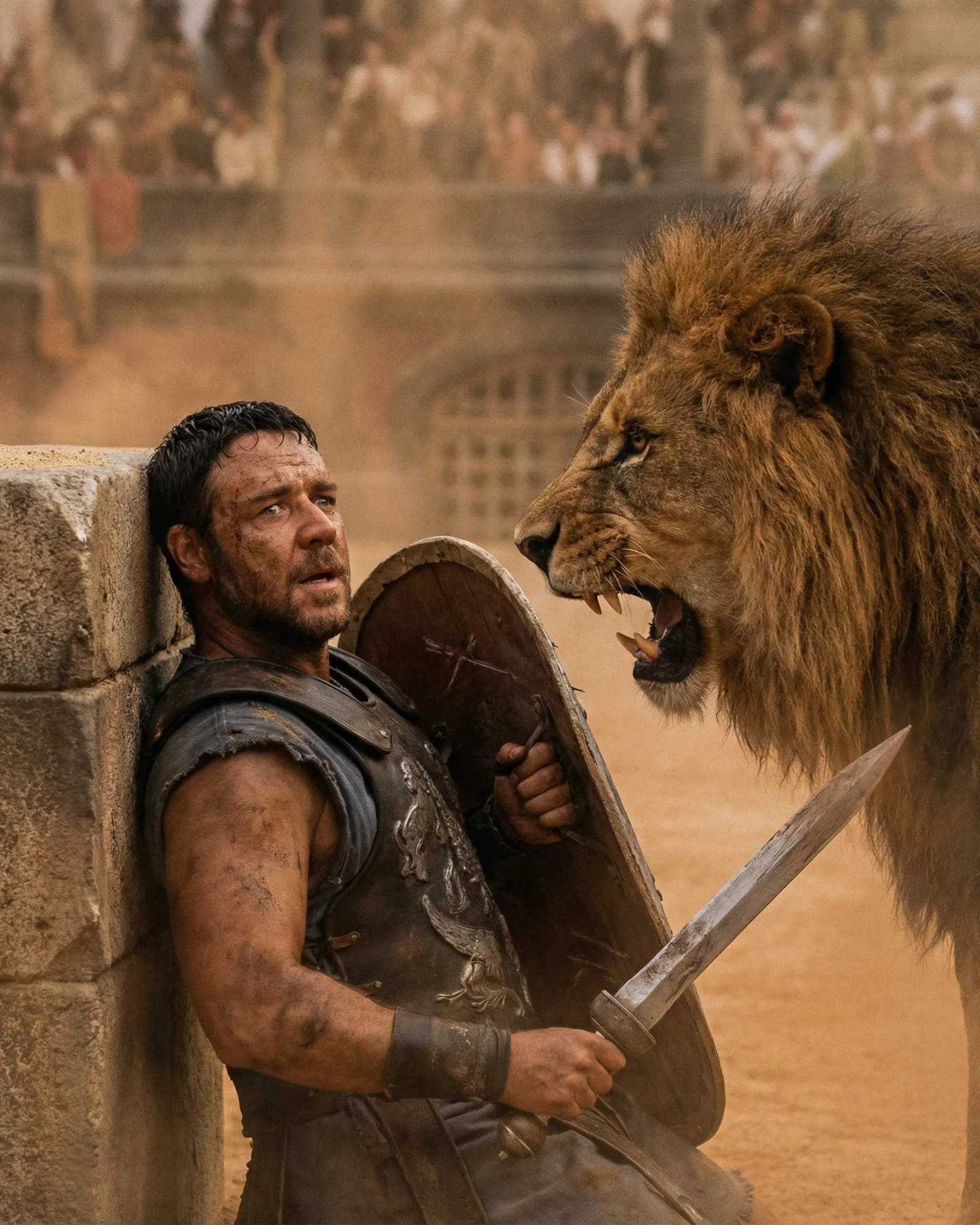
The frame is effective because it does not show a whole battle. It shows one cornered body, one shield, one sword, and one lion already too close. That reduction is what gives the image force. A wide arena shot would describe the setting. This tighter confrontation makes the viewer feel the stakes in the body first.
The wall behind the gladiator is a crucial storytelling element. It removes escape. The viewer understands instantly that there is no tactical reset, no distance to recover, and no room to reposition. The lion therefore becomes more than a creature in the same scene. It becomes a deadline. That is why the image feels urgent even without visible motion blur or big action effects.
The dusty daylight helps too. Everything is sandy, hot, and abrasive. The light does not beautify the scene; it exposes it. That harshness supports the emotional reading. This is not heroic triumph yet. It is raw survival under public spectacle, which is exactly the kind of tension Gladiator imagery depends on.
Why the image has strong visual tension
| Signal |
Evidence (from this image) |
Mechanism |
Replication Action |
| Forced proximity |
The lion's face is already inside the gladiator's defensive space |
Eliminates psychological distance and creates immediate danger |
Stage predator and human close enough that the frame feels nearly too tight |
| No escape geometry |
The fighter is pinned against a stone wall at the left edge |
Makes the confrontation feel final instead of tactical |
Use architecture to block retreat and simplify the survival read |
| Iconic weapon language |
Shield held to the torso, sword angled forward, Roman armor visible |
Delivers gladiator identity without needing extra exposition |
Keep one defensive prop and one offensive prop visible at the same time |
| Dust-heavy daylight |
Sandy air, warm tones, blurred crowd in the heat haze |
Adds realism, historical grit, and public-event scale |
Use dust and harsh sunlight to make the environment feel physically punishing |
Best-fit use cases and transfer ideas
- Epic-movie action homage: Best when the scene depends on survival pressure rather than flashy choreography. Keep the conflict extremely readable.
- Single-frame danger beats: Useful when one image needs to stand in for an entire action sequence. Use one decisive threat instead of many smaller ones.
- Historical combat aesthetics: Strong for sword-and-sandals, arena, or ancient-war content where texture and physical risk matter more than fantasy spectacle.
- AI alt-movie storytelling: Good for sequence posts that imply a whole film through one iconic confrontation.
This structure is less ideal for dialogue scenes, romance, or ensemble action. The power here comes from simplicity. One man, one beast, one corner, one choice. If you add too many elements, the frame loses its brutal clarity.
Three transfer recipes
- Keep: cornered human + dominant threat + blocked escape route. Change: period, creature type, weapon set. Slot template: “{fighter} trapped against {environment barrier} while {threat} closes in”.
- Keep: tight confrontation framing + dust or weather texture + implied crowd. Change: genre and costume language. Slot template: “{survival beat} inside {public arena or battlefield} under {hostile atmosphere}”.
- Keep: one defensive prop and one offensive prop visible. Change: emotional tone, hero archetype, location scale. Slot template: “{desperate defender} facing {overwhelming force} in {epic setting}”.
The aesthetic structure doing the heavy lifting
The image is organized around containment and intrusion. The wall contains the man. The lion intrudes into that contained space. That is the whole drama in compositional terms. Every other detail, from the shield circle to the sword diagonal, exists to support that conflict between defense and breach.
The second major strength is texture hierarchy. Metal armor, dusty skin, coarse lion mane, sandy air, rough stone. All of these materials belong to the same hot, abrasive world. Because the surfaces agree with each other, the frame feels physically believable. That is essential in historical action imagery. If the surfaces do not feel lived in, the danger does not feel real.
The blurred crowd in the back is another smart choice. It tells you this confrontation is public, not private. The fighter is not only trying to survive; he is surviving under spectacle. That is central to the Gladiator mood. Public brutality is part of the genre's emotional logic.
| Observed |
Why it matters |
| Lion head dominating the right half of the frame |
Creates immediate danger and makes the threat feel physically present |
| Gladiator compressed into the left side against stone |
Signals entrapment and removes visual escape routes |
| Shield tight to the torso and sword angled out |
Show defensive and offensive intent simultaneously |
| Dust haze and warm arena daylight |
Build the historical environment through atmosphere, not exposition |
| Blurred spectators in the background |
Remind the viewer that this is survival under public spectacle |
Prompt technique breakdown
To rebuild this image effectively, start with the threat geometry. If the spacing between man and lion is wrong, nothing else will save the frame.
| Prompt chunk |
What it controls |
Swap ideas (EN, 2–3 options) |
| “gladiator cornered against a stone wall while a male lion roars inches away” |
Core confrontation and survival pressure |
“warrior trapped by predator”, “fighter backed into arena wall”, “close-range beast confrontation” |
| “battle-worn Roman armor, shield at chest, short sword in hand” |
Historical combat identity and readable defense state |
“scarred arena armor”, “dusty legionary gear”, “sword-and-shield survival posture” |
| “sandy colosseum with dust haze and blurred crowd” |
Scale, historical place, and public spectacle |
“ancient arena stands”, “sunlit amphitheater crowd”, “dusty gladiator pit” |
| “harsh warm daylight filtered through dust” |
Environmental hostility and textural realism |
“sun-baked arena light”, “hot bronze daylight”, “deserted sandy glare” |
| “tight action frame with lion on right and trapped fighter on left” |
Mobile readability and visual pressure |
“compressed confrontation crop”, “close survival framing”, “predator-versus-human close-up action still” |
How I would iterate this image
Baseline lock first: the left-wall trap, the lion's proximity, and the arena dust atmosphere. Those are the three pillars. Once they are stable, then refine armor wear, crowd visibility, and exact weapon placement.
- Run 1: establish the tight predator-versus-gladiator spacing and the stone wall on the left.
- Run 2: lock the Roman armor, shield posture, and sword angle so the fighter reads instantly.
- Run 3: add arena atmosphere with dust, blurred stands, and sun-baked color tone.
- Run 4: refine lion fur realism, facial tension, armor scratches, and sweat detail.
Use the one-change rule. If the threat feels weak, fix the lion distance before touching the crowd. If the lion works but the scene feels generic, reinforce the wall and colosseum context before changing lighting. The frame wins through brutal simplicity. Protect that simplicity.