Robot Prompts 🤖 Ayer os subí un reel de una imagen animada desde todos los ángulos con Kling 2.5 🎬 Y hoy os quiero compartir todos los prompts que usé para que tú también puedas probarlo 🙊 Como siempre comenta "ARIA" y te los mando sin falta 💕
Robot Prompts 🤖 Ayer os subí un reel de una imagen animada desde todos los ángulos con Kling 2.5 🎬 Y hoy os quiero compartir todos los prompts que usé para que tú también puedas probarlo 🙊 Como siempre comenta "ARIA" y te los mando sin falta 💕
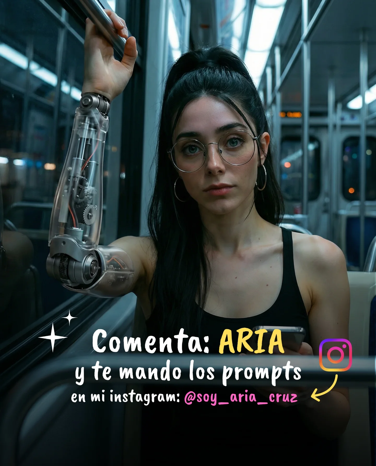
The image is smart because it does not stage the robot arm in a laboratory or a glossy future city. It places the upgrade in one of the most ordinary spaces possible: public transit. That decision changes the story immediately. The robotic arm stops feeling like concept art and starts feeling like everyday identity content. For audience retention, that is powerful. People engage longer when the impossible is embedded inside a familiar routine.
The text overlay matters too. Normally overlays can cheapen an image, but here it reinforces platform fit. The post is not pretending to be a film still. It openly behaves like an Instagram creator asset, with a clear CTA and recognizable visual language. That combination of good art direction plus native platform packaging is a big part of why creator posts outperform “beautiful but contextless” AI images.
| Signal | Evidence (from this image) | Mechanism | Replication Action |
|---|---|---|---|
| Everyday setting | The subject is standing inside a normal subway carriage | Ordinary context makes the robot arm feel more believable and more shareable | Place the impossible element inside a routine environment rather than a fantasy backdrop |
| Clear identity hook | Transparent arm, glasses, black tank top, direct gaze | The viewer remembers the character, not just the effect | Keep styling simple and repeatable so the body modification becomes the hero |
| Platform-native packaging | Spanish CTA text, icon, arrow, creator handle | The image reads as a creator post, not detached digital art | Add overlays only when they strengthen social context and message clarity |
This kind of image is ideal for creators teaching prompts, AI animation workflows, cyber-fashion ideas, or character-building content. It also transfers well to reels covers and carousel slides because the composition leaves enough room for text without burying the subject. If you want to adapt it, keep the “ordinary environment plus extraordinary body detail” rule intact. That is the real engine of the concept.
It is less effective for luxury beauty content, where overlays and transit lighting may reduce polish, and less suitable for hard cinematic worldbuilding, where the subway would need a larger narrative system around it. Here, the strength is compression. One image contains a character, a future hint, a social CTA, and a teachable prompt angle.
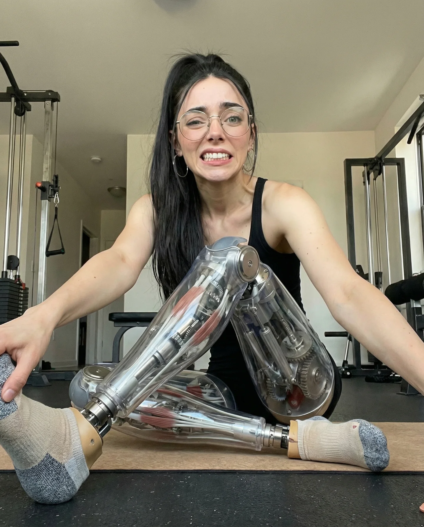
The palette stays restrained: black clothing, silver metal, blue-gray subway tones, and pale skin. That restraint gives the transparent arm room to sparkle without turning the image noisy. The camera stays close enough for intimacy but not so close that the subway disappears. Most importantly, the subject expression is calm. If she looked shocked or aggressive, the post would slide toward movie-poster territory. The neutral gaze keeps it inside creator culture.
| Prompt chunk | What it controls | Swap ideas (EN, 2-3 options) |
|---|---|---|
| transparent cyborg arm with visible mechanics | Main futuristic hook and tactile detail | robotic hand only; full bionic forearm; translucent shoulder prosthetic |
| subway carriage with cool fluorescent light | Believability and urban tone | bus interior; airport train; night tram |
| direct gaze with minimal styling | Character identity and repeatability | soft smile; tired commute expression; confident editorial stare |
| Instagram CTA overlay in Spanish | Platform fit and conversion behavior | prompt giveaway CTA; reel teaser line; comment-to-DM offer |
Lock three things first: the subway environment, the transparent arm engineering, and the lower-third composition space for the text overlay. After that, change only one variable per pass. First pass should fix arm anatomy and hand-to-pole contact. Second pass should tune the fluorescent light reflections on glass and metal. Third pass should balance text size so it reads on mobile without covering the torso. Fourth pass can adjust tone, moving from casual creator post to a slightly more editorial cyber-fashion look just by changing expression and typography style.