
Arte Moderno 🎭🎨 Comenta "ARIA" y te paso todos los prompts 💌
Arte Moderno 🎭🎨 Comenta "ARIA" y te paso todos los prompts 💌
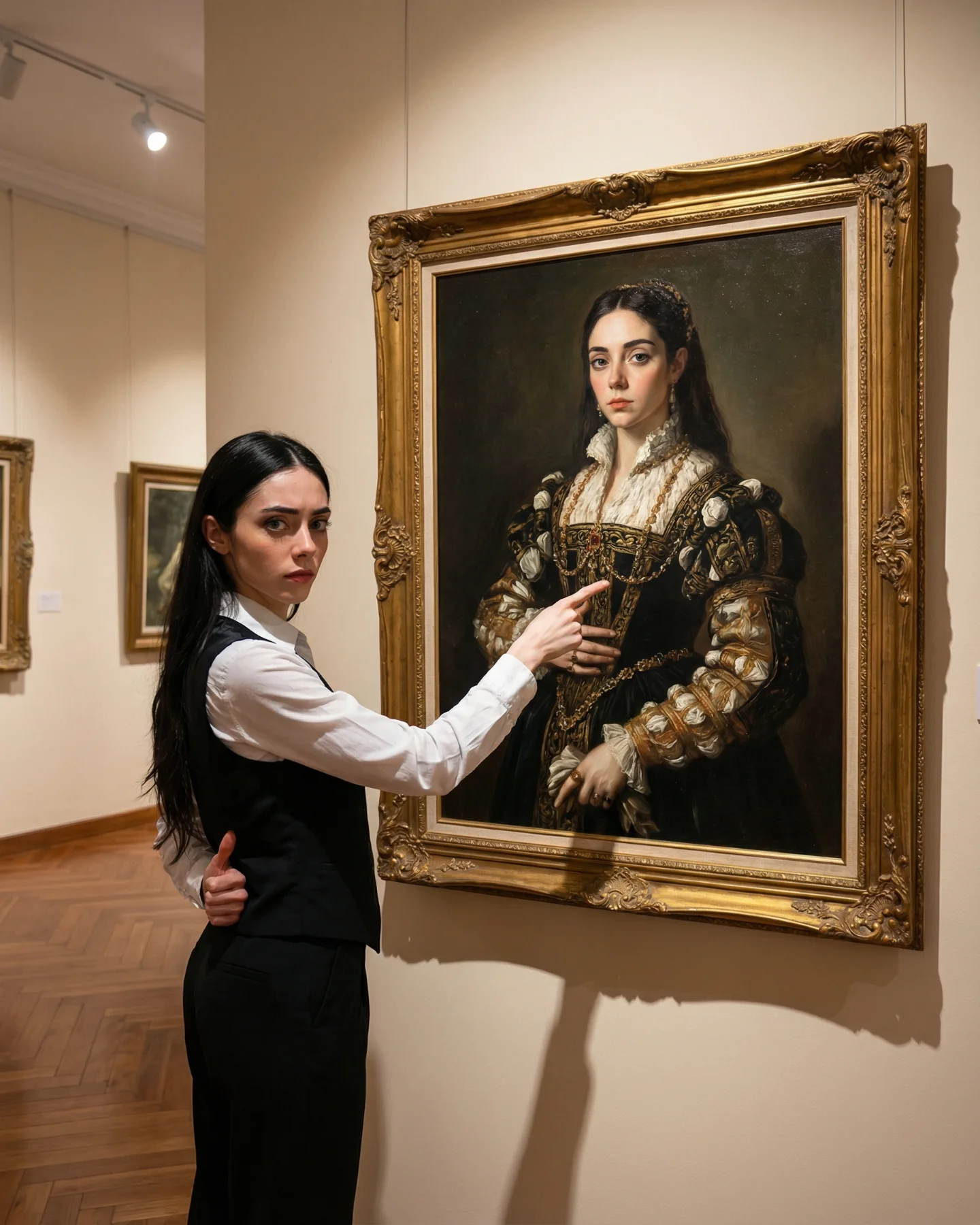
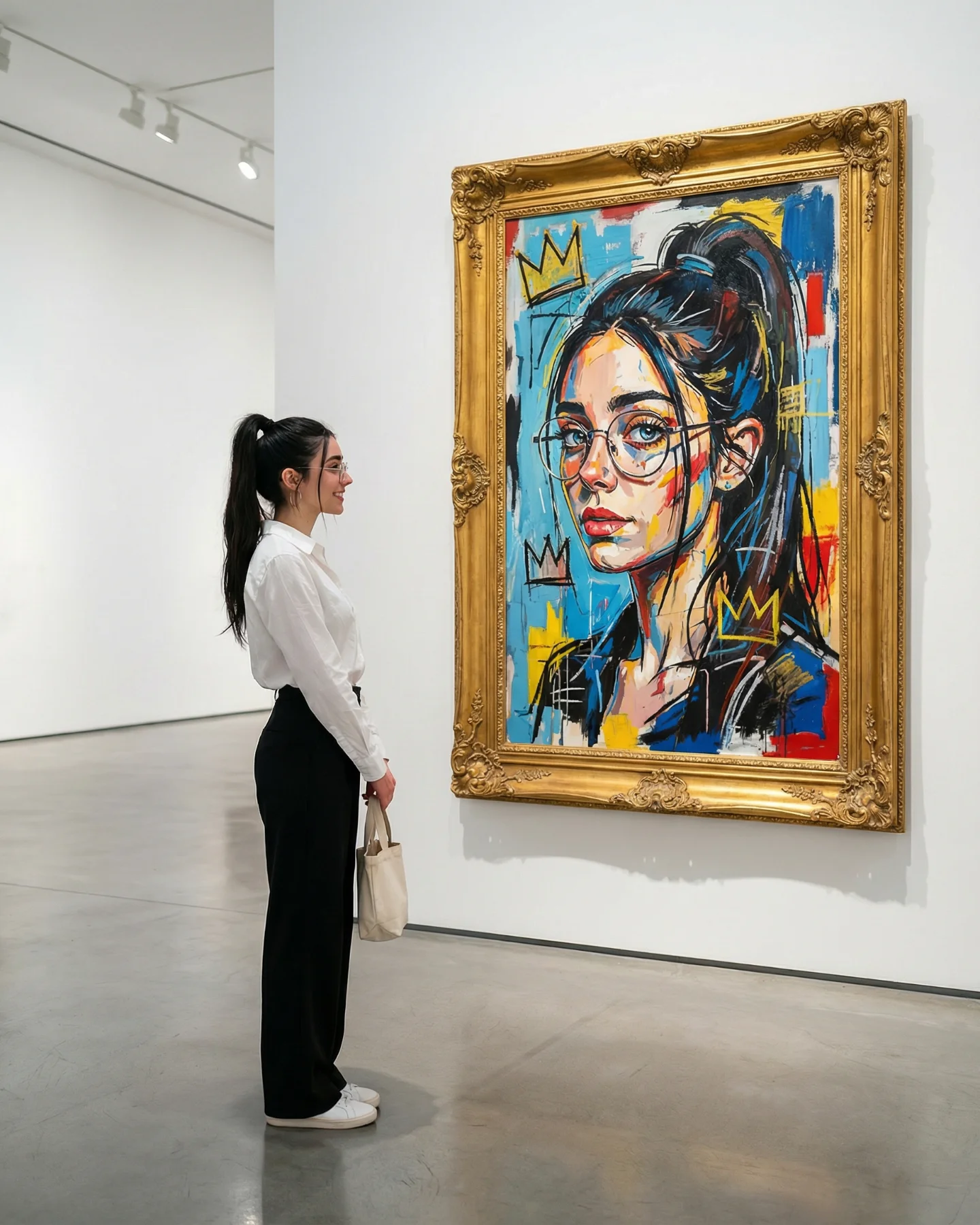
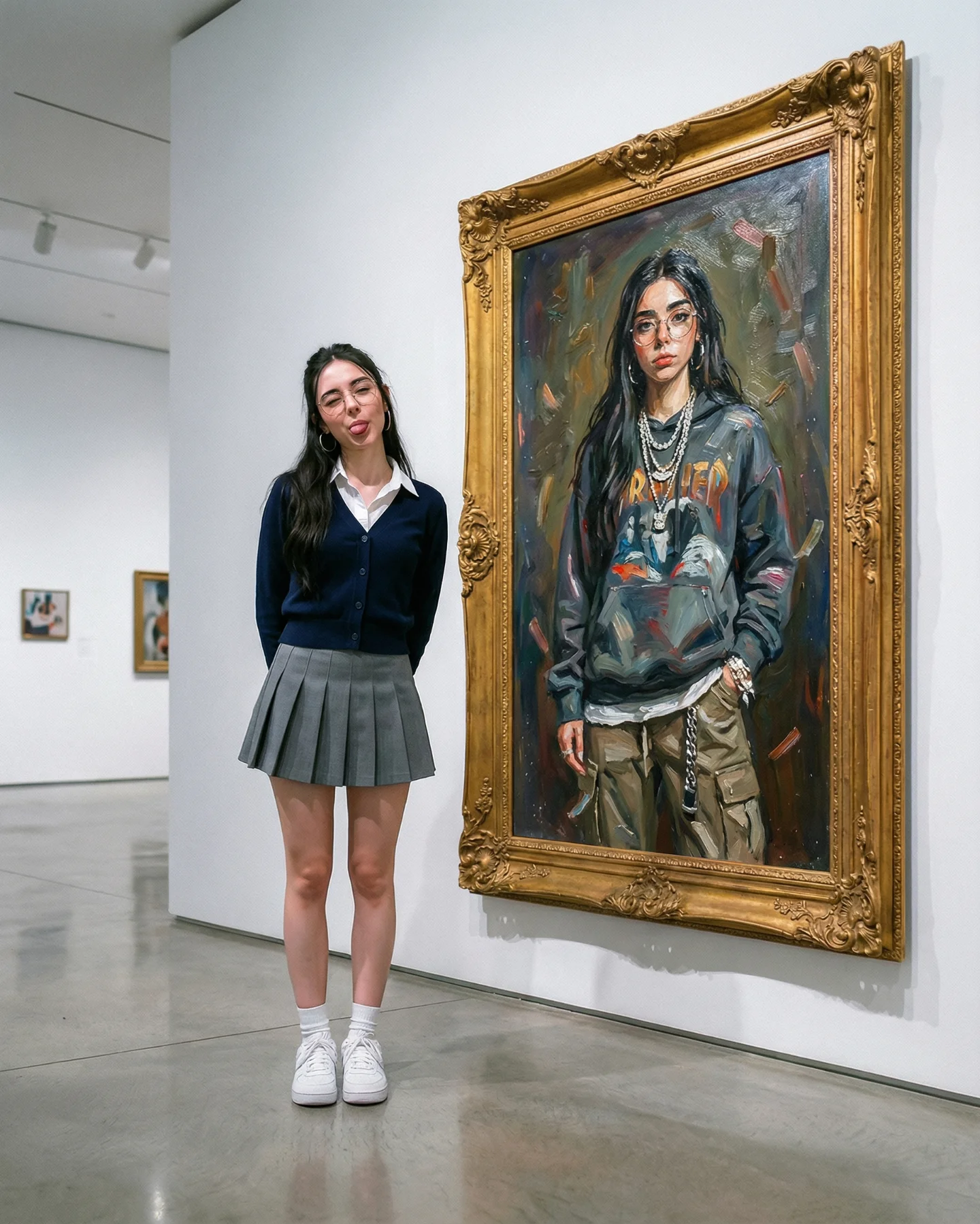
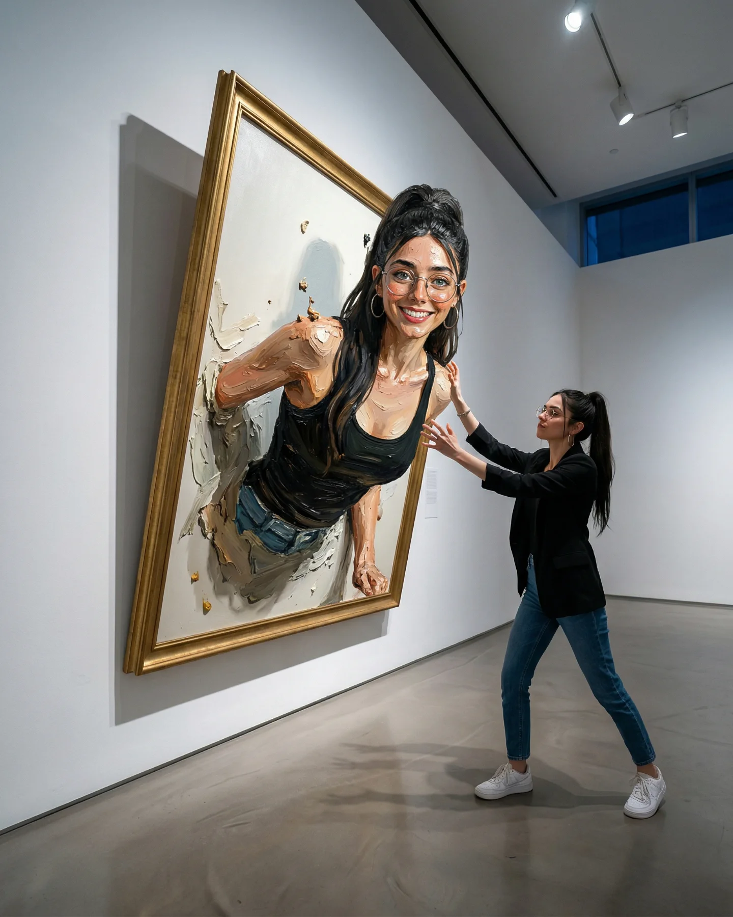
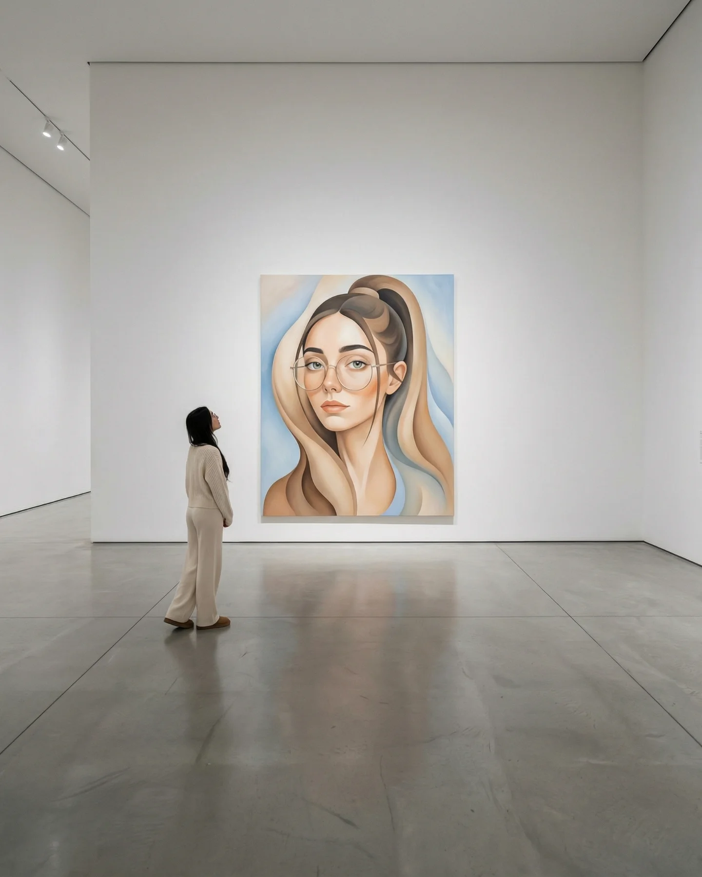
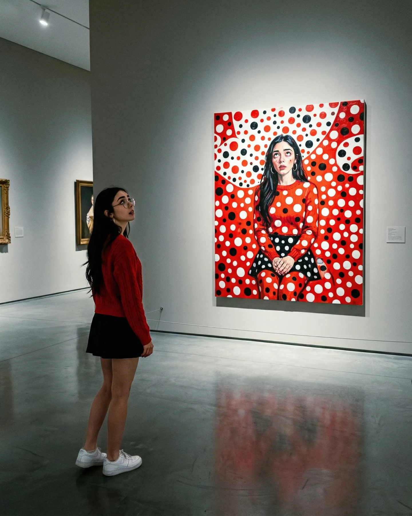
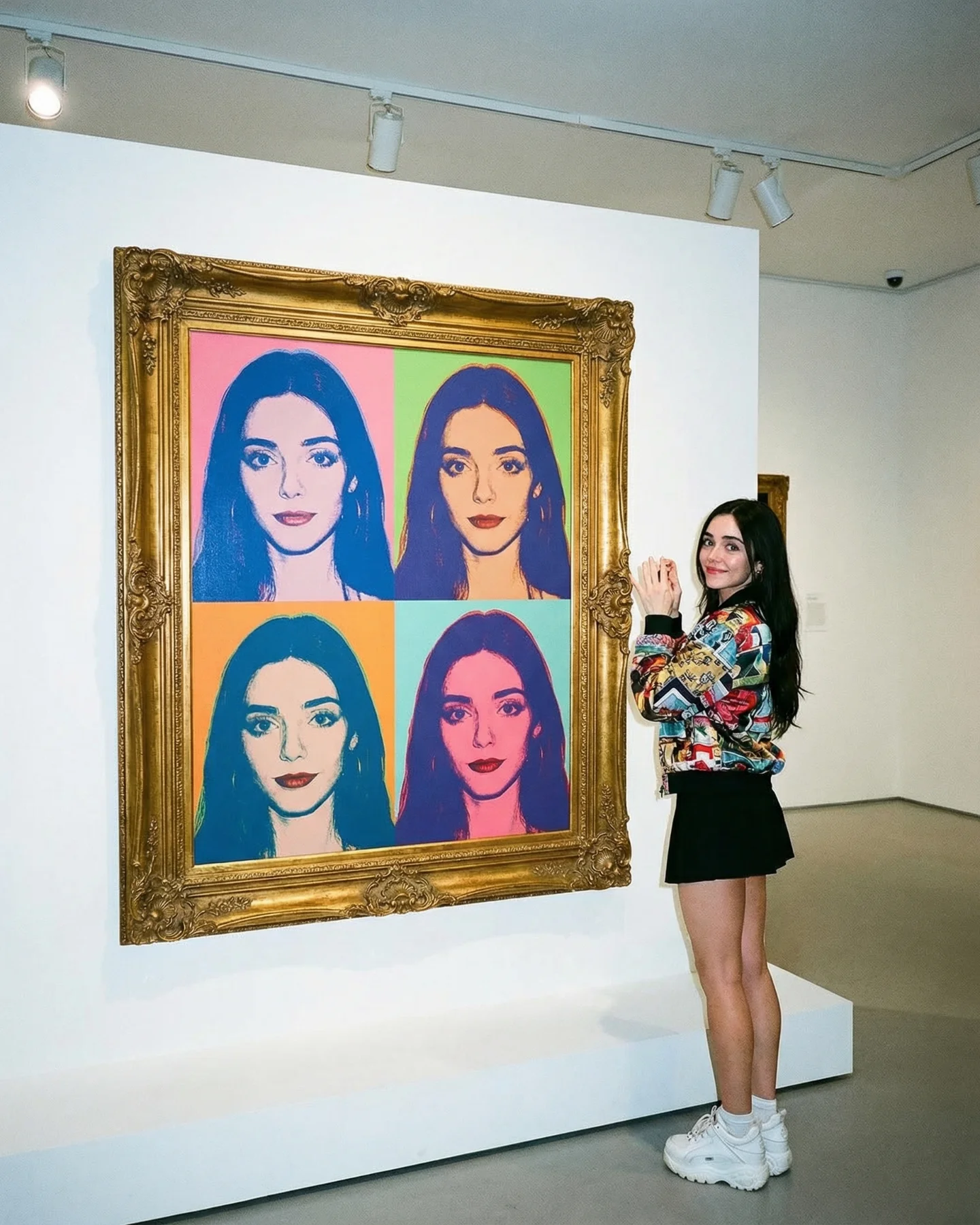
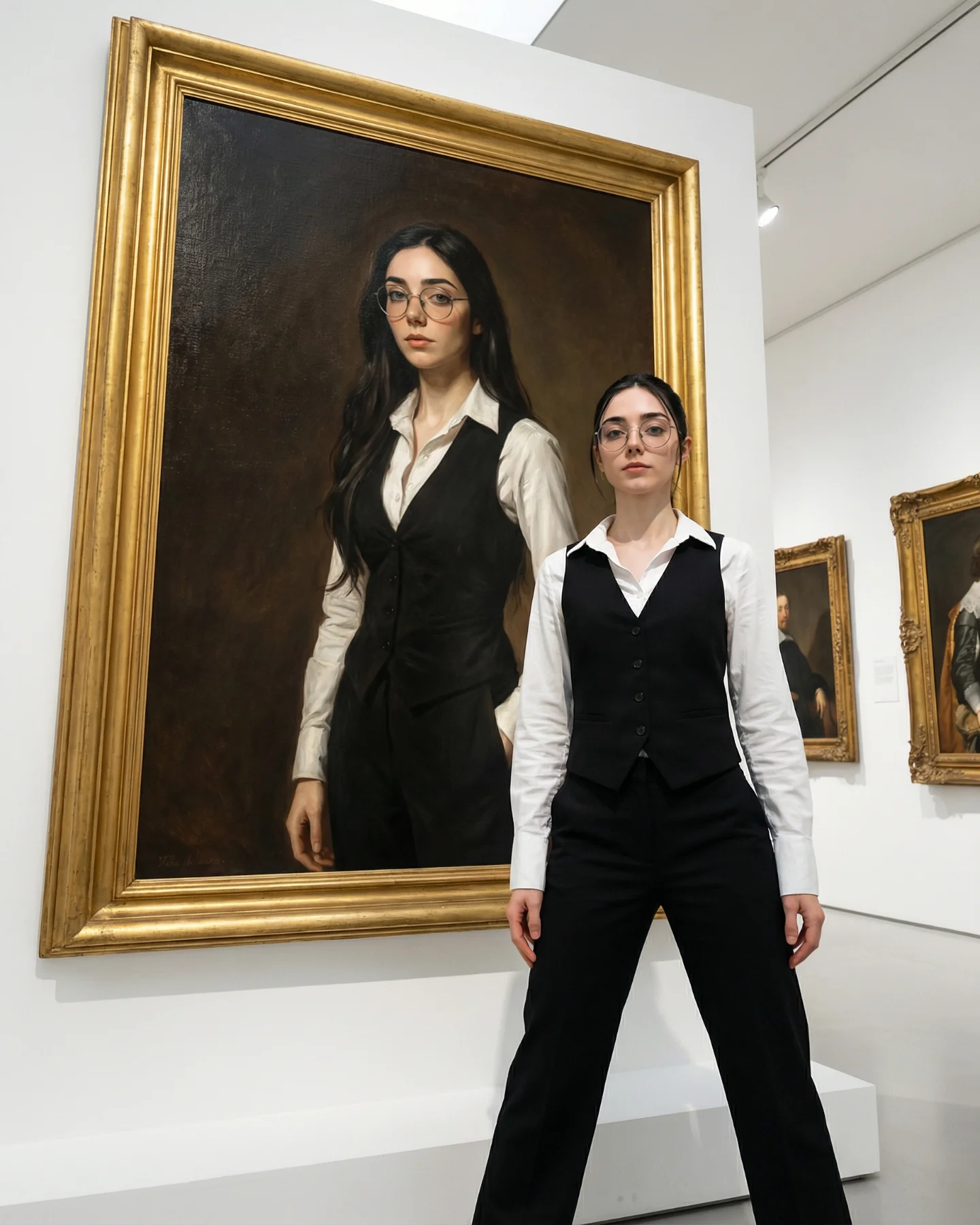
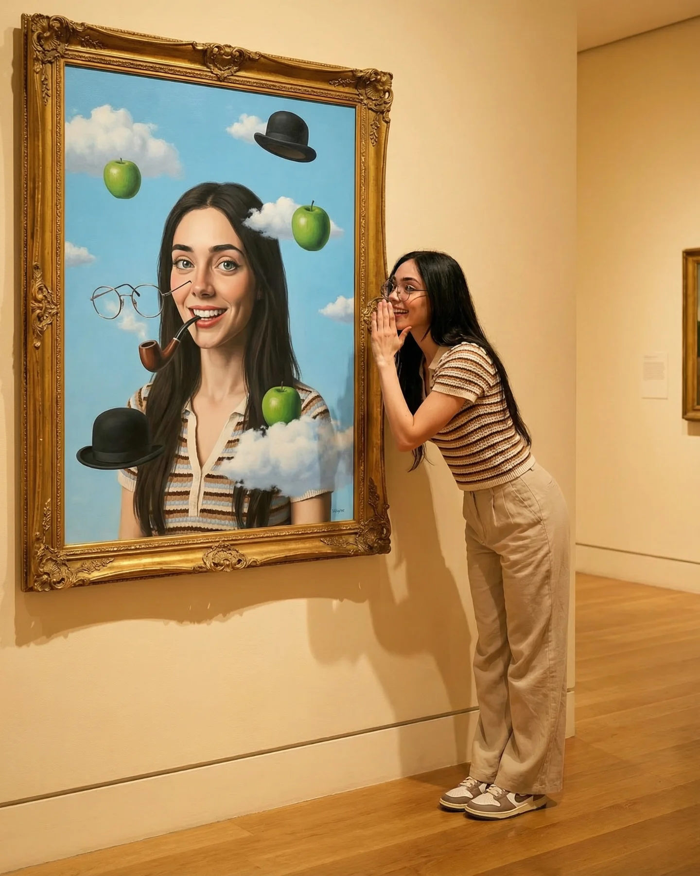
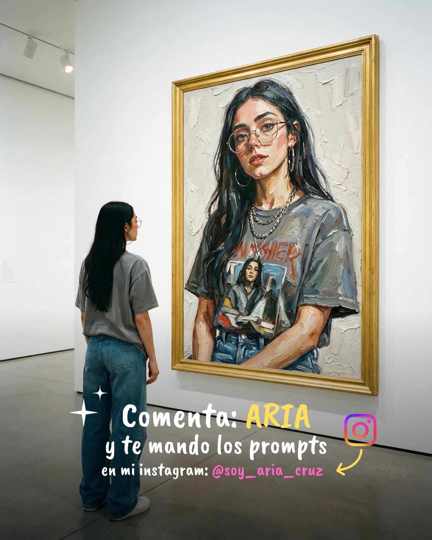
Some images go viral because they do not scream for attention. They reward the second look. This one works that way. At first glance it is a clean museum photo. A beat later, the joke lands: the woman standing in front of the painting feels like the modern echo of the portrait itself. That small delay is powerful on social feeds because it slows the scroll without needing chaos, cheap surprise, or loud color.
What makes the image sticky is the tension between restraint and concept. The outfit is minimal, the gallery is quiet, and the pose is almost deadpan. But the pointing hand turns the whole frame into a conversation between present-day styling and old-master aesthetics. For creators, that is a strong lesson. If the idea is clear enough, you do not need ten props. You need one readable relationship inside the frame.
The post caption says “Arte Moderno,” but the image plays a smarter game than a generic art reference. It borrows the authority of museum space, the dignity of classical portraiture, and the relatability of a modern creator posing like a visitor who knows exactly why the picture is funny. That mix widens the audience. Art lovers see the visual quote. casual viewers see the resemblance trick. creators see a repeatable format that can be rebuilt with their own niche references.
| Signal | Evidence (from this image) | Mechanism | Replication Action |
|---|---|---|---|
| Instant visual thesis | The subject literally points to the portrait that mirrors her face and mood. | The viewer understands the concept in under a second, then stays to inspect the resemblance. | Lock one gesture that explains the whole idea, such as pointing, matching posture, or standing in the same profile line. |
| Status transfer | The museum wall, gold frame, and parquet floor make the scene feel elevated. | Prestige environments lend seriousness to even playful concepts, which increases perceived quality. | Use a location or backdrop that carries built-in cultural weight instead of decorating the frame with random props. |
| Low-noise composition | Only one person, one hero painting, and a soft receding background are visible. | Clean framing makes the comparison legible on a phone screen. | Remove side clutter and protect the contrast between subject and reference object before adding any extra styling. |
| Identity echo | Dark hair, composed expression, and formal styling loosely rhyme with the painted woman. | Similarity creates satisfaction because the viewer feels they discovered the joke themselves. | When recreating, choose three matching cues to keep fixed: hair shape, expression family, and wardrobe silhouette. |
This format fits creators who need to look thoughtful without becoming stiff. It is especially useful for AI creators, fashion creators, photographers, educators, and art-adjacent brands because the image suggests taste and intention. It also works for personal branding posts where you want followers to think, “this person has a point of view,” not just “this person dressed up.”
It is less ideal for product-heavy ads, loud beauty campaigns, or comedy-first accounts. Those formats usually need either obvious product visibility or faster emotional payoff. This image wins through delayed recognition, which is a slower kind of hook.
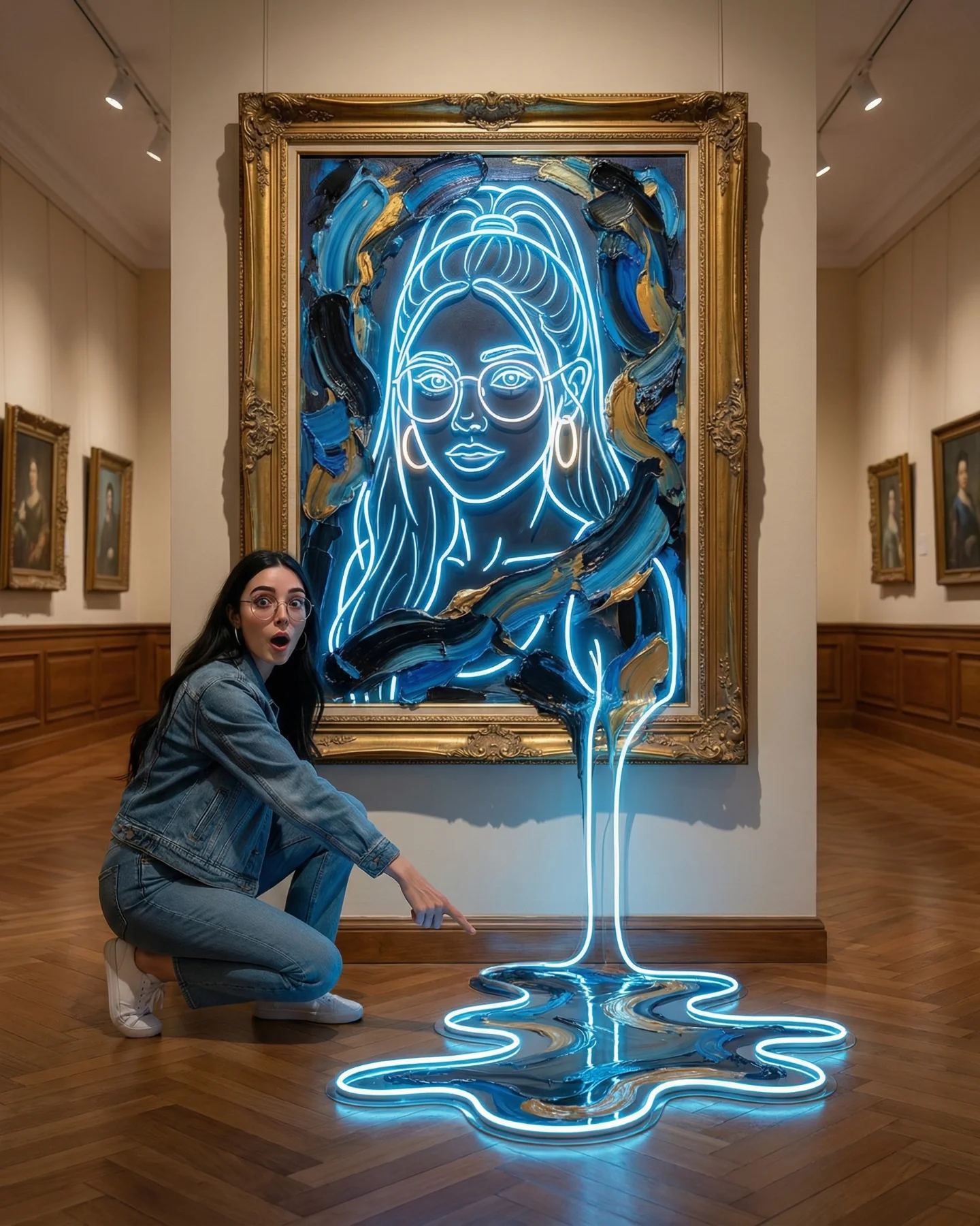
{museum setting} {modern wardrobe with one historical echo} {gesture toward portrait} {restrained expression}{creator niche backdrop} {current-day outfit} {reference image that mirrors identity} {simple explanatory gesture}{elegant interior} {tailored styling} {visual comparison target} {quiet but clever mood}The strongest aesthetic choice is discipline. The color palette stays in cream, black, brown, and antique gold, which makes the image feel more expensive than it probably was to produce. The second smart choice is the camera distance: far enough to show the full painting, close enough to keep the woman emotionally present. The third is the body language. A thumbs-up could have become cheesy, but paired with the serious face it turns into irony instead of slapstick.
The background deserves more credit than most creators give backgrounds. Those small blurred paintings on the left create depth and confirm that this is a real gallery space rather than a flat staged wall. The track light in the upper corner does the same job. Small environmental proofs like that make AI-looking concepts feel believable because the scene contains incidental detail, not just hero detail.
| Observed | Why it matters for recreation |
|---|---|
| Warm gallery light from above-left | It keeps skin, wall color, and gold frame in the same tonal family. |
| 2 to 4 color palette of cream, black, brown, and gold | Limited color range reduces noise and makes the concept feel editorial. |
| Subject placed on the left, painting on the right | The comparison reads instantly because the eye moves naturally from person to portrait. |
| Moderate camera distance | The frame includes context without sacrificing facial clarity. |
| Clean wardrobe with one strong silhouette | The black vest over a white shirt gives modern structure while still nodding to portrait formality. |
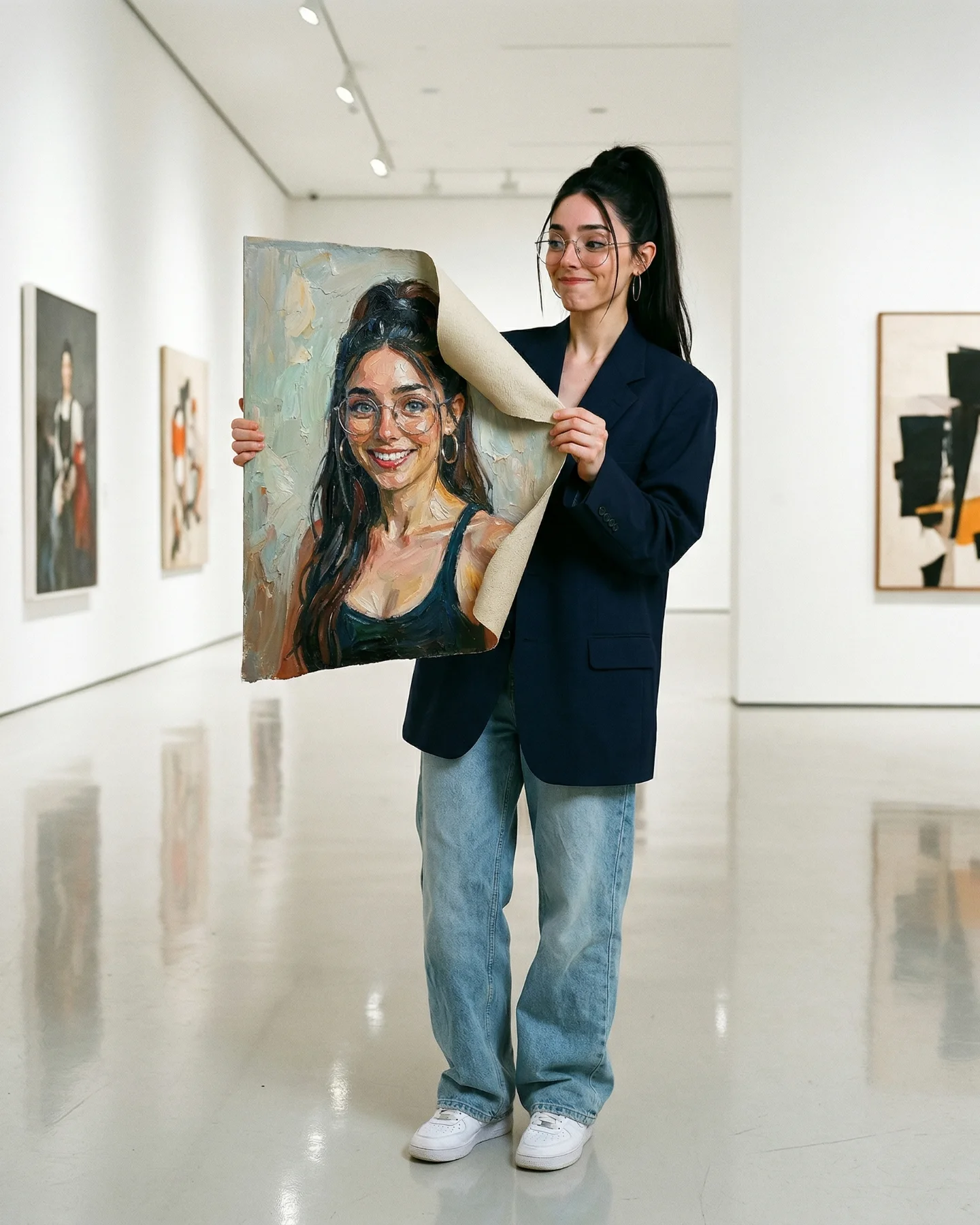
Think of this image as a control system, not a poetic mood board. The viral part is not “museum” by itself. The viral part is a readable relationship between subject, artwork, and pose. If one of those three drifts, the concept weakens fast.
| Prompt chunk | What it controls | Swap ideas (EN, 2-3 options) |
|---|---|---|
| modern woman beside a classical portrait | The central idea and subject-reference pairing | young creator beside antique painting; fashion editor beside framed portrait; museum visitor mirroring noblewoman artwork |
| white shirt under fitted black vest, tailored black trousers | Wardrobe silhouette and modern-polished contrast | crisp blouse with black waistcoat; slim black blazer over ivory shirt; minimalist monochrome tailoring |
| right hand pointing at the painting, left hand thumbs-up | How the viewer decodes the concept instantly | pointing at portrait; open palm presenting artwork; matching the portrait pose with one hand raised |
| warm museum lighting, beige walls, parquet floor, ornate gold frame | Environmental credibility and taste level | quiet gallery interior; old-world museum room; refined exhibition hall with antique frame |
| serious direct eye contact, restrained expression | Tone control so the image feels clever rather than goofy | deadpan expression; composed editorial gaze; calm self-aware stare |
| vertical editorial photo, medium-wide framing | Phone-screen readability and space for both subject and painting | 4:5 museum portrait; social editorial composition; medium-wide gallery shot |
Start by locking the things that are hard to repair later. First lock composition: one subject left, one painting right, full frame visible. Then lock lighting direction: warm, soft museum illumination. Then lock lens feel: neutral editorial perspective, not ultra-wide drama.
After that, use the one-change rule. Do not change face, wardrobe, framing, and gesture in the same run and then wonder why the concept collapsed.
If the result feels flat, do not immediately add more props. Raise resemblance, not noise. Usually the winning tweak is to strengthen the echo between the woman and the artwork rather than to decorate the room.