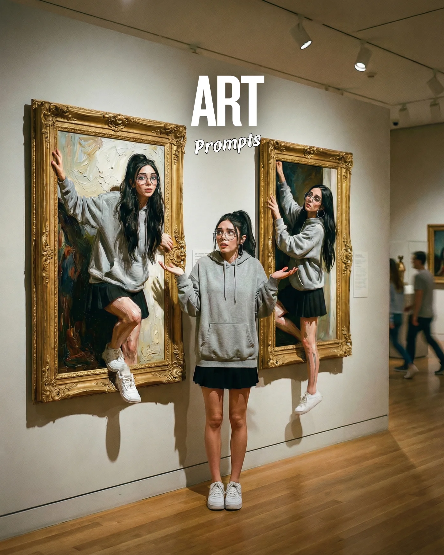

Arte Moderno 🎭🎨 Comenta "ARIA" y te paso todos los prompts 💌
Arte Moderno 🎭🎨 Comenta "ARIA" y te paso todos los prompts 💌
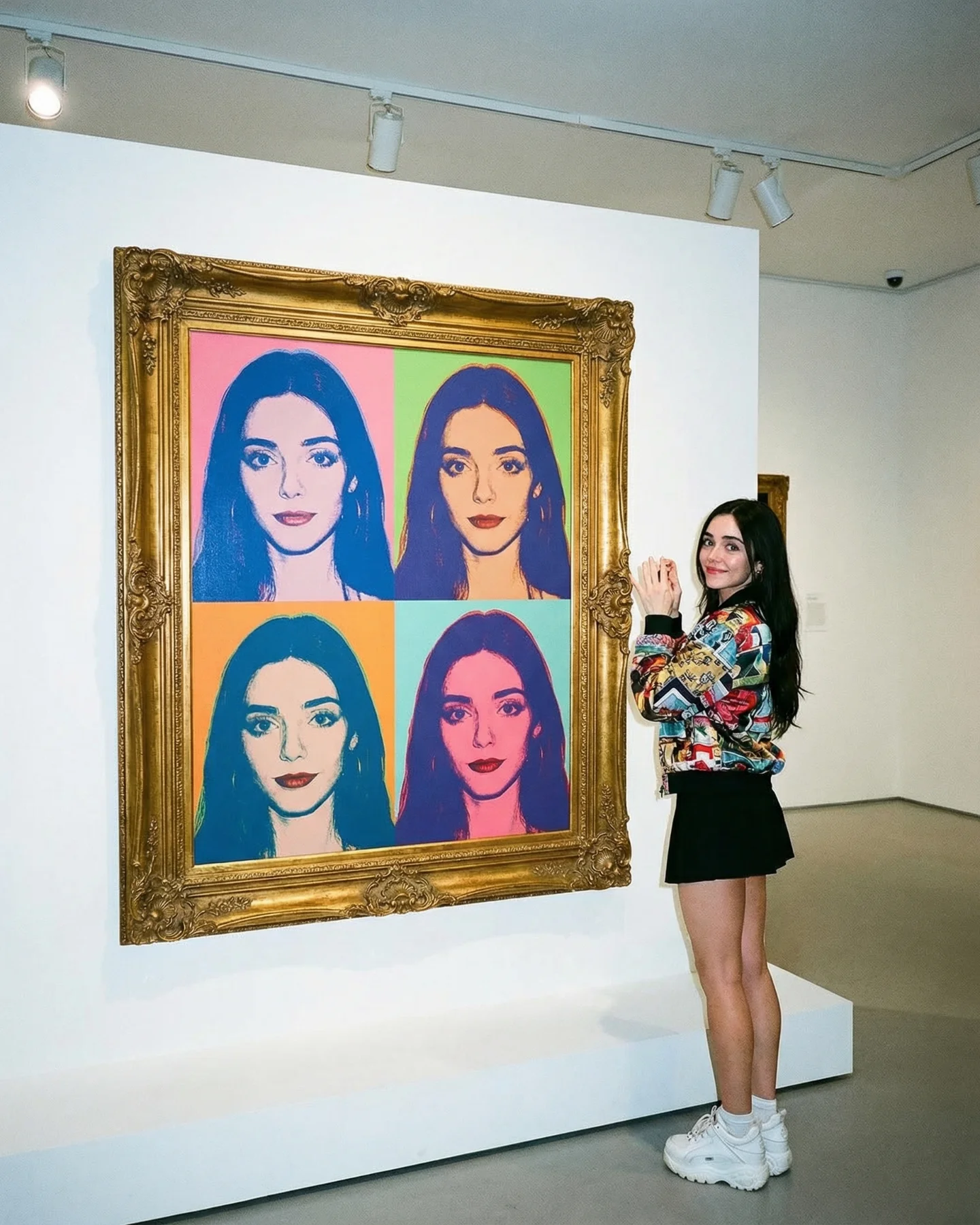
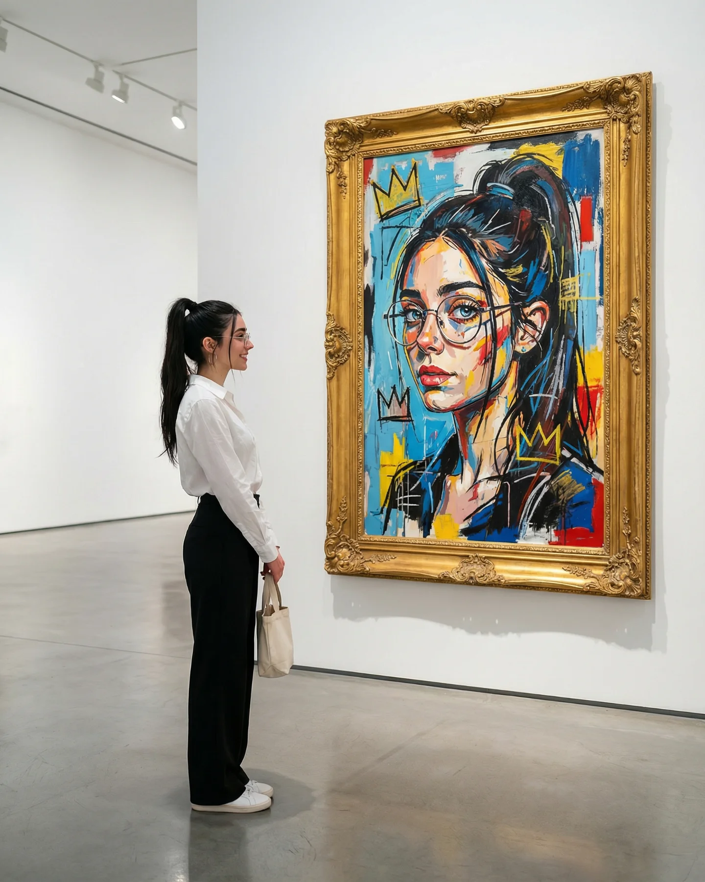
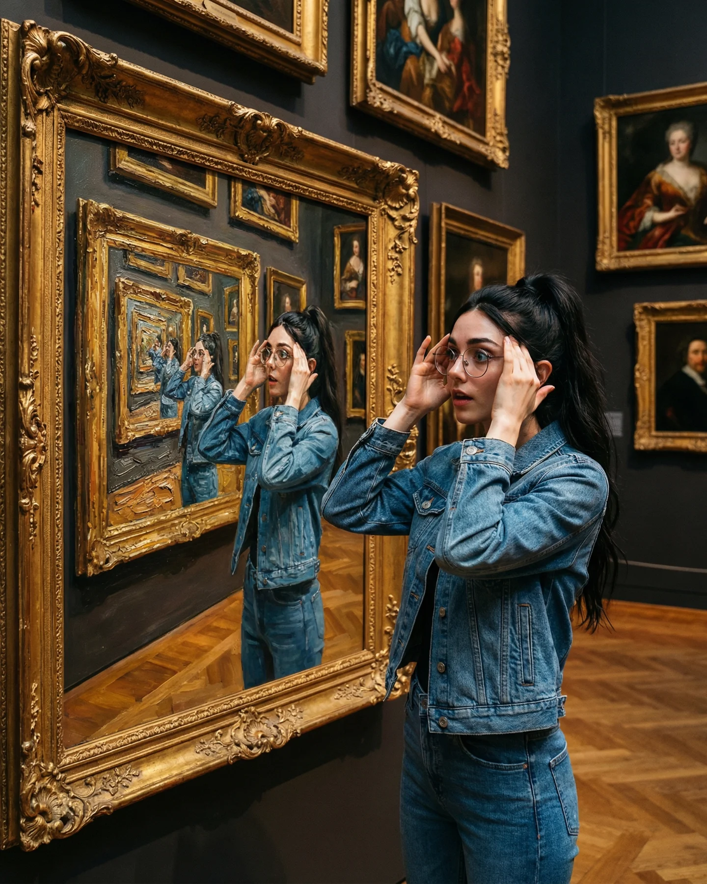
This image works because it turns self-reference into a clean visual event. The creator is not just standing in a museum. She is standing next to a pop-art version of herself, and the frame is built so the viewer understands that relationship instantly. That speed matters on Instagram. A strong image does not need a paragraph of context if the visual thesis is obvious in one glance.
What makes this one travel is the balance between familiar and elevated. Pop-art color blocks feel playful and accessible. The museum wall and gold frame add cultural weight. The real person standing beside the artwork closes the loop and makes the post feel personal instead of generic. It is easy to read, but it still feels designed.
The post caption says “Arte Moderno,” and the image delivers exactly that idea in a way that is broad enough for casual viewers and specific enough for creators. You do not need art history knowledge to understand it. You just need to notice that the framed piece and the woman are clearly linked. That kind of low-friction idea is powerful because it performs across different audience depths. Some people see a stylish museum photo. Others see identity branding. Others see a promptable content format they can remix.
The strongest growth mechanic here is creator-as-art-object. The subject is both audience stand-in and subject matter. That makes the image quietly aspirational. It says: my face, my style, my identity are strong enough to become the exhibit. For AI creators especially, that message lands because identity construction is part of the product.
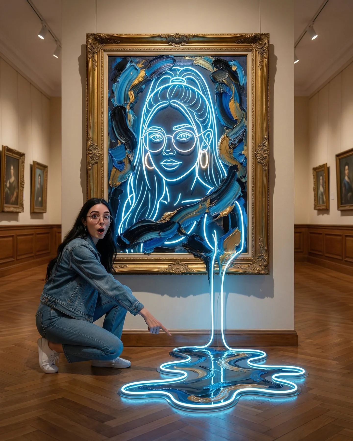
| Signal | Evidence (from this image) | Mechanism | Replication Action |
|---|---|---|---|
| Instant concept clarity | The real woman stands directly beside a four-panel portrait of her own face. | The viewer decodes the joke and the idea in a split second. | Build one unmistakable relationship between the live subject and the hero object, then remove anything that competes with it. |
| Color-led stopping power | The artwork uses saturated pink, lime, blue, orange, and violet blocks. | Bright contrasting blocks create immediate thumb-stopping energy on a mobile feed. | Push the artwork palette harder than the environment so the eye lands on the canvas first. |
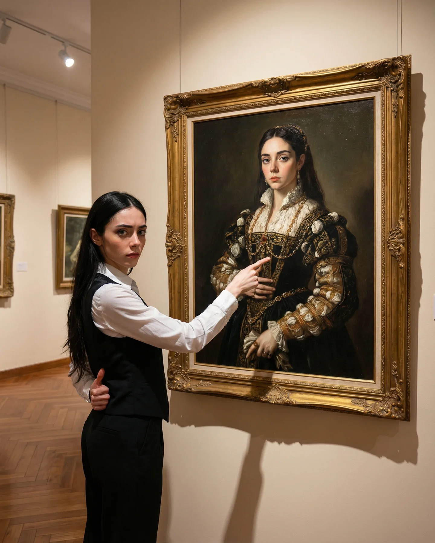
| Status framing | The ornate gold frame and gallery wall make the image feel curated, not casual. | Prestige context raises perceived value and makes the post feel more collectible. | Use a gallery, archive, showroom, or mock-exhibit environment instead of a random decorative wall. |
| Personal branding loop | The image says the creator is both muse and brand asset. | Self-referential content strengthens recall because the identity signal is repeated in two forms. | Mirror the subject inside the artwork using face, pose, or styling cues rather than using unrelated art. |
This aesthetic fits creators who want to look modern, self-aware, and visually literate. It works especially well for AI personas, fashion creators, digital artists, photographers, and creative educators. The image can function as a personal branding post, a campaign visual, a carousel opener, or even a launch image for a prompt pack because it packages identity into a single frame.
It is less useful for direct product selling, tutorial thumbnails, or niche educational posts where utility must be obvious instantly. This is a branding-heavy visual. It sells taste and identity before it sells instruction.
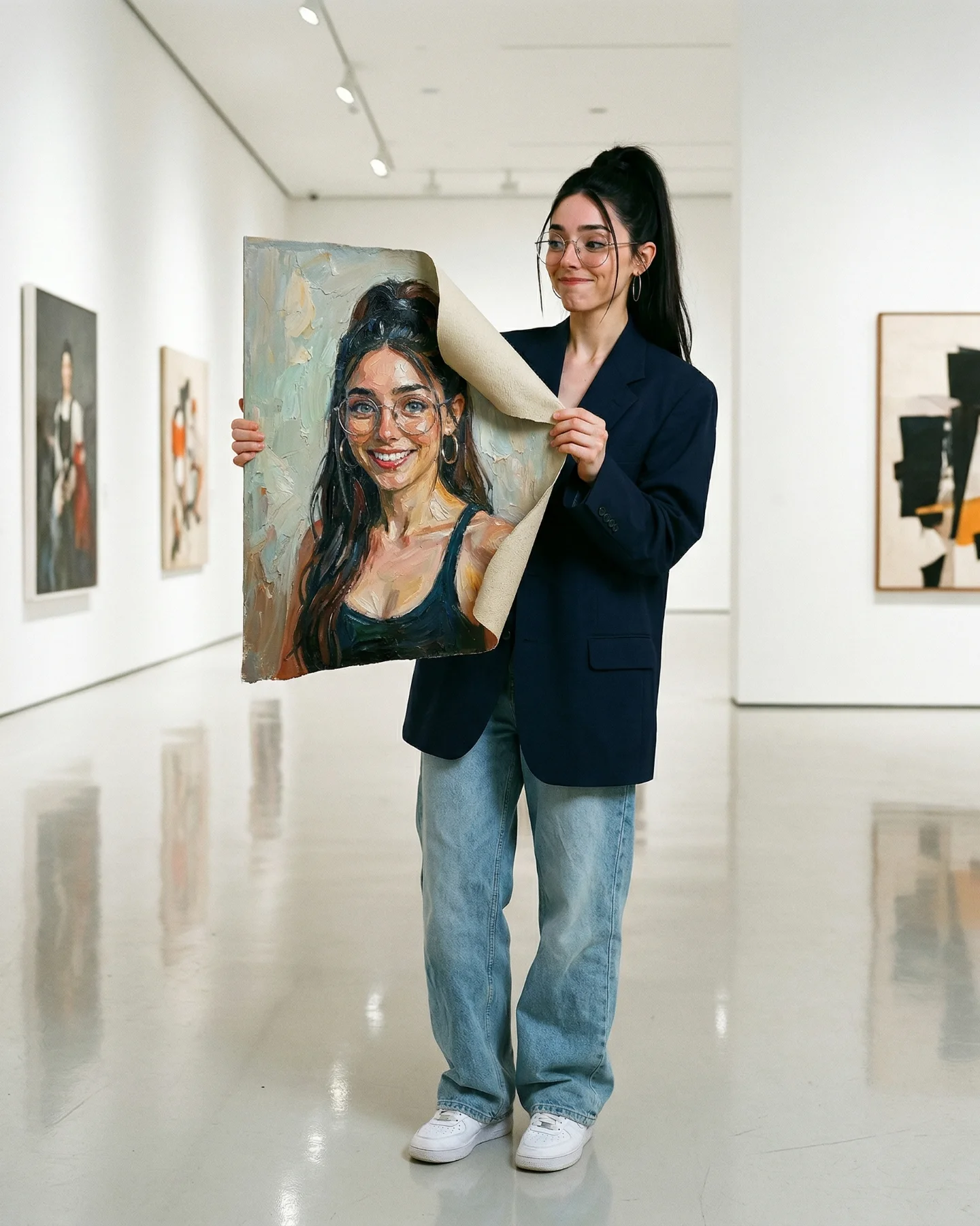
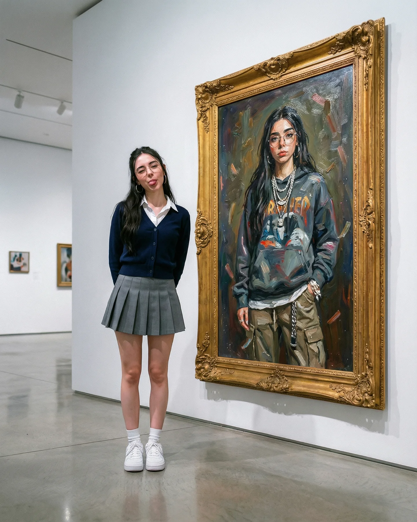
{gallery wall} {stylized portrait of the same subject} {creator standing beside it} {clear identity echo}{clean exhibition space} {brand-color portrait grid} {confident subject pose} {editorial fashion styling}{modern gallery} {AI-generated self portrait series} {real creator beside artwork} {playful premium mood}The image wins on contrast management. The room is nearly blank, so the painting does all the loud work. That is a useful lesson. If the environment is already carrying color, the artwork would lose punch. By keeping the wall white and the floor gray, the creator makes the frame and the portrait feel more expensive. The second smart move is wardrobe contrast. Her jacket is colorful enough to harmonize with the pop-art painting, but the black skirt and white sneakers stop the outfit from becoming noisy.
The pose is also doing more than it seems. Hands together near the chest reads as pleased, admiring, and slightly performative. It feels lighter than pointing and softer than a model pose. That keeps the image from feeling too self-serious. The overall result is aspirational but still friendly, which is a useful middle ground for growth content.
| Observed | Why it matters for recreation |
|---|---|
| Large artwork takes roughly two-thirds of the frame | The image reads as an art concept first and a portrait second. |
| White wall plus gray floor | Neutral architecture protects the color power of the canvas. |
| High-saturation four-panel face grid | Repeated identity plus color variation creates both recall and pop. |
| Full-body real subject on the right | The viewer can compare scale, styling, and attitude against the artwork. |
| Colorful jacket paired with black-and-white basics | The subject connects to the canvas without blending into visual chaos. |
To recreate this well, do not just prompt “woman in museum with pop art.” That is too vague. The control comes from explicitly locking the relationship between artwork, subject, and environment. Think in modules.
| Prompt chunk | What it controls | Swap ideas (EN, 2-3 options) |
|---|---|---|
| young woman standing beside a framed four-panel pop-art self portrait | The core story and identity loop | creator beside Warhol-style self portrait; fashion girl next to pop-art face grid; modern muse standing by stylized self artwork |
| ornate gold frame on a white museum wall | Prestige and gallery credibility | gilded exhibition frame; antique museum frame; decorative gold frame in a clean gallery |
| colorful patterned jacket, black mini skirt, white platform sneakers | Wardrobe rhythm between playful and wearable | graphic bomber jacket; patterned cropped jacket; editorial print jacket with simple black skirt |
| hands pressed together near chest, slight smile | Emotional tone and soft presentation energy | admiring pose; playful presenting gesture; warm smile with composed posture |
| bright neutral gallery lighting with visible track lights | Realism and clean modern mood | museum spot lighting; evenly lit white gallery; crisp exhibition lighting |
| vertical full-body composition with artwork dominating left side | Readability on social feeds | 4:5 gallery composition; full-body museum portrait; artwork-left subject-right framing |
Start with three locks: composition, color hierarchy, and artwork style. If any of those drift, the final image stops feeling intentional. Composition means artwork left and subject right. Color hierarchy means neutral room, loud painting. Artwork style means clearly repeated portrait, not generic abstract pop shapes.
Then iterate one variable at a time.
If the image feels weak, do not add more props. Usually the fix is to increase identity echo or strengthen the artwork palette. This format wins when the visual relationship is unmistakable.