
Arte Moderno 🎭🎨 Comenta "ARIA" y te paso todos los prompts 💌
Arte Moderno 🎭🎨 Comenta "ARIA" y te paso todos los prompts 💌
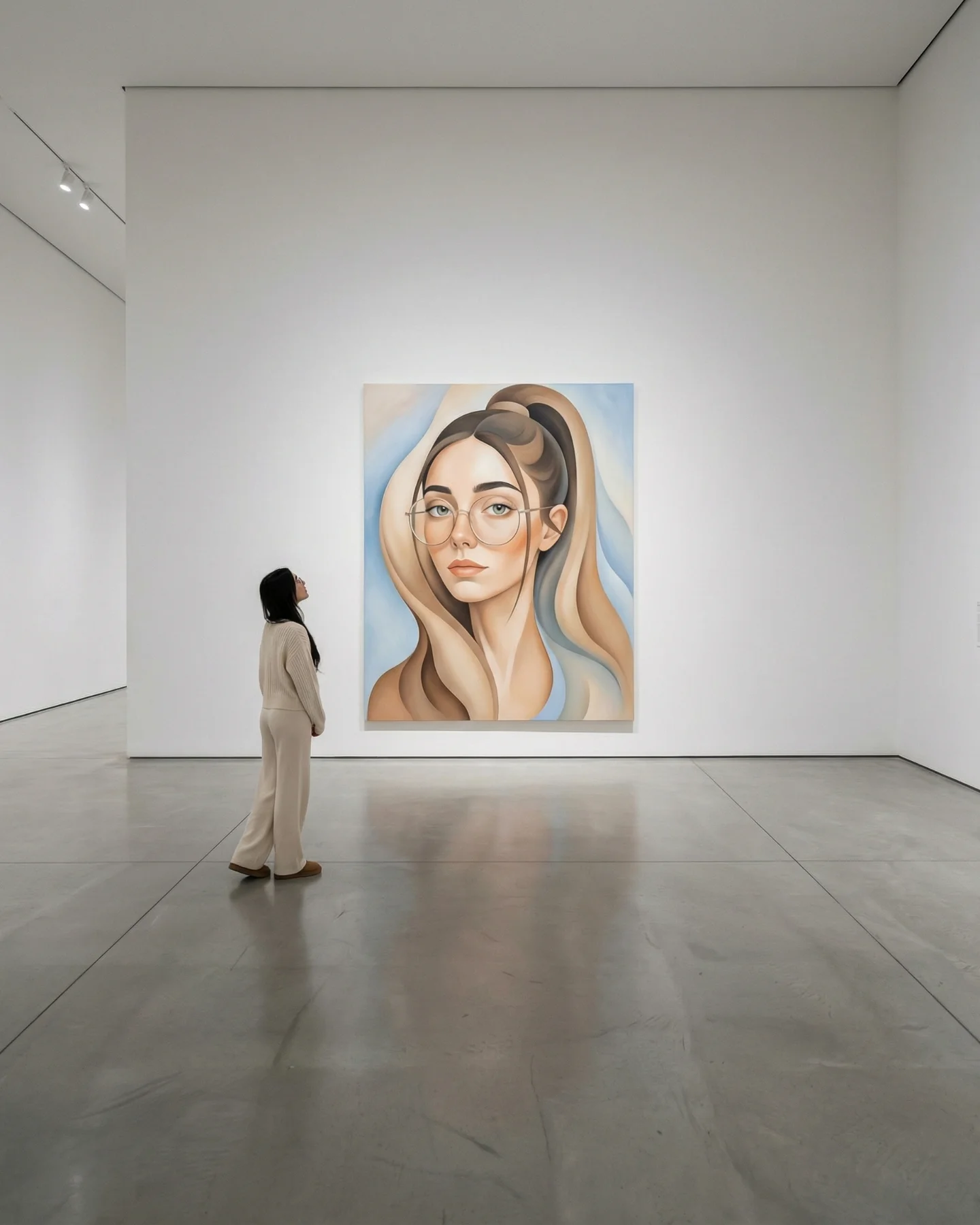
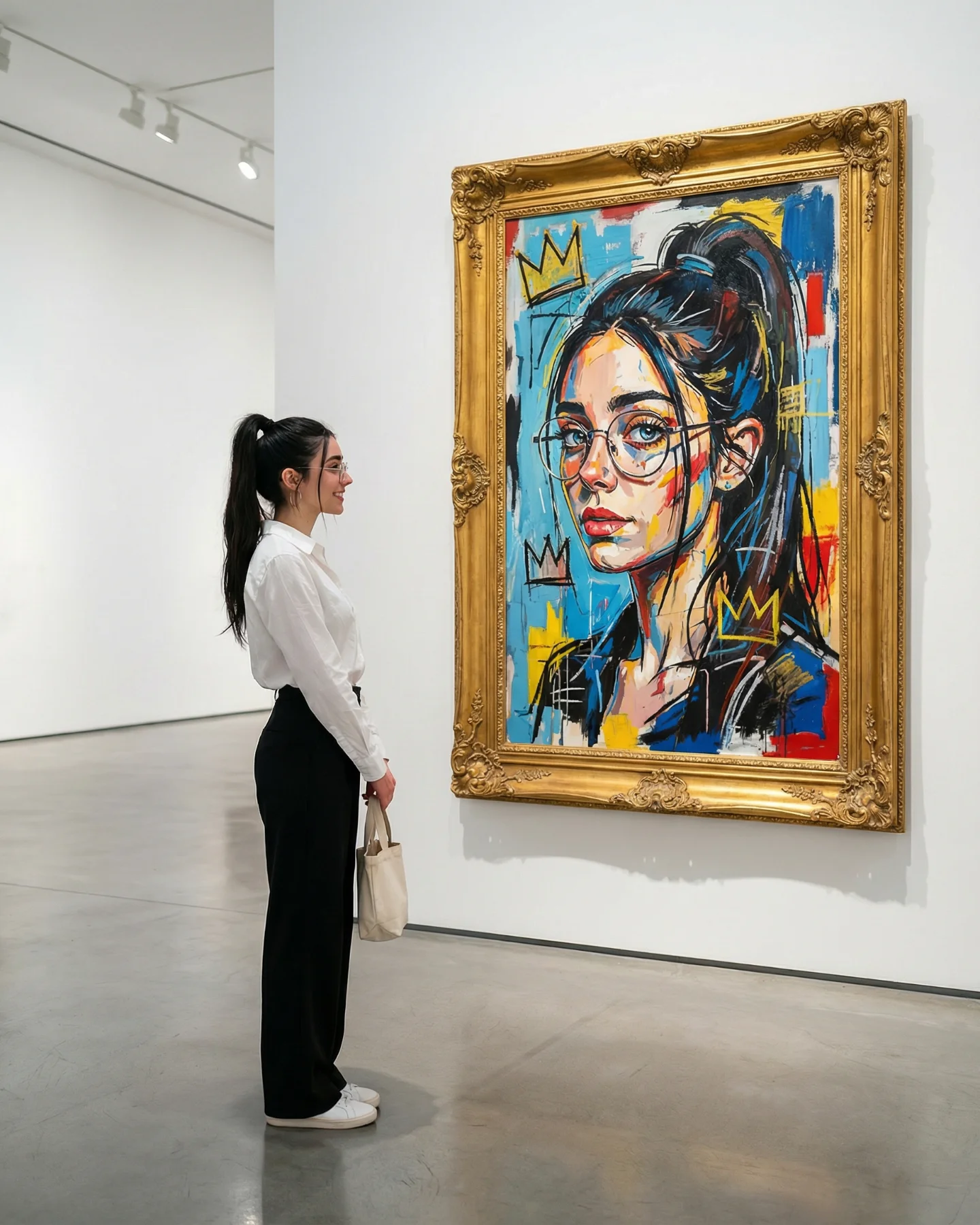
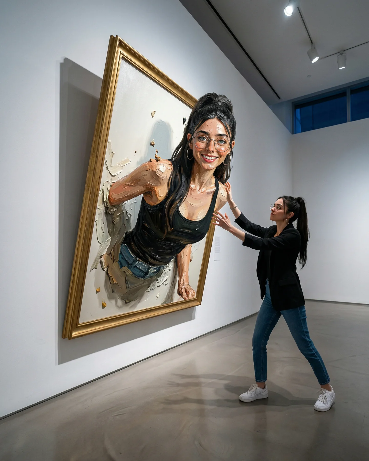
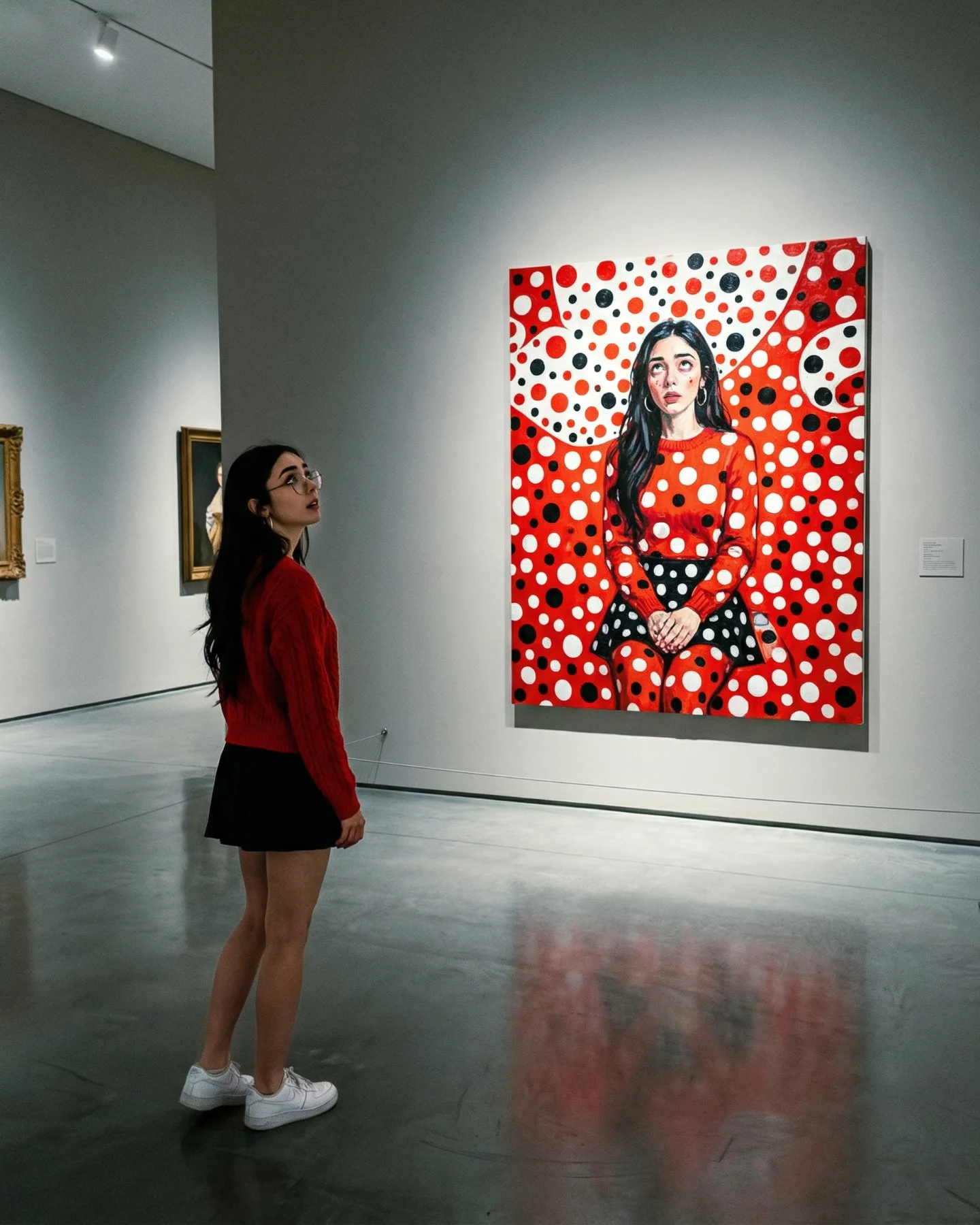
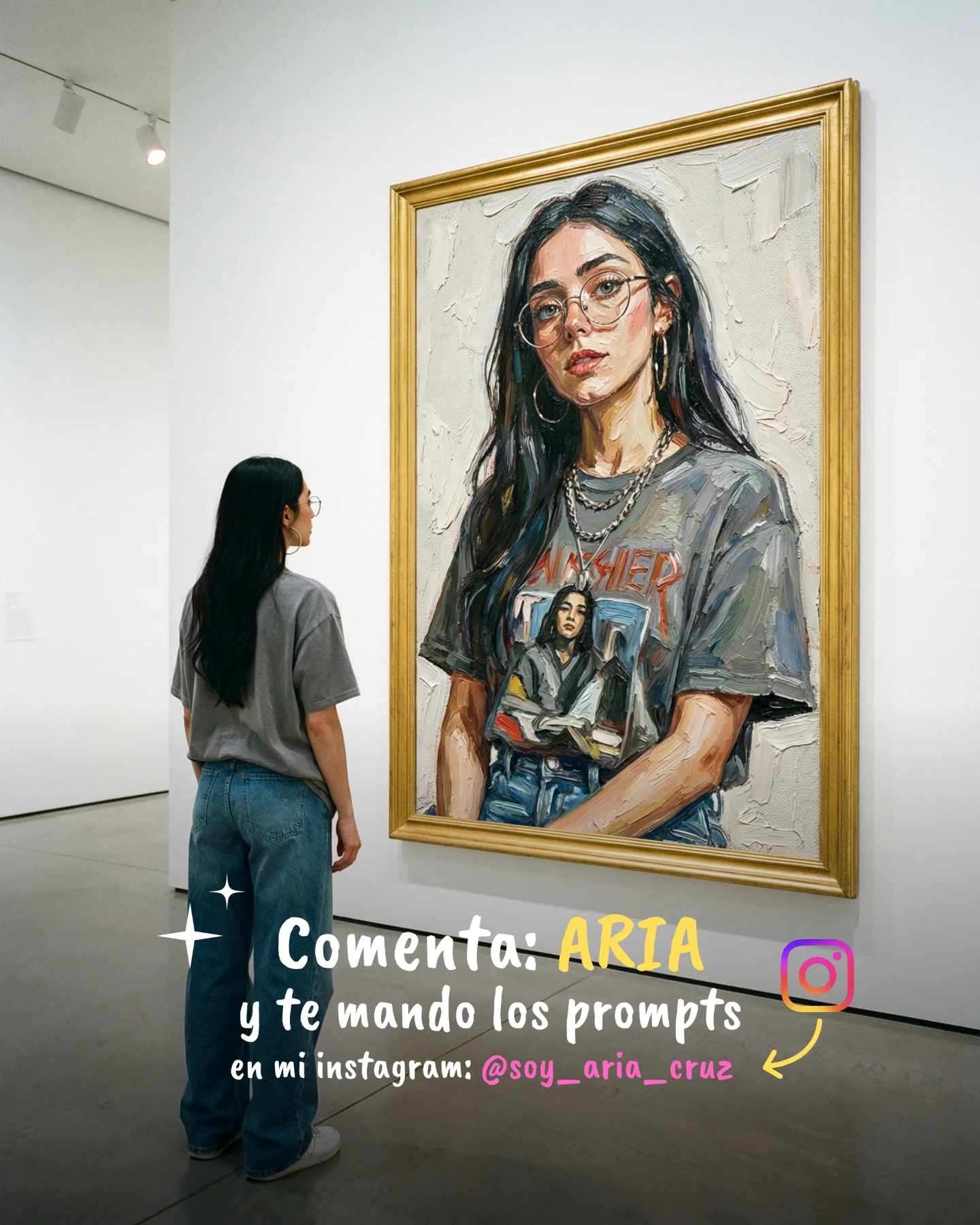
This image takes a route that many creators avoid: it wins attention by shrinking the human figure instead of enlarging it. The viewer does not meet the subject first. The eye meets silence first. A huge white wall, a polished concrete floor, one centered painting, one small woman standing off to the side. That restraint is exactly why the image feels expensive, thoughtful, and highly shareable.
The caption says “Arte Moderno,” but the image does the more important work. It frames modern art not as chaos, but as control. The creator is not performing for the camera. She is performing attention. That single choice changes the whole emotional register of the post. Instead of asking the audience to admire her directly, the image invites them to step into the scene and feel the same pause she is feeling.
The strongest hook here is scale. The subject is intentionally small, and that smallness creates authority rather than weakness. It tells the viewer that the image is not trying too hard. The museum architecture has enough confidence to leave space empty, and the creator borrows that confidence. On social feeds crowded with close crops and over-signaled styling, empty space itself becomes the surprise.
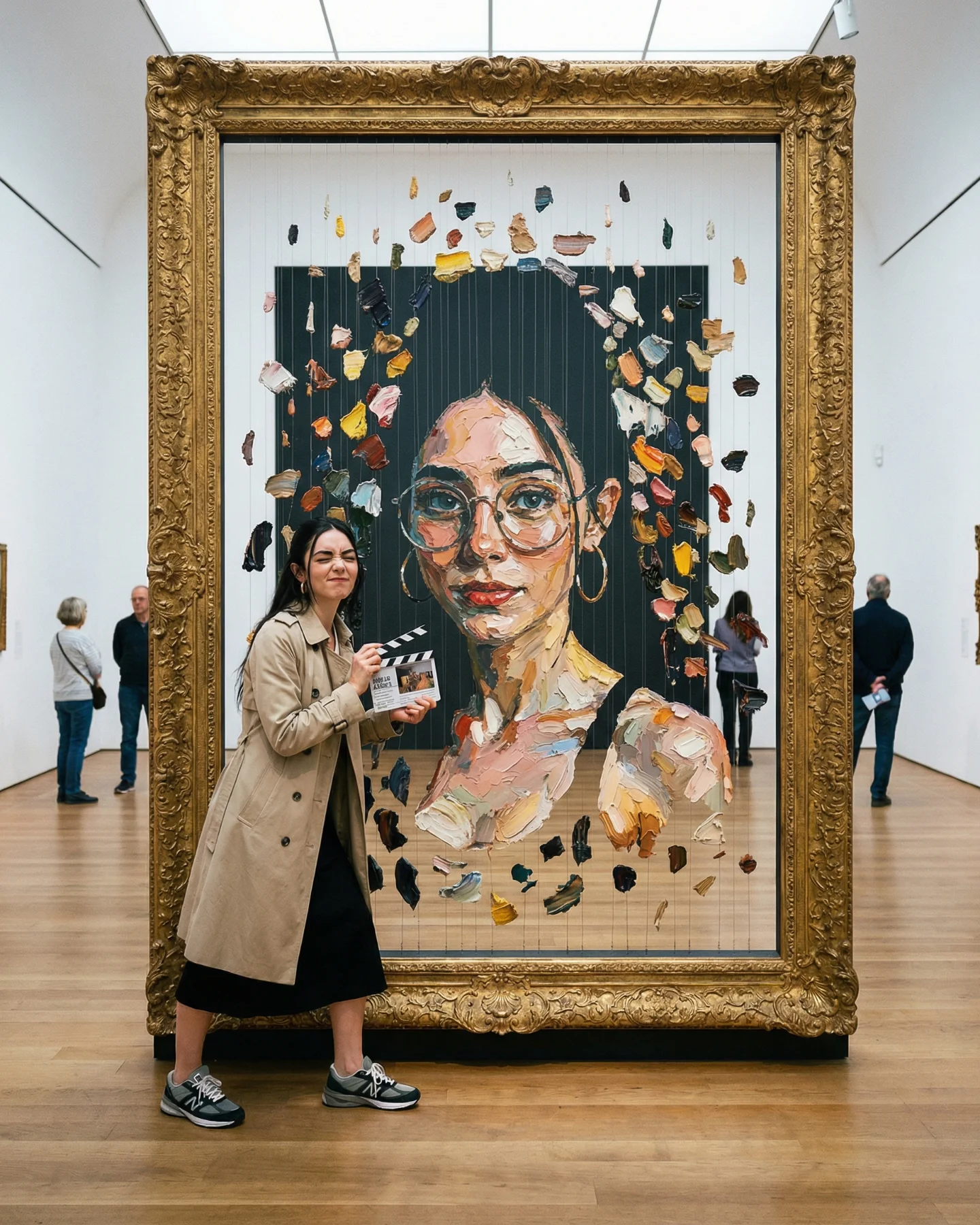
The second hook is the relationship between the woman and the painting. The portrait on the wall carries some visual DNA of the viewer: feminine features, glasses, soft poise. But the connection is indirect. It feels like aesthetic echo, not literal duplication. That gives the post a reflective quality. People are not only looking at a beautiful setup; they are also reading a small story about identity, taste, and self-recognition.
| Signal | Evidence (from this image) | Mechanism | Replication Action |
|---|---|---|---|
| Scale as status | The woman is tiny relative to the towering wall and open floor. | Large empty space signals confidence and makes the composition feel premium. | Keep the subject small in frame and let architecture dominate. |
| Reflective identity cue | The painting shows a stylized feminine face with glasses and soft hair forms. | Viewers sense a relationship between observer and artwork, which adds narrative depth. | Create one visual echo between subject and art, but avoid exact matching. |
| Silence as contrast | No crowd, no text, no props, no busy background. | The absence of clutter makes each remaining element feel more intentional. | Strip the scene down to one person, one wall, one artwork, one mood. |
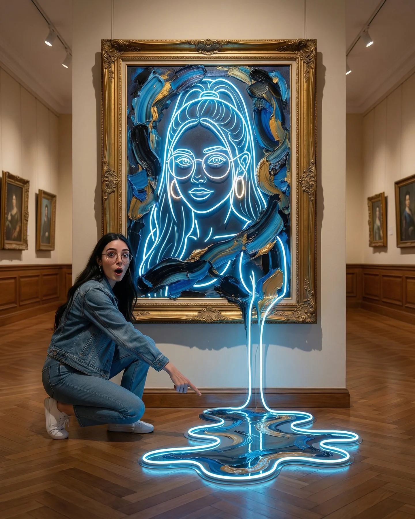
This aesthetic fits creators who want intelligence, calm, and taste to come through before personality theatrics. It is excellent for AI art accounts, fashion creators with a minimalist brand, design-led personal brands, and writers or coaches who want to feel reflective rather than pushy. The image format also works well for launch posts when the message is “this is a world I am building,” not “look at me right now.”
It is less effective for creators whose audience expects intensity, comedy, or obvious product detail. It is also not ideal when the location cannot stay clean. If the background becomes busy, the image loses most of its authority immediately.
| Transfer | Keep | Change | Slot Template (EN) |
|---|---|---|---|
| Luxury fashion version | Small figure scale, white architecture, centered wall art, reflective floor. | Switch the painting to a sharper monochrome fashion portrait and add a long coat. | {white gallery} {minimal tailored look} {fashion portrait canvas} {quiet luxury mood} |
| Creative founder version | Negative space, viewing posture, architectural calm. | Replace the wall art with an abstract brand system or concept image. | {minimal hall} {understated outfit} {conceptual brand artwork} {thoughtful mood} |
| Soft fantasy version | Scale contrast, stillness, clean wall, polished floor. | Transform the painting into a dreamlike muse portrait with pastel surreal details. | {museum space} {cream wardrobe} {dream portrait painting} {contemplative mood} |
The image uses a palette that never competes with itself. Most of the frame lives in white, gray, cream, and pale beige. That means the painting can introduce blue accents and soft peach skin tones without making the scene noisy. The second important choice is proportion. The artwork is centered, but not oversized. That keeps the wall feeling monumental. The room is the stage, and the painting is the note inside it.
The body language also matters. The subject is not presenting, pointing, or dancing. She is looking. That makes the audience slow down. Finally, the polished floor gives the scene a subtle mirror effect, which helps the image feel complete from top to bottom rather than empty below the subject.
| Observed | Recreate |
|---|---|
| Subject placed low and left with large distance from the artwork | Frame wide and resist the urge to crop tighter. |
| Centered pastel portrait against a giant white wall | Use one clean focal artwork and let empty wall carry the luxury. |
| Soft cream wardrobe instead of high-contrast styling | Choose understated monochrome clothing that blends into the architecture. |
| Subtle floor reflection | Shoot on polished concrete or emulate a low-gloss reflective surface. |
To recreate this image, think of it as an environment-led prompt rather than a portrait-led prompt. The room is doing half the work.
| Prompt chunk | What it controls | Swap ideas (EN, 2–3 options) |
|---|---|---|
| small solitary woman in cream outfit viewing art | Sets the emotional tone and keeps the figure understated. | woman in ivory suit; viewer in beige knit set; slim figure in monochrome linen |
| vast white cube museum with polished gray concrete floor | Creates scale, silence, and premium architecture. | minimal exhibition hall; clean gallery atrium; high-ceiling art pavilion |
| single centered pastel feminine portrait canvas | Defines the focal object and the reflective narrative layer. | soft cubist portrait; airy fashion illustration painting; muted surreal muse portrait |
| soft diffuse museum lighting | Protects the calm mood and avoids theatrical noise. | neutral skylight wash; gentle overhead gallery light; even white interior illumination |
| extreme negative space and wide composition | Makes the image feel confident and expensive. | more floor emphasis; taller wall emphasis; corridor-inclusive museum view |
Lock three things first: the subject-to-room scale ratio, the centered placement of the canvas, and the neutral lighting quality. Once those are stable, do not change everything at once.
The lesson from this post is that stillness can outperform spectacle when the visual hierarchy is strong enough. One person, one painting, one large silence. That is the whole strategy.