
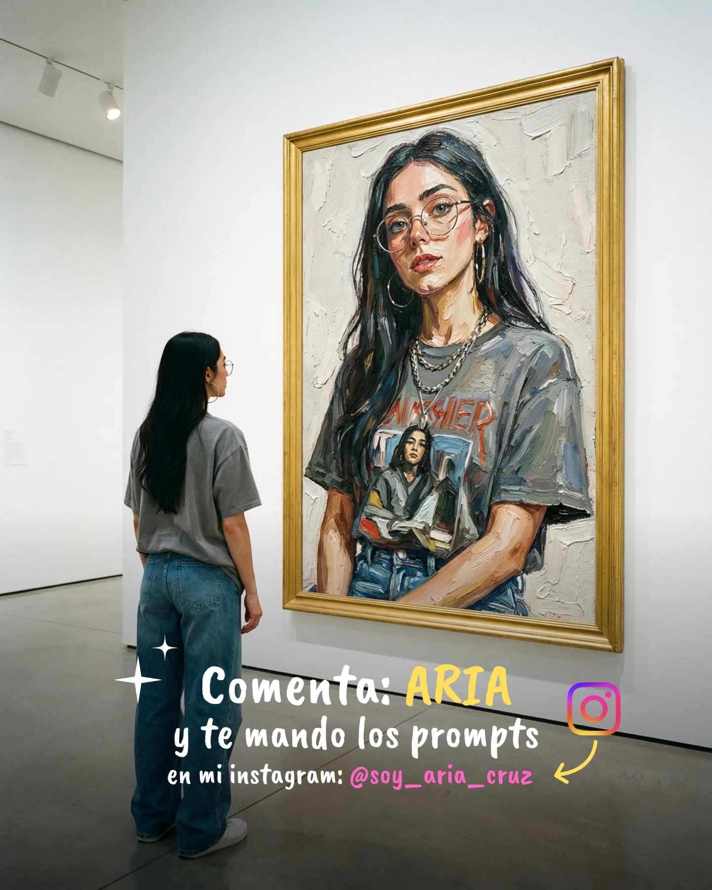
Arte Moderno 🎭🎨 Comenta "ARIA" y te paso todos los prompts 💌
Arte Moderno 🎭🎨 Comenta "ARIA" y te paso todos los prompts 💌
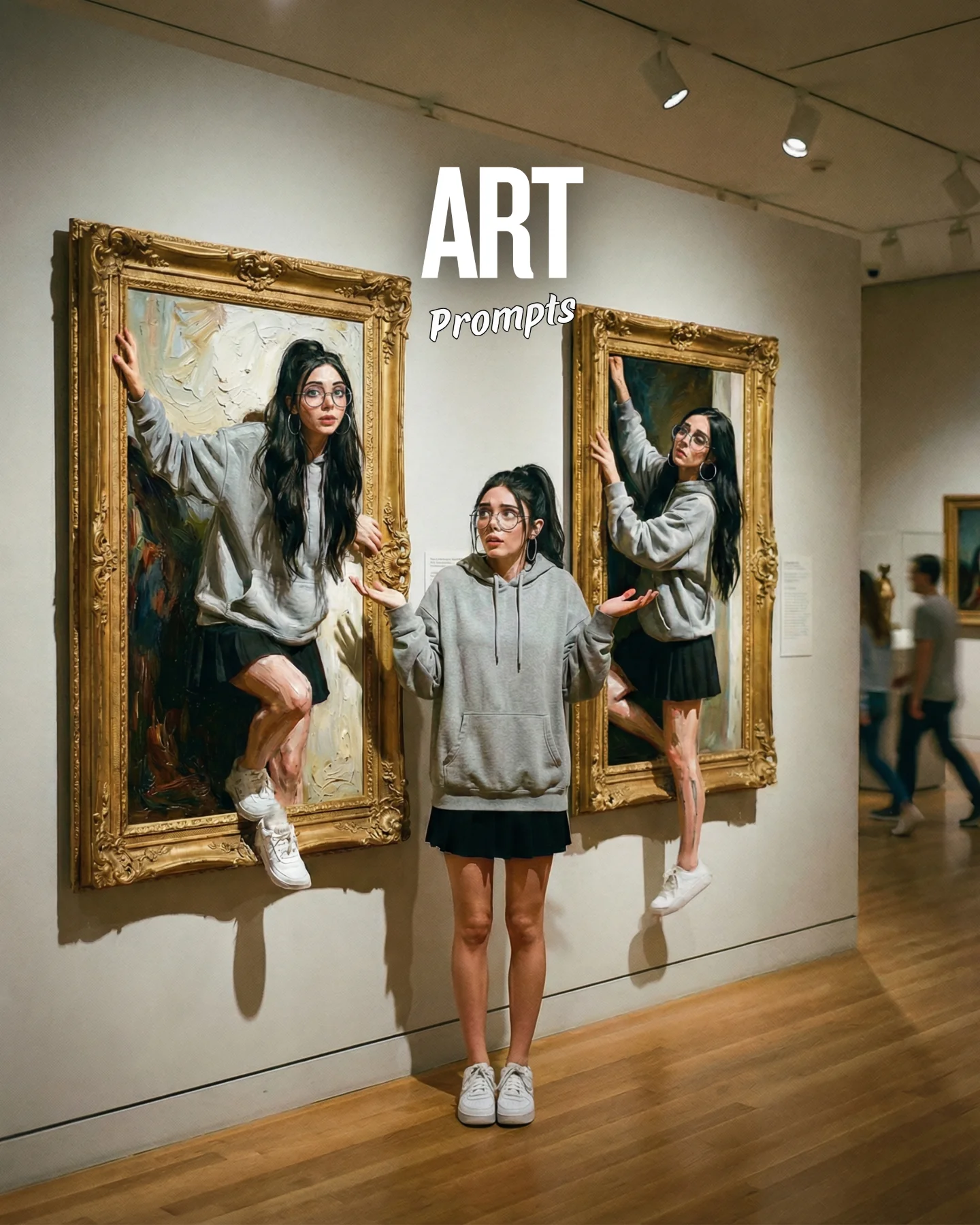
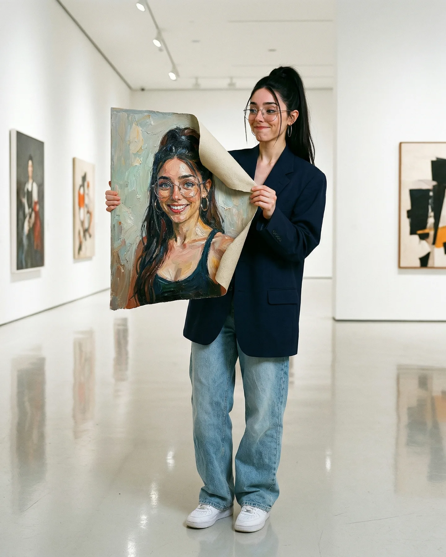
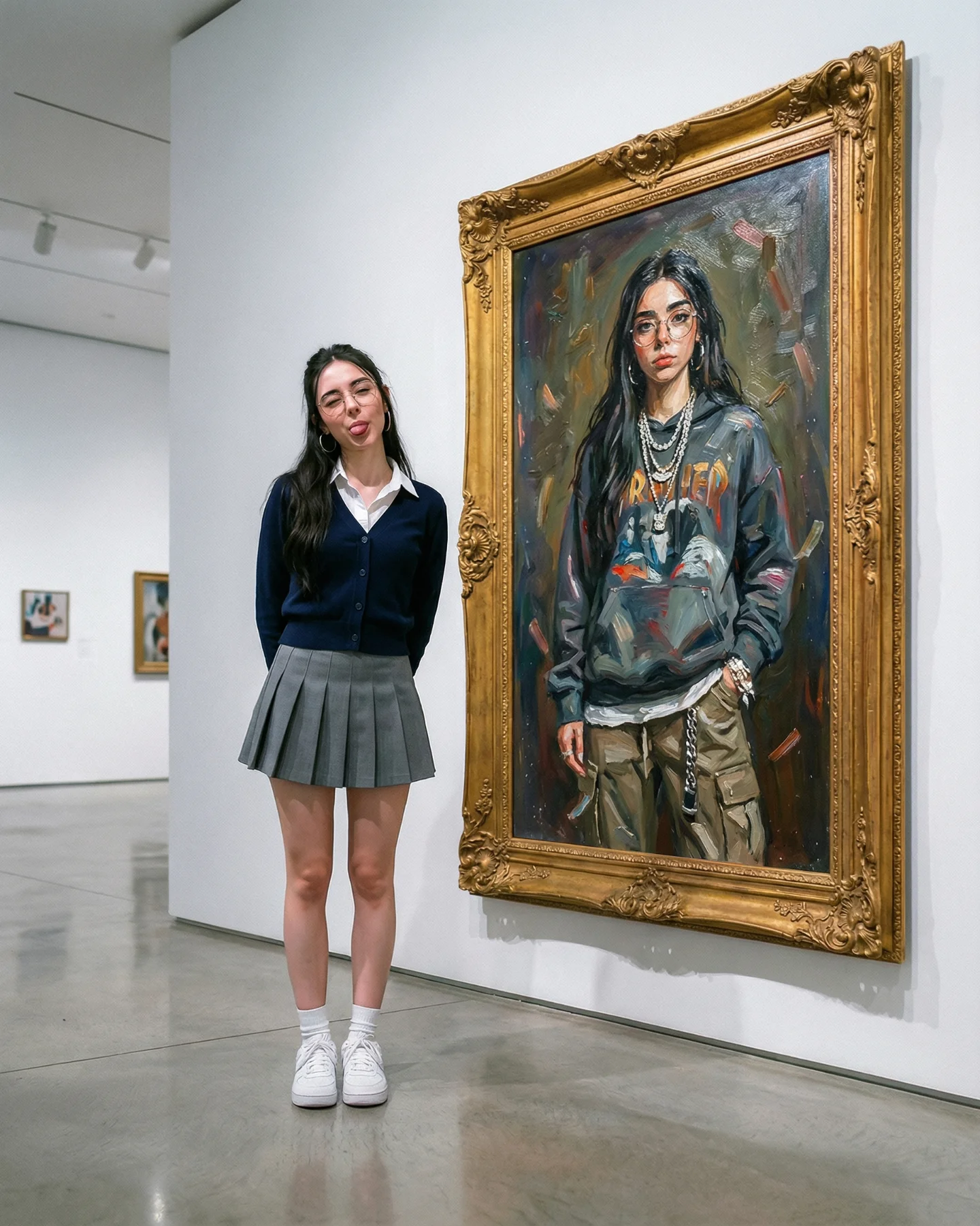
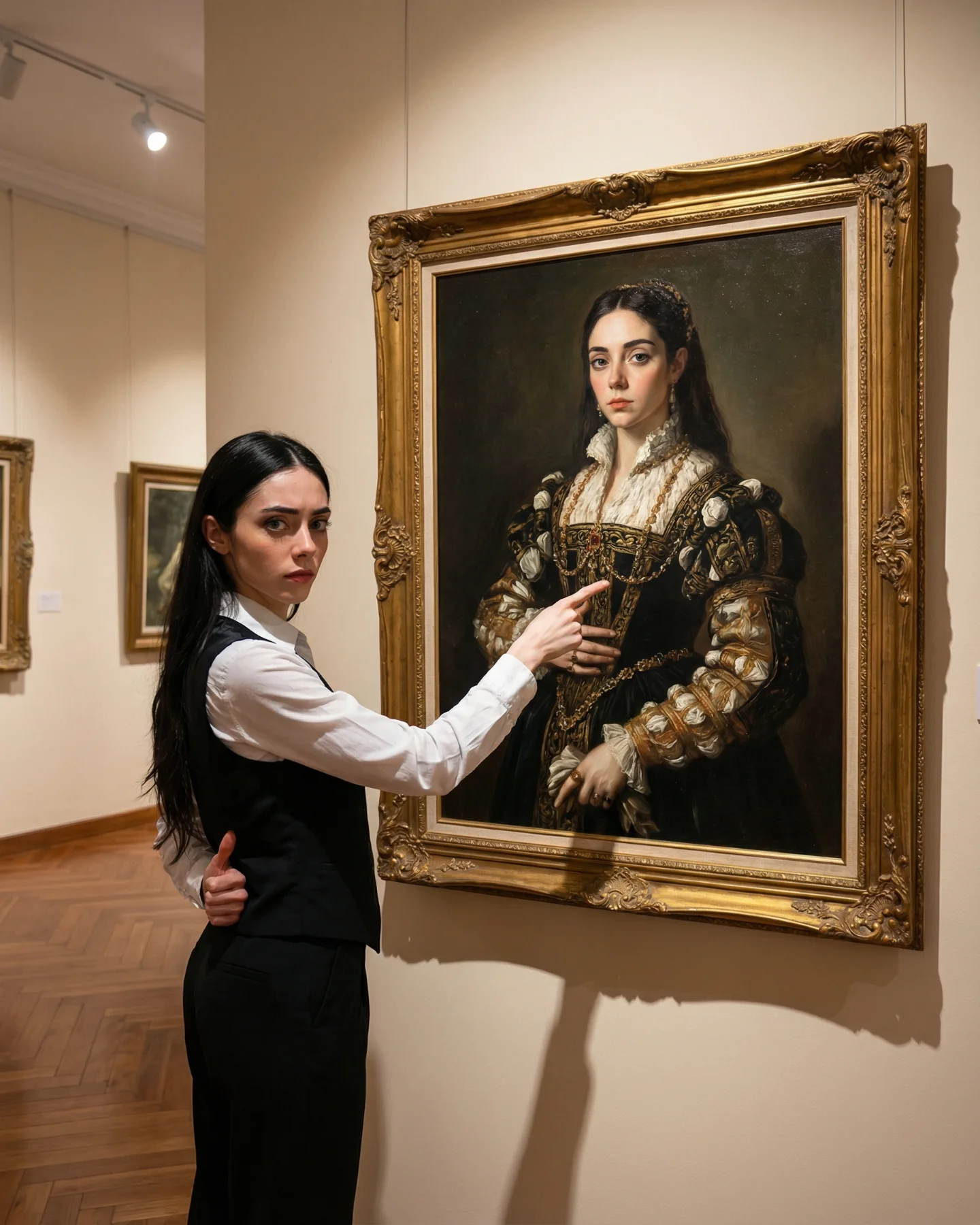
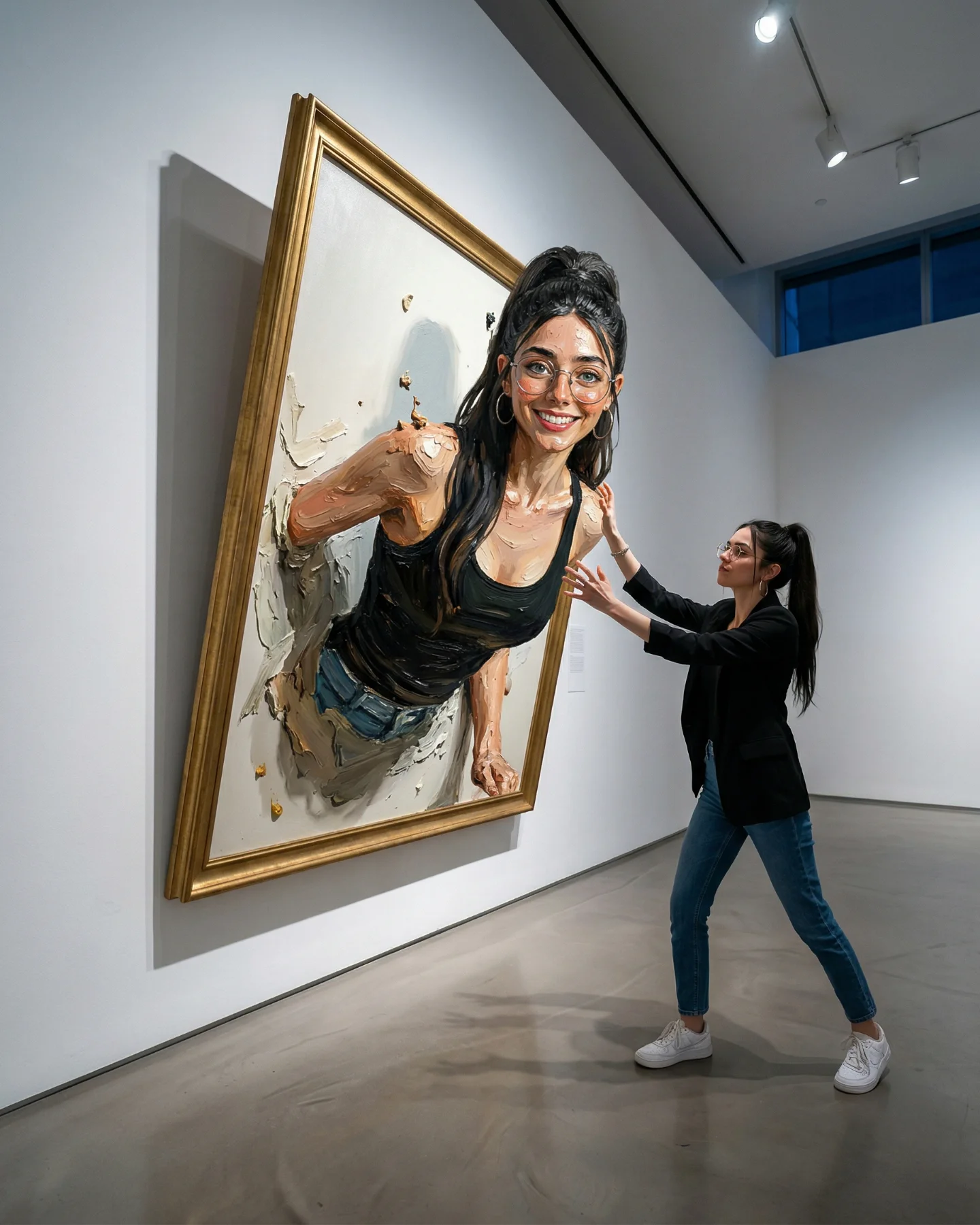
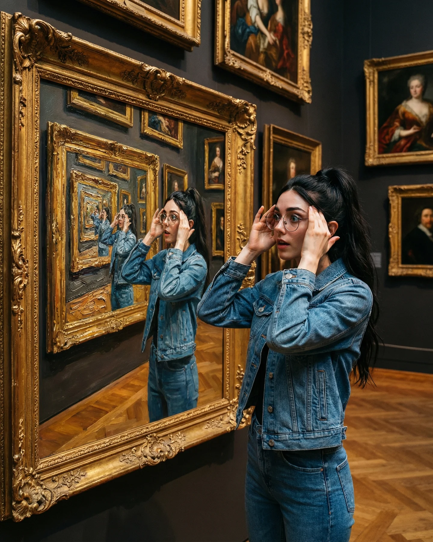
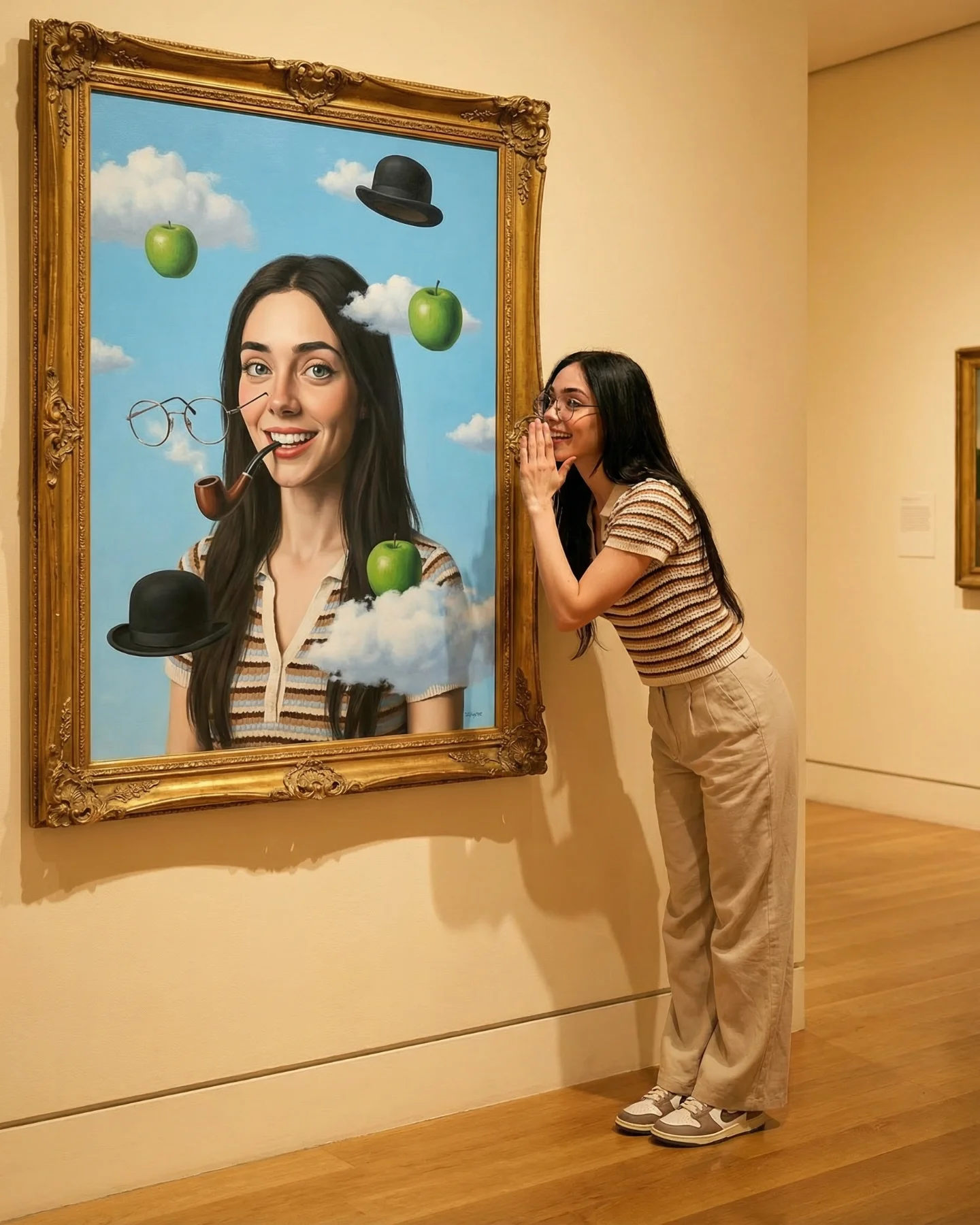
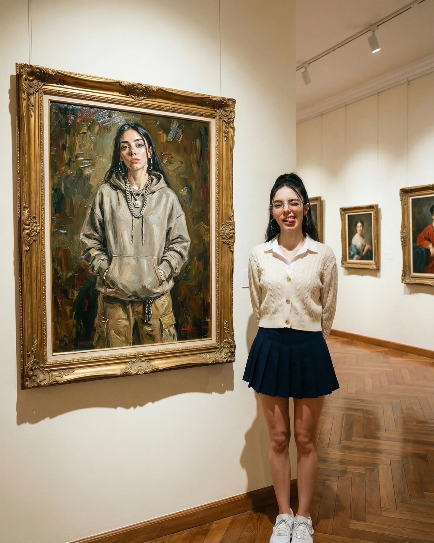
This image works because it borrows authority from a museum wall and then breaks that authority with a playful visual glitch. You are looking at one woman three times, but the frame arrangement makes the repetition feel like an idea rather than a copy-and-paste trick. That is the difference between a prompt that is merely “clever” and a post that makes people stop, smile, and immediately imagine their own remix.
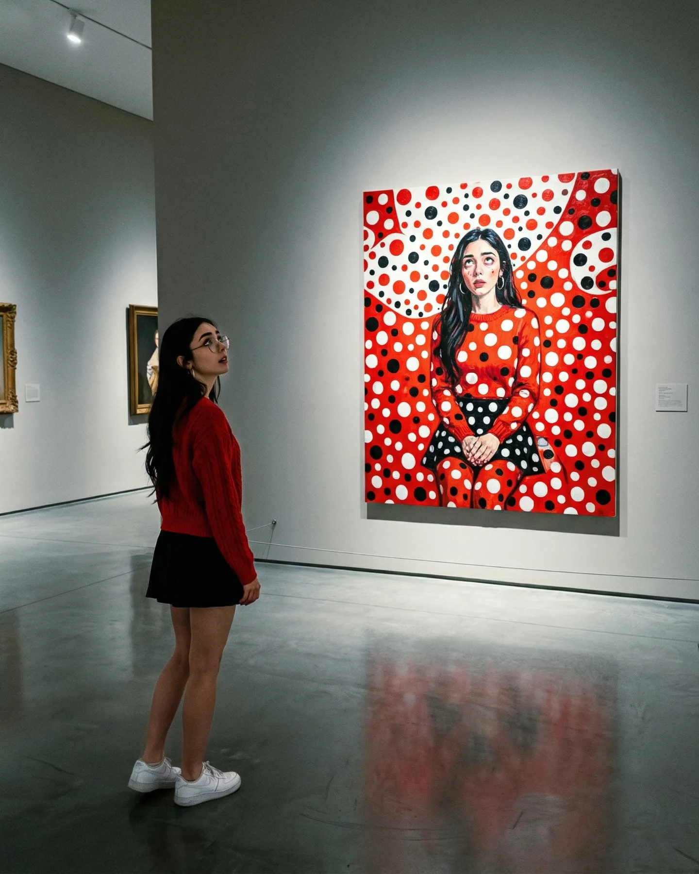
The caption is minimal, but the creative signal is loud. A gray hoodie, a black skirt, white sneakers, and a recognizable gallery setting make the image easy to read in less than a second. Then the eye notices the impossible action: one version stepping out, one version hanging from the frame, one version standing in the middle as if she is the only normal person in the room. That layered reveal creates the replay value. You understand the scene fast, but you still spend another beat checking how the illusion was built.
What makes this post shareable is not just surrealism. It is structured surrealism. The outfit is ordinary, the museum is familiar, and the visual trick is easy to retell: “she turned herself into the art.” That sentence is simple enough for comments, repost captions, and creator imitation. The image also gives viewers a built-in participation prompt. If you create AI content, you instantly want to know how to reproduce the frame illusion, how many clones to use, and what text treatment to add on top.
There is also a soft educational promise in the composition. The headline text says “ART Prompts,” which turns the picture from pure entertainment into perceived utility. Viewers are not only consuming the image; they are decoding it as a prompt example. That matters for growth, because utility-based creative posts tend to earn saves and comments from smaller creators who want to reuse the format in their own niche.
| Signal | Evidence (from this image) | Mechanism | Replication Action |
|---|---|---|---|
| Fast readable concept | One girl appears three times, with two copies interacting with gold frames | The brain understands the hook instantly, so the post wins the first second of attention | Lock one simple visual sentence before prompting: one subject, one impossible action, one familiar place |
| High contrast between normal and impossible | Casual hoodie-and-sneakers styling inside a formal museum gallery | Everyday wardrobe makes the surreal frame escape feel more surprising and memorable | Keep the clothing casual and realistic while raising the scene concept, not the fashion complexity |
| Creator utility | Top text explicitly frames the post as a prompt example | Utility language turns curiosity into saves, comments, and remixes | Add a short on-image label that names the prompt family or technique without over-explaining it |
| Replay detail | Each clone has a different pose and role in the scene | Viewers spend longer checking pose logic and spatial relationships | Design clone poses with different verbs such as stepping out, hanging, standing, looking back |
This visual language is strongest when you want a post to feel both artistic and teachable. It fits prompt roundups, AI art tutorials, creator education carousels, and entertainment-first reels covers. It also works well for personal brand accounts that want to look imaginative without becoming visually chaotic.
It is less ideal for product-led posts, dense storytelling scenes, or niches that require many objects in frame. The power here comes from clean reading order. If you overload the gallery with props, text, or extra characters, the illusion stops feeling elegant and starts feeling busy.
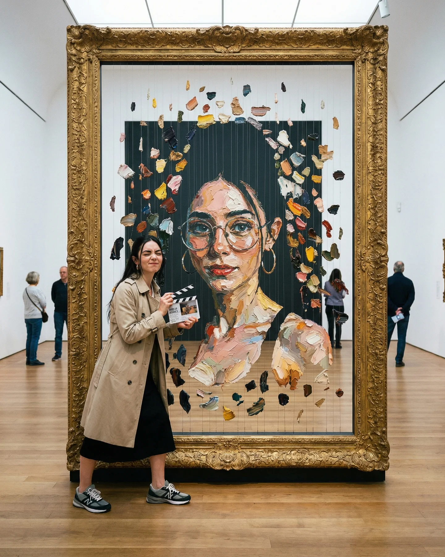
{museum scene} {editorial wardrobe} {frame interaction pose} {luxury mood}{heritage location} {travel outfit} {architectural opening} {cinematic mood}{indoor lifestyle space} {casual outfit} {reflection object} {soft cozy mood}The strongest aesthetic choice is restraint. The palette stays inside warm beige, soft gray, black, white, and old gold. That limited range makes the surreal idea feel polished instead of noisy. The second smart move is the use of full-body framing. You can read the sneakers, legs, skirt silhouette, hoodie volume, and frame scale in one glance, which helps the illusion feel physically credible.
The lighting is another quiet advantage. This is not dramatic studio lighting. It is believable overhead museum light with enough warmth to flatter skin and enough shadow to anchor each figure onto the wall and floor. That realism matters because impossible concepts only work when the surrounding physics feel stable. Even the blurred visitors in the background help; they make the gallery feel occupied and real, which makes the frame-breaking action feel more magical.
| Observed | Why It Matters | How To Recreate |
|---|---|---|
| Warm overhead spotlights with gentle falloff | Keeps the museum believable and gives gold frames dimensionality | Prompt warm gallery track lighting, soft downward shadows, no flash look |
| Three-clone arrangement with distinct gestures | Creates rhythm and makes the viewer scan left-center-right | Write three separate pose clauses instead of one generic “three versions” prompt |
| Neutral wardrobe against ornate frames | Lets the frames and action carry the drama | Use casual muted clothing and avoid loud prints or color blocks |
| Clean wall and floor with limited background clutter | Protects readability on small screens | Keep the environment sparse and place only one or two blurred visitors in the distance |
If you want this result, do not start by writing “surreal museum photo.” Start by locking the control points that make the illusion legible. Think in blocks. First define clone count and pose roles. Then define the frame type. Then define the lighting. Only after that should you add style polish.
| Prompt chunk | What it controls | Swap ideas (EN, 2-3 options) |
|---|---|---|
| three versions of the same woman, left emerging, center shrugging, right hanging from frame | Scene logic and visual hook | “left climbing out / center looking up / right sitting on frame”; “left reaching outward / center hands in pockets / right leaning back” |
| ornate antique gold museum frames on a cream gallery wall | Authority, setting, and contrast | “baroque gold frames”; “minimal black frames”; “arched vintage mirrors” |
| oversized gray hoodie, black pleated mini skirt, white sneakers | Accessibility and casual relatability | “beige trench coat”; “school-uniform styling”; “soft knit sweater and loafers” |
| warm overhead track lighting, realistic museum ambiance | Believability and mood | “soft daylight from skylight”; “moody tungsten spotlight”; “clean white gallery lighting” |
| vertical 4:5 full-body composition with center clone between frames | Readability on social feeds | “wide environmental portrait”; “closer 3/4 crop”; “symmetrical frontal composition” |
| photoreal surreal editorial composite, subtle depth of field | Finish quality | “cinematic realism”; “glossy fashion editorial”; “soft filmic realism” |
The fastest way to converge is to lock the non-negotiables first. Baseline lock: the left-center-right composition, the warm museum lighting direction, and the ornate gold frame scale. If those three are unstable, every later improvement will feel random. After that, follow a one-change rule. Change only one or two knobs per run so you can see what actually caused the improvement.
If the image starts drifting, do not rewrite the whole prompt. Add a corrective clause for the single broken part. That is especially important in clone scenes, because over-editing usually causes the model to lose one figure or collapse the pose logic.