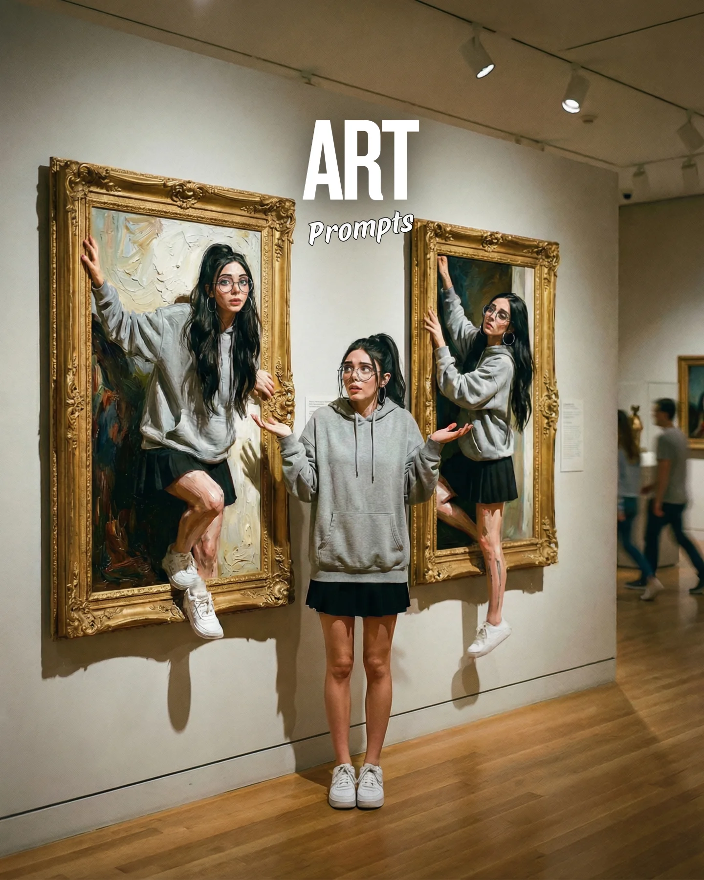

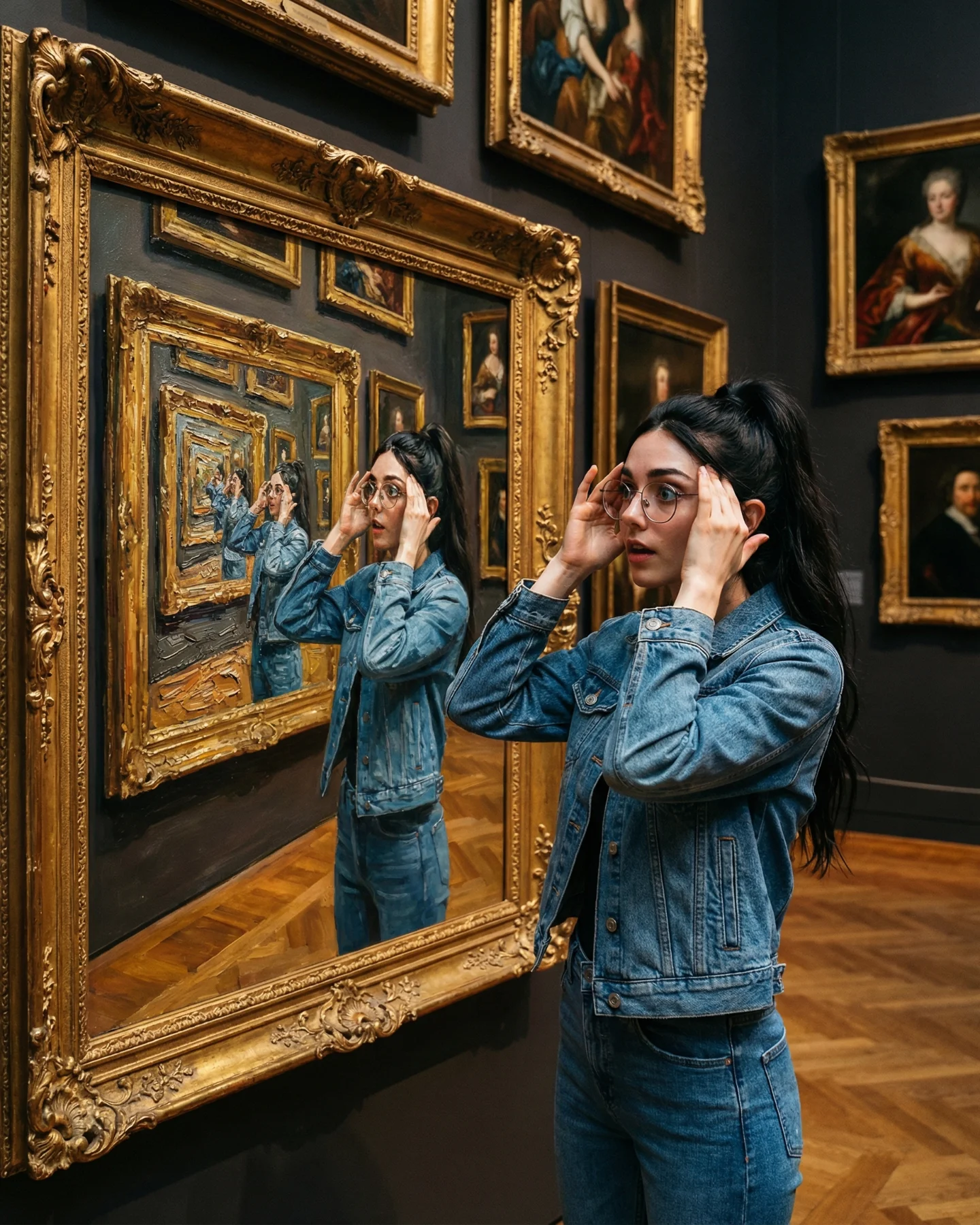
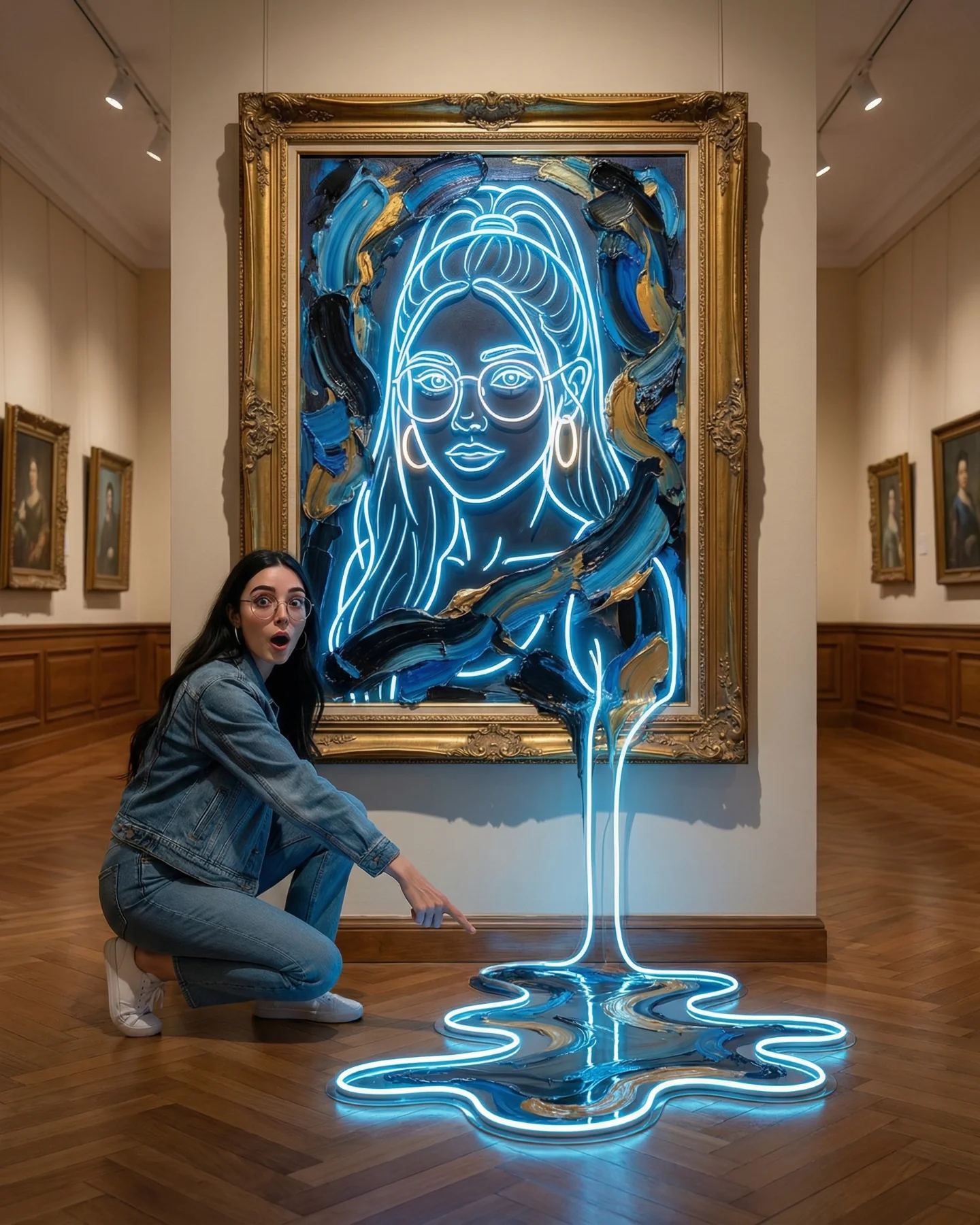
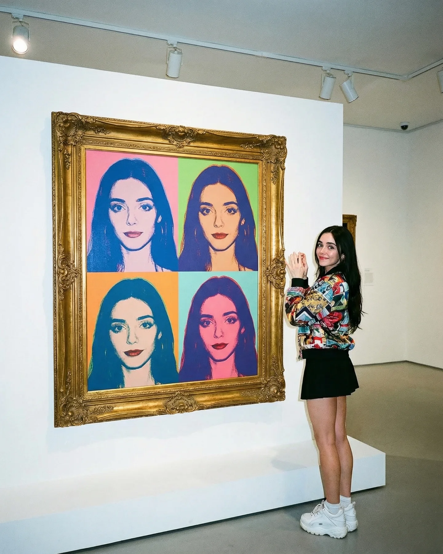
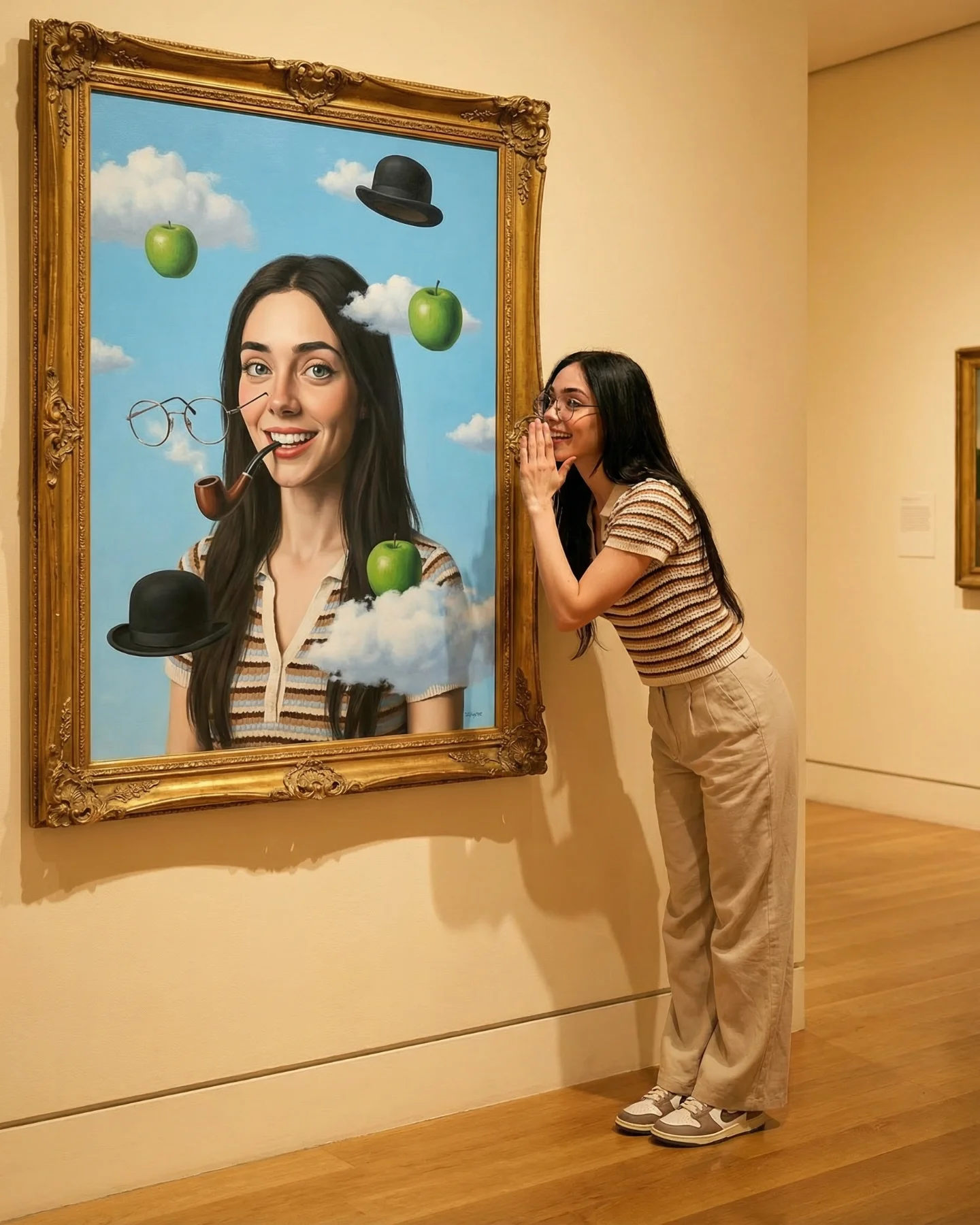
Arte Moderno 🎭🎨 Comenta "ARIA" y te paso todos los prompts 💌
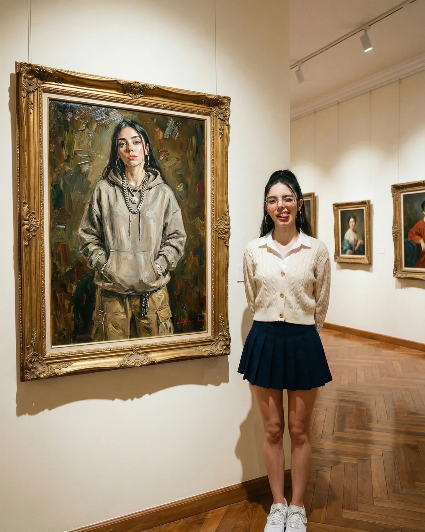
Arte Moderno 🎭🎨 Comenta "ARIA" y te paso todos los prompts 💌
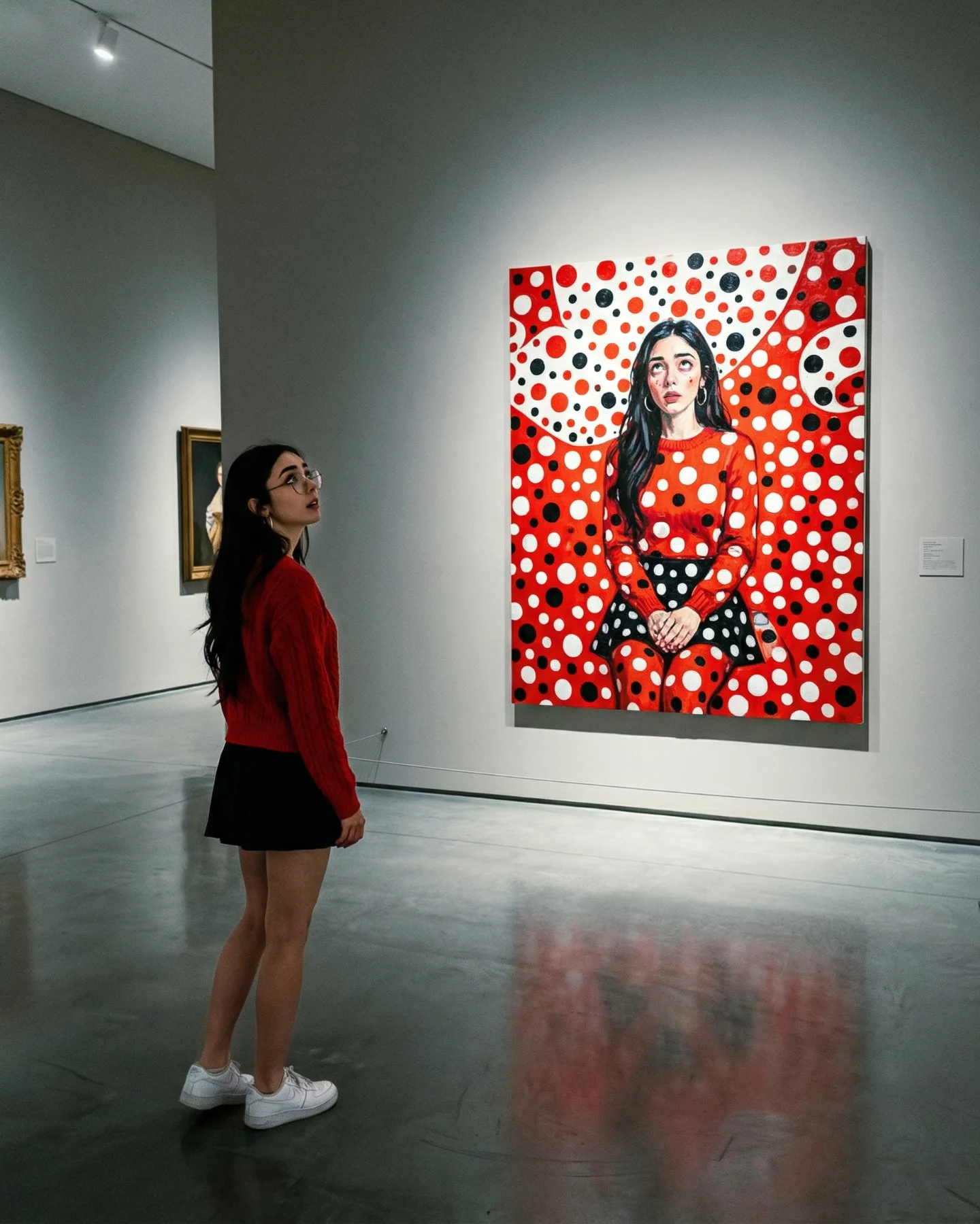
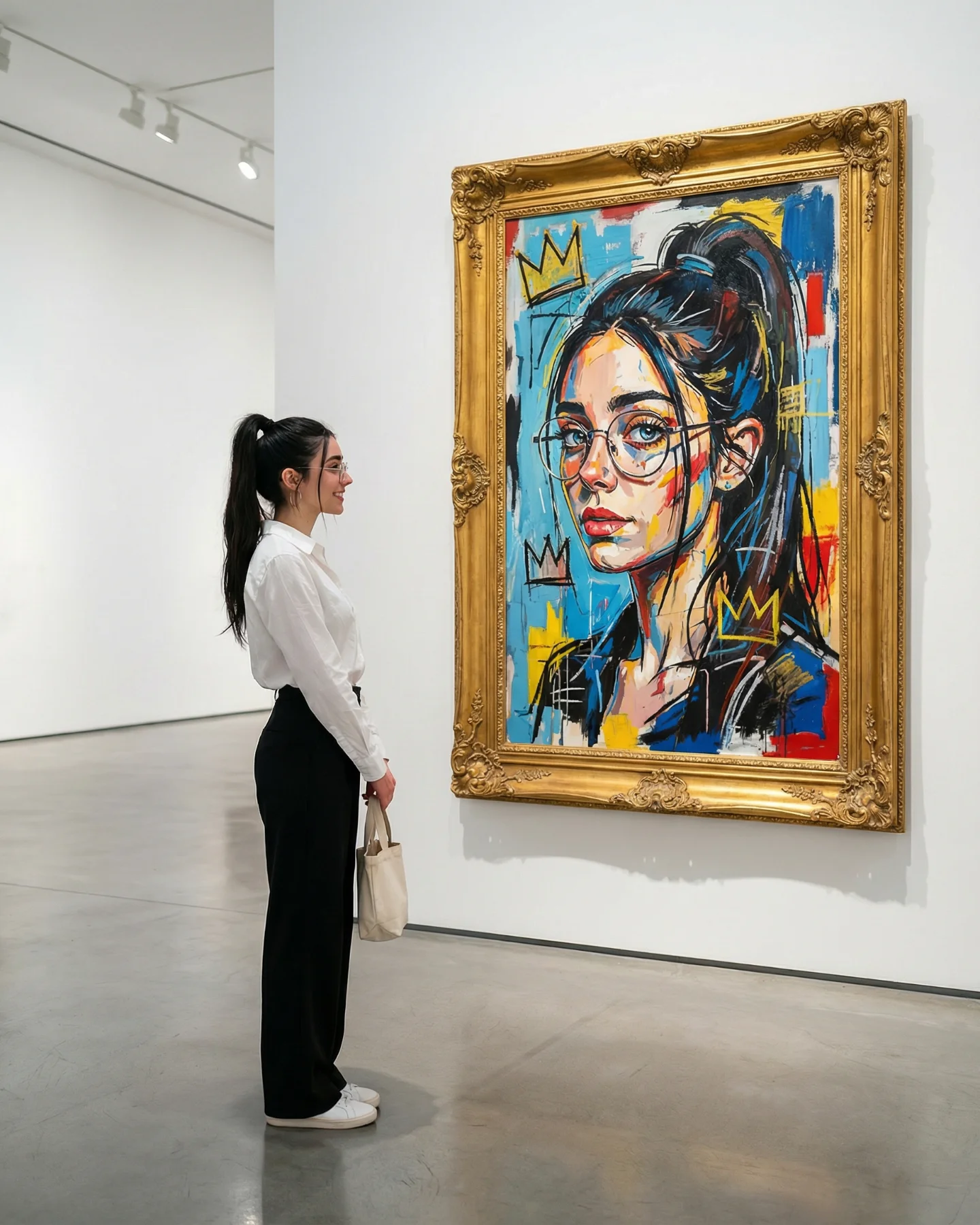
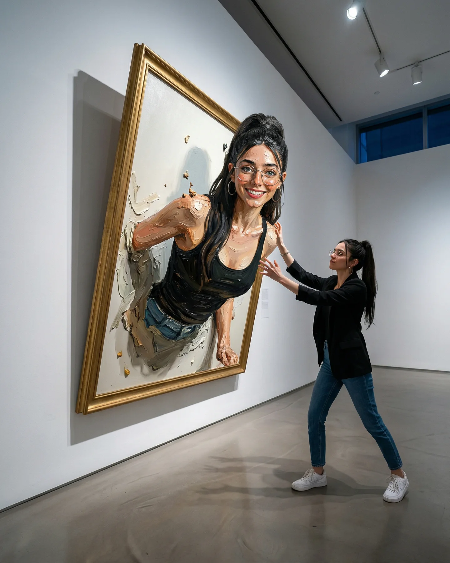
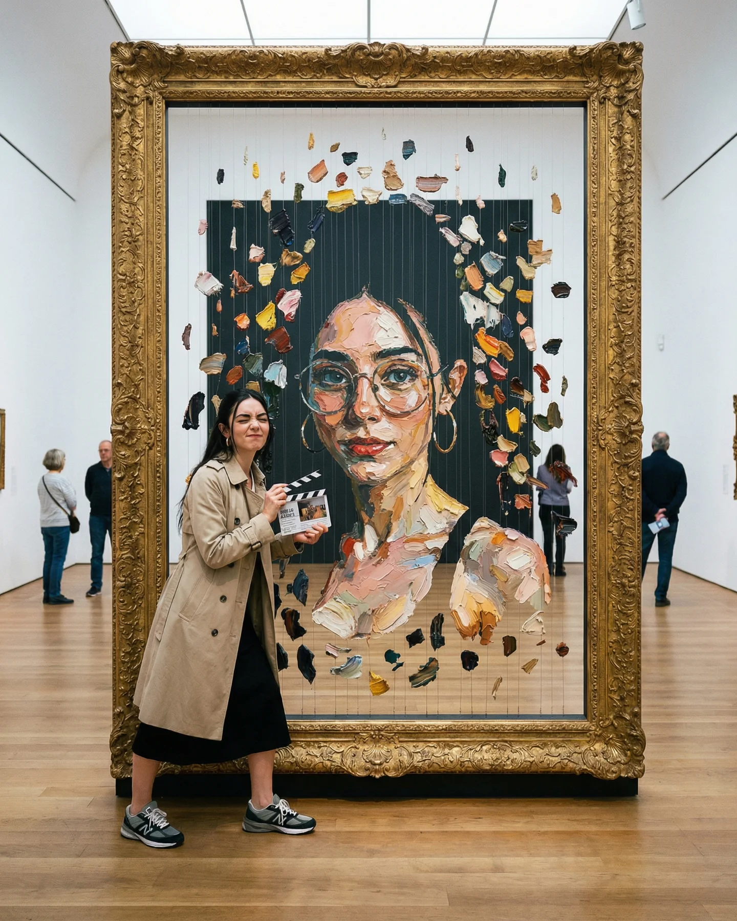
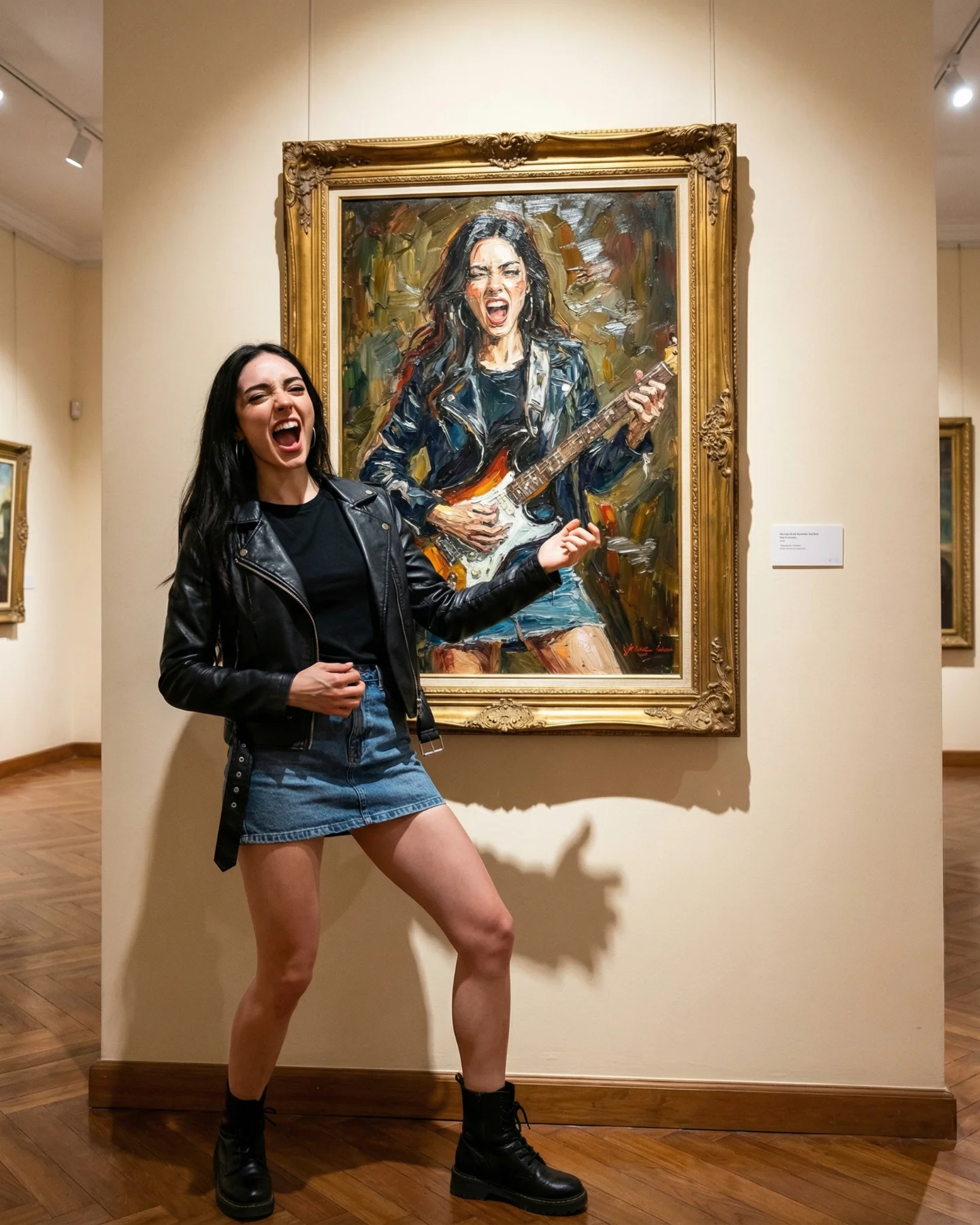
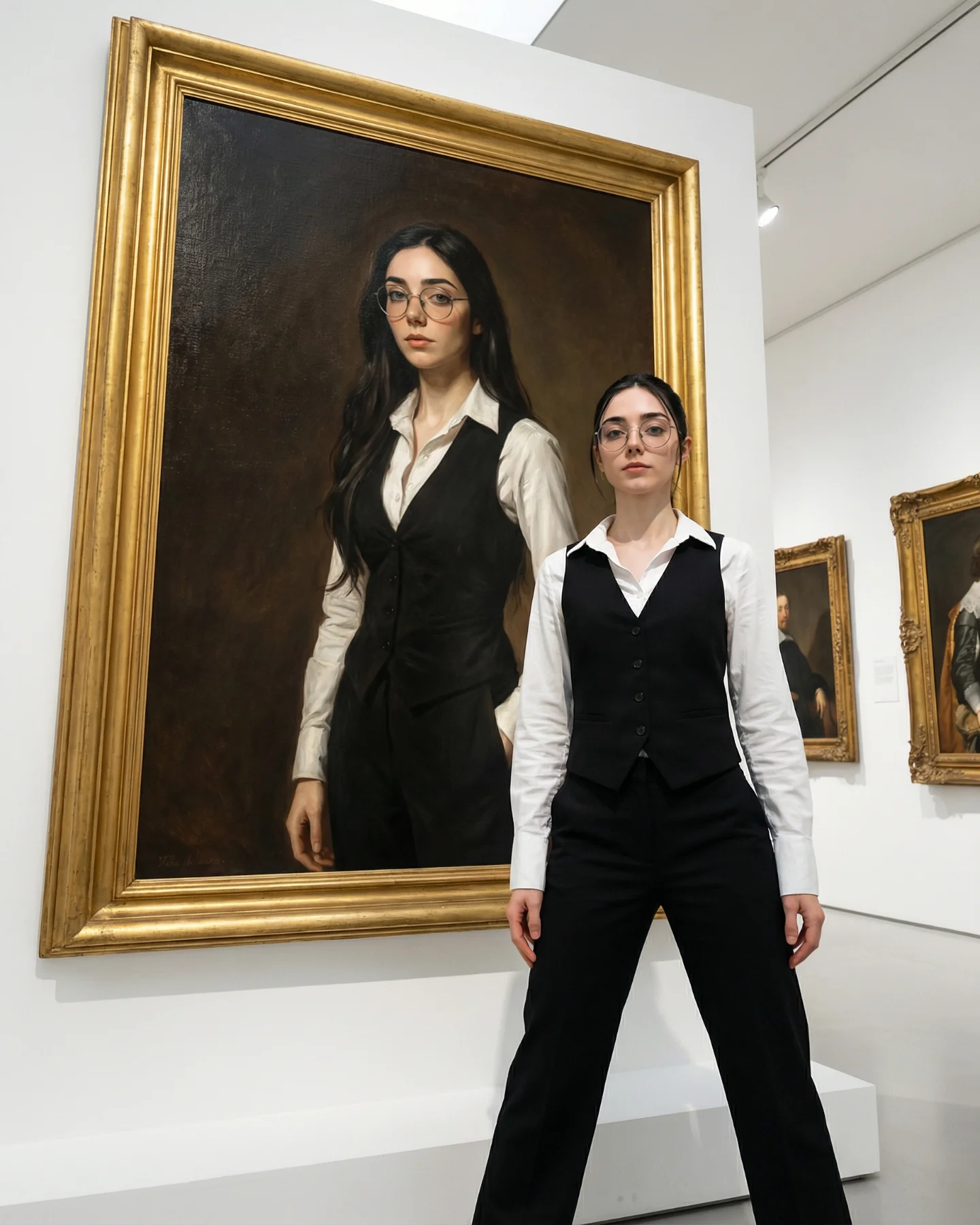
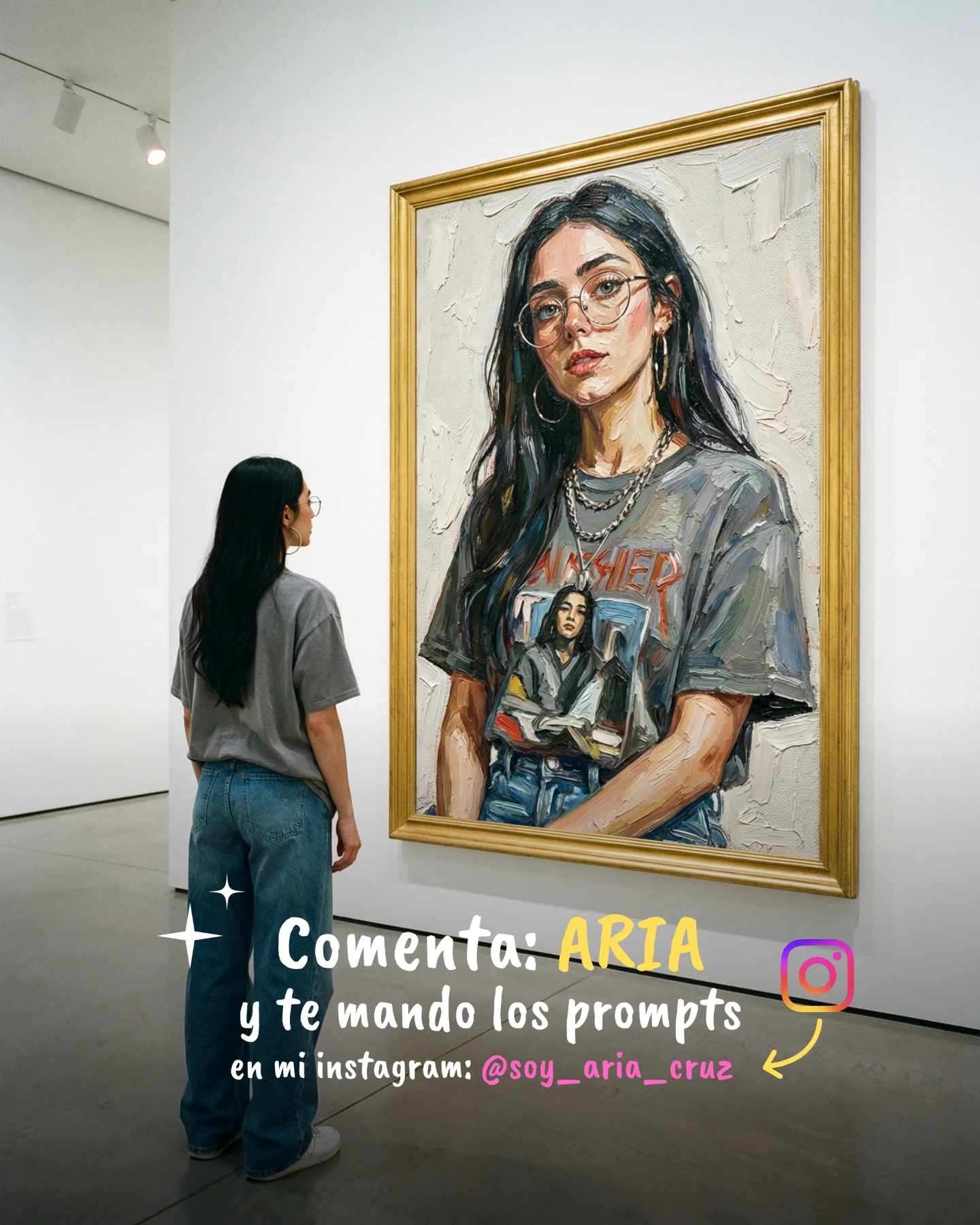
This image does not rely on motion tricks or surreal frame-breaking. Its strength comes from identity contrast. The real woman is understated: red sweater, black skirt, white sneakers, calm posture. The painted version is loud, patterned, and impossible to ignore. That split makes the scene feel like a conversation between everyday self and stylized persona rather than just “girl in museum.”
The contrast is especially effective because it is anchored by one repeated color. The real-world sweater and the red-heavy painting belong to the same visual family, so the connection reads instantly. That small continuity move is what keeps the image from feeling random. It turns the museum wall into an amplified version of the same identity.
The post works because it gives the viewer two entry points at once. One is aesthetic: the red-and-white dot painting is graphic and immediately readable. The other is emotional: the real subject is standing there almost like a spectator to her own transformed self. That duality creates a clean social story. People can read it as style inspiration, as self-reflection, or as a prompt concept they want to recreate.
There is also a strong remix mechanism built into the image. The structure is simple enough to transfer: one real person, one oversized wall portrait, one aesthetic exaggeration. You can swap the art movement, wardrobe, or palette without losing the core idea. That is exactly the kind of format smaller creators can reuse across niches.
| Signal | Evidence (from this image) | Mechanism | Replication Action |
|---|---|---|---|
| Clear self-to-art relationship | The woman stands looking at a portrait version of herself in matching red tones | Identity-based concepts are easier to interpret and repost | Tie the real subject to the artwork with one shared anchor such as color, pose, or hairstyle |
| High-contrast art style | The painting uses dense red, white, and black polka-dot patterning | Graphic pattern makes the artwork legible even on small screens | Choose one dominant visual system and push it hard inside the artwork only |
| Quiet real-world styling | The viewer’s outfit is simple and modern | Minimal styling outside the art prevents visual competition | Keep the real subject clean and restrained when the artwork is already loud |
| Museum authority | The large canvas hangs in a polished gallery with open space and reflections | Gallery context makes the concept feel elevated rather than novelty-only | Use museum architecture and scale to frame the artwork as something worth studying |
This prompt format is strong for creators who want to explore persona, style systems, or “what if my identity became an art movement?” content. It fits AI art accounts, fashion creators, visual educators, and moodboard pages that want something more thoughtful than a straightforward portrait.
It is less effective for high-chaos surrealism, crowded narrative scenes, or product-led content. The post wins through clarity and contrast, not plot density.
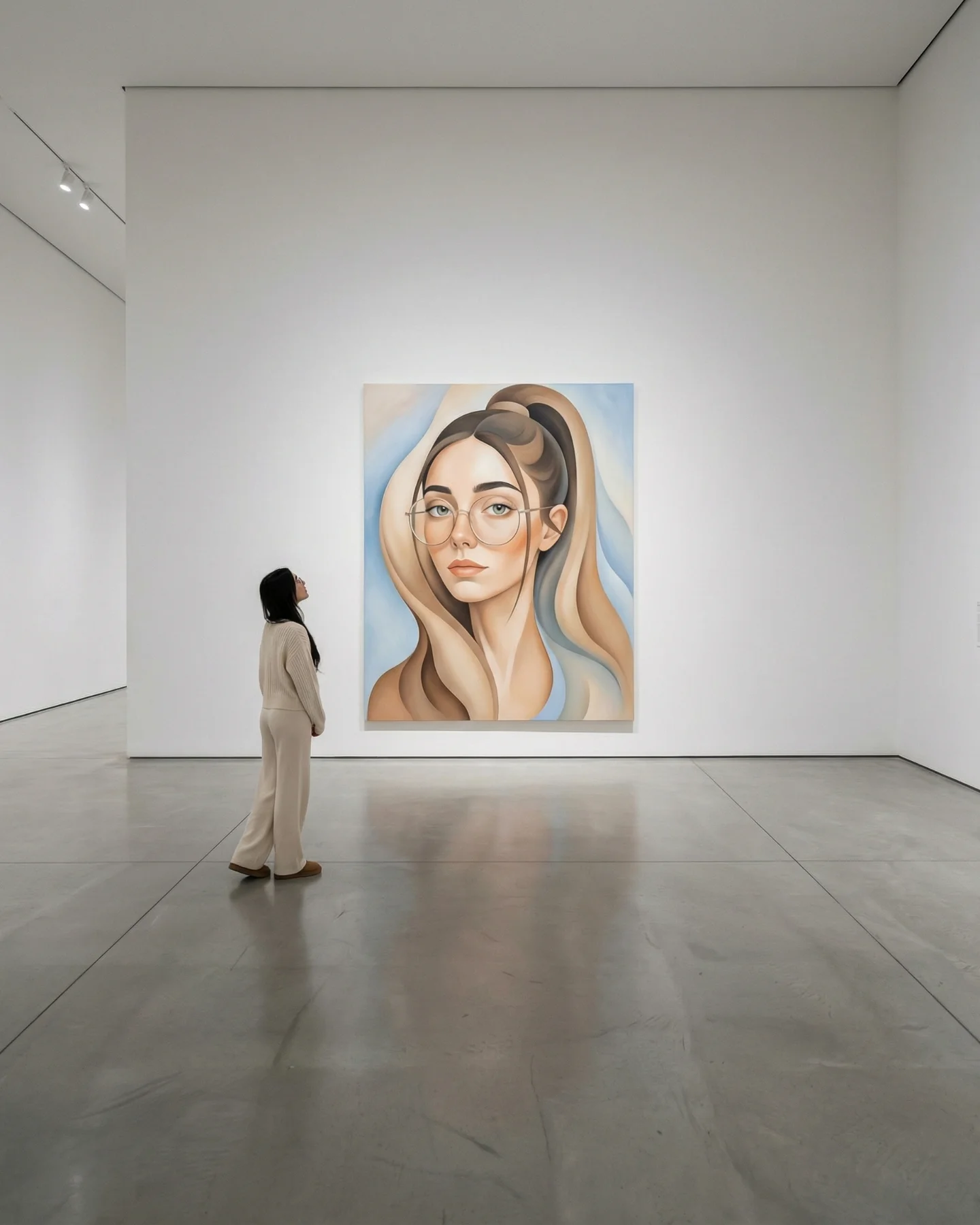
{museum room} {simple real outfit} {oversized stylized self-portrait} {single visual motif}{gallery wall} {minimal wardrobe} {self portrait in ink style} {contemplative mood}{modern museum scene} {matching color accent} {collage self-portrait} {bold editorial energy}The smartest aesthetic choice here is scale. The painting is large enough to feel authoritative, while the woman remains small enough to feel like a viewer first. That asymmetry gives the artwork psychological power. It feels less like she made a portrait and more like she is confronting a louder version of herself.
The polished floor helps too. It catches a soft echo of the red canvas and makes the room feel more expensive and intentional. Without that reflective surface, the scene would still work, but it would lose some of its quiet theatricality. The empty space around both figures also matters. It gives the viewer time to read the contrast instead of rushing past it.
| Observed | Why It Matters | How To Recreate |
|---|---|---|
| Red sweater outside, red motif inside the painting | Creates immediate identity continuity | Use one shared color between the real subject and the stylized portrait |
| Dense dot pattern only inside the artwork | Keeps the style system legible and contained | Confine the bold visual motif to the canvas rather than the whole room |
| Small figure looking upward at oversized painting | Makes the artwork feel elevated and psychologically larger | Place the real subject lower and farther away from the canvas |
| Cool gray gallery with reflective floor | Balances the heat of the red artwork and adds polish | Use a muted architectural space with subtle reflective surfaces |
To reproduce this kind of image well, you need to control two visual languages at once. The real-world figure should feel contemporary and quiet. The painting should feel obsessive, graphic, and stylized. If those two modes bleed into each other, the image becomes muddled. So the prompt needs a clear separation between “viewer” and “art object.”
| Prompt chunk | What it controls | Swap ideas (EN, 2-3 options) |
|---|---|---|
| young woman in a red sweater looking at a large self-portrait in a museum | Core narrative relationship | “man viewing his painted double”; “woman facing her digital self”; “visitor confronting stylized self-portrait” |
| red, white, and black all-over polka-dot portrait style | Artwork identity and graphic impact | “floral maximalism”; “comic-book pop art”; “monochrome geometric abstraction” |
| gray contemporary gallery with polished reflective floor | Architectural mood and authority | “white cube gallery”; “dark museum room”; “arched institutional hall” |
| red sweater, black pleated skirt, white sneakers | Real-world simplicity and color echo | “cream sweater and loafers”; “black turtleneck and trousers”; “red dress with flats” |
| large wall-mounted canvas with small side label | Museum authenticity | “framed painting”; “canvas floating mount”; “triptych installation” |
| soft neutral gallery light and subtle floor reflections | Finish and polish | “warmer museum light”; “cool white gallery light”; “gentle spotlight emphasis on canvas” |
Baseline lock: the viewer-to-painting scale relationship, the red continuity between outfit and canvas, and the separation between quiet realism and maximalist art style. Those three decisions define the whole image.
The deeper lesson is useful for prompt design in general: bold style becomes more powerful when it has something calm to push against. This image understands that. The art is loud, the viewer is quiet, and the tension between them is exactly what makes the post feel memorable.