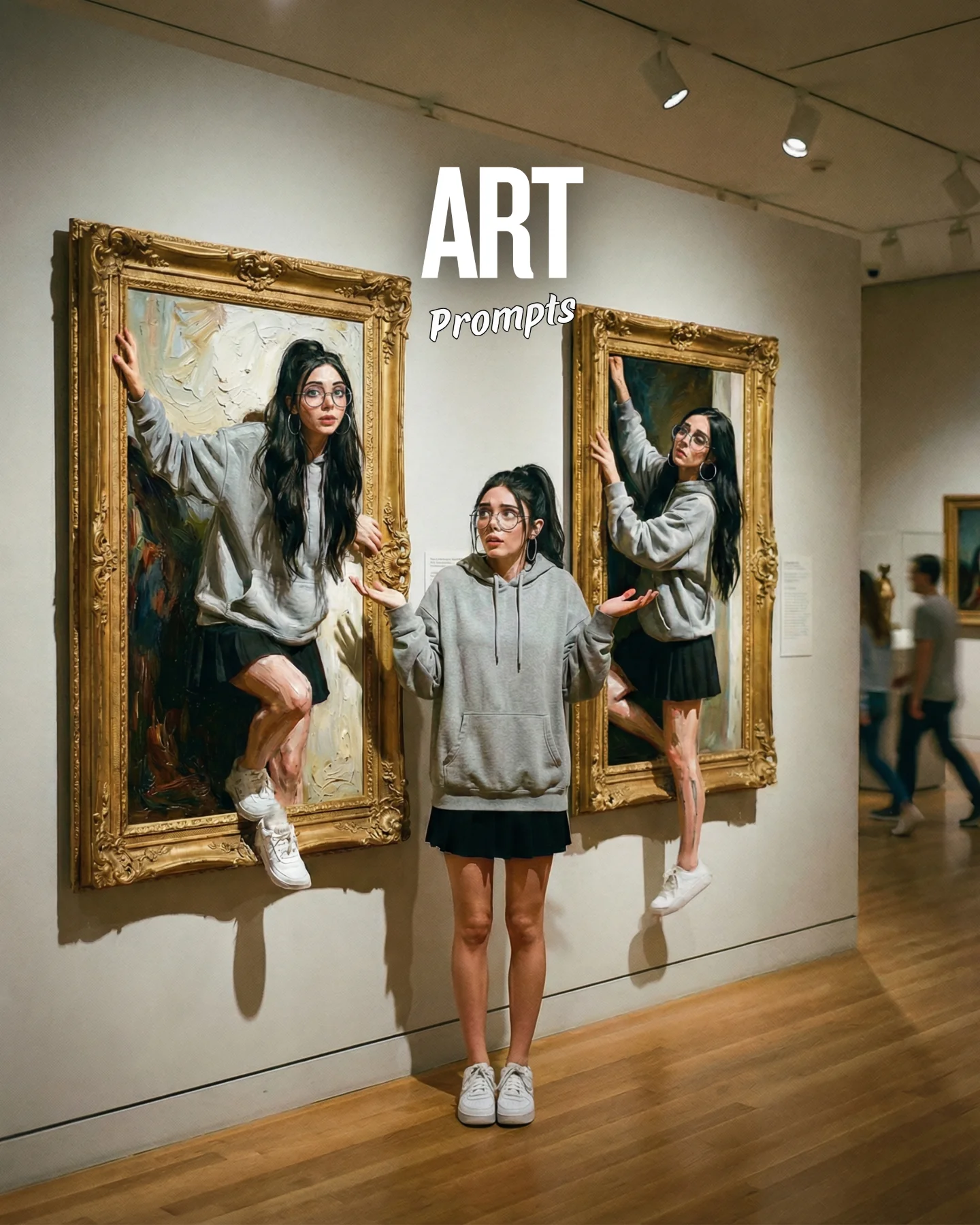

Arte Moderno 🎭🎨 Comenta "ARIA" y te paso todos los prompts 💌
Arte Moderno 🎭🎨 Comenta "ARIA" y te paso todos los prompts 💌
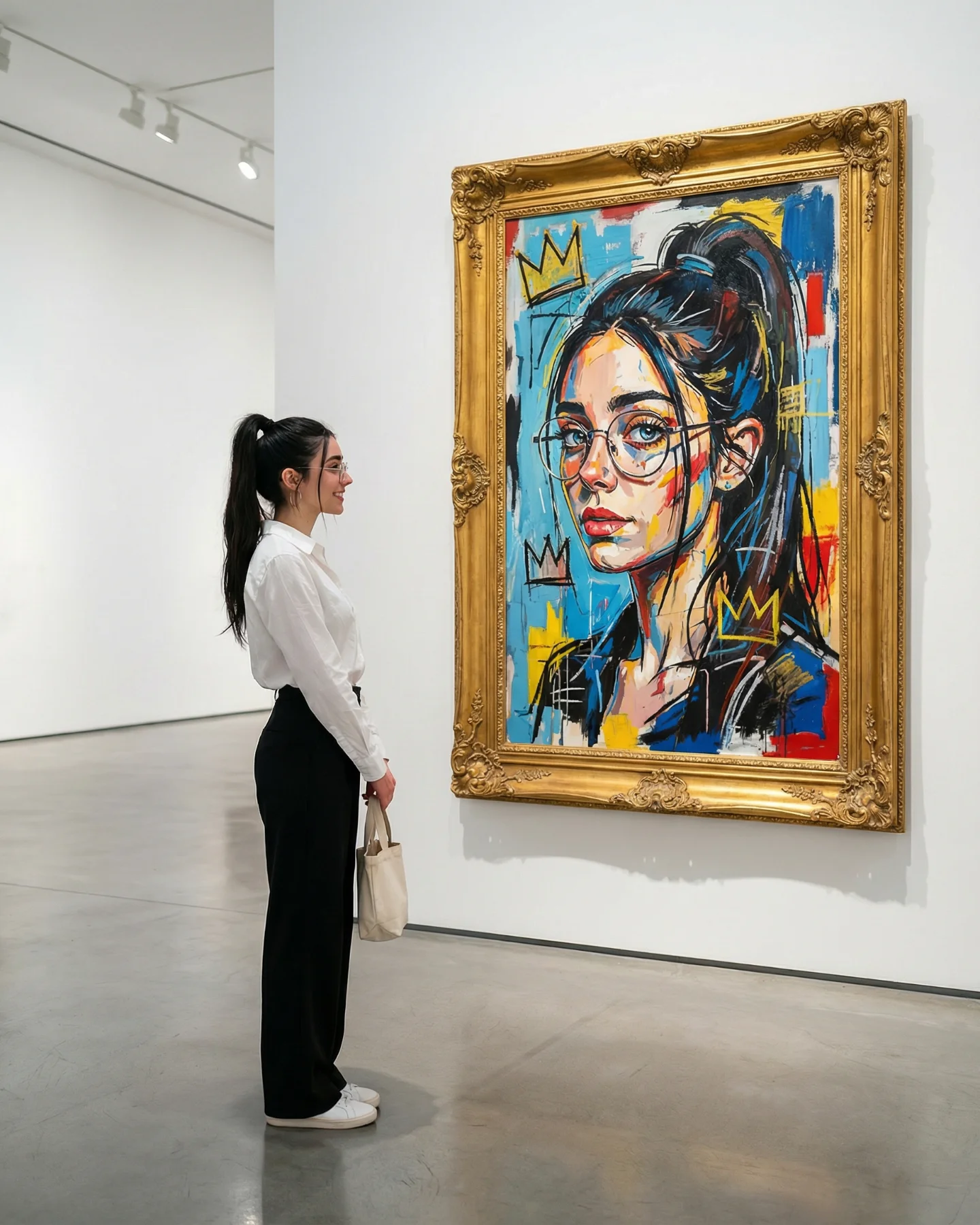
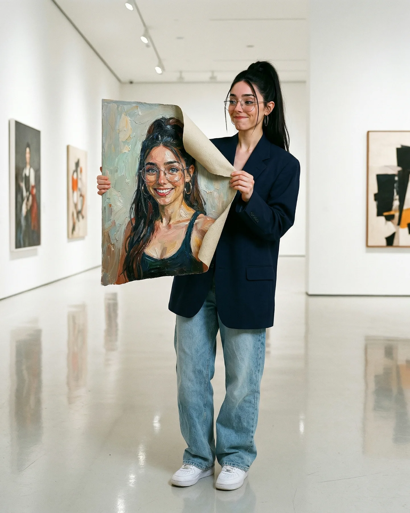
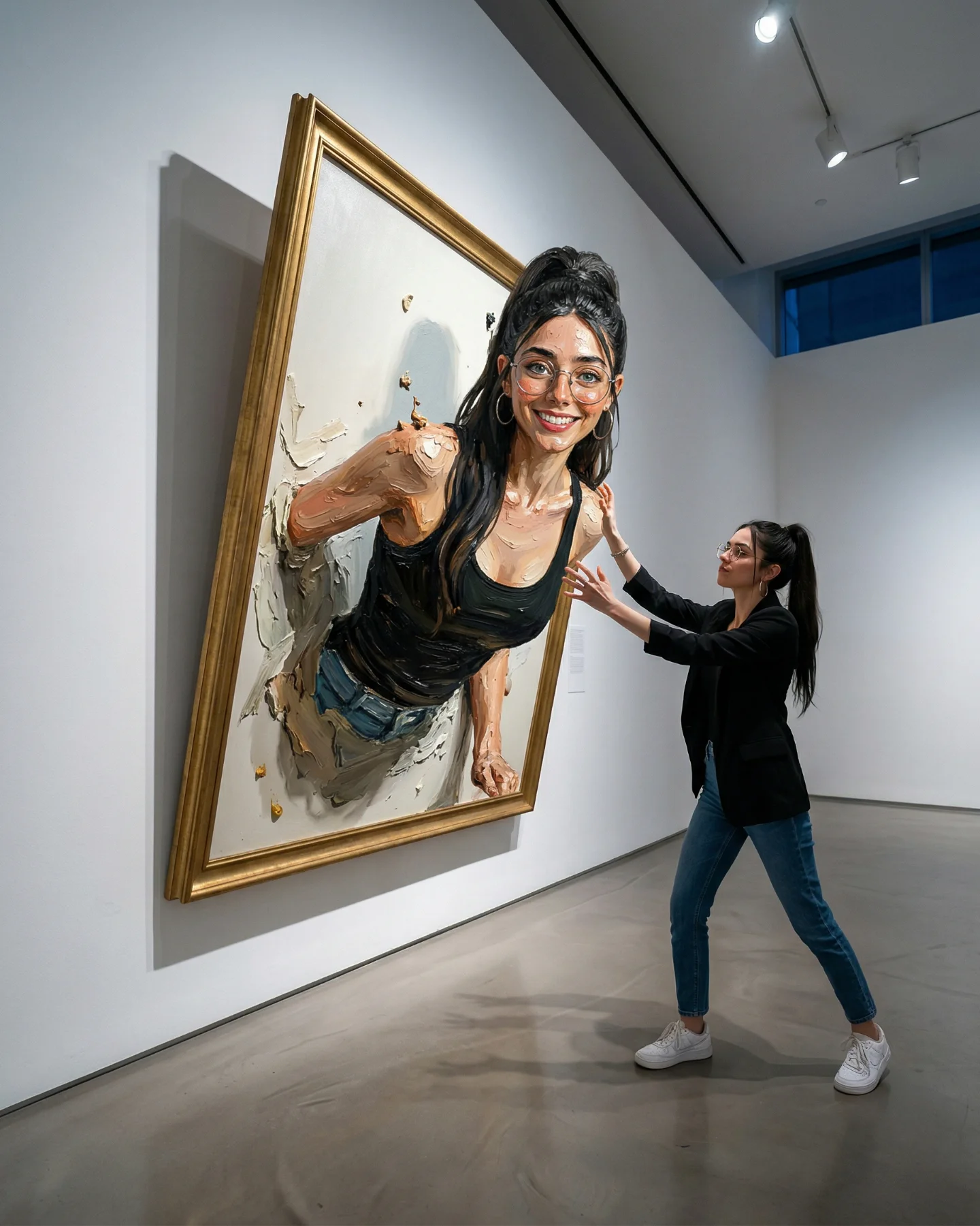
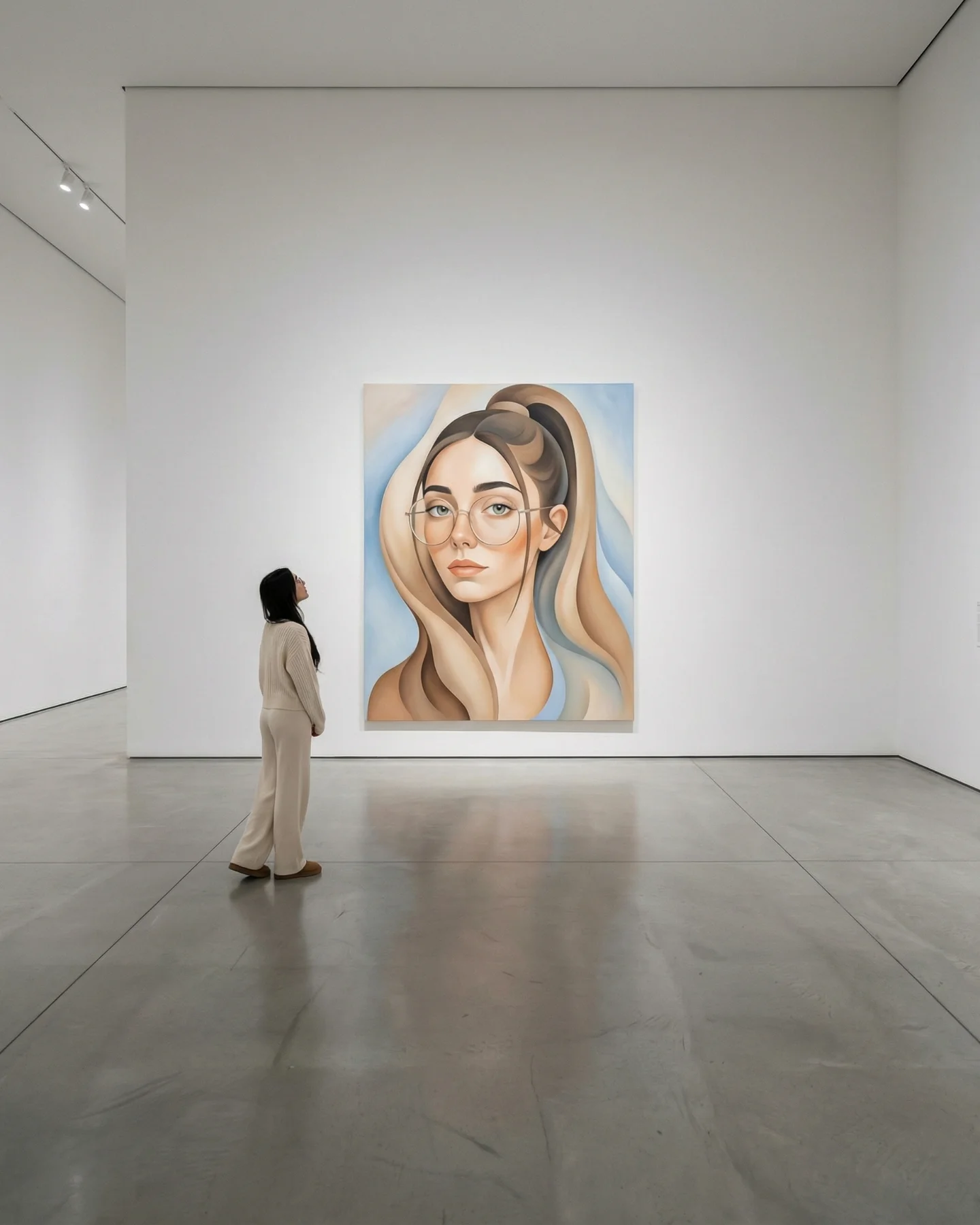
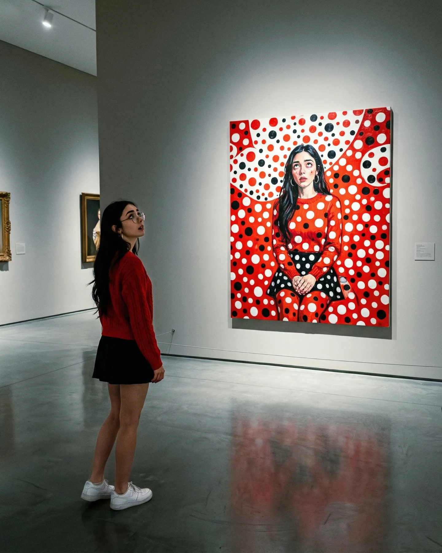
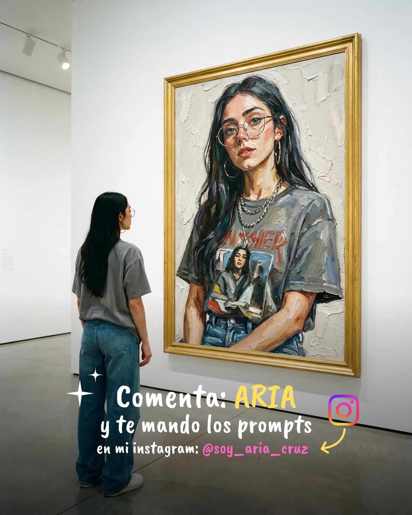
This image lands because it does two jobs at once. It gives you a scene with immediate cultural context, and it wraps that scene around a simple emotional action: one person pausing to look. That is why the frame feels richer than a normal fashion shot or a normal gallery snapshot. You are not just looking at an outfit or a painting. You are looking at taste, self-positioning, and aspiration compressed into one clean visual statement.
For small creators, that matters. The post reads fast in-feed because the structure is legible in under a second: woman on the left, artwork on the right, white space everywhere else. But the image does not feel empty. The bright portrait inside the gold frame creates the tension that keeps the eye there longer. The result is a post that feels premium, thoughtful, and still easy to remix.
The strongest growth mechanic here is contrast discipline. The room is almost monochrome: white walls, gray floor, black trousers, white blouse. That makes the framed portrait do the heavy lifting. The saturated blue, yellow, and red inside the painting become the hook, while the real woman acts as the entry point. Viewers can imagine themselves in the scene, which is a much stronger retention device than showing the art alone.
There is also a useful identity loop in the composition. The woman looking at a portrait of another woman creates a subtle mirror effect. It suggests taste, introspection, and curation. That is exactly the kind of signal that gets saved, shared, and used as reference by creators building a more elevated visual brand.
| Signal | Evidence (from this image) | Mechanism | Replication Action |
|---|---|---|---|
| Immediate readability | One viewer, one artwork, lots of clean wall space | Low visual clutter improves scroll-stop speed and memory | Lock the scene to one human subject and one hero object before changing anything else |
| Status through restraint | Minimal outfit and neutral gallery environment let the art carry the color | Restraint reads as premium and intentional rather than noisy | Turn saturation down in the room, then concentrate color in a single focal element |
| Mirror narrative | A real woman studies a stylized female portrait | Viewers project themselves into the scene and stay longer | Pair a human observer with a symbolic object that reflects identity, ambition, or taste |
| Cultural framing | Museum setting plus ornate frame signals taste and credibility | Context upgrades a simple pose into a lifestyle statement | Use location cues that imply curation: gallery, archive, showroom, studio, or library |
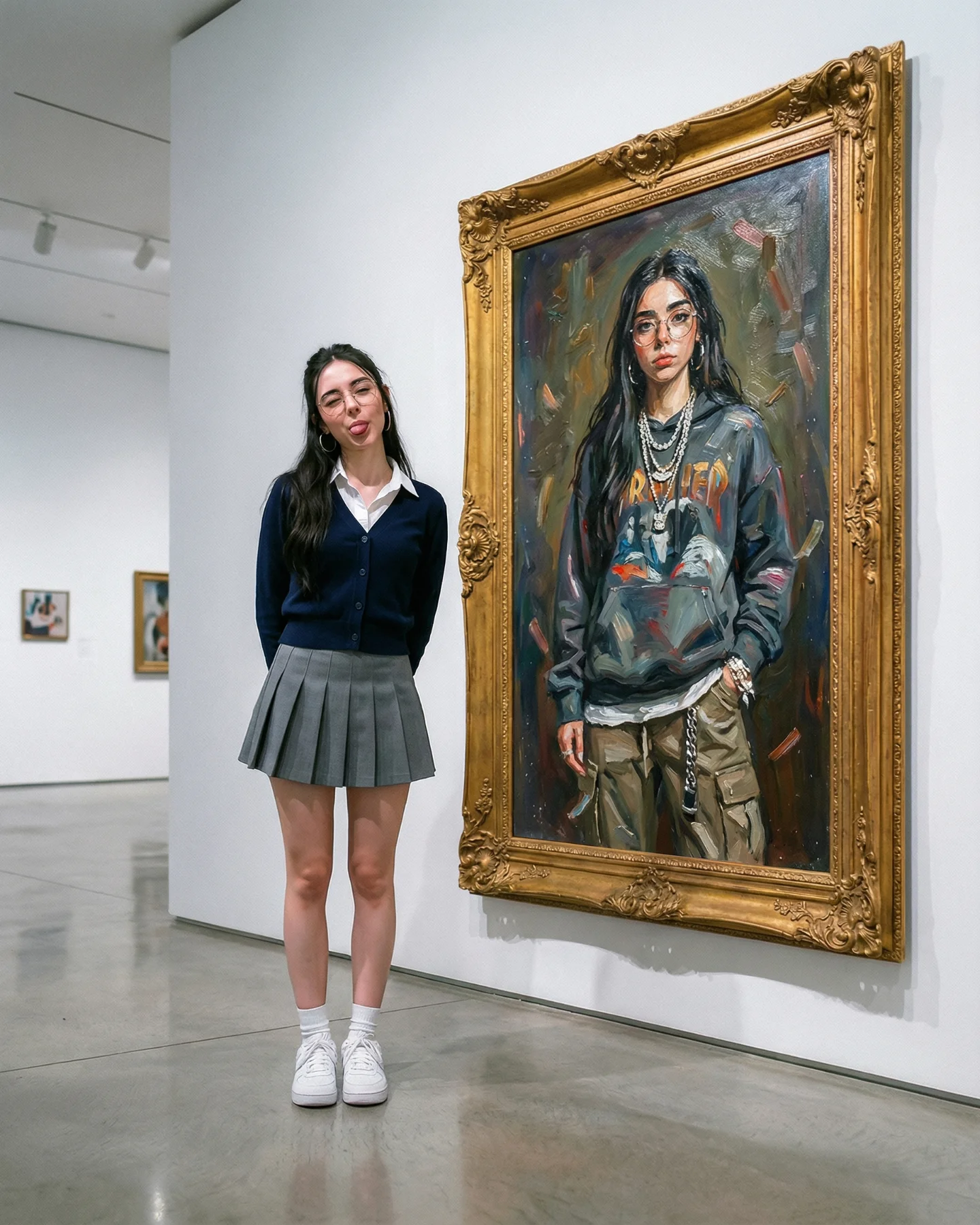
This style works especially well when you want to look aspirational without becoming flashy. It fits creators in AI art, fashion moodboards, personal branding, visual storytelling, and lifestyle education. The image says, “I know what I am looking at,” which is useful when your brand needs authority with softness rather than hard-selling energy.
It is less ideal for posts that need dense product explanation, multiple objects competing for attention, or highly energetic movement. This format depends on calm control. If you overload it with props, text, or too many emotional cues, the image loses the exact clarity that makes it perform.
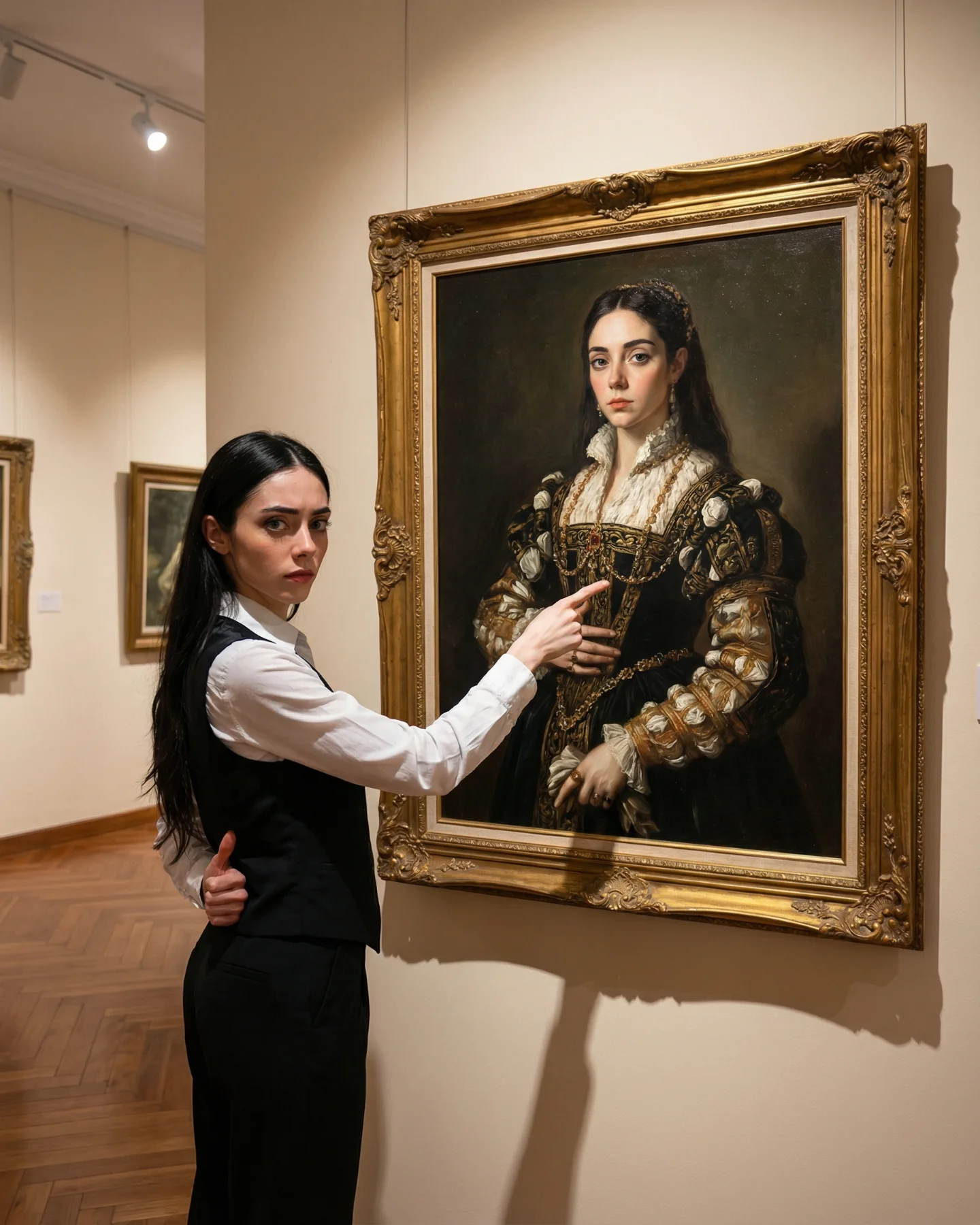
The image succeeds because it does not confuse polish with complexity. Most of the frame is quiet. The wall is quiet. The floor is quiet. The outfit is quiet. That quietness creates room for one expressive interruption: the painting. When creators try to recreate this style, they often over-focus on the artwork and forget that the silence around it is doing half the job.
The second aesthetic win is proportion. The painting is large enough to dominate, but the human figure is still essential. If the person were too small, the frame would become documentary. If the person were too large, the frame would become fashion-first. Here, the balance keeps the image suspended between lifestyle and art reference, which is exactly why it feels useful as a creator-facing visual.
| Observed | Recreate | Why it matters |
|---|---|---|
| Visitor fills a modest portion of the left side | Keep the person at roughly one-third of the frame width, not dominant | The artwork remains the hook while the human figure provides relatability |
| Large white negative space around the subjects | Do not fill the wall with extra objects, signage, or furniture | Negative space is what makes the image feel premium and fast to parse |
| Single vivid color cluster inside the painting | Use one high-saturation focal area against a restrained room palette | This creates thumbnail impact without turning the whole image chaotic |
| Soft overhead gallery lighting | Avoid harsh side sunlight or dramatic shadow patterns | Even light keeps the scene clean, controlled, and editorial |
| Ornate gold frame against modern architecture | Preserve the classic-versus-minimal tension | The style contrast adds sophistication and memorability |
Think of this image as a stack of control blocks rather than one giant descriptive sentence. The more clearly you separate the blocks, the easier it becomes to remix the scene without breaking what made it work.
| Prompt chunk | What it controls | Swap ideas (EN, 2-3 options) |
|---|---|---|
| subject + pose | Relatability, body language, and narrative stillness | "woman in side profile", "man with hands behind back", "stylish visitor pausing mid-step" |
| wardrobe block | Taste level and distraction control | "crisp white blouse and black trousers", "minimal beige trench and loafers", "all-black gallery outfit" |
| hero object | The visual hook that earns the click and the save | "large pop-art portrait", "oversized abstract canvas", "framed editorial photograph" |
| environment cleanliness | Premium feel and readability | "white-cube museum interior", "minimal showroom", "quiet archival gallery" |
| lighting direction + softness | How calm or dramatic the frame feels | "soft overhead museum light", "diffused skylight", "neutral exhibition spotlights" |
| color logic | Where attention goes first | "neutral room with blue-yellow-red focal art", "warm stone room with emerald accent", "monochrome space with one orange statement piece" |
Treat the first generation as a convergence pass, not the final answer. Lock three things before you start experimenting: the left-right composition, the museum lighting behavior, and the size relationship between the viewer and the framed artwork. If any of those drift, the image stops feeling like this reference even if the colors are similar.
The one-change rule matters here. If you alter pose, painting style, room palette, and camera angle in the same run, you will not know which move improved the image. This format rewards restraint. Keep the skeleton stable, then push only one or two knobs at a time.
If you want this look to perform, do not chase “museum aesthetic” as a vague mood. Build the mechanism: one calm observer, one vivid hero object, one controlled room, and one strong contrast block. That is the repeatable part.