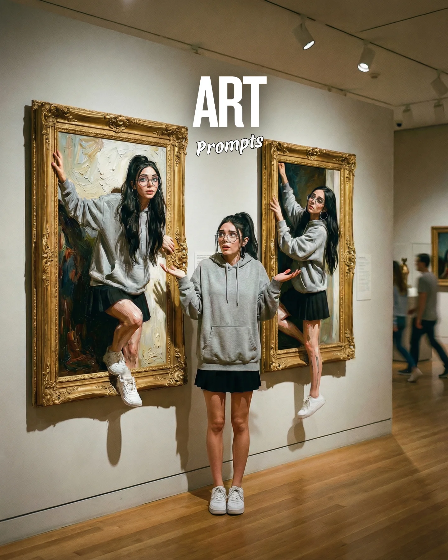

Arte Moderno 🎭🎨 Comenta "ARIA" y te paso todos los prompts 💌
Arte Moderno 🎭🎨 Comenta "ARIA" y te paso todos los prompts 💌
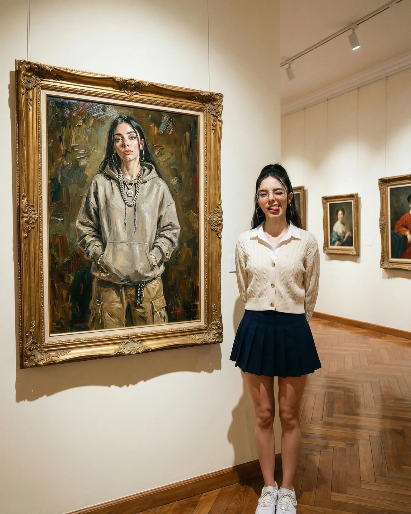
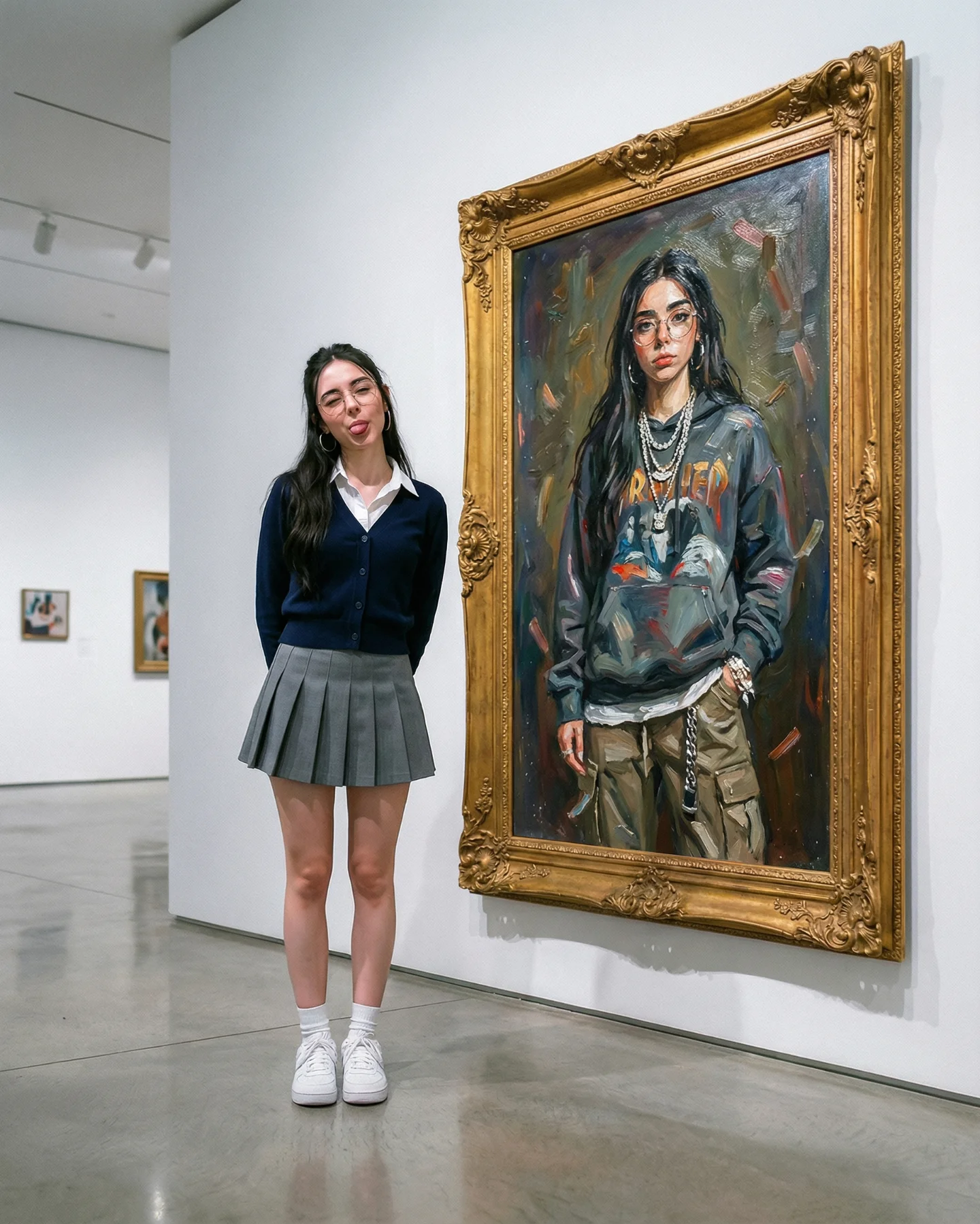
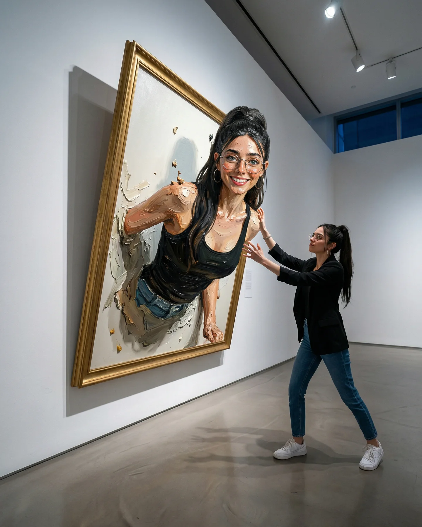
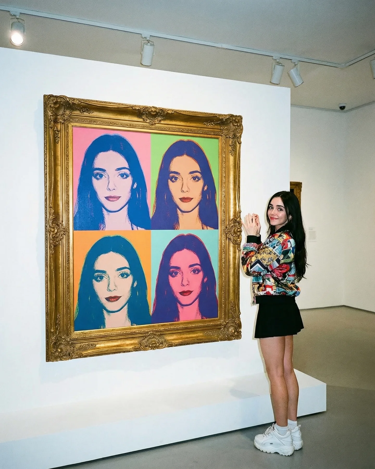
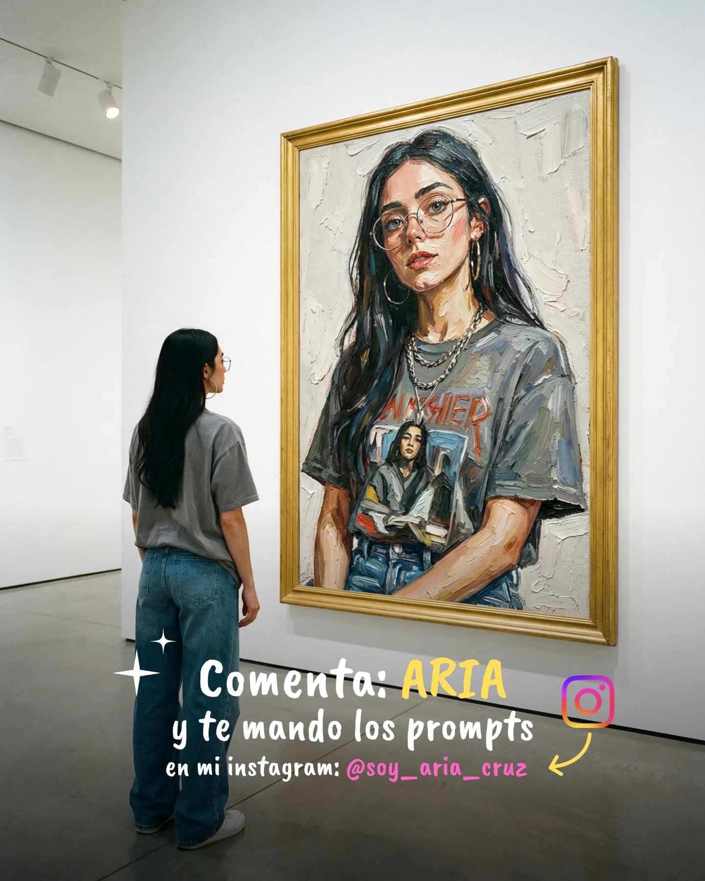
This image works because it does not rely on a single identity. The woman standing in the gallery looks polished, neat, and almost sweet: cream cardigan, pleated skirt, white sneakers, hands behind her back, easy smile. The woman inside the painting carries a different signal entirely: oversized hoodie, layered chains, hands in pocket, cooler expression, more attitude. Put together, the photo stops being a simple museum pose and starts functioning like a personality split rendered in one clean frame.
That duality is exactly what makes the image effective for social media. Small creators do well when a post gives people something to read beyond “pretty” or “stylish.” Here, the audience gets contrast immediately. The real person looks accessible. The painted version looks like a tougher inner character. That creates a low-friction story, and low-friction stories are highly shareable.
The post is built on controlled mismatch. If the subject had copied the painting exactly, the image would have become a predictable lookalike stunt. Instead, the contrast is the hook. The creator is standing close enough to claim the portrait, but styled differently enough to create tension. That tension invites comments because viewers naturally start assigning meaning: soft outside, bold inside; polished public self, rebellious creative self; gallery girl meets streetwear muse.
The museum setting sharpens the effect. Traditional walls, ornate frame, and parquet flooring give the scene authority. Because the background is culturally coded as “serious,” even a small wardrobe contrast feels more intentional. The post ends up looking considered, not random.
| Signal | Evidence (from this image) | Mechanism | Replication Action |
|---|---|---|---|
| Dual identity contrast | Real subject wears a cardigan and pleated skirt, while the painting shows a hoodie and chains. | The audience gets a quick, memorable story about two sides of one persona. | Design the artwork to hold a different style code from the live subject. |
| Approachable expression | The real subject smiles gently and stands with hands behind her back. | Soft body language keeps the image warm instead of overly conceptual. | Use a friendly posture for the live figure even when the artwork is cooler. |
| Museum credibility | Gold frame, warm walls, track lighting, wood floor, framed portraits in the distance. | The environment makes the contrast feel curated rather than costume-like. | Place the identity contrast inside a refined gallery-style setting. |
This image format is especially useful for creators building a layered personal brand. Fashion creators can use it to show range without posting a collage. AI art creators can use it to turn one generated persona into a dialogue with the creator’s real-world styling. Lifestyle creators can use it when they want to hint at edge without fully abandoning softness.
This is less ideal for highly minimalist luxury brands that avoid obvious character contrast. It also becomes weaker if the wardrobe split is too subtle. The concept depends on viewers noticing that the live person and the painted version play different roles.
| Transfer | Keep | Change | Slot Template (EN) |
|---|---|---|---|
| Soft vs edgy fashion version | Side-by-side comparison, ornate frame, warm museum setting. | Swap the live look to knitwear and the painted look to leather or denim layers. | {museum wall} {soft daytime outfit} {edgy painted alter ego} {contrast mood} |
| Founder persona version | Friendly live posture, different coded identity in the artwork. | Make the painting more commanding or futuristic while the real subject stays approachable. | {gallery interior} {clean smart-casual look} {bold concept portrait} {quiet authority mood} |
| Campus editorial version | Youthful wardrobe, refined environment, one clear portrait pairing. | Lean further into academia outside the frame and streetwear inside the frame. | {classic museum} {preppy outfit} {street-style portrait painting} {playful identity mood} |
The image is visually satisfying because the palette stays coherent even while the style codes diverge. Cream cardigan, beige hoodie, gold frame, and warm wall tones all belong to the same color family. That means the contrast comes from silhouette and attitude, not from chaotic color fighting. This is a strong lesson for creators: you can push concept harder when your palette stays calm.
The frame size also matters. The painting is large enough to feel like a real counterpart, not a decorative prop. Meanwhile, the subject’s pose is almost school-uniform neat. Hands behind the back is a smart choice because it creates immediate innocence and composure. That makes the hoodie-and-chain version inside the artwork feel even more pointed.
| Observed | Recreate |
|---|---|
| Shared warm neutral palette across both subject and painting | Keep cream, beige, gold, and wood tones consistent even if style codes differ. |
| Real subject posed politely beside a cooler painted version | Contrast attitude through posture, not only clothing. |
| Large ornate frame with visible painterly texture | Use a museum-grade frame and expressive brushwork to elevate the concept. |
| Extra framed works visible deeper in the gallery | Add just enough background art to confirm the setting without stealing focus. |
The best way to control this look is to separate the “real self” prompt blocks from the “painted self” blocks. If you blend them too early, the contrast disappears.
| Prompt chunk | What it controls | Swap ideas (EN, 2–3 options) |
|---|---|---|
| smiling young woman in cream cardigan and pleated skirt | Defines the approachable, preppy live subject. | ivory knit set with loafers; soft blouse with tennis skirt; cream cardigan with tailored shorts |
| large ornate gold-framed oil portrait in streetwear hoodie | Creates the alter-ego layer and the main narrative contrast. | painted leather-jacket version; chain-layered bomber portrait; moody denim look portrait |
| warm traditional museum with parquet floor | Gives the scene seriousness and aesthetic credibility. | historic gallery corridor; classic exhibition room; intimate portrait gallery |
| balanced side-by-side composition | Keeps the comparison readable and clean. | painting left subject right; tighter waist-up compare shot; wider gallery comparison frame |
| friendly live expression vs cooler painted expression | Controls the emotional split that makes the concept legible. | smile vs stoic; relaxed vs intense; sweet vs detached |
Lock the contrast logic first. The image fails if both versions of the subject communicate the same emotional role. Start by defining who the real subject is and who the painted self is.
The strength of this format is that it lets a creator talk about range without using words. One body stands in the room. Another lives inside the frame. The audience does the rest of the storytelling for you.