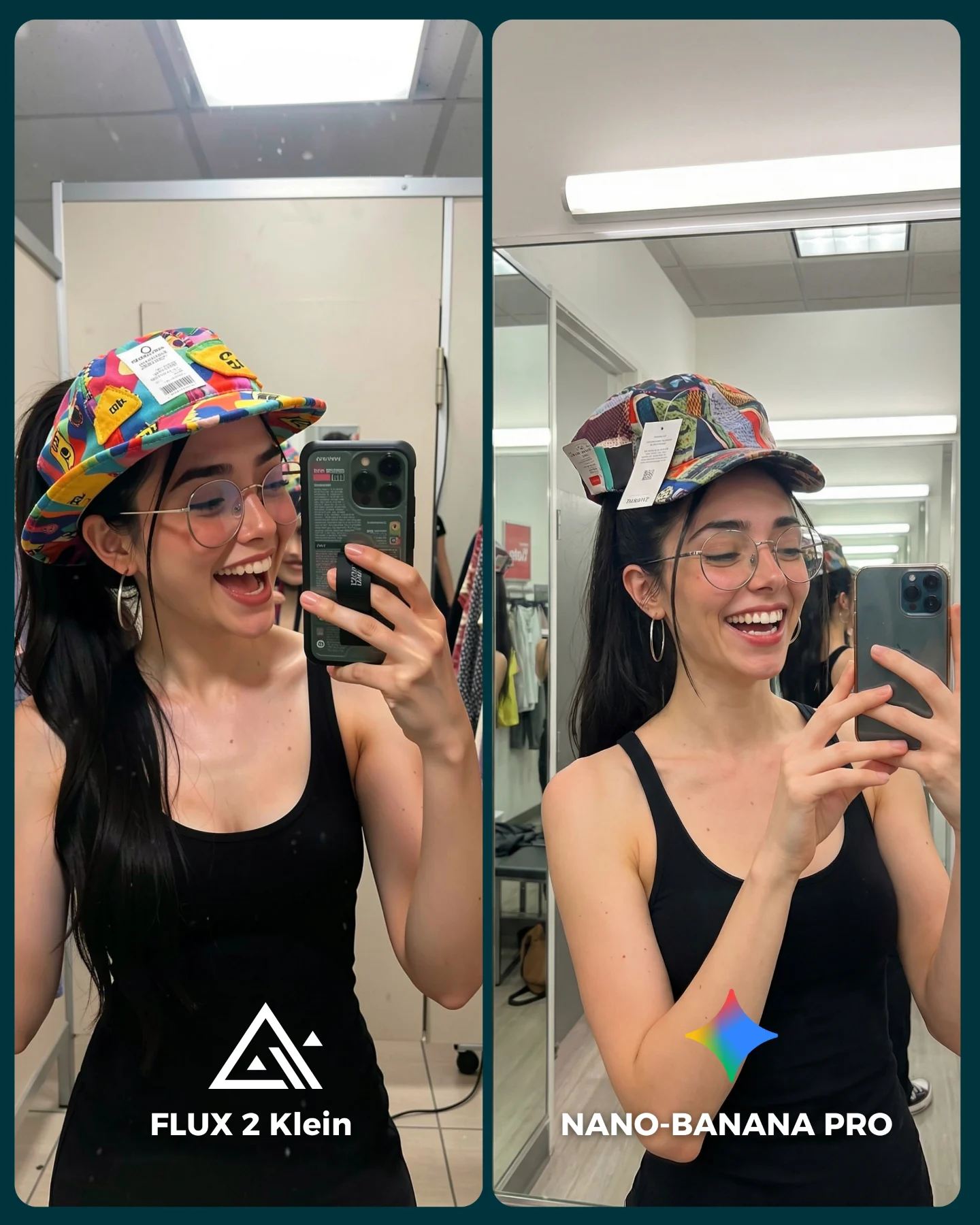
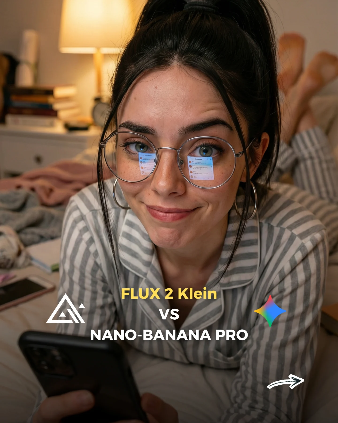
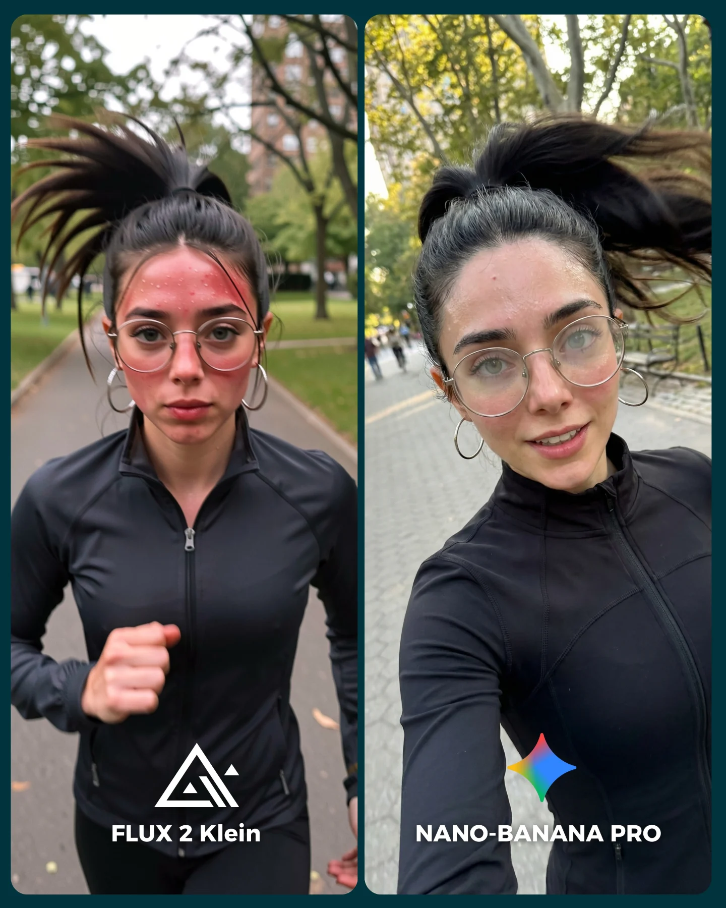
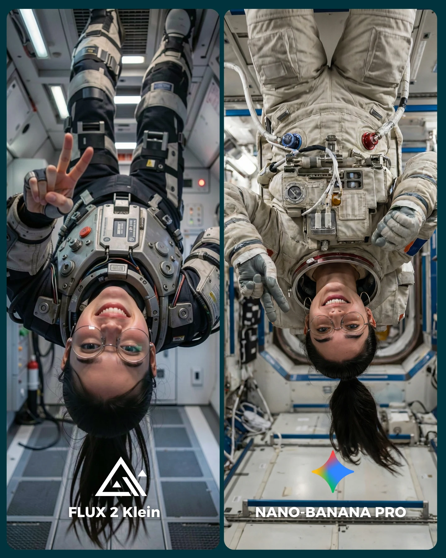
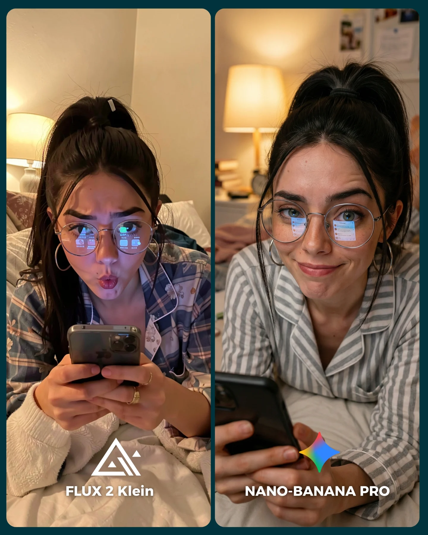
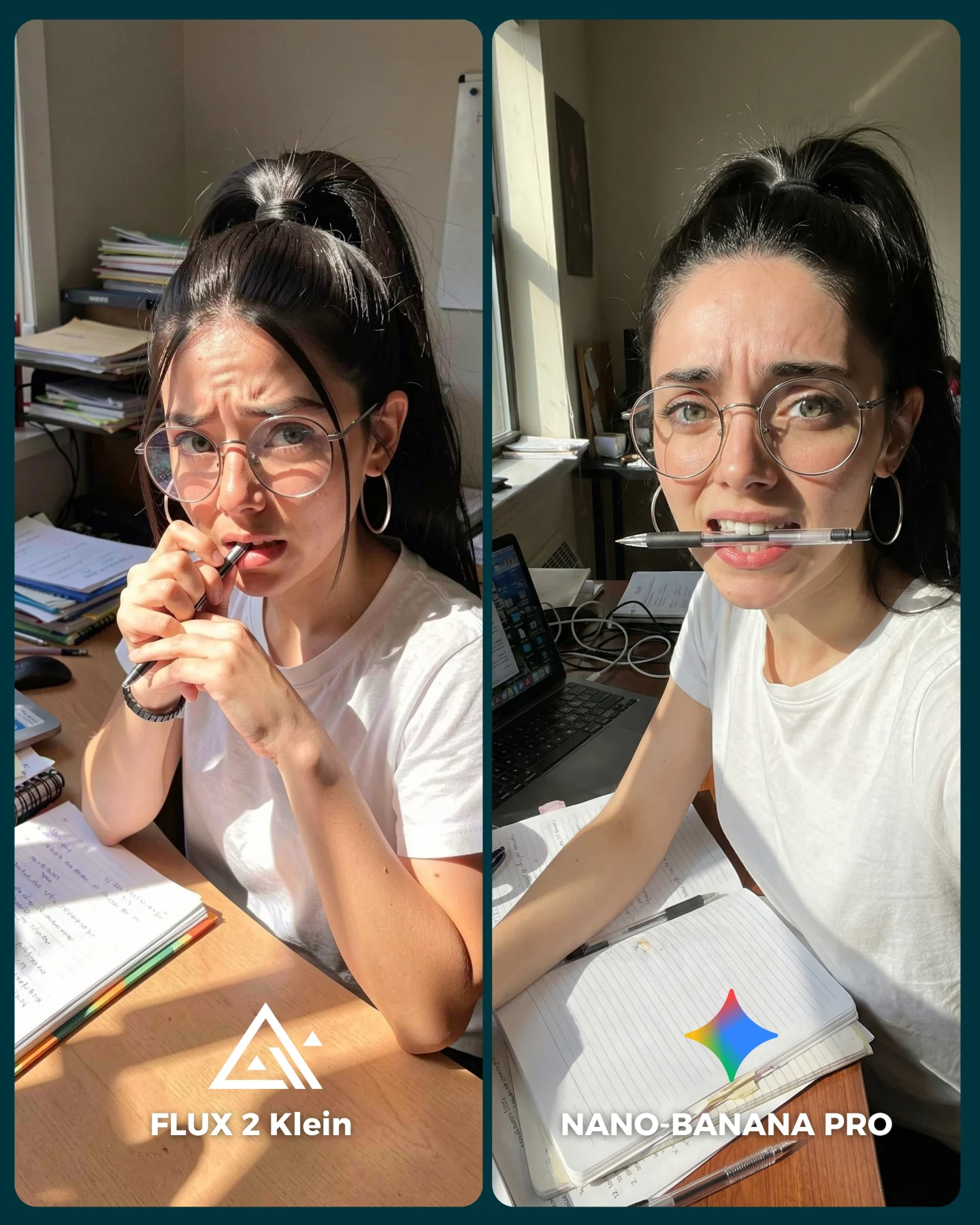
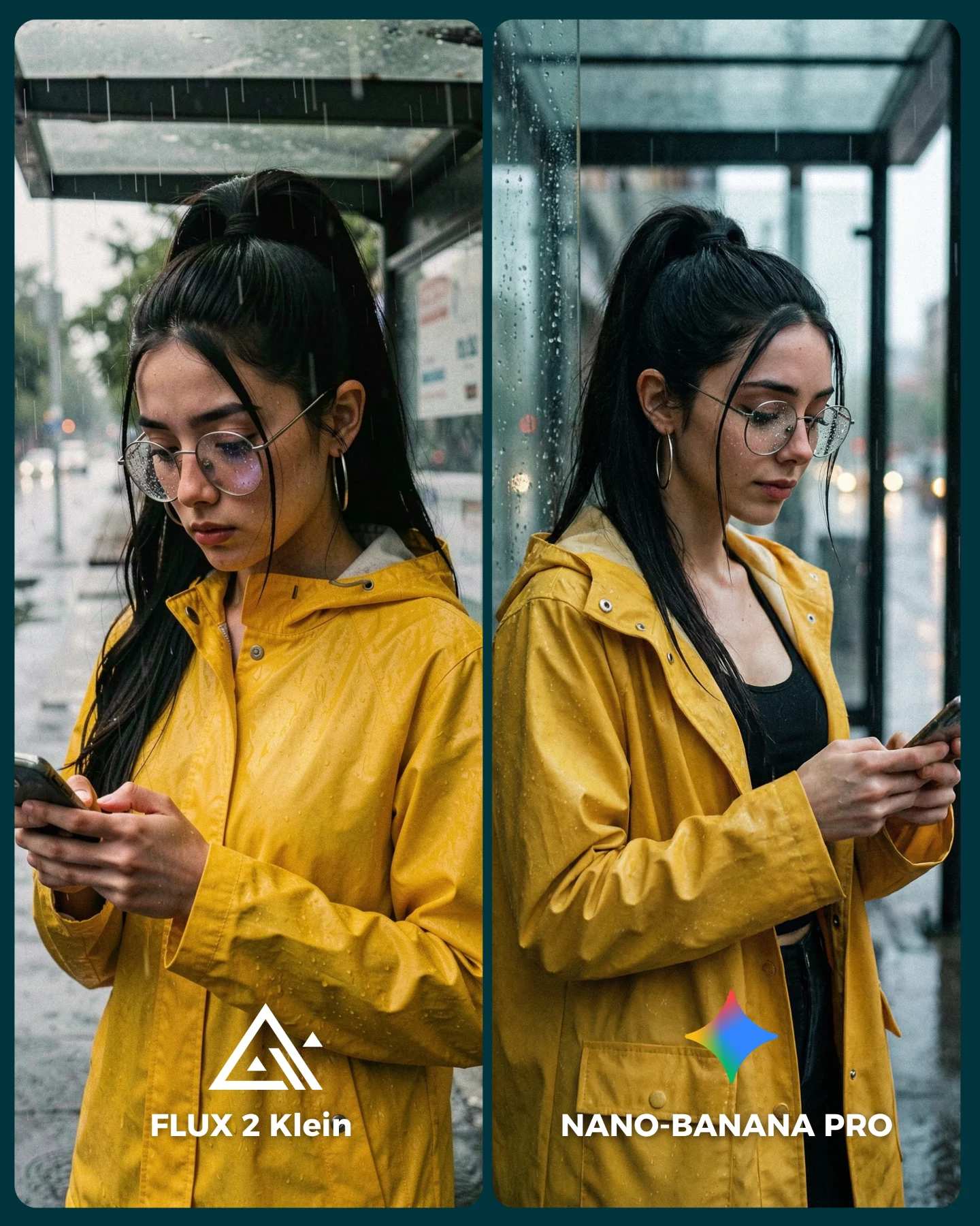
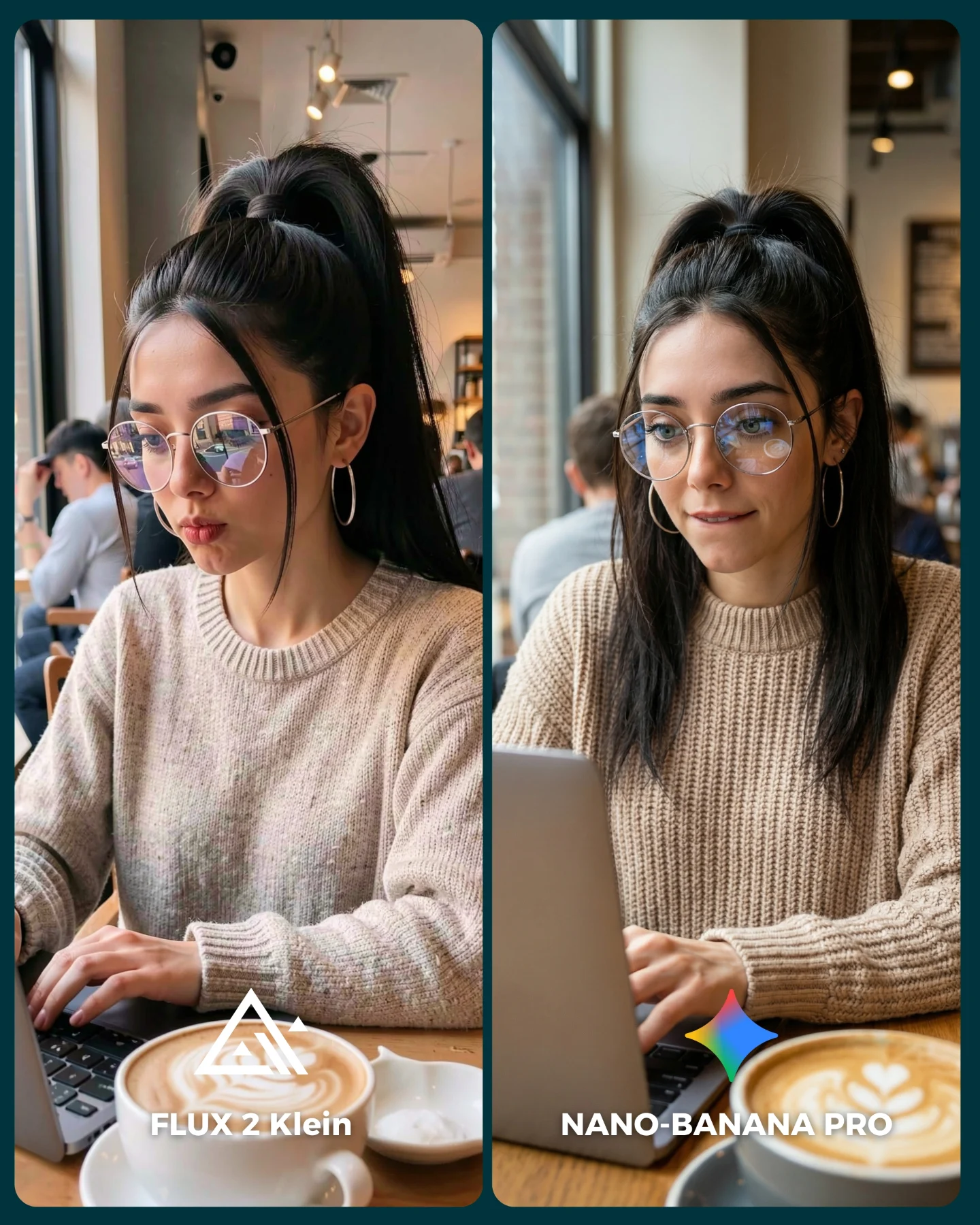
The Fitting Room Comparison: How soy_aria_cruz Built This AI Art
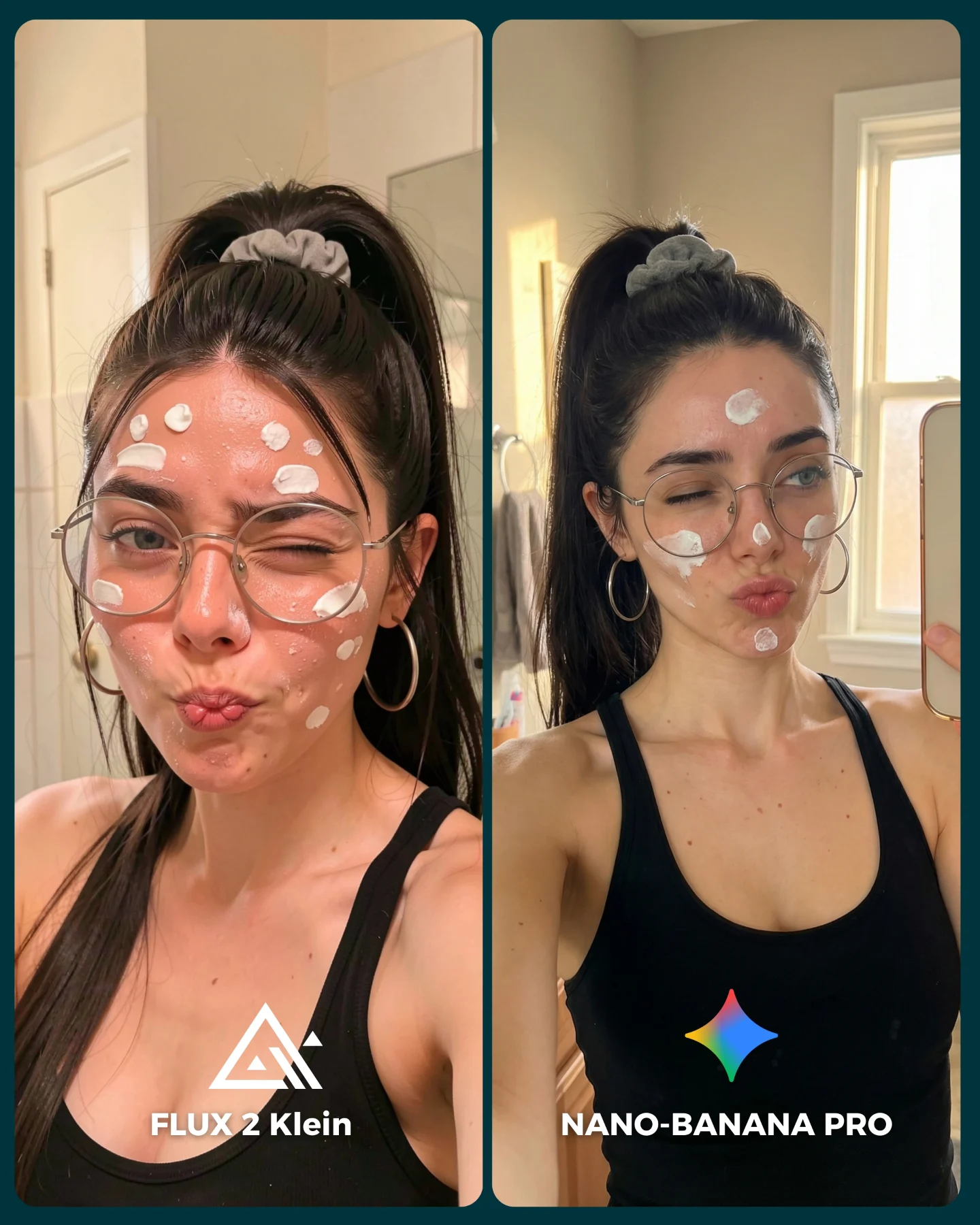
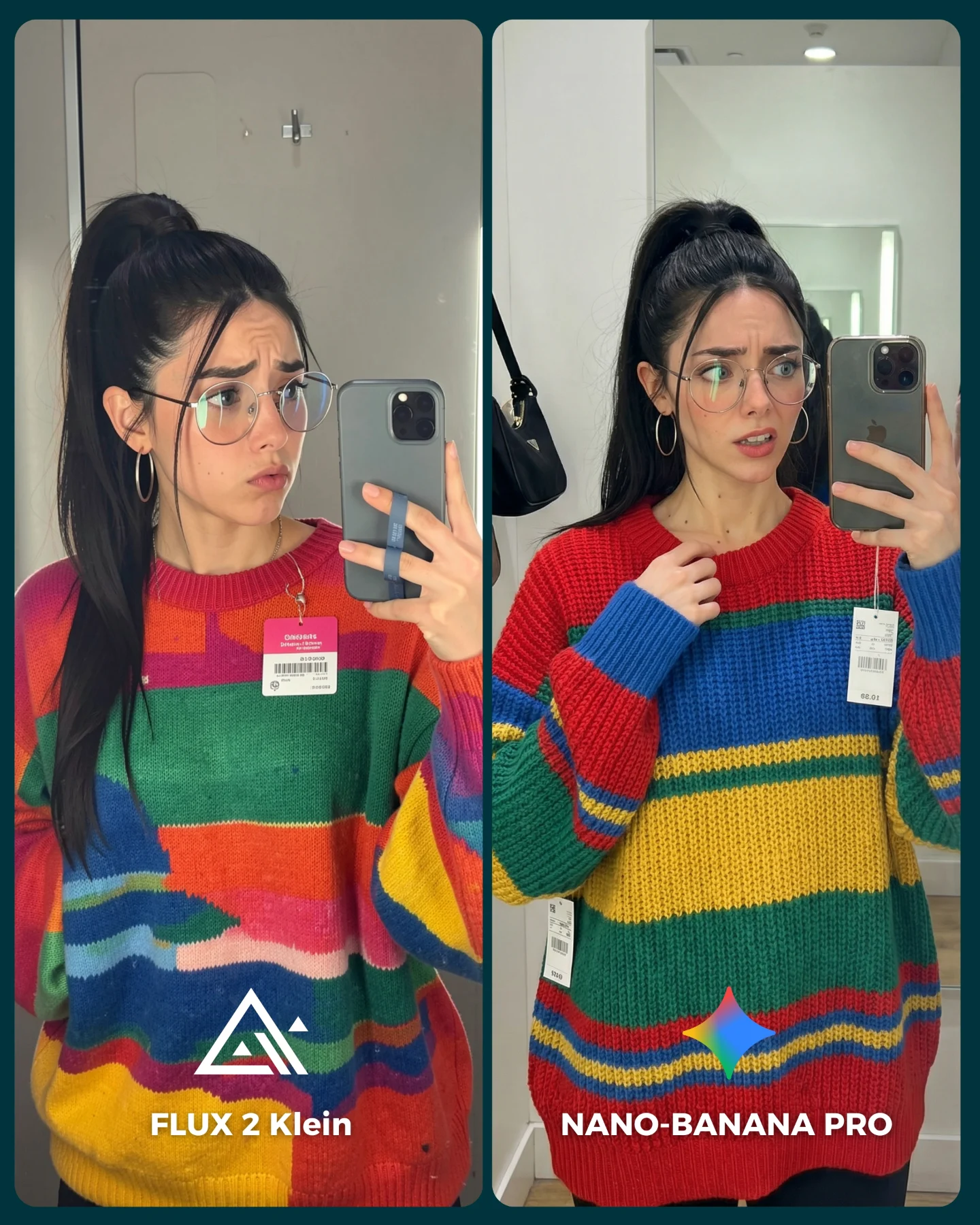
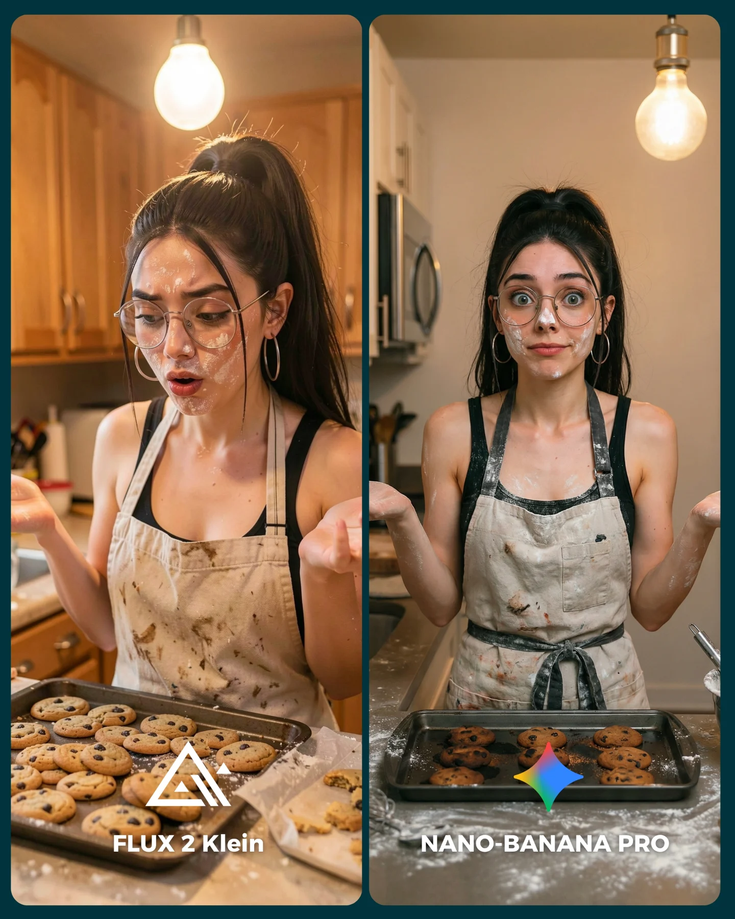
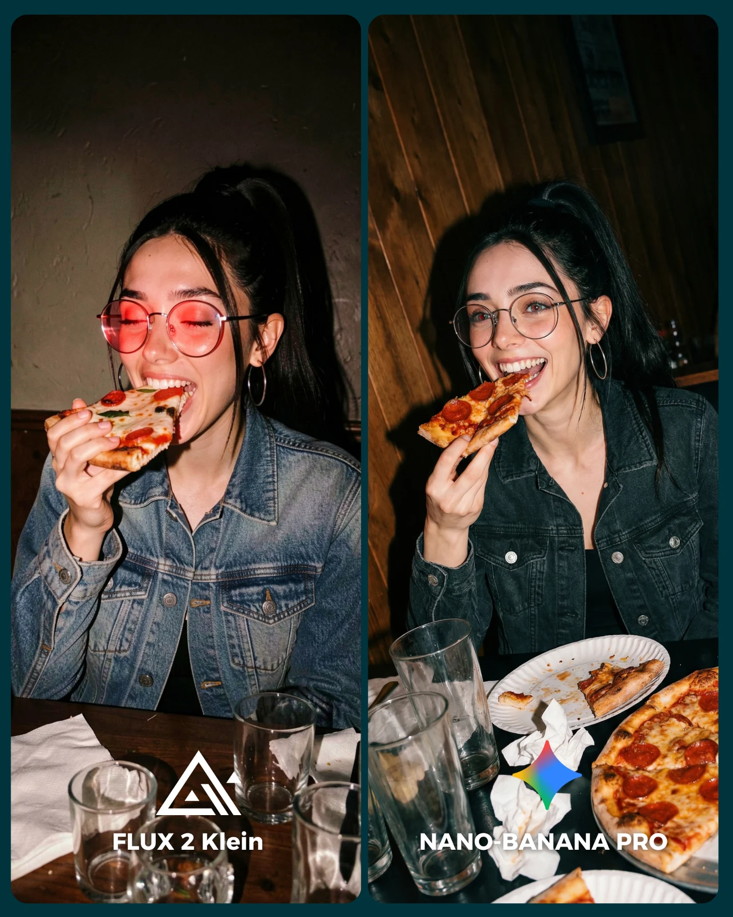
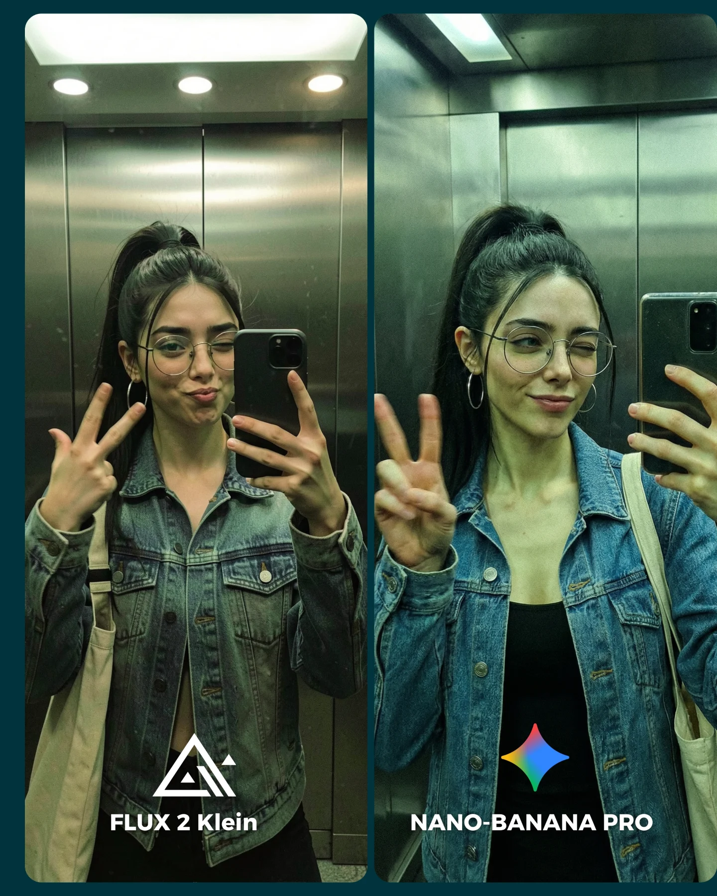
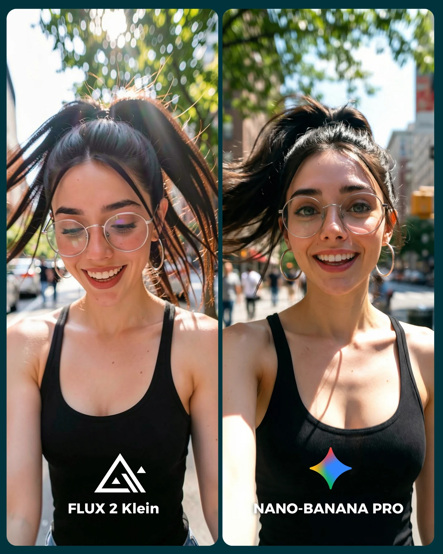
This image is effective because it is not trying to sell only a portrait. It is comparing two generated results in a context that people instantly understand: a fitting-room mirror selfie. That makes the graphic useful for AI model evaluation, creator demos, and casual product-style comparison content.
Why it works
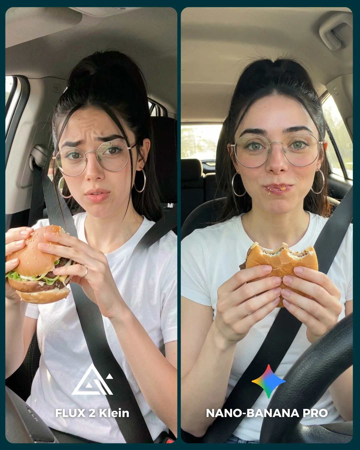
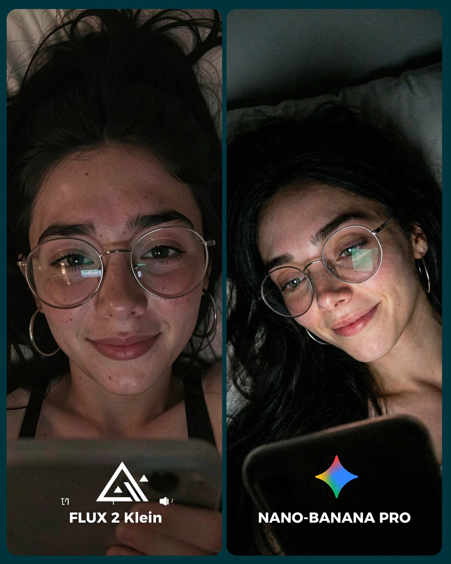
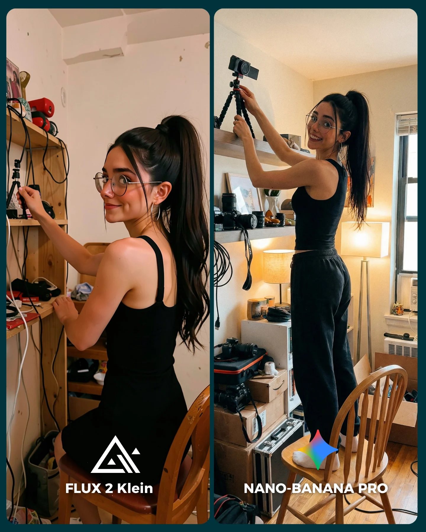
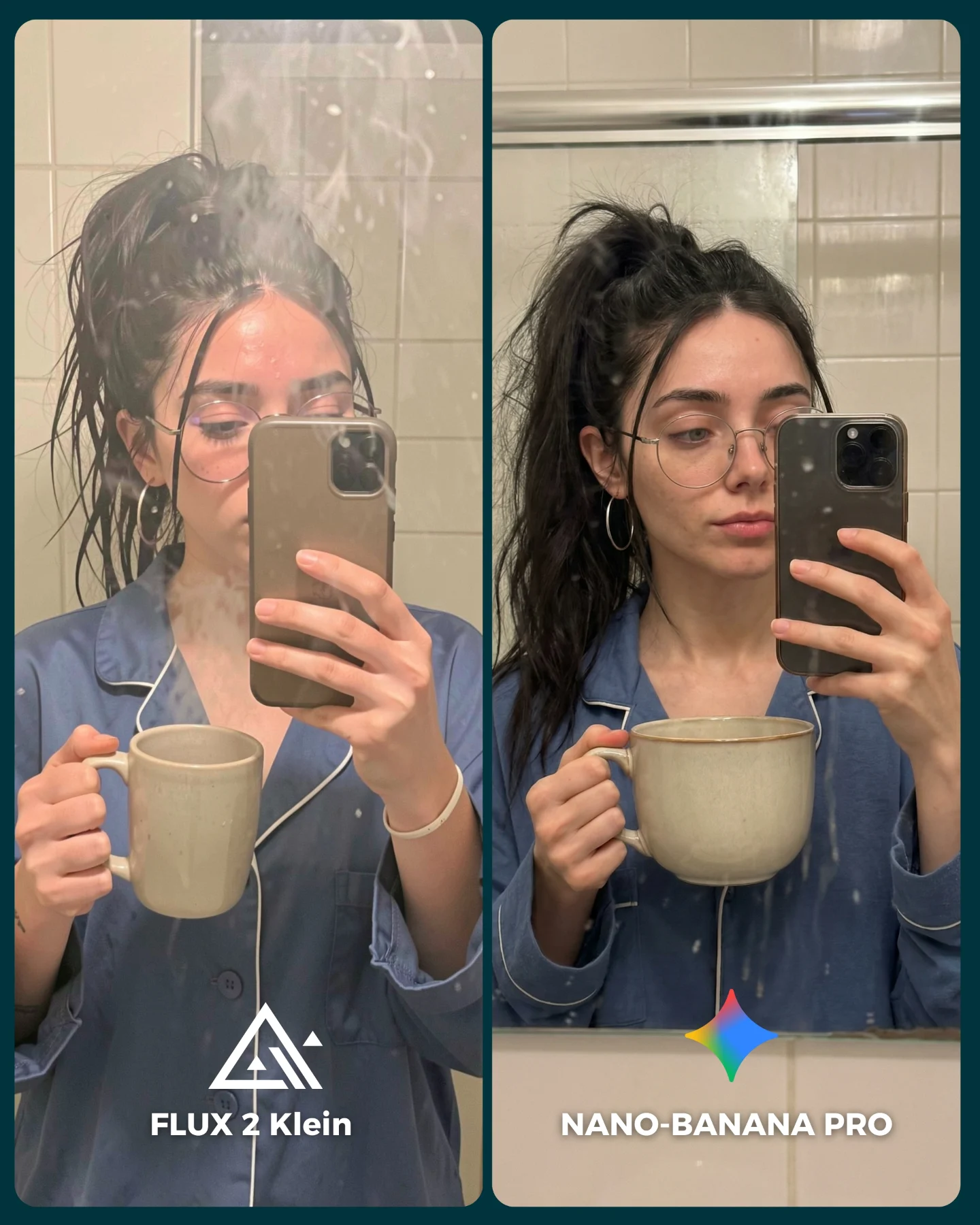
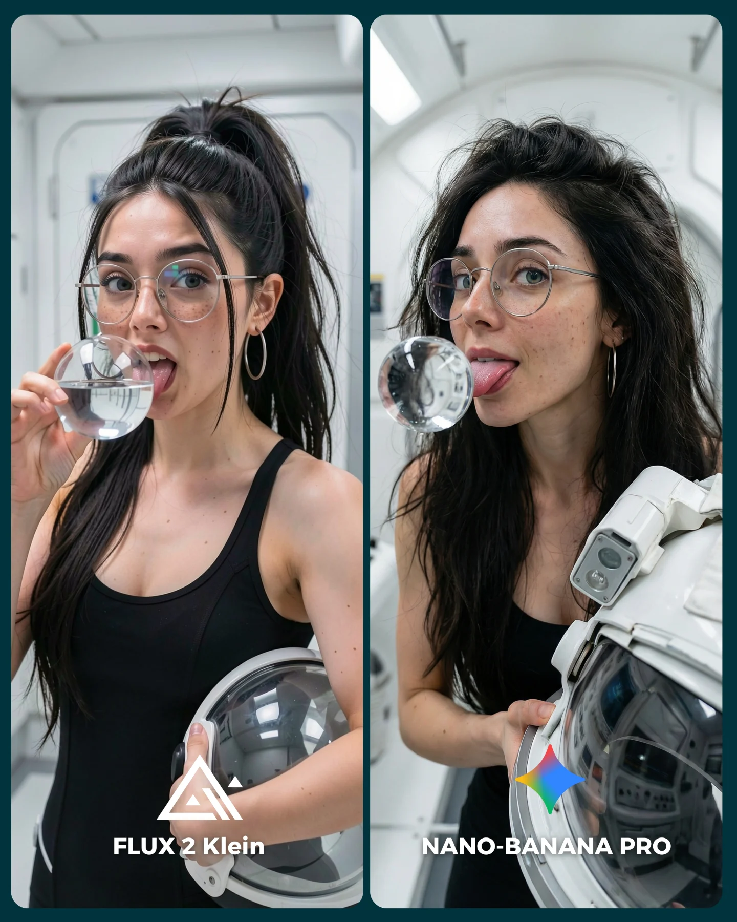
The side-by-side format does most of the structural work. By keeping the styling, environment, and pose nearly the same across both panels, the viewer can focus on the model differences instead of getting distracted by unrelated composition changes.
The colorful cap is also a strong choice. It gives both images a memorable visual anchor and introduces complex texture, small printed elements, and bright color transitions that are useful for comparing rendering quality.
The fitting-room setting adds realism. Mirrors, ceiling panels, neutral partitions, and attached hat tags make the scene feel like authentic creator content instead of a sterile benchmark test.
Use cases
This prompt is ideal for AI image model comparisons, creator tool demos, fitting-room selfie concepts, split-screen social graphics, retail try-on content, and benchmark visuals where expression, texture, and environment consistency all matter.
Aesthetic read
The aesthetic blends casual fashion selfie culture with product-comparison graphics. It feels approachable and internet-native, but still organized enough to function as an informative visual asset.
Prompt technique breakdown
To recreate this image well, the prompt should specify the split-screen layout, fitting-room mirrors, bright multicolor cap with tags, black tank top, round glasses, hoop earrings, smartphone selfie pose, and bottom labels naming each model version. Those details are what make the image read as a comparison artifact rather than a simple portrait collage.
It is also important to keep the lighting flat and retail-like. Dramatic light would reduce the usefulness of the comparison by adding unnecessary mood and shadow differences.
Remix playbook
You can remix this concept by changing the clothing item being tested, using a different accessory with complex patterns, swapping the fitting room for a bathroom or studio mirror, or comparing three panels instead of two. You can also adjust the labels to compare different models, settings, or prompt versions. The concept remains useful because side-by-side creator selfies are an easy way to expose rendering differences in a format viewers instantly understand.
That is what makes this prompt effective. It turns a casual try-on selfie into a structured, highly readable model-comparison image.