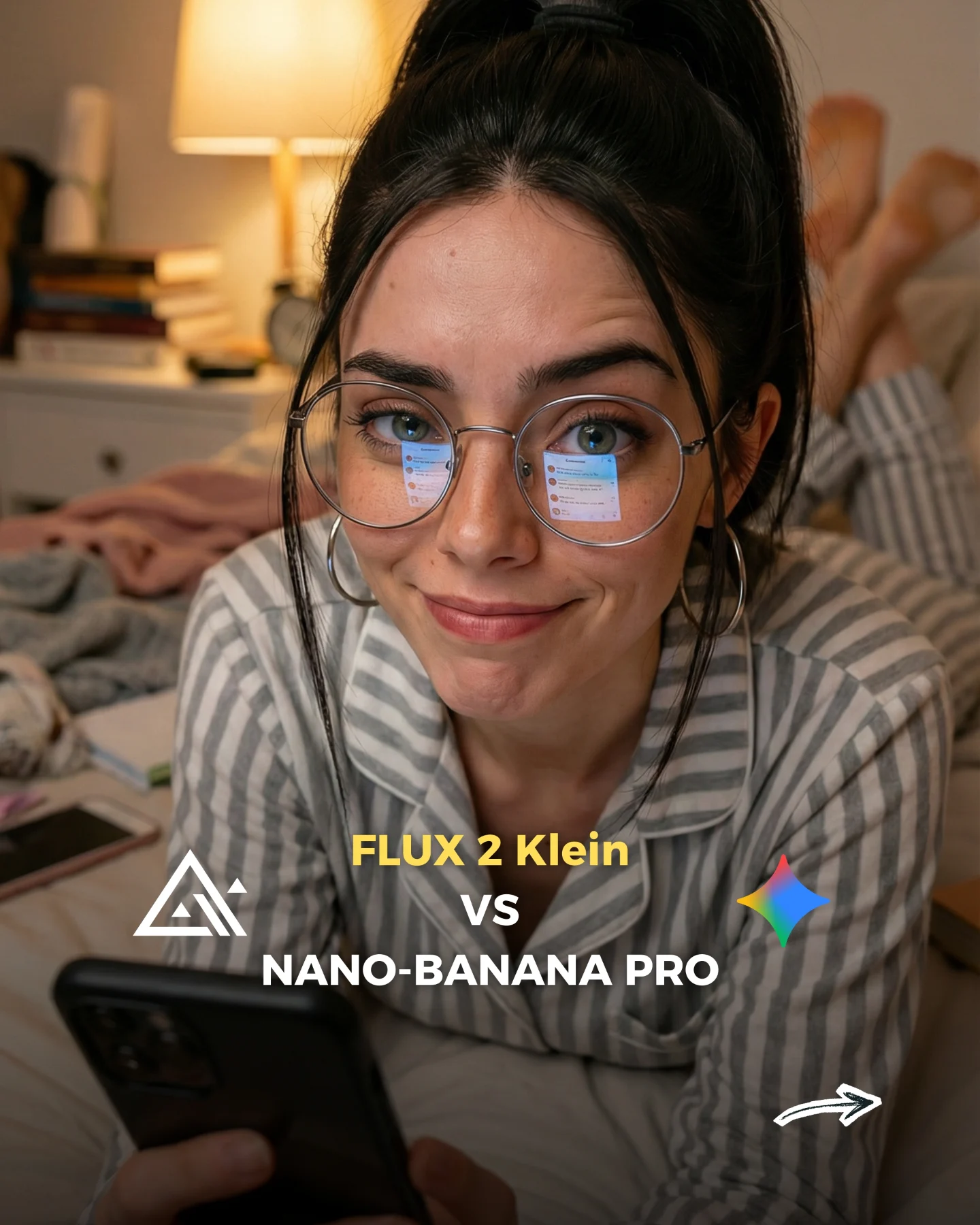
How soy_aria_cruz Made This Flux 2 Klein vs Nano Banana Comparison — and How to Recreate It
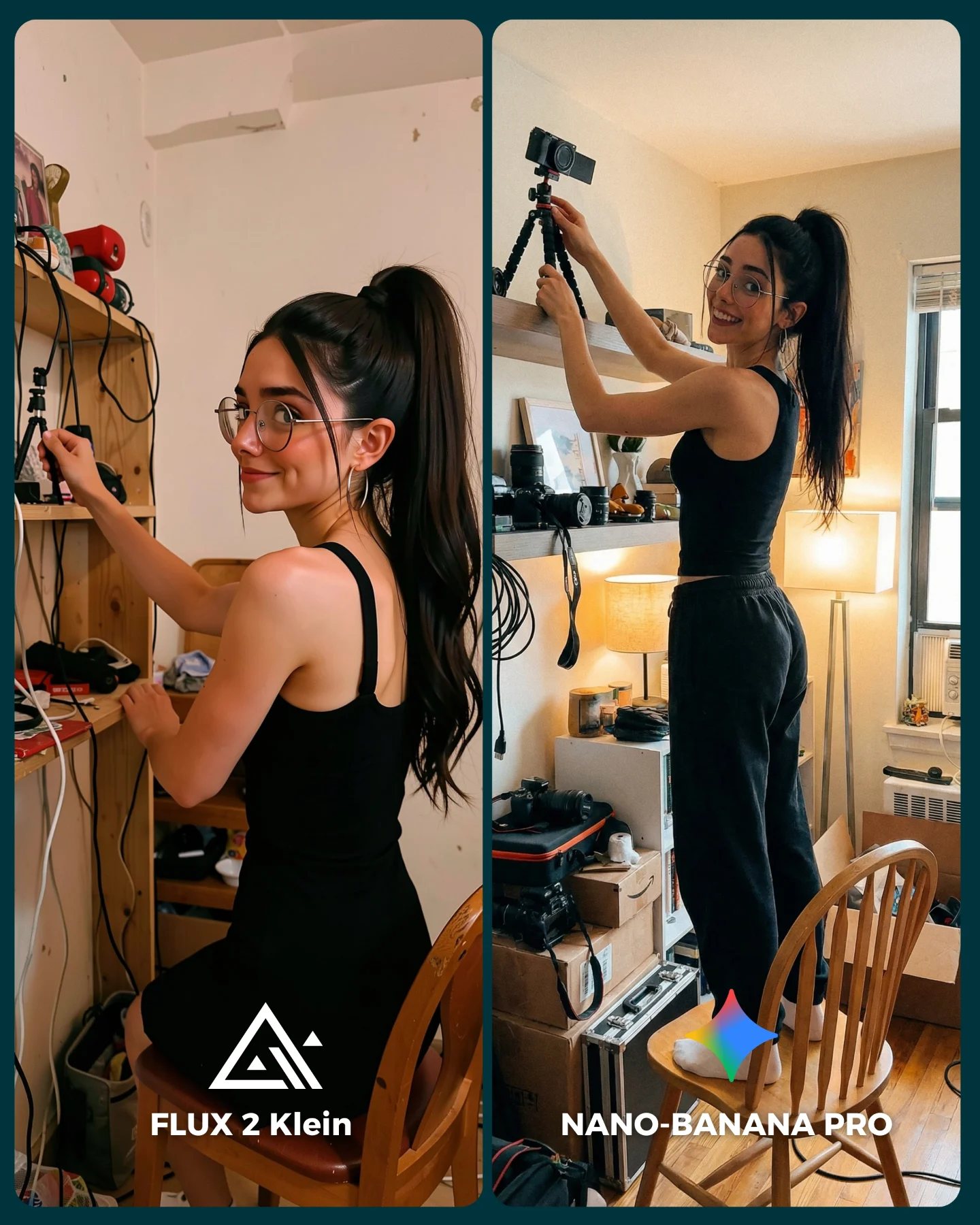
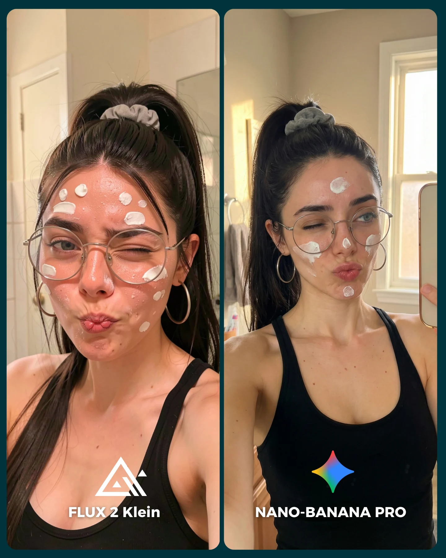
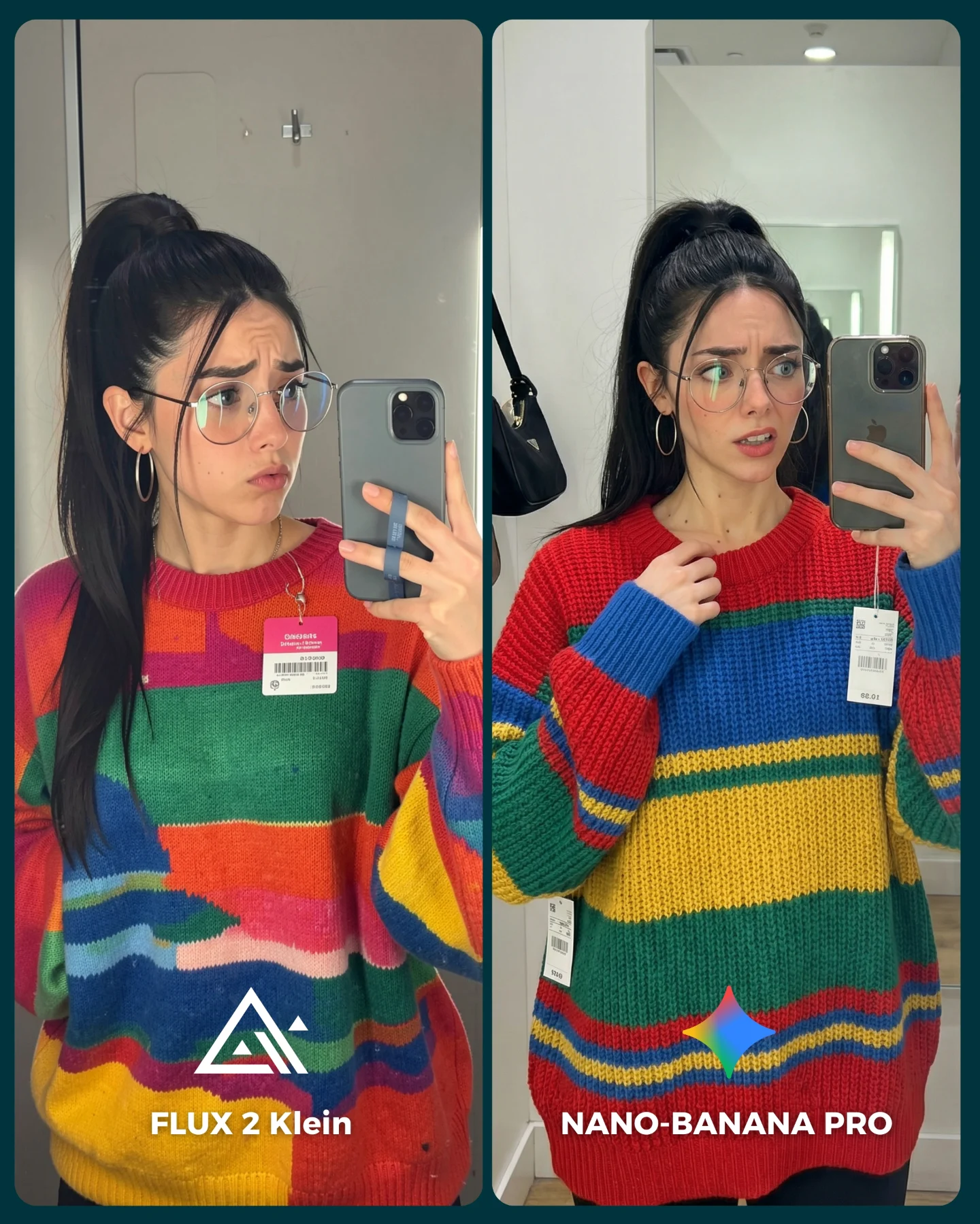
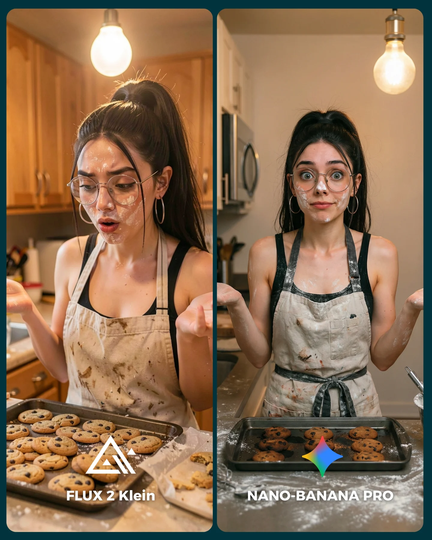
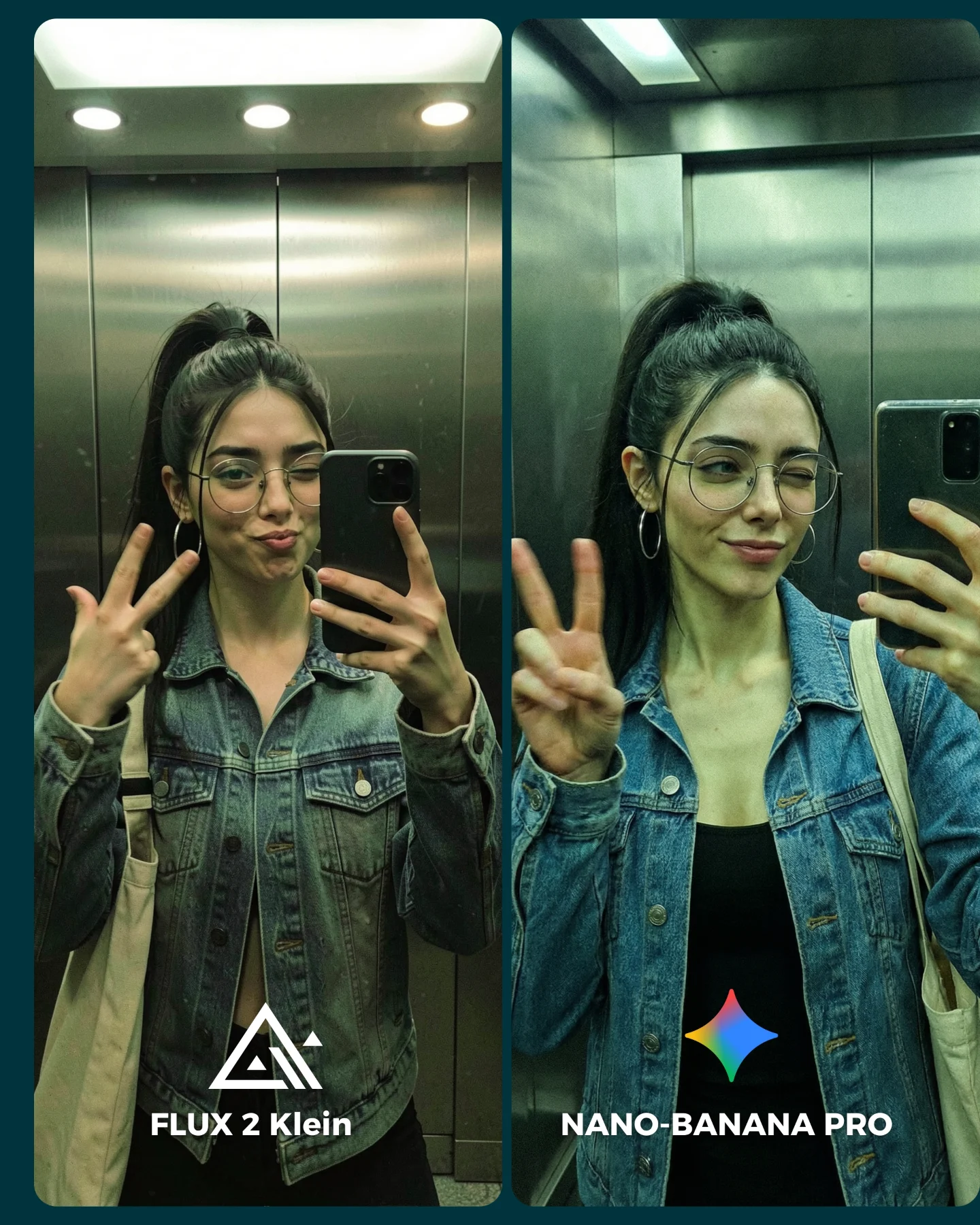
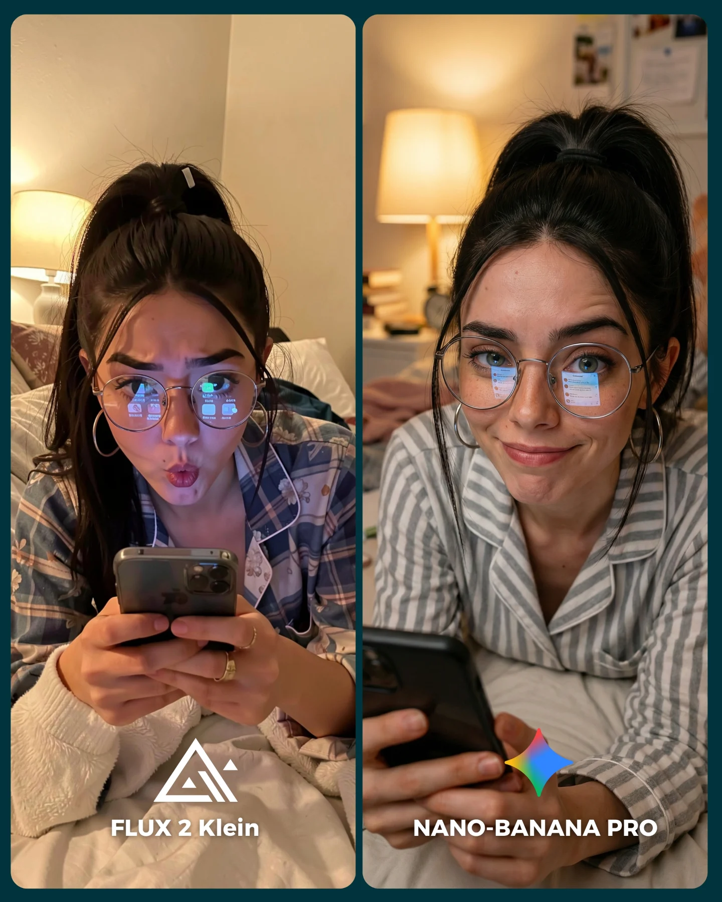
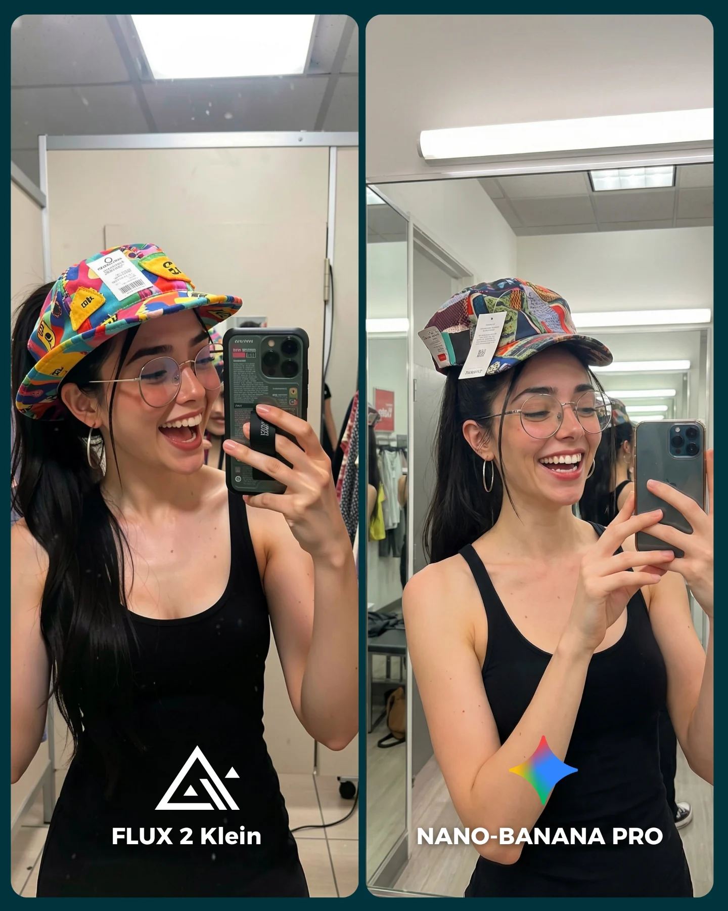
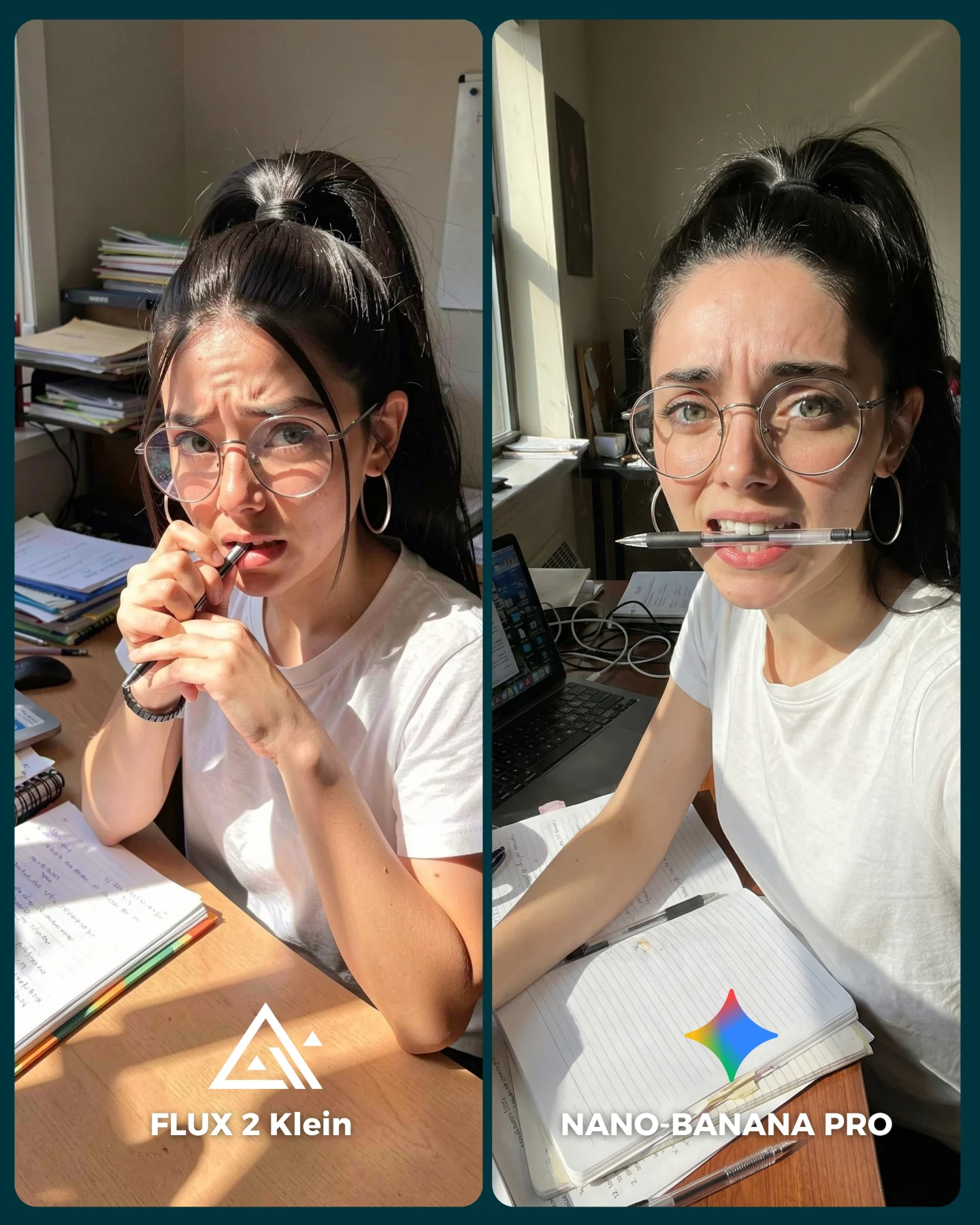
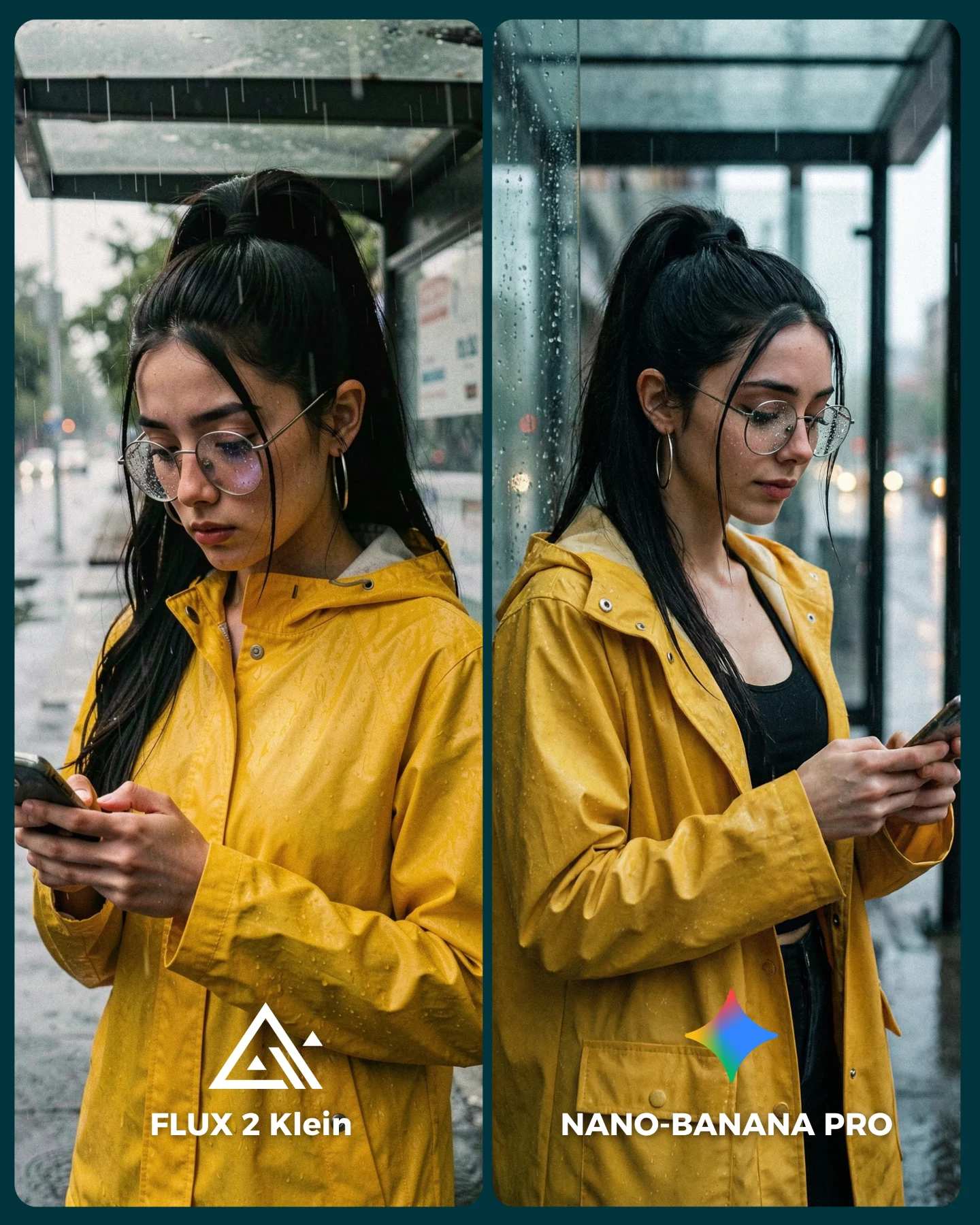
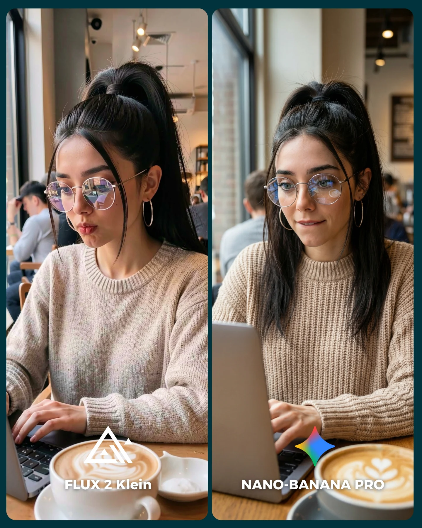
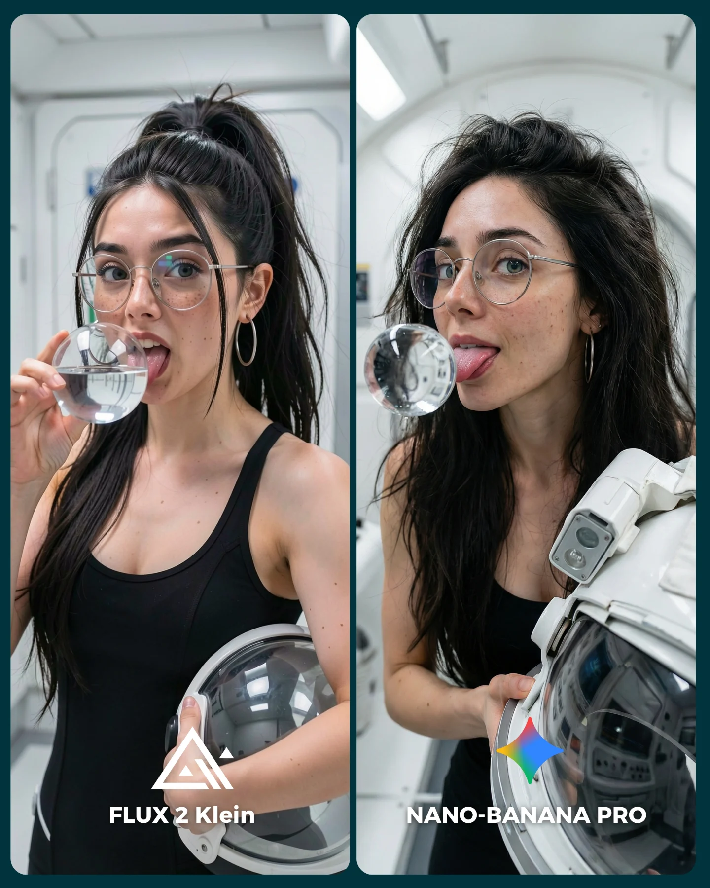
This image works because it compares models through a believable creator task instead of an abstract benchmark. A lot of generator comparisons fail because they only swap aesthetics. Here, both panels ask the model to hold the same character identity while also respecting a messy room, technical objects, human posture, and small hand interactions with gear. That is a much more useful test for creators because it mirrors the kind of scene they actually want to generate.
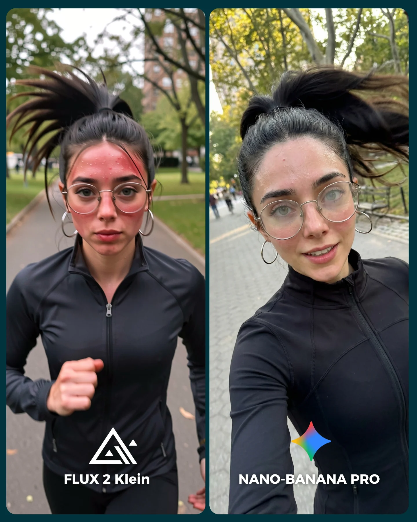
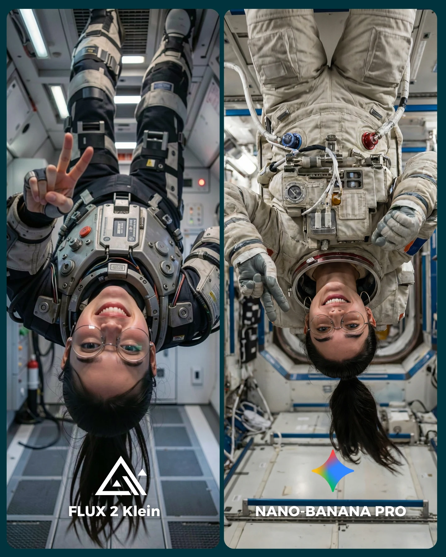
The caption frames this as “Flux 2 Klein vs Nano Banana Pro,” and the image makes that comparison instantly readable. Same person. Same general room. Same creator-tech theme. Different execution. That clarity matters because a comparison only becomes persuasive when viewers can isolate what changed and what stayed constant.
The strongest growth lesson here is that consistency is easier to appreciate when the scene includes many failure points. Shelves, wires, chair legs, tripods, hand placement, and repeated identity cues all give the viewer something to inspect. That is why comparison content like this performs well: it invites the audience to audit the image instead of just glance at it.
| Signal | Evidence (from this image) | Mechanism | Replication Action |
|---|
| Same-character stress test | Identical ponytail, glasses, outfit, and face across both panels | Viewers can judge consistency rather than getting distracted by different styling | Lock identity traits first and compare only model execution, not concept changes |
| Real-world complexity | Shelves, cables, cameras, chair, tripod, hand interactions | Complex rooms reveal model weaknesses faster than simple portraits | Build comparison prompts around cluttered but familiar creator environments |
| Different task staging | One panel seated with cables, one panel standing on a chair adjusting a camera | The audience can compare motion logic and spatial reasoning | Test two nearby but not identical actions using the same persona and room context |
Where This Format Transfers Best
This format is ideal for AI model comparisons, creator workflow tests, home-studio prompt packs, and educational posts where the goal is to show why one model handles realism or consistency better than another. It also transfers well to kitchen scenes, office desks, workshop corners, and hobby rooms where objects and gestures create many small points of failure.
It is less useful for pure beauty portraits or minimal-product renders. Those scenes may look pretty, but they do not give viewers enough information to compare model behavior in a meaningful way.
- Transfer 1: Keep the same identity and room; change the task from camera setup to painting, sewing, or music gear adjustment; template:
{same subject} {same room} {two related creator tasks} {split-screen comparison} - Transfer 2: Keep the home-studio clutter test; change the models being compared; template:
{creator workspace} {identity consistency} {object-rich scene} {A vs B generator labels} - Transfer 3: Keep the side-by-side layout and task contrast; change the environment to kitchen, desk, or garage studio; template:
{same persona} {same environment family} {two action variants} {comparison card}
Aesthetic Read
The image is effective because the design is practical, not flashy. The dark divider, rounded corners, and bottom labels create enough structure to make the post feel editorial, but the room details still look domestic and real. The black outfit helps too. It reduces one variable so the viewer can focus on pose, room logic, and hand interaction instead of wardrobe noise. This is a good example of how comparison content benefits from visual restraint.
| Prompt chunk | What it controls | Swap ideas (EN, 2-3 options) |
|---|
| same woman in both panels | Identity consistency benchmark | same man in both panels; same duo across both panels; same pet owner across two rooms |
| cluttered home studio with gear shelves | Object complexity and realism challenge | messy desk setup; compact music corner; crowded hobby workshop |
| two related creator actions | Spatial and pose comparison value | editing versus filming; packing gear versus unpacking gear; hanging lights versus checking focus |
| split-screen social comparison card | Readability and platform-native comparison format | before/after layout; left-right model benchmark; stacked two-frame carousel cover |
Execution Playbook
Lock these three things first: the subject identity, the room family, and the comparison layout. If those drift, viewers stop comparing models and start comparing concepts instead.
- Run 1: lock the same persona, same room, and left-right comparison card.
- Run 2: keep the layout and change only the task performed in each panel.
- Run 3: keep the tasks and room, then test different model pairs.
- Run 4: keep the same methodology and move the benchmark into another object-rich domestic environment.