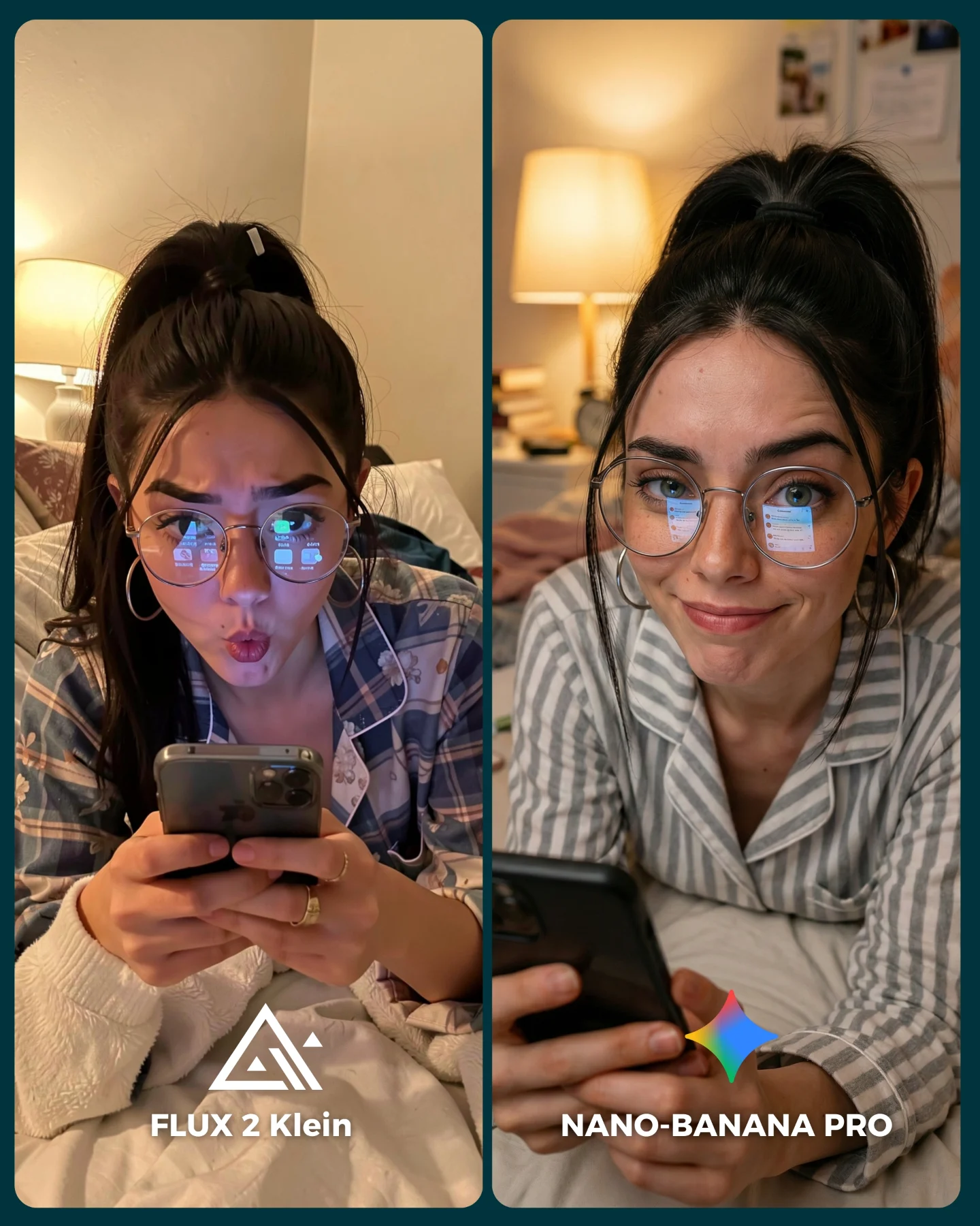
How soy_aria_cruz Made This Flux vs Nano Banana Skincare AI Art — and How to Recreate It
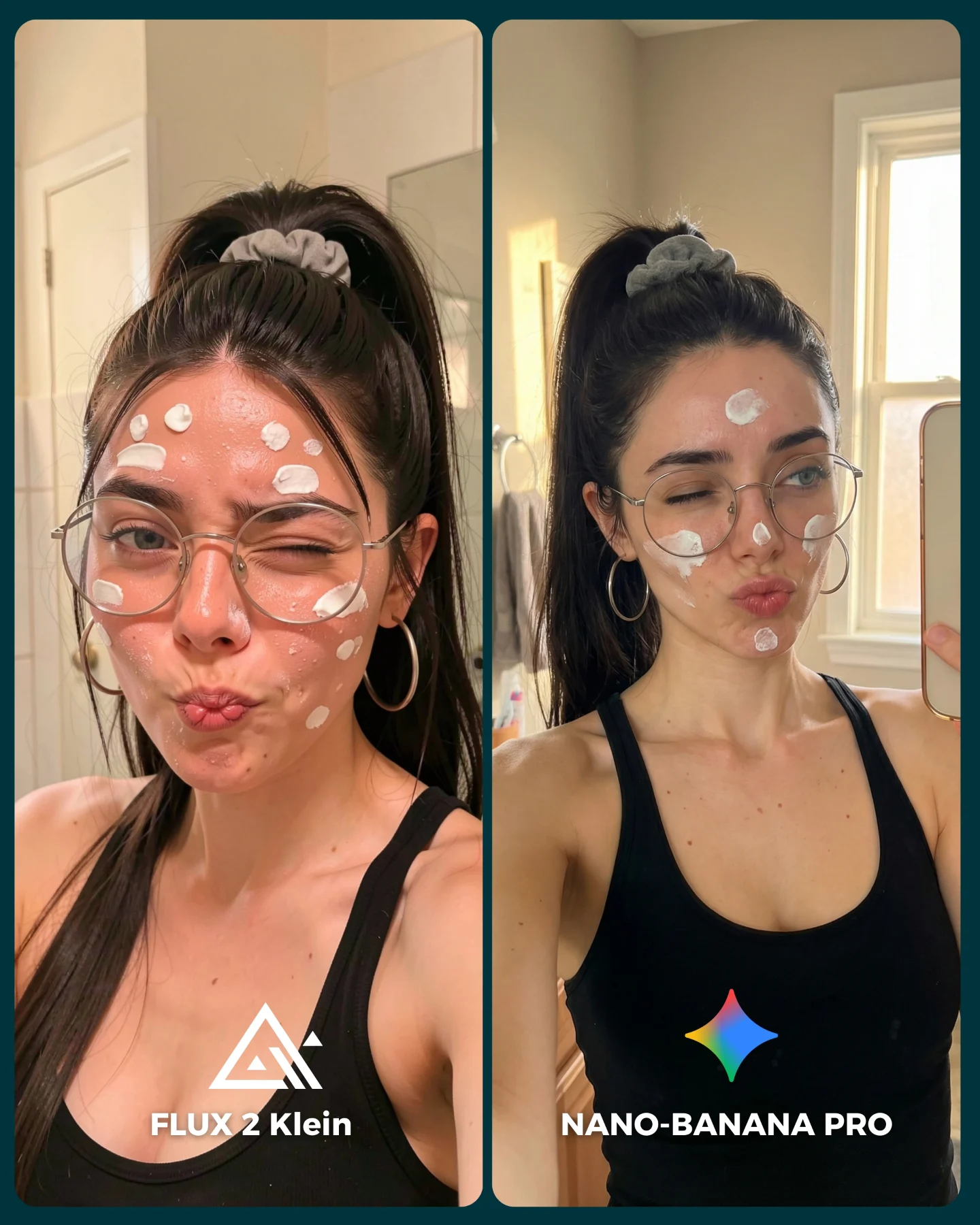
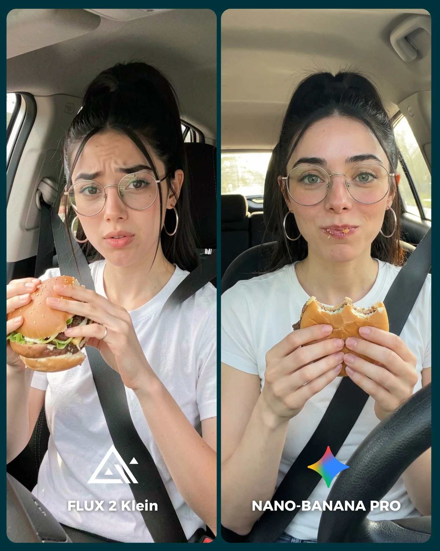
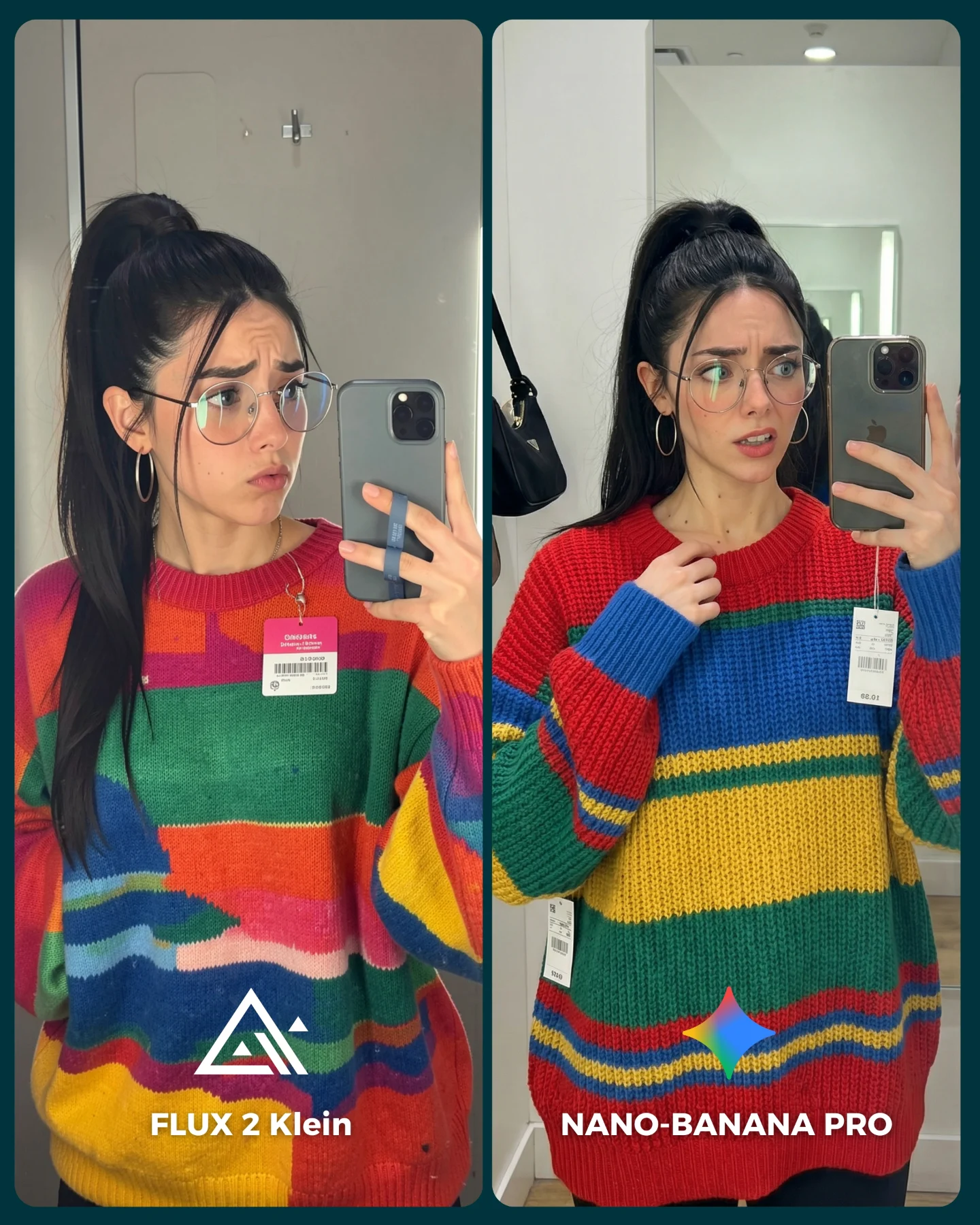
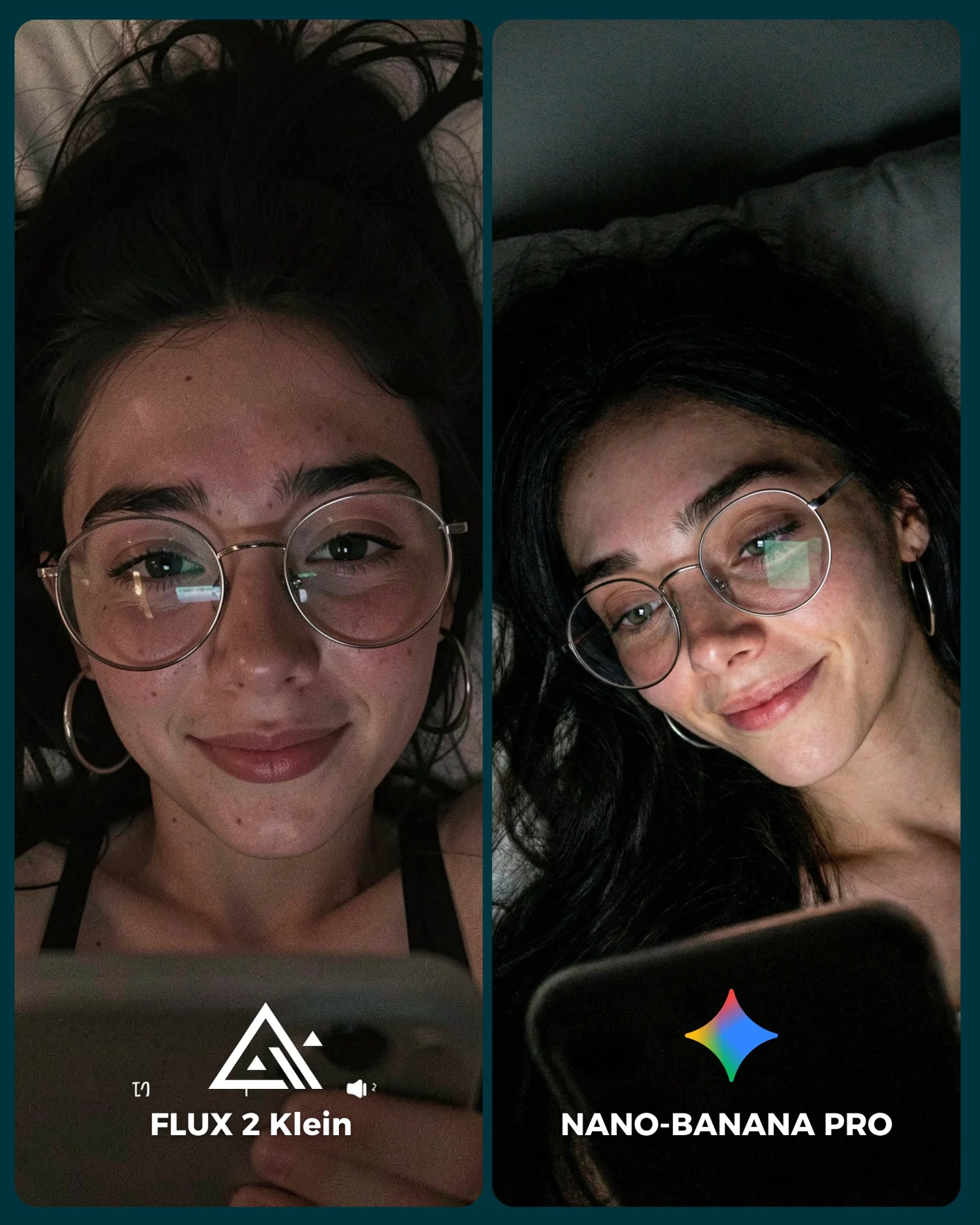
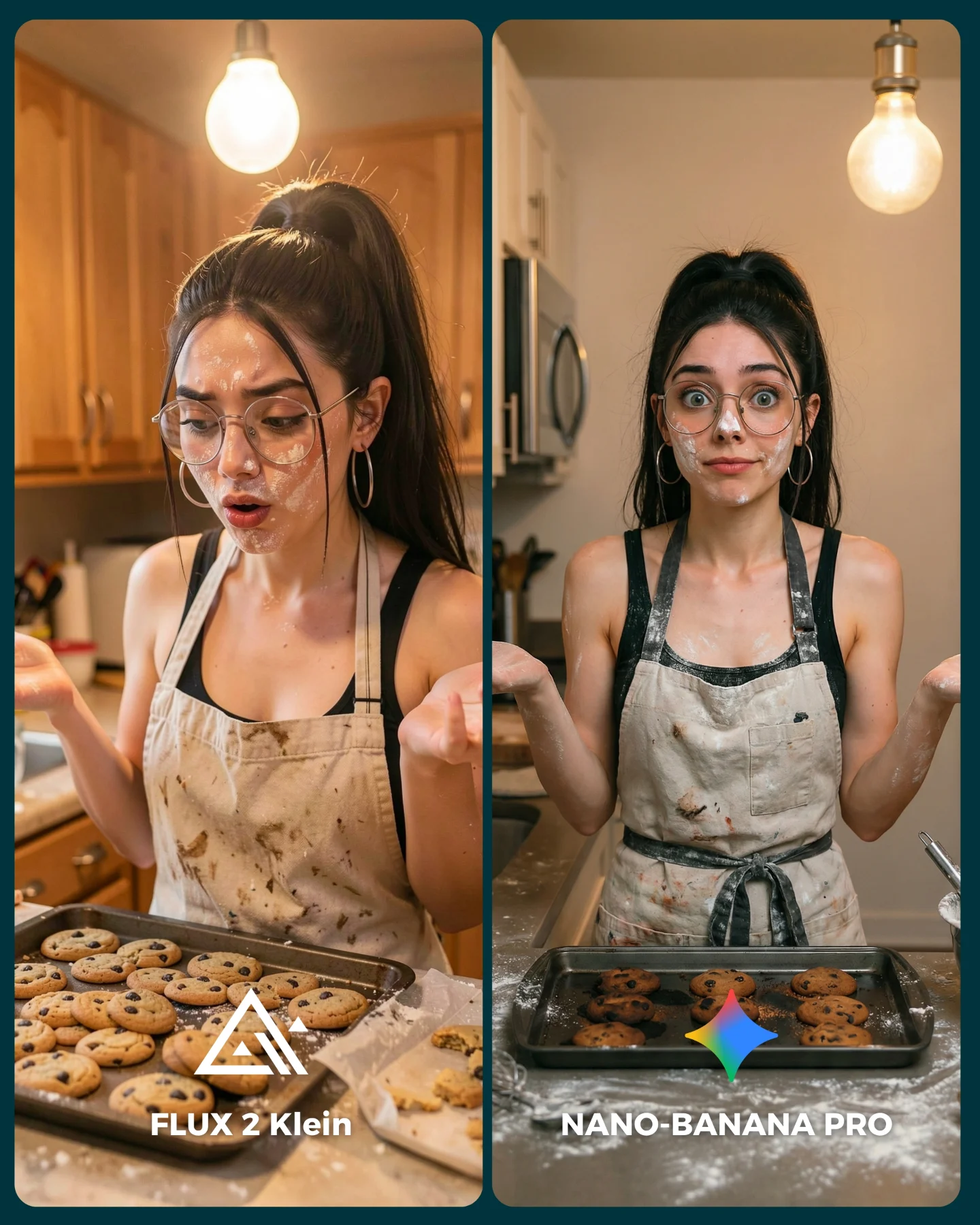
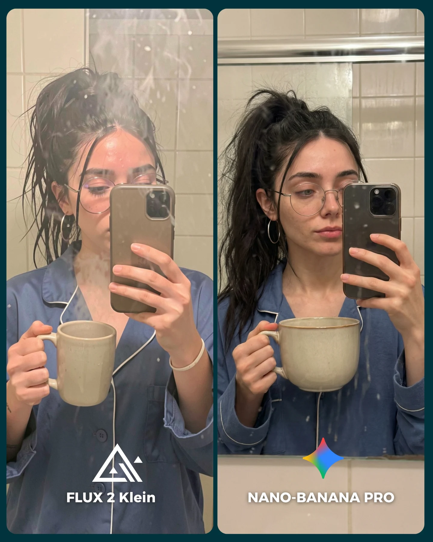
This image is smart because it tests realism in a format people already understand and enjoy. A casual skincare selfie feels native to social media, but it also contains a lot of subtle technical demands: skin texture, cream placement, facial symmetry, glasses, ponytail shape, hand-to-phone interaction, and playful expression control. That makes it a very efficient benchmark.
The best part is that the post still feels fun. It does not read like a lab experiment. It reads like something a creator would genuinely post while doing skincare at home. That mix of usefulness and normality is exactly why comparison content like this gets comments. People can judge it without feeling like they are reading a spec sheet.
Why people naturally compare these two outputs
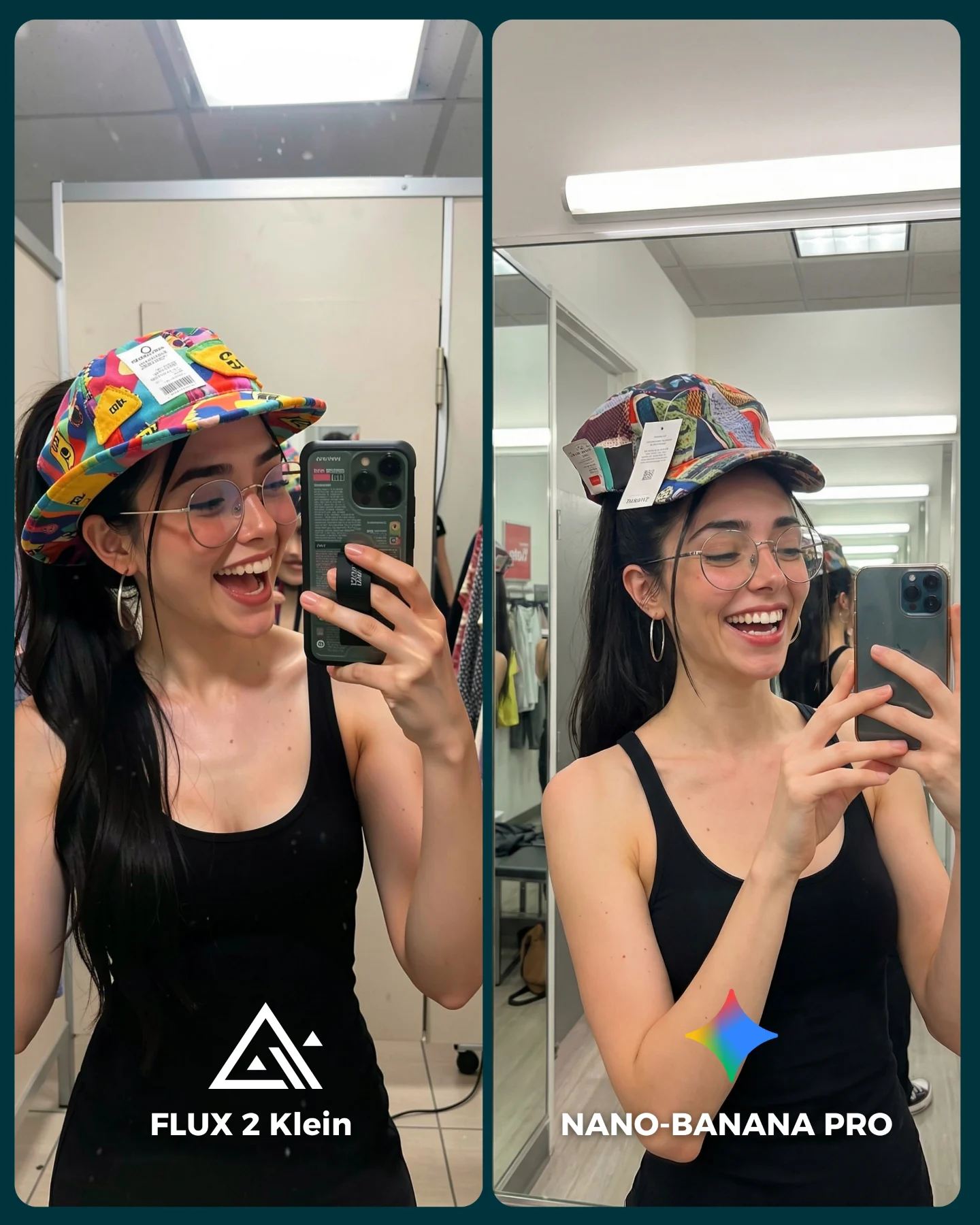
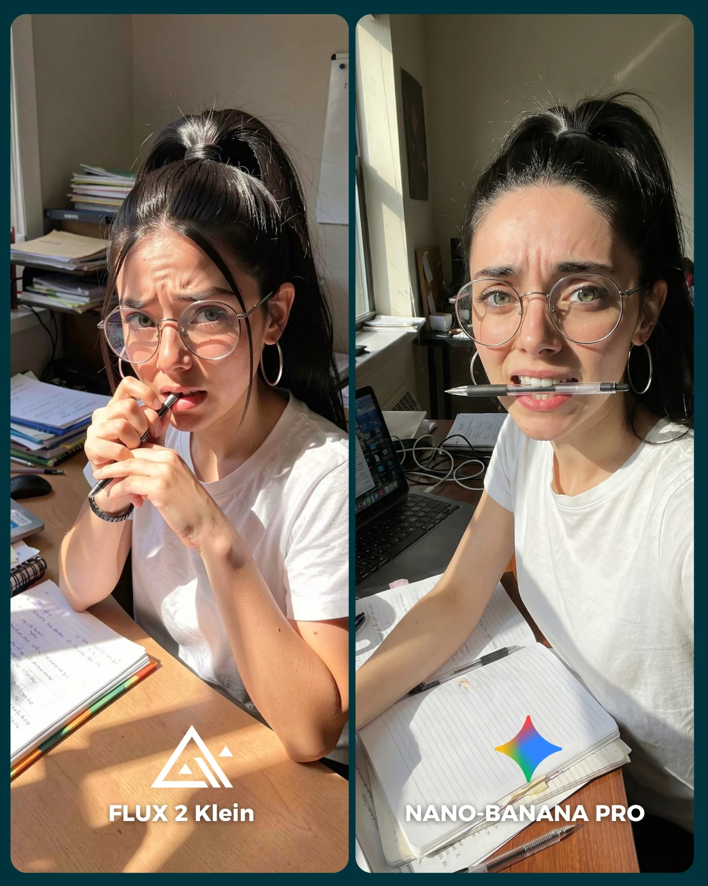
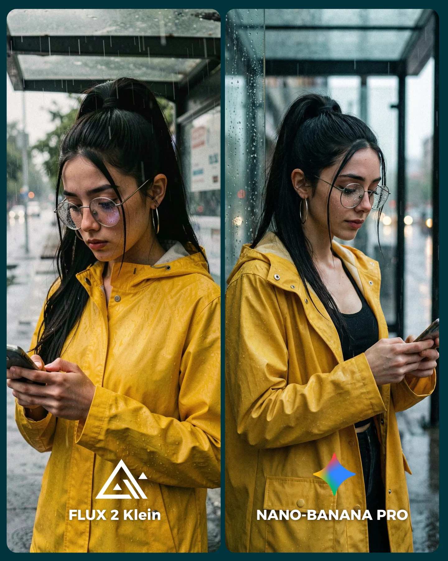
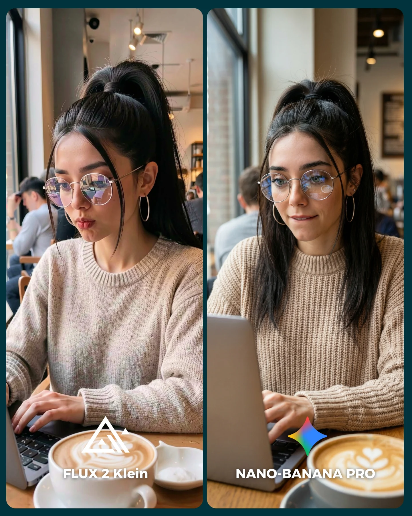
The strongest mechanism is familiarity. Most viewers know what a real skincare selfie looks like. That means they have a strong internal reference when they scan the image. They can immediately judge whether the skin looks too plastic, whether the cream dots feel convincing, or whether the expression holds together naturally.
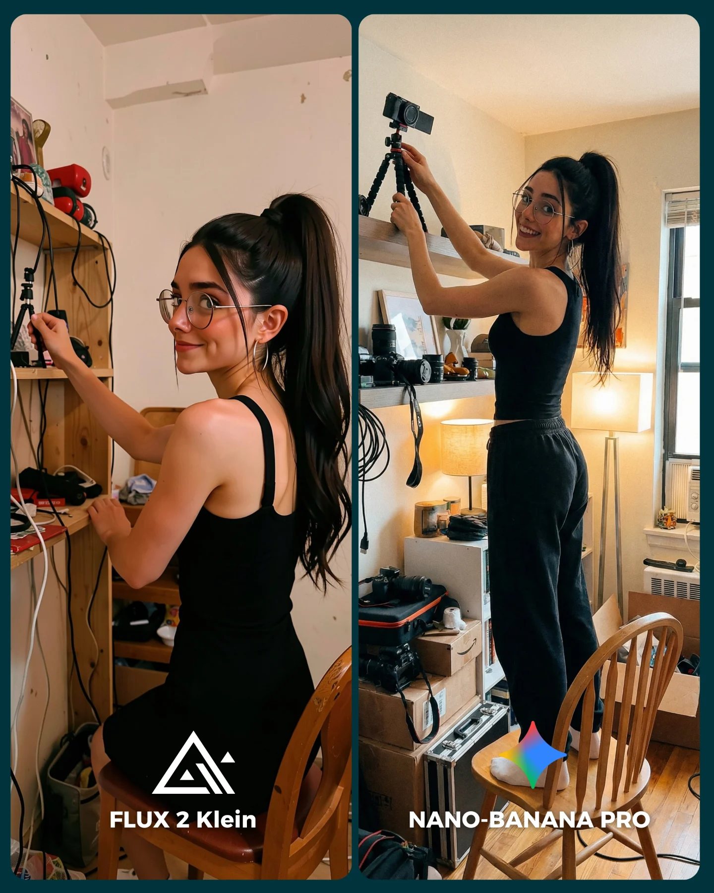
The split-screen also helps because the two panels are similar enough to invite a fair comparison while still being visually distinct. The left side is tighter and more face-led. The right side gives a little more environment and phone context. That makes the viewer compare both quality and social believability.
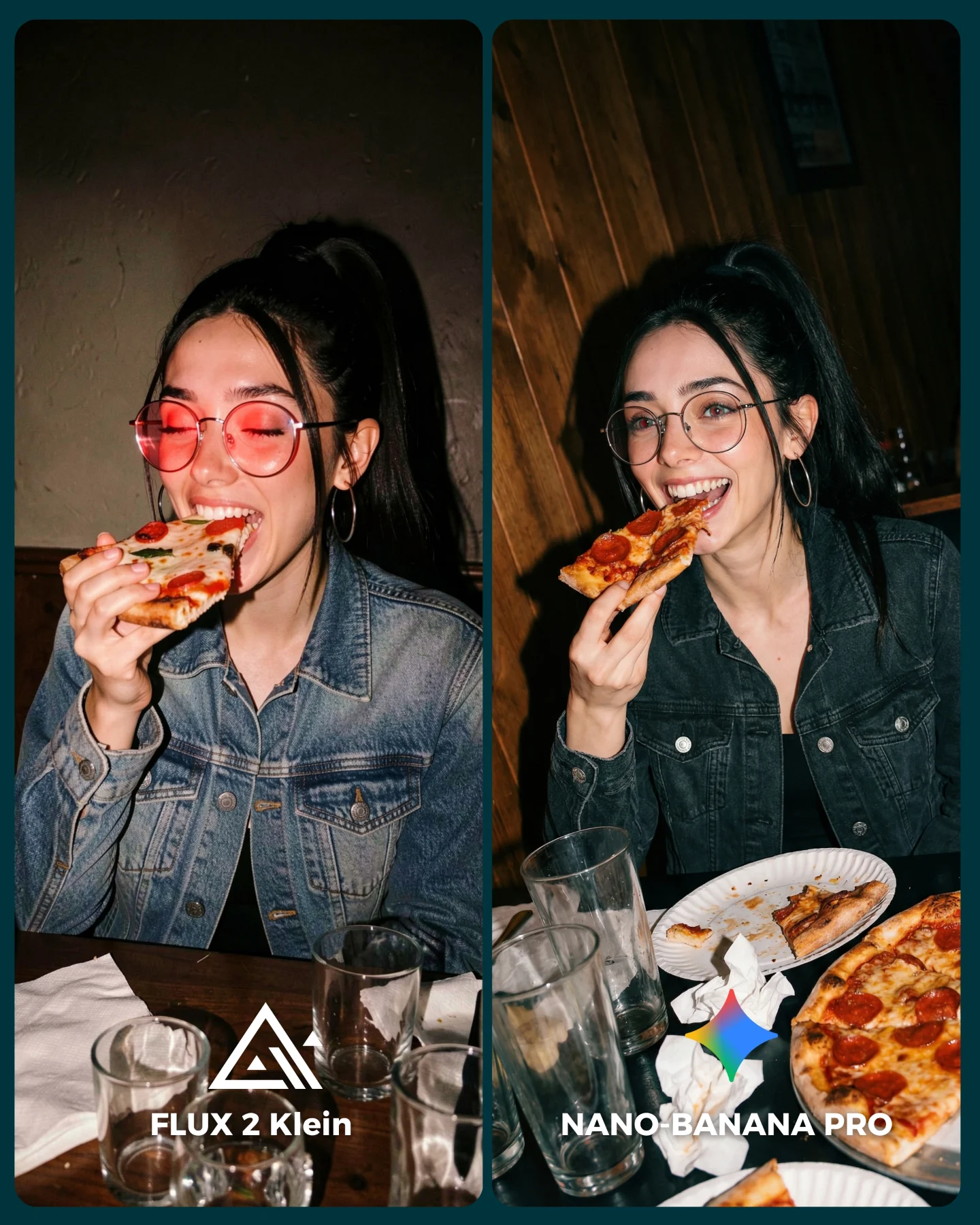
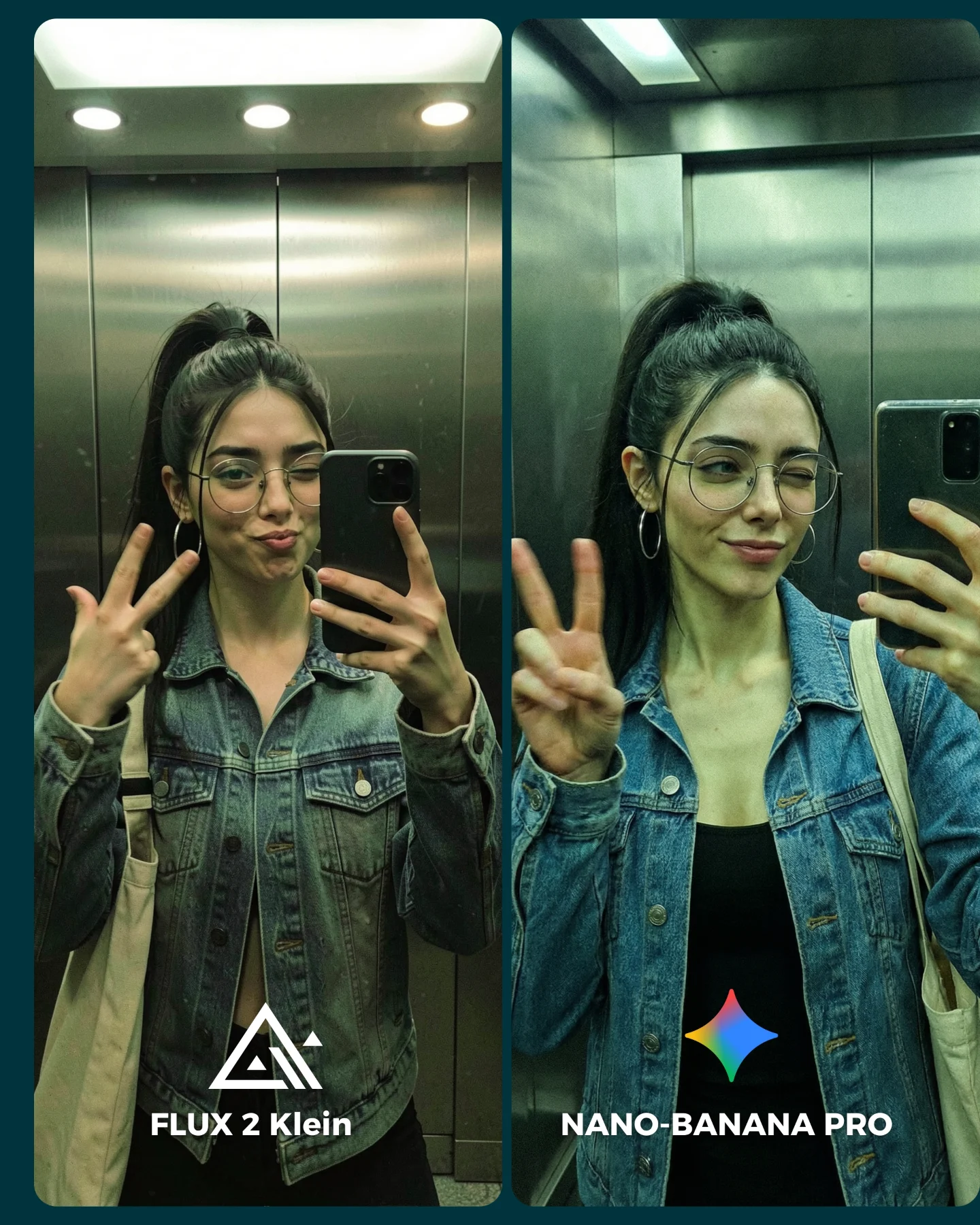
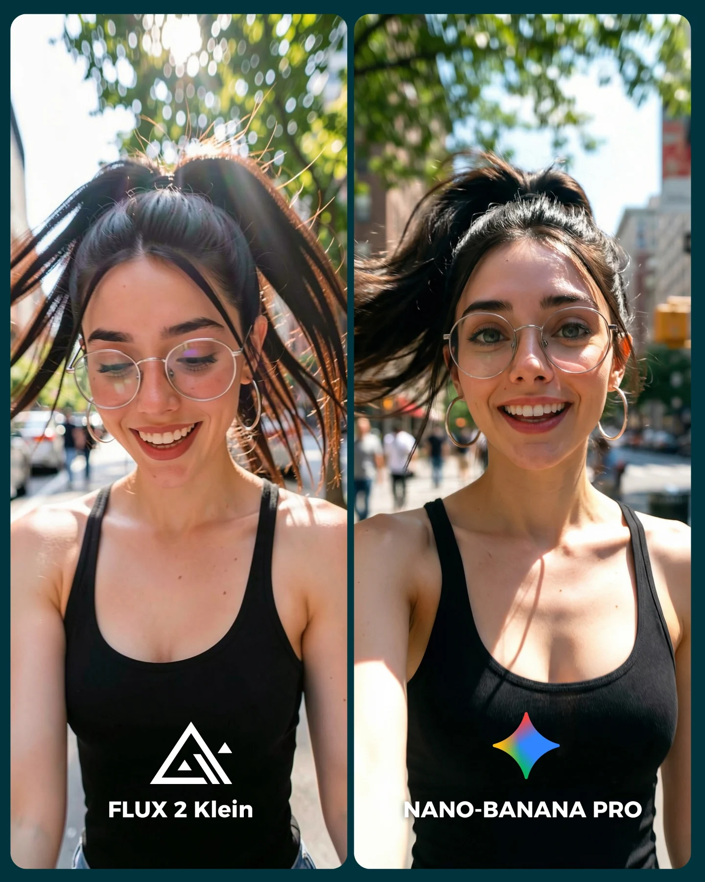
| Signal | Evidence (from this image) | Mechanism | Replication Action |
|---|
| Everyday realism test | Bathroom-like setting, black tank top, cream dots, glasses, phone selfie framing | Viewers immediately know what the scene should feel like | Choose a familiar creator behavior that audiences can judge intuitively |
| Micro-detail difficulty | Skincare cream texture, wink, duckface, reflections in glasses, scrunchie, skin texture | Small realism failures become visible fast | Use scenes with many subtle face-and-material checkpoints |
| A/B clarity | Two clearly labeled panels for FLUX 2 Klein and NANO-BANANA PRO | The image naturally invites opinion and comparison comments | Keep the comparison visible inside the asset, not only in the caption |
Where this style fits best
This format is strongest for beauty prompt tests, selfie-realism benchmarks, and creator posts that want to compare models without losing everyday warmth. It works especially well when the audience is interested in whether an AI image can feel socially native rather than overtly cinematic.
- Beauty and skincare prompt tests: The scene creates many small realism checkpoints in a simple setup.
- Selfie-consistency comparisons: The same face under slight expression changes reveals a lot about model quality.
- Creator-led benchmark posts: It still feels like personality content, not purely technical evaluation.
- Comment-bait comparisons: People naturally have opinions on which version feels more real.
It is less suited for dramatic storytelling, luxury editorial campaigns, or wide cinematic scenes. The strength here is familiarity and close-range realism.
Three transfer recipes
- Makeup touch-up version: Keep the split-screen selfie logic, but replace cream dots with lip liner, powder, or under-eye patches. Slot template:
{same creator selfie setup} {left model output} {right model output} {clear beauty-state detail} - Morning routine version: Keep the home-space realism while swapping the skincare step for coffee, towel, or wet hair cues. Slot template:
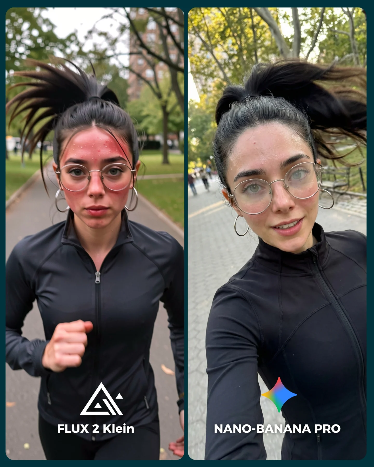
{daily routine selfie} {shared identity} {minor expression difference} {A/B labels} - Gym post-workout version: Keep the close selfie framing but change the realism checkpoints to sweat, flyaway hair, and flushed skin. Slot template:
{casual selfie benchmark} {subtle texture challenge} {left/right model comparison} {platform-native styling}
Aesthetic read: why it still feels engaging
The image succeeds because the setup is casual but not careless. The black tank top, hoop earrings, and high ponytail give the subject a consistent silhouette. The cream dots add visual rhythm across the face, which keeps the close-up from feeling flat. Even the scrunchie is doing quiet work by making the hairstyle more specific and recognizable.
The right panel's visible phone edge also matters. It adds a small piece of physical proof that makes the scene feel more credible as a selfie. That is a good reminder that social-native images often benefit from tiny practical cues, not just beautiful faces.
| Observed | Why it matters |
|---|
| White skincare dots placed across the face | Creates a highly visible realism challenge in a simple composition |
| Wink on left, duckface on right | Introduces expression variation without changing the whole setup |
| Phone edge visible in the right panel | Makes the selfie framing feel socially believable |
| Scrunchie, glasses, and hoop earrings | Provide identity anchors that viewers can compare across panels |
| Soft home interior with window | Keeps the image approachable and not over-produced |
Prompt technique breakdown
To recreate this kind of comparison, you need to specify both the beauty-state details and the casual phone-language of the image. If you only say “woman doing skincare,” the output usually becomes too ad-like. The post works because it still behaves like creator content.
| Prompt chunk | What it controls | Swap ideas (EN, 2-3 options) |
|---|
| two-panel skincare selfie comparison | The A/B benchmark structure | makeup comparison board; before/after skincare frame; left/right beauty test |
| same woman with cream dots and glasses | Identity consistency plus subtle realism challenge | under-eye patches; pimple stickers; sunscreen streaks |
| left tighter, right wider with phone edge | Variation while keeping social realism | mirror version vs direct version; front close-up vs half-body selfie; wink vs smile |
| soft daylight home background | Everyday credibility and anti-studio feel | bathroom mirror light; bedroom window light; hallway daylight |
| bottom labels and simple icons | Direct benchmark readability | generator names; v1 vs pro labels; badge footer |
How to iterate this kind of image
Baseline lock the split-screen layout, the cream-dot placements, and the face identity first. Those are the foundation. Then refine one or two things at a time: first the expressions, second the glasses reflections, third the phone and arm perspective, and fourth the skin texture and ambient room light.
The broader lesson is that some of the best AI comparison scenes are the ones that look easiest. The more ordinary the scenario feels, the more brutally viewers notice what is off. That is why this image is such a useful benchmark.