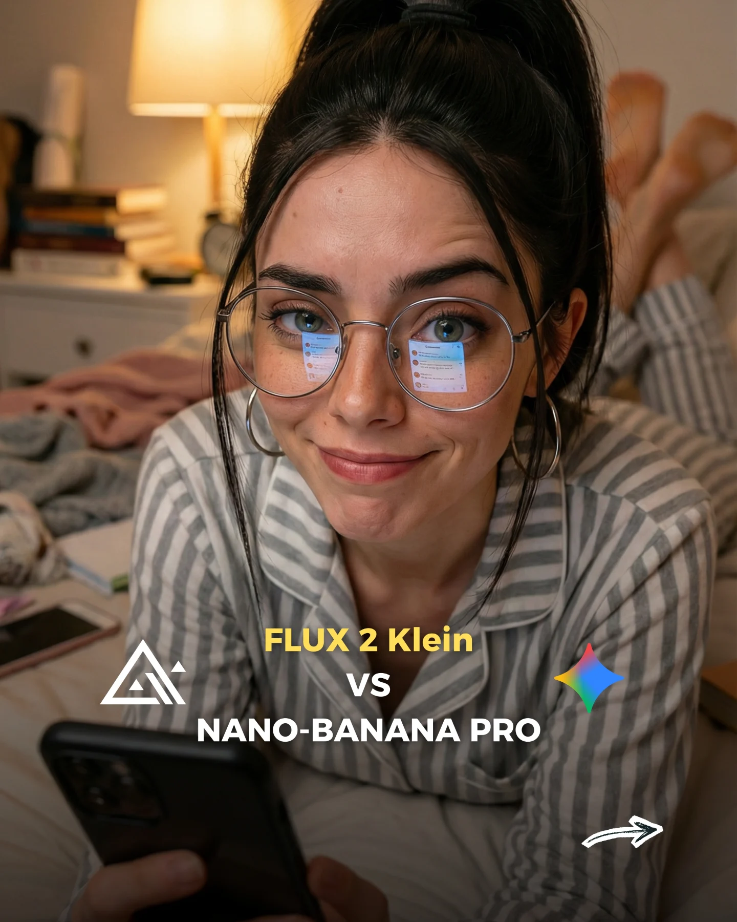
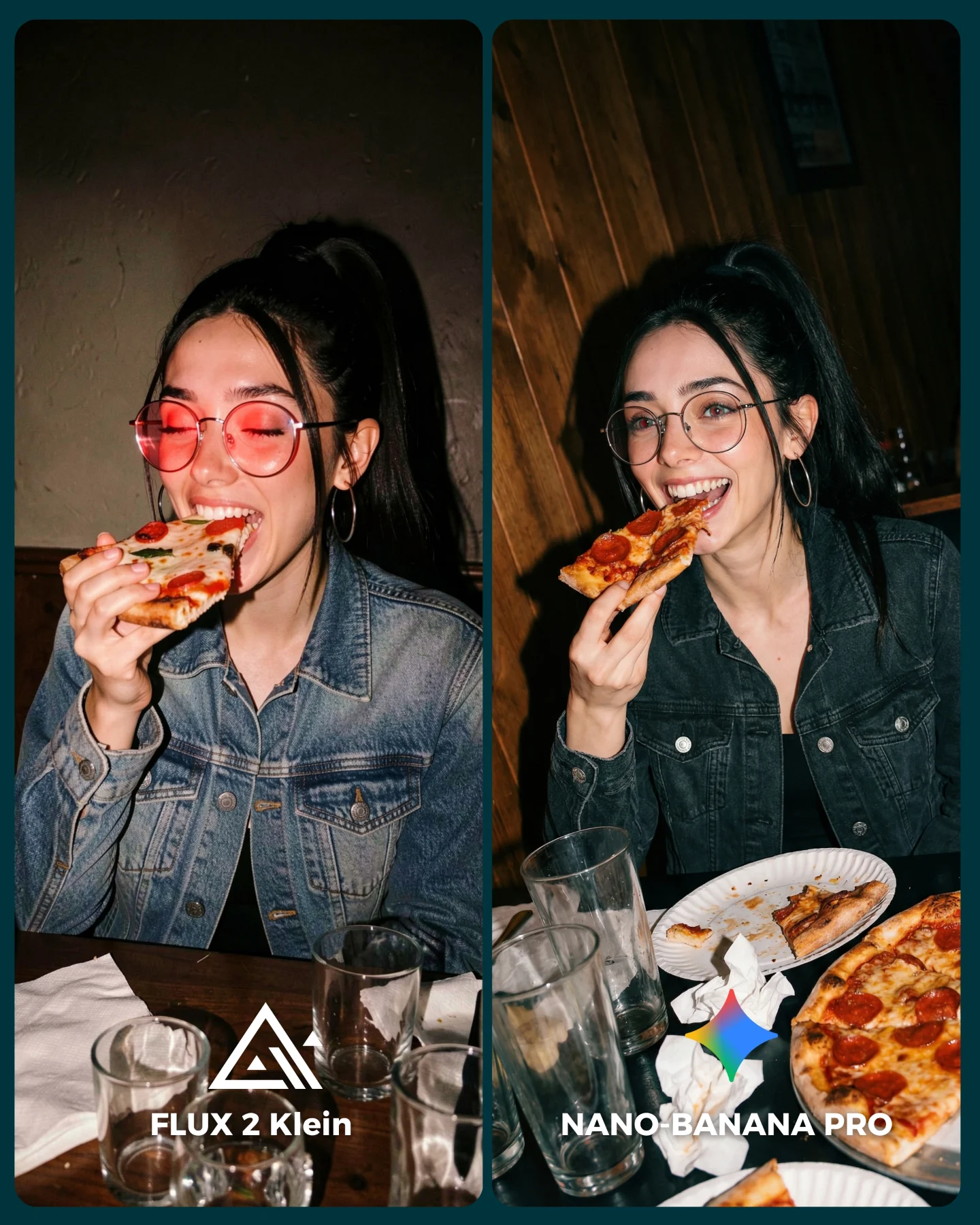
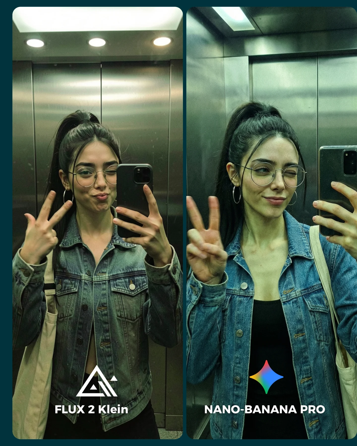
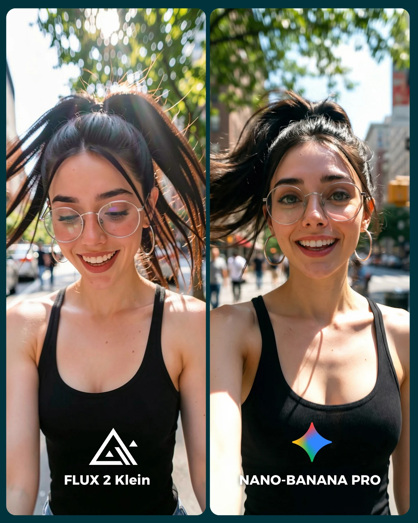
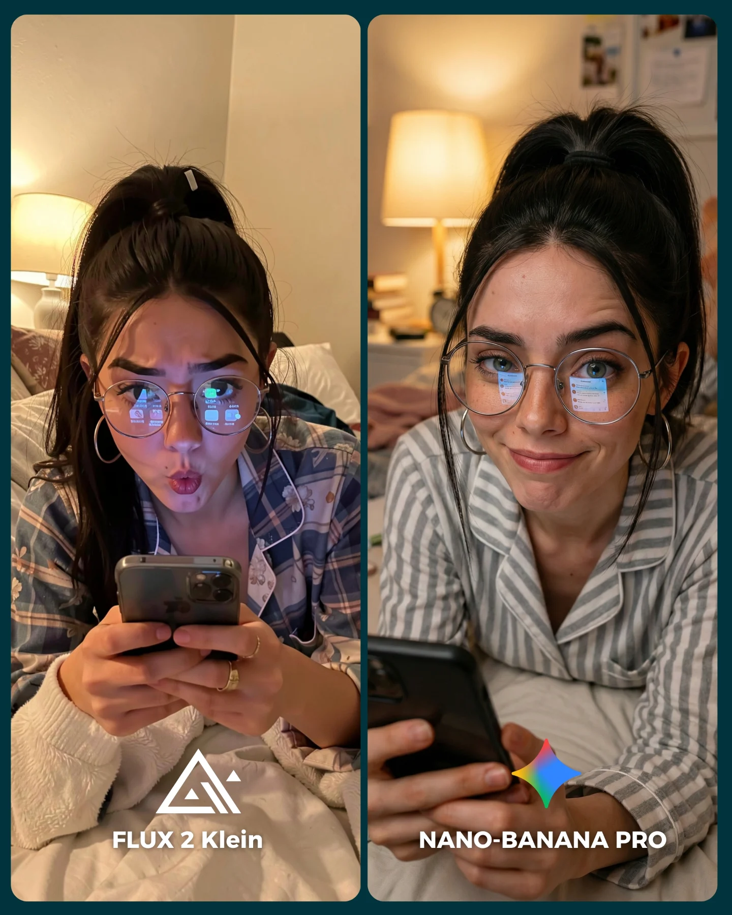
How soy_aria_cruz Compared Flux 2 vs Nano Banana Astronaut AI
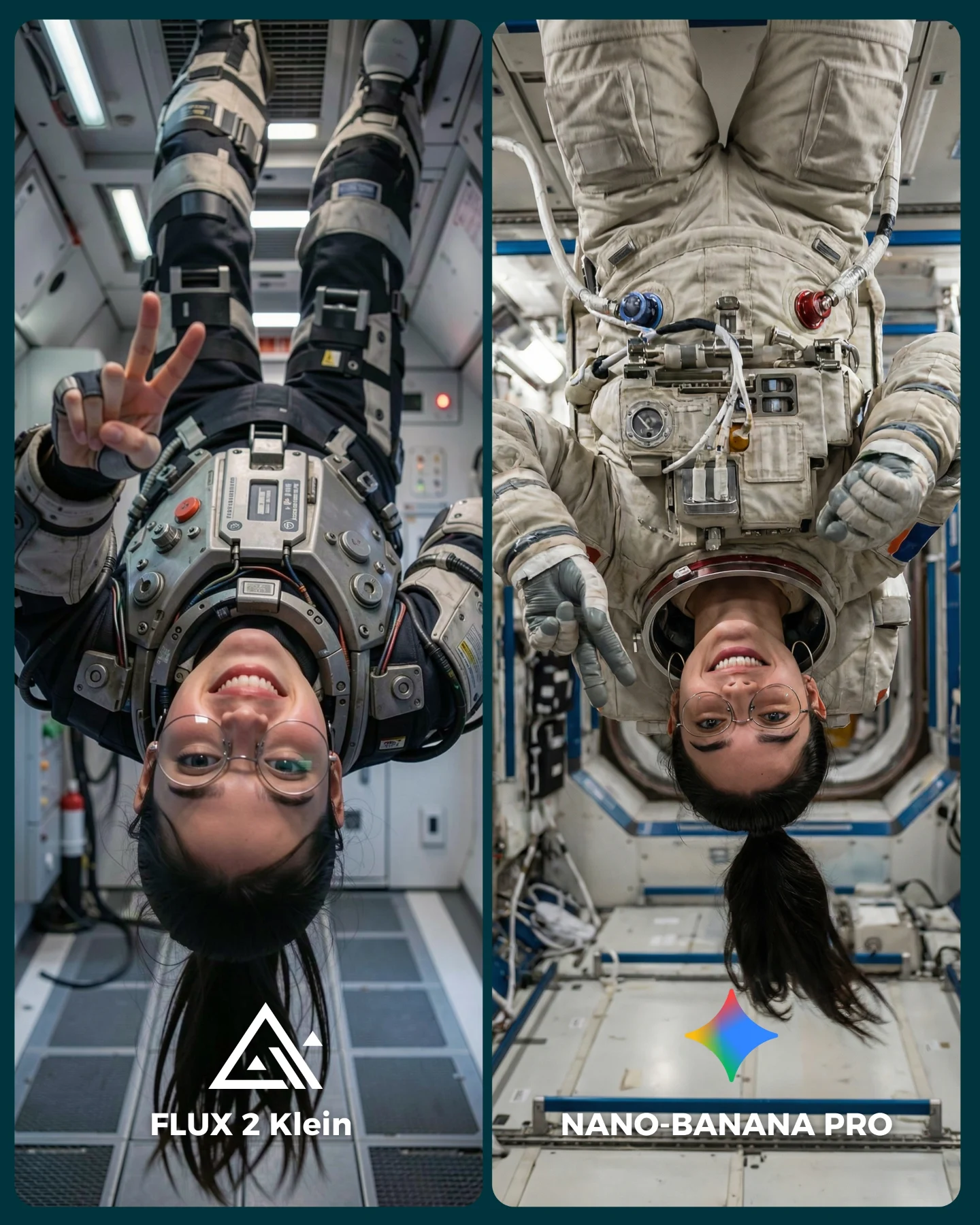
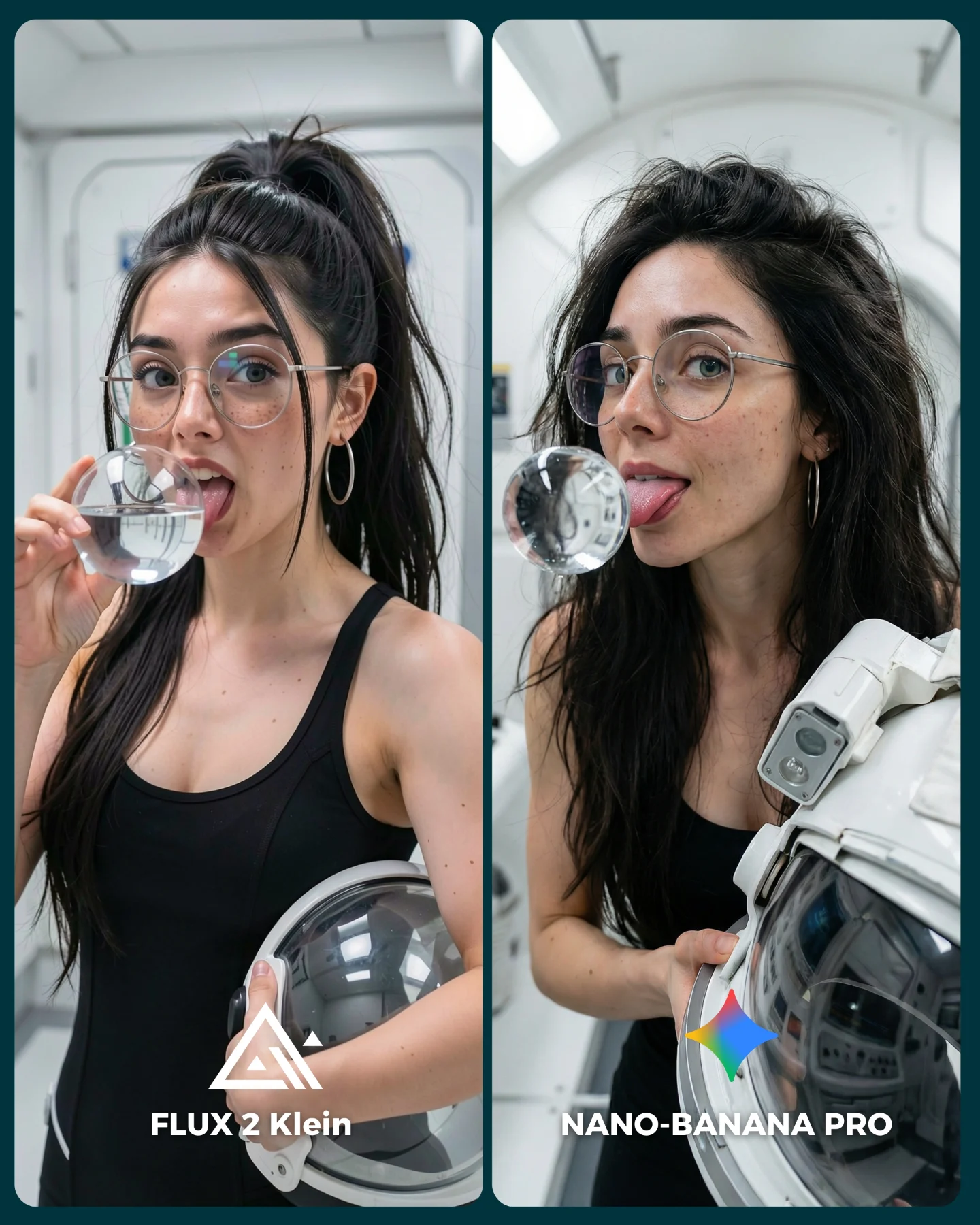
This post works because the hook and the test are the same thing. At first glance, the upside-down astronaut framing is funny and eye-catching. But once you look closer, you realize the image is doing real benchmark work: suit hardware, body orientation, face consistency, gloves, tubing, cabin geometry, and hair direction all have to hold together at once.
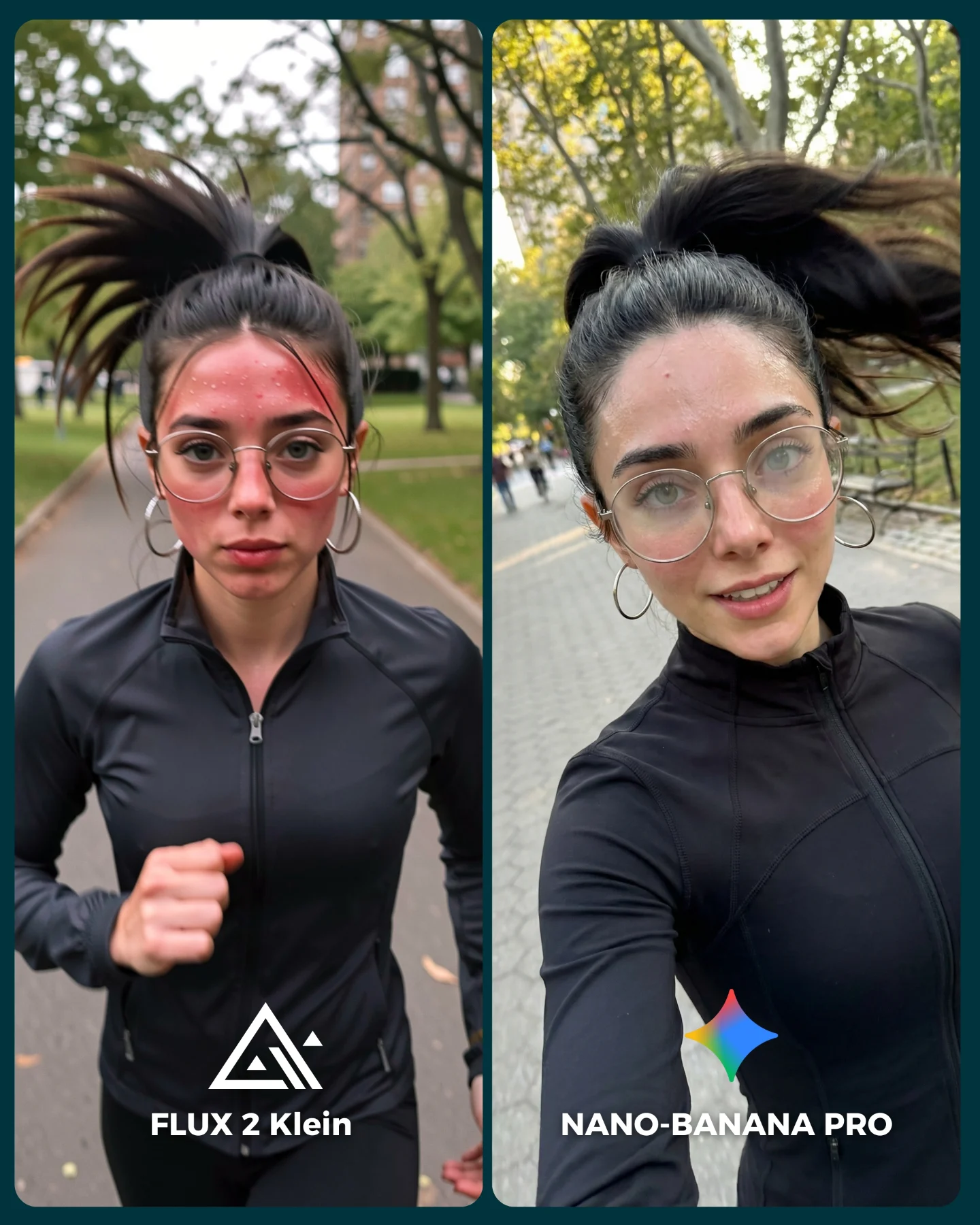
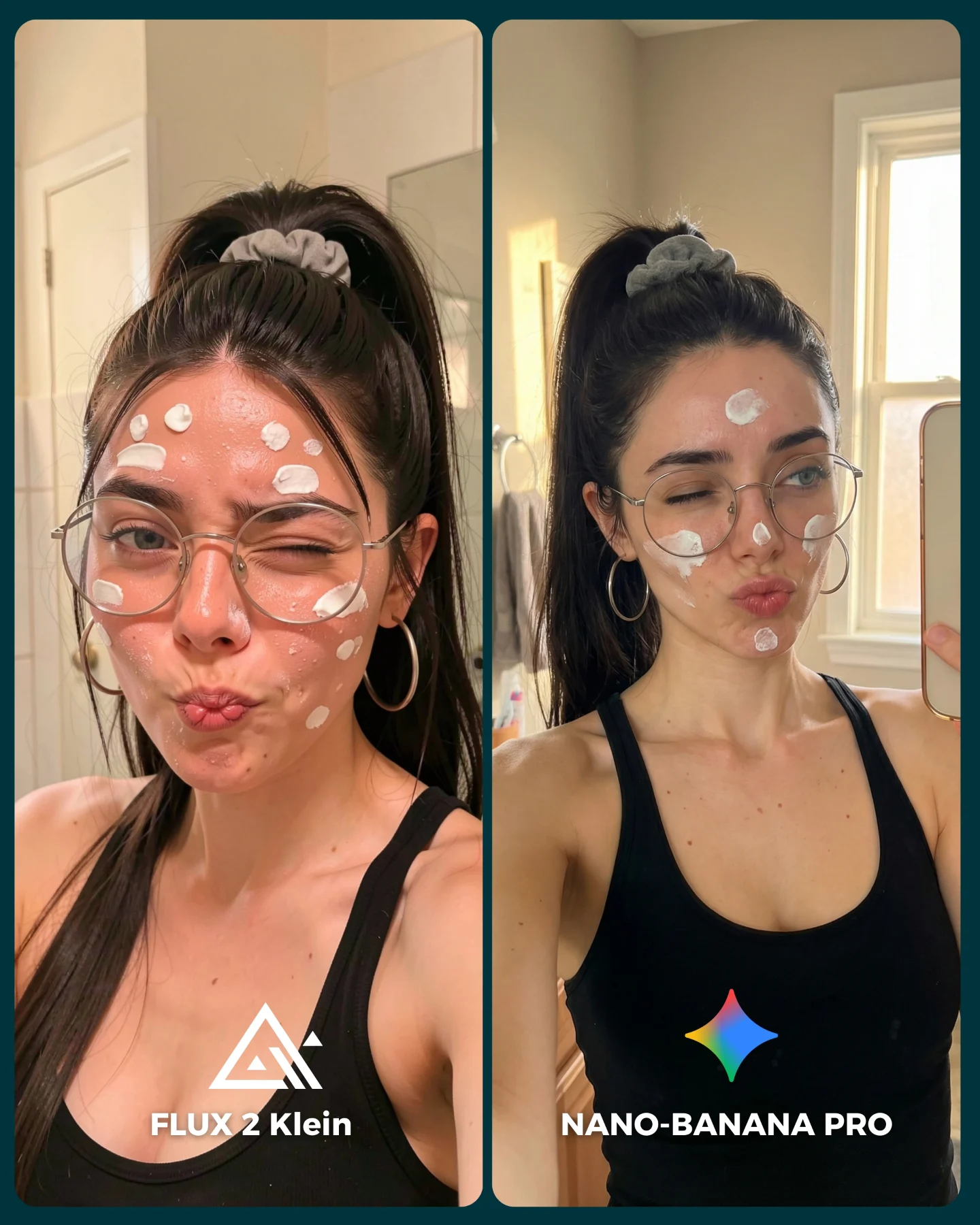
That is why this kind of image performs well for AI creator accounts. It gives casual viewers an immediate spectacle while giving detail-oriented viewers actual evidence to inspect. A good comparison post often needs both layers. This one delivers them cleanly.
Why it can pull comments
The upside-down framing is the first stop signal. People instinctively reorient the image in their heads, which already buys the creator more attention. Then the split-screen format turns that attention into judgment. Which side feels more real? Which suit is more convincing? Which one handles the interior space better?
The image is also strong because it tests a scene that is unfamiliar but still understandable. Most viewers have never been in zero gravity, but they know enough about astronaut imagery to notice when a suit or cabin feels wrong. That is an ideal benchmark zone: specialized enough to be interesting, familiar enough to be debatable.
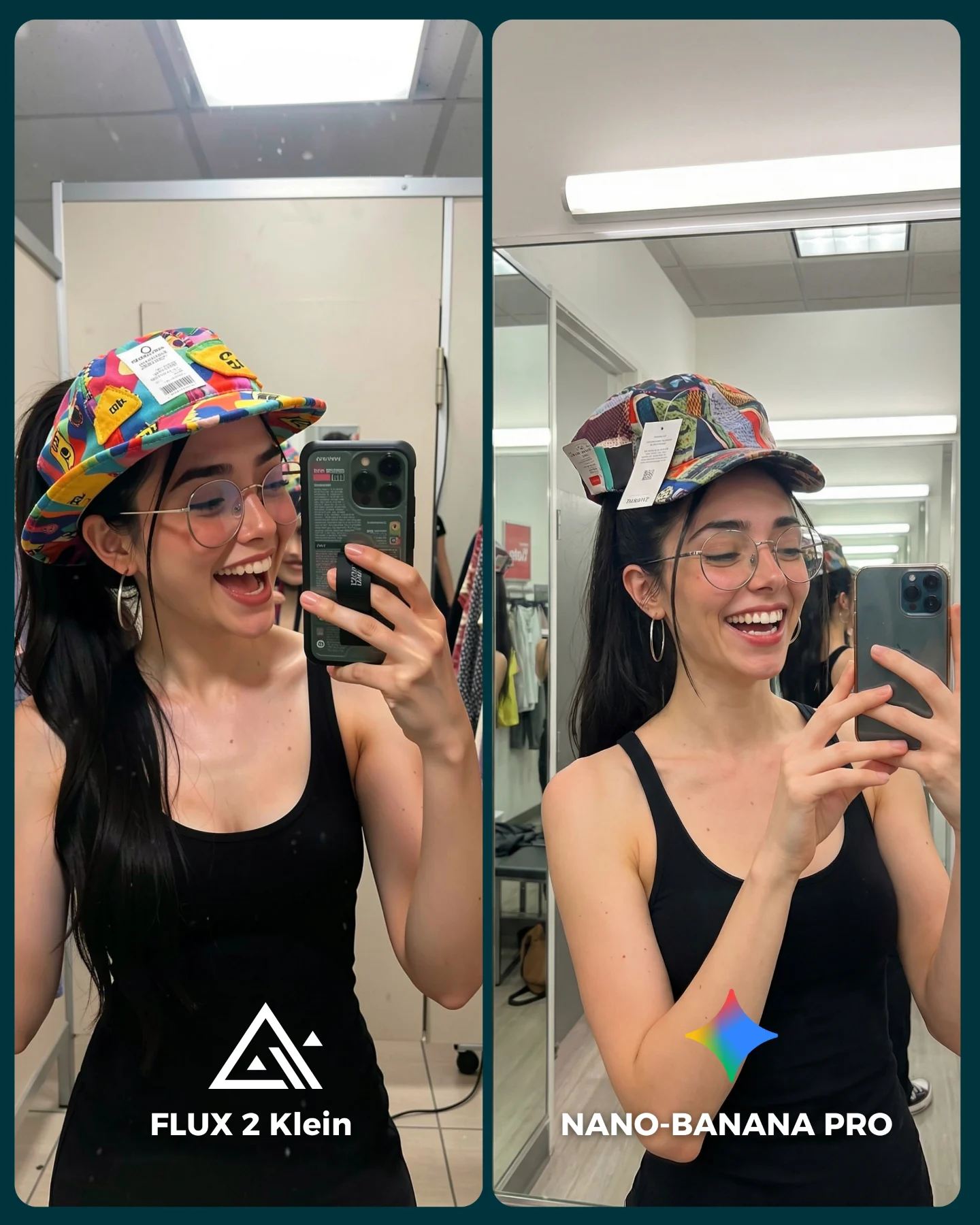
| Signal | Evidence (from this image) | Mechanism | Replication Action |
|---|
| Orientation shock | Both figures are clearly upside down inside a spacecraft | The unusual framing interrupts the scroll immediately | Use one spatial condition that forces viewers to look twice |
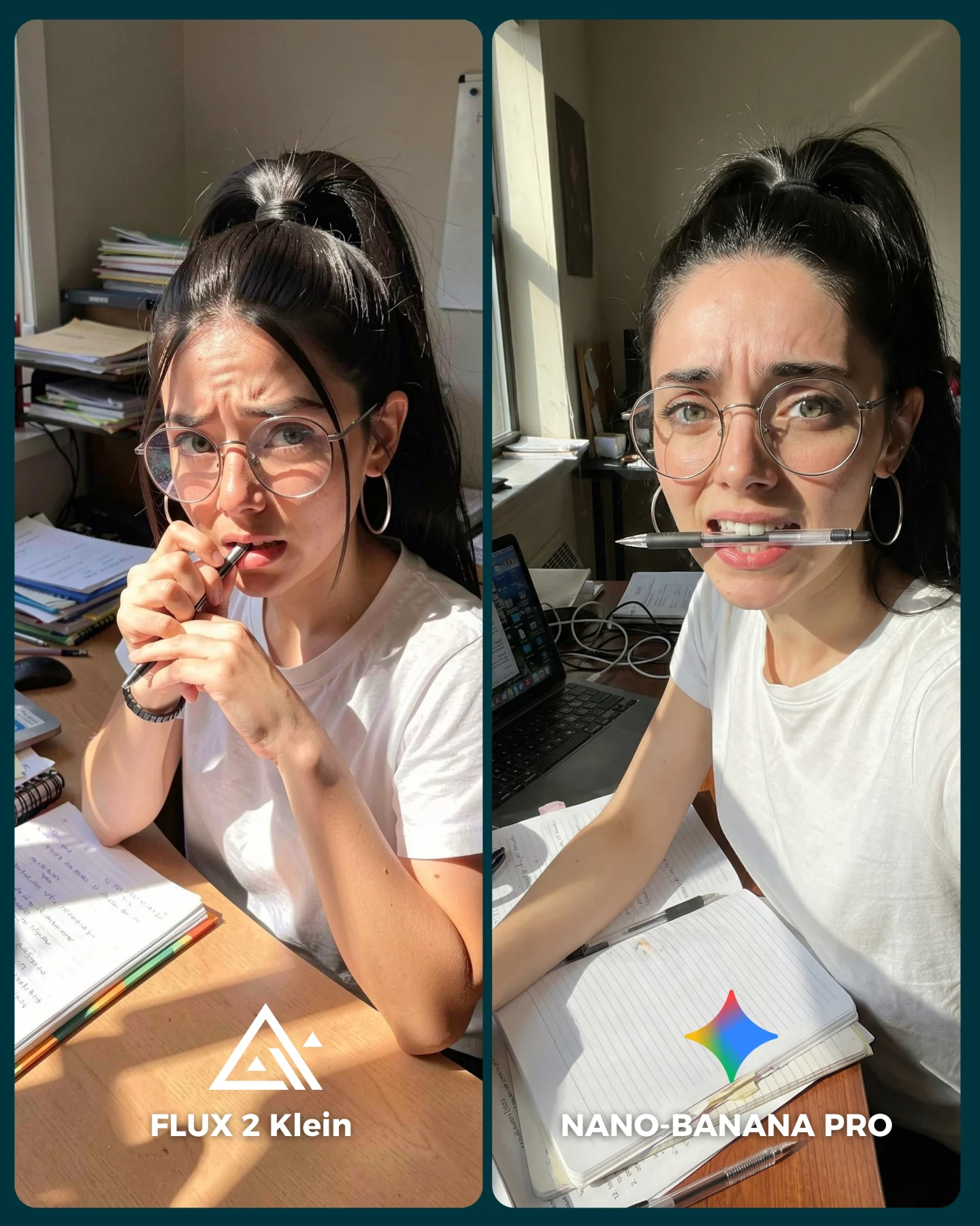
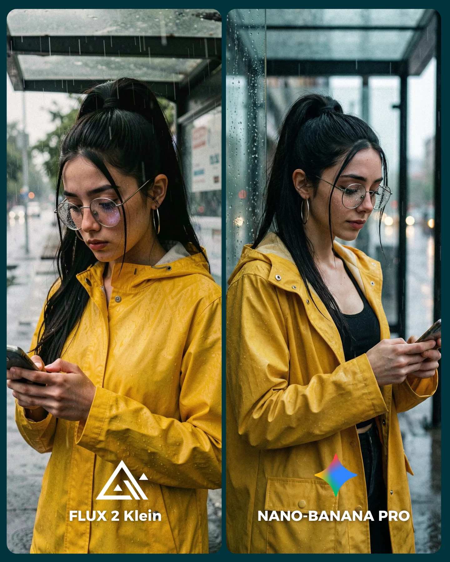
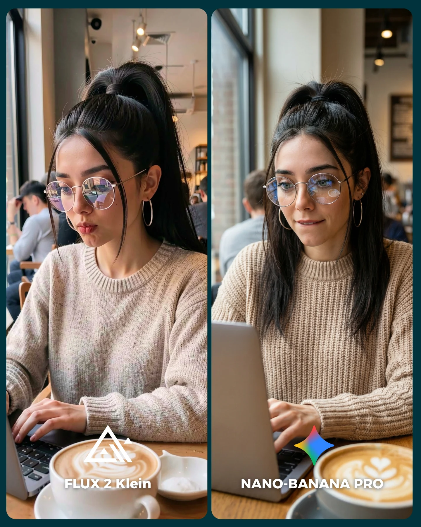
| High-detail benchmark | Visible suit modules, gloves, tubing, fasteners, and cabin equipment | Technical detail gives the audience proof points for comparison | Choose scenes where realism depends on many small components |
| Same-face consistency test | The same creator appears in two different astronaut suit systems | Character lock becomes easier to judge under harder constraints | Keep the face stable while changing only the model and gear logic |
Where this format works best
This format is ideal for model comparison posts, prompt breakdowns around technical realism, and creator feeds that want to look imaginative without losing rigor. It is especially useful when you want to demonstrate that a model can handle high-complexity equipment and unfamiliar orientation while still keeping the character intact.
- Best fit: realism benchmark posts for sci-fi and technical interiors.
- Best fit: prompt showcases focused on suits, gear, and zero-gravity scenes.
- Best fit: audience-poll posts where viewers compare detail fidelity.
- Not ideal: soft emotional lifestyle content where heavy hardware would overpower the mood.
- Not ideal: minimalist fashion content that depends on simple clean silhouettes.
Three transfer recipes
- Keep: upside-down framing and interior realism. Change: the domain, such as submarine, flight deck, or lab chamber. Template: {same character} inside {technical interior} under {orientation challenge}
- Keep: comparison split and one stable face. Change: the equipment system, such as armor, diving suit, or hazmat gear. Template: {model A} vs {model B} on {hardware-heavy subject}
- Keep: one high-complexity setting. Change: the emotional read, from playful to serious or mission-focused. Template: {microgravity or inversion pose} with {specific gear language}
Aesthetic read
The image feels strong because it balances friendliness with machinery. The face is smiling and approachable, but the suits are dense with detail. That contrast stops the scene from feeling cold. It also makes the benchmark easier to care about because viewers are comparing a character, not just equipment.
The inversion helps aesthetically too. When the body is upside down, the suit reads differently: buckles, tubes, hair, and gloves all gain a strange new gravity logic. This is a good reminder that perspective and orientation can be as important as object detail when you are trying to create a memorable technical image.
| Observed | Recreate | Why it matters |
|---|
| Upside-down astronaut portraits | Lock inversion clearly and let hair and body confirm it | Orientation is the hook and the realism test at once |
| Distinct left-right suit families | Make one side darker and more futuristic, the other lighter and more practical | Contrast helps viewers compare model interpretation |
| Dense cabin detail | Keep rails, panels, hatches, and technical clutter readable | The interior sells the zero-gravity environment |
| Friendly face inside heavy gear | Preserve a clear smile and visible identity markers | Character warmth makes the benchmark more engaging |
Prompt technique breakdown
This should be prompted as a technical comparison scene with a strong orientation challenge. If you only prompt “astronaut” and “space station,” you will miss the part that actually makes the image memorable.
| Prompt chunk | What it controls | Swap ideas (EN, 2-3 options) |
|---|
| upside-down astronaut in zero gravity | The central hook and spatial logic | inverted spacewalker; floating upside down in module; reversed-orientation astronaut portrait |
| spacecraft interior with panels and rails | The believable environment | orbital module; station cabin; technical spacecraft bay |
| detailed suit hardware and tubing | Benchmark difficulty and realism proof points | EVA gear; chest modules; articulated suit systems |
| same woman in both panels | Identity consistency across models | same face lock; same creator in two outputs; stable character benchmark |
| comparison labels at the bottom | Instant readability of the test | model-vs-model title; tool benchmark labels; left-right comparison names |
Execution playbook
Lock three things first: the inverted pose, the spacecraft interior, and the face consistency. After that, refine suit systems and labels.
- Run 1: solve body orientation and ponytail direction so the inversion reads instantly.
- Run 2: refine the suit hardware and cabin detail without losing face clarity.
- Run 3: differentiate the left and right suit languages while keeping the same person.
- Run 4: add labels and polish the comparison so it still reads at feed size.
The image wins because it makes a difficult benchmark look playful. That is the balance worth protecting.