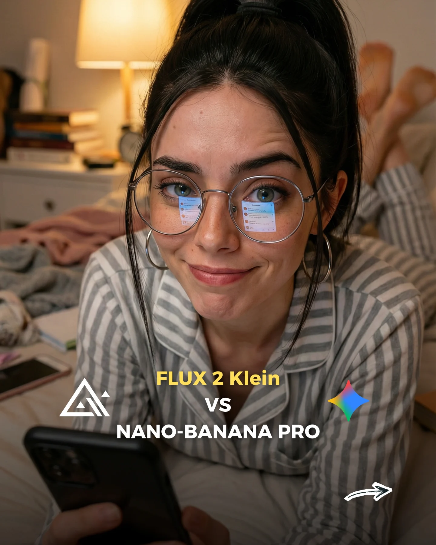
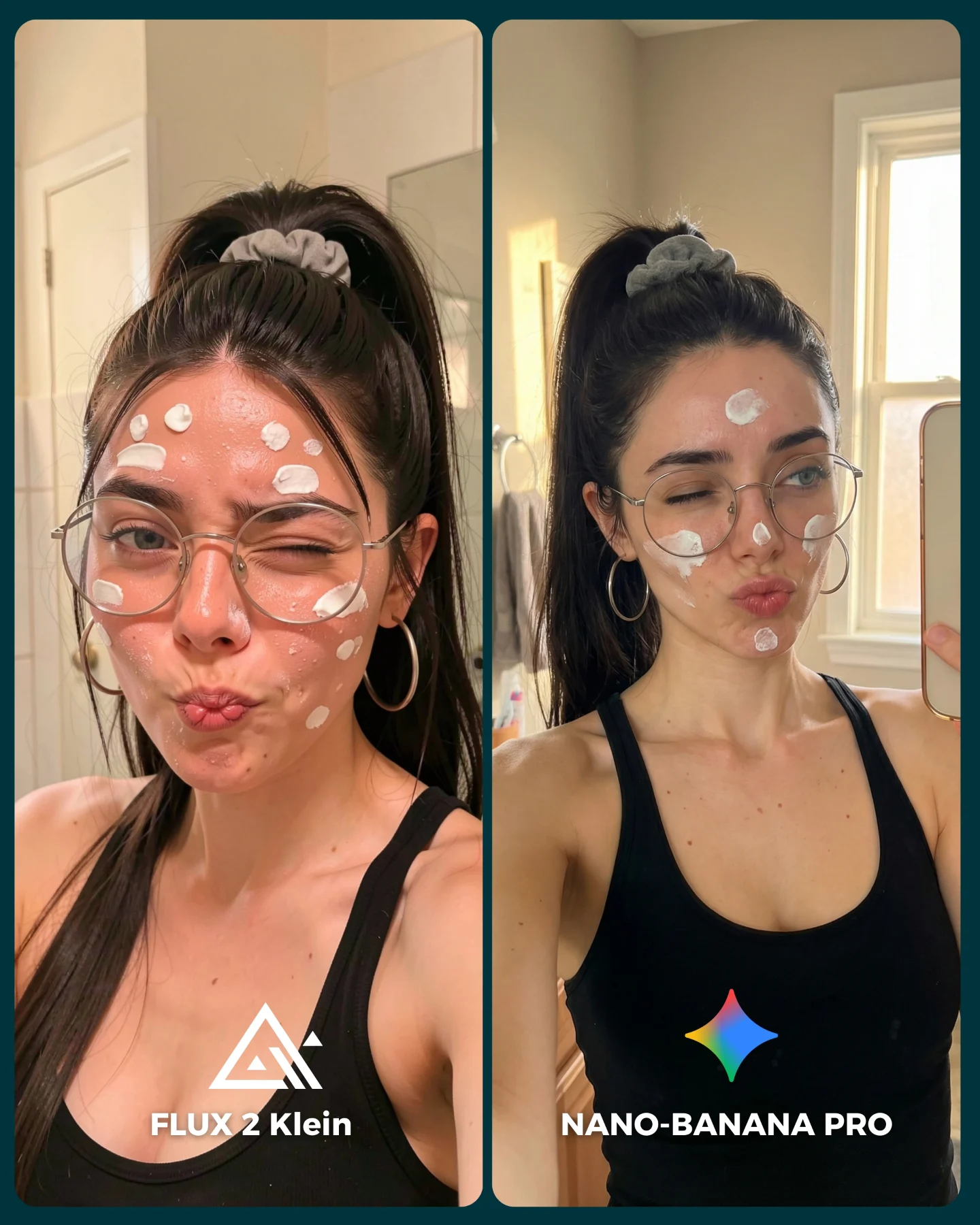
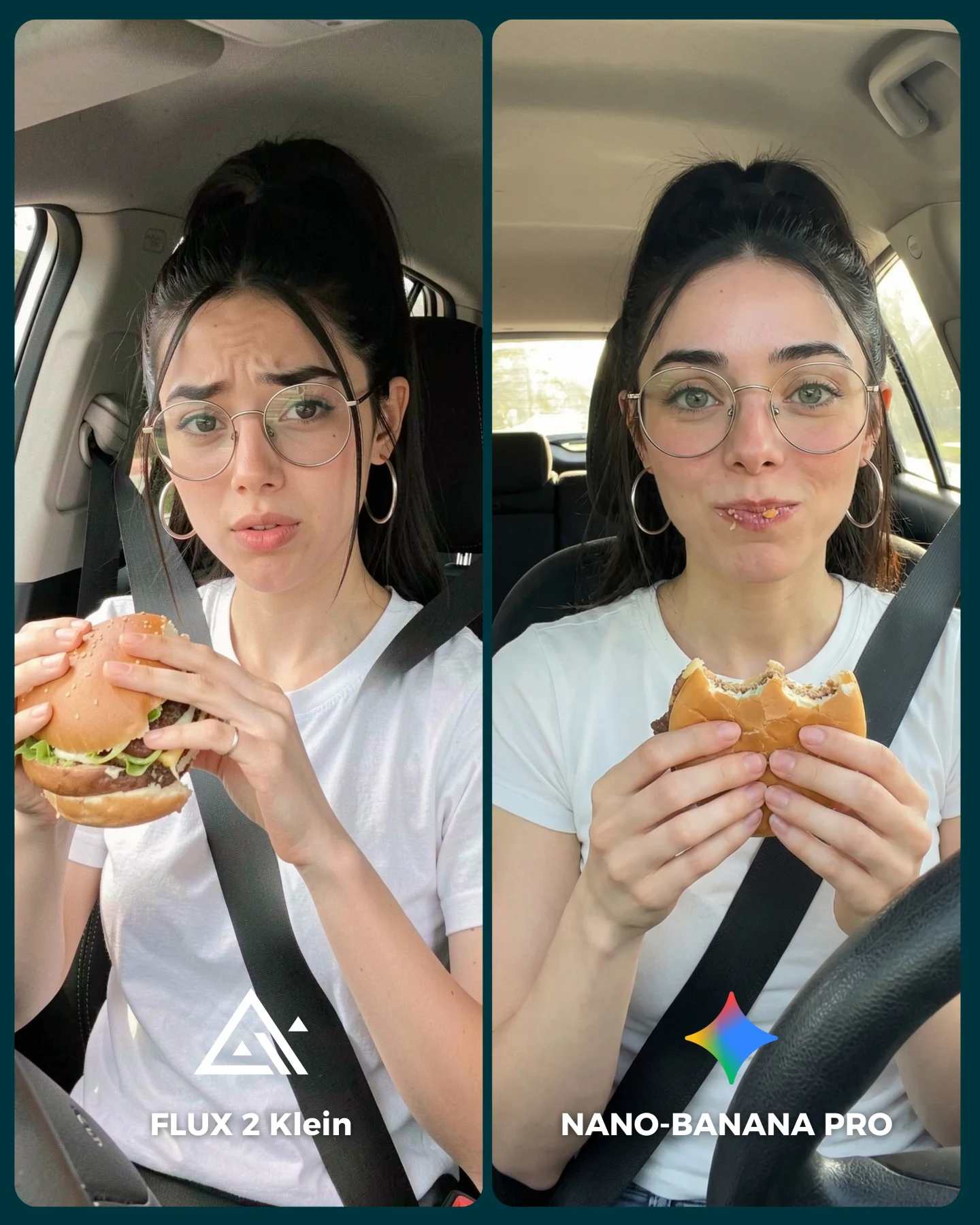
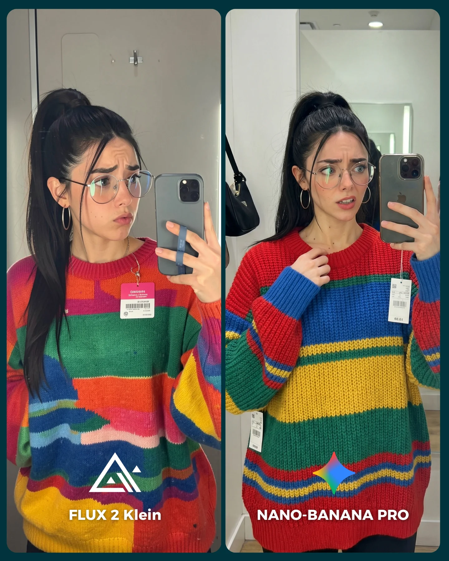
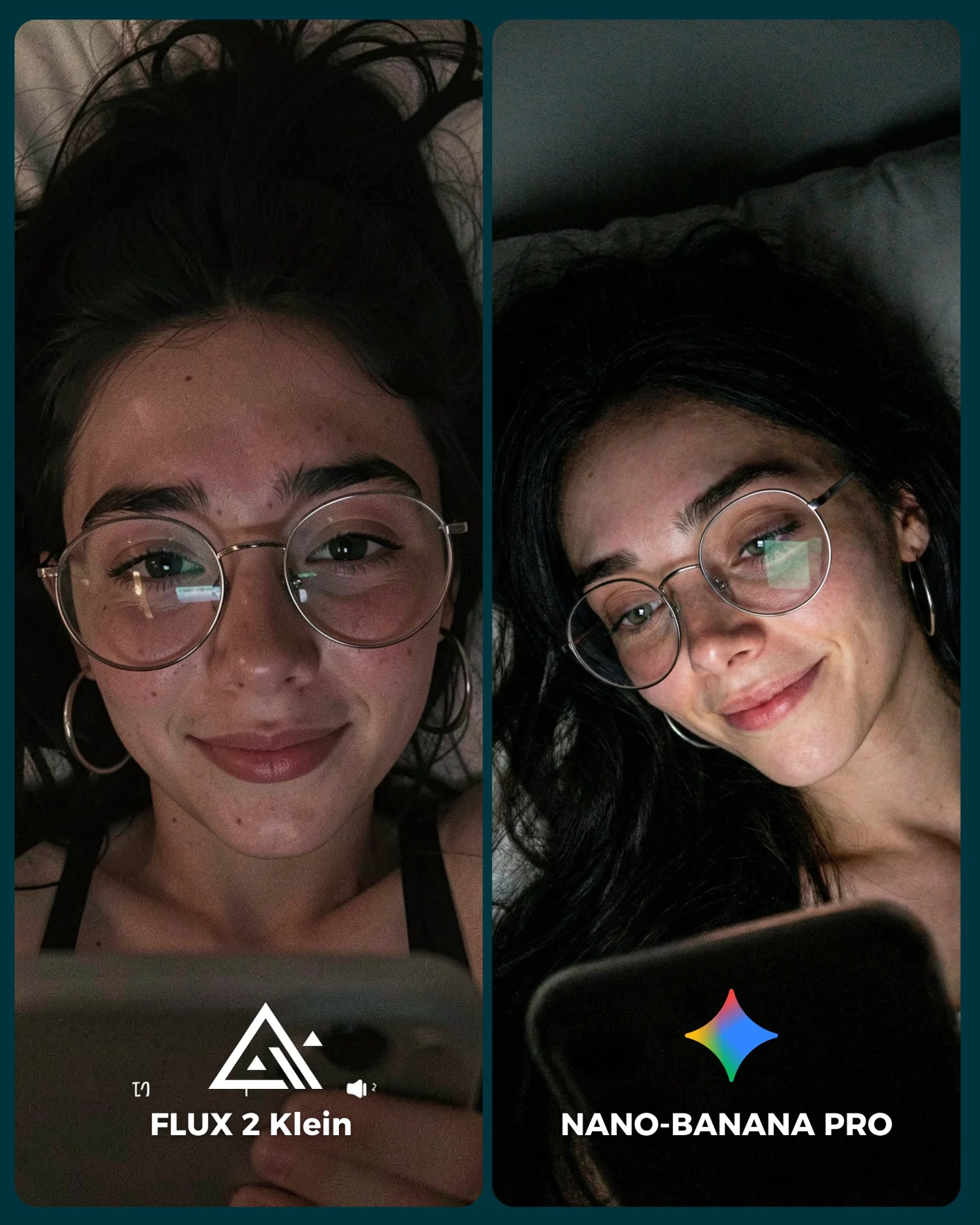
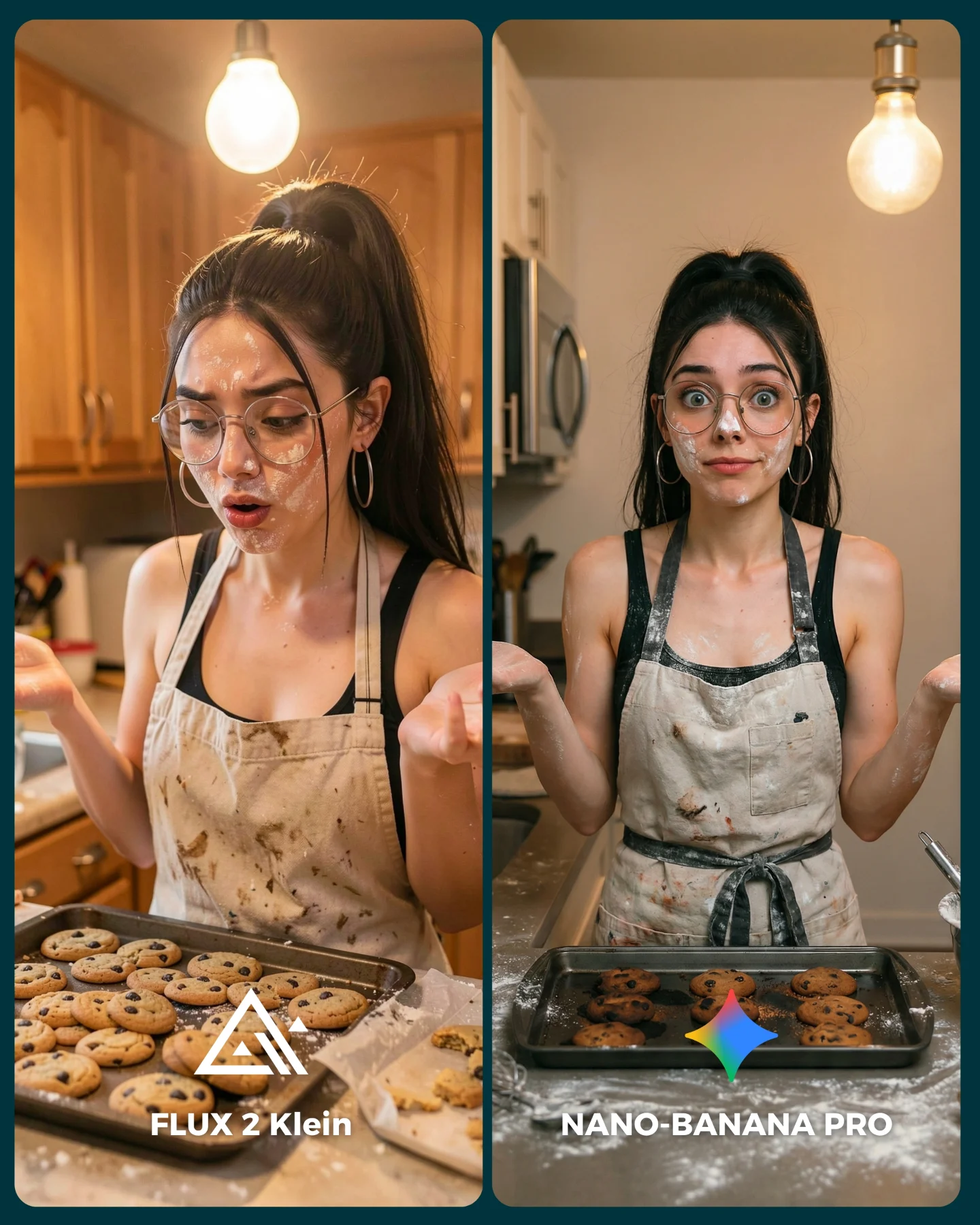
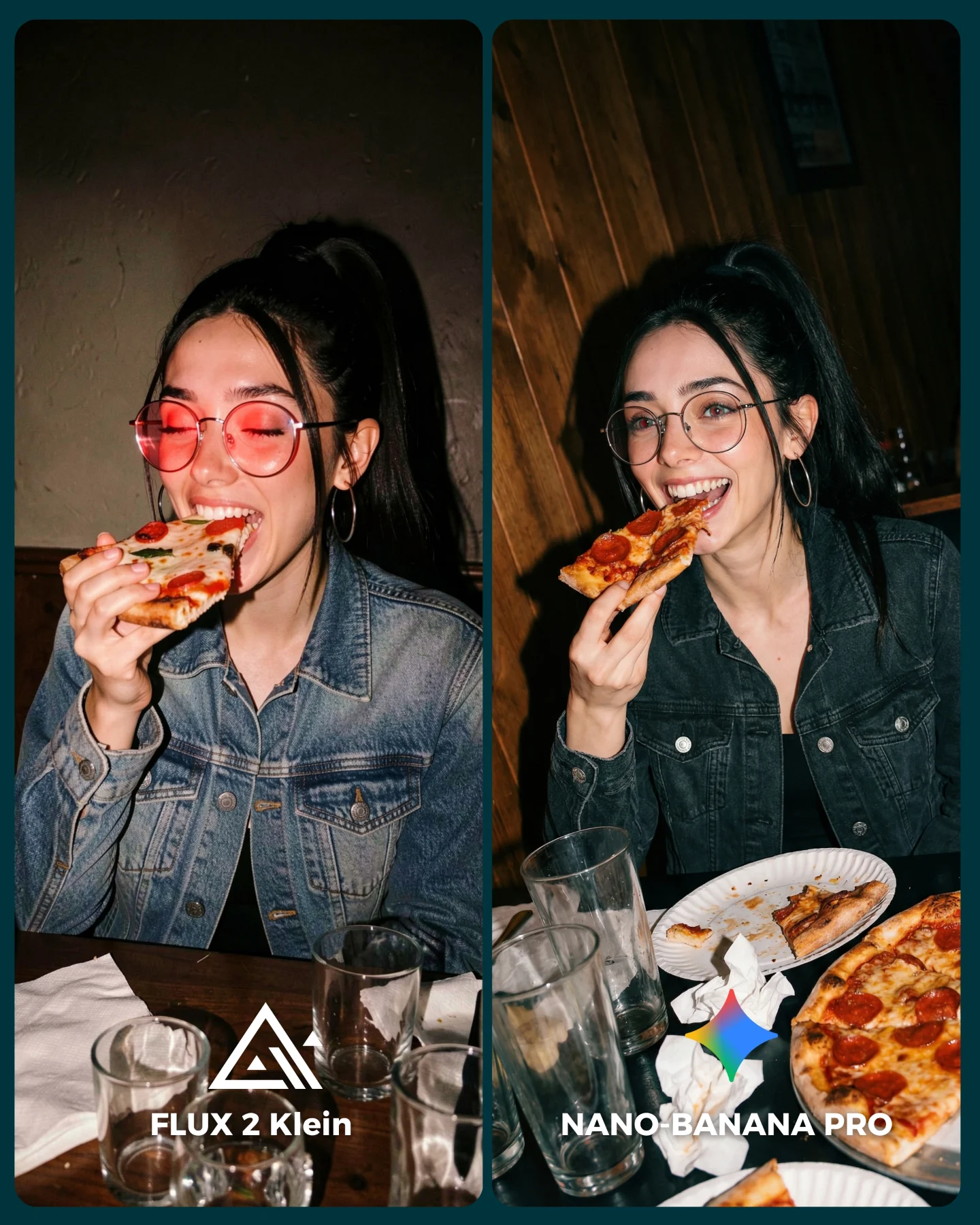
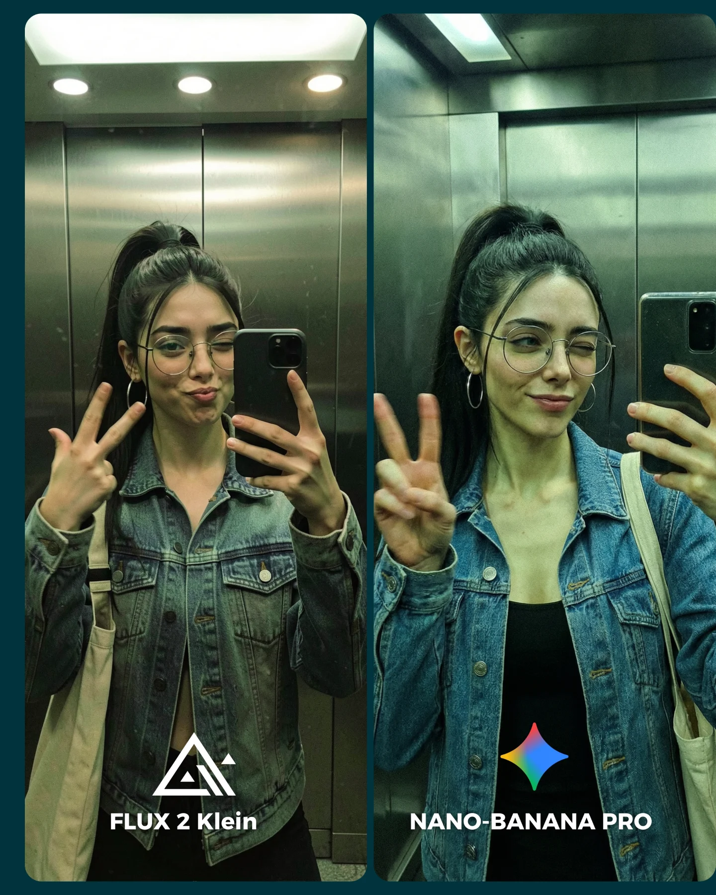
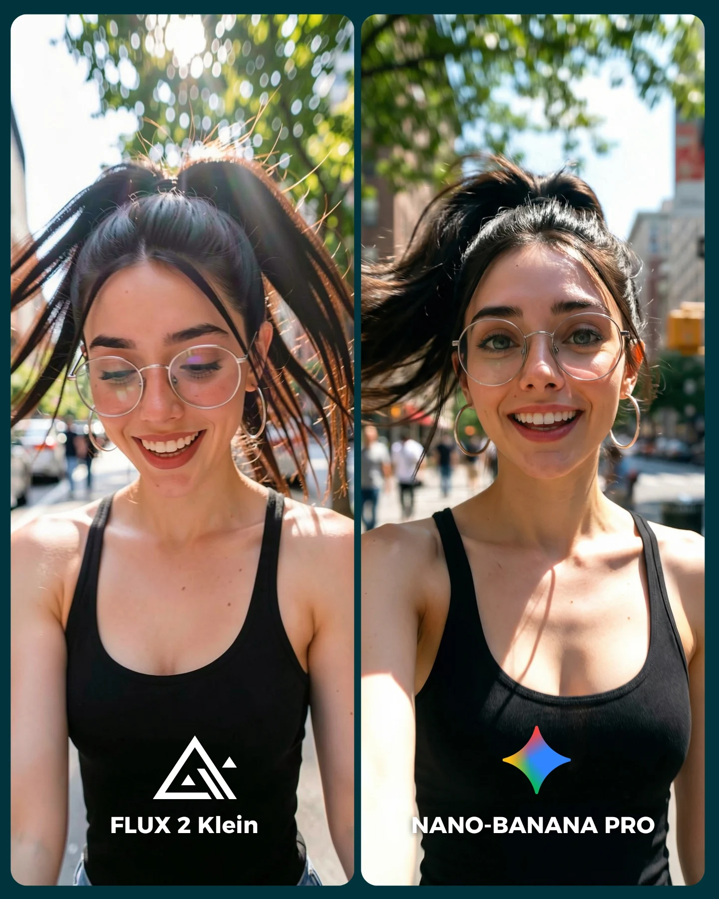
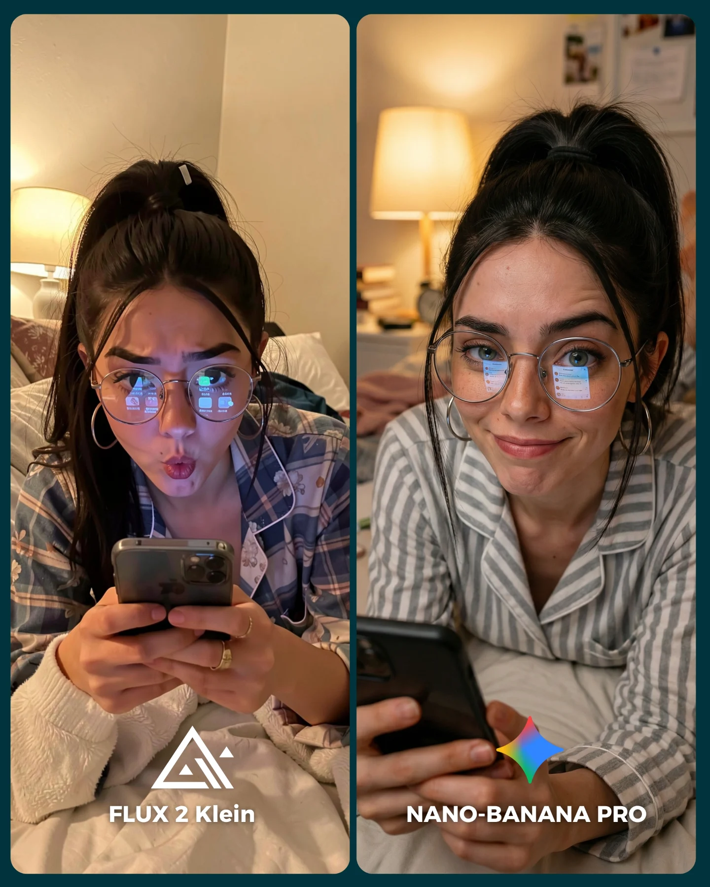
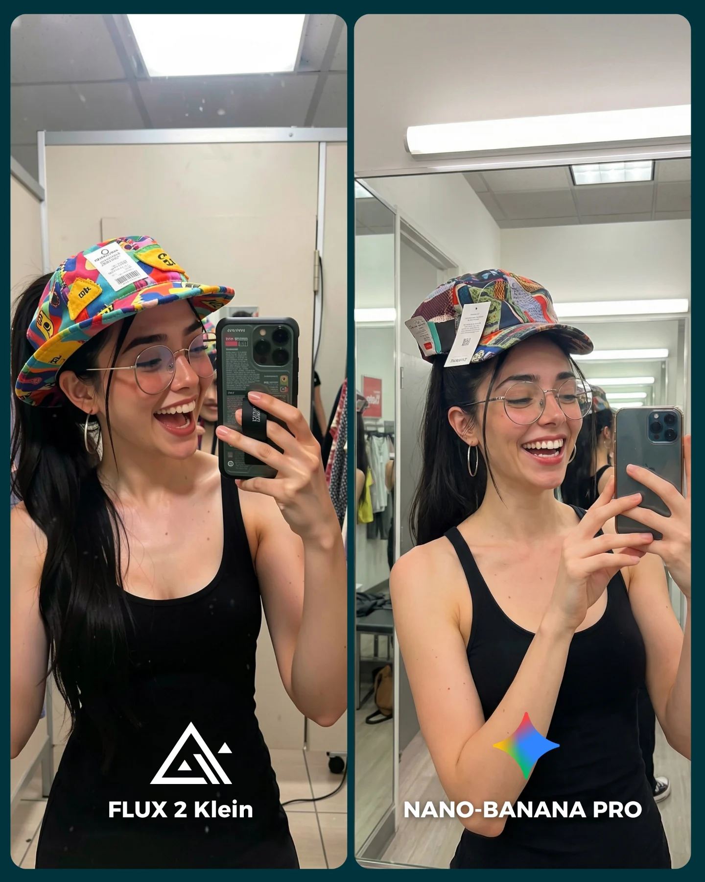
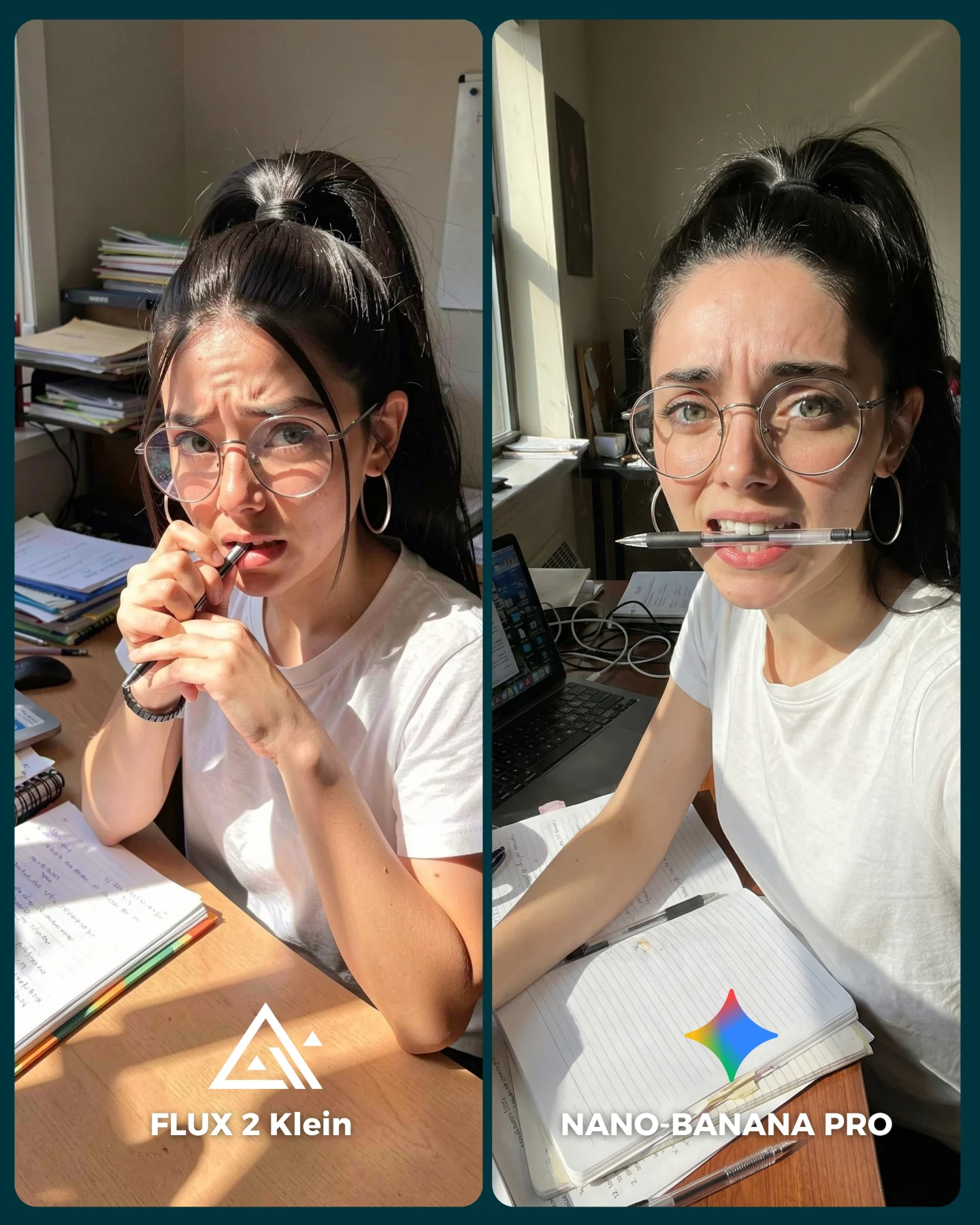
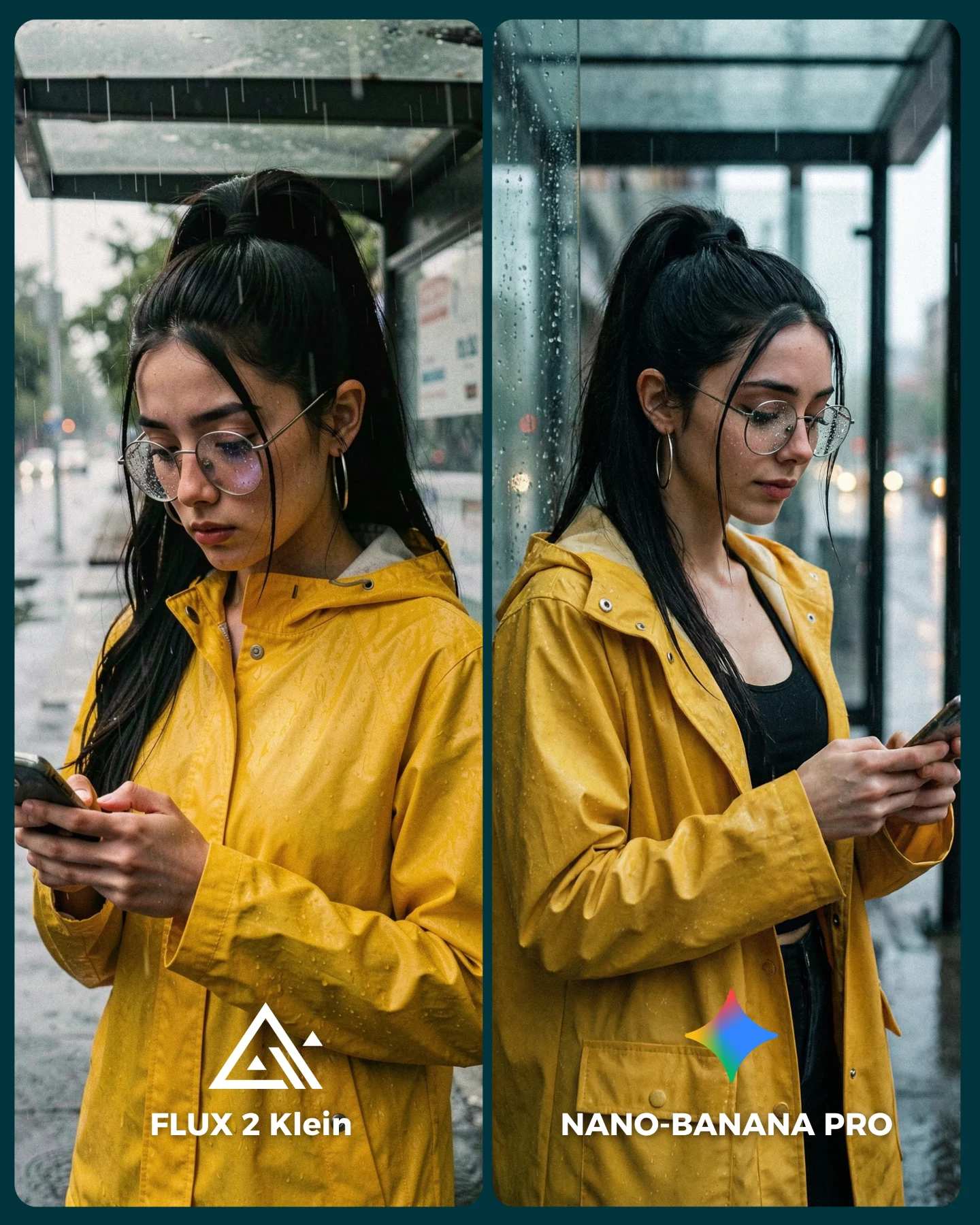
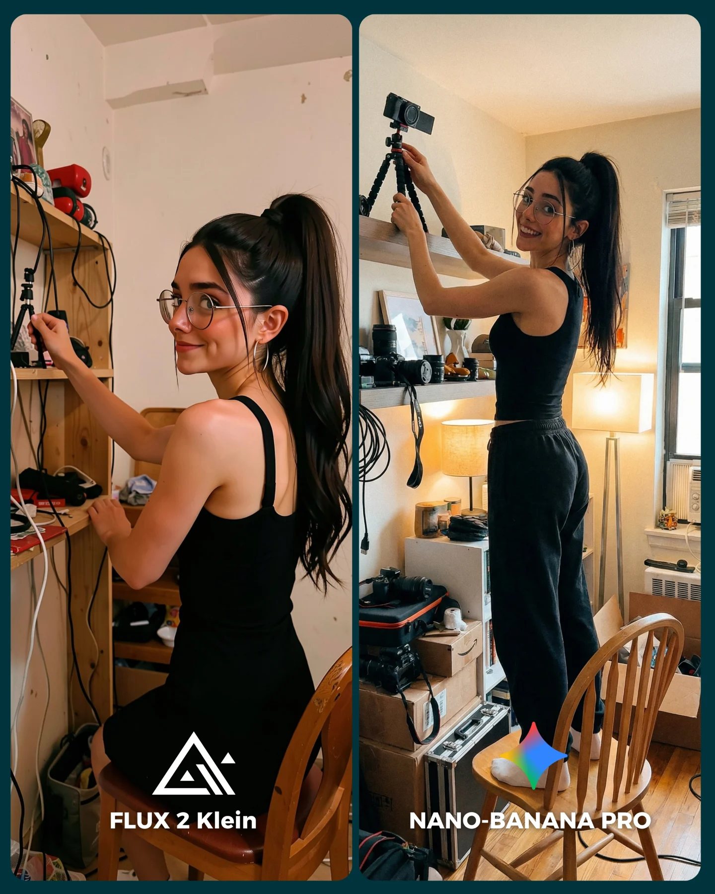
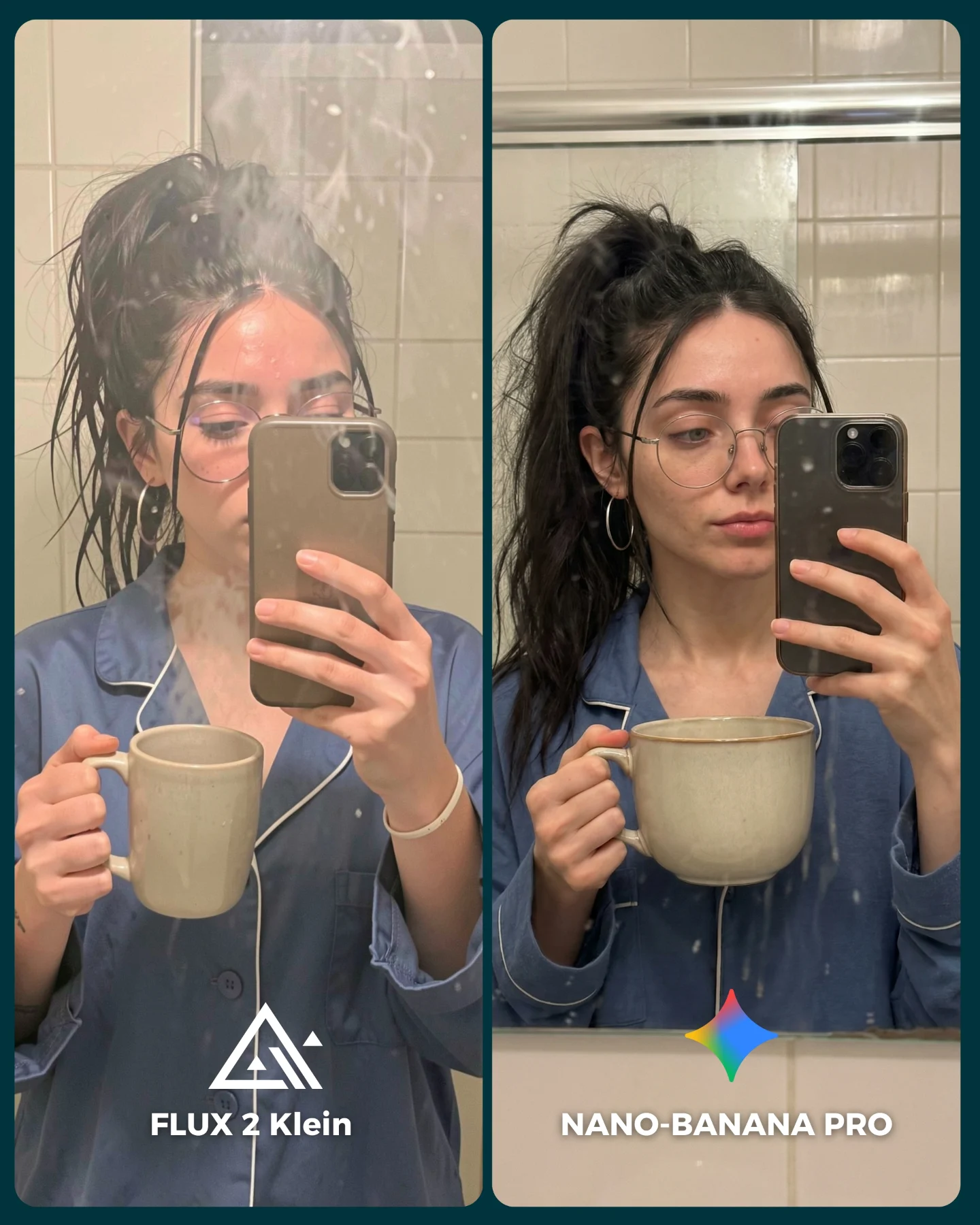
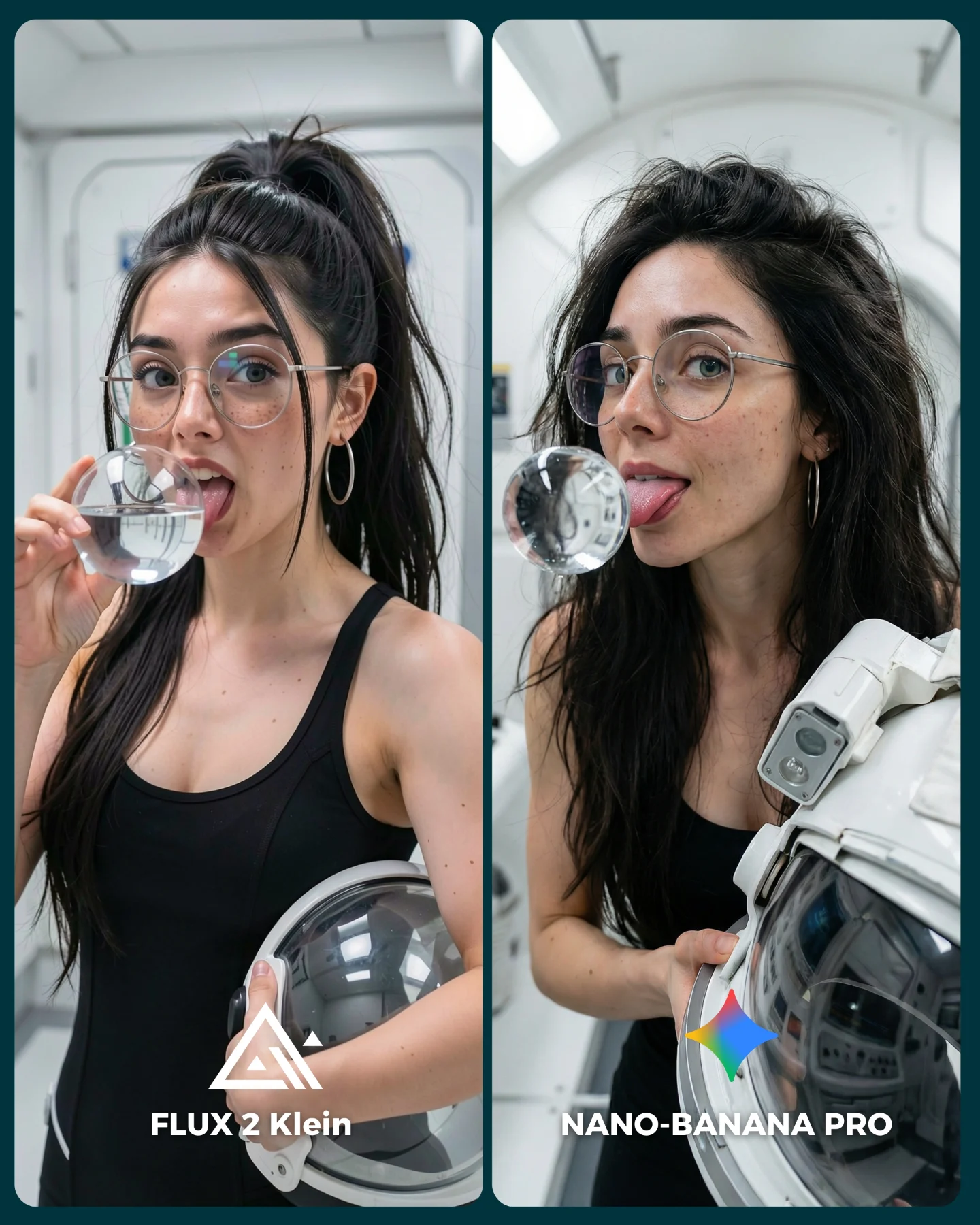
Flux 2 Klein VS. Nano Banana Pro 💥
Sigo pensando que no hay nada mejor que Nano Banana Pro 😅
O crees que hay algún generador de imágenes que le hace la competencia?? 👀
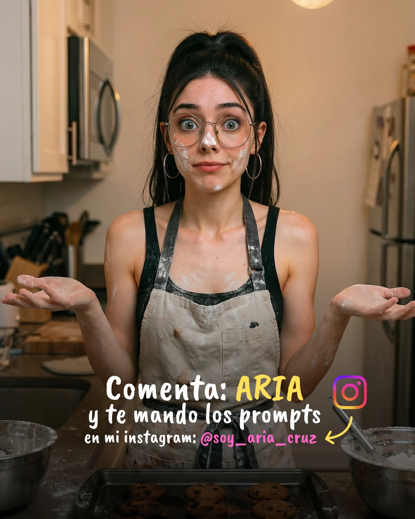
Como siempre... os puedo mandar todos los prompts de las imágenes si comentas "ARIA" 💕
How soy_aria_cruz Made This Flux 2 Klein vs Nano Banana Pro AI Portrait and How to Recreate It
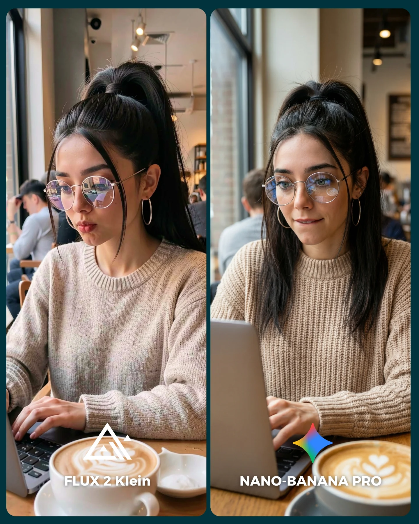
This image works because it compares image models inside a scene that viewers already understand. A woman with a laptop in a coffee shop is not an exotic setup. It is ordinary, recognizable, and useful. That makes every quality difference easier to feel. You are not judging fantasy spectacle. You are judging whether a model can handle a believable lifestyle moment that creators actually want to publish.
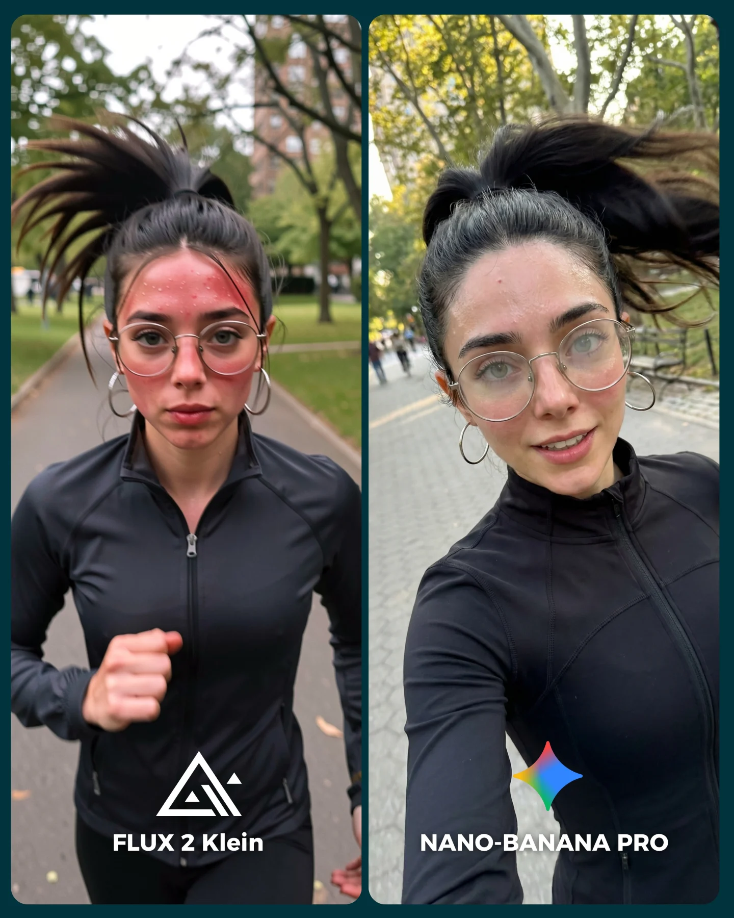
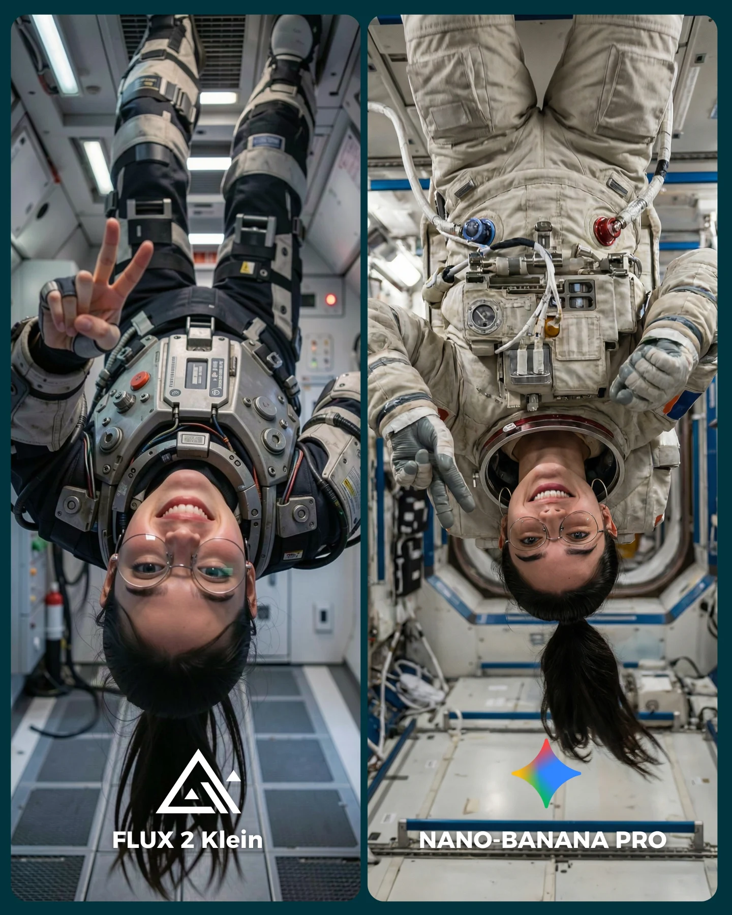
The creator also chose a smart pressure test. A cafe scene looks simple at first, but it quietly contains many places where generation quality can drift: eyeglass reflections, fingers on a keyboard, knit sweater texture, hairline cleanup, latte art, window light, and background depth. Because the setup is everyday, even small errors become visible. That is exactly why this kind of post invites comments. Viewers can see the winner without needing a technical lecture.
Why It Feels Shareable Instead of Dry
The best comparison content does not look like a benchmark chart. It still feels like social content. Here, the warm cafe tone, the soft knit sweater, and the familiar laptop-and-coffee setup keep the image approachable. The split-screen format adds structure, but the visual mood remains friendly. That matters for growth. People are much more willing to debate tools when the post still looks like something they might save for style or prompt inspiration.
Signal
Evidence (from this image)
Mechanism
Replication Action
Familiar setting
Cafe table, laptop, latte, window-side seating
Low-friction context makes quality differences easier to notice
Test models in real social scenes that your audience already recognizes
Texture stress
Chunky beige knit sweater and hair strands near the face
Complex but common textures expose realism gaps quickly
Use knitted fabrics, loose hair strands, and reflective glasses in at least one comparison frame
Readable A/B frame
Equal split-screen with clear model names
Lets viewers choose a winner instantly
Keep layout symmetrical and put labels where they are visible in thumbnail view
Turns a technical comparison into something save-worthy
Choose scenes that can function both as benchmark and as lifestyle inspiration
Where This Style Transfers Best
Creator productivity content: ideal for laptop, notebook, and work-session aesthetics. Keep the window light and tabletop composition.
Prompt teaching: useful when you want to show how models handle realistic everyday scenes. Change one quality variable at a time.
Lifestyle brand moodboards: the cafe setting feels calm and aspirational without being sterile. Swap wardrobe and props to fit the niche.
Tool recommendation posts: viewers can evaluate realism based on familiar details instead of vague claims. Keep the split-screen format.
This approach is less suited to high-drama fashion editorials, nightlife content, or surreal concept art. The strength here is quiet realism. If the goal is spectacle, a cafe scene may undersell the intended emotion.
Three Transfer Recipes
Library version: Keep the soft window light, glasses reflections, and typing pose. Change the cafe to a reading table with books. Slot template: {quiet study space} {same person and laptop} {soft knit wardrobe} {model comparison}
Home-office version: Keep the seated laptop composition and lifestyle realism. Change the latte to a ceramic mug and add subtle desk accessories. Slot template: {cozy desk setup} {same woman typing} {natural daylight} {A/B model labels}
Co-working version: Keep the split-screen and texture stress. Change the background to a modern work lounge with glass partitions. Slot template: {modern co-working space} {glasses and knit sweater} {laptop work moment} {generator duel}
The Aesthetic Lesson Behind the Post
This is a good reminder that realism is often built from small cooperative details rather than one dramatic effect. The latte art softens the foreground. The glasses reflections make the subject feel embedded in the room. The sweater texture adds warmth and tactile credibility. The background blur keeps the environment alive without distracting from the face. None of these elements would carry the image alone, but together they create a scene that feels publishable. That is what small creators should pay attention to when choosing benchmark prompts: pick scenes where subtle quality matters.
Observed
Why It Matters
Soft side window light
Builds natural facial shaping without overcomplicating the image
Glasses with visible reflections
Tests realism in a way viewers can spot immediately
Latte cup in foreground
Adds depth and lifestyle context quickly
Chunky knit sweater
Provides a material challenge that separates strong from weak rendering
Background customers softly blurred
Makes the space feel real while keeping focus on the subject
Prompt Blocks Worth Reusing
Prompt chunk
What it controls
Swap ideas (EN, 2-3 options)
same young woman repeated across two equal panels
Fairness and identity consistency
same man in both panels, same outfit on two generators, same desk scene twice
photorealistic cafe laptop moment with latte in foreground
Scene credibility and lifestyle appeal
library desk study scene, co-working lounge desk, breakfast table work session
soft window daylight with gentle interior ambient fill
Lighting realism
overcast side light, morning cafe light, warm bookstore window light
clean split-screen labels at the bottom
Comprehension and engagement
winner tag, version badge, score overlay
How To Iterate This Type of Comparison
Start by locking the subject identity, the seated laptop pose, and the lighting direction. Those three pieces create fairness. After that, only move one or two knobs per test.
Run 1: keep the whole cafe prompt stable and compare base model quality only.
Run 2: keep pose and lighting, but make the sweater texture more difficult.
Run 3: keep wardrobe and framing, then refine glasses reflections and hand realism.
Run 4: keep the best render quality and improve presentation with more readable labels or cleaner crop balance.
If results become too glossy and lose trust, bring back everyday imperfection. Ask for natural cafe clutter, less polished facial expression, or slightly uneven typing posture. Those subtle irregularities often make AI lifestyle scenes feel more believable.