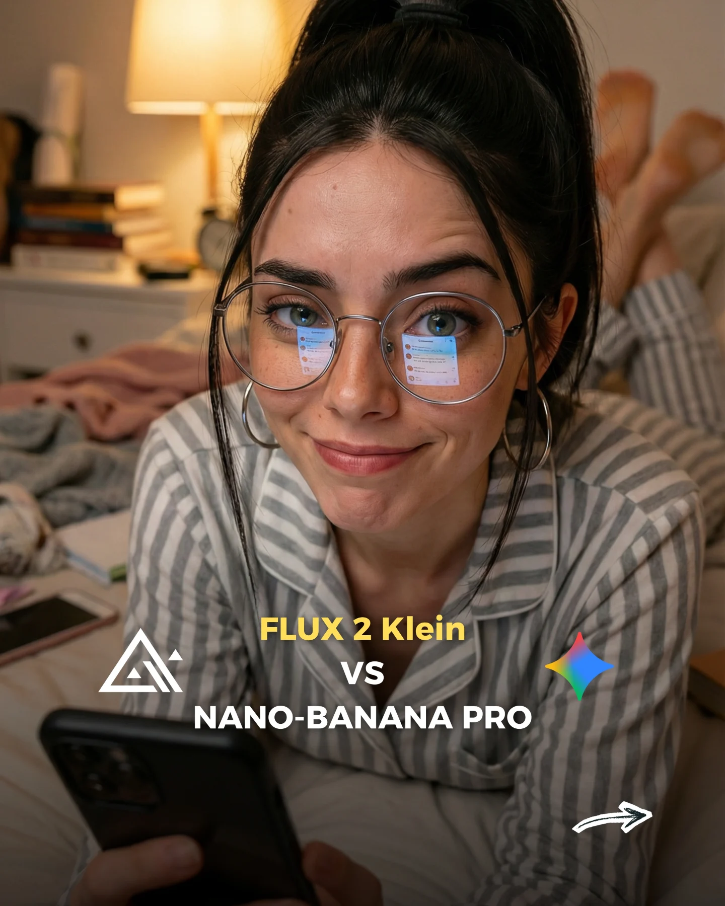
How soy_aria_cruz Compared Flux 2 Klein vs Nano Banana Pro AI
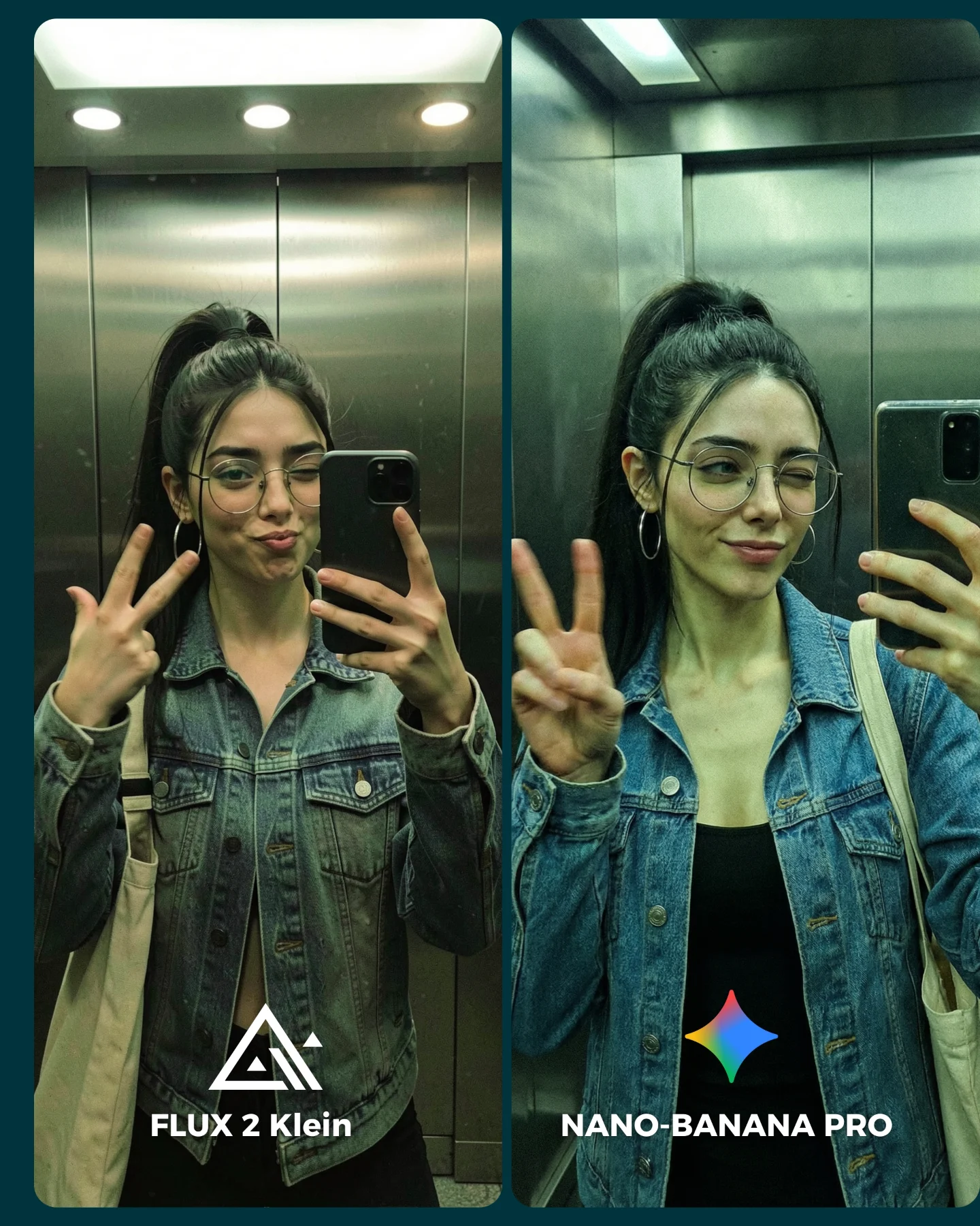
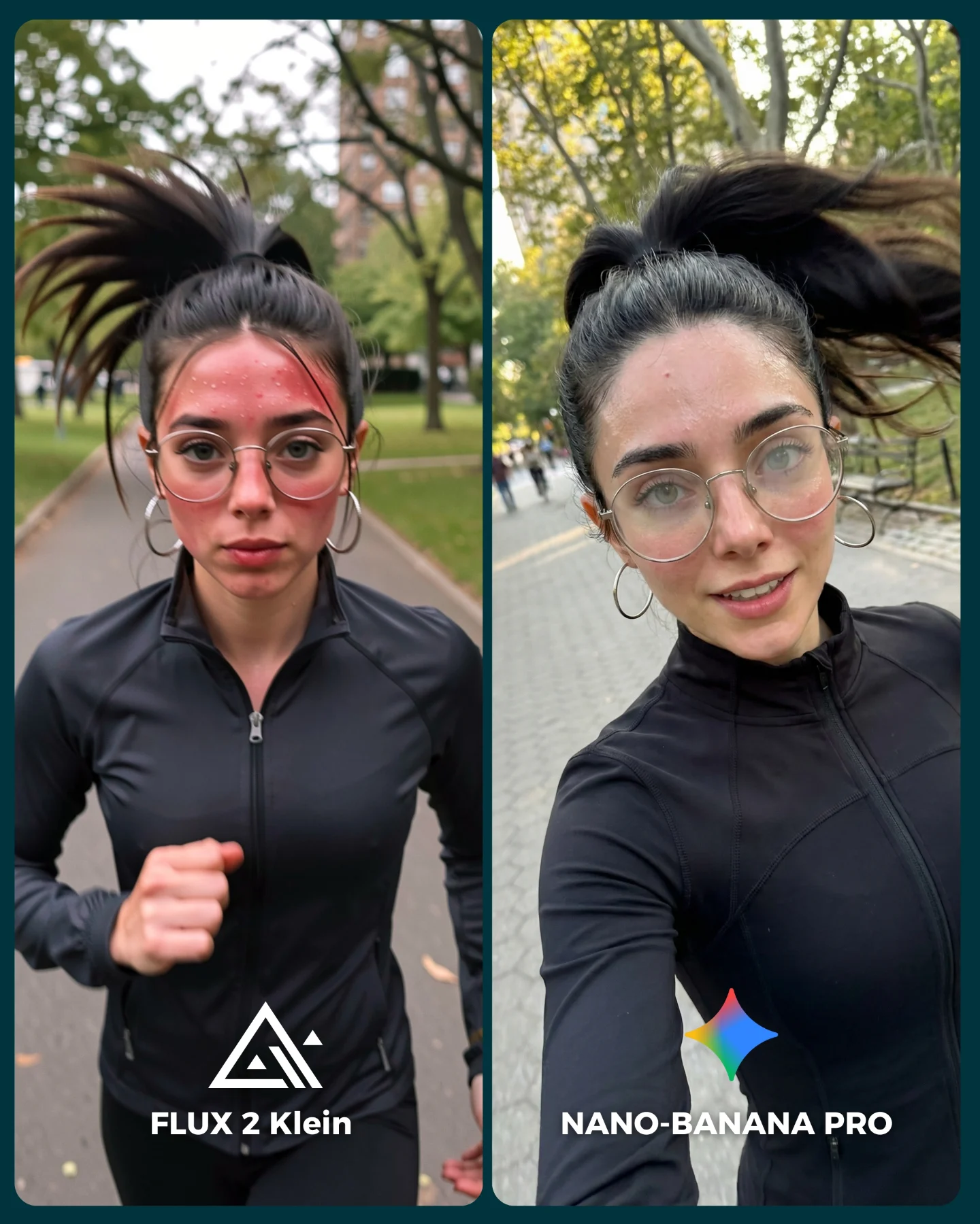
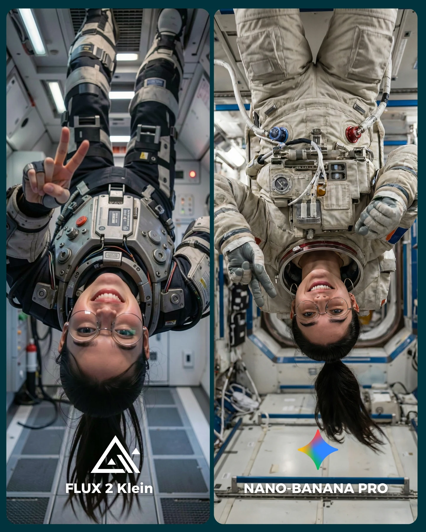
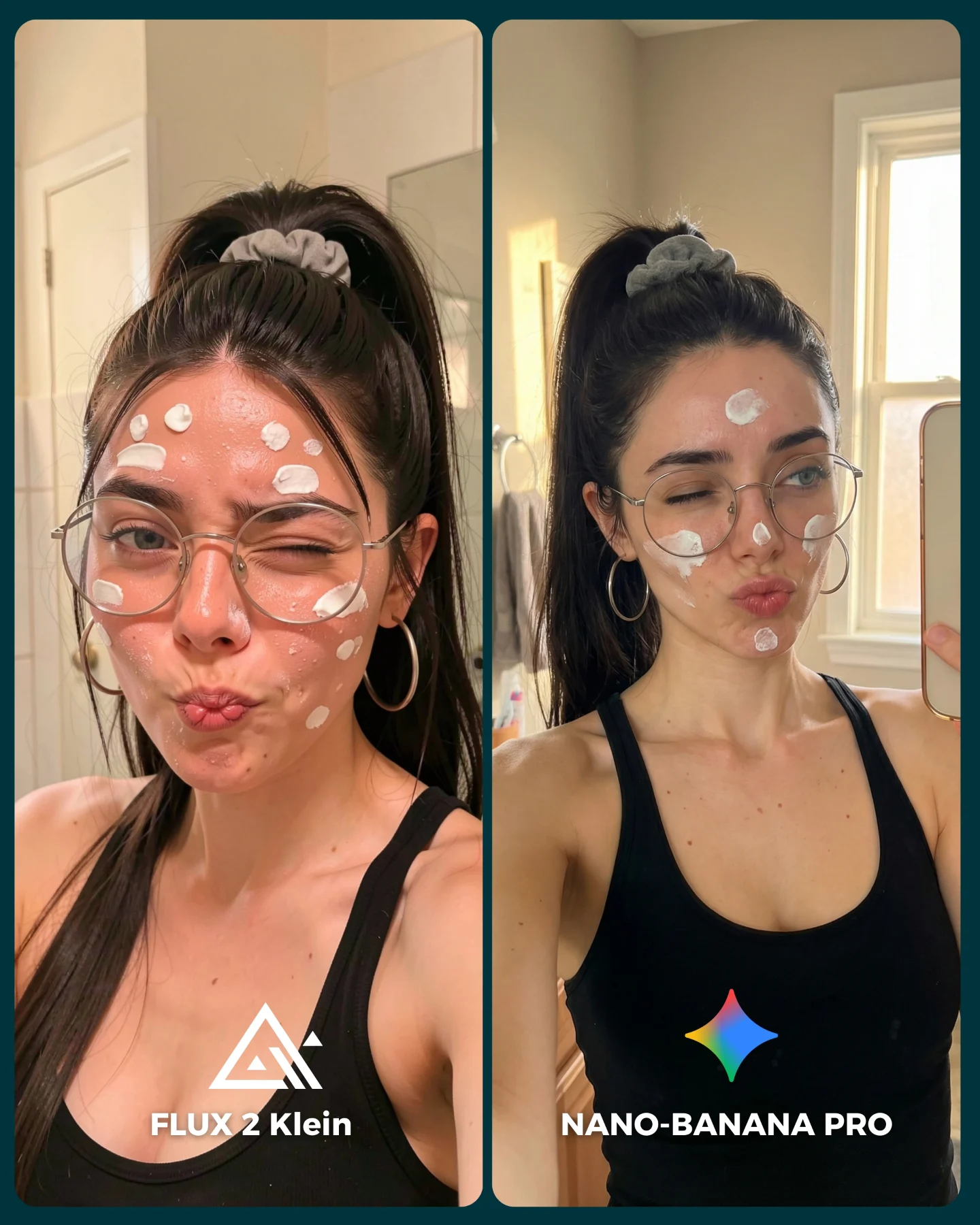
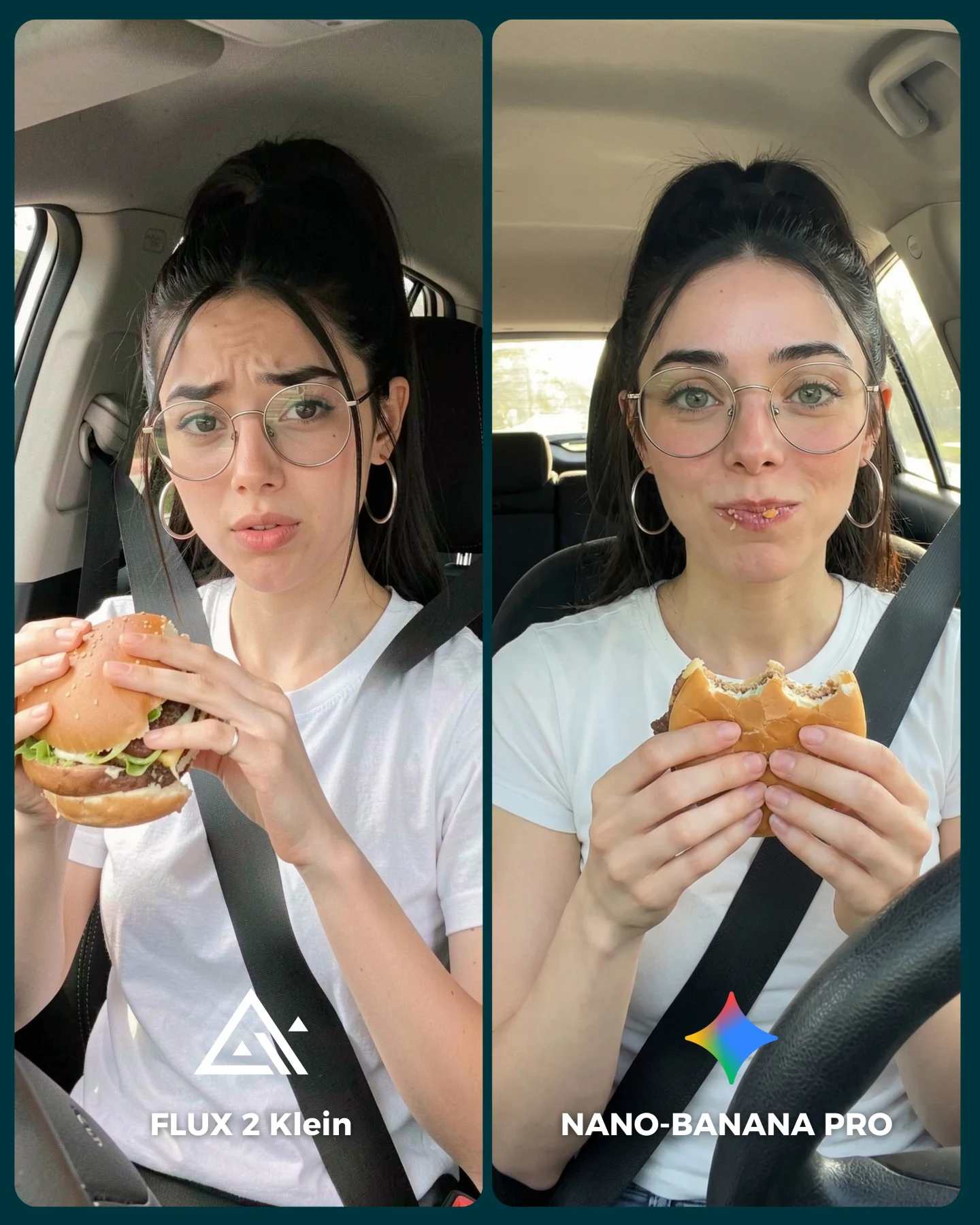
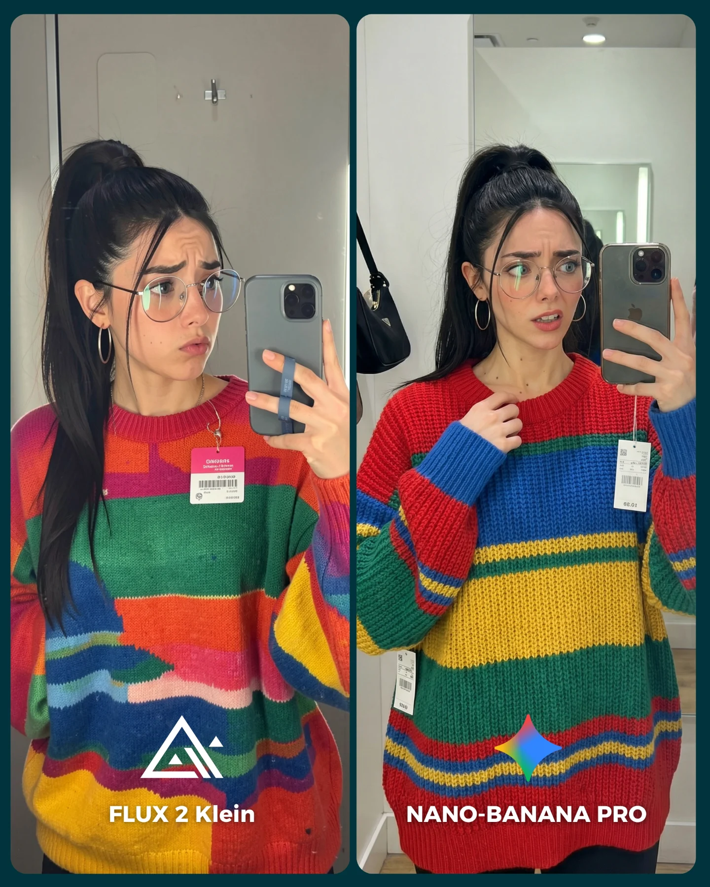
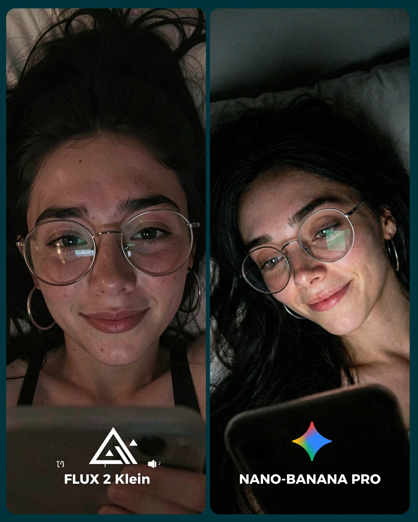
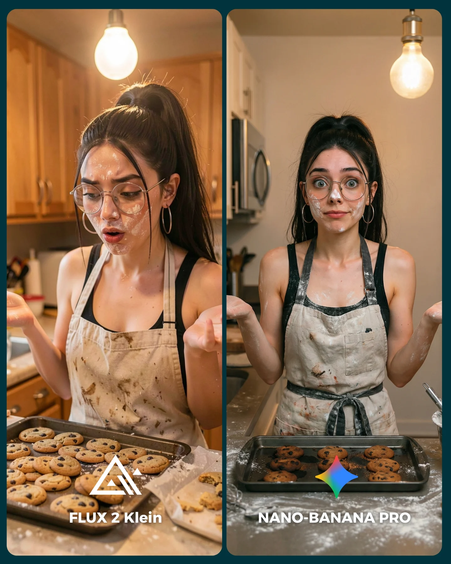
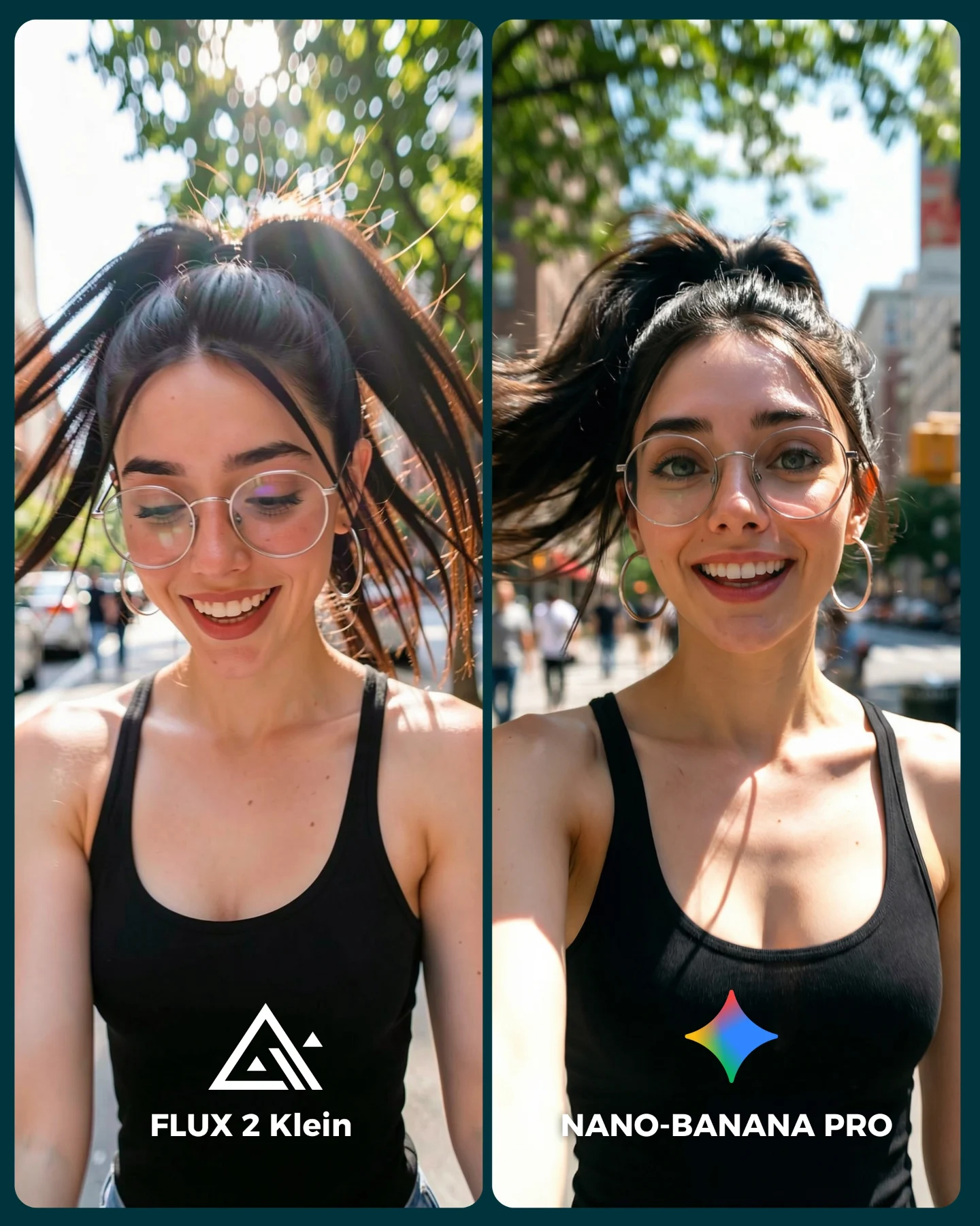
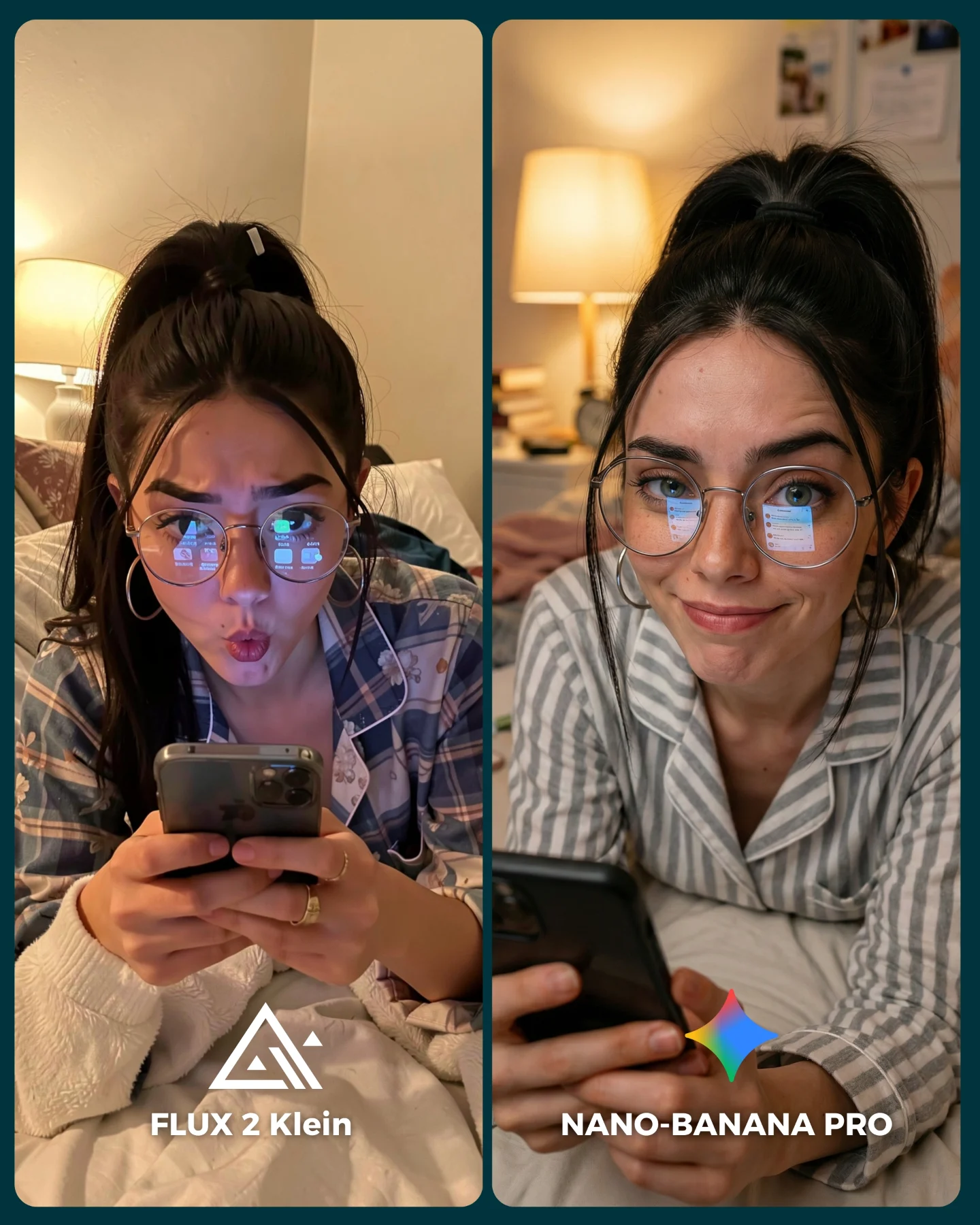
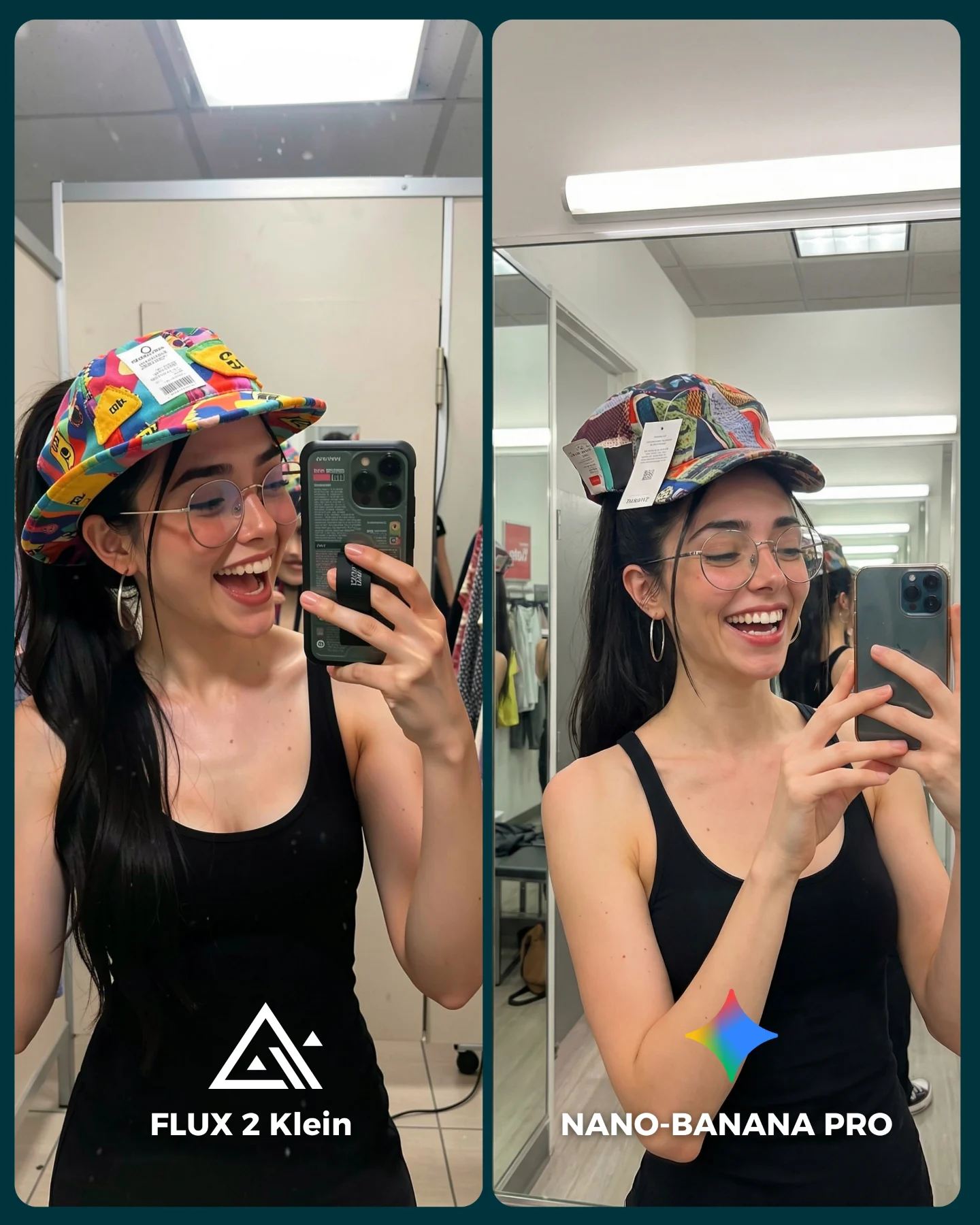
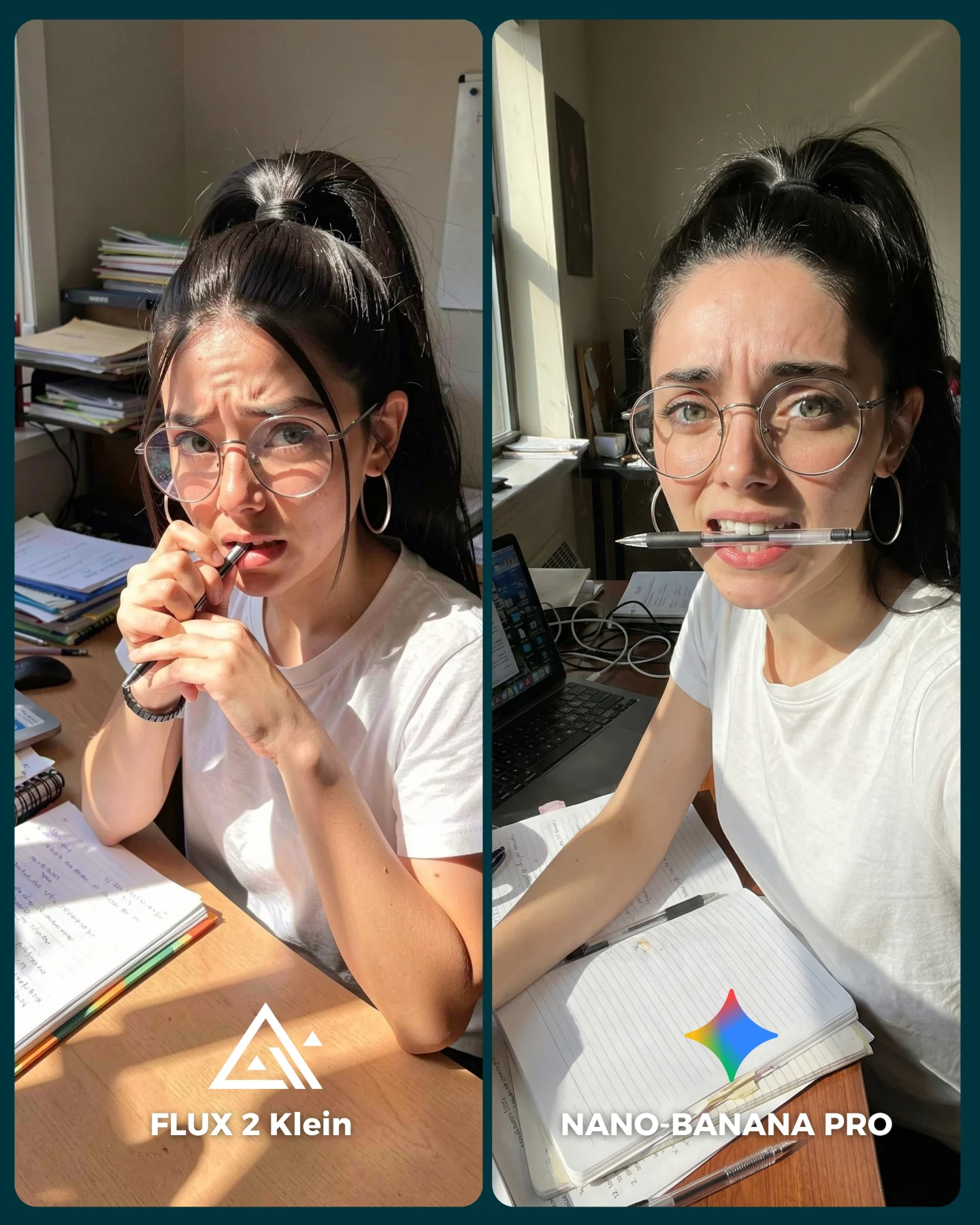
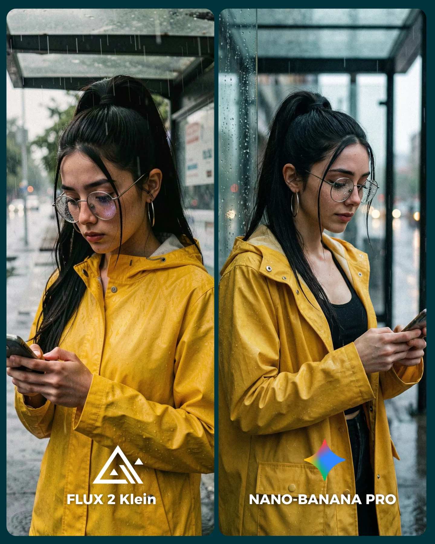
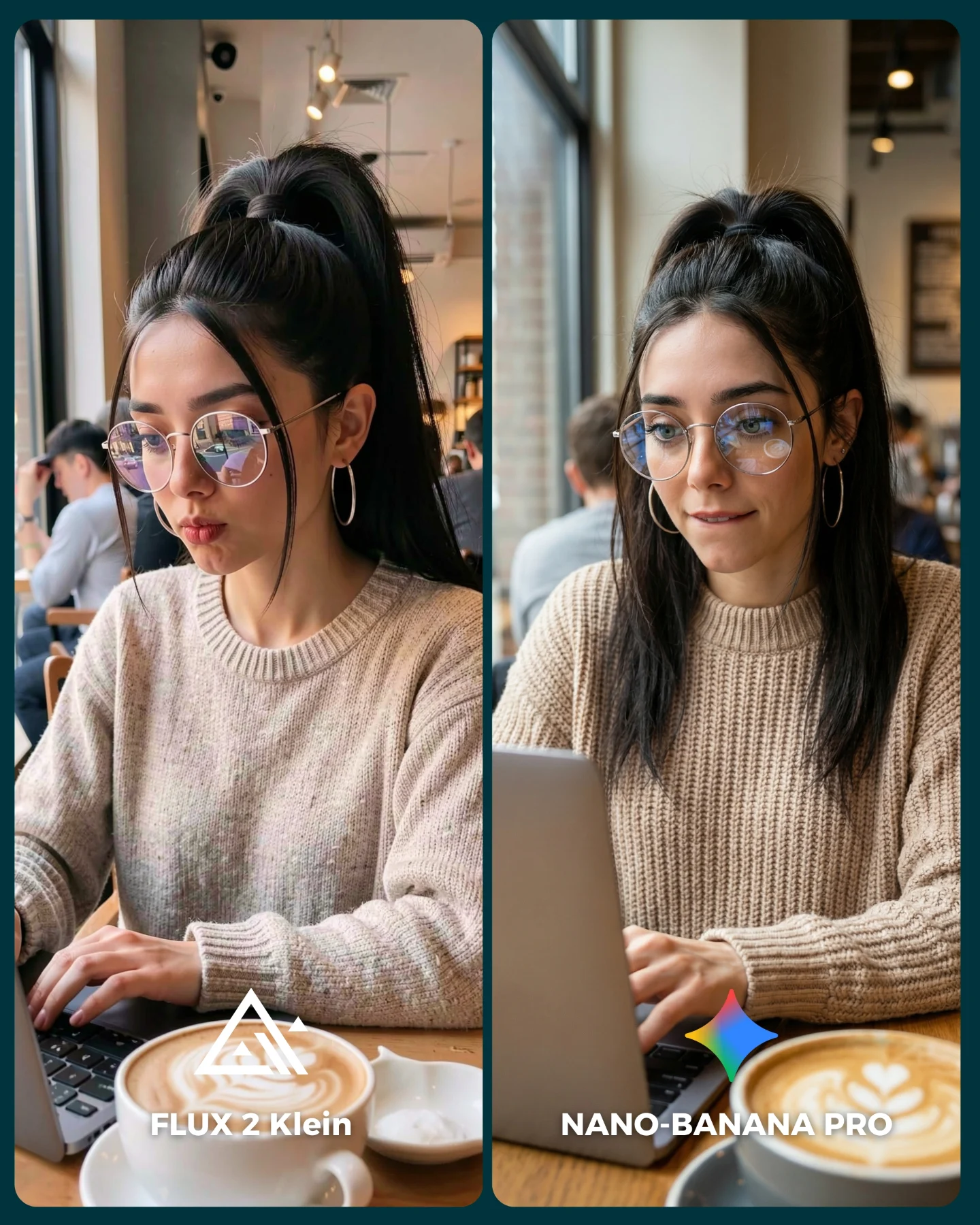
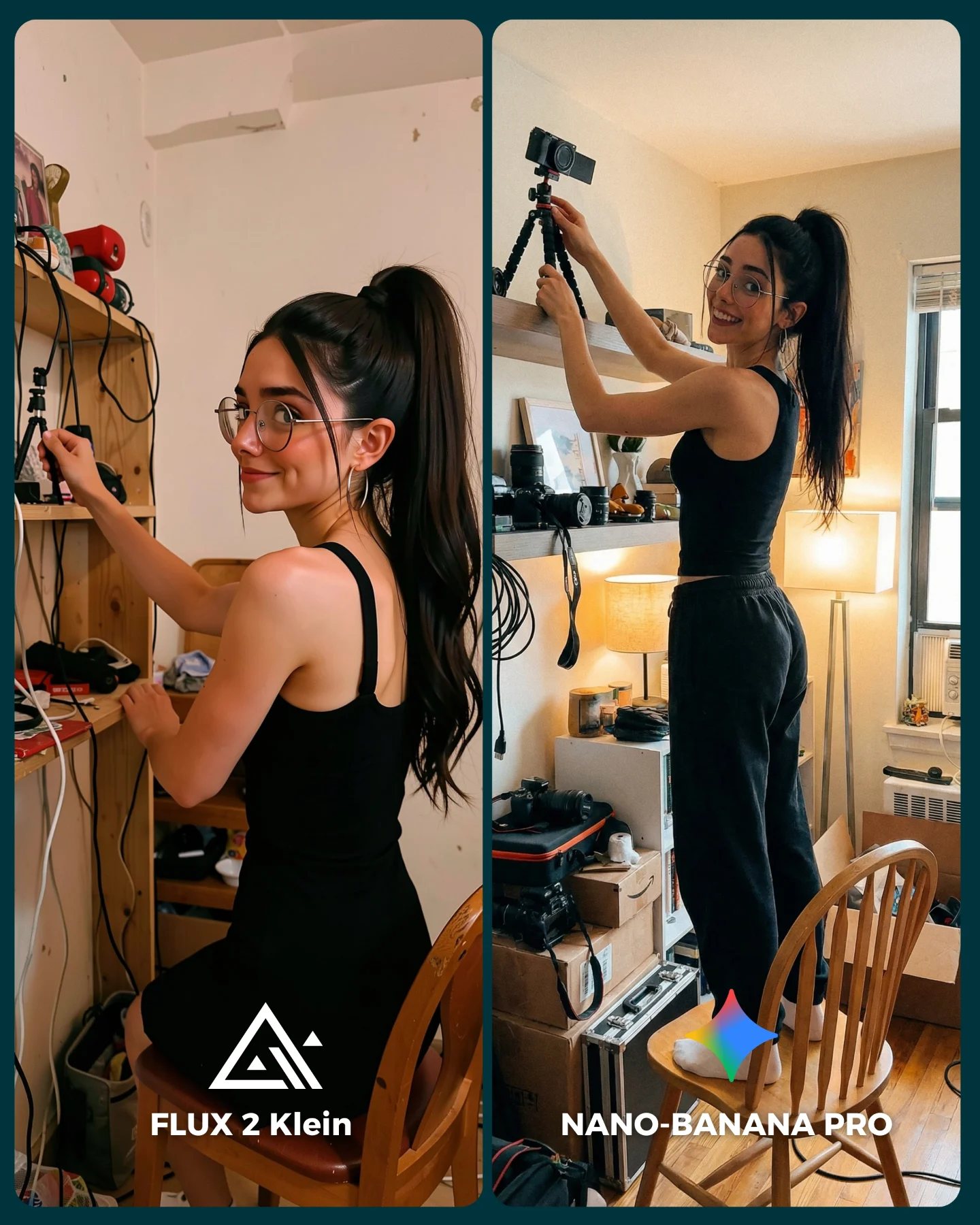
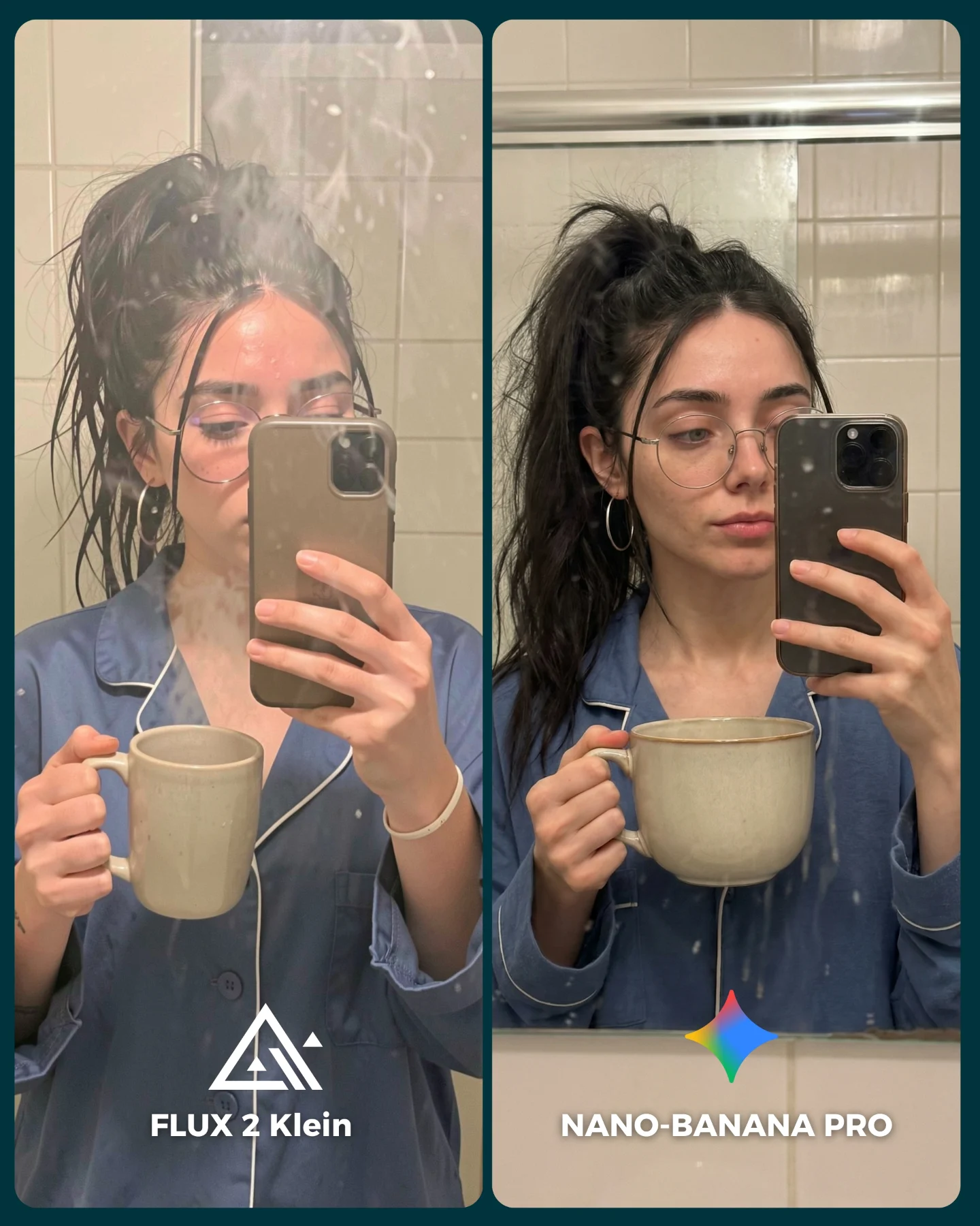
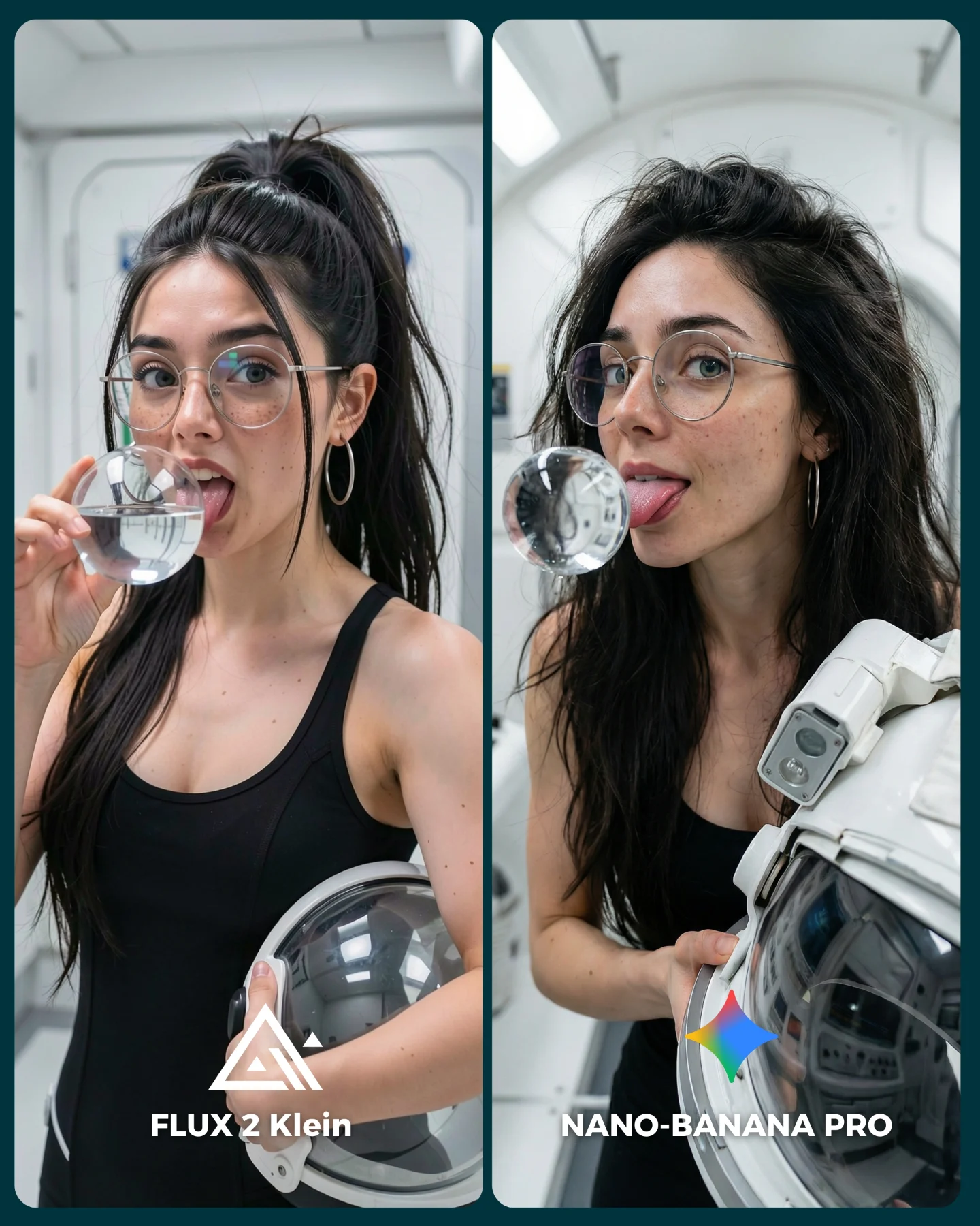
At a glance, this feels like a very simple benchmark. It is just a woman taking a mirror selfie in an elevator. But that simplicity is exactly why it is useful. Everyday selfie scenes are where people actually judge whether an image model feels believable enough to post. If a system cannot handle a denim jacket, a tote bag, a wink, metal elevator reflections, and one partially blocked face, it is not really ready for the kind of casual social content creators make every day.
The clever part of the setup is how many small difficulties are hidden inside an ordinary scene. Mirrors create alignment pressure. The phone blocks part of the subject. The peace sign adds finger-shape risk. The metal walls challenge reflection logic. The overhead elevator lights are not flattering, which means skin tone has nowhere to hide. This is the kind of image that reveals quality not through spectacle, but through whether the model can survive normal life.
That is also why the comparison is easy to engage with. Viewers do not need to care about image-generation technology to understand the difference. They only need to ask themselves which side looks like a real selfie they would believe on their feed. That makes the post naturally social.
Why The Comparison Works
| Signal | Evidence (from this image) | Mechanism | Replication Action |
|---|
| Everyday realism | Elevator mirror, denim jacket, tote bag, peace sign, phone blocking the face | Ordinary scenes create a more honest benchmark than fantasy settings | Test models on plausible daily-life images, not only cinematic showcase prompts |
| Many subtle failure points | Hands, reflections, phone geometry, skin under bad lighting, eyewear, denim texture | Small realism errors become obvious in selfies because viewers know the format intimately | Use prompts with normal but technically layered details |
| Direct winner readability | The right panel feels cleaner and more coherent without changing the scene itself | Strong benchmark content makes improvement visible without changing the underlying concept | Hold the pose and setting constant so viewers judge rendering quality, not composition novelty |
| Social-native framing | The image already looks like content that belongs on a phone feed | Benchmark posts perform better when they feel natively postable | Choose comparison scenes that resemble the content your audience actually makes |
The elevator is also a smart setting because it gives just enough context without becoming a visual story of its own. You immediately know where the image happens, but the environment does not compete with the face. That balance is what makes the comparison both useful and readable.
Where This Format Transfers Best
This approach is strongest for everyday-AI benchmark content, identity consistency tests, creator-tool comparisons, and prompt education around normal social media imagery. It is especially good when the audience cares about realism in casual settings, not just cinematic hero shots.
- Daily-life model comparisons: ideal for showing which system handles believable social content better.
- AI influencer identity tests: useful when the goal is to keep the same character stable in a simple recurring scenario.
- Prompt teaching posts: strong for demonstrating that realism lives in small details, not only dramatic scenes.
- Product or workflow comparisons: effective when a new model claims better realism and you need a relatable proof point.
It is less effective for high-fashion storytelling, dramatic travel imagery, or art-direction-heavy brand campaigns. This image wins because it is ordinary in exactly the right way.
- Transfer recipe 1 Keep: mirror selfie and one small reflective room. Change: elevator to fitting room, hallway mirror, or office bathroom. Slot template (EN):
{same subject} casual mirror selfie in {small reflective environment}, side-by-side model comparison - Transfer recipe 2 Keep: same everyday pose and identity markers. Change: outfit texture, such as leather jacket, knit cardigan, or trench coat. Slot template (EN):
{same woman} in a realistic everyday selfie, testing {outfit material} and indoor reflections - Transfer recipe 3 Keep: phone partial occlusion and hand gesture. Change: lighting quality, such as fluorescent, warm hallway light, or parking-garage LED. Slot template (EN):
{subject} taking a mirror selfie under {lighting condition}, realism benchmark graphic with clear labels
The Aesthetic Read
The image feels effective because it does not overreach. The denim jacket is familiar, the tote bag is believable, and the elevator is a place people have actually taken awkward selfies. That familiarity makes the tiny differences in quality matter more. In an ordinary environment, every small inconsistency becomes louder.
The right panel works better because it improves the image without changing its personality. That is an important benchmark principle. Better output should still feel like the same girl in the same elevator, not a different concept with smoother skin. The point of the comparison is fidelity, not transformation.
The wink and peace sign are also doing more work than they seem. They make the selfie feel informal and contemporary, but they also introduce technical difficulty. That is the sweet spot for good benchmark content: gestures that feel casual to viewers but stressful to the model.
| Observed | Why it matters | How to recreate |
|---|
| Stainless elevator walls and overhead lights | Give the image a believable everyday setting with reflection pressure | Use small metallic interiors rather than clean abstract backdrops |
| Phone partially blocking the face | Adds realistic selfie geometry and occlusion | Keep the phone large enough to interfere with the portrait slightly |
| Peace sign and wink | Make the pose socially familiar while increasing anatomy difficulty | Choose one casual face cue and one hand cue |
| Denim plus tote bag | Ground the image in plausible off-duty styling | Use common wardrobe elements instead of over-designed outfits |
| Embedded model labels at the bottom | Turn the image into a native comparison post | Add clear, low-position labels that do not fight with the face |
Prompt Blocks That Matter Most
| Prompt chunk | What it controls | Swap ideas (EN, 2-3 options) |
|---|
| same woman taking an elevator mirror selfie | Defines the whole benchmark scenario | same woman in a fitting-room selfie; hallway mirror selfie; office-lobby mirror selfie |
| denim jacket, black top, tote bag, glasses | Locks the everyday identity markers | leather jacket and headphones; knit cardigan and tote; trench coat and shoulder bag |
| wink and peace sign while holding a phone | Sets the casual social-media tone and hand challenge | duck face and thumbs up; soft smile and peace sign; raised eyebrow and wave |
| stainless-steel elevator with overhead lights | Creates the reflective enclosed environment | mirrored hallway; brushed metal lift; fluorescent office elevator |
| left flatter, right cleaner and more realistic | Builds the readable comparison result | left murkier right clearer; left weaker skin tone right stronger; left less coherent right more natural |
| bottom labels with model names and icons | Frames the image as a benchmark post | Model A / Model B; Base / Pro; Version 1 / Version 2 |
What to lock first
Lock the mirror-selfie geometry, the identity cues, and the elevator reflections first. Those three elements make the comparison honest.
How To Iterate On This Benchmark
Baseline Lock: keep the same subject, the same casual pose, and the same reflective elevator setting. Then vary only one challenge at a time, such as the model version, outfit material, or lighting tint.
- Run 1: stabilize the face, glasses, phone shape, and peace-sign fingers in both outputs.
- Run 2: test different casual outfits while keeping the exact same environment and framing.
- Run 3: rotate the indoor lighting quality but keep the selfie concept identical.
- Run 4: if the series continues, build a bank of everyday benchmark scenes like elevators, dressing rooms, office mirrors, and train windows.
The reason this image works is that it evaluates what really matters to most creators: whether a model can make normal life look normal in the right way. That is a much harder standard than it sounds.