Why soy_aria_cruz's Flux 2 vs Nano Banana Pizza Comparison Went Viral
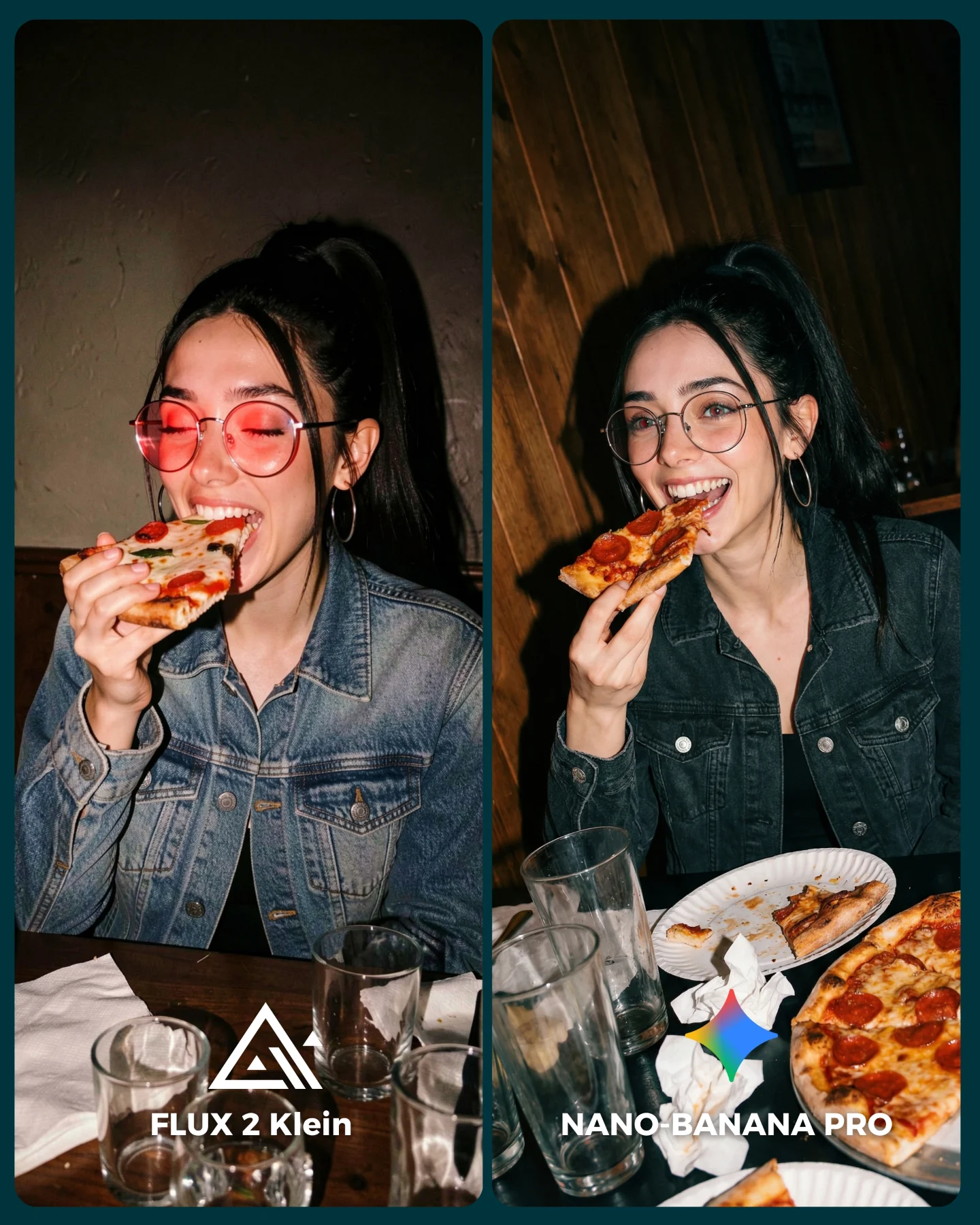
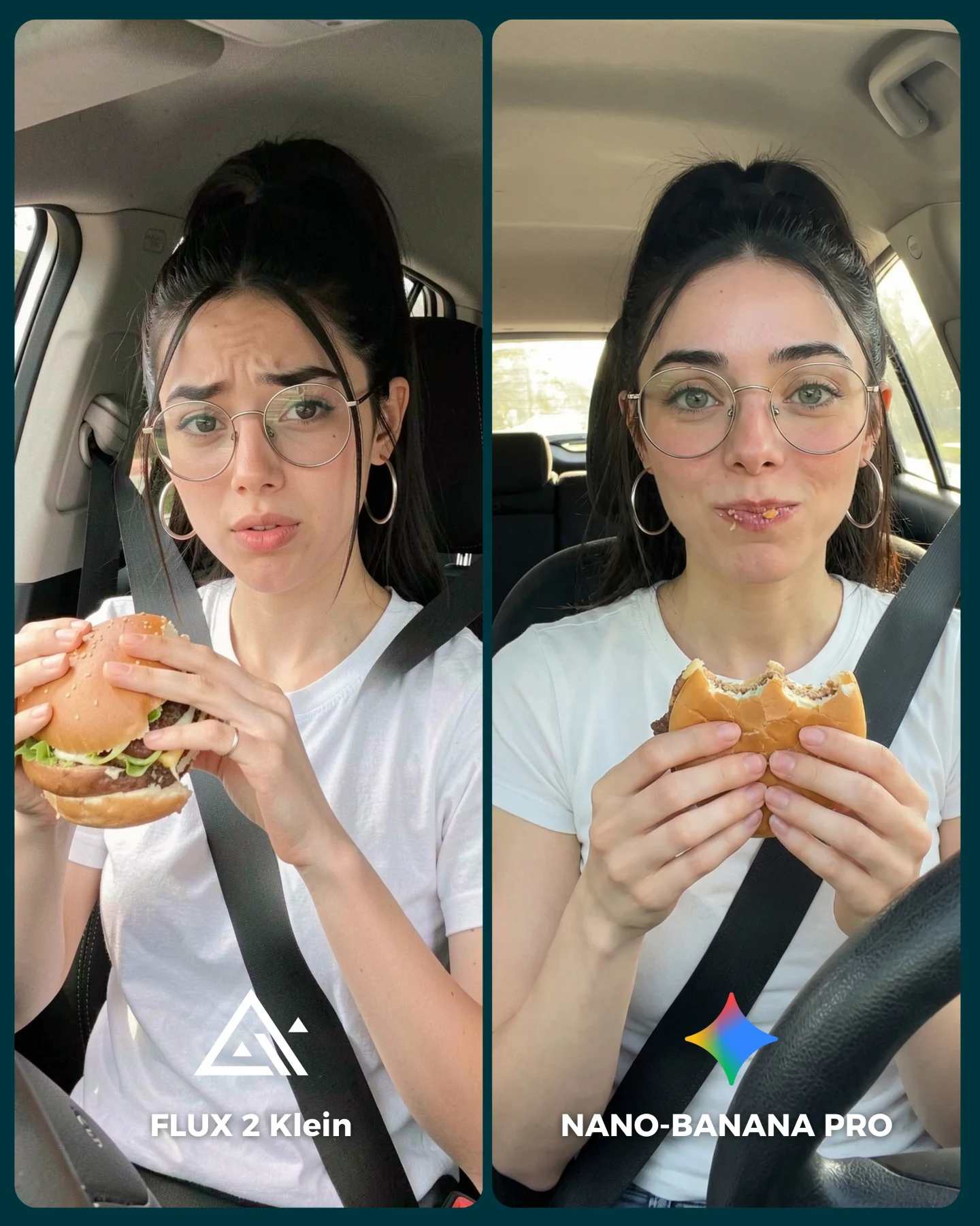
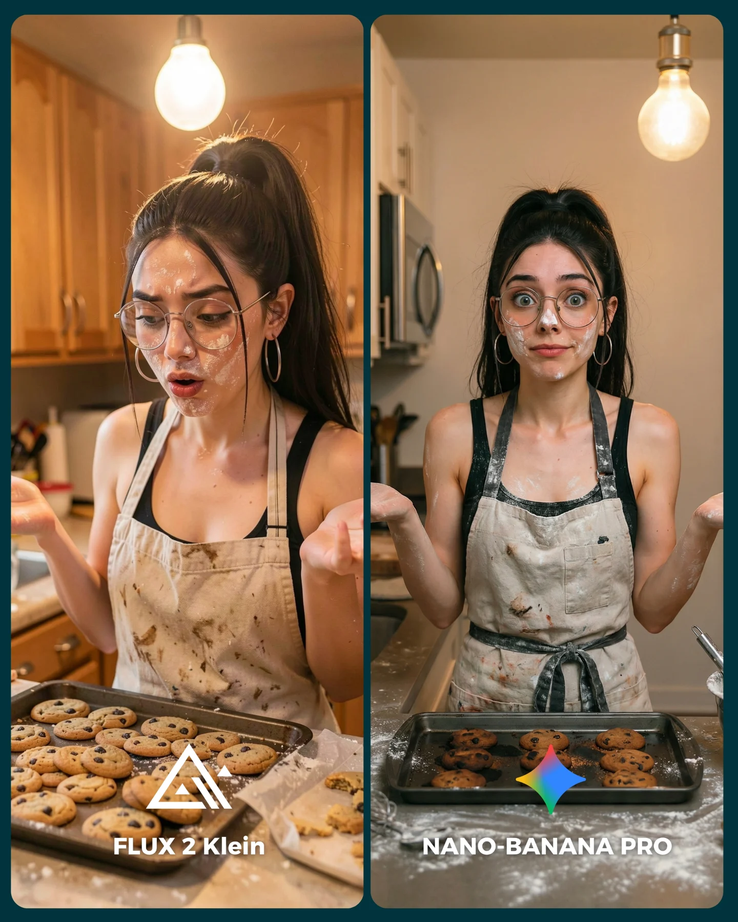
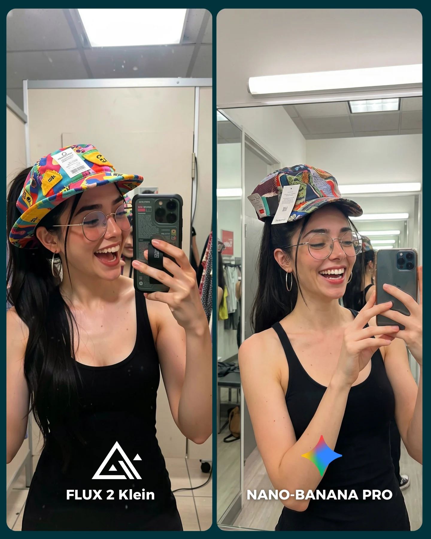
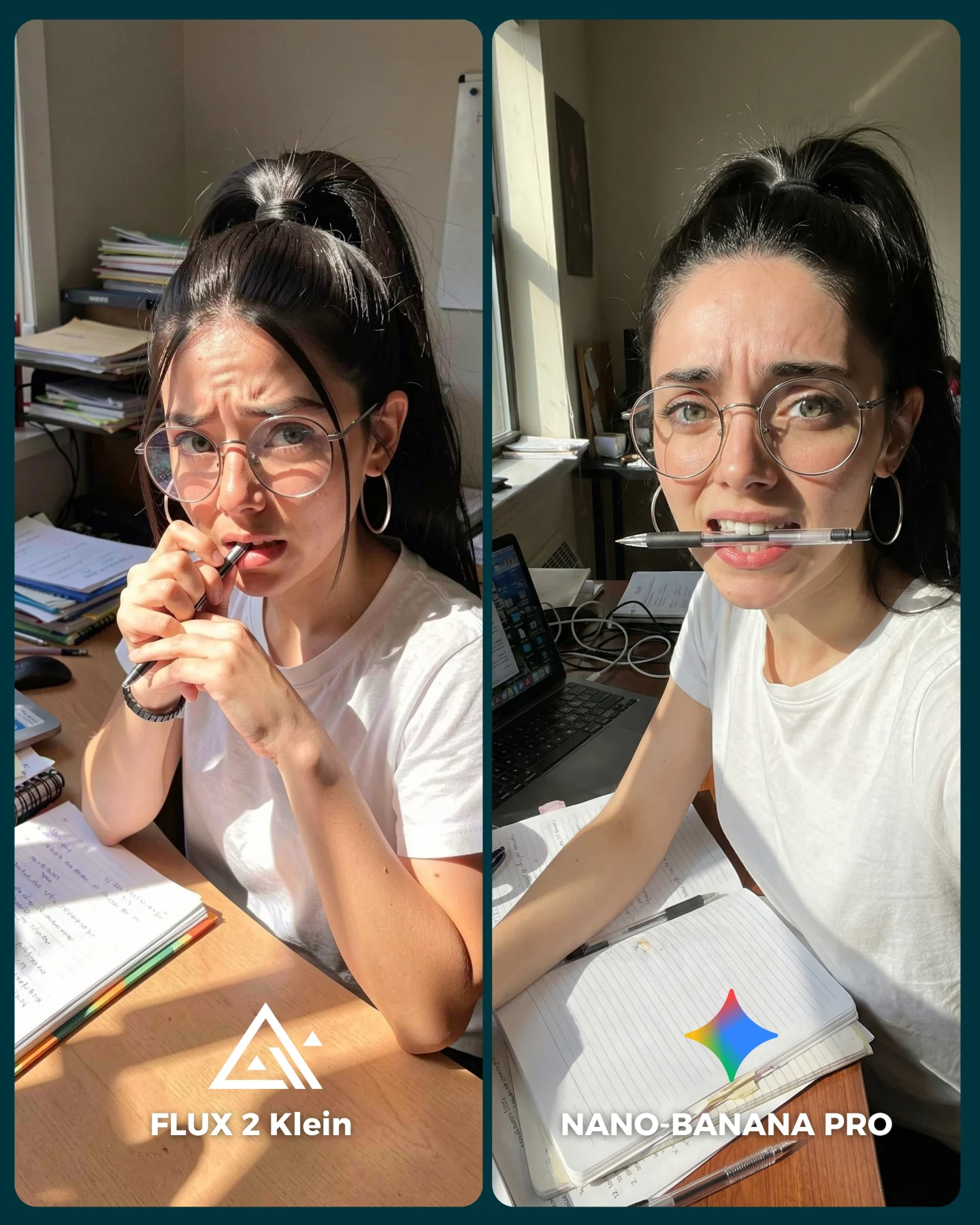
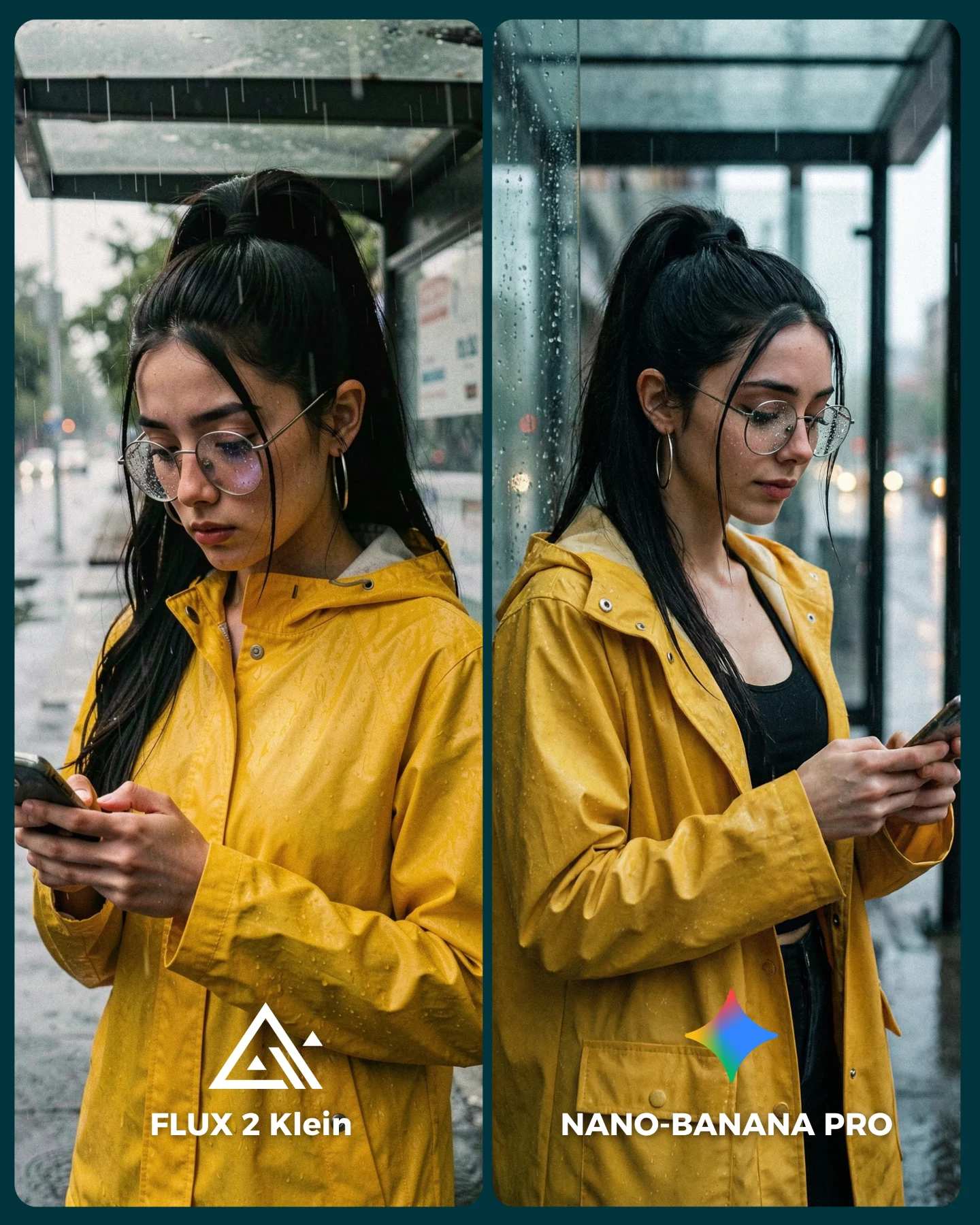
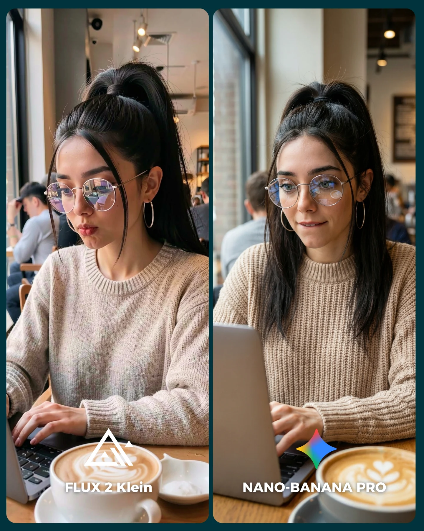
This image is useful because casual dining scenes are deceptively hard. At first glance, it is just a woman about to eat pizza in a low-lit restaurant. But once you look closely, the difficulty becomes obvious: mouth shape, teeth, slice angle, cheese detail, greasy pepperoni texture, glass reflections, cluttered table logic, denim texture, and dim restaurant lighting all have to cooperate at the same time. That makes this a much better benchmark than a clean beauty portrait.
The caption compares Flux 2 Klein with Nano Banana Pro, and this is exactly the kind of test that helps people see a difference quickly. Food scenes are intimate and familiar. Everyone knows roughly how a pizza table should look. Everyone knows when glasses reflections seem odd. Everyone notices when a bite gesture feels wrong. Because the scene is so socially recognizable, errors become easier to judge.
Why the Comparison Reads Instantly
The strongest thing about this card is that it isolates one very common behavior: eating pizza with friends in a dim restaurant. That commonness makes the benchmark powerful. If the render fails here, viewers feel it immediately because they have seen some version of this moment in real life dozens of times.
The second reason it works is the visible flaw on the left side. The red lens glow creates an instant “something is off” reaction before the viewer even studies the rest of the image. That is valuable in comparison content. It gives the audience a quick entry point into the benchmark and makes them more likely to keep looking for other differences.
| Signal | Evidence (from this image) | Mechanism | Replication Action |
|---|
| Familiar social scenario | A woman in a casual pizzeria holding a slice of pepperoni pizza near her mouth. | Everyday scenes create a strong internal reference for viewers, making realism easier to judge. | Benchmark models on situations people know intimately, not only on stylized fantasy scenes. |
| Visible renderer failure cue | The left panel shows unnatural glowing red lenses. | An obvious flaw gives the audience a quick reason to compare more deeply. | Choose examples where one model clearly stumbles on a specific realistic detail. |
| Messy-table realism | Used glasses, napkins, plates, and pizza clutter fill the foreground. | The image feels socially alive rather than staged for a commercial shoot. | Let small dining mess remain in frame when realism is the main goal. |
Why Food Scenes Are Good AI Stress Tests
Food scenes combine object realism and human realism in a very unforgiving way. The food must look edible, the mouth must look anatomically plausible, the hand must grip the slice correctly, and the table has to stay messy in a coherent way. That is a lot of pressure for one simple-looking image. When a model handles all of that well, viewers trust it more.
The right side works better because it feels less like “pizza plus pretty face” and more like a real person paused in the middle of a meal. That subtle difference matters. Good realism often comes from preserving ordinary disorder rather than cleaning everything up.
Where This Format Fits Best
This format is ideal for AI comparison posts, prompt library pages about food and lifestyle scenes, restaurant snapshot benchmarks, and creator accounts trying to prove that a model can survive ordinary social moments. It also performs well for SEO because terms like pizza prompt, restaurant portrait, casual food photography, and dining realism are concrete and searchable.
- Model-vs-model benchmark posts: perfect fit because the scene is relatable and the flaws are easy to discuss.
- Prompt education pages: strong fit when teaching how to lock face identity inside cluttered lifestyle scenes.
- Lifestyle-food creator content: useful because the image feels socially native and not overly polished.
- Community engagement posts: effective because viewers love judging which side looks more real in familiar scenarios.
It is less useful for aspirational food branding or luxury hospitality pages, where the dining mess would work against the desired polish. Here, the mess helps.
Three Transfer Recipes
| Transfer | Keep | Change | Slot Template (EN) |
|---|
| Burger comparison version | Casual restaurant clutter, recognizable eating action, side-by-side labels. | Swap pizza for a burger or fries while preserving the same low-light social scene. | {two-panel restaurant comparison} {same woman identity} {casual food-bite moment} {realism benchmark} |
| Late-night diner version | Messy table, flash snapshot feel, mouth realism challenge. | Use pancakes, coffee, or dessert in a booth setting instead of pizza. | {dim diner scene} {same subject} {food interaction close-up} {left-right model test} |
| Street-food version | Everyday social realism, one visible flaw vs one stronger render. | Move the test outdoors to a food stall or market while keeping the same bite interaction logic. | {casual food environment} {same face anchors} {real eating moment} {comparison-card mood} |
Aesthetic Read
The image is visually effective because the restaurant palette is grounded: warm wood, dark table, denim blue, off-white plates, amber glass reflections, and red pepperoni. That palette is ordinary enough to feel real, but still rich enough to look inviting. It gives the viewer a clear social scene without trying to be stylish for its own sake.
The glasses are another important benchmark element. In food images, reflective surfaces often expose renderer problems quickly. The left panel’s red glow is memorable precisely because it disturbs such a familiar material. When something as common as eyeglass reflection looks wrong, viewers instantly trust the image less.
| Observed | Recreate |
|---|
| Pizza slice near the mouth with real table clutter below | Keep the action and the environment in the same frame so the scene feels lived in. |
| Glasses reflection as a benchmark clue | Use reflective accessories when you want renderer differences to become obvious. |
| Wood-paneled low-light restaurant backdrop | Choose familiar food environments rather than abstract studio spaces. |
| Labels integrated into a diptych card | Make the comparison easy to decode on mobile without requiring caption context first. |
Prompt Technique Breakdown
To recreate this kind of comparison, prompt the behavior and the table reality together. If you only prompt “girl eating pizza,” the benchmark will be too shallow.
| Prompt chunk | What it controls | Swap ideas (EN, 2–3 options) |
|---|
| same woman in denim jacket bringing pizza to her mouth | Locks identity and the key everyday action. | burger bite moment; fries and drink laugh; slice raised to smile |
| dim pizzeria with glasses, plates, napkins, and pizza clutter | Builds the realistic social environment. | late-night diner table; casual pub meal; messy restaurant booth scene |
| left panel with unnatural red glasses glow | Creates an obvious comparison flaw viewers can notice instantly. | weird reflections; bad lens tint; overprocessed eye area error |
| right panel more natural and photoreal | Establishes the target benchmark quality. | cleaner food texture; better mouth anatomy; more grounded skin and light handling |
| two-panel labeled benchmark card | Makes the comparison distributable and easy to discuss. | model A/B food scene diptych; left-right realism card; casual dining comparison layout |
Remix Steps
Start by locking the same woman and the same table scene. Then vary the model while preserving the bite moment. If the action changes too much between sides, the benchmark loses fairness.
- Run 1: freeze identity anchors like ponytail, glasses, denim jacket, and facial structure.
- Run 2: build the same low-light pizza-table environment on both sides.
- Run 3: vary the renderer so the differences in glasses, food texture, and mouth realism become visible.
- Run 4: add model labels and polish the card layout only after the comparison itself is clear.
The bigger lesson is that ordinary social scenes are some of the best realism tests available. They are so familiar that viewers can spot a fake-feeling image almost immediately.