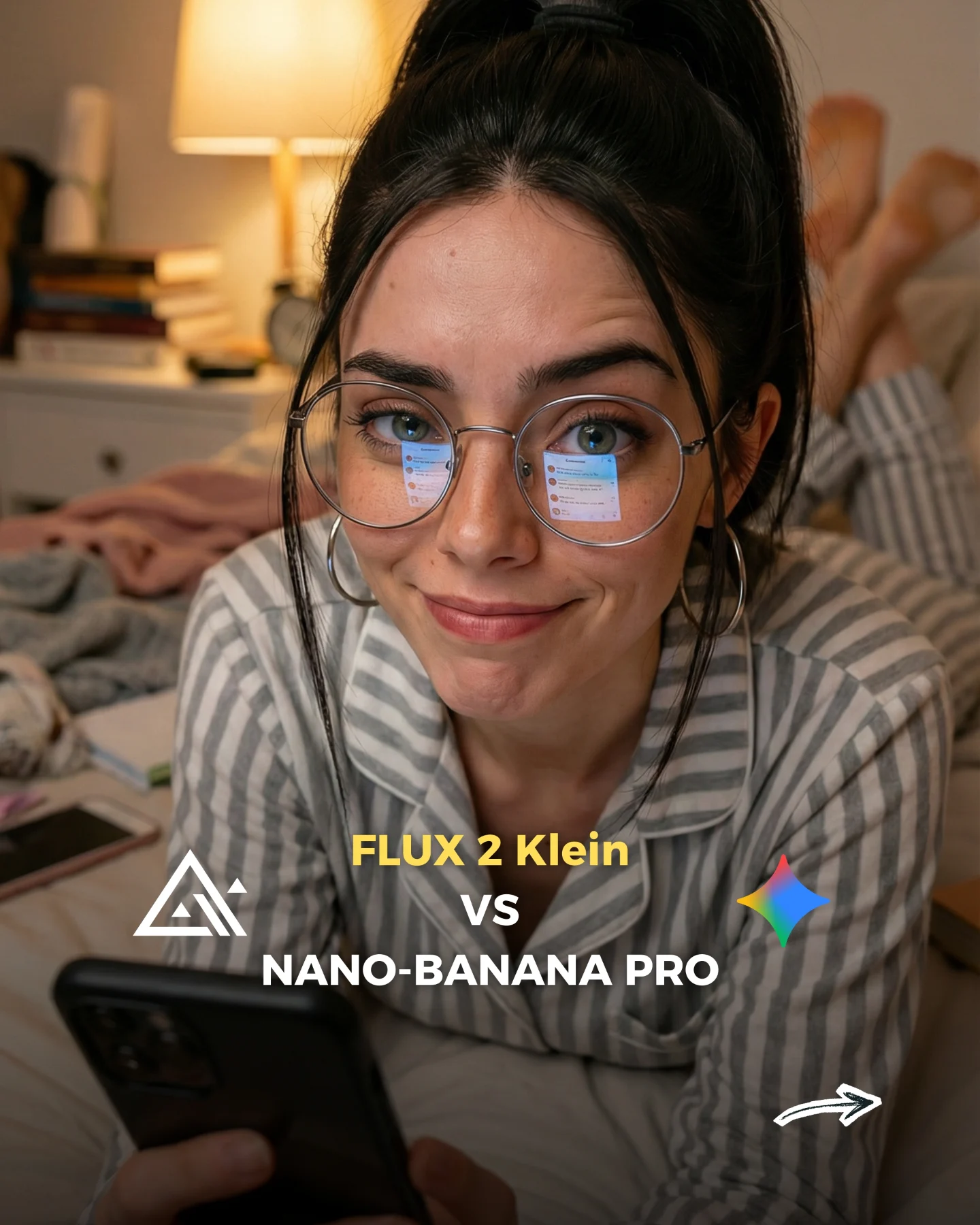
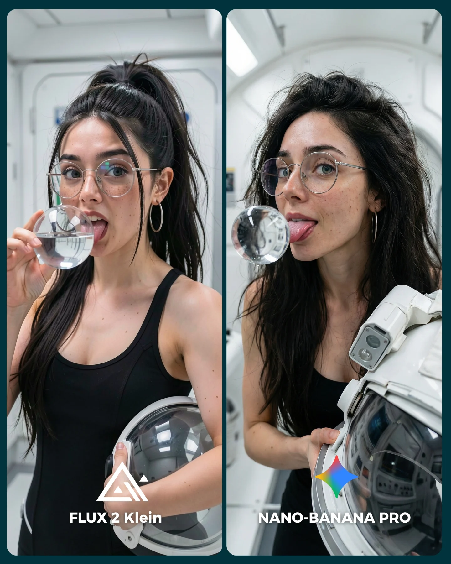
Flux 2 Klein VS. Nano Banana Pro 💥
Sigo pensando que no hay nada mejor que Nano Banana Pro 😅
O crees que hay algún generador de imágenes que le hace la competencia?? 👀
Como siempre... os puedo mandar todos los prompts de las imágenes si comentas "ARIA" 💕
How soy_aria_cruz Made This Flux 2 Klein vs Nano Banana Pro AI Art — and How to Recreate It
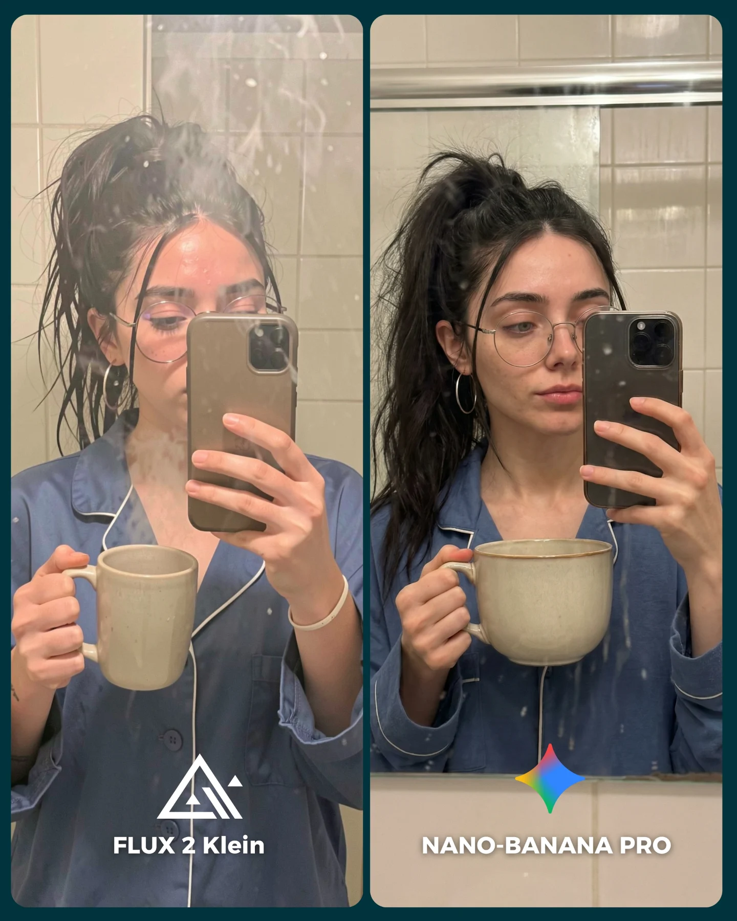
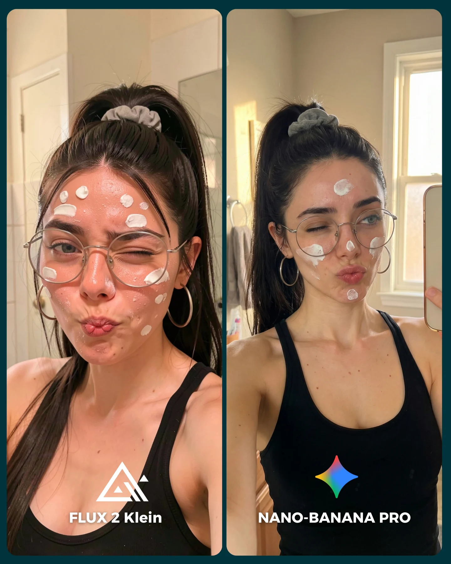
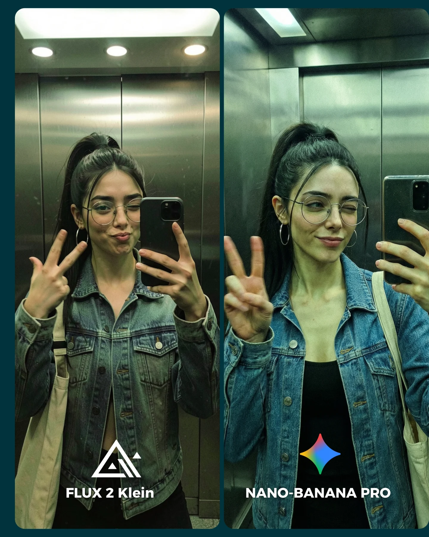
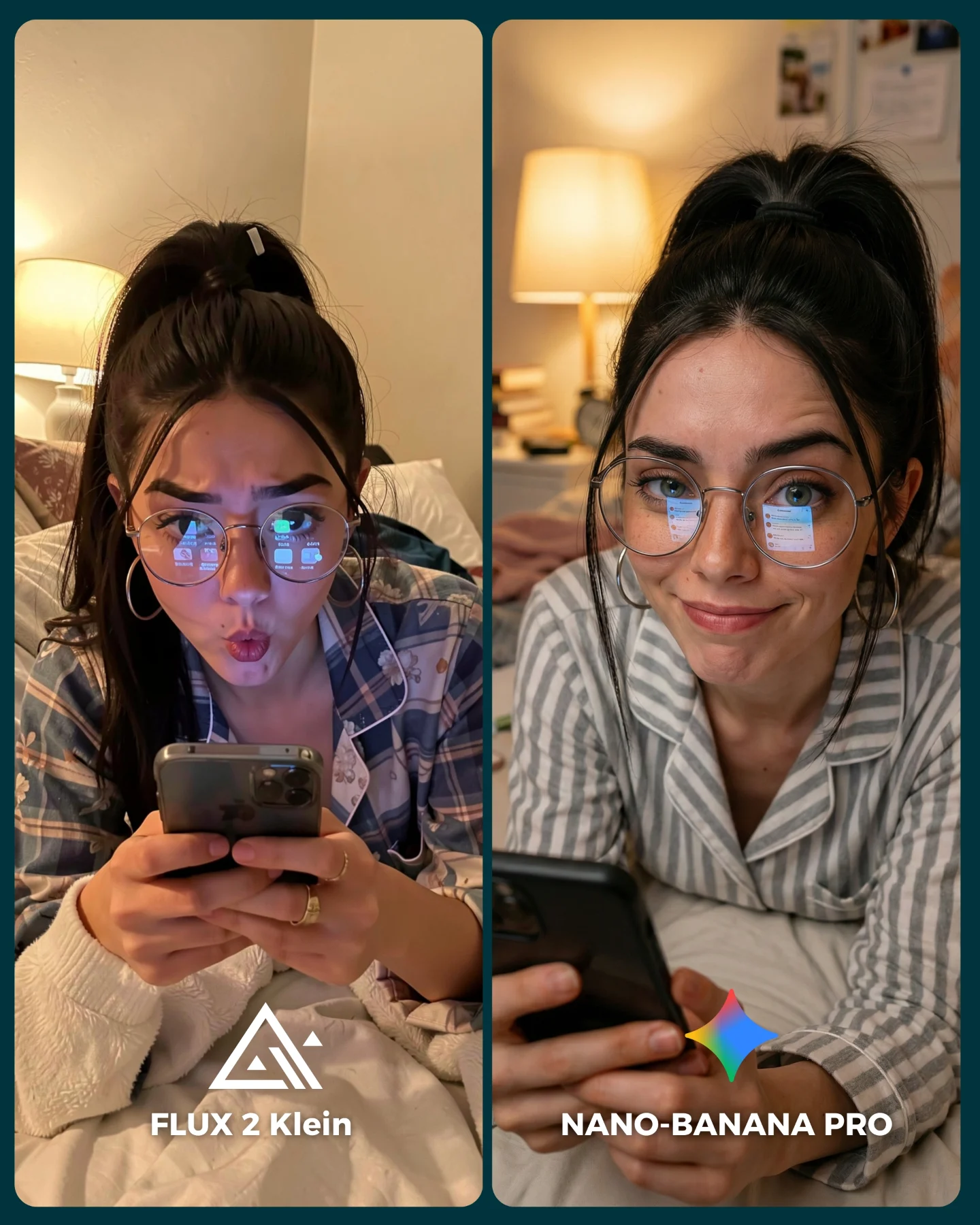
This image is effective because it takes something highly technical, an AI model comparison, and puts it inside a scene that feels instantly familiar. Instead of abstract outputs or sterile side-by-side grids, the post uses a morning bathroom mirror selfie with coffee, steam, pajamas, and phone in hand. That choice does two things at once. It makes the comparison emotionally approachable, and it gives the audience a very clear sense of what details actually matter when judging realism.
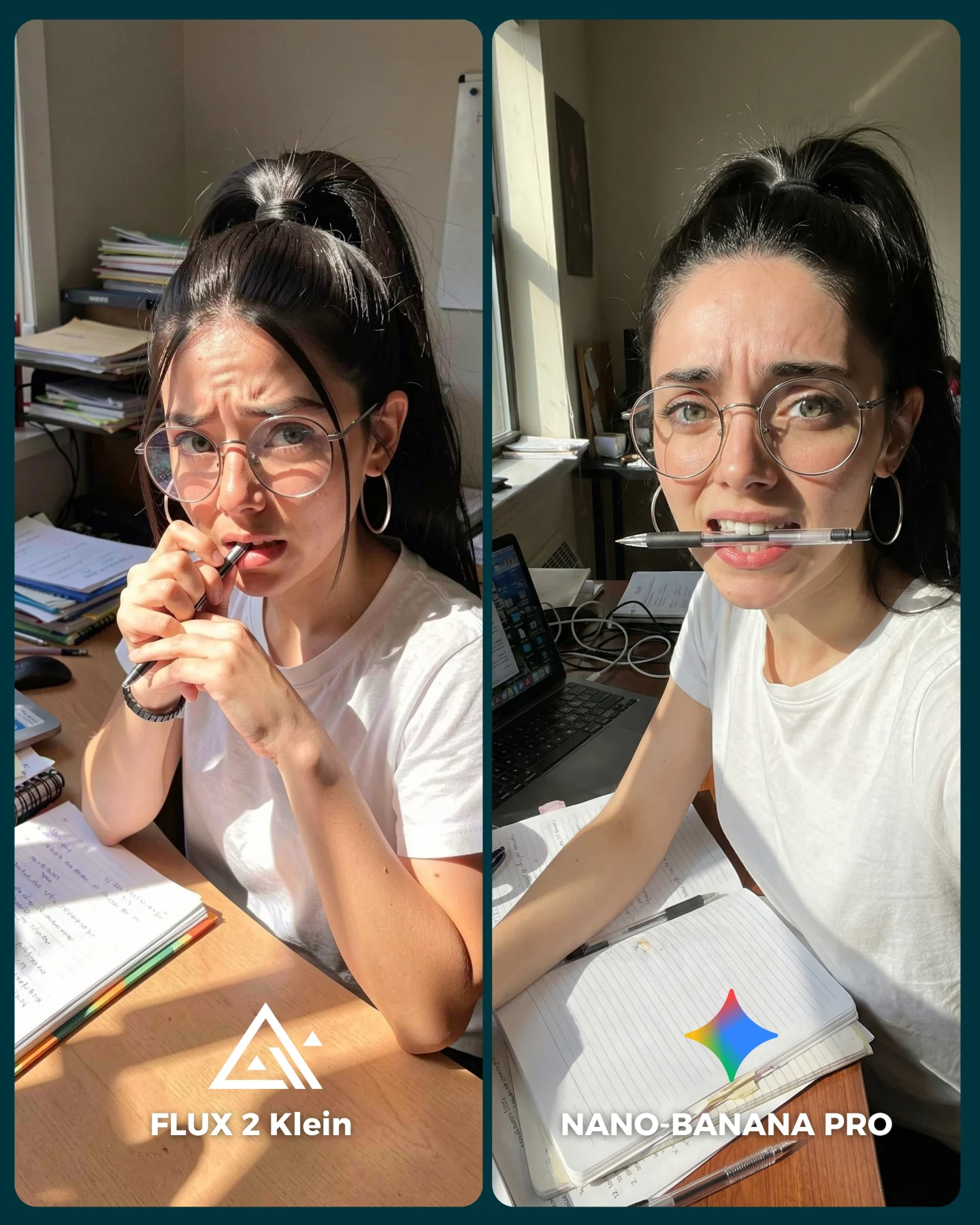
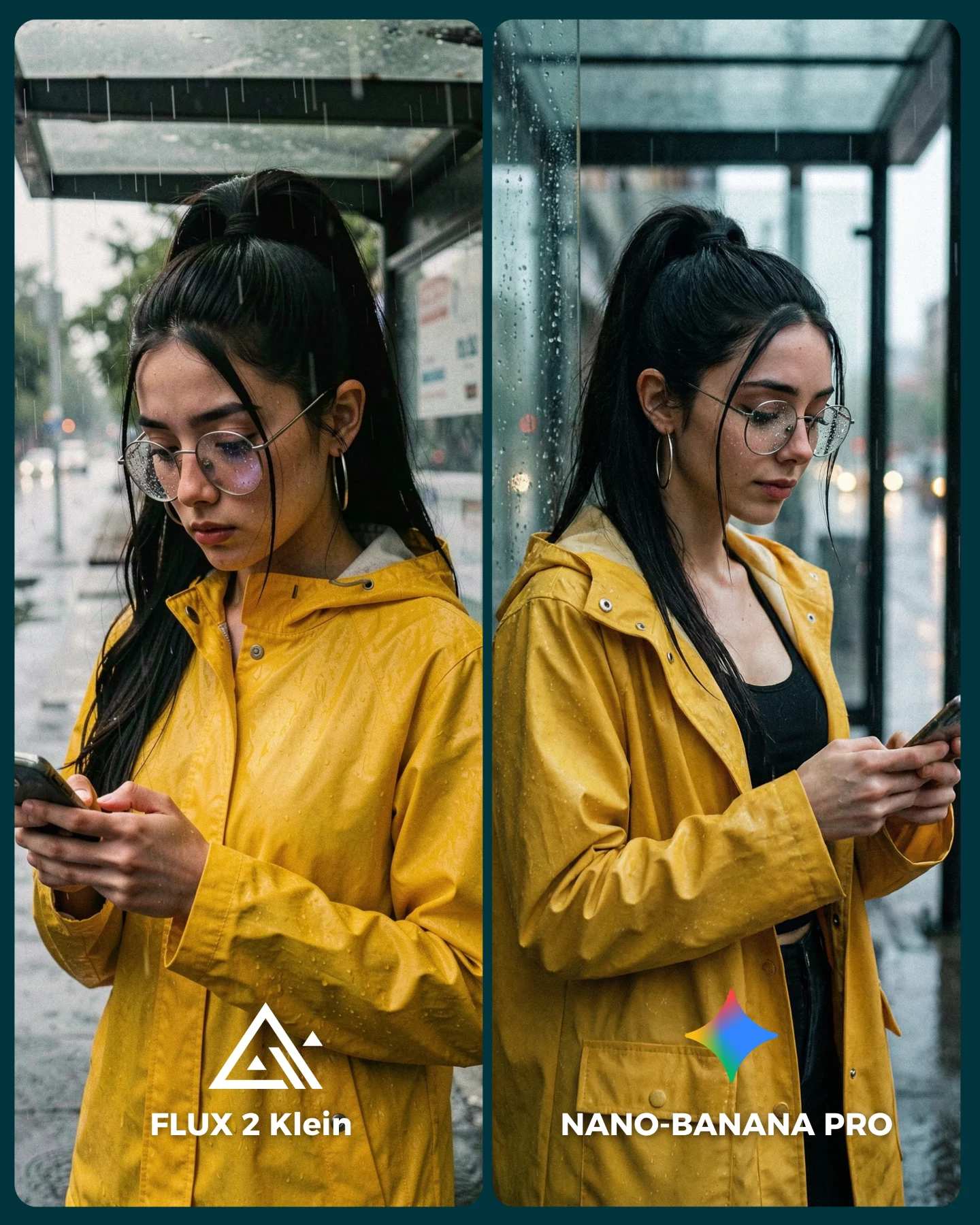
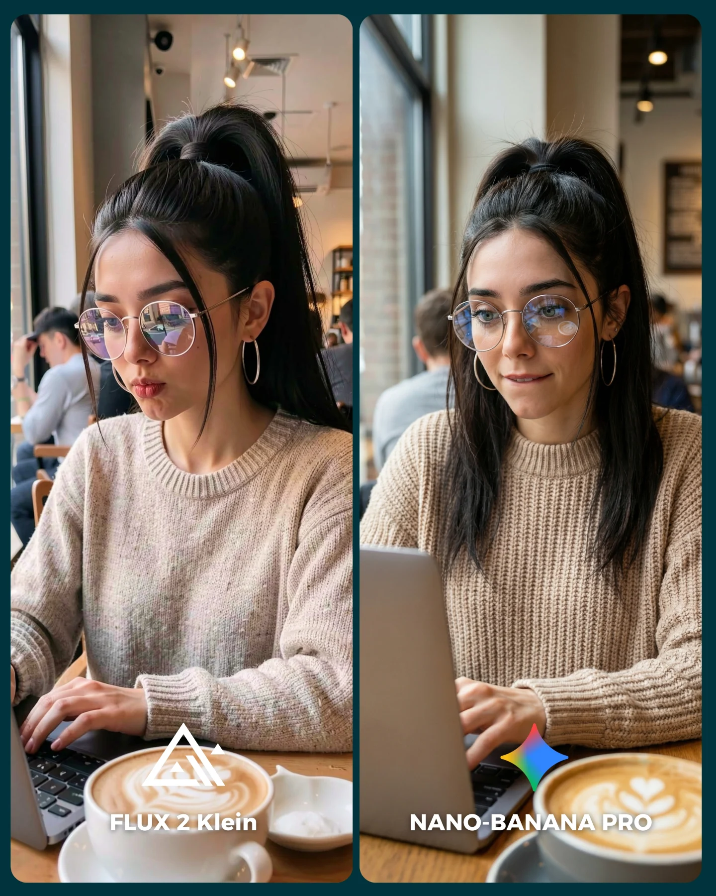
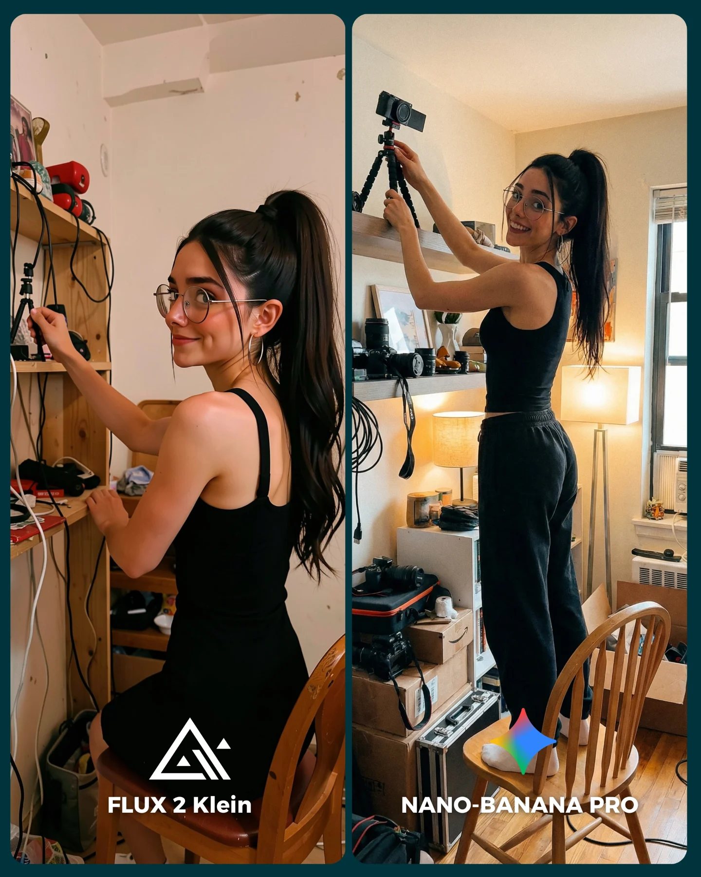
The scene is especially smart because it is full of small stress points for image models. You have eyeglasses, reflections, steam, tiled geometry, a hand wrapped around a mug handle, satin fabric, skin texture, and a mirror surface with dirt or condensation. These are exactly the kinds of elements that reveal whether a model can hold together domestic realism without collapsing into plastic perfection. In that sense, the image is not just pretty content. It is a meaningful test case.
What also helps is the visual honesty. The bathroom is ordinary. The styling is sleepy and minimal. The coffee mug is oversized and real. That ordinariness is a strength. When comparison posts use exaggerated fantasy scenes, viewers often admire them without learning anything useful. Here the setup feels close enough to daily life that the result has practical value for creators who care about believable human imagery.
Why It Holds Attention
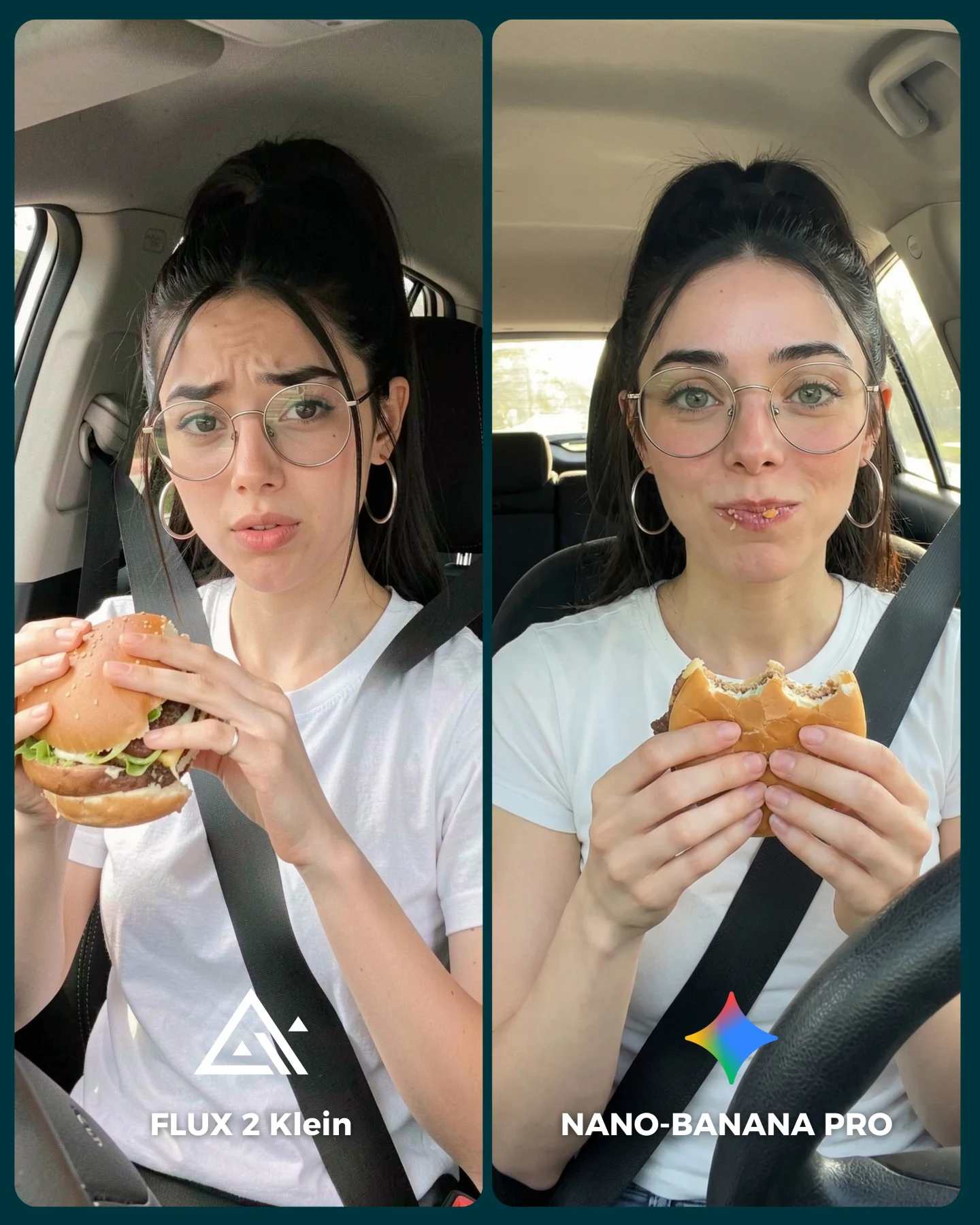
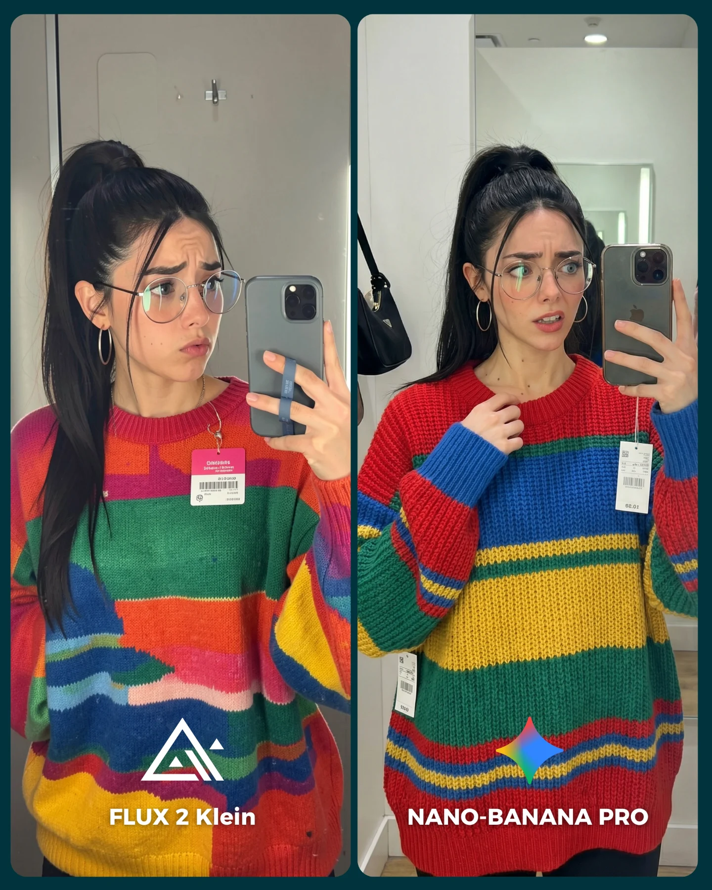
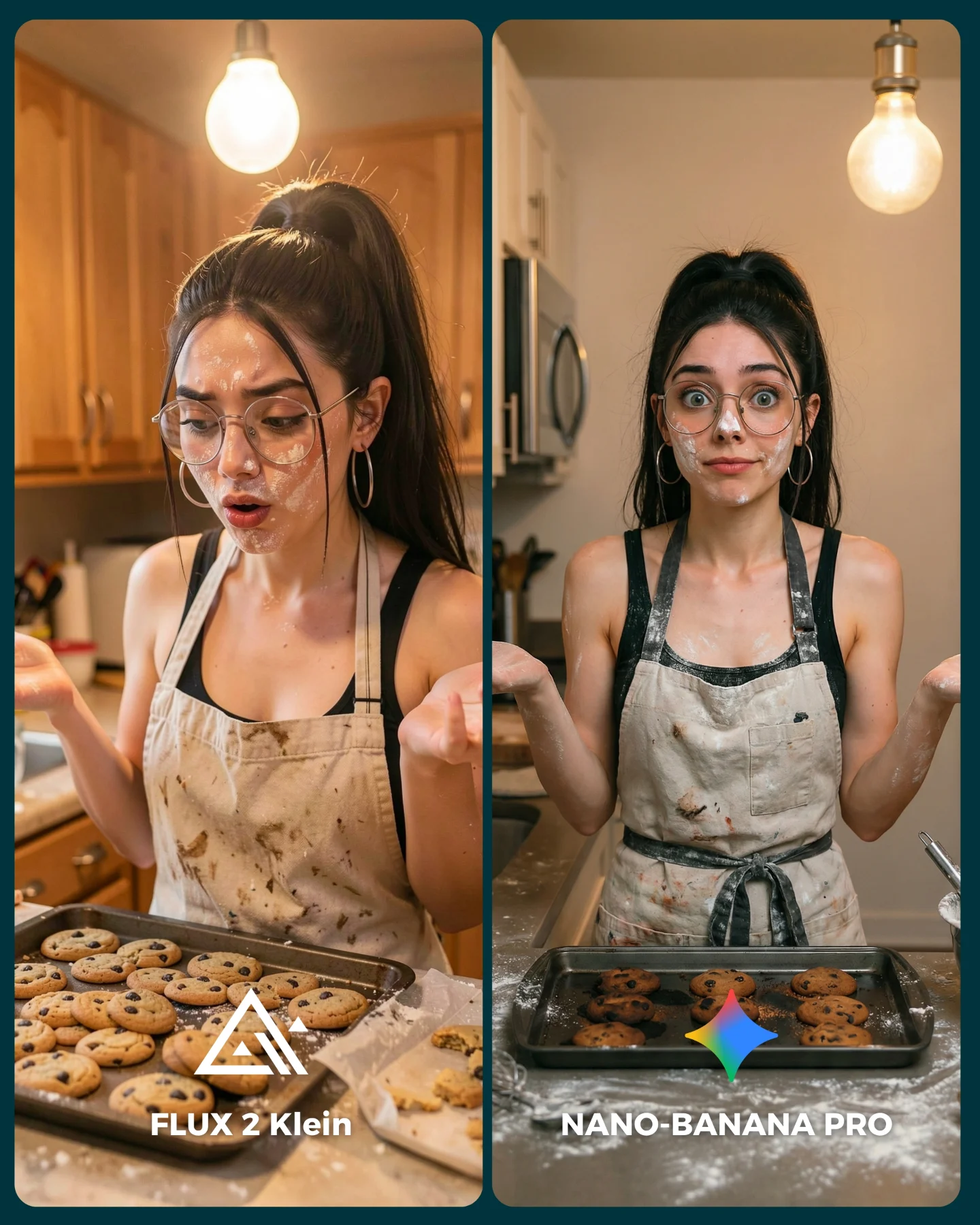
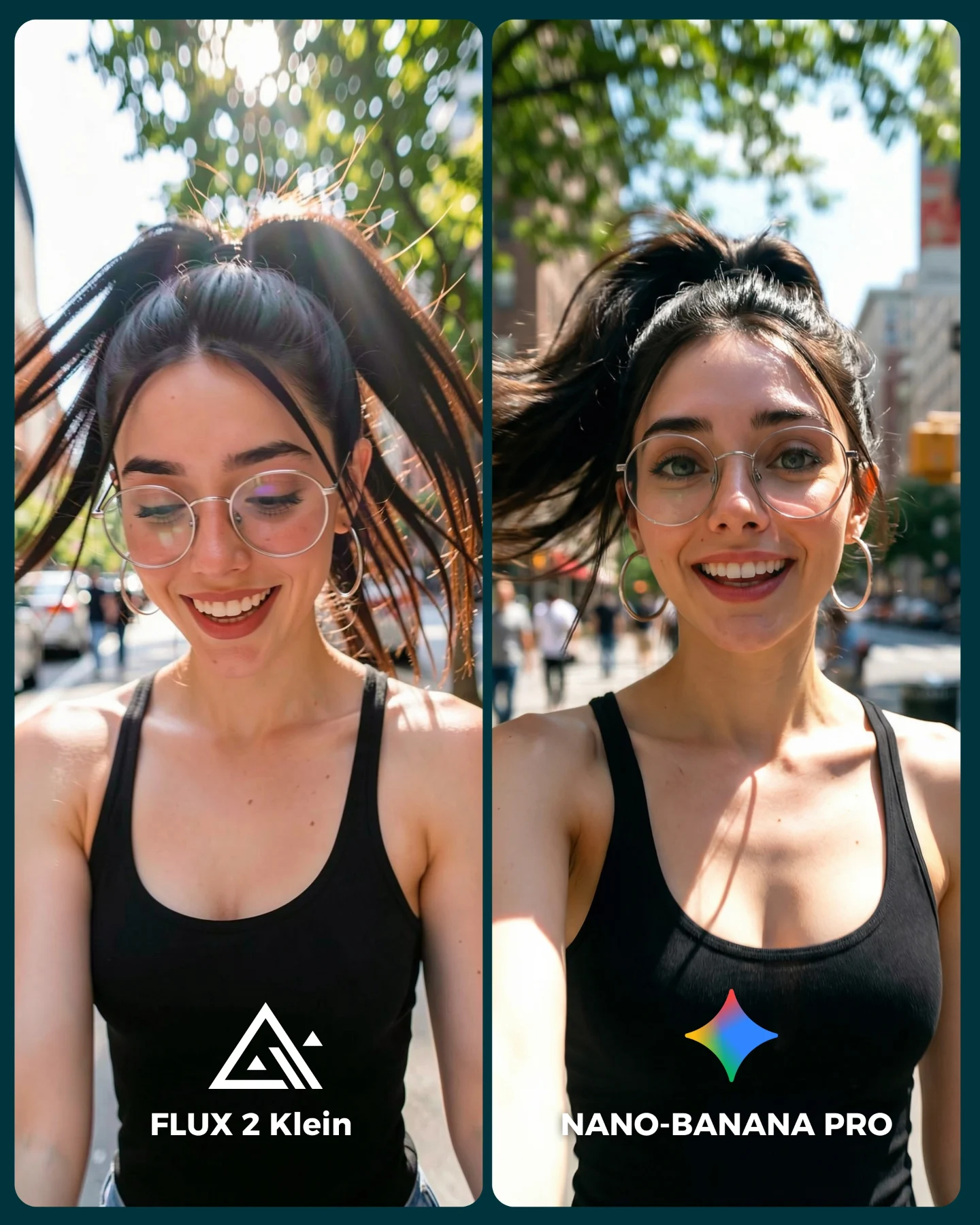
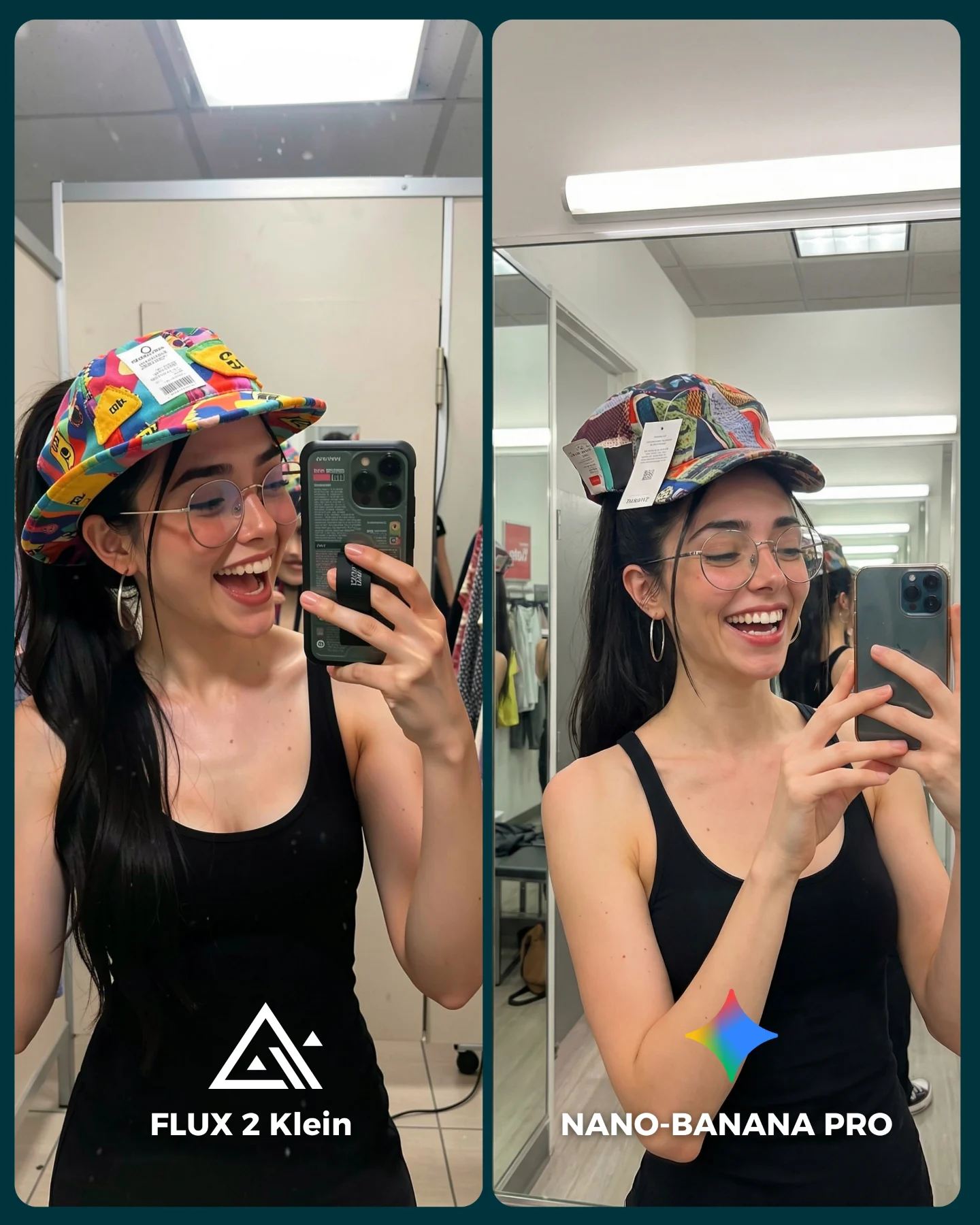
The first hook is the split-screen itself. People are naturally drawn to contrast, especially when the two images are almost the same but not quite. That invites inspection. The audience starts comparing skin, steam, fabric, mug shape, tile clarity, and overall realism almost automatically. Good comparison content often wins because it turns the viewer into an active judge.
The second hook is the cozy domestic mood. The pajamas, coffee mug, and just-woke-up bathroom setting make the technical comparison feel less like a benchmark sheet and more like a scene from real creator life. That lowers resistance. The post becomes easier to consume because it feels like a lifestyle image first and a model test second.
Signal
Evidence (from this image)
Mechanism
Replication Action
Built-in comparison behavior
Two nearly identical mirror selfies are placed side by side with model labels
Viewers immediately start scanning for differences, which increases dwell time
Use near-matching prompts and preserve the same pose so the comparison is easy to read
Domestic realism stress test
Steam, glasses, satin pajamas, mug handle, and mirror specks all appear in one frame
Small realism cues expose how well each model handles difficult everyday details
Choose comparison scenes with ordinary but technically fragile elements
Relatable creator routine
The image looks like a sleepy morning coffee selfie, not a lab test
Viewers engage more easily when technical content feels embedded in life
Wrap comparisons inside believable personal rituals like getting ready, journaling, or commuting
Thumbnail clarity
The panel labels and visual split make the topic obvious even at small size
Fast comprehension improves hold and click-through behavior
Add concise model names and keep the split layout clean and symmetrical
Where This Format Works Best
This visual format is ideal for AI image benchmark posts, prompt-library comparisons, realism tests, social covers for “which one wins?” debates, and creator education content that needs to stay warm instead of dry. It works especially well when the audience already cares about subtle differences in rendering but does not want to read long technical explanations first.
Best for AI generator comparisons: the side-by-side design makes visual judgment immediate.
Best for realism-focused prompt content: bathroom mirrors, steam, hands, and fabric reveal model quality quickly.
Best for Instagram covers and carousel openers: the layout announces the topic at a glance.
Best for solo creators building authority: the personal routine setting makes the review feel firsthand and credible.
It is less ideal for creators aiming for highly cinematic art direction, extreme fantasy outputs, or formal enterprise-style model reviews. The strength here is intimate realism. If the topic requires a more neutral institutional tone, the bathroom setting may feel too casual.
Not ideal for corporate benchmarking: the home setting is intentionally personal, not analytical in tone.
Not ideal for luxury-beauty branding: mirror specks and steam work against polished perfection.
Not ideal for abstract art comparisons: this format shines most when realism differences matter.
Three Transfer Recipes You Can Reuse
The durable lesson is not “always compare models in a bathroom.” It is to pick one realistic scene with several fragile detail zones, then keep the pose nearly identical so the audience can judge clearly.
Kitchen-coffee remix. Keep: same subject twice, same pose, comparison labels, one domestic prop. Change: bathroom mirror to kitchen counter, mug to cereal bowl or kettle, steam to window condensation. Slot template (EN): {same subject} in side-by-side domestic comparison, subtle realism stress points, clear model labels, cozy everyday setting
Desk-late-night remix. Keep: home realism, glasses reflections, split-screen design. Change: pajamas to sweater, mug to energy drink can, bathroom tiles to laptop-lit desk and messy notes. Slot template (EN): {creator} comparing {model A} vs {model B} in a personal workspace, matched pose, visible difficult textures
Hallway-mirror remix. Keep: mirror selfie logic, nearly identical framing, lifestyle closeness. Change: steam to hallway lamp shadows, mug to tote bag, tiled room to apartment entry mirror. Slot template (EN): {same mirror selfie scene} rendered by two models, matching body position, one or two controlled environmental differences
What Makes the Image Useful, Not Just Attractive
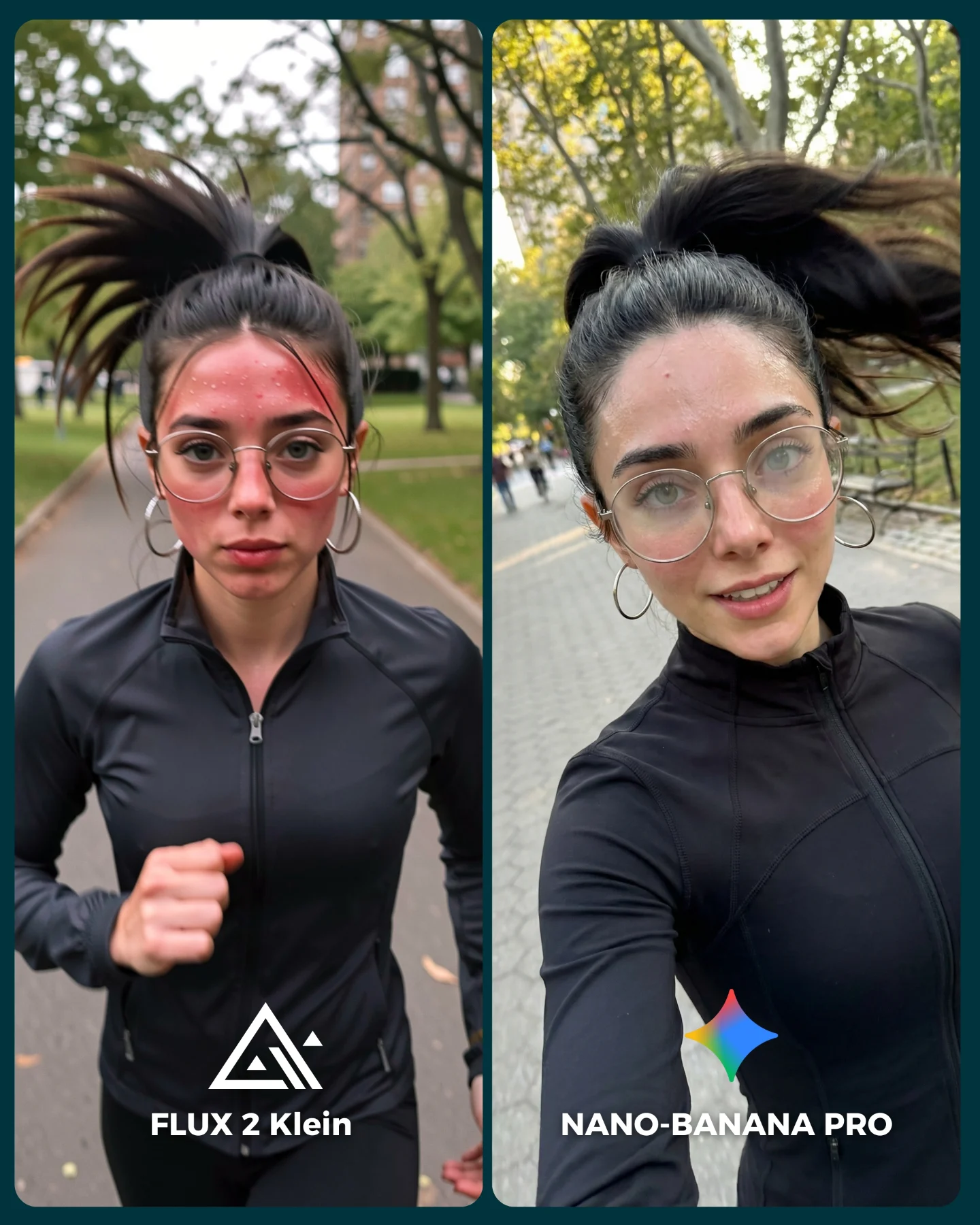
The first reason is that it tests more than faces. Many model comparison posts stay stuck at “which one makes the prettier person?” This image pushes further. It asks how each model handles atmosphere, glass, ceramic form, textile sheen, hand anatomy, and ambient lighting in a cramped domestic environment. That is much closer to the actual creative problems people face.
The second reason is that the left-right distinction is subtle rather than theatrical. One side is slightly hazier and warmer, the other a bit clearer and more controlled. That subtlety is good because it teaches viewers to notice quality gradients, not only obvious failures. Educational content gets stronger when it helps people develop taste, not just opinions.
The third reason is formatting. The labels are integrated cleanly into each side, which turns the image into a usable social asset. It is not simply a raw benchmark screenshot. It is a benchmark packaged for attention. That is an important skill for creators: showing evidence in a format people will actually stop for.
Observed
Why it matters for recreation
Same subject and pose on both sides
Keeps the comparison fair and easy for viewers to parse
Steam and mirror haze, especially on the left panel
Adds realism complexity and reveals model handling of atmosphere
Blue satin pajamas with white piping
Fabric sheen helps test texture rendering under home lighting
Large beige mug and dark phone
Everyday props introduce hand-object interaction, a common model weakness
Clear model labels at the bottom of each panel
Turns the image into instantly understandable comparison content
Prompt Technique Breakdown
If you want to recreate this kind of post in AI, the key is to control scene consistency more than visual drama. Both sides should feel like the same moment rendered with slightly different model behavior, not two totally different compositions pretending to be a comparison.
Prompt chunk
What it controls
Swap ideas (EN, 2–3 options)
same woman in split-screen mirror selfie holding mug and phone
Core comparison fairness and repeated subject setup
matched selfie pose; near-identical domestic comparison; same subject two-model render
humid bathroom, mirror specks, pale tiles
Environment realism and technical stress points
steamy bathroom mirror; post-shower home interior; lived-in tiled washroom
blue satin pajamas, glasses, hoop earrings, messy ponytail
cozy domestic benchmark image, not polished beauty ad
Overall tone and prevents sterile or glam drift
creator realism test; everyday AI comparison visual; intimate benchmark cover
How I Would Iterate This Without Breaking the Comparison
Lock three things first: the split-screen structure, the pose consistency, and the domestic bathroom realism. If any of those move too far, the comparison stops feeling trustworthy.
Then iterate carefully.
Run 1: establish identical framing, props, and styling across both sides.
Run 2: tune the left-right atmospheric difference so one side feels hazier without becoming unreadable.
Run 3: refine mug shape, hand grip, mirror spots, and pajama fabric texture.
Run 4: clean up the bottom labels and overall graphic integration for scroll-friendly readability.
If the image becomes too glamorous, add more steam, flat light, and domestic imperfection. If it becomes too messy, simplify the background and strengthen the typography. The goal is useful realism wrapped in a clean enough package to perform socially.
The Larger Creator Lesson
For creators, this image shows that benchmark content can perform when it respects both evidence and aesthetics. Too much evidence with no visual care becomes forgettable. Too much aesthetics with no meaningful test becomes empty. The best posts sit in the middle, where people can feel the scene and learn from it at the same time.
That balance is worth stealing. If you want your comparison posts to get saved instead of skimmed, choose scenes that contain real creative problems, make the differences easy to inspect, and package the result like a story from actual life rather than a cold scoreboard.