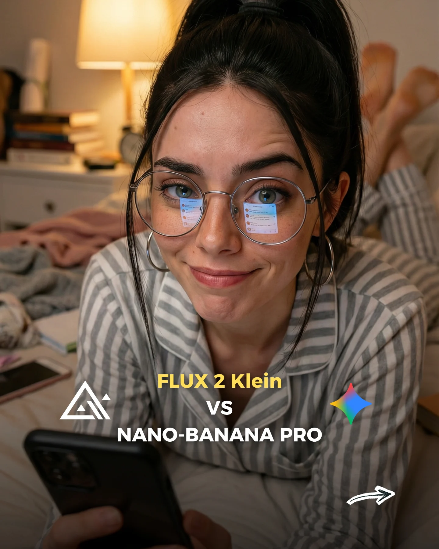
How soy_aria_cruz Made This Flux 2 Klein vs Nano Banana Pro AI Portrait and How to Recreate It
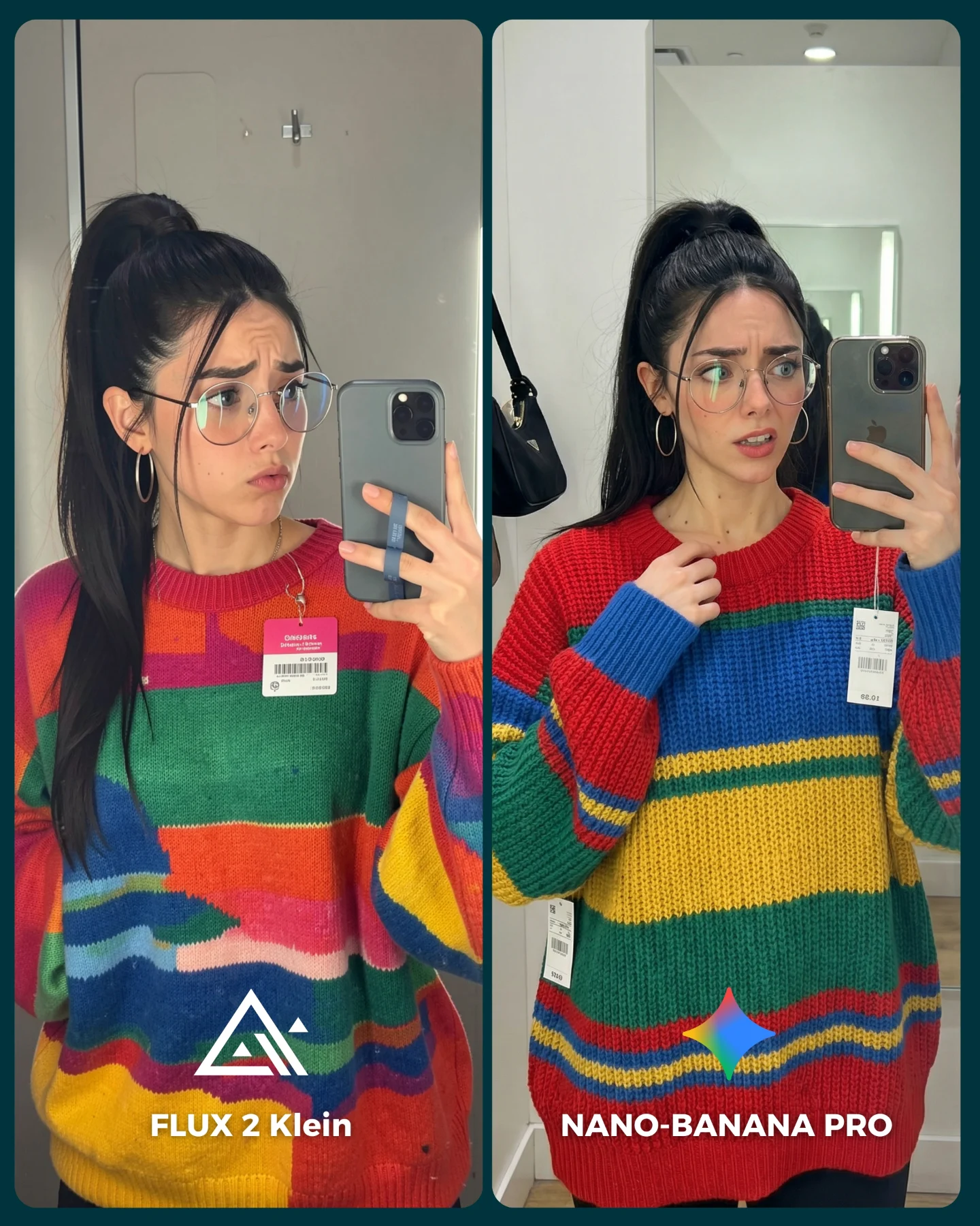
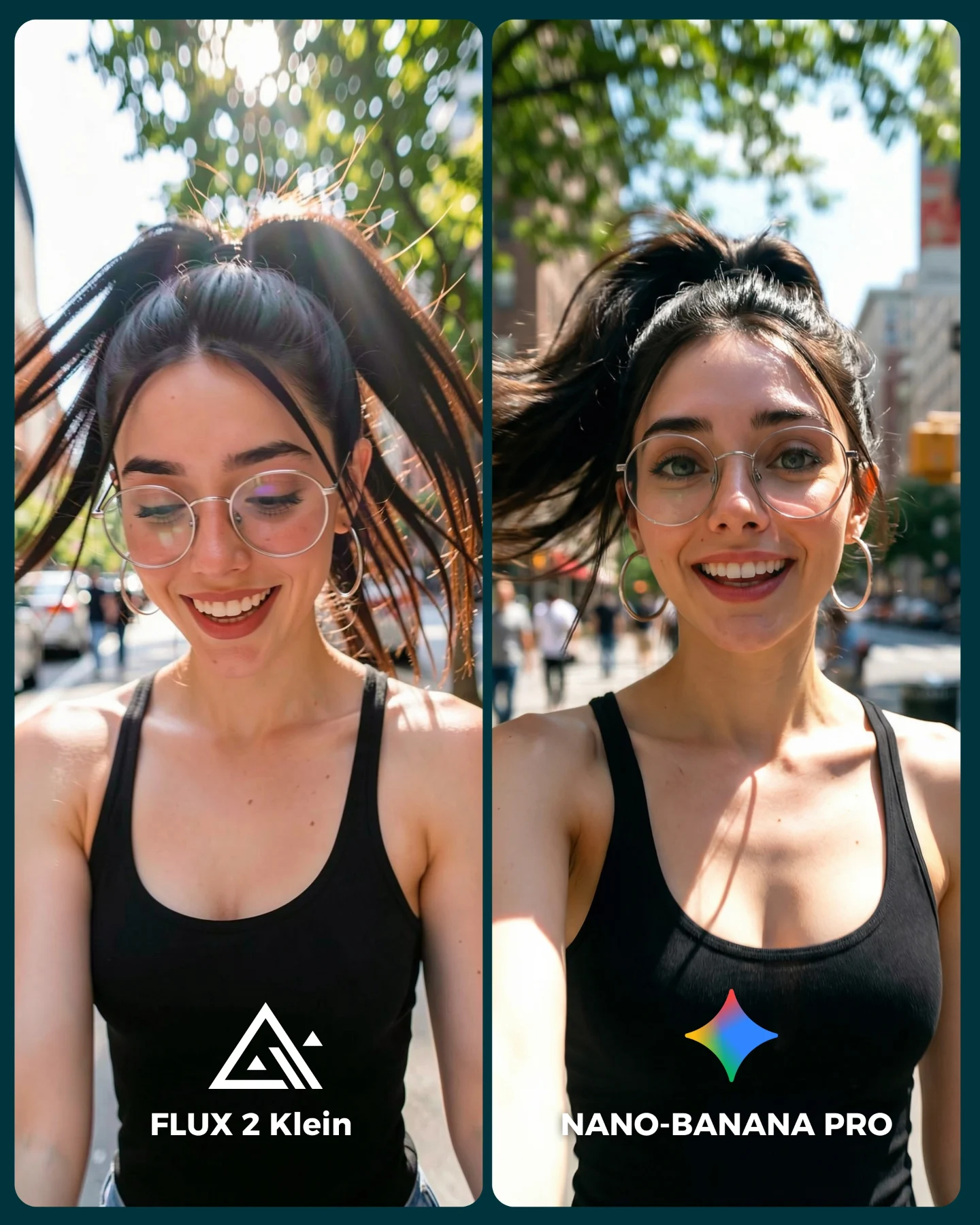
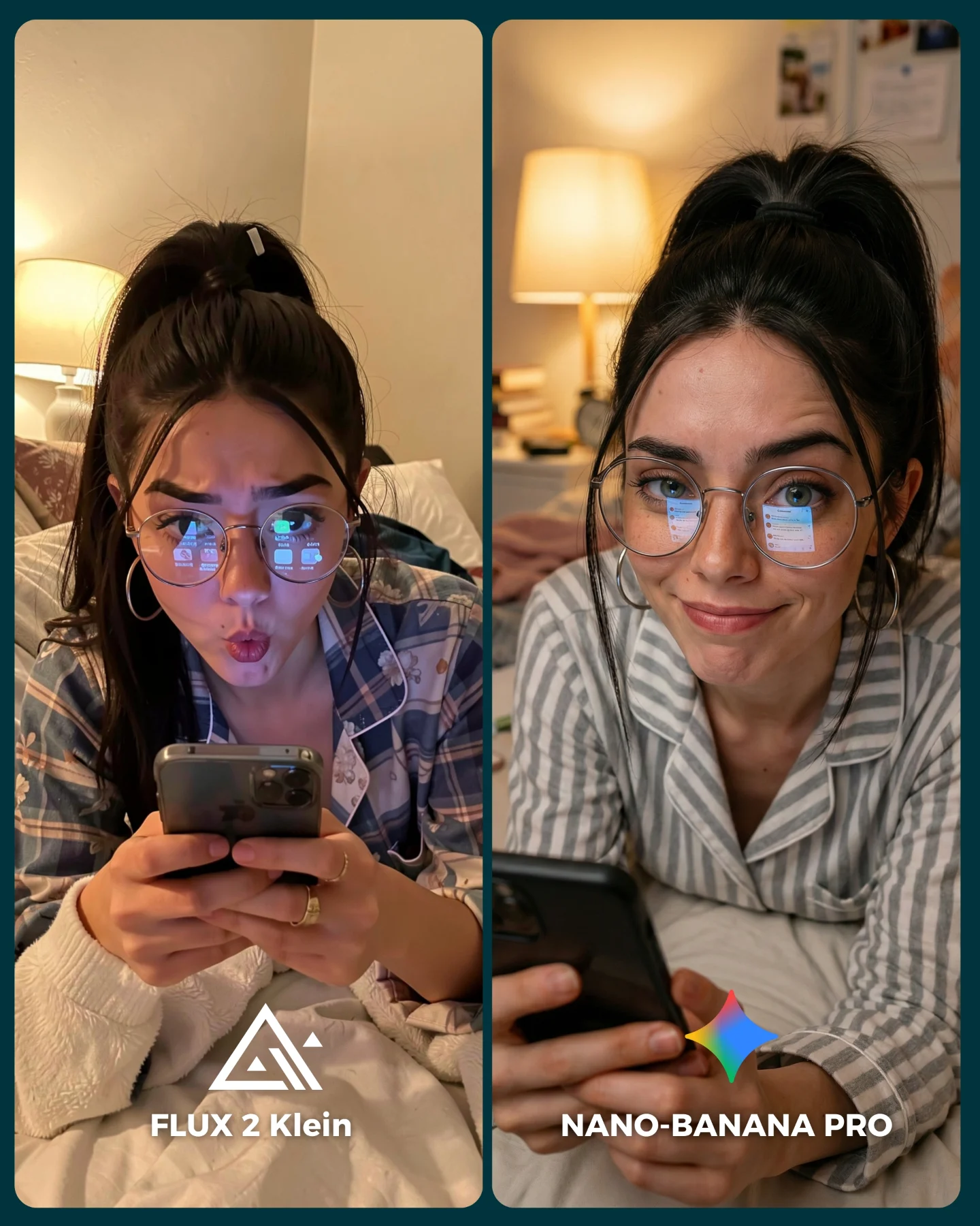
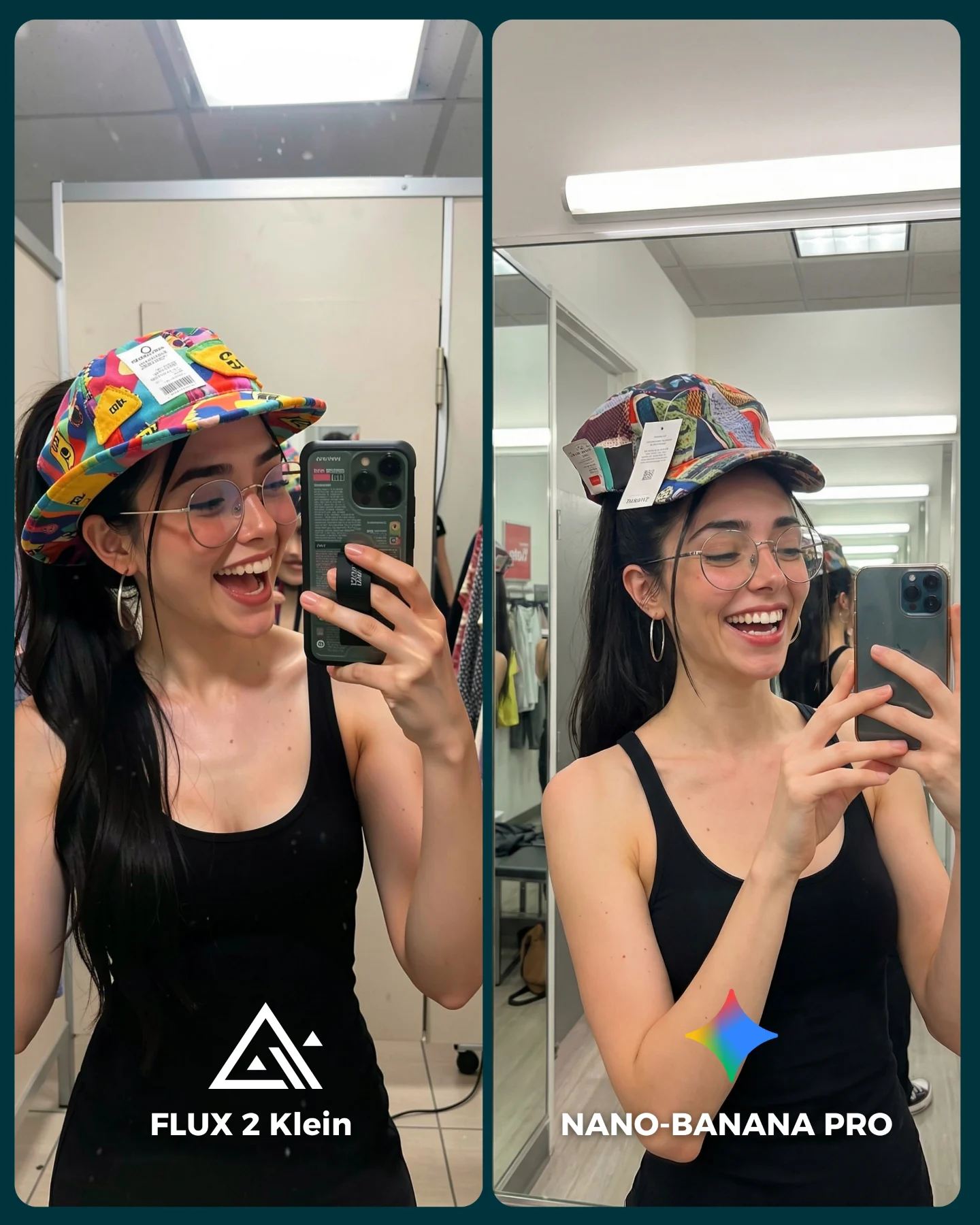
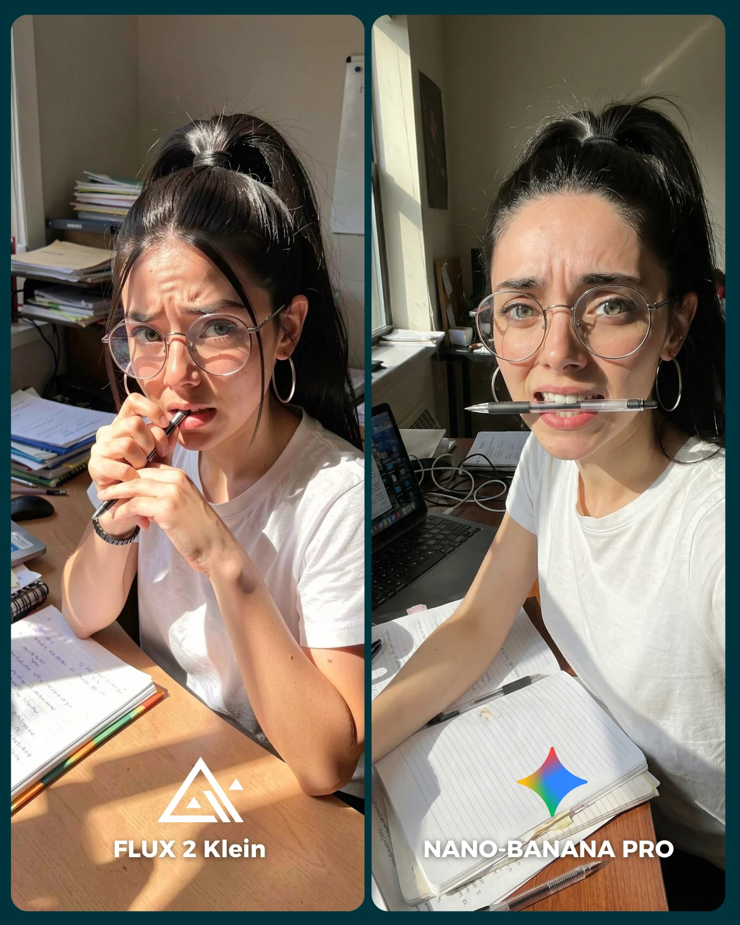
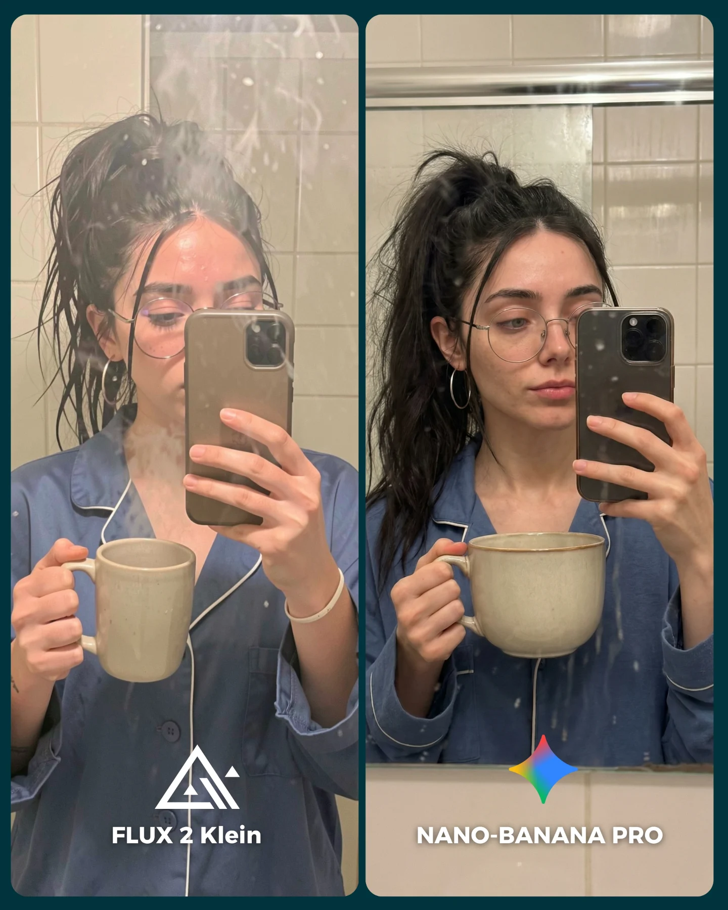
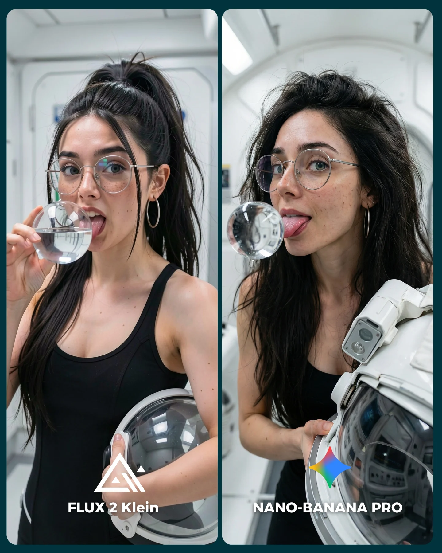
Comparison posts work when the difference is easy to notice but hard to ignore. This one does that well. The creator keeps almost everything constant: same person, same selfie setup, same mirror logic, same bright sweater energy. That consistency turns the audience into judges. Instead of asking whether the image is pretty, the post asks which generator wins. That is a much stronger engagement mechanic because viewers feel invited to pick a side.
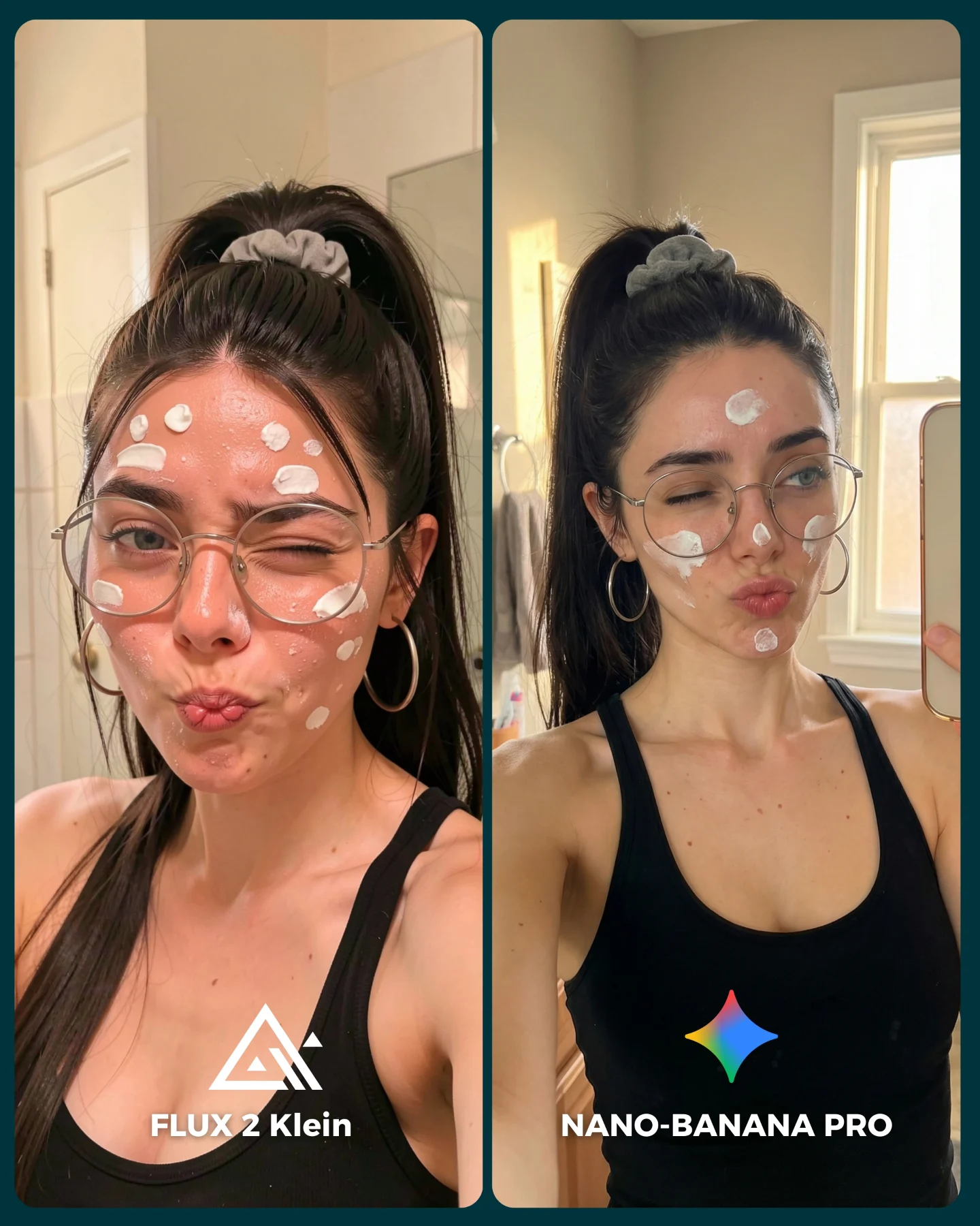
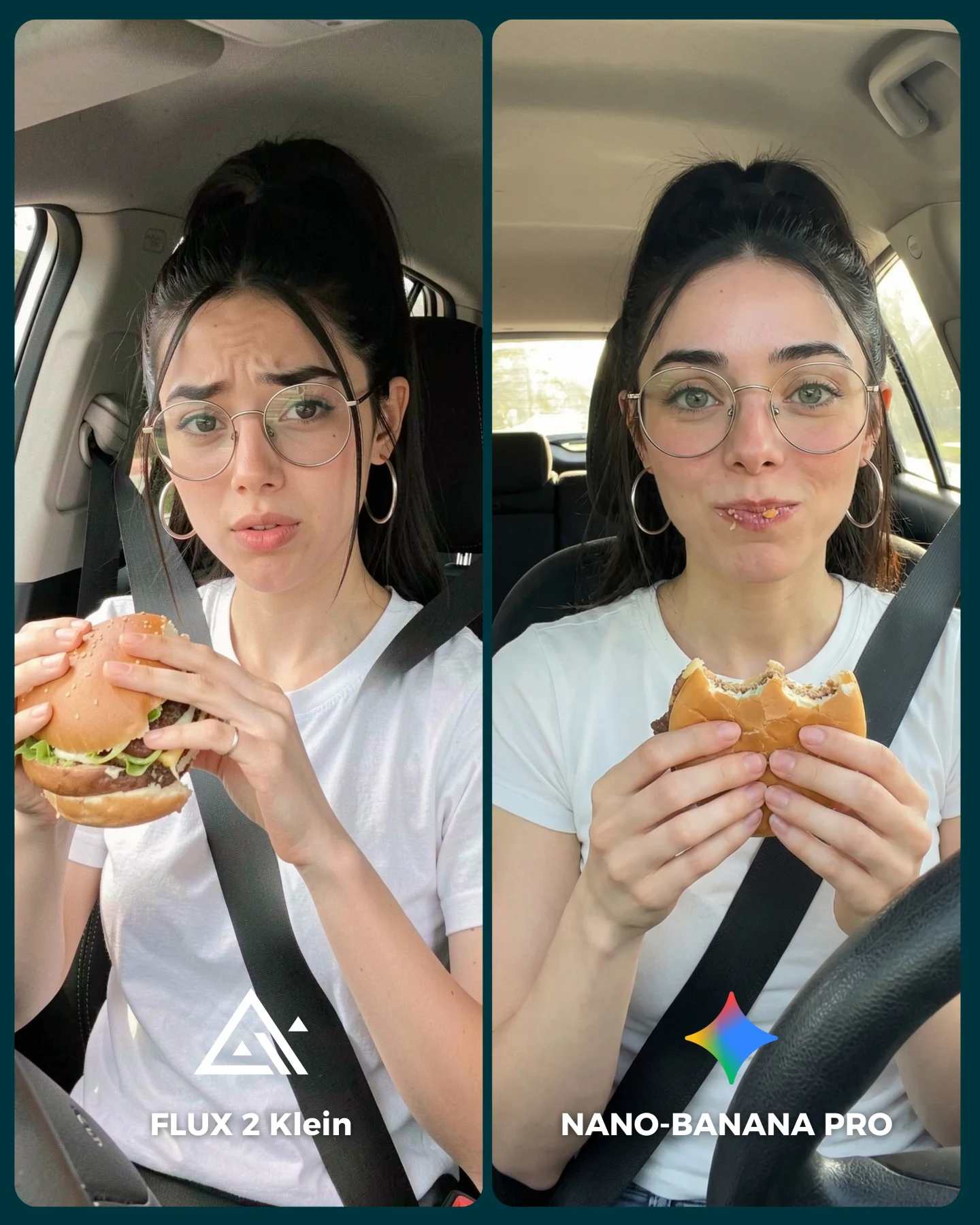
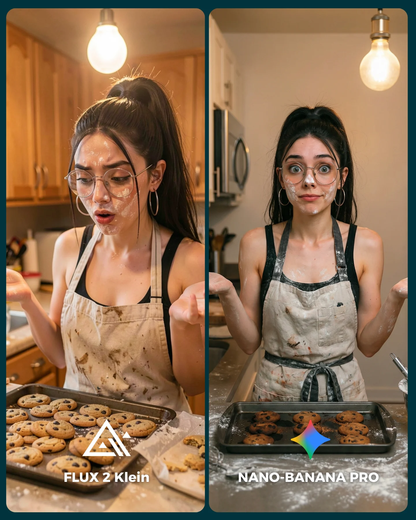
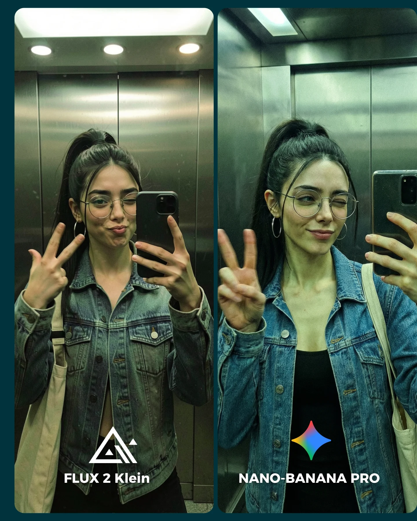
The visual setup is also smart for mobile. A split-screen mirror selfie is familiar, easy to read, and naturally credible. People understand this format in a second. Then the details start to matter: facial accuracy, knit texture, sweater structure, eye direction, expression stability, tag realism. You are not forcing the audience through a technical explanation. You are letting the image turn quality differences into something obvious and discussable.
Why It Travels Beyond Prompt Nerds
The caption frames the image like a friendly debate, not a lab test. That matters. Many creators post model comparisons in a way that feels closed and technical. Here, the image remains social. The wardrobe is loud, the expression is funny, and the mirror selfie format feels native to everyday posting. So even viewers who do not care deeply about models can still react to the fashion, the personality, and the side-by-side difference.
| Signal | Evidence (from this image) | Mechanism | Replication Action |
|---|
| Clear A/B framing | Two equal panels with model names at the bottom | Reduces cognitive load and makes engagement frictionless | Use a strict split-screen layout with labels that can be understood in one glance |
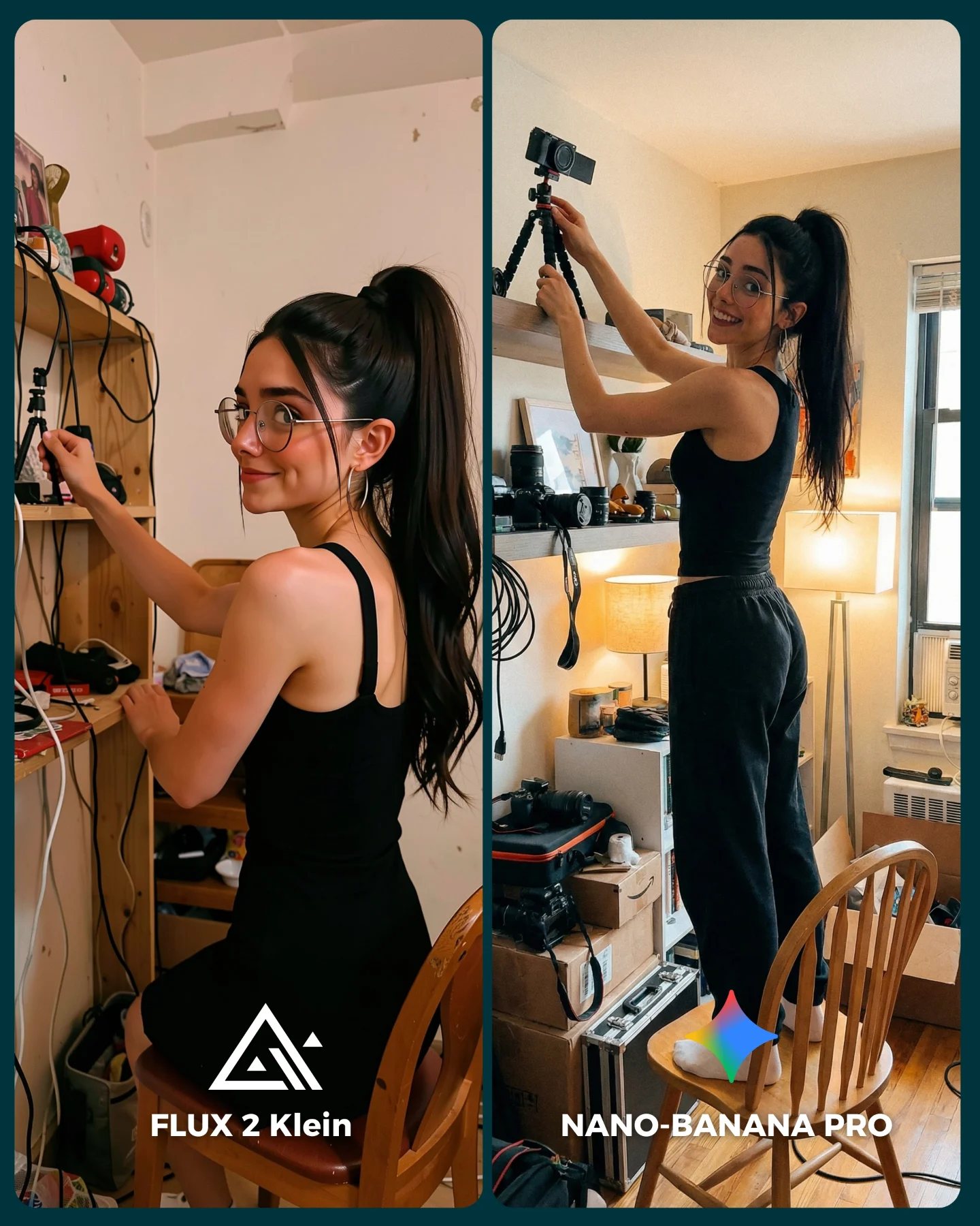
| Identity lock | Same woman, same phone, same hair, same glasses | Keeps the comparison fair so differences feel meaningful | Freeze face structure, pose family, and props before testing any model change |
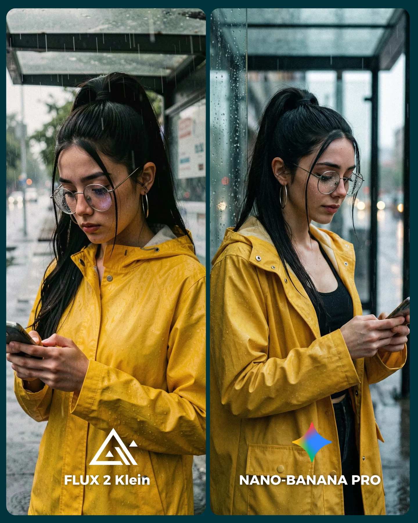
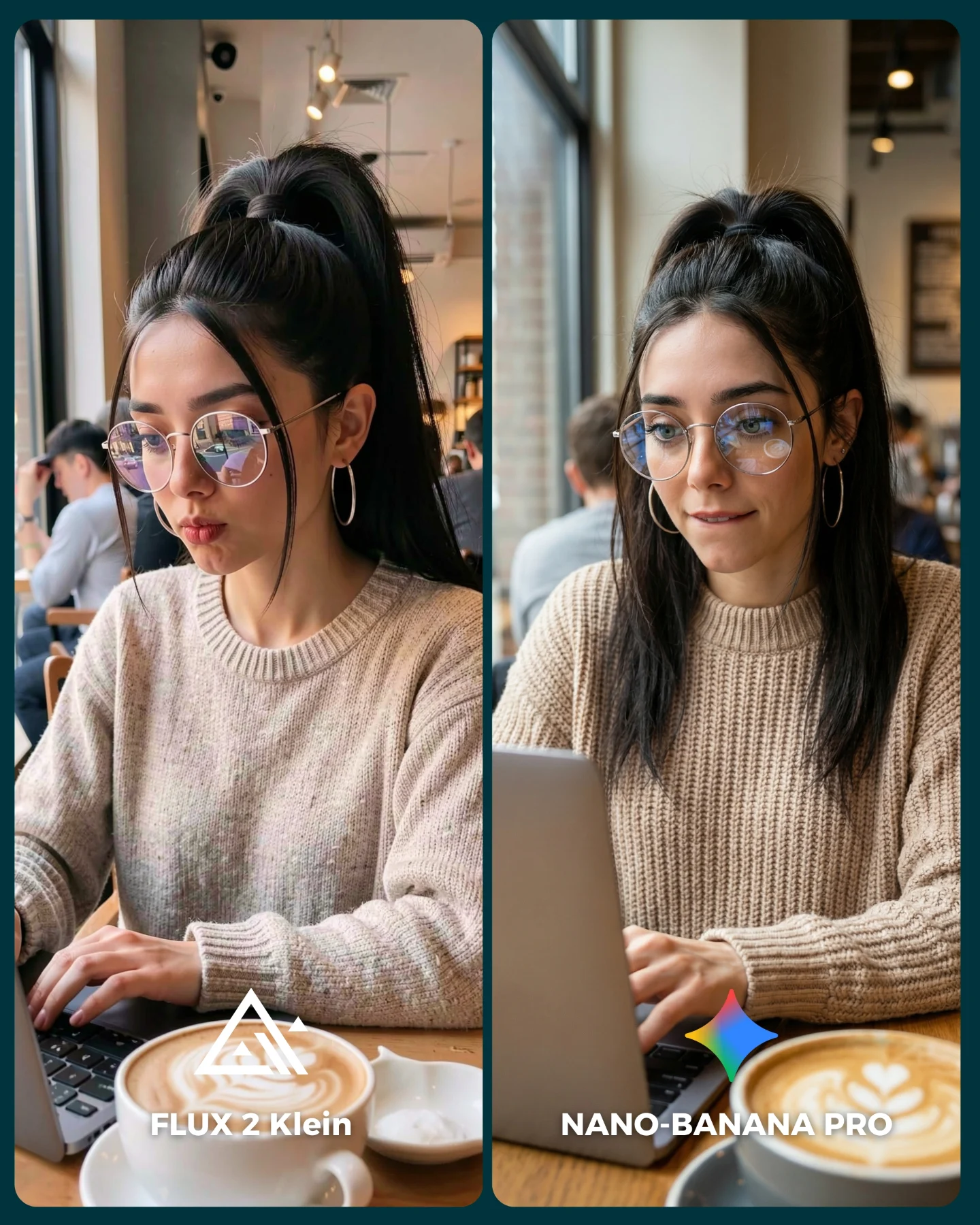
| Texture stress test | Chunky multicolor knit sweaters and hanging retail tags | Complex texture exposes rendering weaknesses quickly | Choose wardrobe with obvious knit detail, hard color transitions, and small realism checks like tags |
| Social-native format | Mirror selfie inside a fitting-room style space | Feels familiar and believable, so viewers stay longer | Benchmark models inside everyday photo formats instead of abstract fantasy scenes |
Best-Fit Use Cases
- AI tool comparison content: ideal when you want comments from viewers who enjoy choosing winners. Keep the setup fixed and only vary the model.
- Prompt education posts: a split-screen teaches faster than a long caption. Change one prompt block and let the audience see the result.
- Fashion or outfit creators testing realism: knitwear, tags, and mirror reflections expose quality quickly. Keep wardrobe loud and readable.
- Creator trust-building: showing side-by-side results makes your recommendations feel earned instead of vague. Add concise labels and invite debate.
This format is less effective for emotional storytelling, luxury editorial moodboards, or scenic travel inspiration. The comparison frame is analytical by nature. It asks viewers to inspect, not to drift.
Three Transfer Recipes
- Makeup counter transfer: Keep the same split-screen identity lock and phone selfie realism. Change the sweaters to beauty-counter lighting and product-in-hand testing. Slot template:
{mirror selfie setting} {same person} {beauty product or outfit variable} {model comparison} - Outerwear transfer: Keep the retail mirror and panel labels. Change knit sweaters to leather jackets, faux fur, or trench coats so material realism becomes the test. Slot template:
{store mirror} {same model identity} {textured outerwear} {A/B model labels} - Street-style transfer: Keep the side-by-side comparison logic and recognizable prop. Change the fitting room to a shop window or elevator mirror. Slot template:
{urban mirror setup} {same woman and phone} {statement outfit} {generator duel}
The Aesthetic Read That Makes It Useful
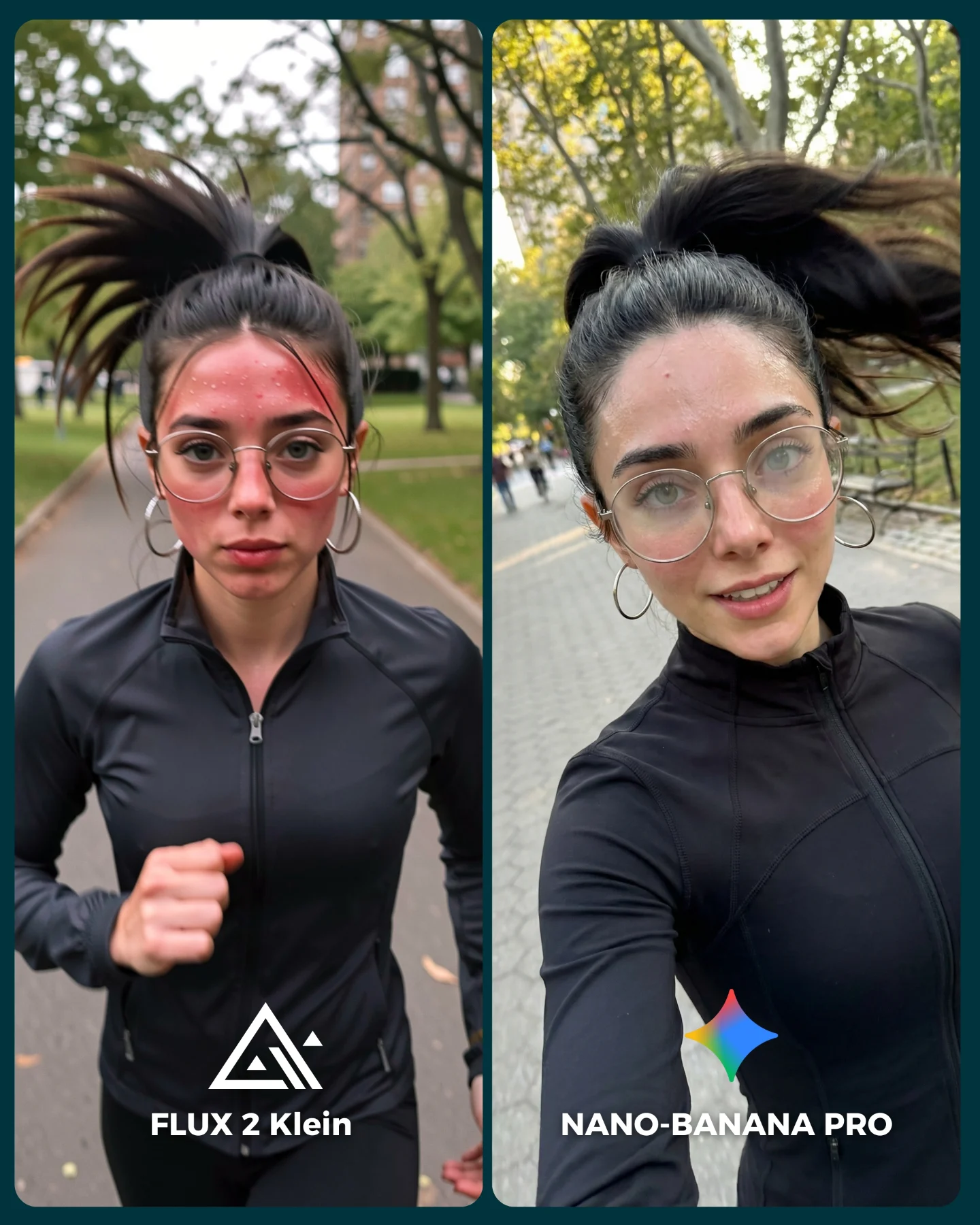
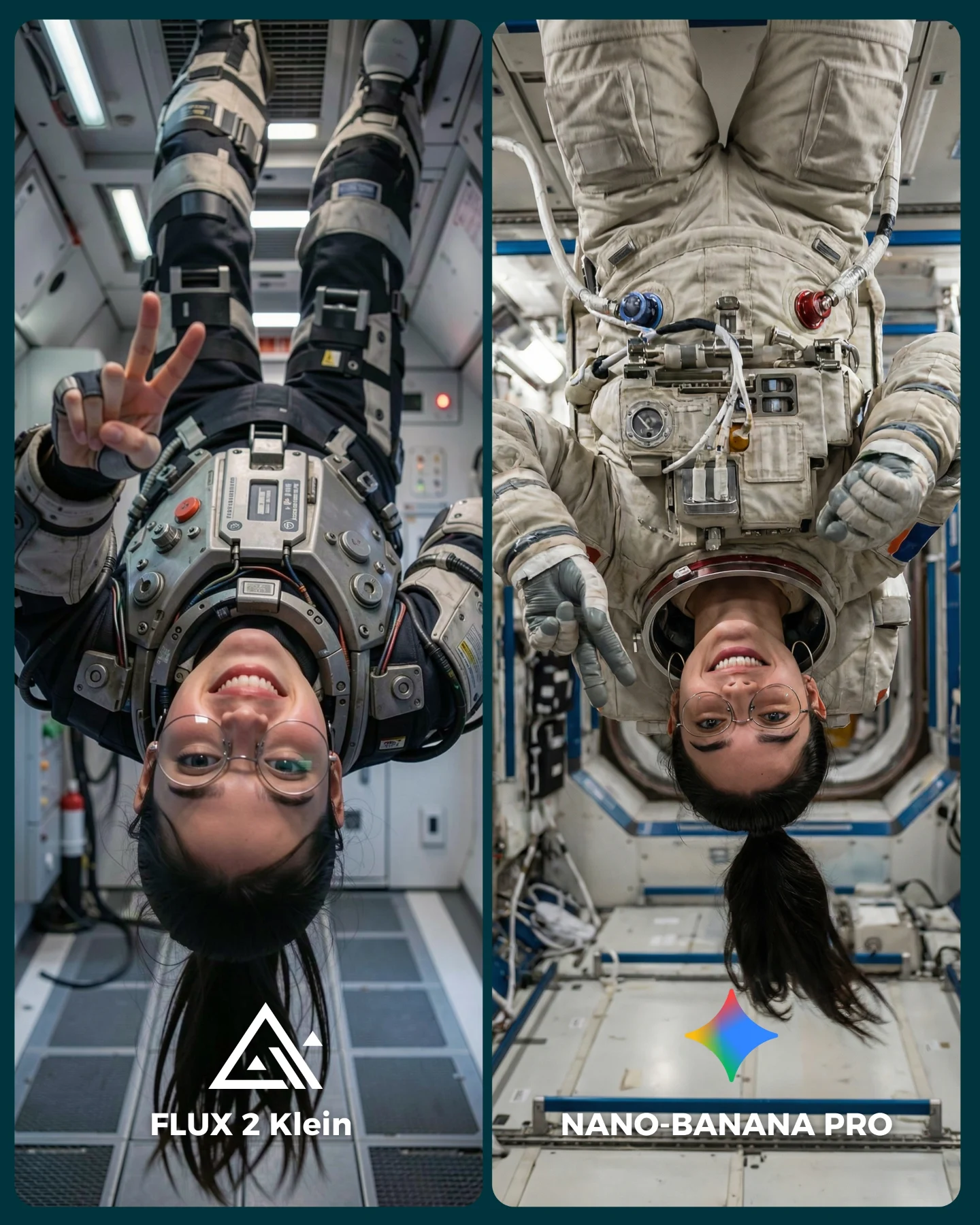
What makes this image effective is not only that it compares models. It compares them inside a setup with just enough difficulty. Mirror selfies are unforgiving. Glasses need to sit correctly, hairline edges need to look natural, knit texture cannot melt, and the body pose has to remain human. The creator did not choose a glamorous cinematic scene. She chose an ordinary environment where mistakes are easier to spot. That makes the result more valuable for working creators who need dependable image generation rather than isolated beauty shots.
| Observed | Why It Matters |
|---|
| Equal split-screen layout | Creates fairness and makes quality differences easier to compare |
| Bright, difficult knitwear textures | Tests structure, color control, and material fidelity |
| Mirror selfie with phone in hand | Introduces a common source of anatomy and reflection errors |
| Eyeglasses and hoop earrings | Add small accessory checks that weak models often mishandle |
| Retail tags still attached | Adds subtle realism clues that make the scene feel more convincing |
Prompt Blocks To Keep or Swap
| Prompt chunk | What it controls | Swap ideas (EN, 2-3 options) |
|---|
| same young woman repeated in two equal vertical panels | Comparison fairness and identity control | same man in two panels, same couple in two panels, same outfit in two rooms |
| photorealistic smartphone mirror selfie in a fitting-room setting | Everyday realism and format credibility | elevator mirror selfie, shop-window reflection, bathroom mirror selfie |
| oversized colorful knit sweater with visible retail tags | Material complexity and realism stress test | sequined dress, faux-fur coat, striped cardigan |
| glasses, hoop earrings, high ponytail, dark gray phone | Fine-detail consistency | cat-eye glasses and blazer, claw clip and scarf, slick bun and leather tote |
| bottom labels naming each model output | Reader comprehension and engagement prompt | winner badge, score markers, version tags |
Execution Playbook
Lock three things first: identity, camera perspective, and scene type. If those move, your comparison stops being fair. Then iterate with discipline.
- Run 1: lock the person, phone pose, and mirror framing. Compare only base model output.
- Run 2: keep the same prompt and test a wardrobe with more difficult texture, such as thick knit or sequins.
- Run 3: keep the wardrobe and framing, then tune expression accuracy and eye direction.
- Run 4: only after realism is stable, refine graphic presentation with labels, border color, and thumbnail readability.
If the images become too polished and lose believability, add retail imperfections back in: visible tags, neutral store walls, slightly awkward hand placement, and plain overhead lighting. Those details make comparison posts feel honest, which is exactly why audiences trust them.