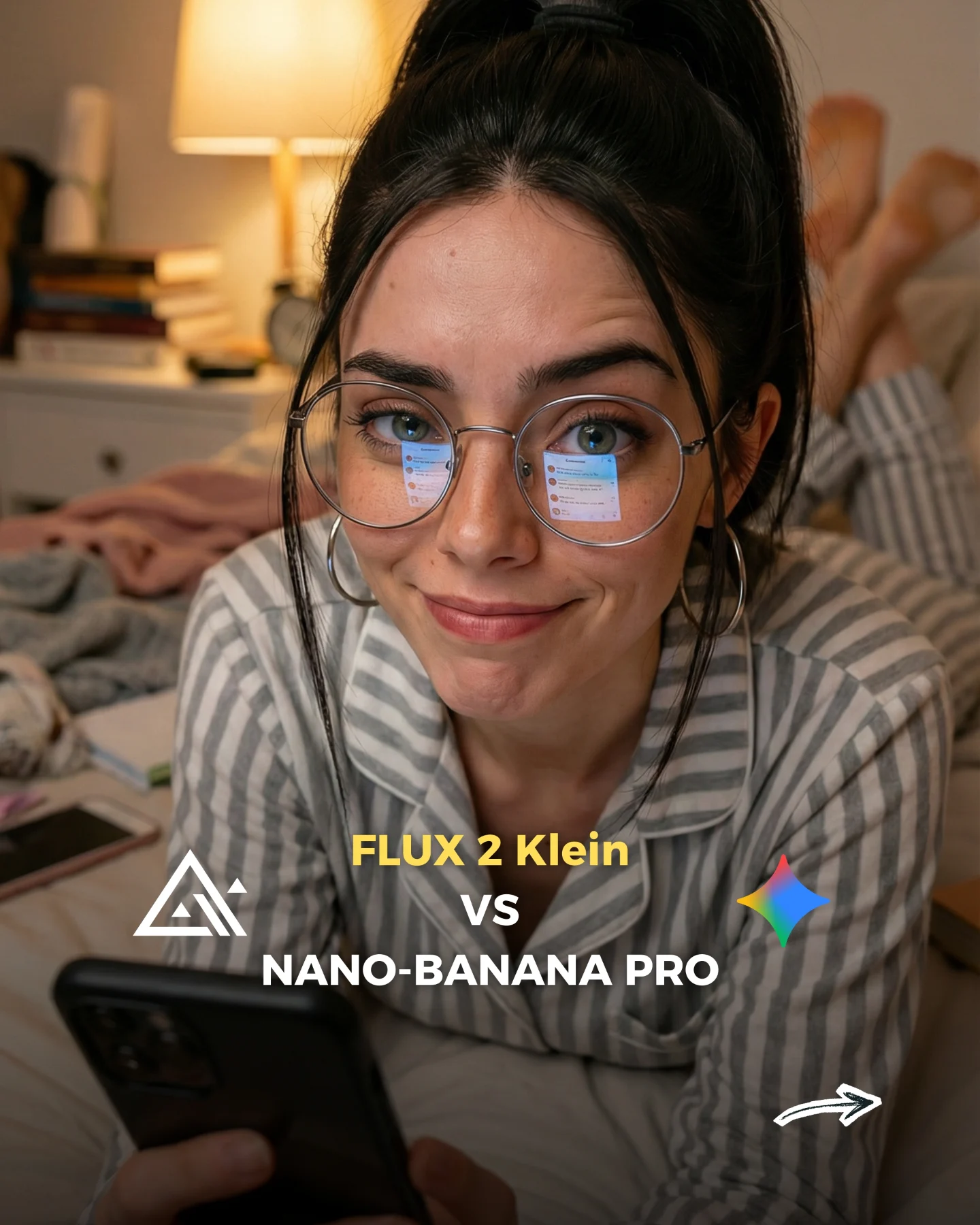
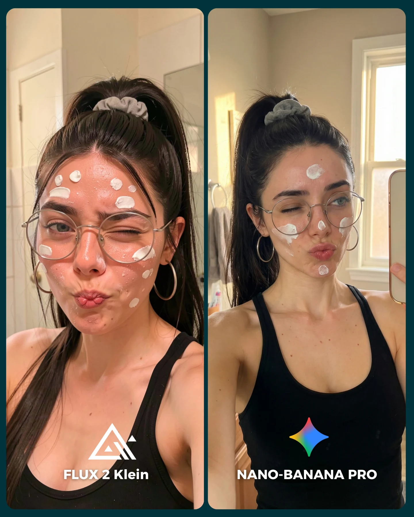
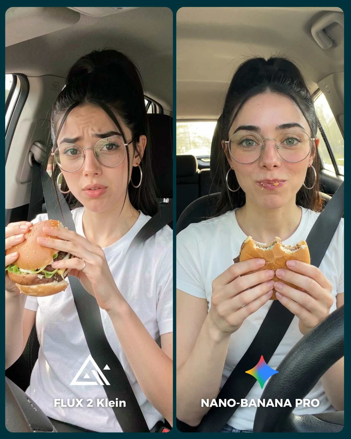
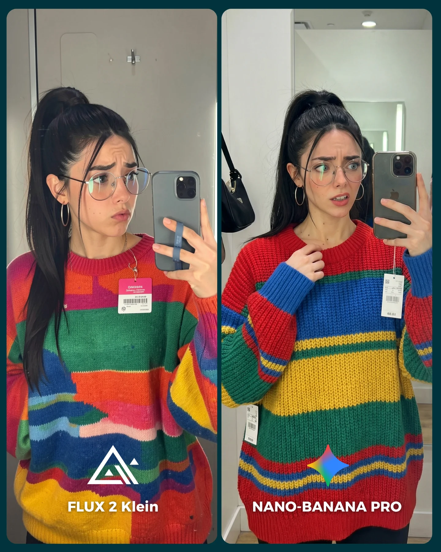
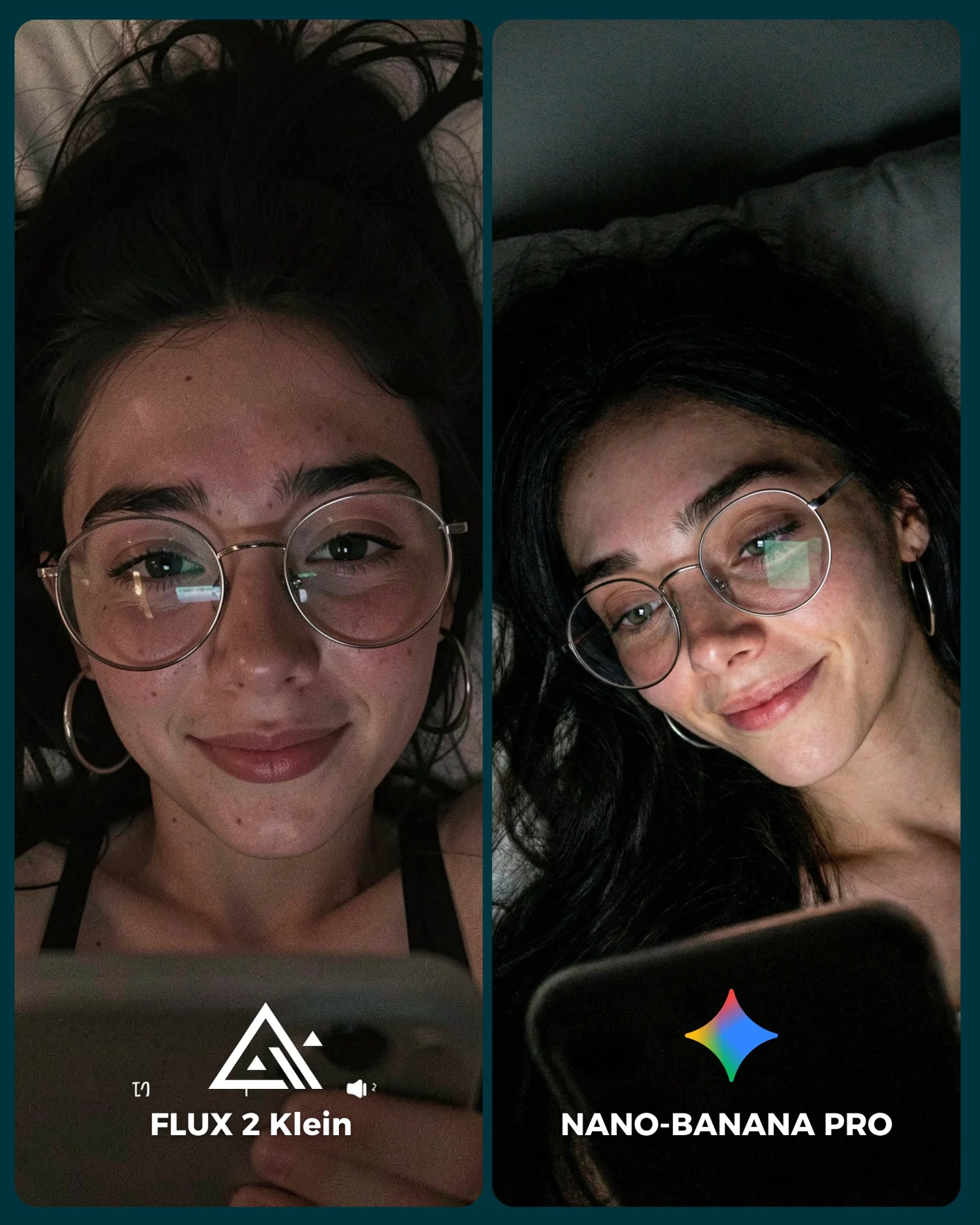
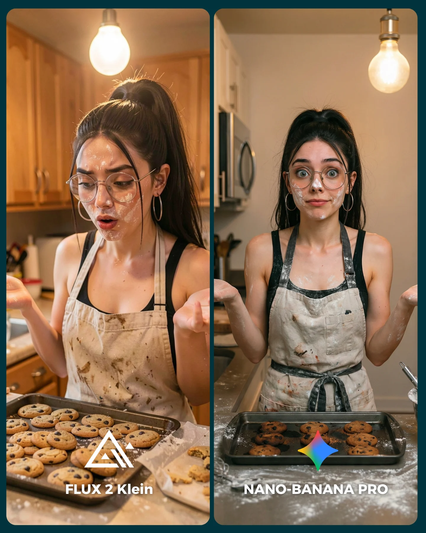
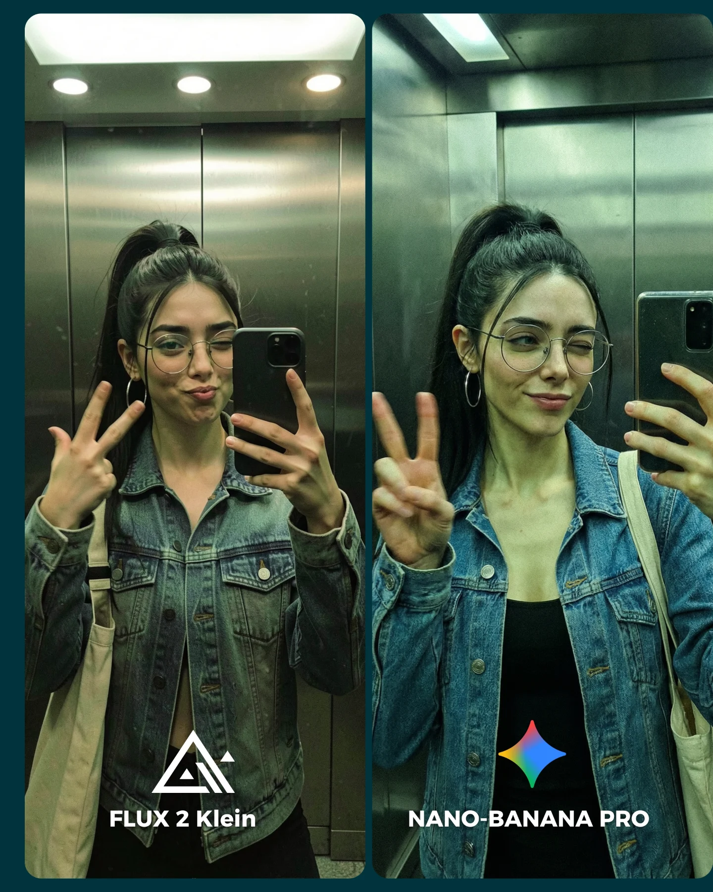
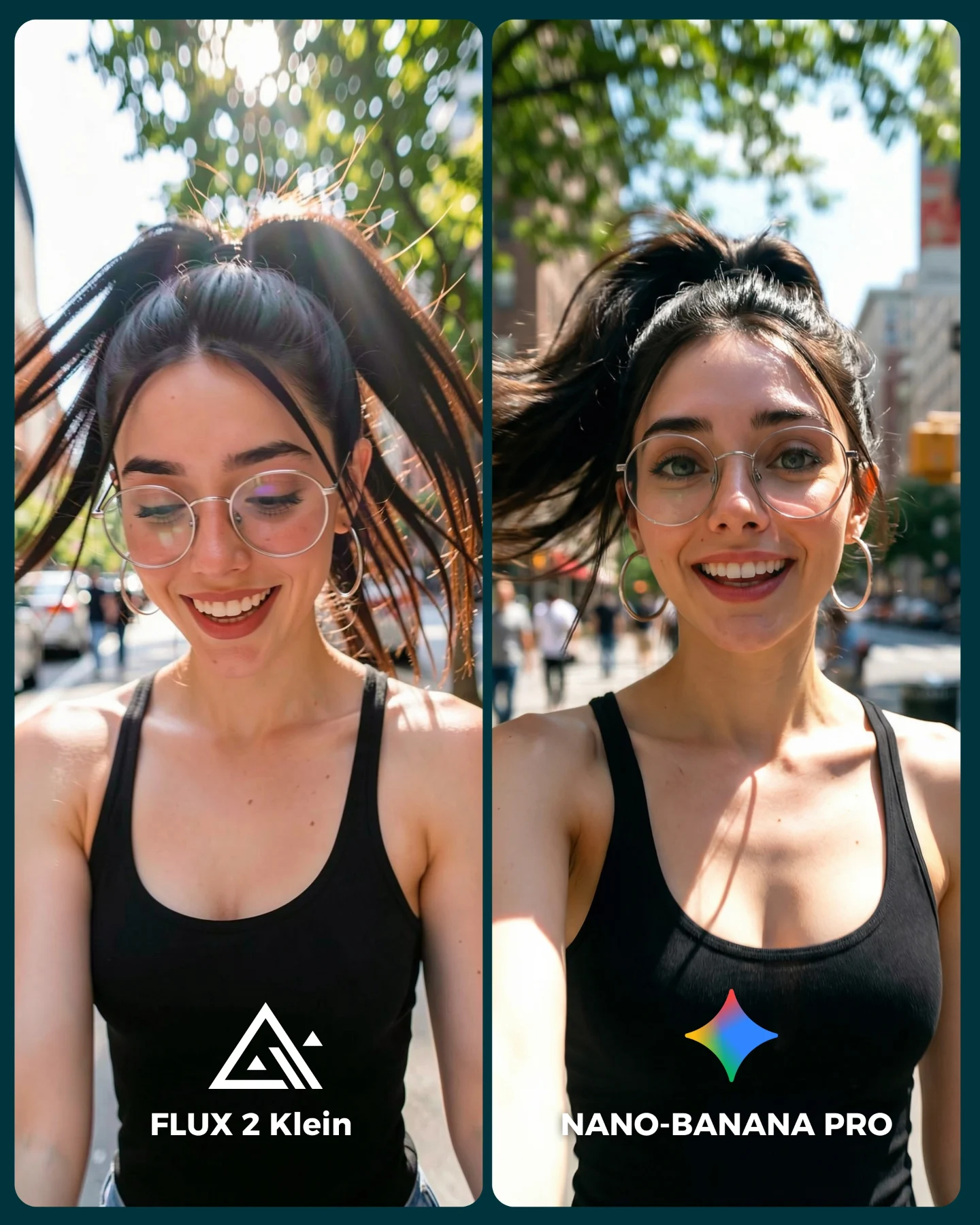
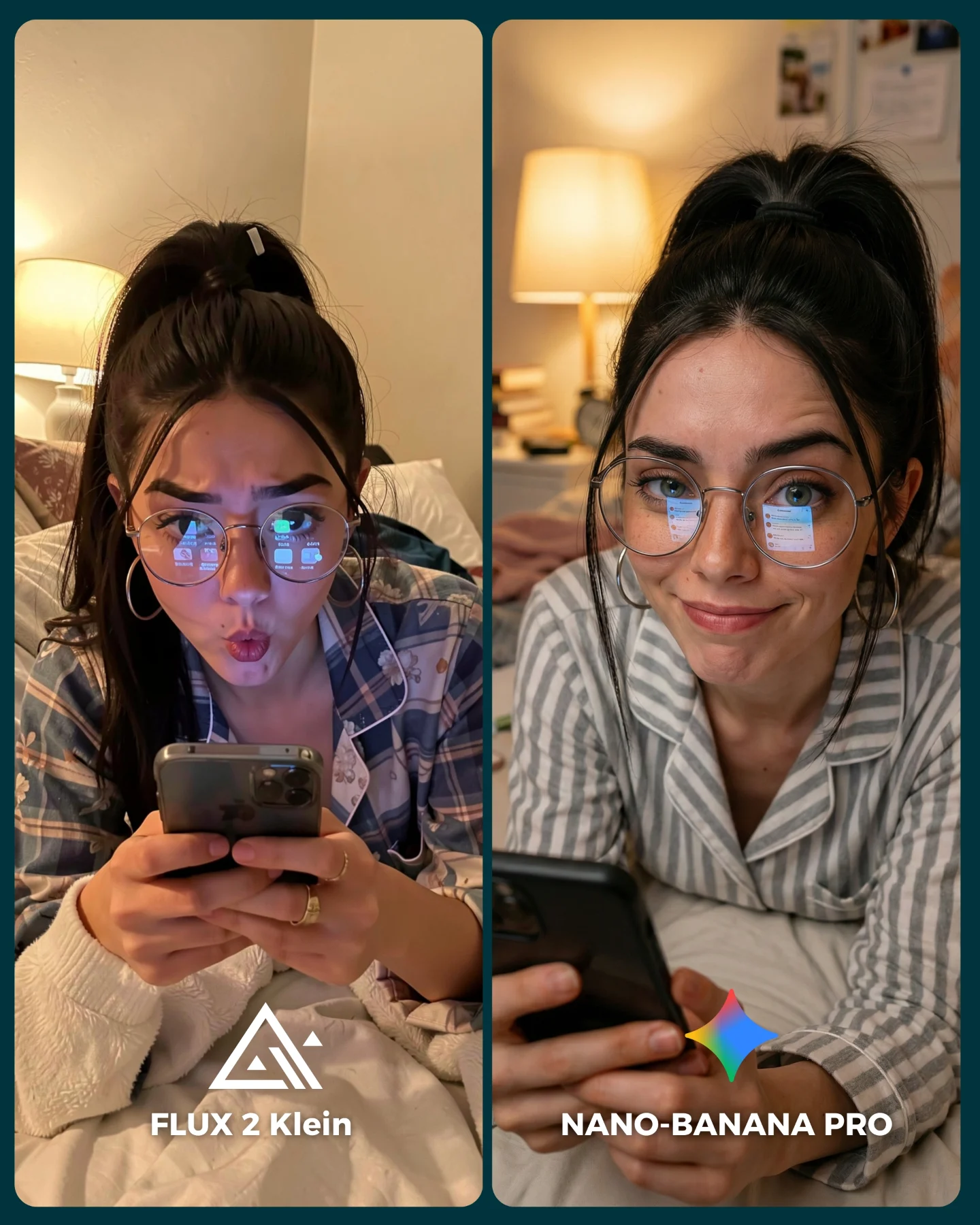
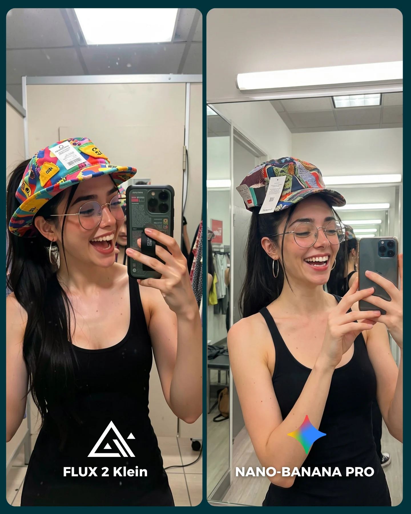
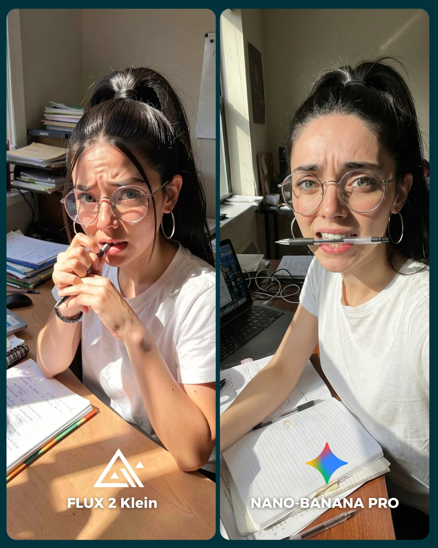
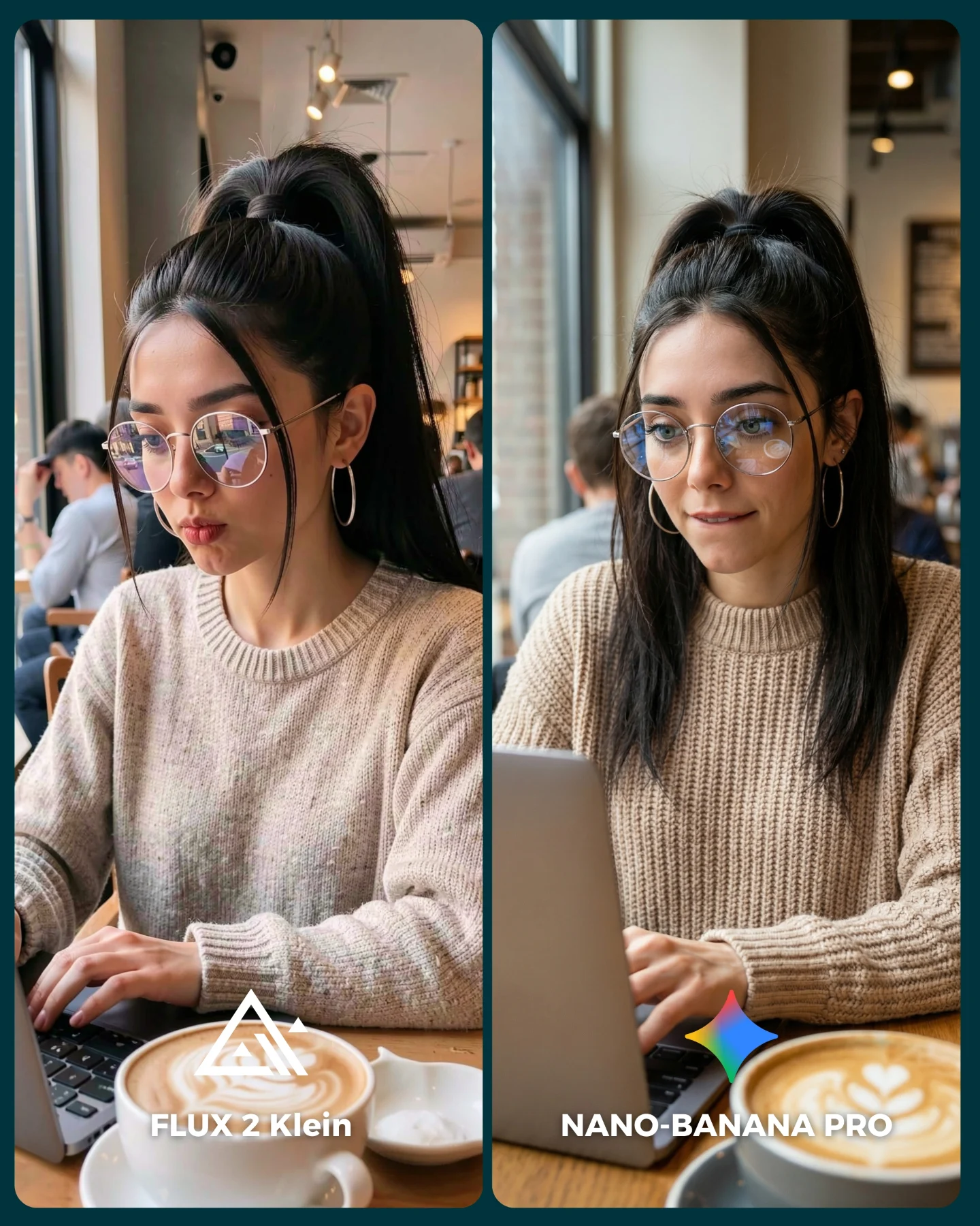
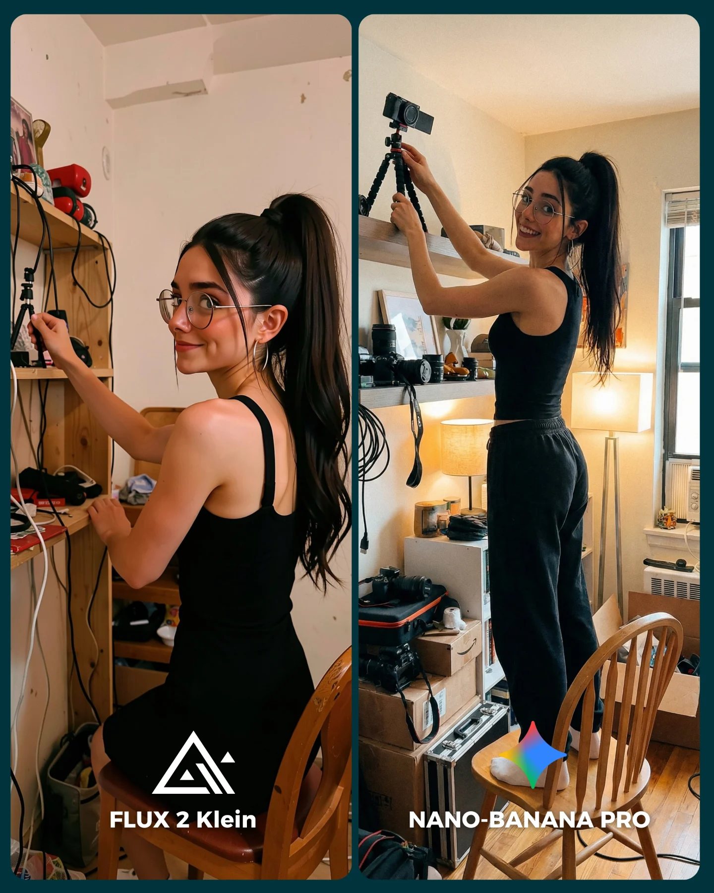
How soy_aria_cruz Made This Flux 2 Klein vs Nano Banana Pro AI Portrait
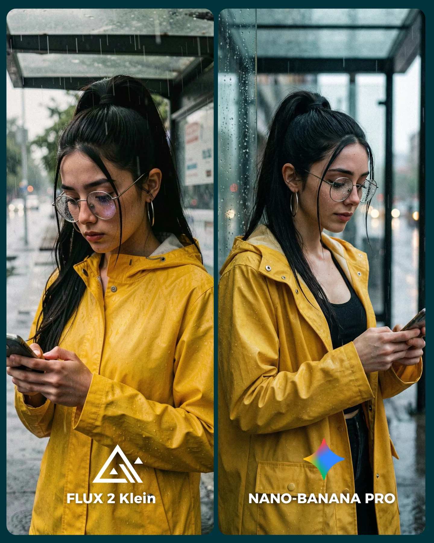
This image is effective because it uses a situation everyone recognizes, standing in the rain checking a phone, and turns it into a very demanding realism test. Wet glass, damp hair, reflective lenses, rain jacket folds, hand anatomy, and soft overcast light all have to work together. That makes the comparison meaningful without making it feel overly technical.
The yellow raincoat is also a smart choice. It gives the image an immediate visual anchor inside a mostly gray and blue environment. That helps both panels read quickly at thumbnail size while still leaving room for viewers to inspect the subtle differences in realism.
Why people naturally compare these two panels
The strongest mechanism is everyday plausibility. Viewers have seen scenes like this in real life, so they already know what rain on glass, damp hair, and distracted phone posture should look like. That gives them a strong internal benchmark and makes judgment almost automatic.
The split-screen format sharpens that process. The left panel invites scrutiny of face and texture, while the right panel adds environmental credibility. That means viewers are not only asking which face looks better, but which image feels more like a believable rainy moment.
| Signal | Evidence (from this image) | Mechanism | Replication Action |
|---|
| Everyday realism benchmark | Phone use in a rainy shelter with wet glass and overcast light | Viewers know how this should look, so flaws become obvious | Use familiar scenes with subtle weather complexity |
| Clear color anchor | The bright yellow jacket dominates against cool gray surroundings | The image reads instantly while still leaving room for nuance | Give the subject one strong accent color in an otherwise muted environment |
| Environmental proof | Glass shelter, wet pavement, and blurry city background support the scene | The benchmark feels grounded rather than abstract | Keep enough surrounding context that the setting is never ambiguous |
Where this aesthetic fits best
This kind of image is strongest for rainy-day prompt packs, realism benchmarks, urban lifestyle comparison posts, and creators who want their AI tests to feel close to real-world street photography. It works especially well when the goal is to demonstrate naturalism rather than fantasy.
- Weather realism comparisons: Rain introduces texture, reflection, and softness in one scene.
- Phone-use lifestyle prompts: Familiar modern behavior makes the benchmark easy to read.
- Urban casual style content: The image still looks fashionable without being overly styled.
- Comment-driven A/B tests: Viewers can easily pick which panel feels more believable.
It is less suited for cinematic spectacle or luxury fantasy. The strength here is natural observation and subtle environmental difficulty.
Three transfer recipes
- Umbrella commute version: Keep the rain realism and phone-use logic, but add a folded umbrella and more sidewalk context. Slot template:
{rainy city situation} {same subject identity} {left/right comparison} {strong weather cues} - Coffee-run version: Keep the overcast mood while replacing the phone with a coffee cup and to-go routine. Slot template:
{weathered street scene} {casual outerwear} {daily-life action} {A/B labels} - Train-platform version: Keep the damp realism and quiet posture, but shift the background to a station platform. Slot template:
{public transit setting} {rain jacket styling} {hands occupied} {natural overcast light}
Aesthetic read: why the image still feels attractive
The image stays engaging because it treats ordinary weather as visual texture rather than inconvenience. The jacket, the glass droplets, and the cool background all create layers without becoming busy. It looks real, but it still has shape and mood.
The subject's lowered gaze helps too. It keeps the frame inward and unperformed. This is important for rainy content: too much posing breaks the atmosphere. The best versions feel like a moment interrupted, not a scene over-staged.
| Observed | Why it matters |
|---|
| Bright yellow raincoat against gray-blue weather | Creates fast readability and emotional focus |
| Wet glass and soft urban blur | Adds environmental realism without clutter |
| Phone held in both hands | Makes the pose feel completely contemporary and believable |
| Glasses with subtle reflections | Introduces a delicate but visible realism checkpoint |
| Downward gaze and calm expression | Preserves the quiet rain-day mood |
Prompt technique breakdown
To recreate this style, prompt the weather system and the social behavior together. If you only ask for “girl in yellow jacket,” you lose the realism. If you only ask for “rainy city portrait,” you lose the phone-centered intimacy that makes the image current.
| Prompt chunk | What it controls | Swap ideas (EN, 2-3 options) |
|---|
| rainy shelter phone portrait comparison | The everyday A/B benchmark structure | bus-stop benchmark; under-awning comparison; train-platform weather test |
| same woman in yellow rain jacket | Identity consistency and visual anchor | red puffer jacket; beige trench coat; dark windbreaker |
| left tighter, right more environmental | Variation within a fair shared setup | close-up vs mid-shot; face-led vs context-led; front crop vs side crop |
| wet glass, damp hair, muted overcast light | The core realism challenge | fogged bus window; drizzle on train glass; rainy storefront reflection |
| bottom labels with model names | Clear benchmark readability | version badges; footer text; generator name markers |
How to iterate this kind of image
Baseline lock the rain mood, the yellow jacket, and the phone posture first. Those three elements define the scenario. Then refine one or two layers at a time: first the face and glasses, second the hand and phone anatomy, third the raindrops and shelter details, and fourth the balance between subject sharpness and background softness.
The broader lesson is that realism comparisons work best when they look deceptively ordinary. Ordinary scenes are exactly where viewers notice what feels wrong.