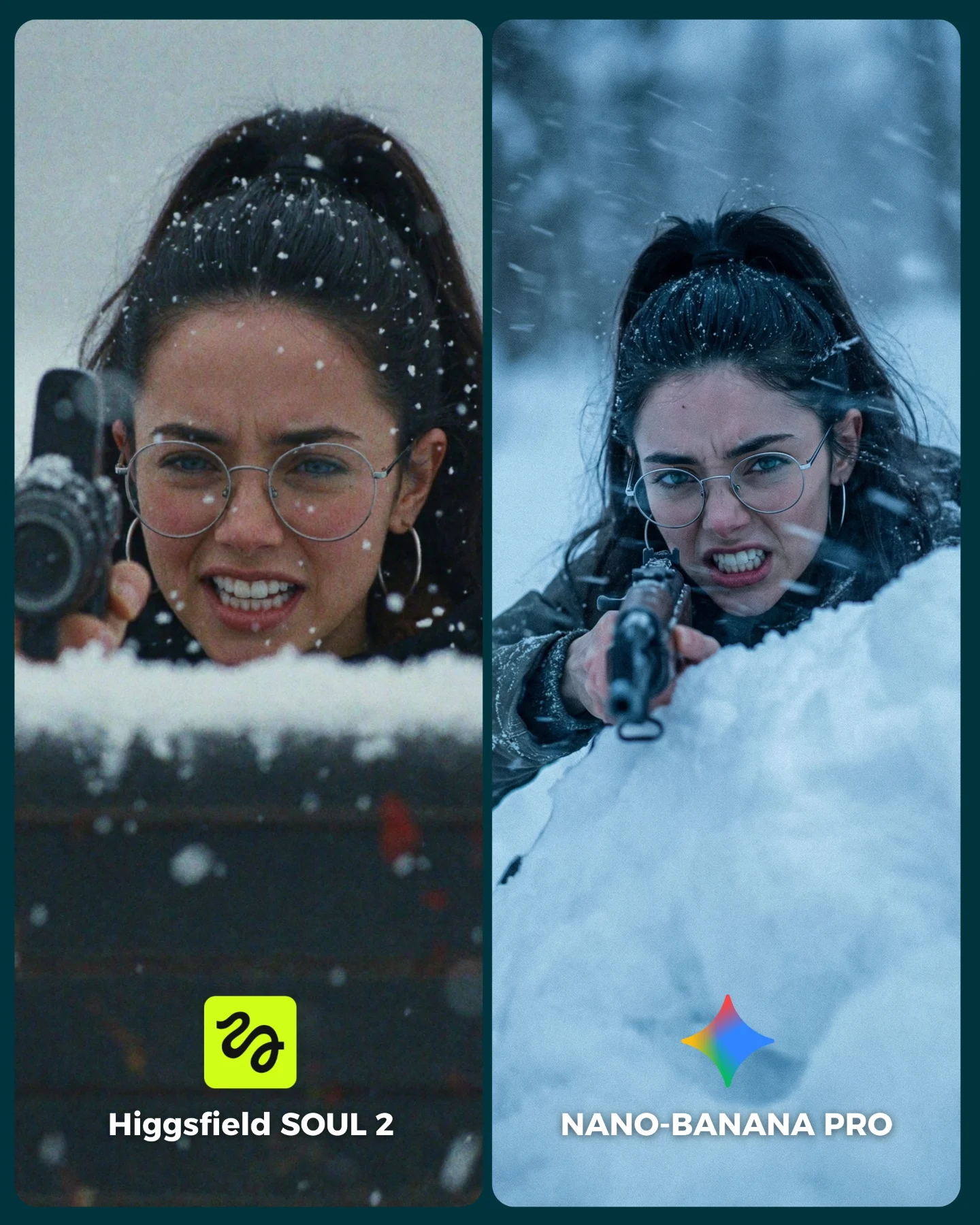
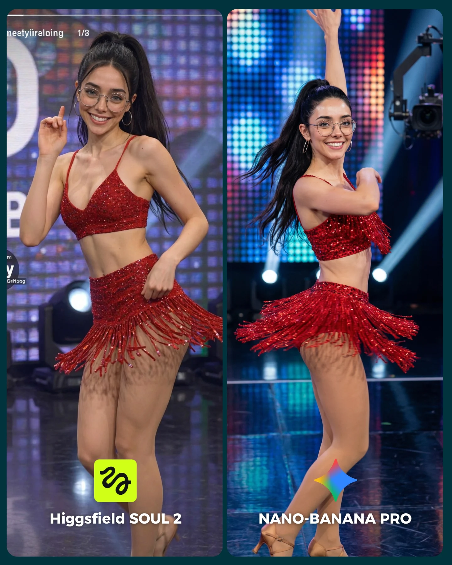
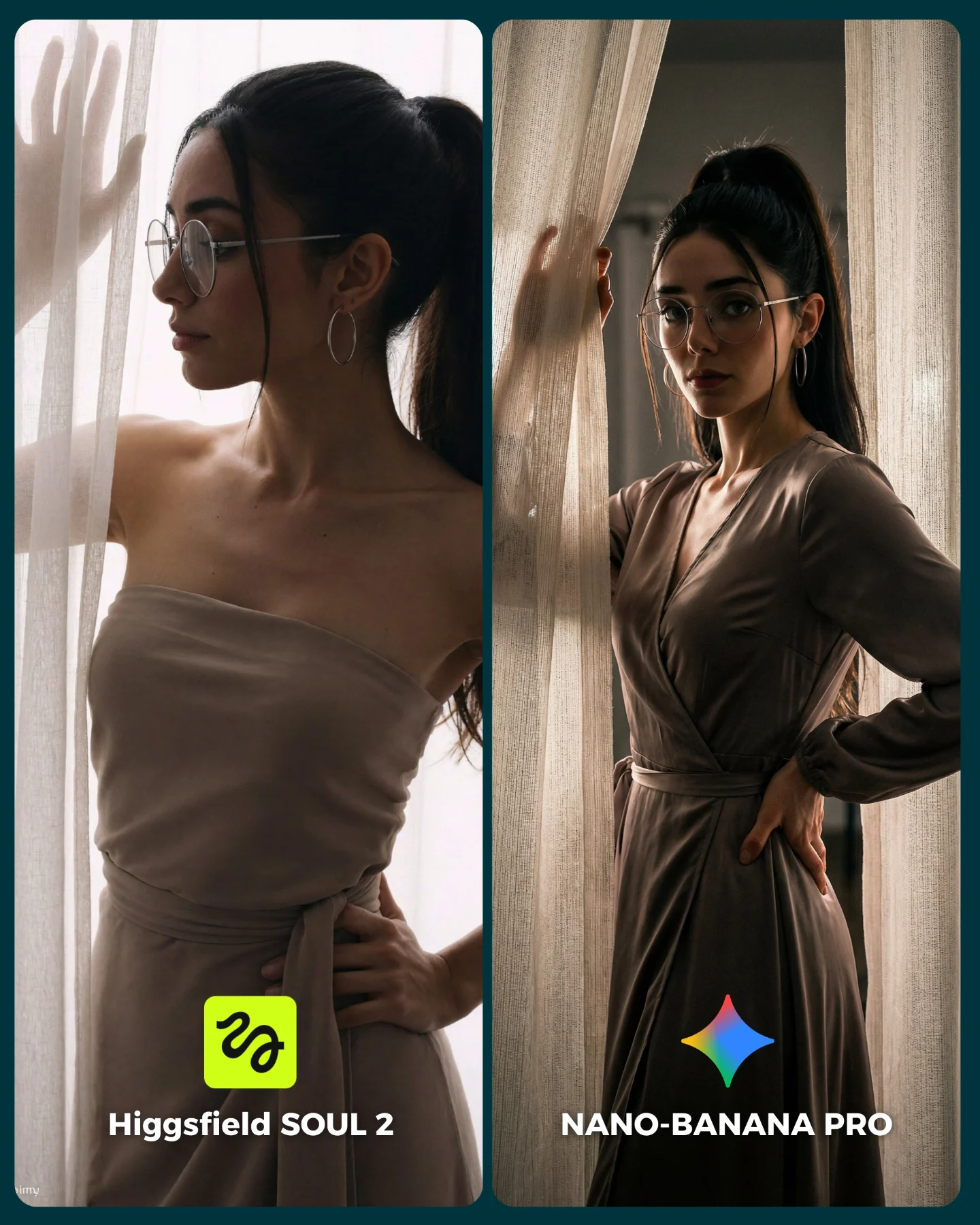
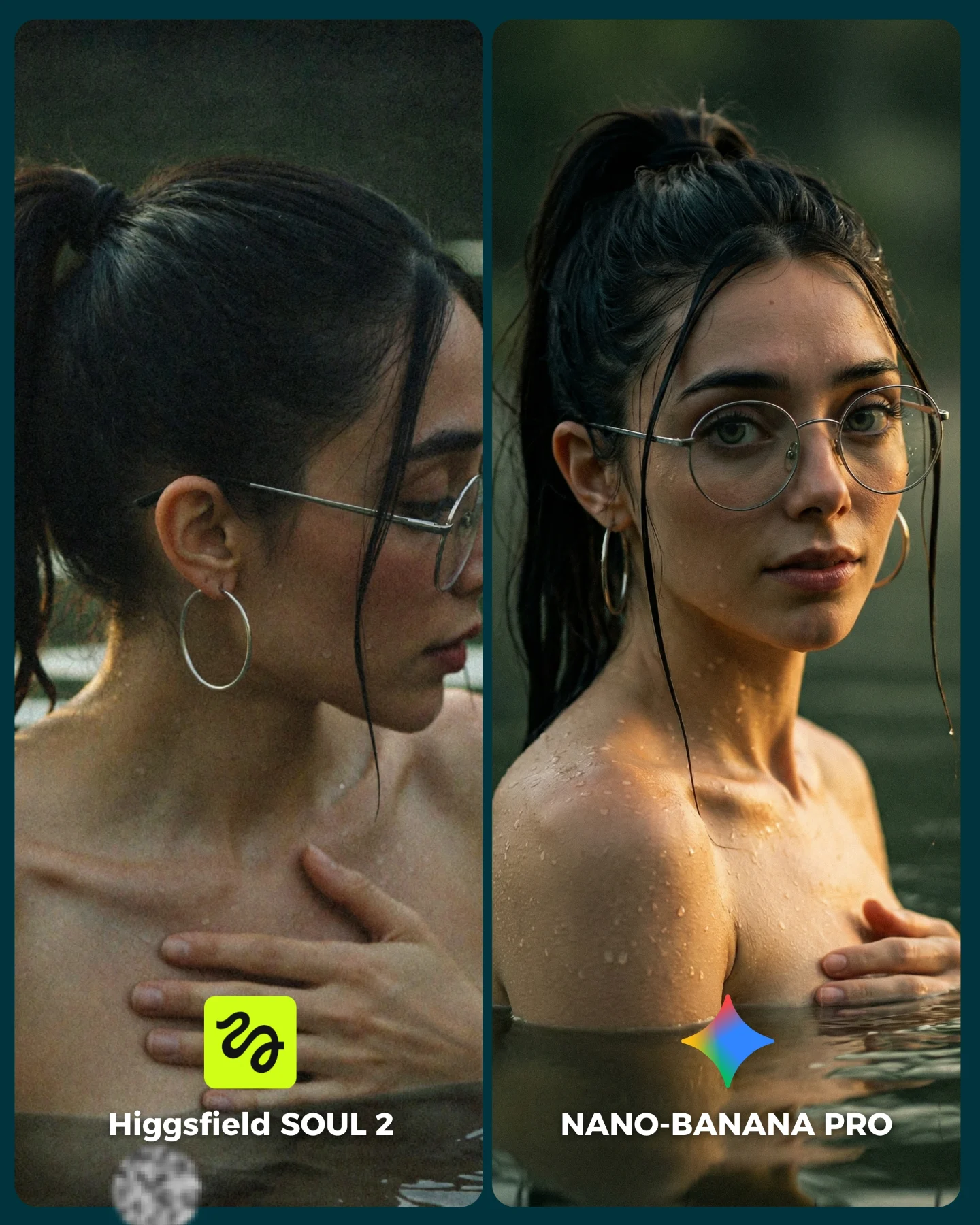
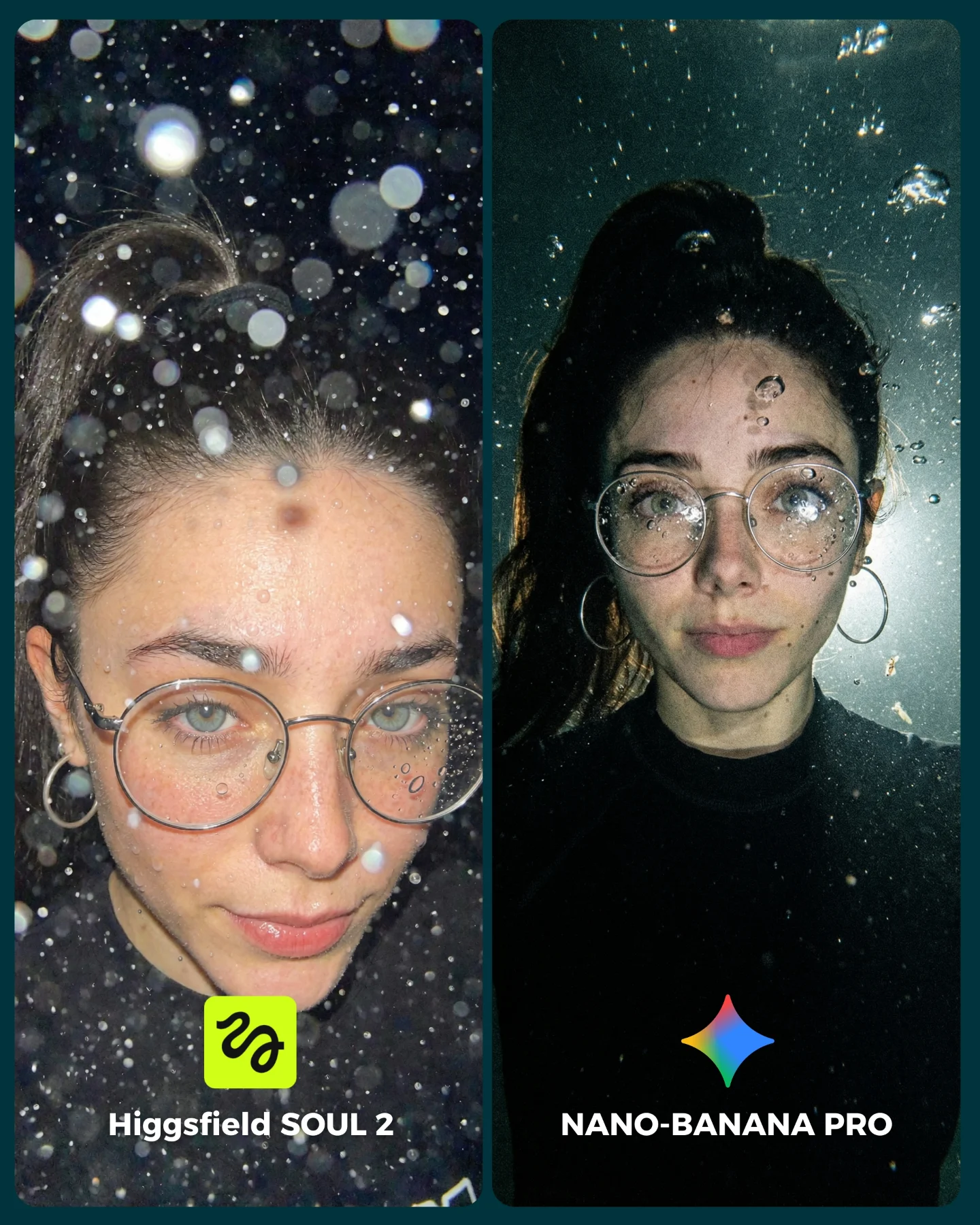
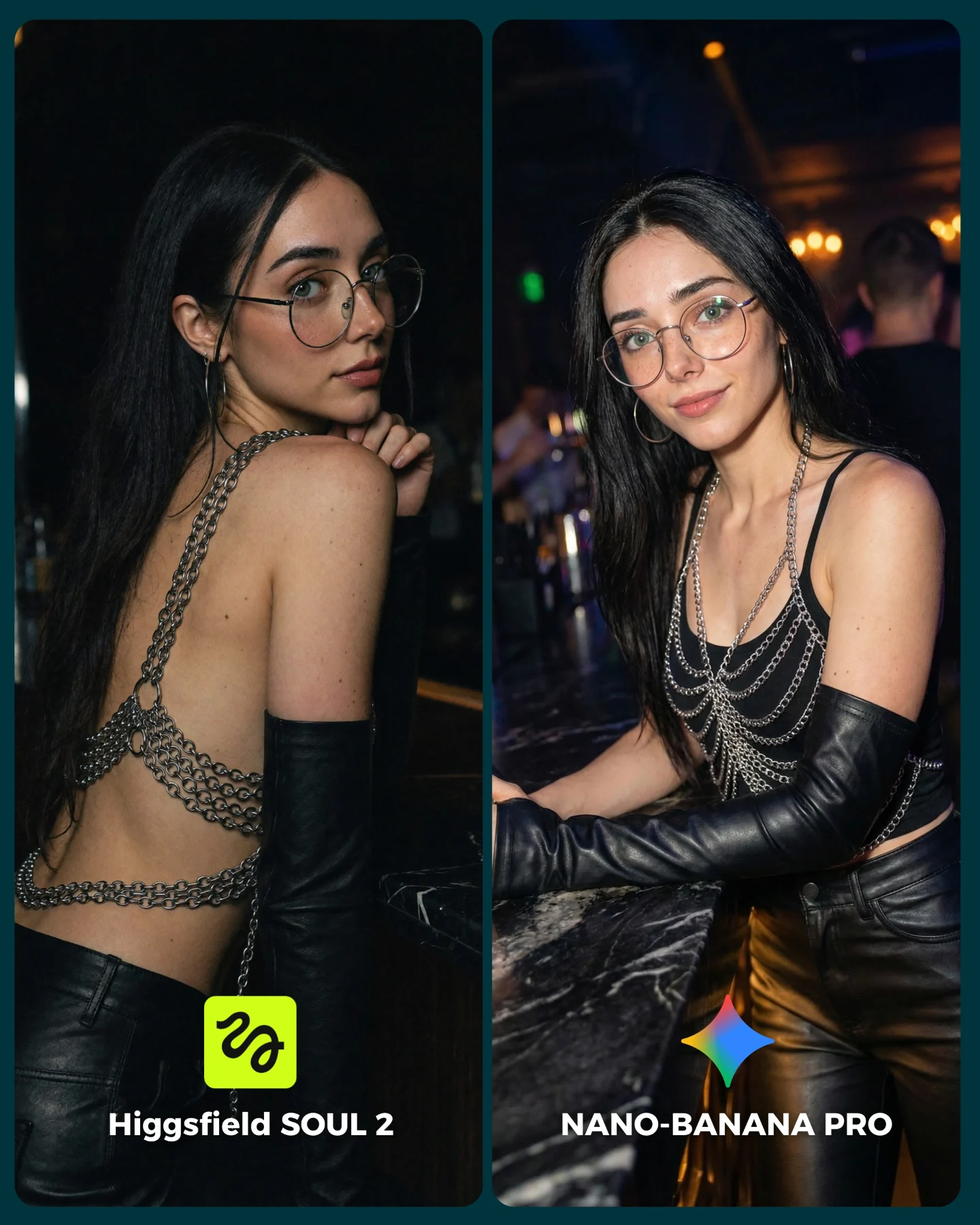
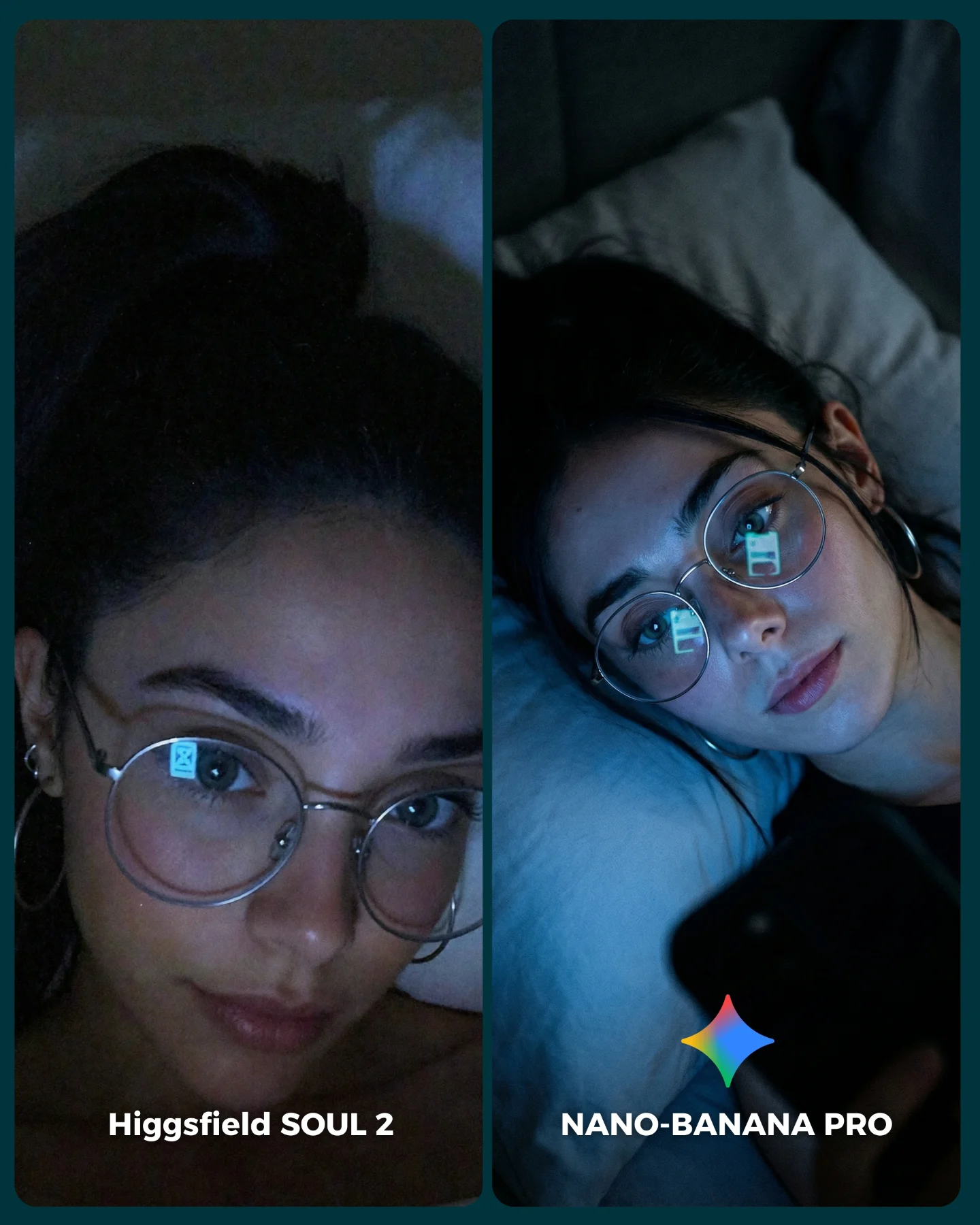
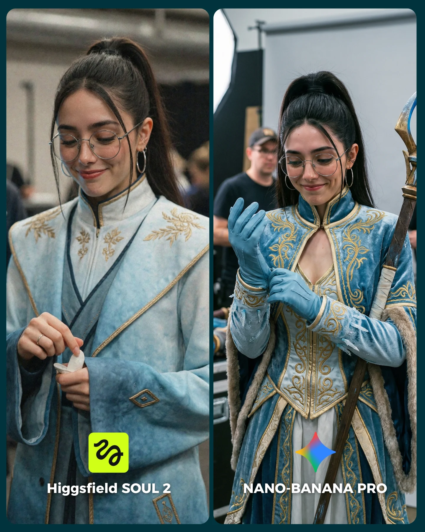
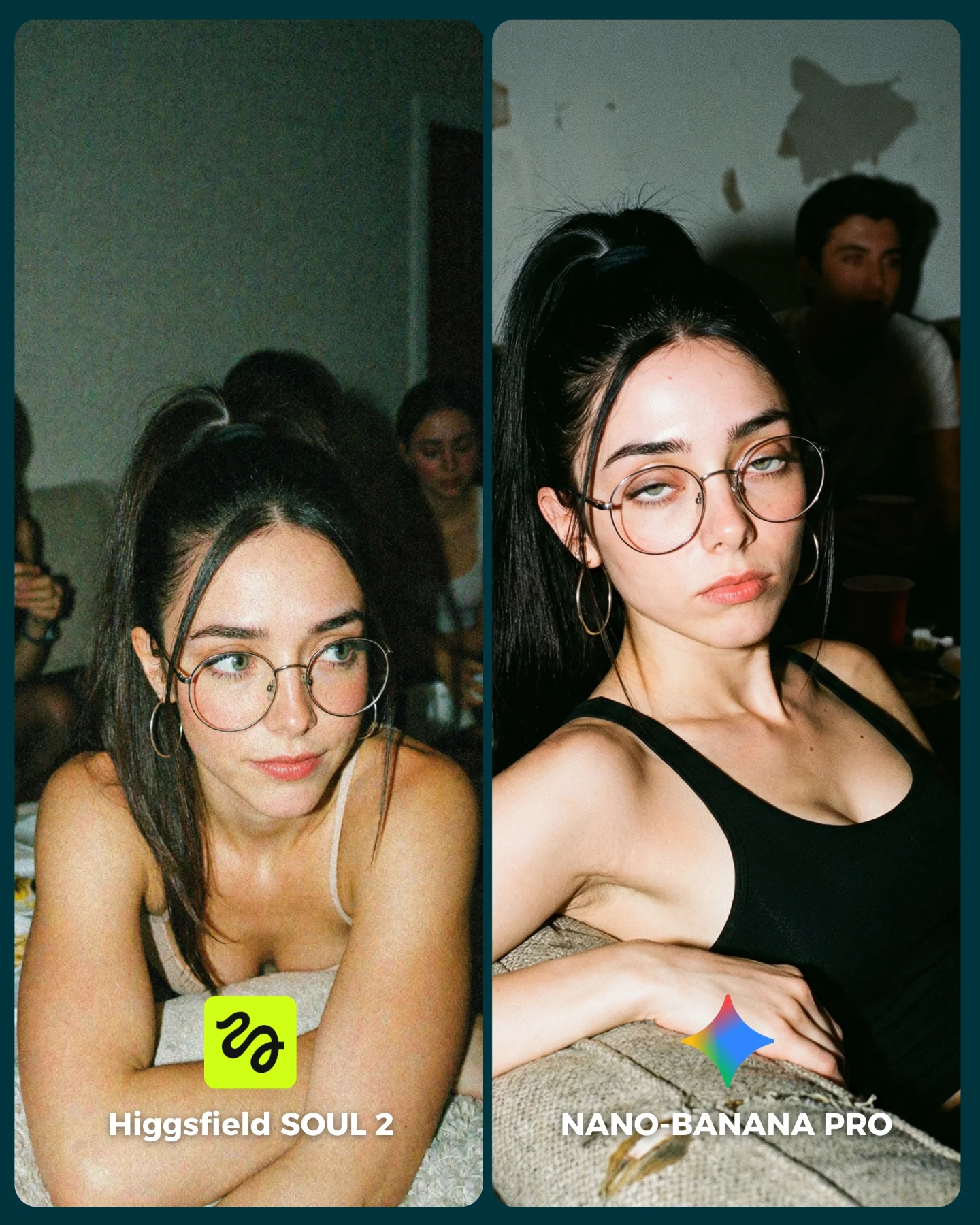
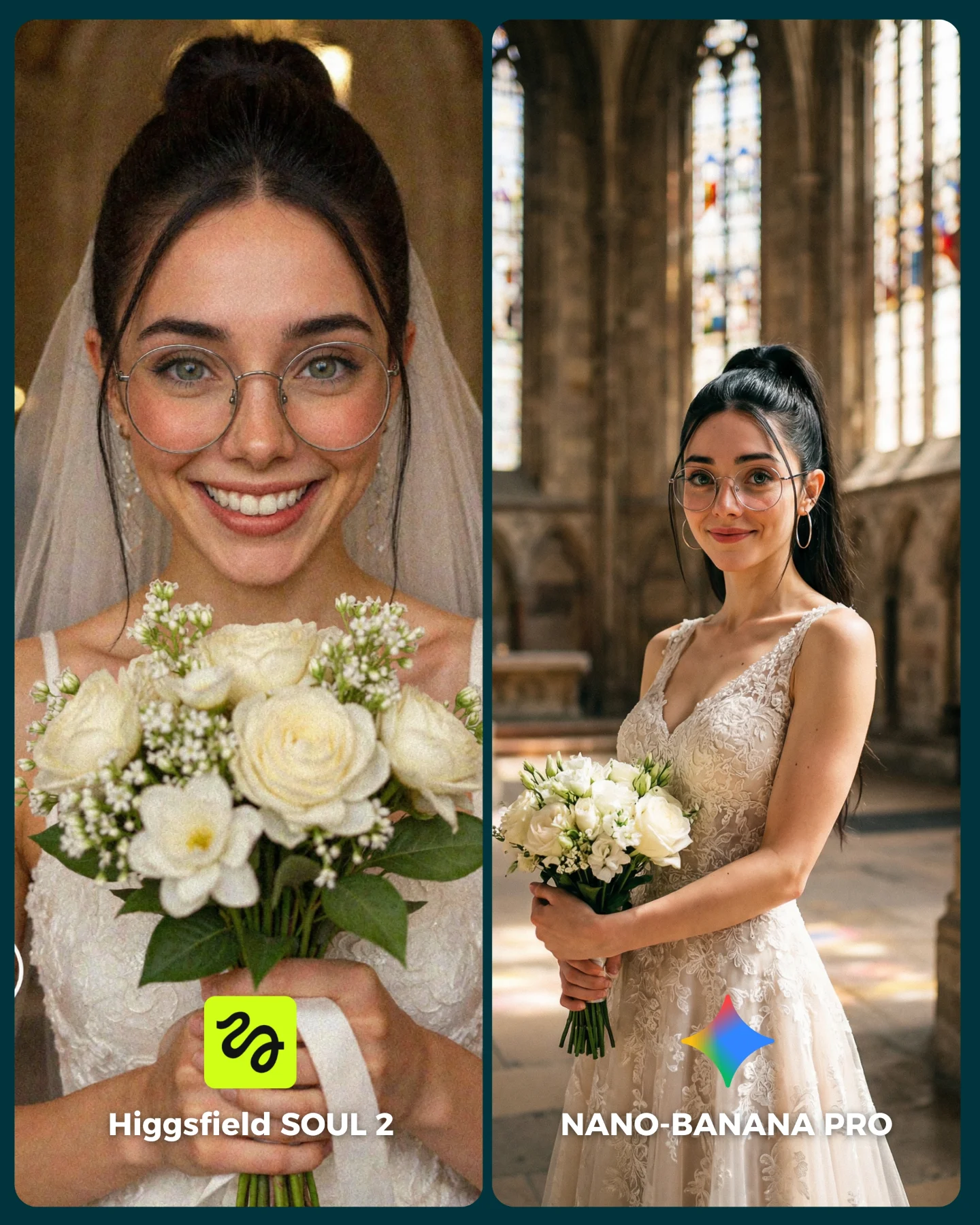
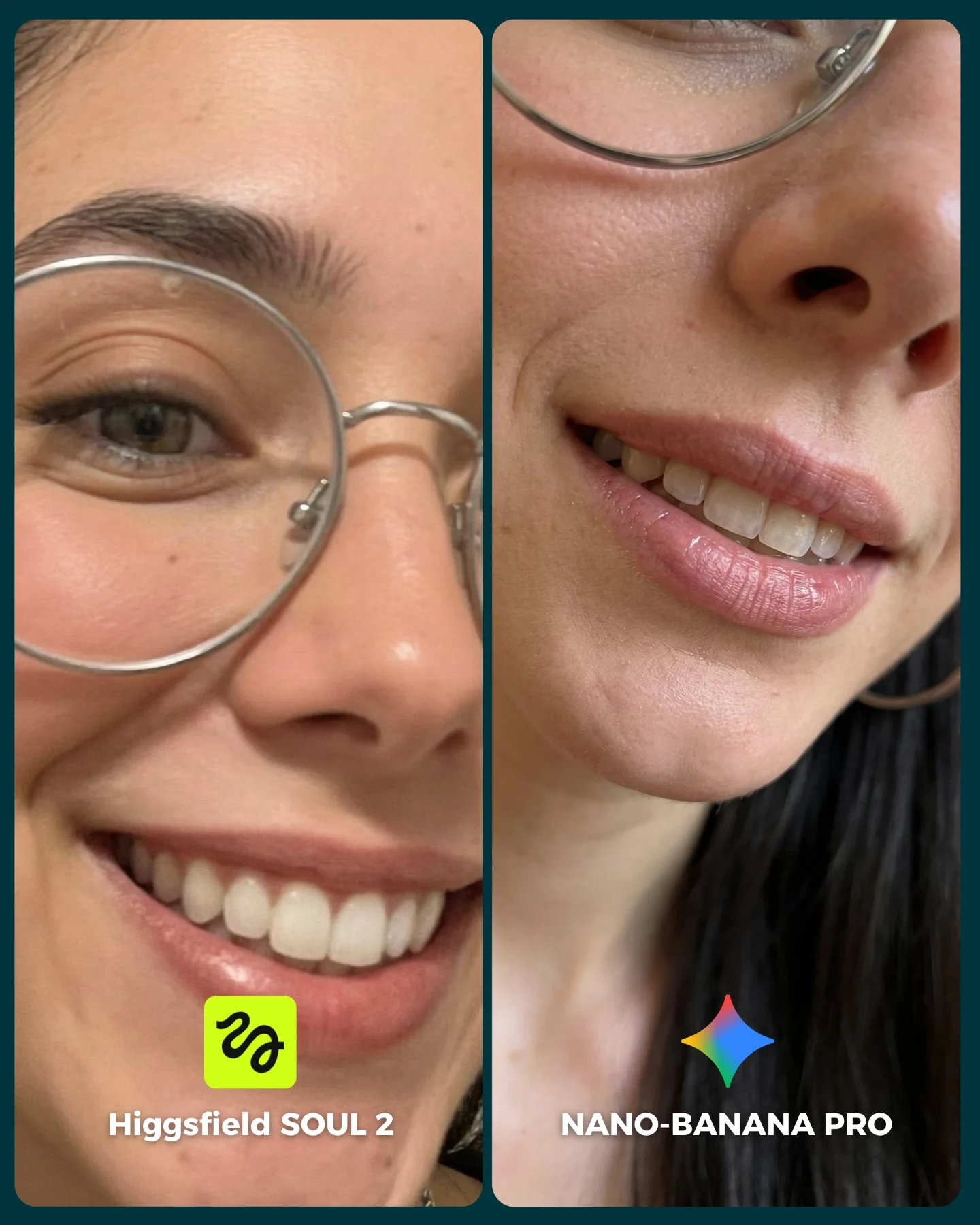
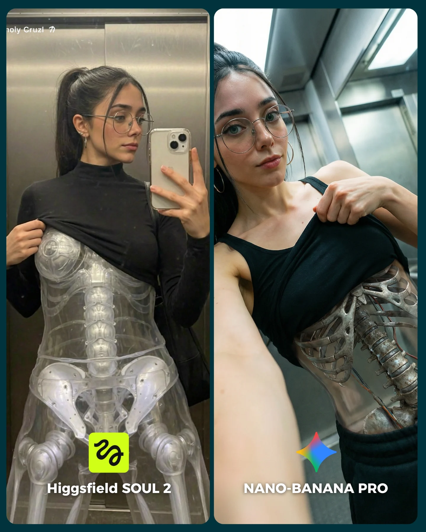
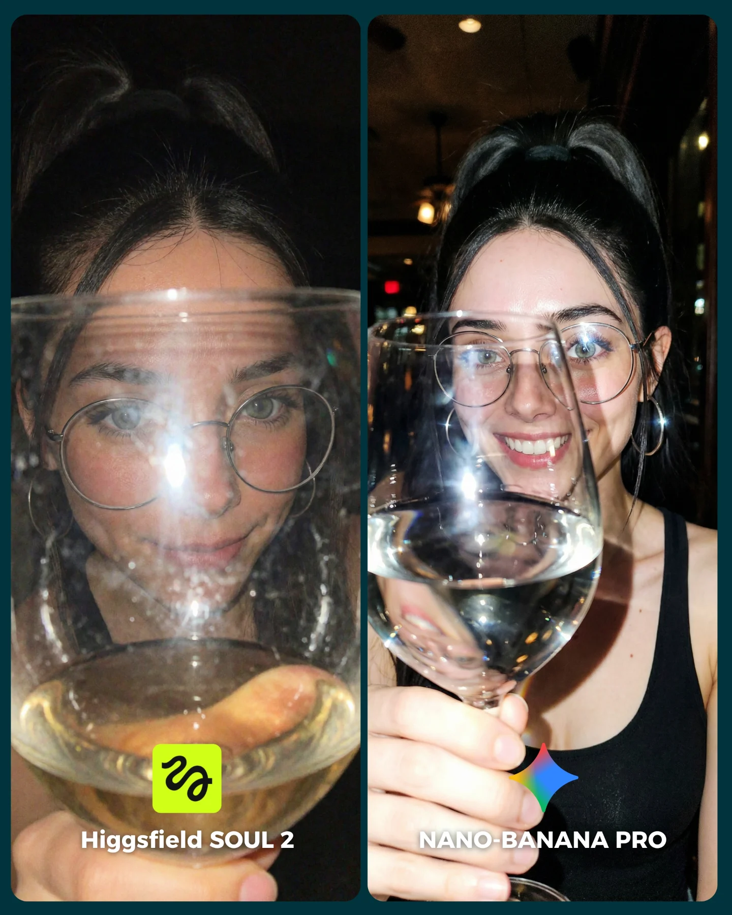
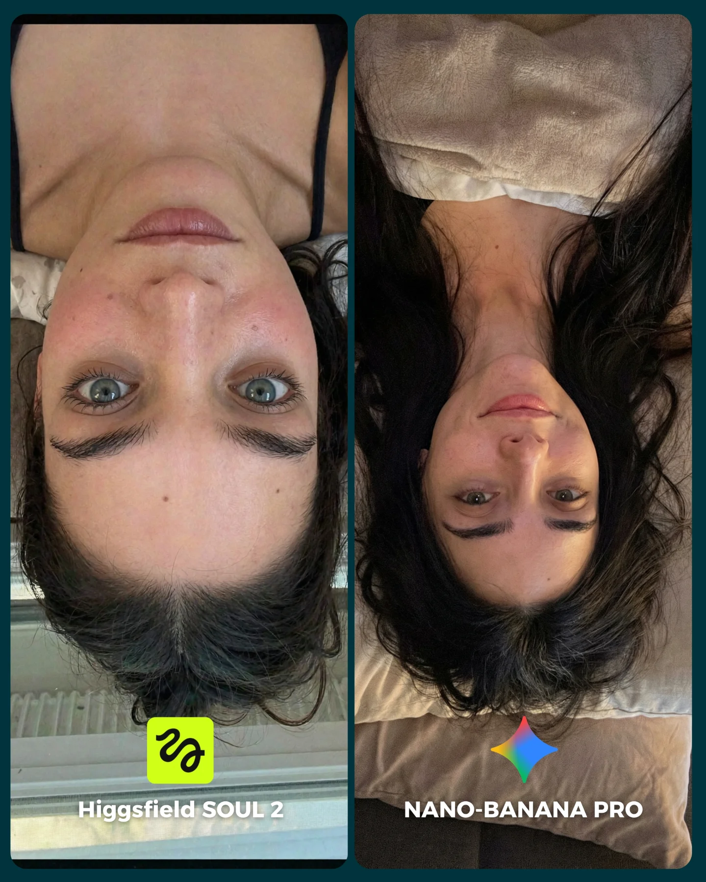
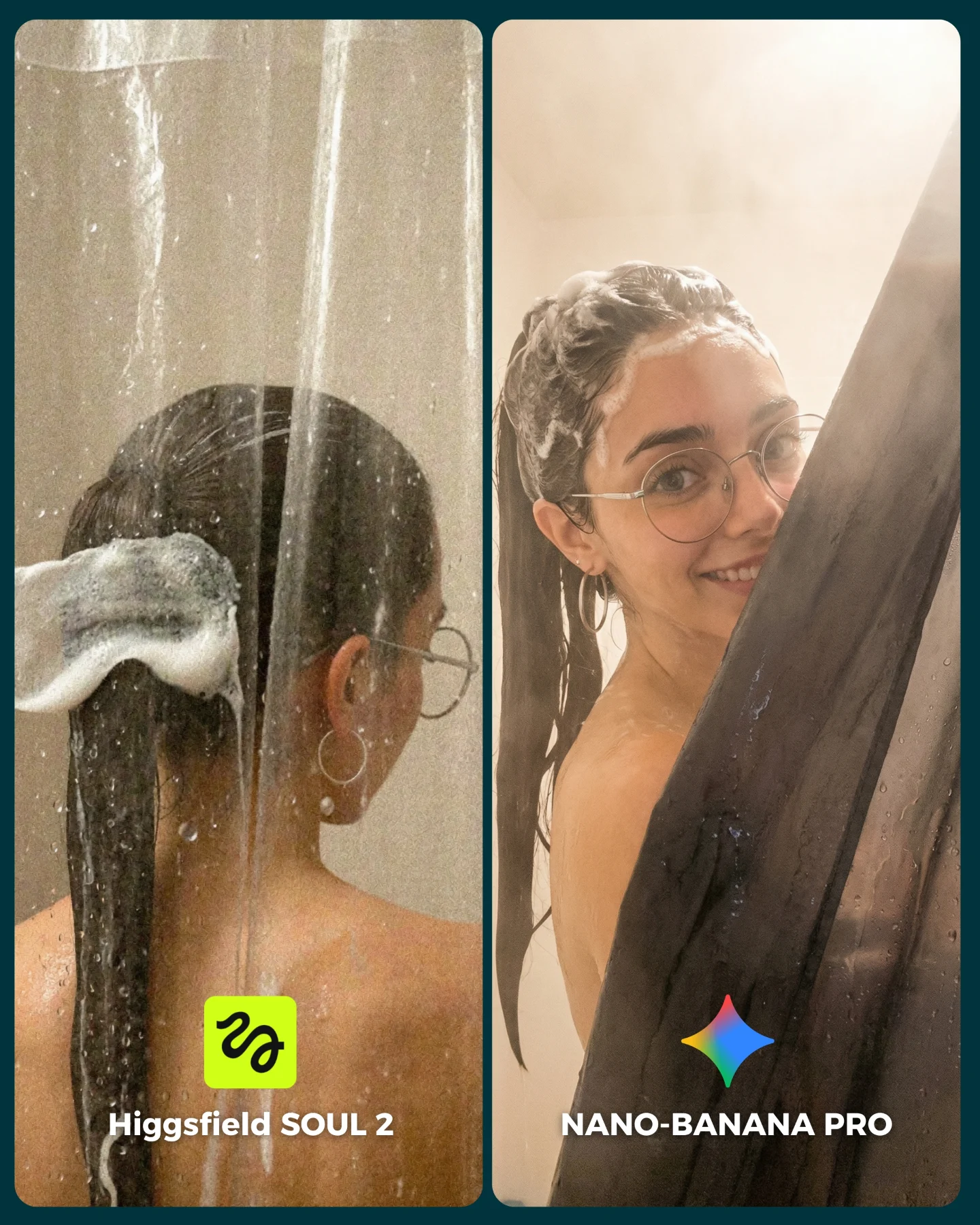
SOUL 2 Vs. Nano Banana Pro 💥
Higgsfield ha lanzado su nuevo generador de imágenes SOUL 2 ⚡ Puedes subirle hasta 80 imágenes de referencia de tu personaje para mantener mejor la constancia 👀
Y para compararlo bien, lo he puesto a prueba junto a Nano Banana Pro que hasta el momento es mi generador de imágenes favorito 💕
La verdad es que hay algunos resultados de SOUL 2 que me han sorprendido bastante... No está nada mal, pero sigo prefiriendo Nano Banana para la mayoría de las ocasiones 😅
Os dejo algunas imágenes que he generado y espero leer vuestras opiniones en comentarios 💌 Y si quieres los prompts de todas las imágenes comenta "ARIA" y te los mando por mensaje!
How soy_aria_cruz Made This SOUL 2 vs Nano Banana Pro AI Art — and How to Recreate It
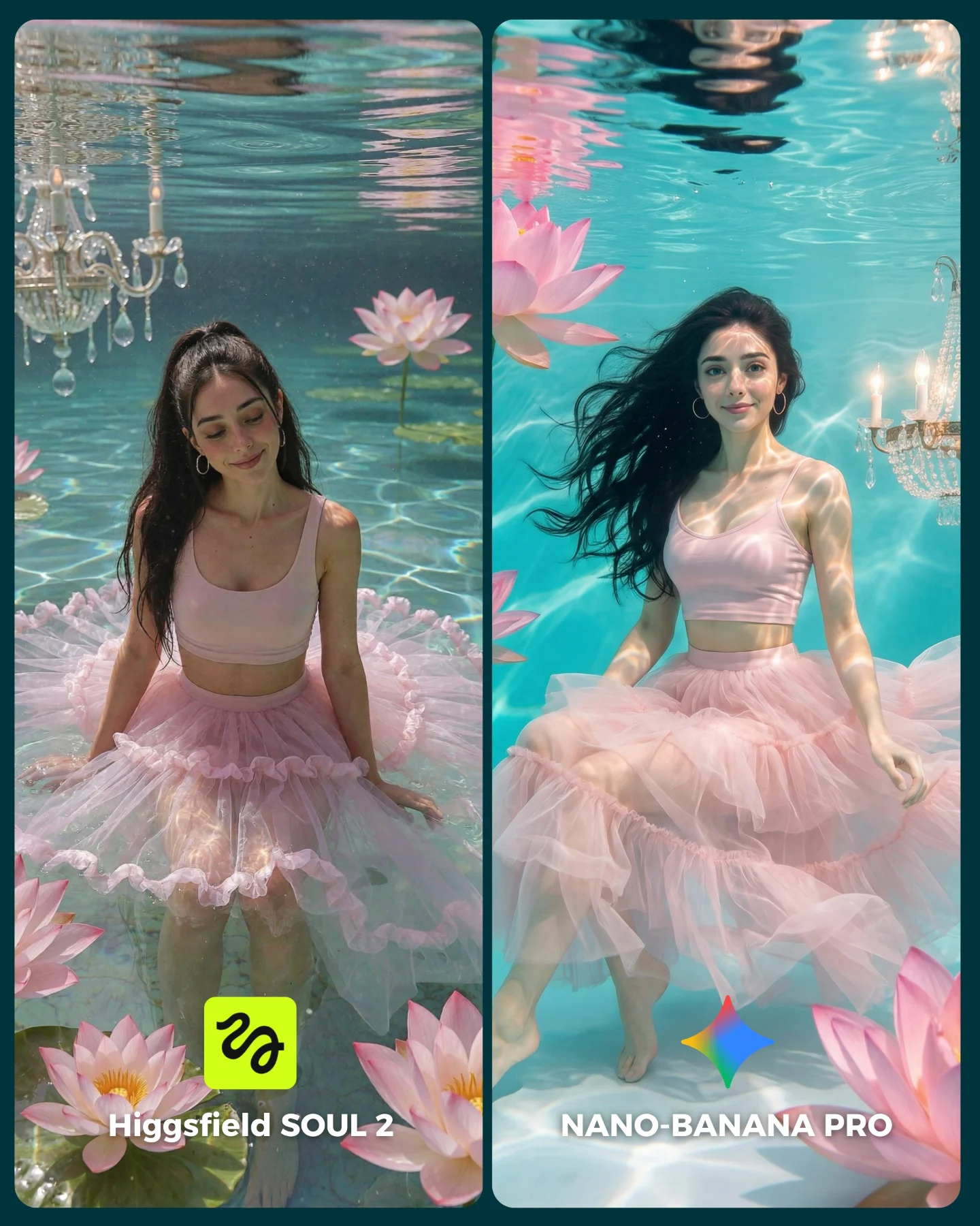
At first glance, this looks like a dreamy beauty post. But its real function is technical. The scene is full of difficult control problems: underwater fabric, floating hair, light caustics, flower placement, chandelier reflections, and character consistency across two panels. That makes it a very strong comparison image, because the beauty is inseparable from the benchmark.
For creators, this is an important format lesson. If you want a comparison post to perform, it helps when the scene is already shareable on pure aesthetics. The audience stops because it is pretty, then stays because the split-screen asks them to inspect. That combination is much stronger than a dry side-by-side grid.
Why it can go viral
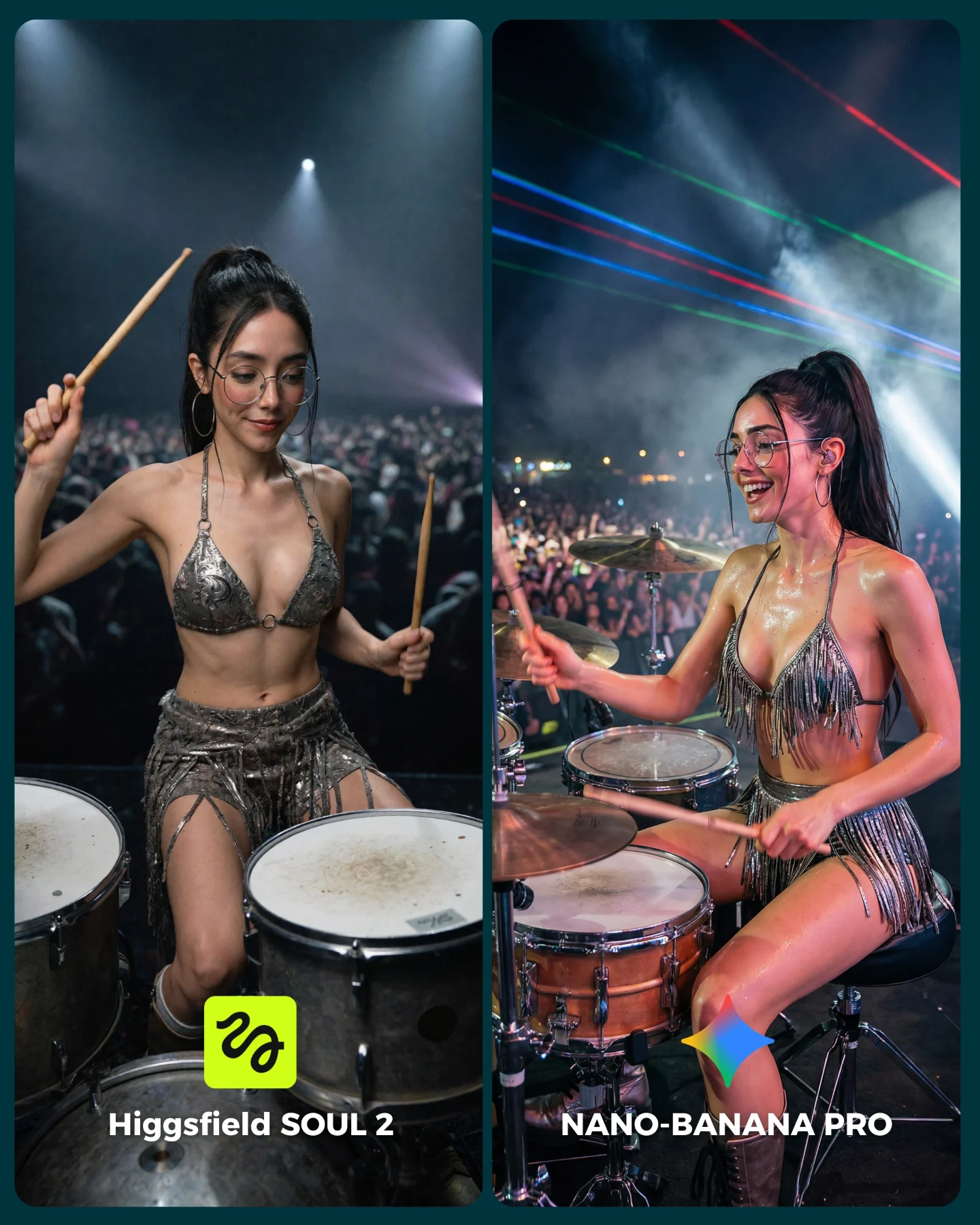
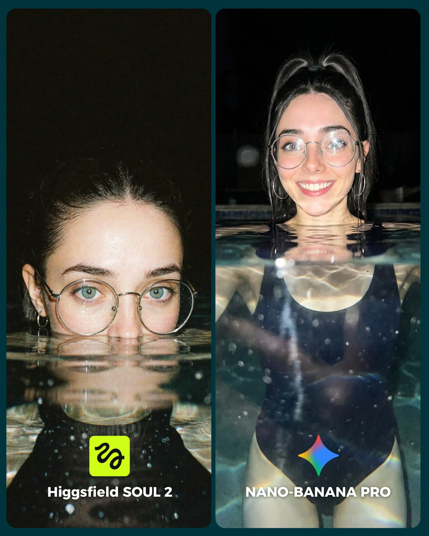
The image uses contrast in a clever way. The subject and outfit are soft, feminine, and romantic, but the actual test is demanding. Water is hard. Transparent tulle is hard. Hair movement is hard. Chandelier details and floral props add even more places for the models to fail. So the post is emotionally inviting while still offering real proof points.
The left-right layout also creates a subtle narrative. One panel feels closer to a posed water portrait, while the other feels more fully submerged and cinematic. That gives the audience more than a binary winner. It gives them two different readings of the same concept, which makes comments more detailed and more frequent.
Beauty attracts the click before technical curiosity takes over
Choose a scene that is inherently shareable even without the comparison label
Multiple realism checkpoints
Floating hair, water surface distortion, fabric bloom, chandelier detail
Viewers have many concrete elements to judge
Build 4-5 difficult material behaviors into one comparison scene
Controlled sameness
Same character, outfit, and general setup across both sides
The audience can focus on model quality instead of scene drift
Lock persona and concept before changing the generator
Where this format works
This kind of comparison is ideal for AI creators who want to look both artistic and technically serious. It is also strong for prompt sellers because it proves they can manage complex environments without losing the main character. The post is especially useful when the account wants to move beyond plain portrait comparisons and show range.
Best fit: fantasy-realism model comparisons with a strong hero character.
Best fit: prompt showcases for water, fabric, and hair control.
Best fit: high-aesthetic posts that still need comment-driven engagement.
Not ideal: minimalist product posts that need clean negative space.
Not ideal: strictly documentary realism accounts where overt fantasy styling would confuse the brand.
Three transfer recipes
Keep: split-screen benchmark and one locked character. Change: the fantasy environment, such as clouds, ice, or rain glass. Template: {model A} vs {model B} inside {dreamlike material challenge}
Keep: pastel fashion and complex water behavior. Change: the prop family, such as flowers, ribbons, or pearls. Template: {same character} in {fluid environment} with {floating props}
Keep: one side near the surface and one side deeper underwater. Change: the mood, from romantic to eerie or regal. Template: {surface portrait} vs {submerged portrait} in {styled underwater world}
Aesthetic read
The scene feels expensive because it layers softness without becoming empty. The turquoise water, pink tulle, and lotus flowers all sit within one controlled palette, so the image feels cohesive. The chandeliers are important because they add a hint of theatrical luxury without dominating the subject. They turn the set from a simple pool into a fantasy editorial environment.
The strongest design move, though, is the fabric. The tulle skirt gives the water something visible to shape. That makes motion legible. When creators build underwater scenes, they often forget that water needs a material partner to show its behavior clearly. Here, the skirt becomes both styling and evidence.
Observed
Recreate
Why it matters
Pastel turquoise-and-pink palette
Keep color families tightly limited
It makes a complex scene feel elegant instead of cluttered
Visible water surface at top
Show the boundary between air and water clearly
That boundary helps viewers judge realism immediately
Billowing tulle skirt
Use one fabric that responds dramatically to water
It visualizes motion and adds premium styling at the same time
Lotus flowers plus chandelier details
Add a few high-signal props with distinct material behavior
They widen the benchmark without stealing focus from the character
Prompt technique breakdown
This is a layered-material prompt. The generator has to handle skin, water, hair, transparent fabric, flowers, and crystal details in one frame. If you prompt it as a simple beauty portrait, it will usually flatten the scene.
Prompt chunk
What it controls
Swap ideas (EN, 2-3 options)
underwater editorial with visible surface and caustics
The physics and mood of the scene
submerged pool portrait; clear underwater fashion frame; floating water studio
pink crop top and voluminous tulle skirt
Silhouette and movement readability
sheer gown; ribbon dress; layered chiffon skirt
floating lotus flowers and crystal chandeliers
Fantasy-luxury set dressing
water lilies and pearls; hanging crystals; floral palace details
same woman in both panels
Consistency across the comparison
same face same earrings; same muse across both outputs; locked identity cues
two labeled model-comparison panels
Engagement structure and instant comprehension
left-right benchmark card; split-screen model test; tool showdown layout
Execution playbook
Lock the environment first: one water color, one wardrobe, one character, one prop family. After that, vary only the model output or one material behavior.
Run 1: solve the subject likeness and skirt shape before worrying about props.
Run 2: refine the water surface, hair float, and caustic light patterns.
Run 3: add lotus flowers and chandelier details only once the base scene holds together.
Run 4: adjust crop balance so each side reveals a different strength without breaking the fairness of the comparison.
The key is controlled richness. The scene should feel lush, but every added element must help the benchmark. If a prop does not test something or strengthen the fantasy logic, it should not be there.