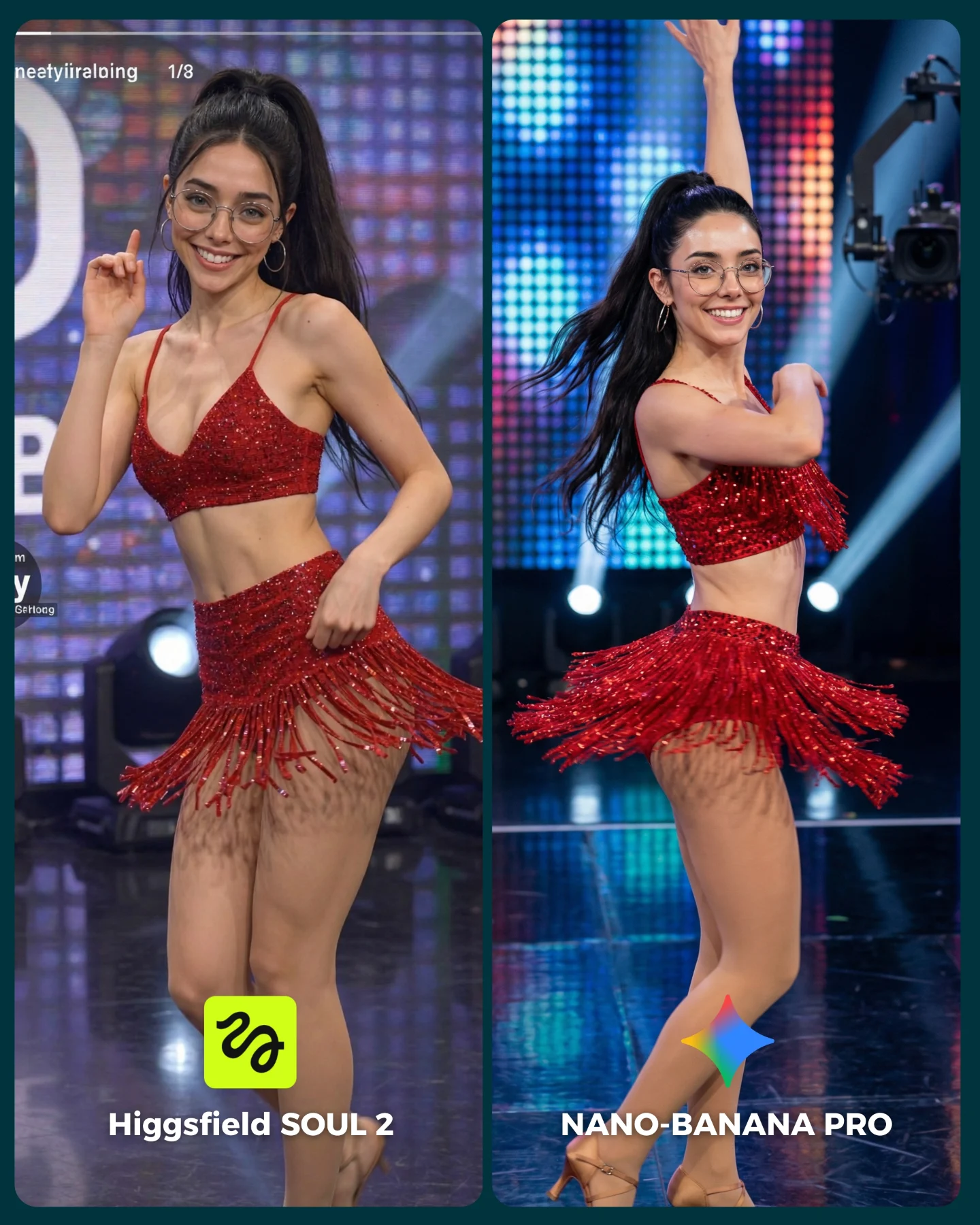
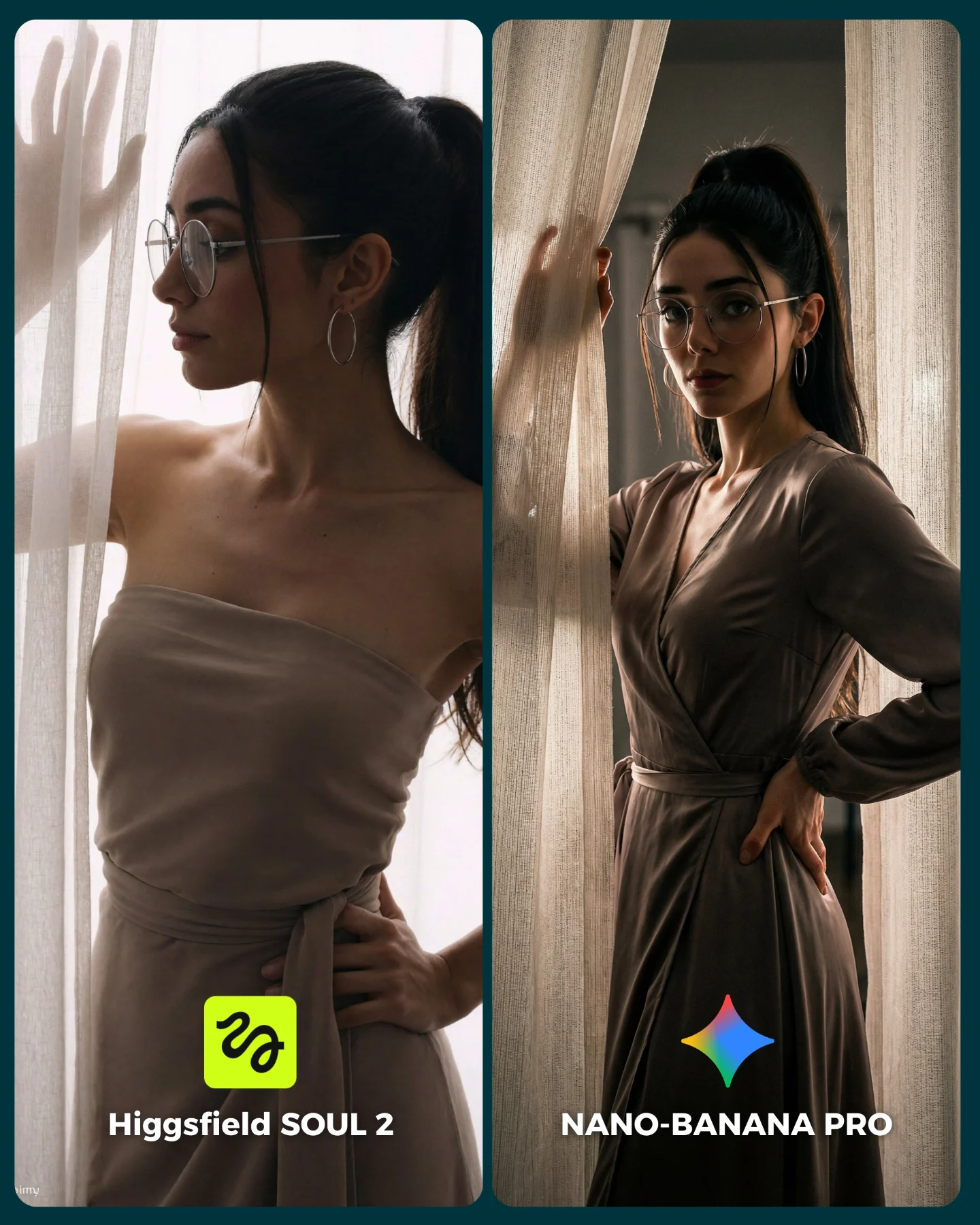
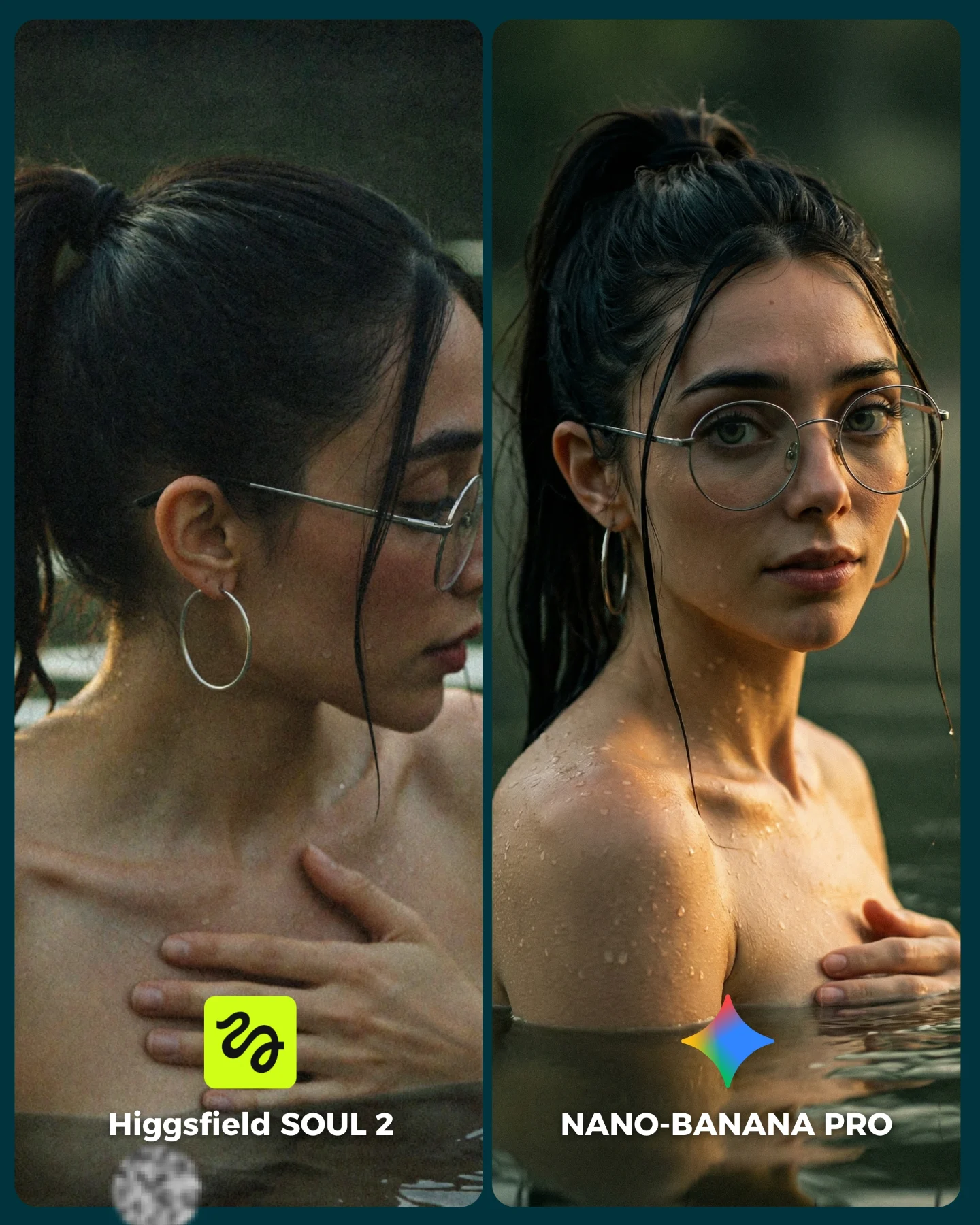
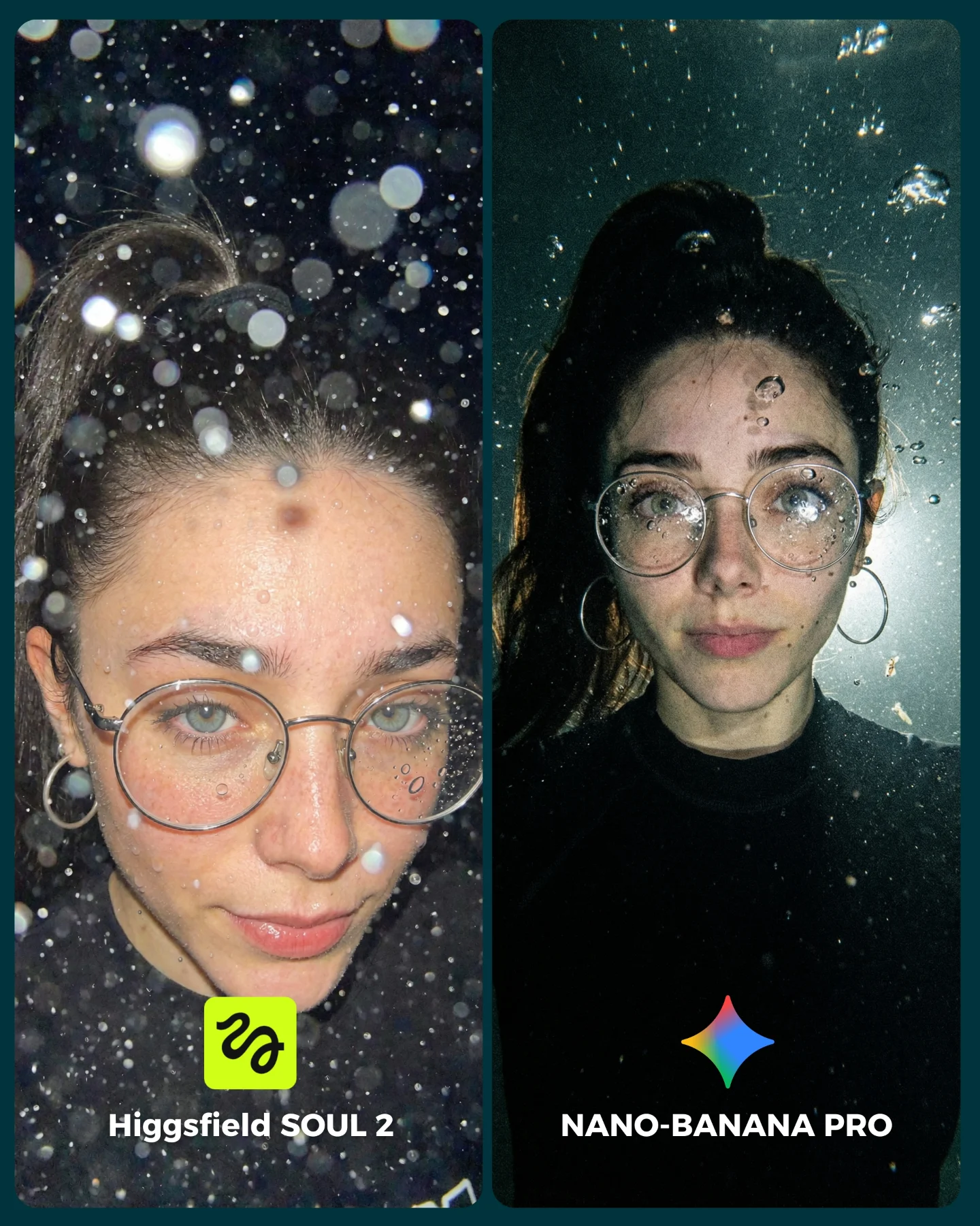
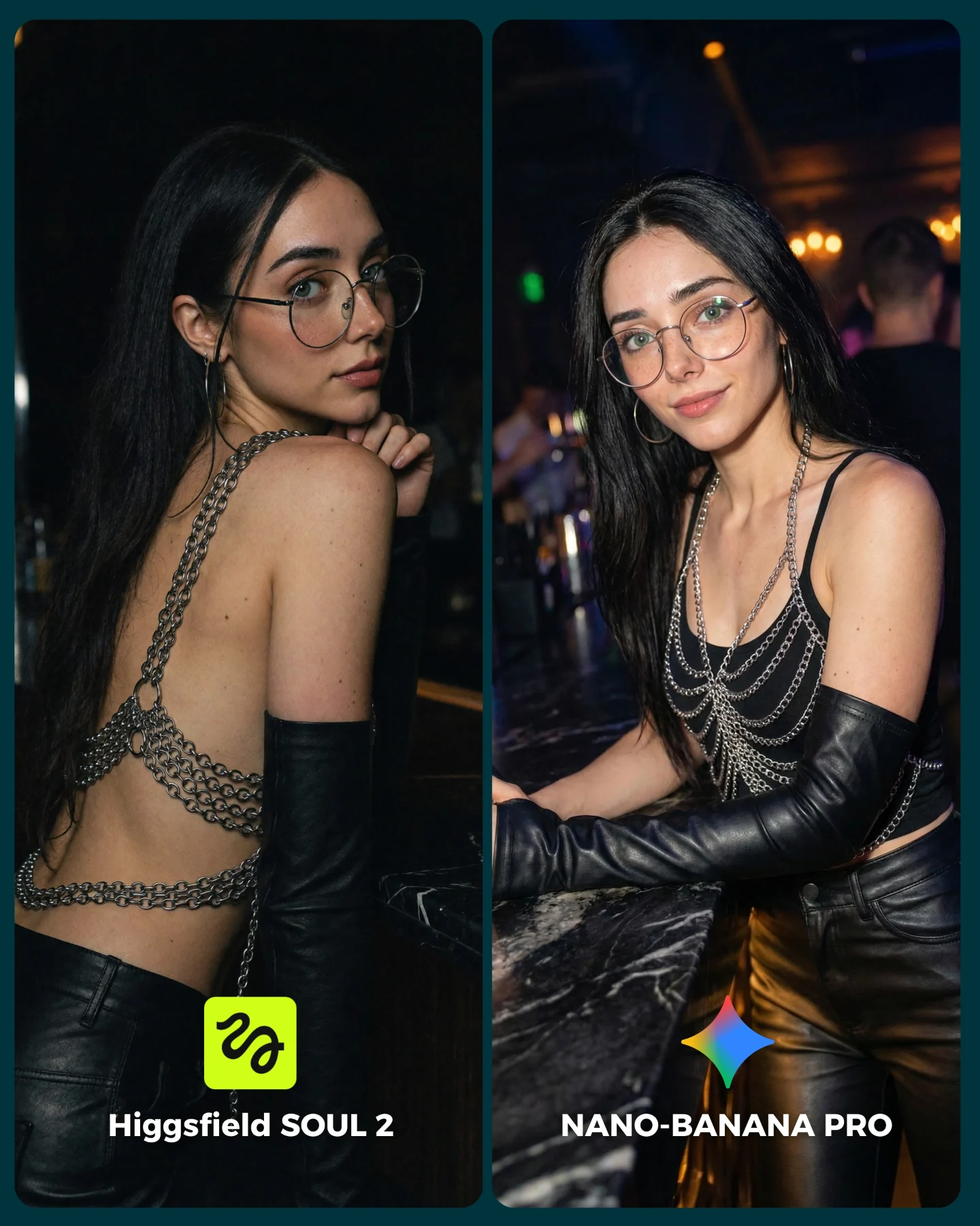
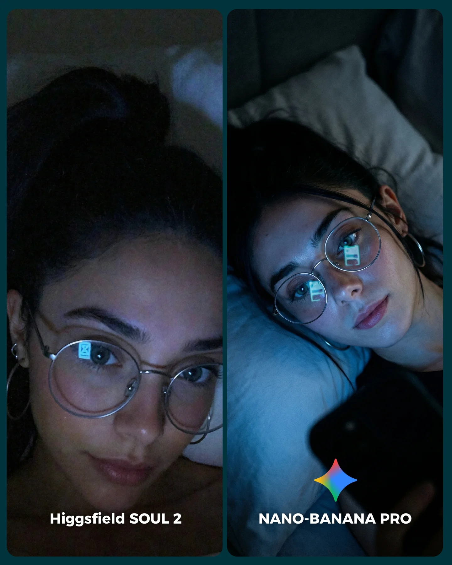
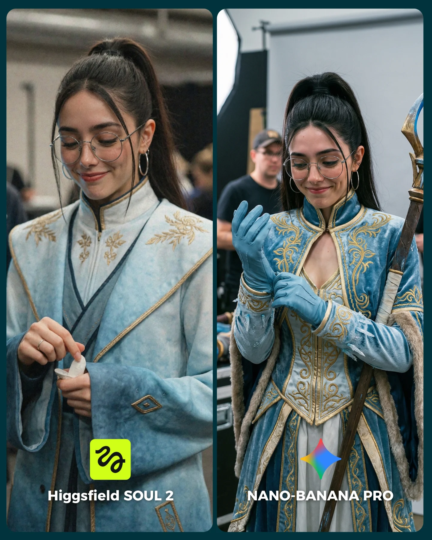
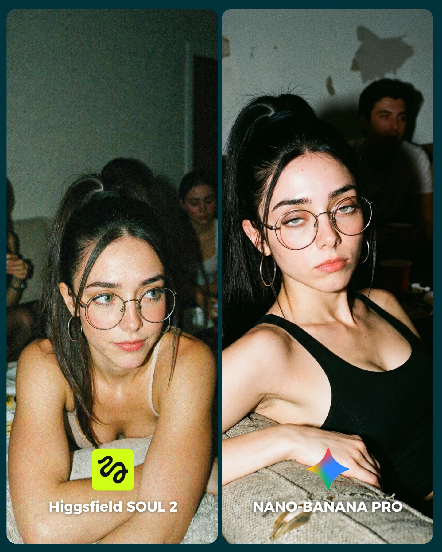
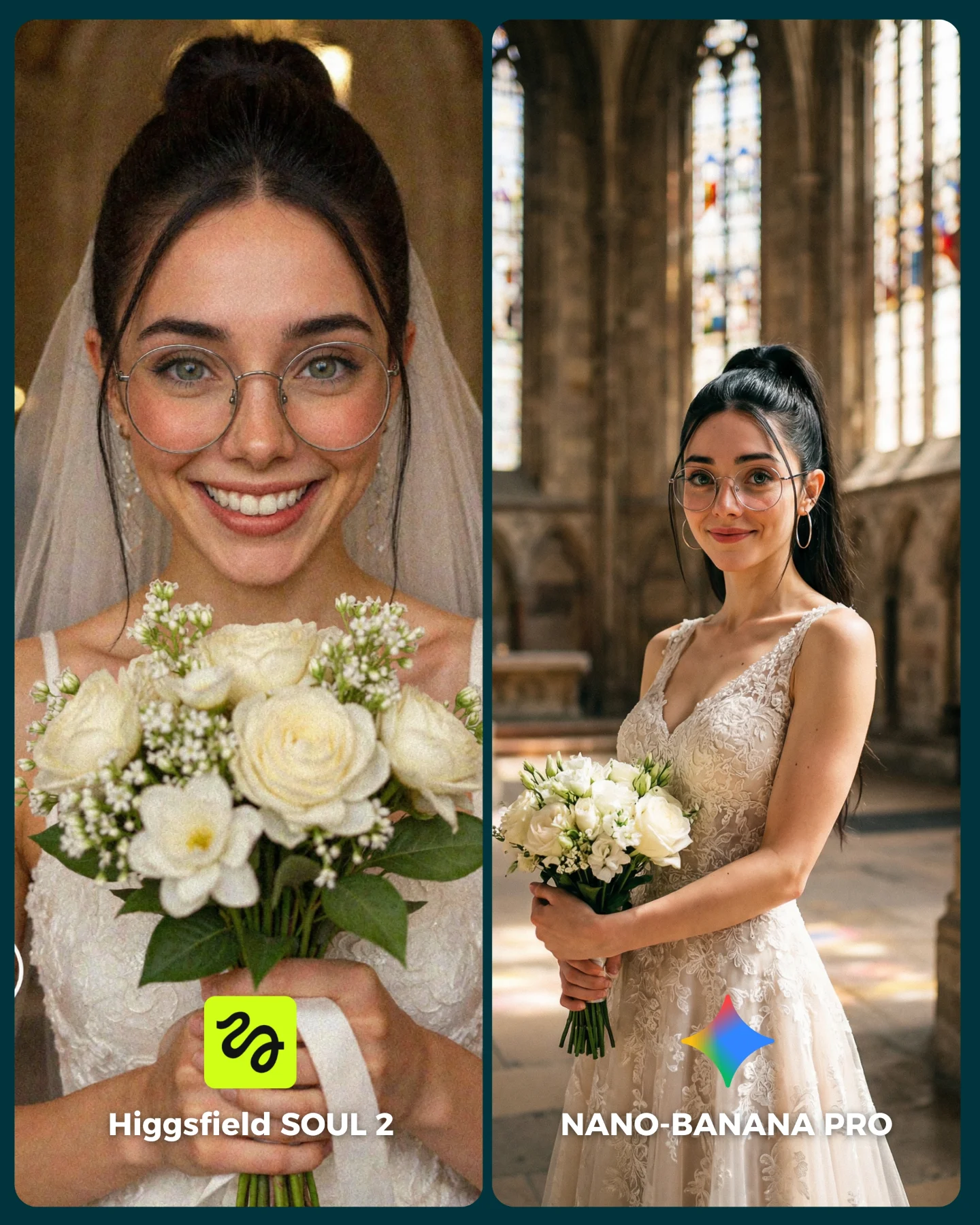
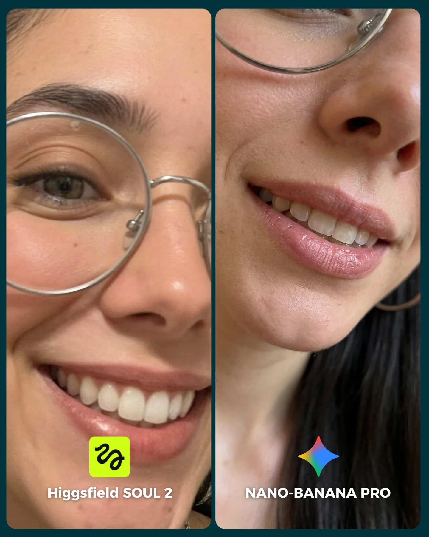
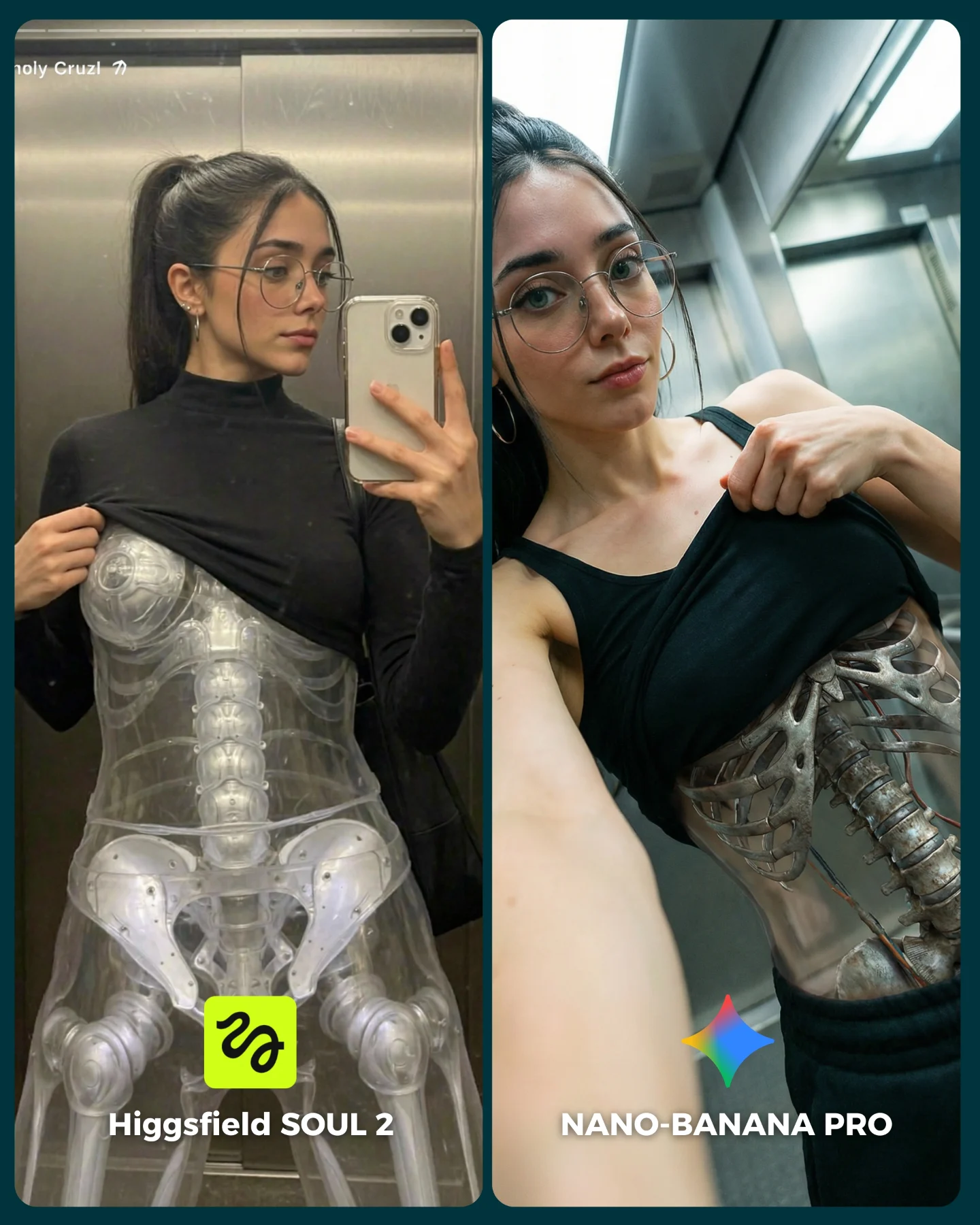
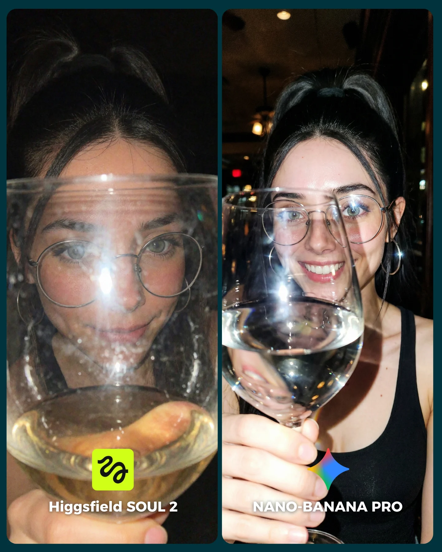
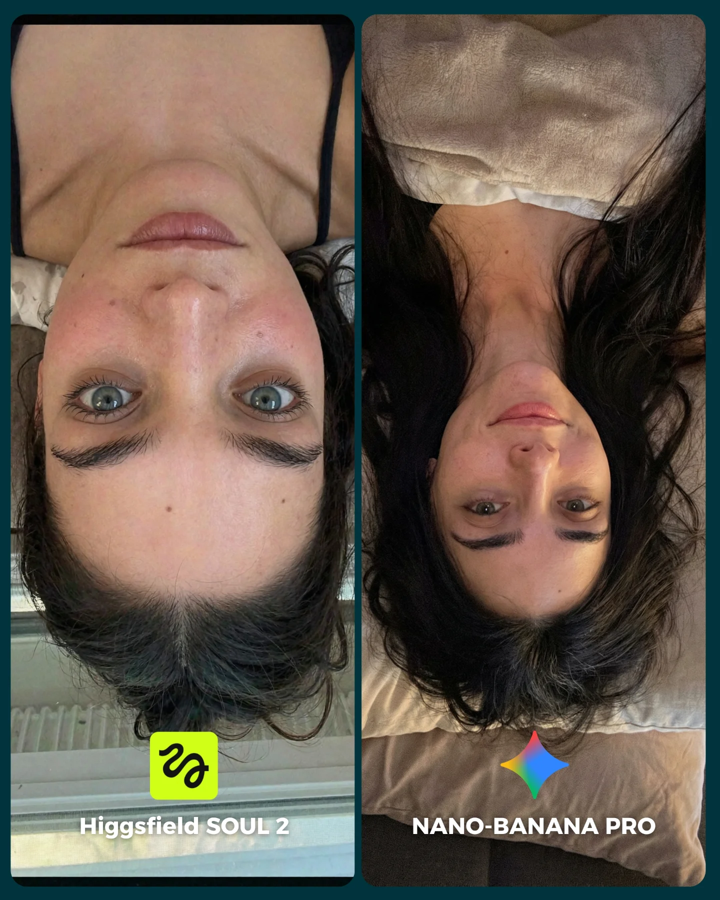
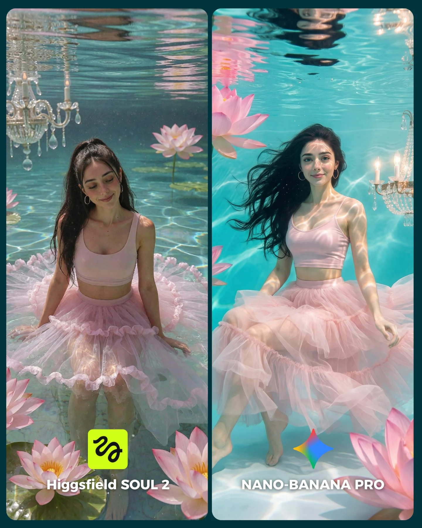
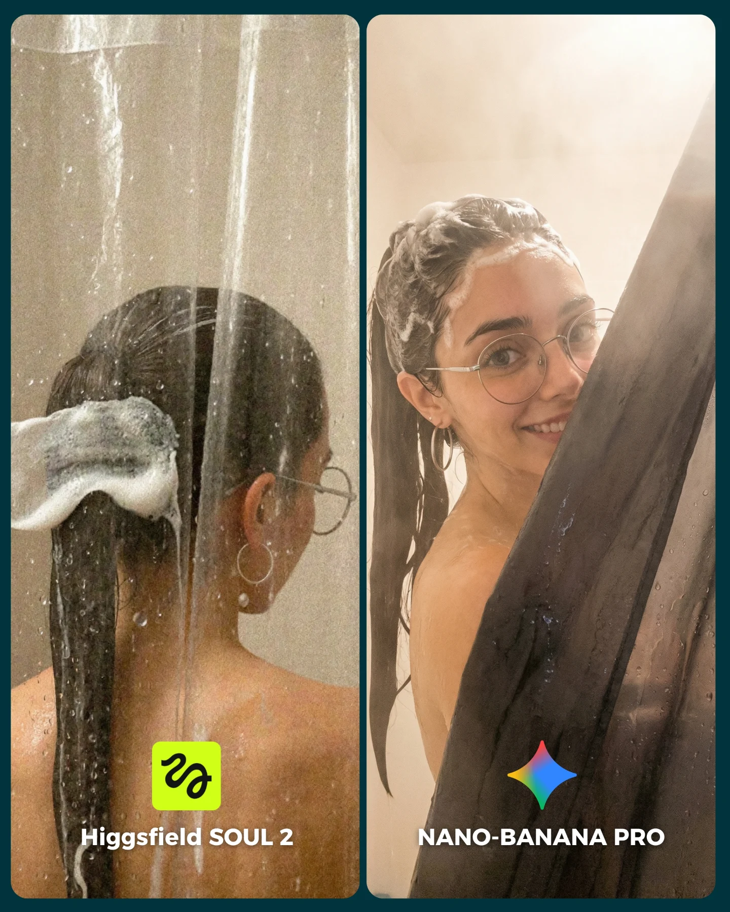
SOUL 2 Vs. Nano Banana Pro 💥
Higgsfield ha lanzado su nuevo generador de imágenes SOUL 2 ⚡ Puedes subirle hasta 80 imágenes de referencia de tu personaje para mantener mejor la constancia 👀
Y para compararlo bien, lo he puesto a prueba junto a Nano Banana Pro que hasta el momento es mi generador de imágenes favorito 💕
La verdad es que hay algunos resultados de SOUL 2 que me han sorprendido bastante... No está nada mal, pero sigo prefiriendo Nano Banana para la mayoría de las ocasiones 😅
Os dejo algunas imágenes que he generado y espero leer vuestras opiniones en comentarios 💌 Y si quieres los prompts de todas las imágenes comenta "ARIA" y te los mando por mensaje!
How soy_aria_cruz Made This SOUL 2 vs Nano Banana Pro AI Art — and How to Recreate It
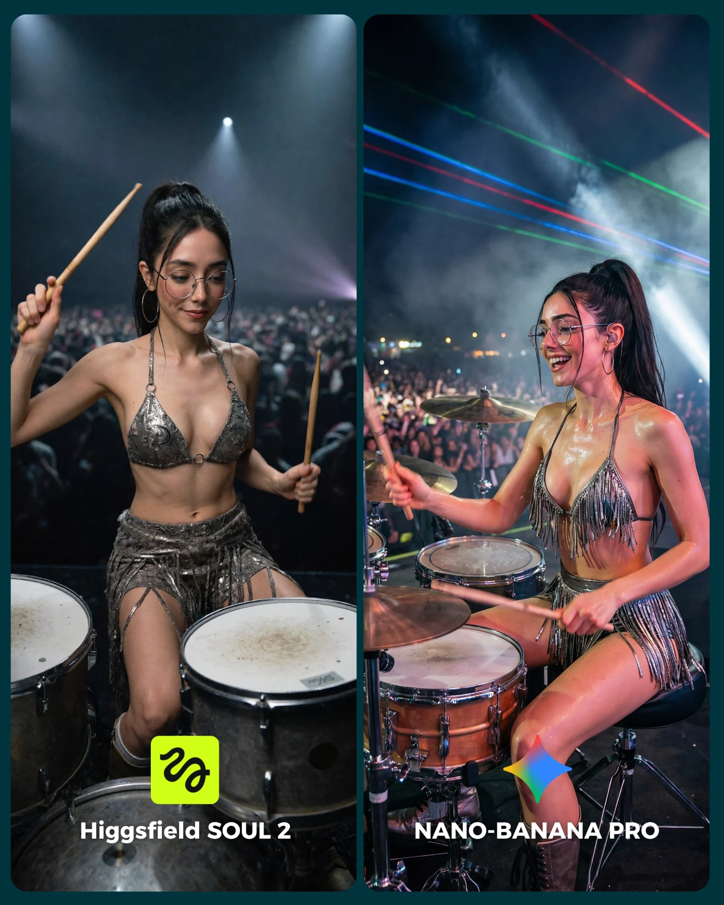
This side-by-side works because live performance scenes punish weak image generation. A concert drummer image has almost no forgiving area. You need anatomy under movement, believable instrument layout, realistic crowd depth, hard stage lighting, reflective costume material, and consistent face identity at the same time. That is a much tougher benchmark than a static portrait with clean beauty light.
The split-screen format makes that difficulty visible fast. Both panels use the same basic concept, the same character, the same glasses, and the same silver performance styling. That means the viewer is not deciding based on taste alone. They are deciding which side feels more like a real concert photo.
Why This Comparison Gets Comments
It works as content because the audience can evaluate it instinctively. People may not know how to describe model fidelity in technical language, but they know when a stage image feels flat. They can see if the body looks too posed, if the crowd feels fake, or if the drum kit seems disconnected from the performer. That makes the comment prompt almost frictionless: viewers can pick a side immediately.
The right panel feels stronger because it captures live-show chaos more convincingly. Sweat sheen, richer light variation, laser lines, and a more open expression all push the scene closer to a real performance photograph. The left panel still works, but it feels more controlled, as if the model understands the concept without fully embodying the event.
Signal
Evidence (from this image)
Mechanism
Replication Action
High-complexity environment
Drum kit, crowd, spotlights, haze, metallic outfit, and motion all exist together
Complex scenes reveal whether the model can keep multiple systems coherent
Benchmark with staged performance environments instead of static portraits
Controlled identity comparison
The same woman, glasses, ponytail, and outfit appear in both panels
Stable identity makes the model difference easier to judge
Lock face anchors and accessories before changing model or generation stack
Concert-energy realism
The stronger panel has more believable light spill, body sheen, and stage emotion
Performance images succeed when they feel lived rather than merely posed
Prompt sweat sheen, crowd blur, haze, and expressive motion instead of generic “concert scene”
Simple side-picking format
Two labeled outputs invite an immediate opinion
A/B structure naturally increases comments because viewers want to judge
Use clear side labels and matched crops so the comparison reads in under a second
Where This Format Fits Best
This kind of comparison is ideal for creators teaching model choice, prompt fidelity, or identity consistency under stress. It also works for audience-building posts where the goal is to turn technical testing into a conversation. Music-performance scenes are especially useful because they mix glamour with mechanical complexity.
Best for model-vs-model content: the split layout makes performance differences obvious. Change the scene, but keep all key variables fixed.
Best for hard consistency tests: stage lighting and metallic costume rendering expose weak control quickly. Change the genre, not the stress level.
Best for engagement posts: viewers enjoy picking winners when the comparison is visually dramatic and easy to understand.
Best for prompt educators: this image naturally opens discussion around motion, props, and light realism in one frame.
It is less ideal for serene inspiration feeds or pure storytelling carousels. This image is engineered as an evaluation surface first.
Three Transfer Recipes
DJ booth comparison. Keep: split layout, crowd, lighting difficulty, metallic styling. Change: drum kit to mixer and decks, seated drummer to standing DJ, sticks to headphones or faders. Slot template: {same character} {same stage identity} {live-performance role} {A/B model labels}
Lead guitarist comparison. Keep: concert crowd and stage haze benchmark. Change: drums to electric guitar, seated pose to standing performance stance, fringe outfit to rocker stagewear. Slot template: {concert setup} {instrument role} {identity anchor} {realism comparison}
Dancer spotlight test. Keep: difficult stage light and body realism challenge. Change: instrument scene to choreography pose under moving lights. Slot template: {stage environment} {dance outfit} {high-difficulty motion pose} {side-by-side model test}
Aesthetic Read
The image succeeds because the drum kit gives the frame structure. Without the drums in the foreground, the scene would become another concert portrait. The hardware, rims, and drumheads force the model to commit to spatial relationships. That is part of what makes the comparison interesting: the scene has real geometry, not just vibes.
The metallic fringe costume is another smart test variable. Reflective materials under concert light are notoriously easy to get wrong. In a good output, they shimmer differently across body planes. In a weaker one, they flatten into generic silver texture. That is why the outfit is not just decoration here. It is part of the benchmark.
Observed
Why It Matters
How To Recreate
Visible drum kit in the foreground
Anchors the performance and introduces real spatial constraints
Always include enough of the instrument to prove the action is believable
Silver fringe performance outfit
Tests reflective material handling under stage light
Choose one light-reactive wardrobe element when benchmarking concert realism
Crowd and haze behind the performer
Makes the environment feel live rather than staged
Add crowd blur, smoke haze, and lighting spill in the background
More expressive right-side energy
Shows how realism often improves when micro-behavior feels less posed
Prompt natural performance joy, not only “beautiful musician” styling
Prompt Technique Breakdown
Concert comparison prompts need more structure than glamour. The safest way to build them is to lock the identity first, the instrument second, and the stage environment third. Only after those are stable should you tune which side feels more realistic. If you start with “epic concert drummer,” you usually get noise instead of performance logic.
Prompt chunk
What it controls
Swap ideas (EN, 2-3 options)
same young woman drummer with glasses, ponytail, and silver stage outfit in both panels
Identity control
“same singer in both panels”; “same dancer in both panels”; “same DJ in both panels”
seated at a real drum kit holding drumsticks mid-performance
Action and prop realism
“striking cymbal”; “cross-stick motion”; “mid-fill over toms”
live concert crowd, haze, spotlights, and stage beams
“small logo badges”; “model names in bottom corners”; “carousel comparison captions”
How I Would Iterate It
Baseline lock: the drum kit geometry, the performer identity anchors, and the side-by-side panel structure. Those are the non-negotiables. Once they are stable, the realism separation between left and right becomes much easier to control.
Run 1: solve the drums, sticks, and seated anatomy. If the instrument logic fails, stop there.
Run 2: stabilize face identity, glasses, ponytail, and the silver outfit across both panels.
Run 3: tune environment realism with crowd blur, stage haze, and believable light direction.
Run 4: separate the outputs: keep the left cleaner and flatter, and make the right side more energetic, wet, and concert-real.
Quick remix checklist
One hard scene with real geometry
One stable identity across both sides
One obvious realism upgrade path
One clear crowd-and-light environment
One audience question that can be answered visually
The bigger takeaway is simple: if you want an A/B post to feel meaningful, choose a scene where realism is difficult to fake. This concert drummer test does exactly that. It makes the model prove itself under light, motion, props, and spectacle at the same time.