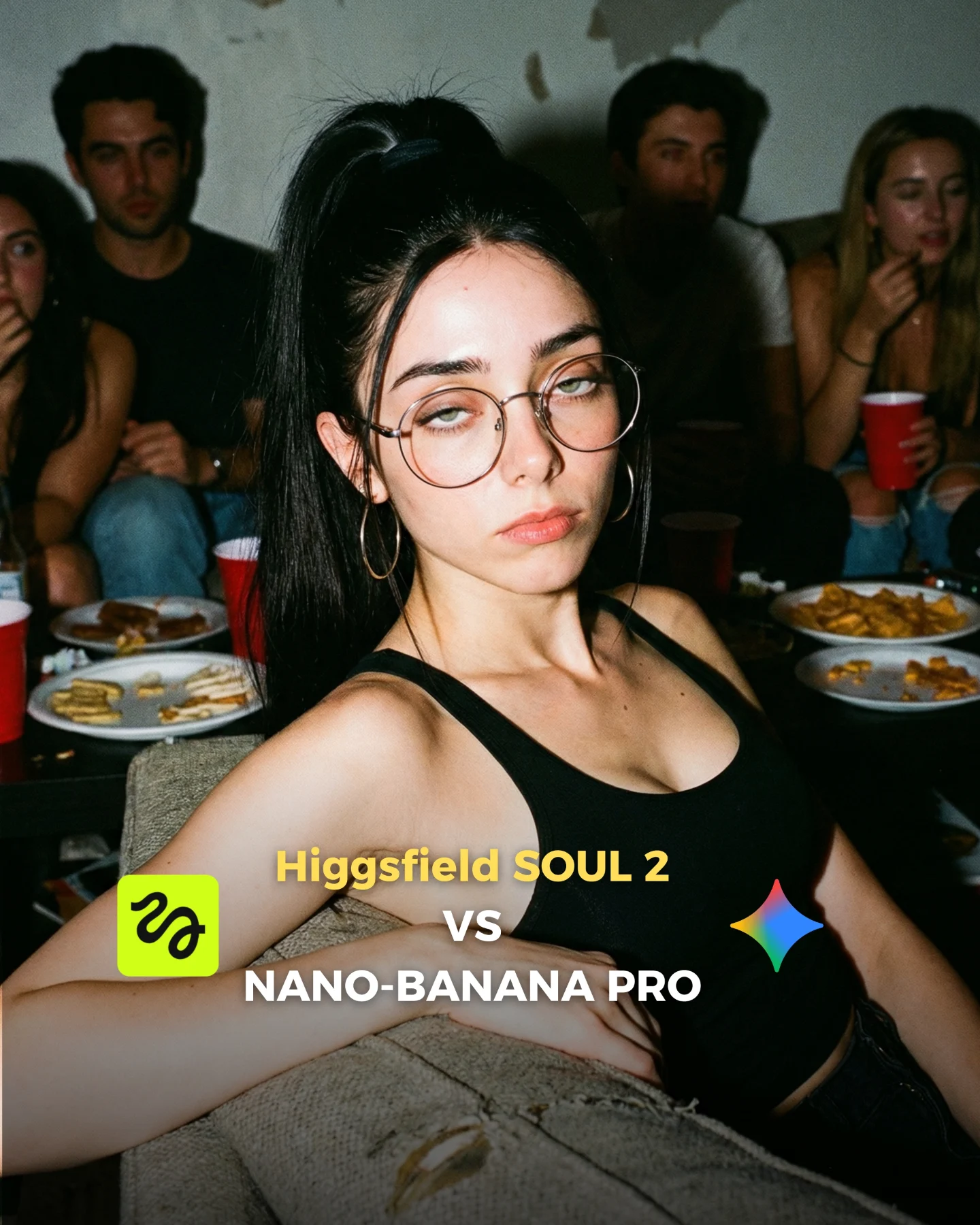
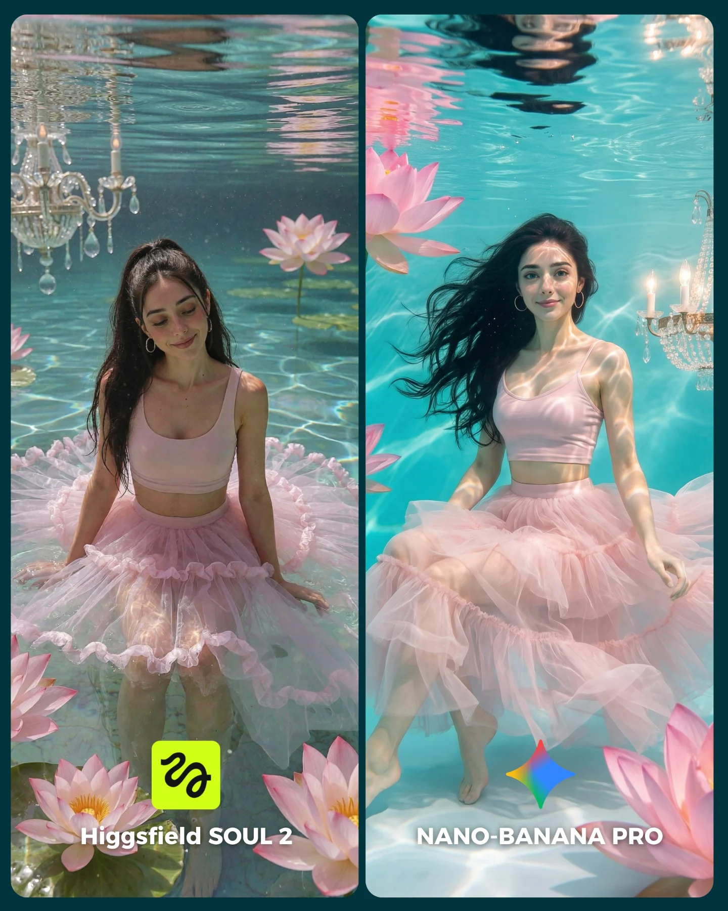
How soy_aria_cruz Made This SOUL 2 vs Nano Banana Shower AI Art — and How to Recreate It
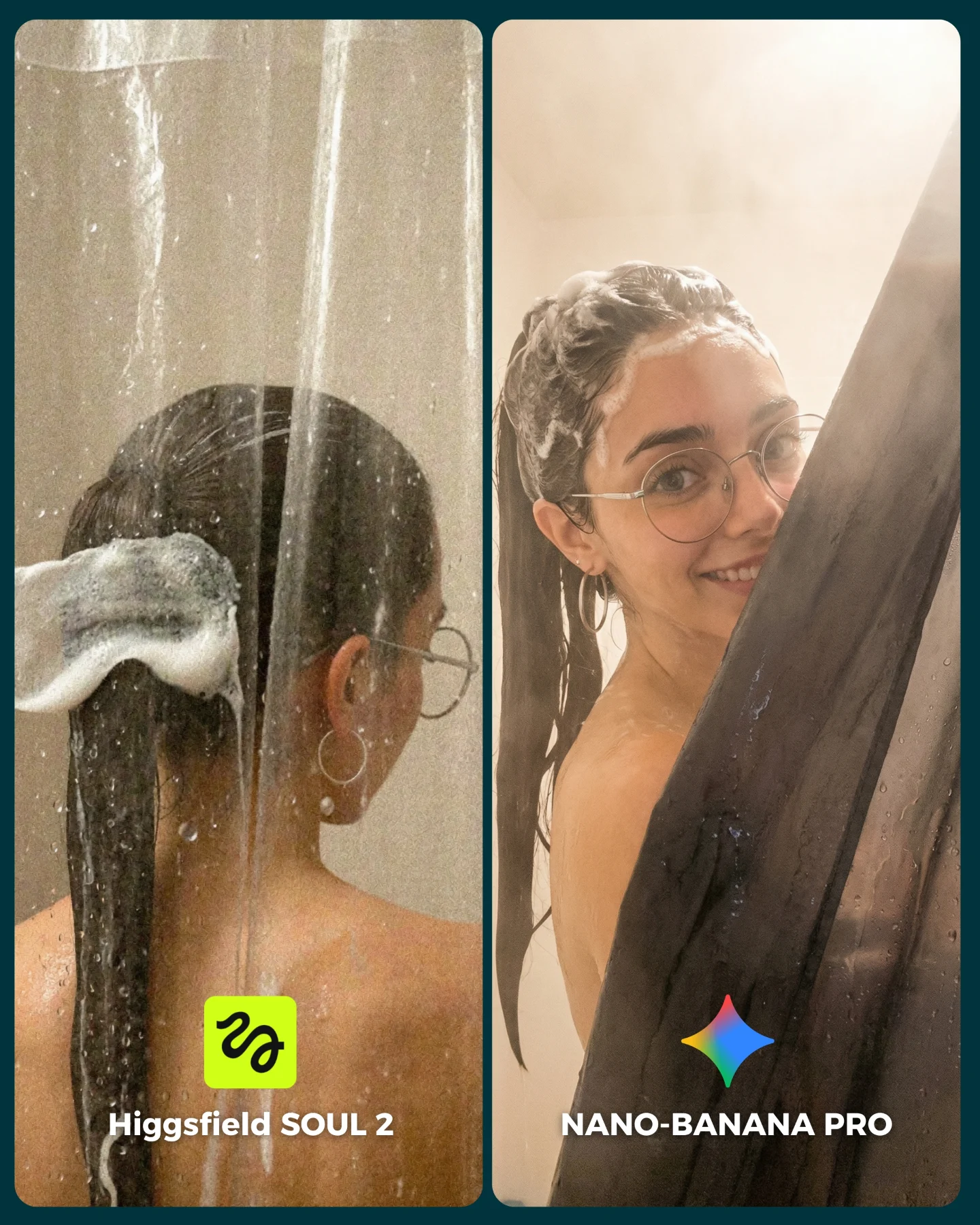
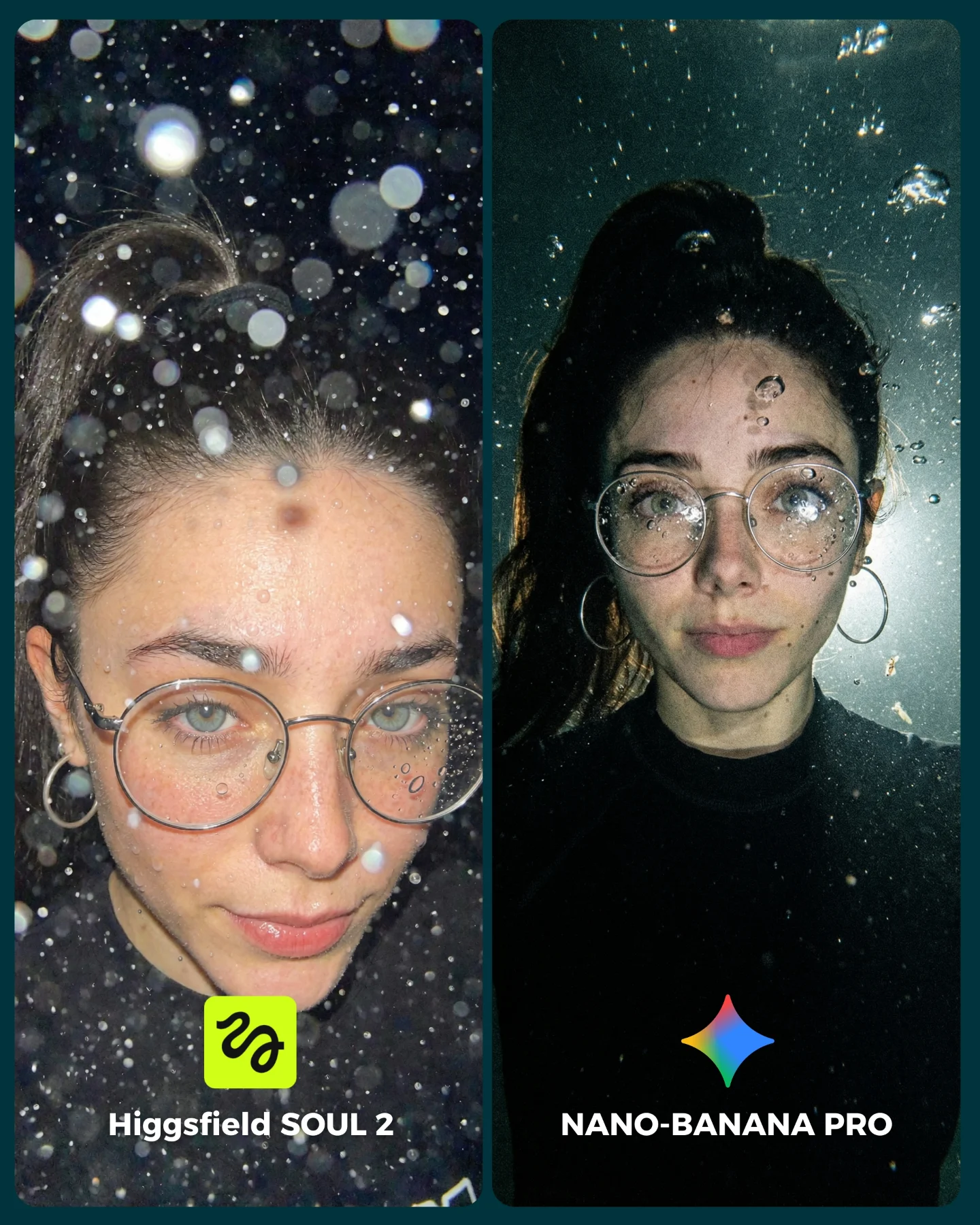
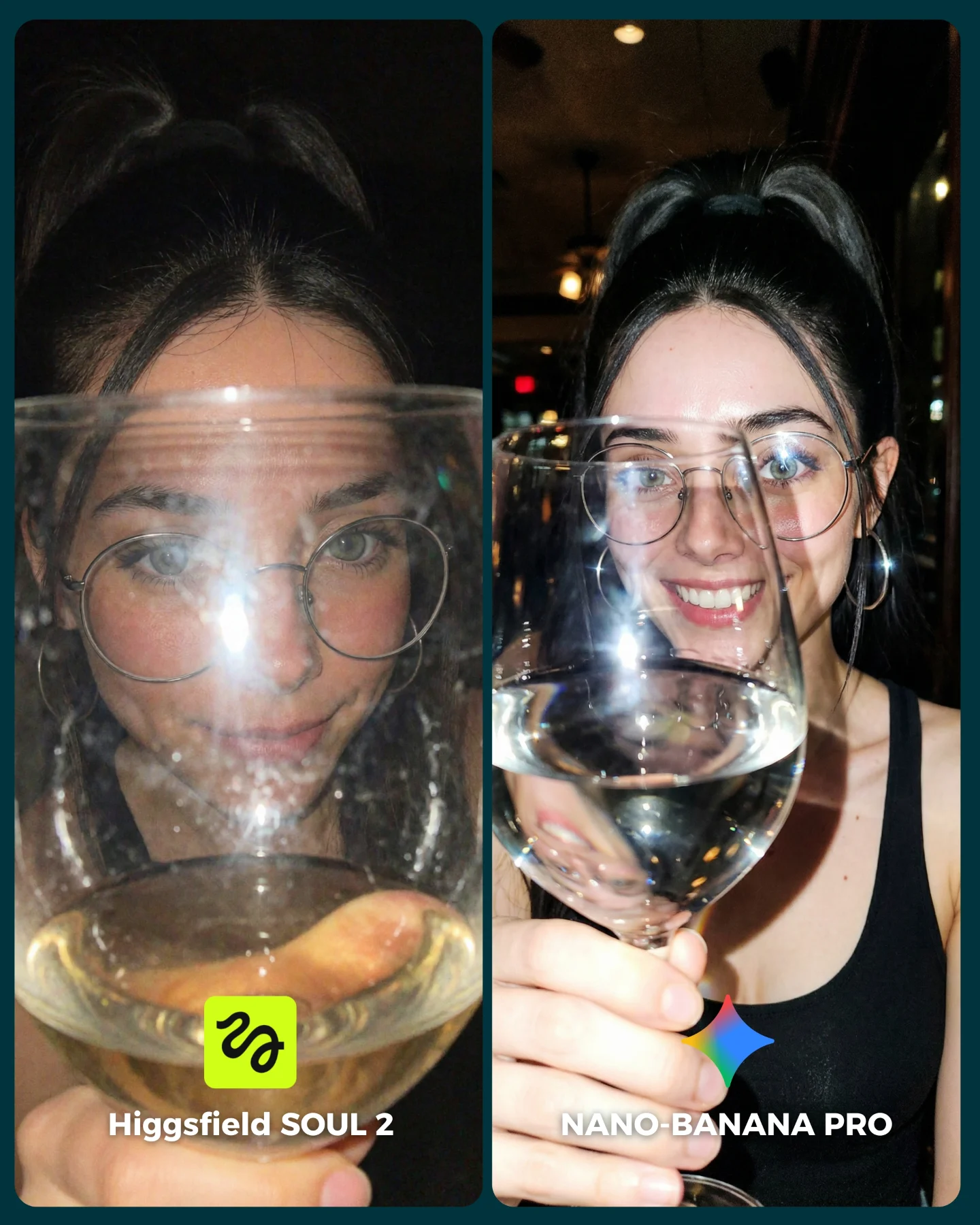
This image works because it tests realism in one of the hardest possible environments: water, glass, steam, skin, wet hair, and partial occlusion all at once. That gives viewers a lot to evaluate without making the post feel technical or dry. The split-screen format turns those details into a visible contest, which is much easier for an audience to engage with than a purely written explanation.
The subject choice is also strong. A shower scene immediately exposes whether a model can keep a face stable under moisture, preserve believable hair clumping, and handle reflections or haze without collapsing into artifacts. In other words, the concept is visually appealing, but it is also a legitimate stress test.
Why the side-by-side format helps here
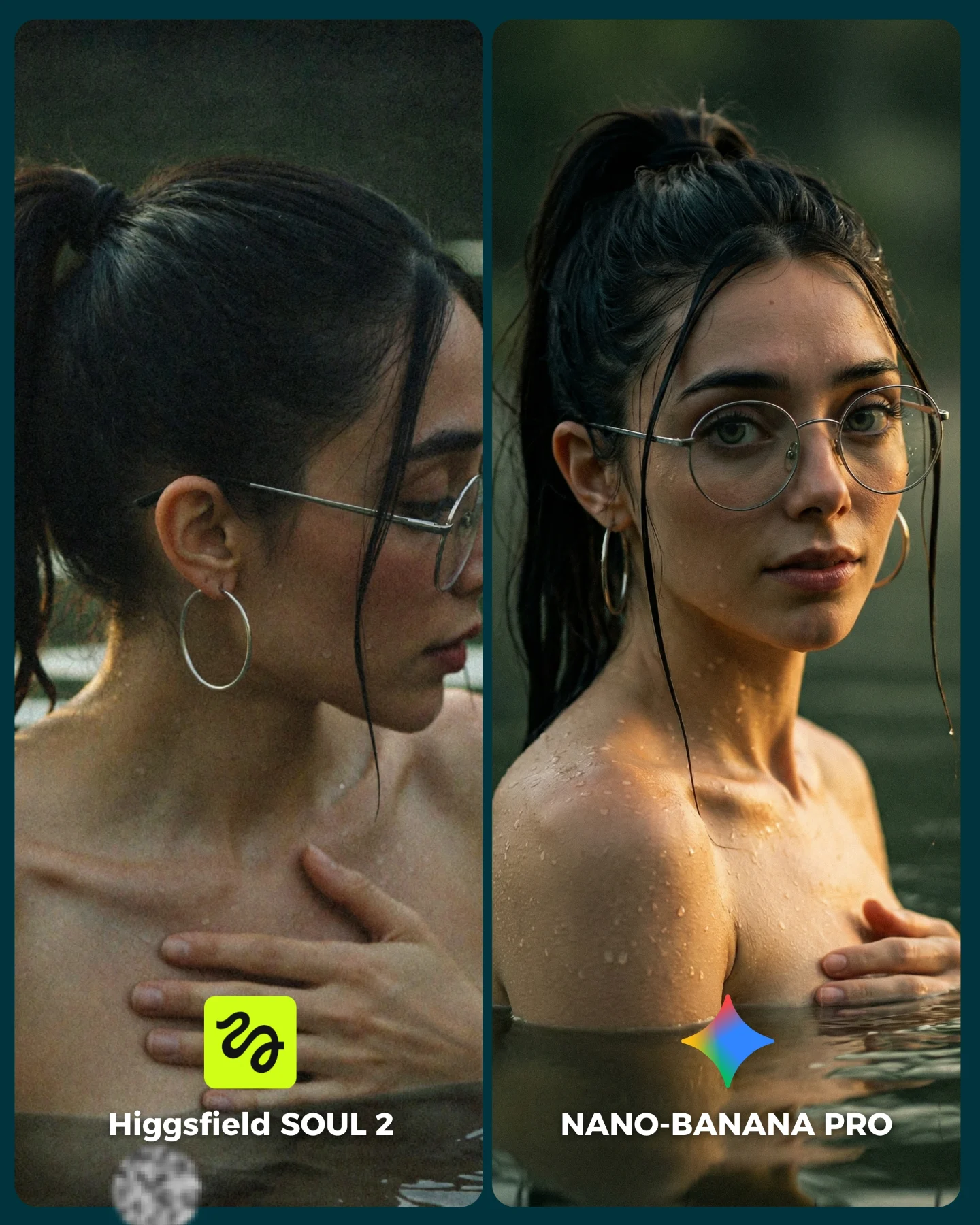
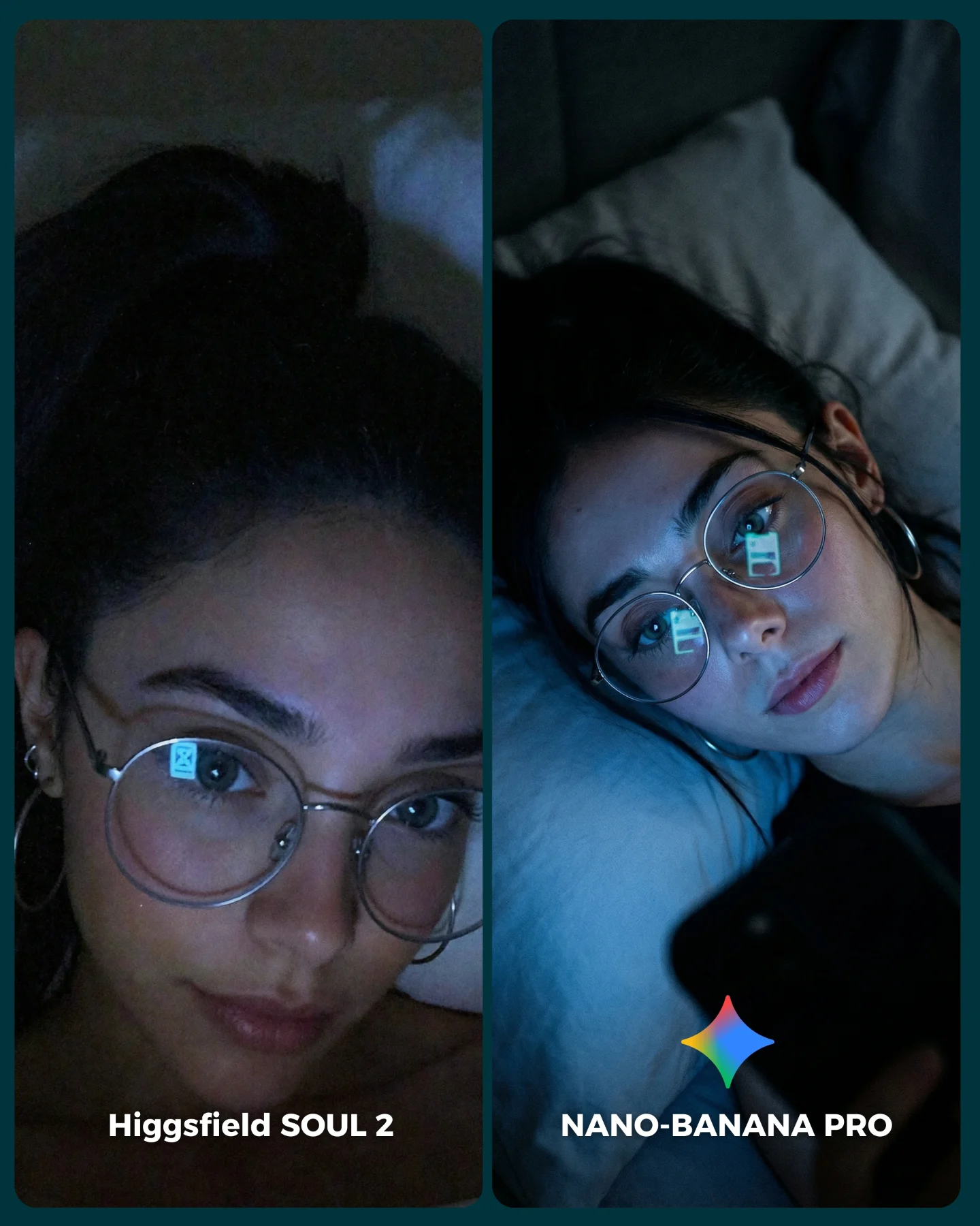
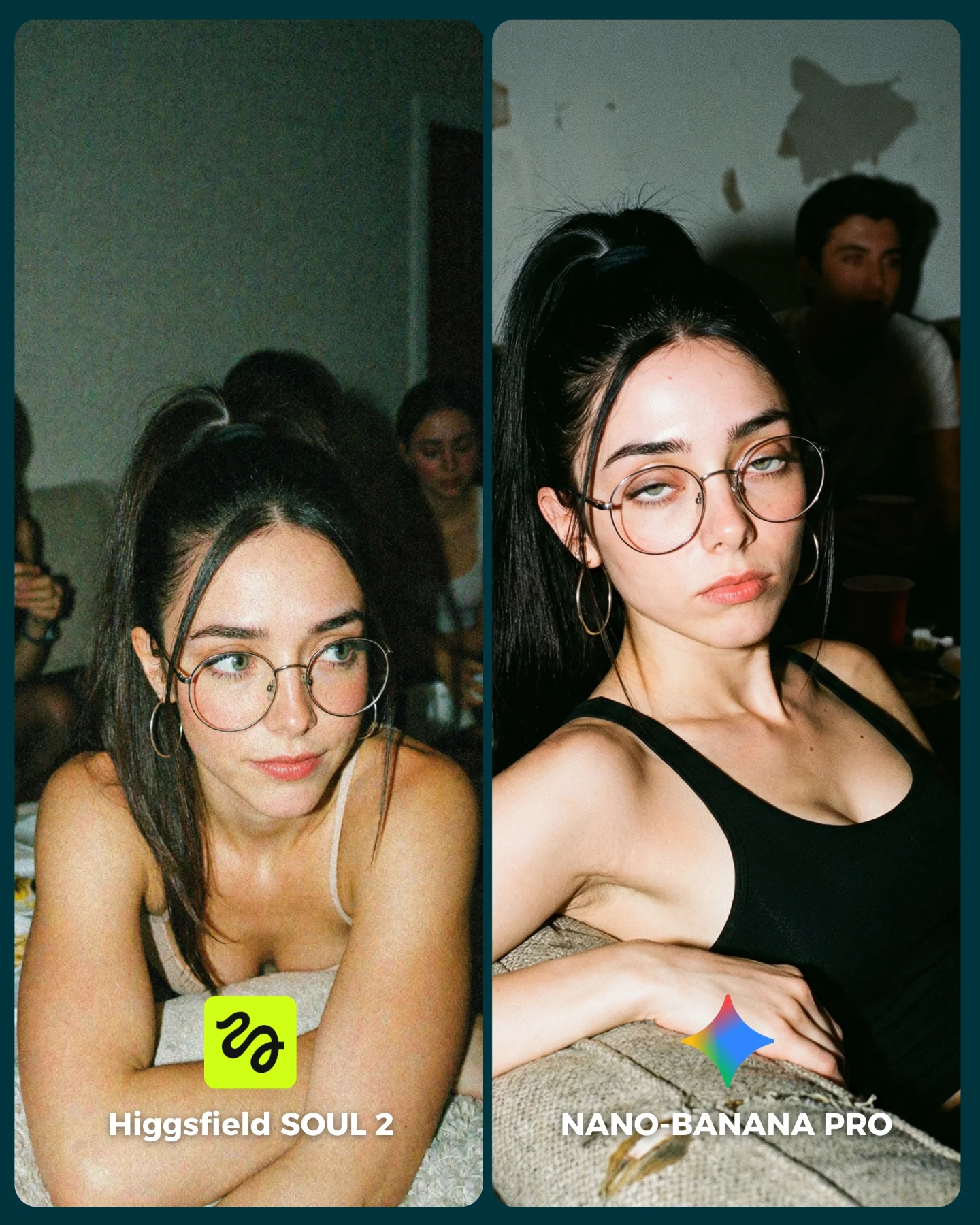
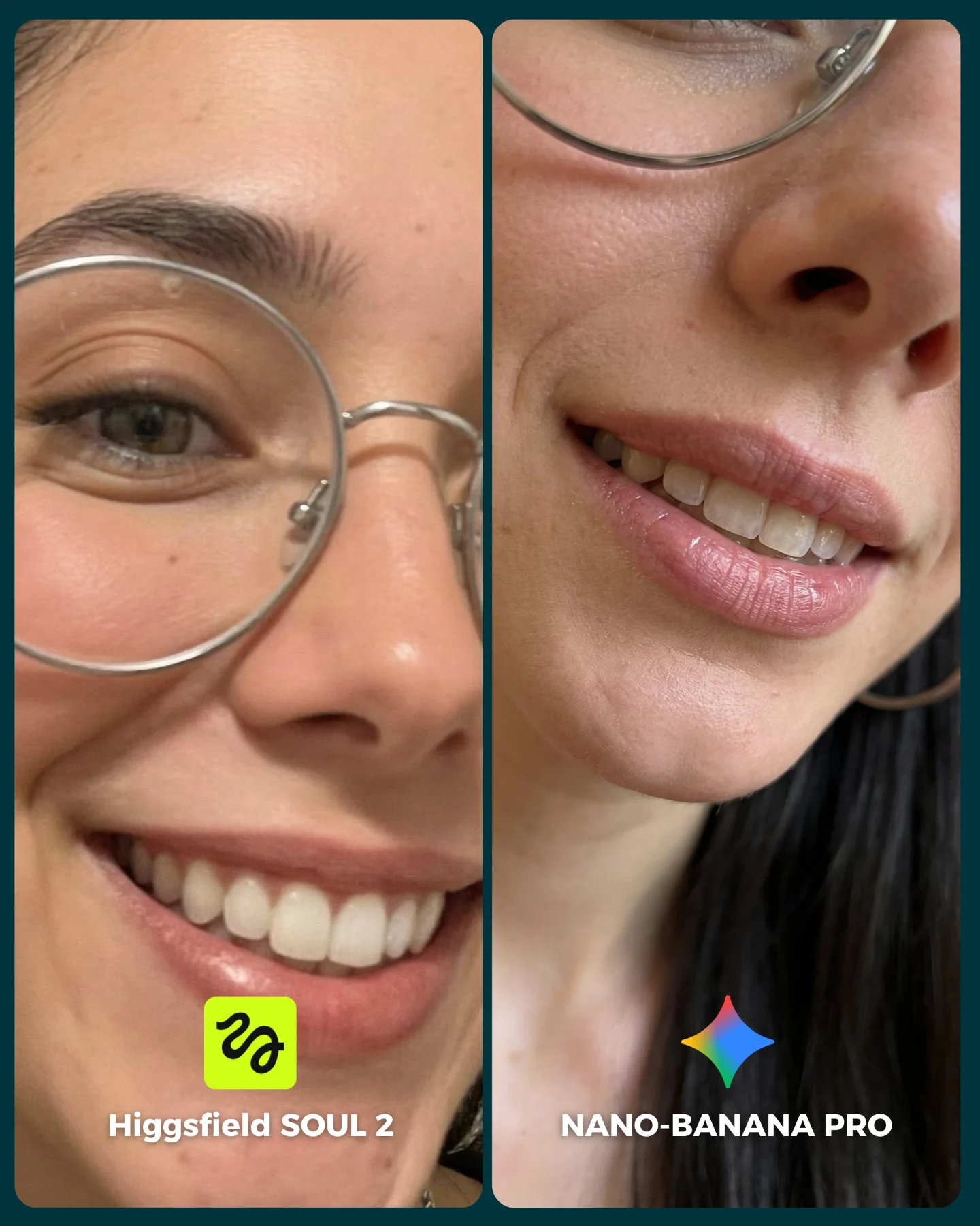
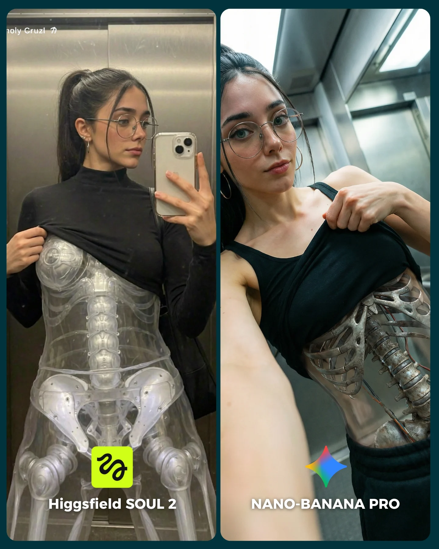
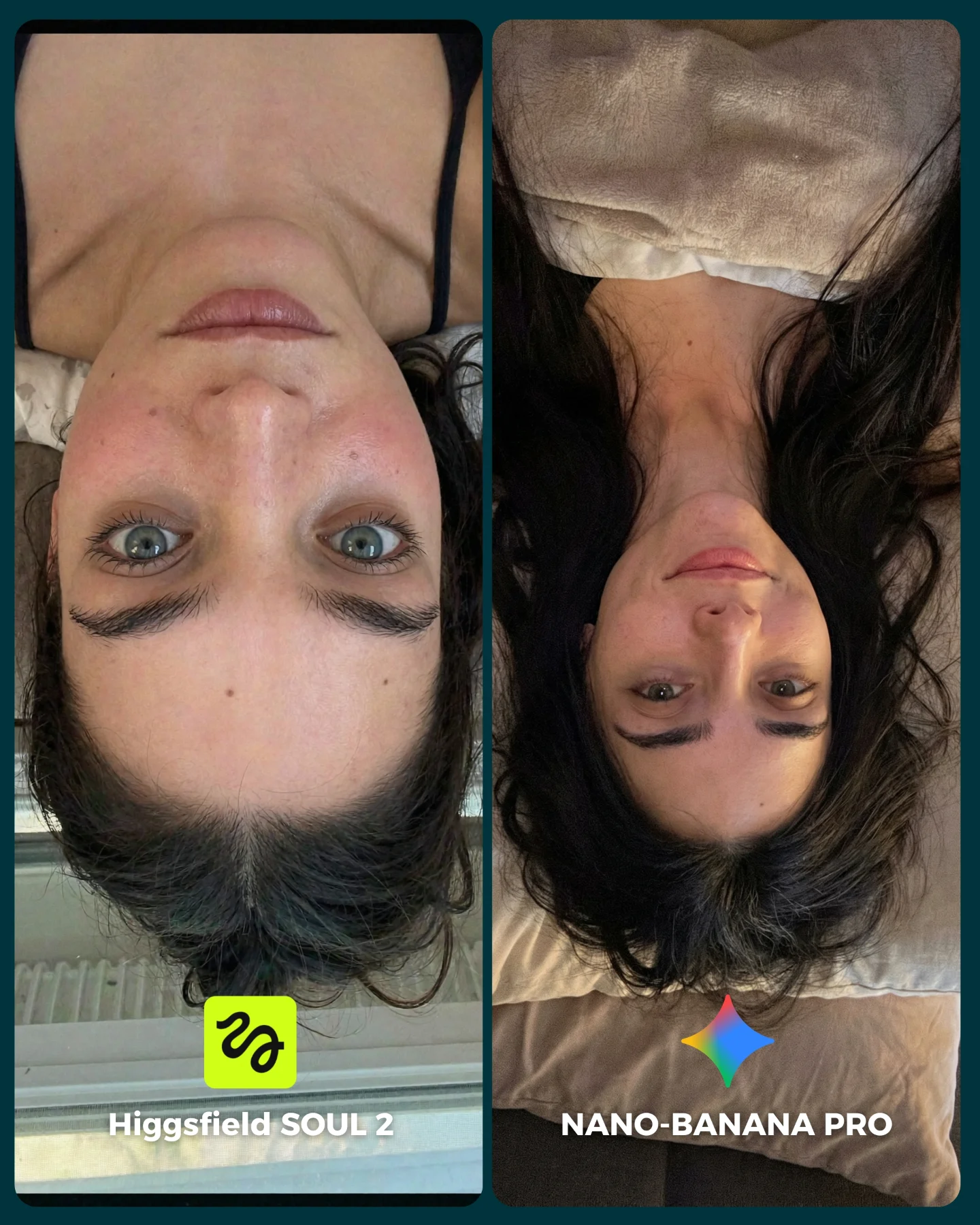
The strongest mechanic is that the scene gives the viewer obvious realism checkpoints. On the left, people look at foam placement, glass texture, and how naturally the wet ponytail falls. On the right, they judge facial consistency, steam, skin rendering, and how the subject interacts with the dark foreground curtain. This makes the audience feel like they have a real basis for choosing a winner.
The image also benefits from contrast inside the same scenario. The left panel is more filtered and obscured, while the right panel is more direct and expressive. That gives viewers two types of difficulty within one benchmark: can the model handle diffusion, and can it handle a clearer beauty-style portrait under moisture?
| Signal | Evidence (from this image) | Mechanism | Replication Action |
|---|
| Difficult realism test | Steam, droplets, wet hair, foam, skin, curtain occlusion | Viewers have many visible details to inspect and compare | Choose scenes with multiple material systems interacting at once |
| Clear A/B structure | Two labeled panels with the same subject in the same shower-world concept | Comments become easier because the comparison is already framed | Put the benchmark labels directly into the image |
| Variation within consistency | Left panel is diffused and rear-facing; right panel is direct and smiling | The test feels richer without losing fairness | Keep the identity constant while varying the angle or emotional read |
Where this style is strongest
This format is ideal for model comparisons, portrait consistency tests, and prompt-library posts that want to demonstrate where a generator succeeds or fails under difficult conditions. It is especially effective when the audience cares about realism and fine detail.
- Model benchmark posts: Water and steam reveal weaknesses quickly, so the comparison feels meaningful.
- Beauty-realism tests: The subject's face and wet-hair detail create obvious quality checkpoints.
- Prompt education content: The scene helps explain why some prompts are harder than they look.
- Comment-driven creator posts: People are more likely to debate when the difference is visible but subtle.
It is less ideal for casual lifestyle storytelling or broad tutorial covers. This scene is a high-detail technical showcase wrapped in an attractive visual package.
Three transfer recipes
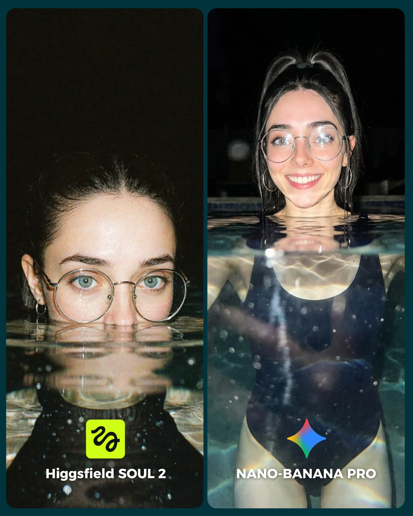
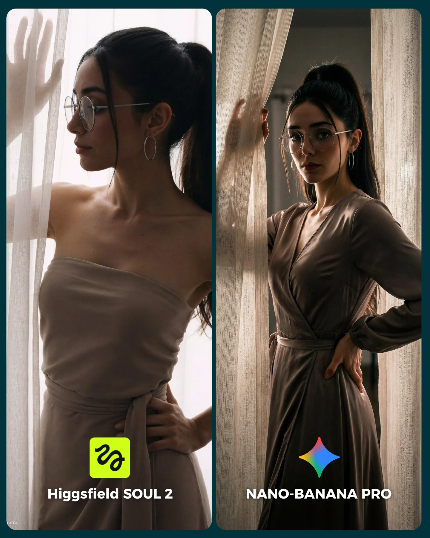
- Rain-on-window portrait: Keep the same moisture-heavy benchmark logic, but replace the shower glass with rainy window reflections. Slot template:
{shared wet-light concept} {model A output} {model B output} {clear bottom labels} - Poolside wet-hair test: Keep the realism checkpoints around water and hair, but move the setting to a daylight pool edge. Slot template:
{water realism brief} {left model result} {right model result} {A/B branding} - Makeup-removal sink scene: Keep the intimate bathroom environment, but shift to towel, mirror, and skin texture realism. Slot template:
{bathroom benchmark setup} {stable subject identity} {panel variation} {model labels}
Aesthetic read: why it still feels polished
The image succeeds because it treats the benchmark like an editorial board, not just a test file. The warm bathroom palette, soft steam, and restrained framing keep the comparison from feeling clinical. That matters because visually pleasant benchmarks are more likely to be shared and saved.
The left and right panels also do complementary jobs. The left side sells atmosphere and difficult wet-surface rendering. The right side sells facial fidelity and emotional appeal. Together, they make the viewer feel they are seeing both the technical and human side of the comparison.
| Observed | Why it matters |
|---|
| Wet glass and visible shampoo foam on the left | Creates a challenging realism test that viewers can inspect quickly |
| Direct smiling portrait on the right | Gives the benchmark a human focal point and shareable warmth |
| Dark foreground curtain or towel | Adds depth and another material-rendering checkpoint |
| Warm humid bathroom lighting | Keeps the scene attractive rather than sterile |
| Bottom labels with model names and icons | Turns the visual into an immediate comparison tool |
Prompt technique breakdown
To make this kind of post work, you need to specify the bathroom environment, the moisture effects, and the comparison packaging separately. If you only prompt “woman in shower” you will usually get something too generic or too explicit. The scene needs structure.
| Prompt chunk | What it controls | Swap ideas (EN, 2-3 options) |
|---|
| two-panel shower comparison layout | The A/B benchmark structure | v1 vs pro split board; before/after realism test; side-by-side moisture benchmark |
| same woman under wet-hair bathroom lighting | Identity consistency across both outputs | same woman in rain portrait; same woman after pool swim; same woman in sink-mirror scene |
| left panel through wet glass, right panel more direct | Variation within a fair shared concept | blurred vs sharp; profile vs direct gaze; occluded vs open portrait |
| steam, droplets, foam, and damp curtain | The realism checkpoints that make the benchmark meaningful | misty mirror; water-beaded window; towel-wrapped wet-hair scene |
| bottom model labels and icons | Viewer clarity and debate framing | simple text footer; colored badges; panel captions |
How to iterate this kind of image
Baseline lock the split-screen layout, the shared bathroom world, and the subject identity first. Then solve one challenge at a time: first the wet-hair structure, second the glass and droplets, third the face and glasses, and fourth the curtain occlusion and label clarity. That keeps the benchmark readable.
The larger lesson is that a good comparison post does not need to explain everything in the caption. It just needs to give viewers enough visible evidence to make a decision. This image does that well by turning moisture realism into a social prompt.