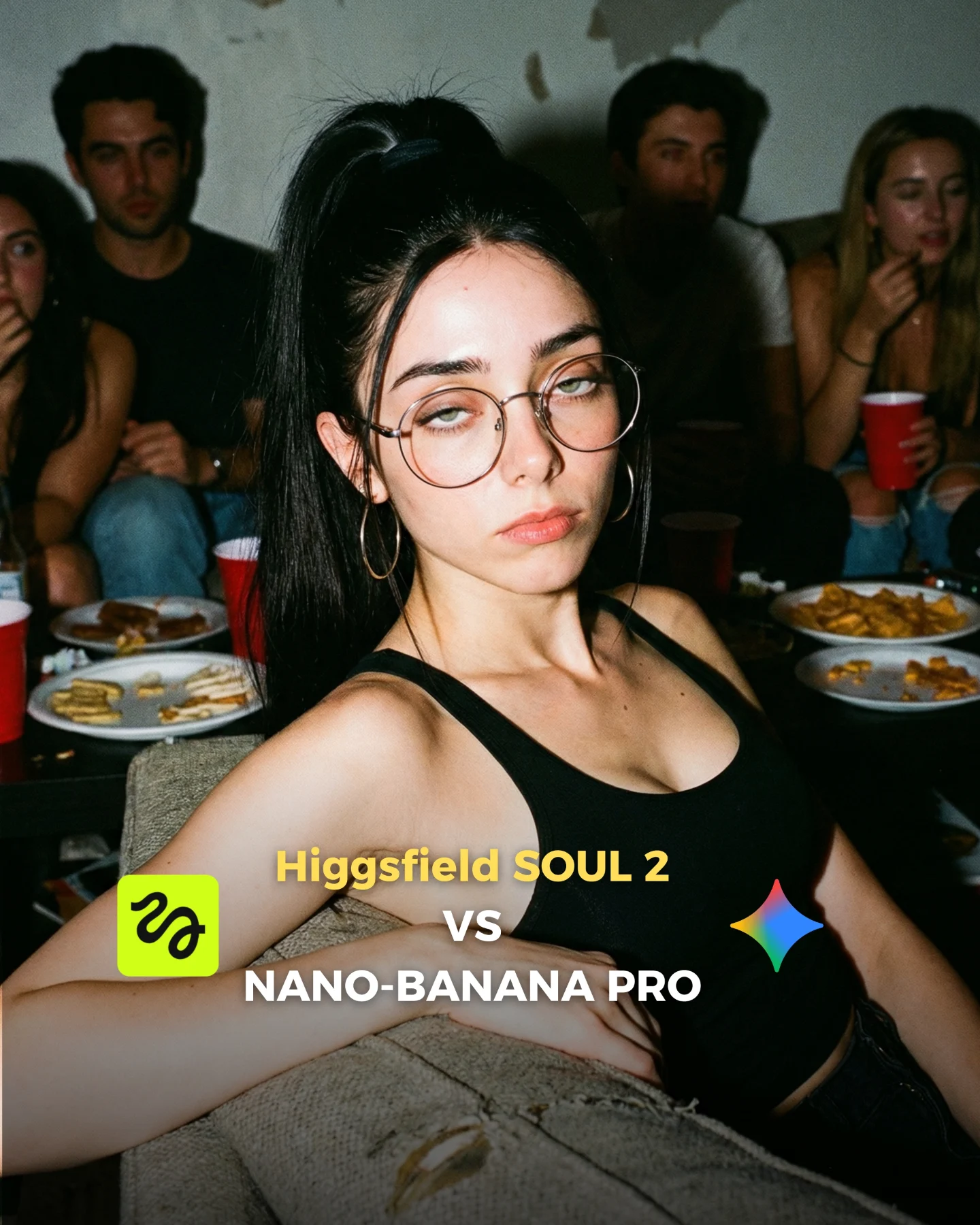
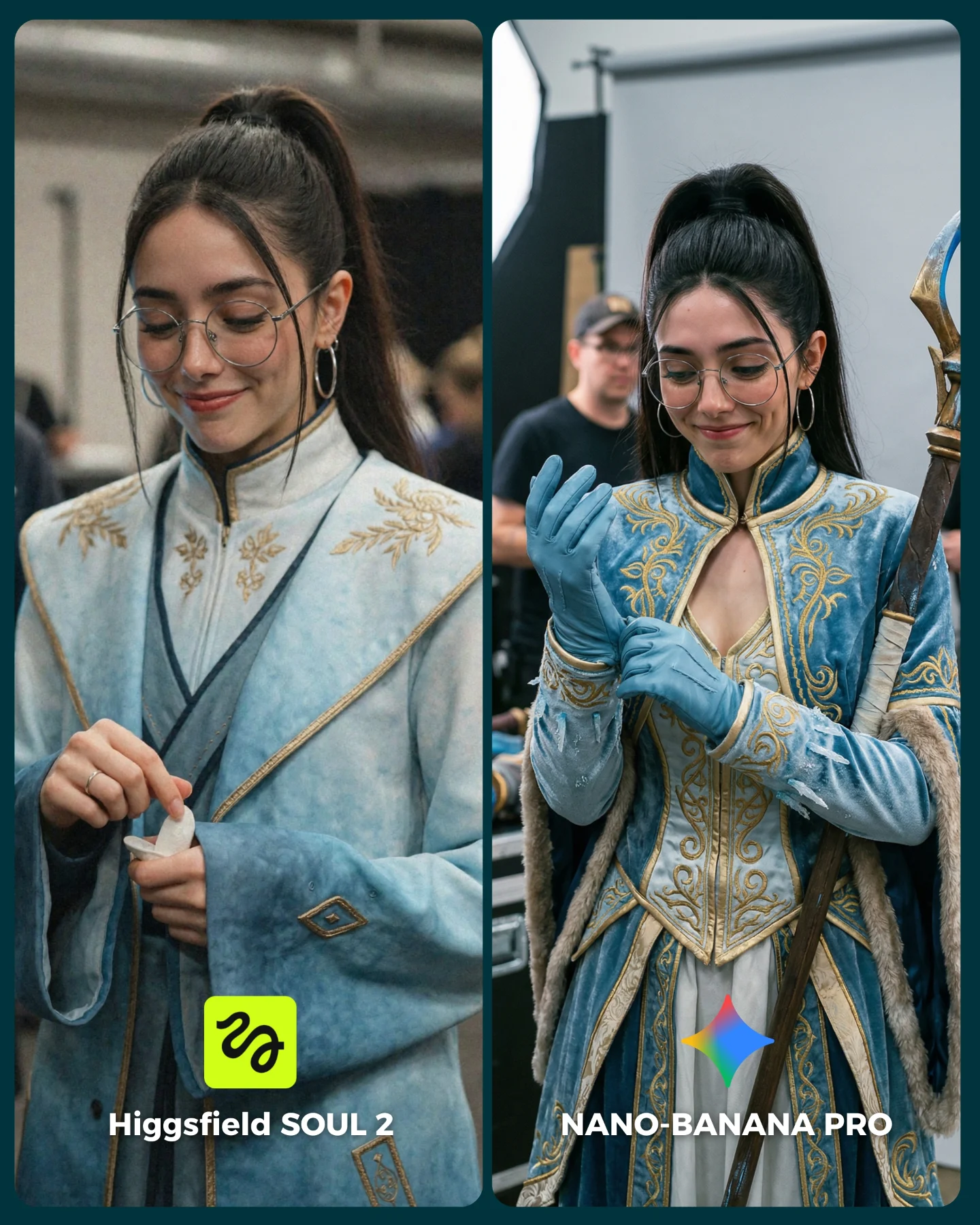
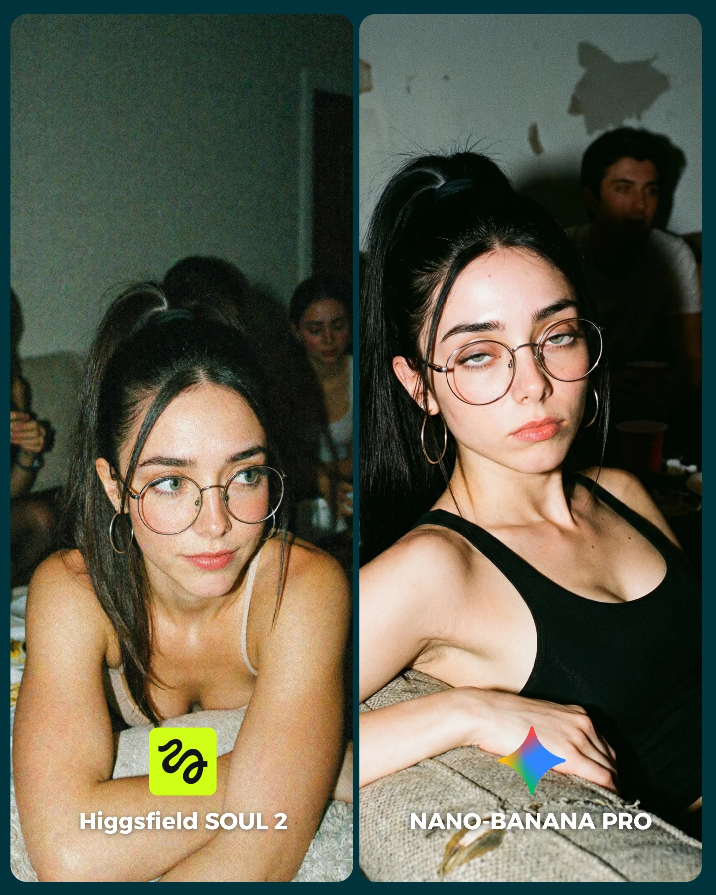
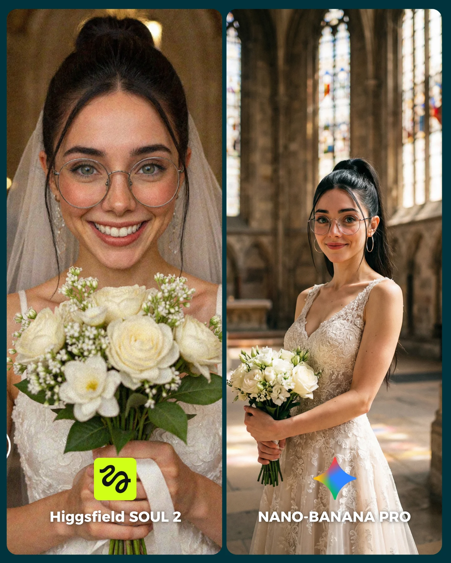
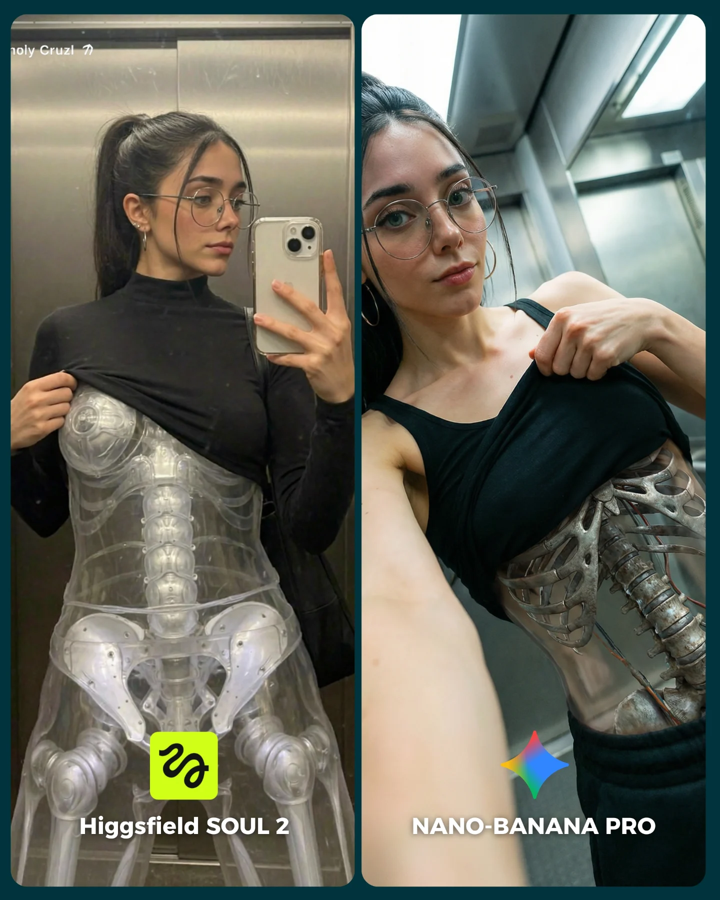
How soy_aria_cruz Compared SOUL 2 vs Nano Banana Pro and What to Recreate
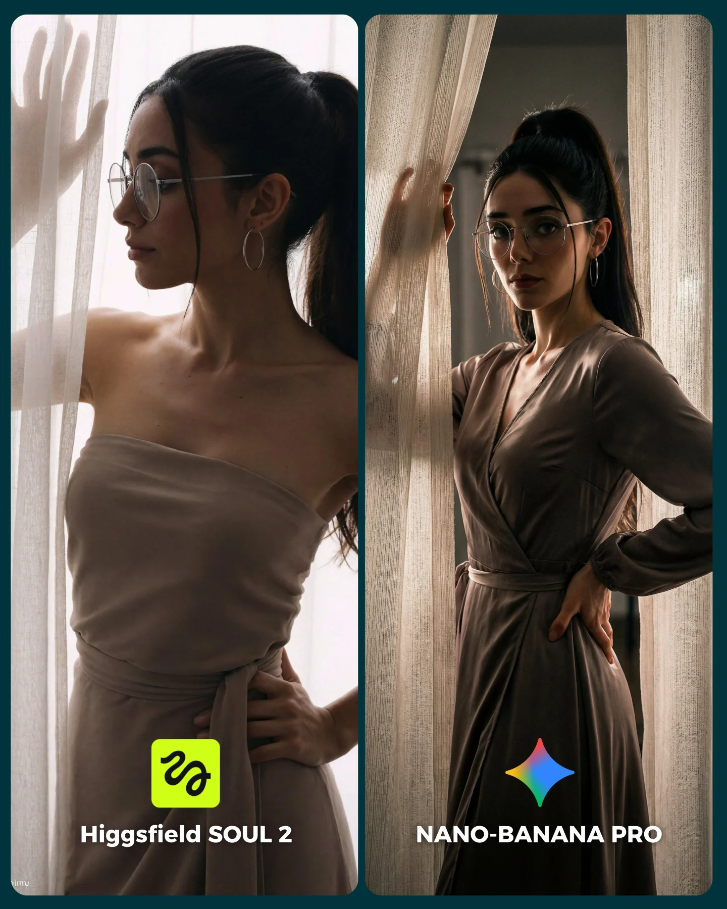
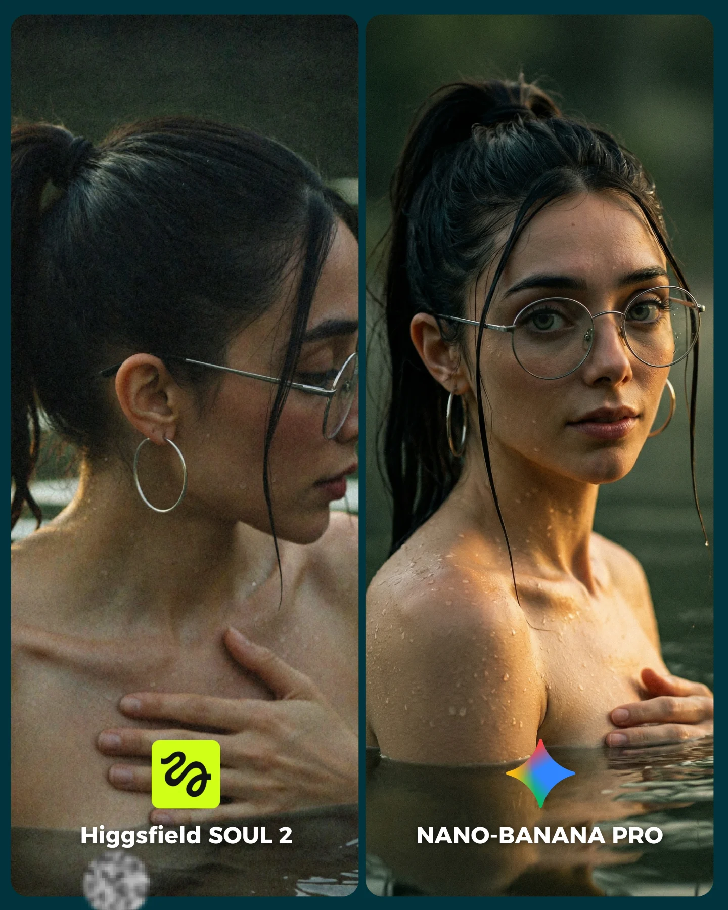
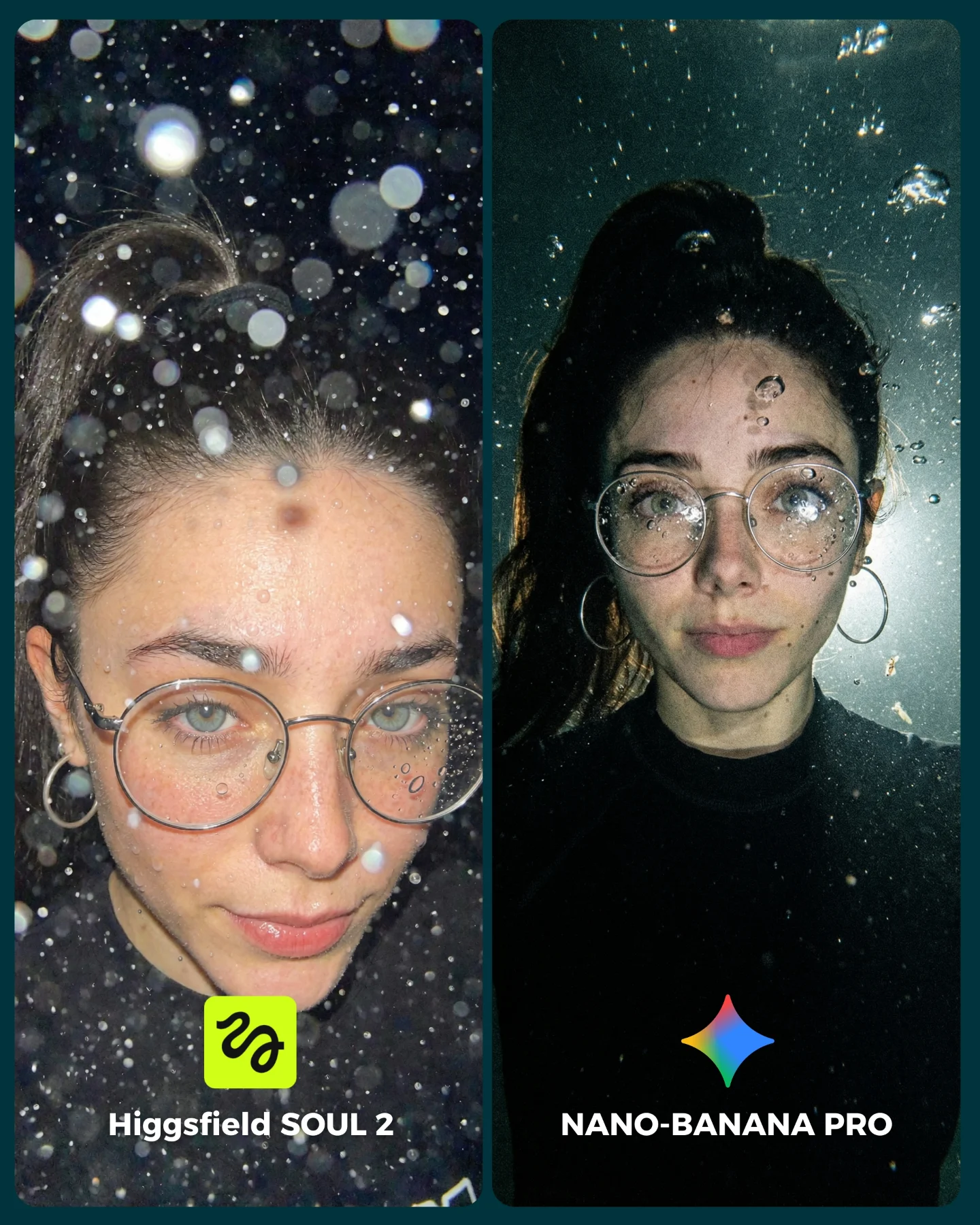
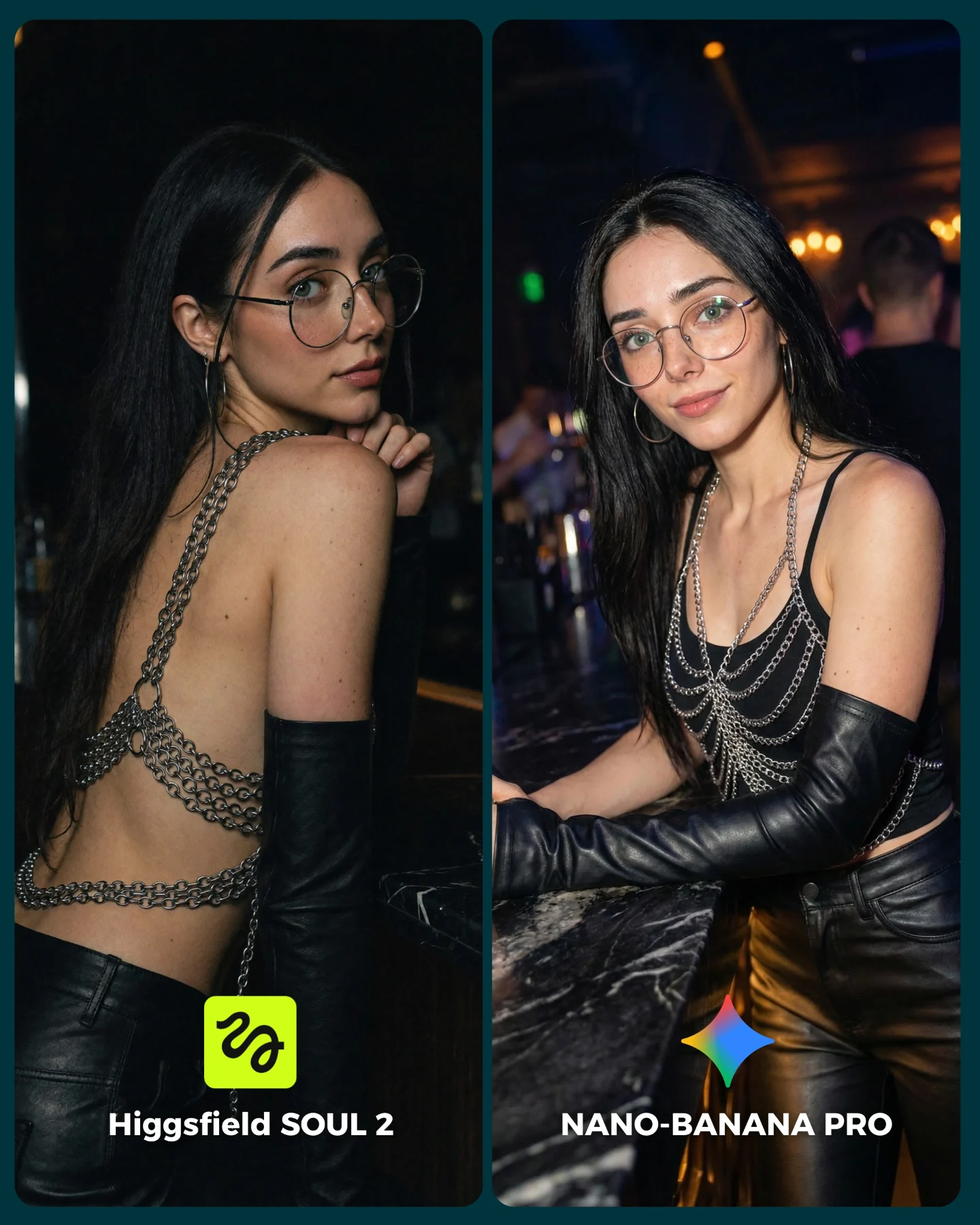
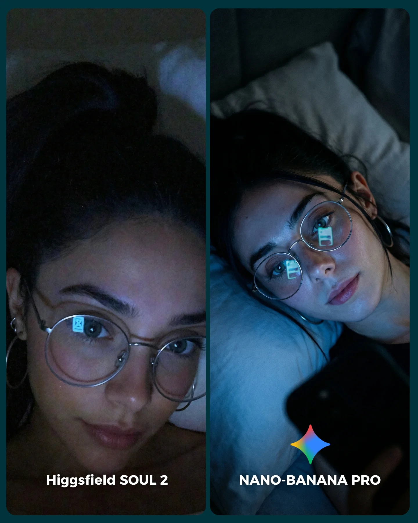
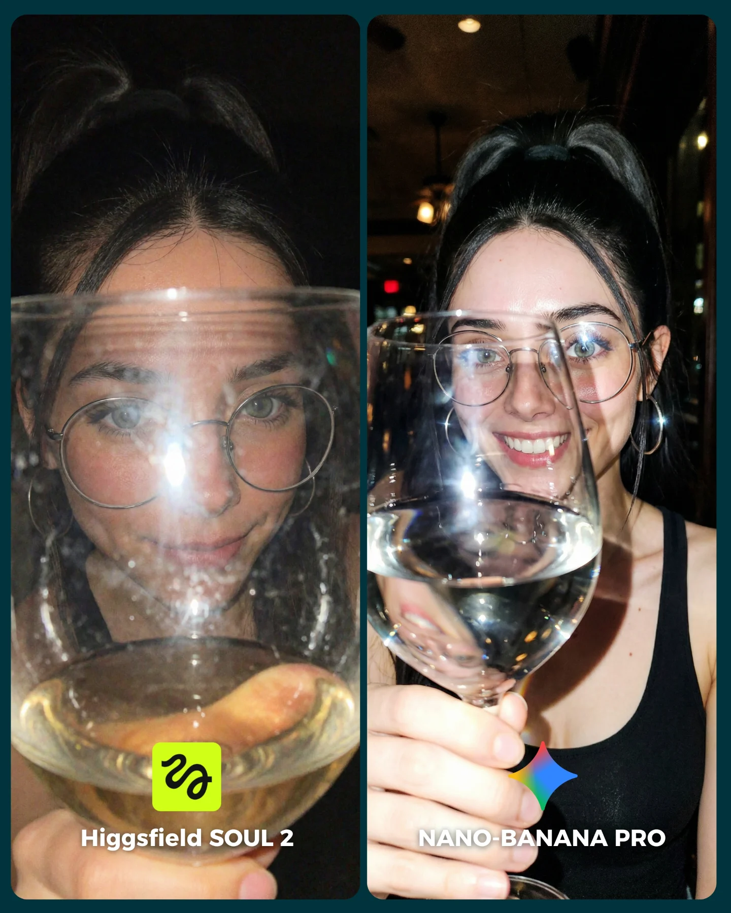
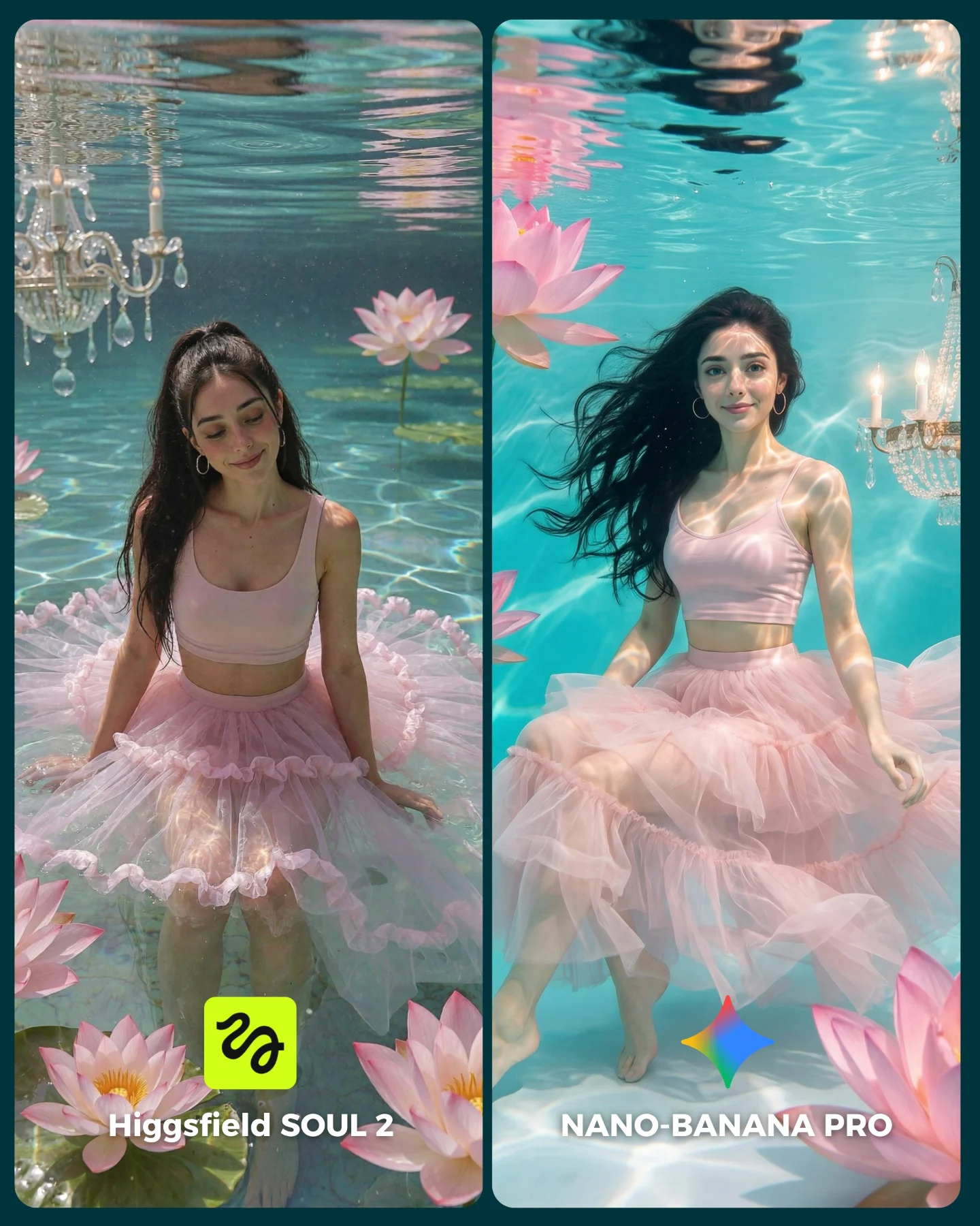
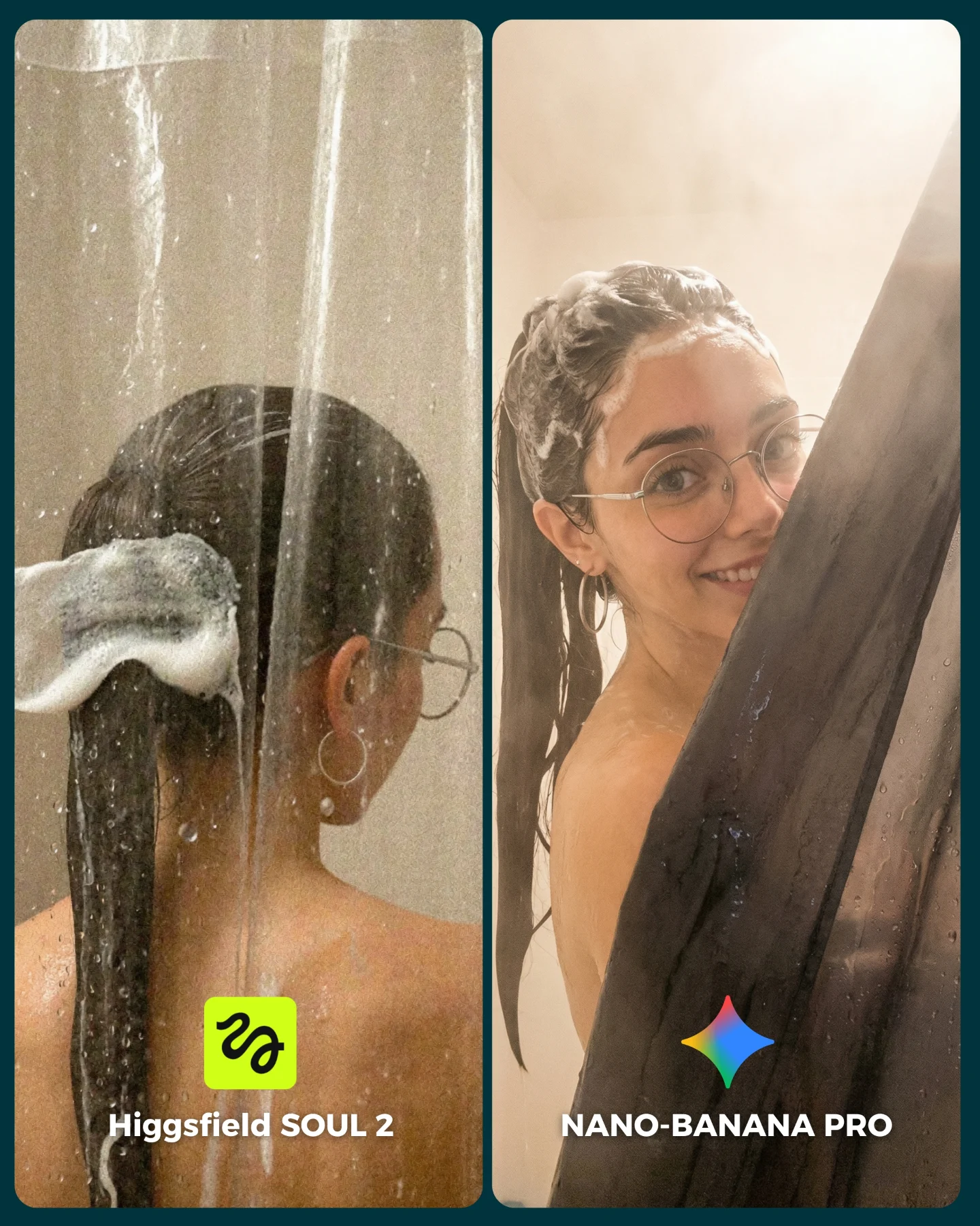
This image succeeds because it compares two models in a scene that looks simple but is actually technically demanding. Soft curtain light, semi-translucent fabric, facial consistency, glasses, body proportions, and elegant garment folds all need to hold together at once. That makes the comparison useful, while the fashion-editorial styling keeps it beautiful enough to stop the scroll.
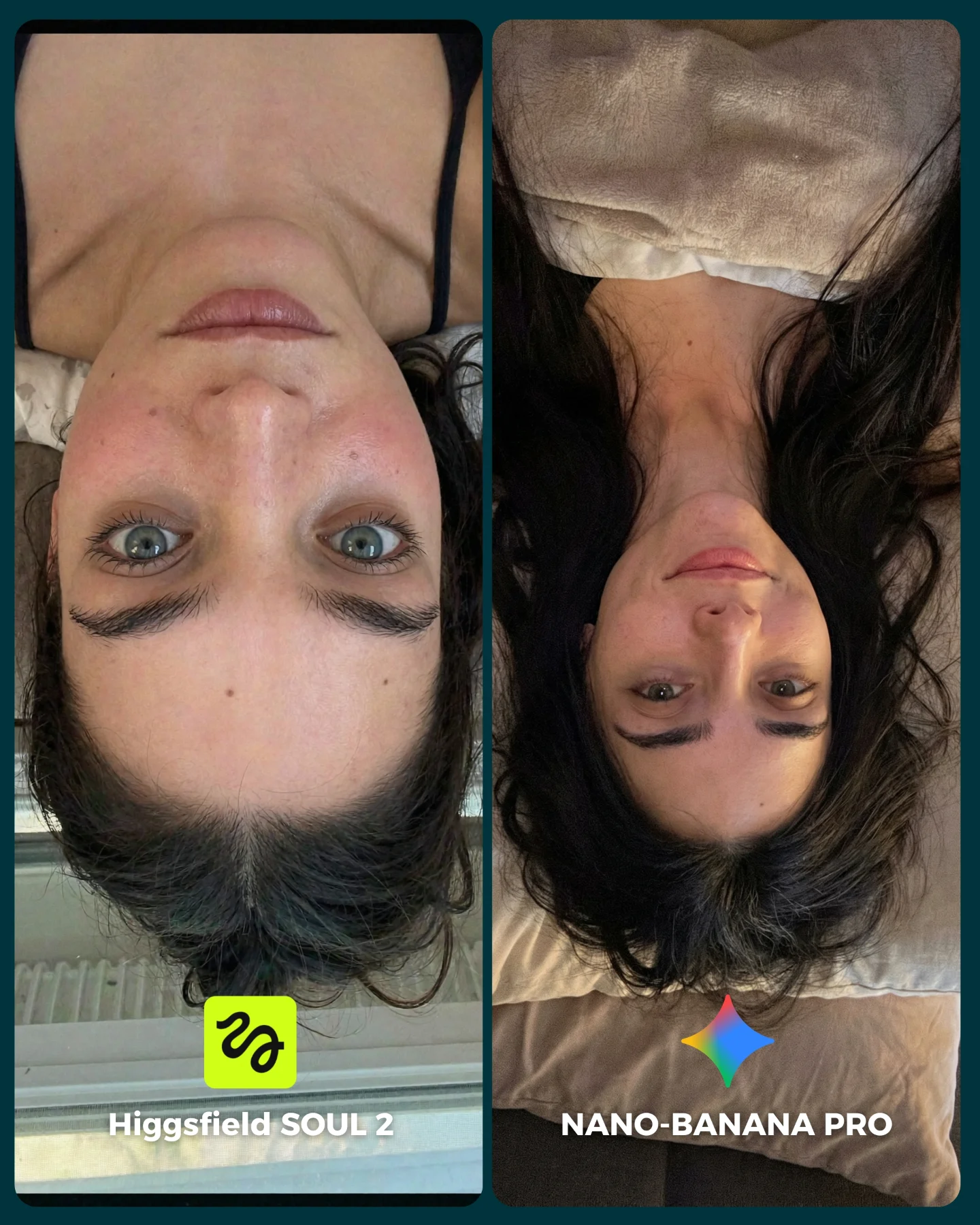
The visual also benefits from emotional clarity. Both panels feel intimate and refined, so the audience is not distracted by concept changes. Instead, viewers focus on execution. Which face feels more convincing? Which fabric falls better? Which pose feels more natural? That kind of close-looking behavior is exactly what a comparison post needs.
Why people will compare these two panels
The split-screen design does the first part of the work by framing the image as a choice. The styling does the second part by giving the audience visible things to judge. Window-light portraits are a smart benchmark because the differences are subtle but meaningful. If one model handles cheekbone shading better, or preserves better hand anatomy, or interprets the dress with more realism, viewers can see it without needing technical explanation.
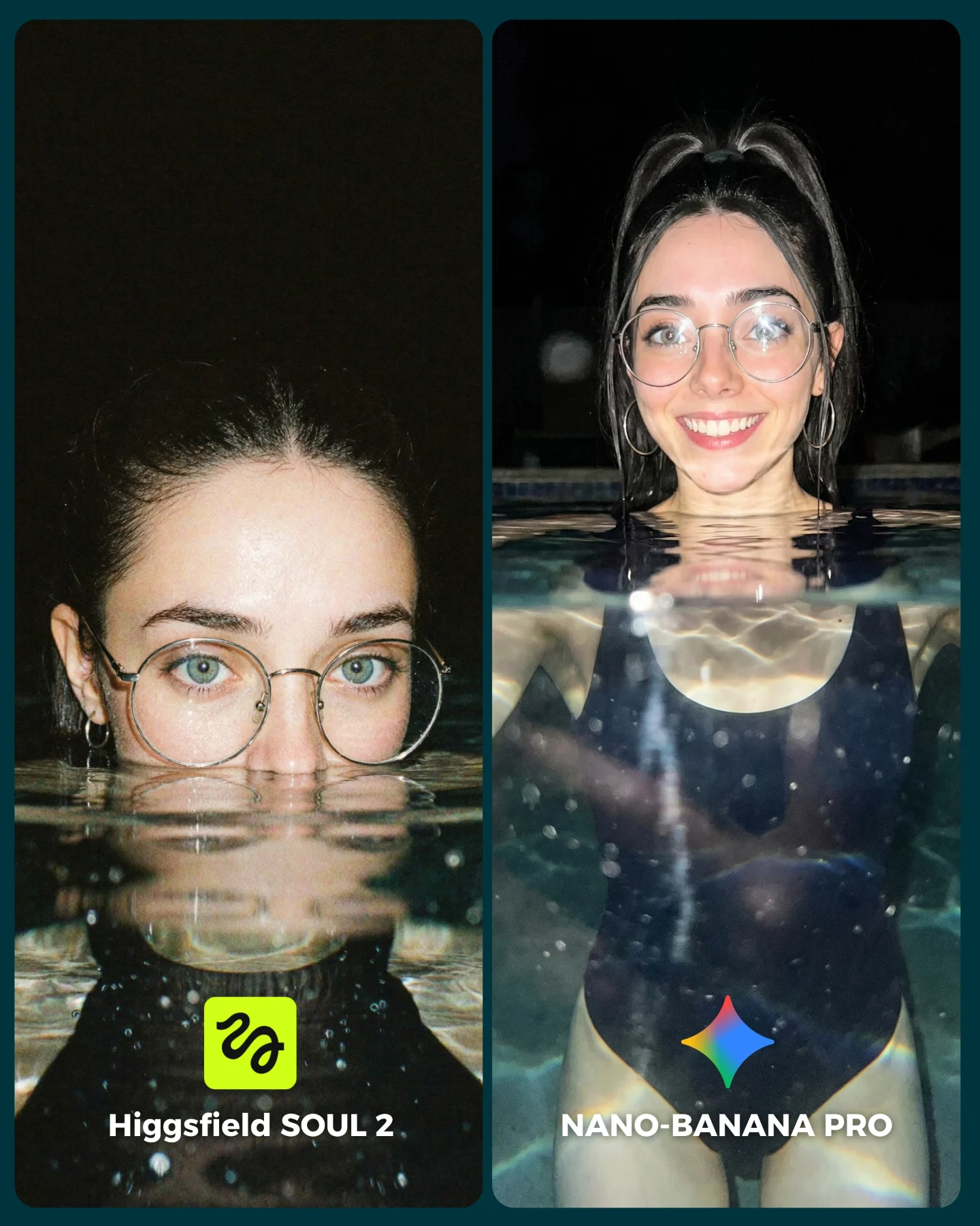
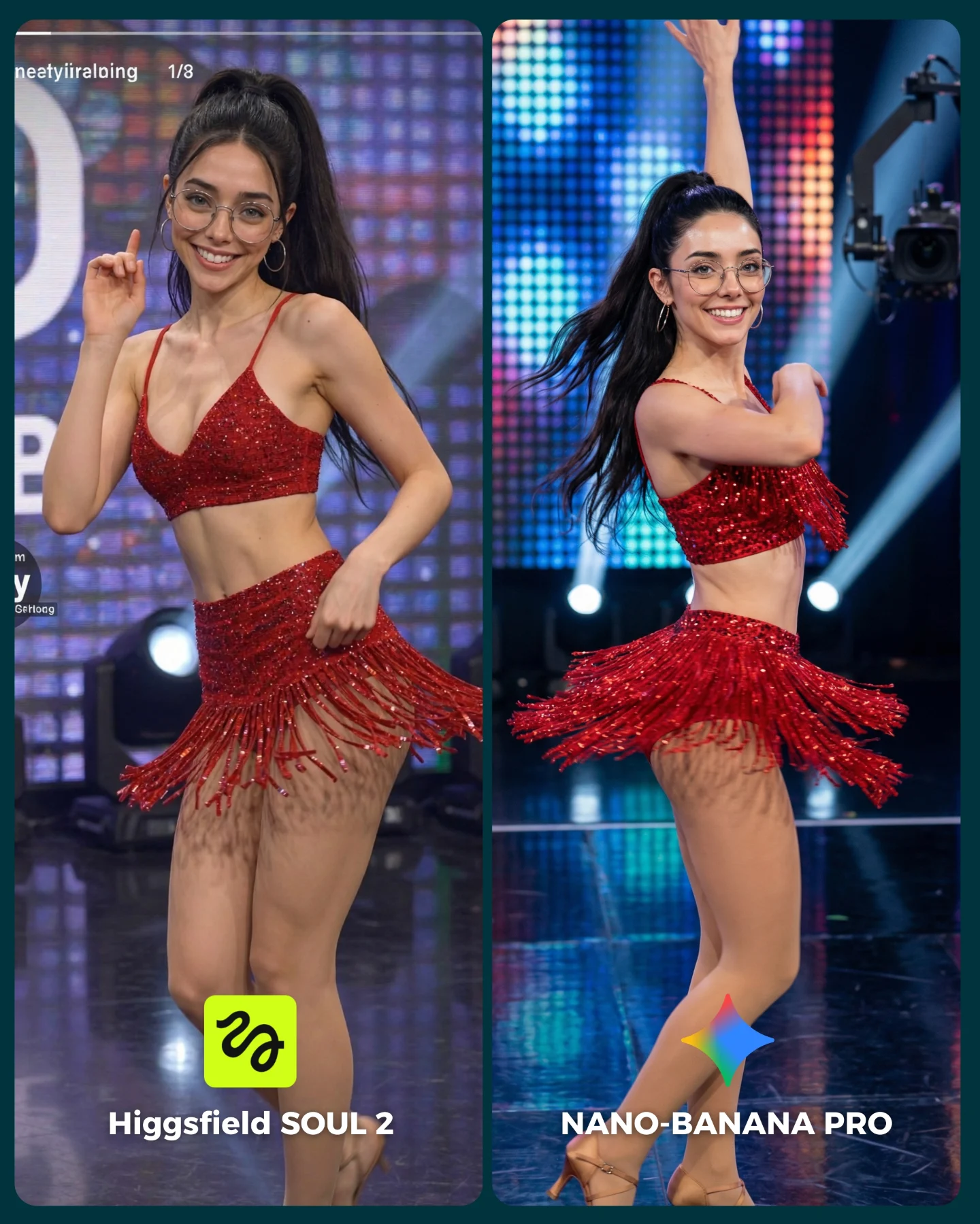
Another strength is that the left and right panels are not identical copies. They share the same woman, palette, and mood, but they show different pose logic. That keeps the board from feeling repetitive while still keeping the test fair. The audience gets to evaluate identity consistency and scene handling at the same time.
| Signal | Evidence (from this image) | Mechanism | Replication Action |
|---|
| Elegant benchmark framing | Two labeled portrait panels with matching styling and soft curtain light | The image feels polished enough to share, not just technical enough to inspect | Choose benchmark scenes that are aesthetically strong on their own |
| Material realism test | Taupe dress folds, sheer curtains, reflective eyeglasses, soft skin light | Viewers can judge subtle model quality through visible surfaces | Use scenes with cloth, translucency, and reflective accessories |
| Stable identity across variation | Same woman appears in both panels with different pose treatment | Lets the audience evaluate consistency rather than unrelated outputs | Hold face, palette, and styling constant while varying pose or framing |
Where this style is strongest
This format is ideal for portrait-model comparisons, fashion prompt tests, and creator content that wants to look premium while still driving opinion. It works especially well when the audience cares about realism, character consistency, and visual taste.
- Model comparison posts: The side-by-side layout encourages comments about which version feels more realistic.
- Fashion prompt education: Soft-window portraits are excellent for teaching how generators handle fabric and pose.
- Luxury aesthetic benchmarks: The scene feels elevated without needing elaborate set design.
- Series content: Repeating this format across different scenarios can build a recognizable testing framework.
It is less suited for chaotic action scenes or high-concept fantasy posts. The value here comes from subtlety. The audience needs room to notice the differences.
Three transfer recipes
- Bridal-light version: Keep the split-screen benchmark structure, then swap the dress for bridal fabric and refine veil translucency. Slot template:
{shared portrait setup} {model A output} {model B output} {clear panel labels} - Editorial trench-coat version: Keep the same soft-window logic, but shift to stronger tailoring and autumn tones. Slot template:
{window-light mood} {stable subject identity} {left/right variation} {comparison branding} - Beauty campaign version: Keep the curtain-light intimacy while replacing the wardrobe focus with makeup and skin rendering tests. Slot template:
{soft portrait brief} {panel A interpretation} {panel B interpretation} {bottom model text}
Aesthetic read: why the comparison still feels premium
The restrained palette is doing important work. Because everything sits inside beige, taupe, cream, and soft brown, the viewer notices texture and structure more clearly. Loud color would compete with the benchmark goal. Here, the scene is quiet enough that realism becomes the main event.
The curtain is also a smart tool. It provides both softness and structure. In the left panel it creates a gentle silhouette and dreamy edge light. In the right panel it frames the body more theatrically. That means a single environmental element is carrying most of the mood while the models reveal how differently they handle it.
| Observed | Why it matters |
|---|
| Soft filtered daylight through sheer curtains | Creates a demanding but flattering realism test |
| Matching neutral palette across both panels | Keeps the comparison focused on execution instead of styling changes |
| Eyeglasses and hoop earrings | Add extra realism checkpoints that often drift in AI portraits |
| Left panel lighter, right panel more sculpted | Gives viewers multiple quality signals to compare |
| Clear bottom labels and icons | Turns the image into an immediate A/B decision card |
Prompt technique breakdown
To recreate this kind of post, you need to control three layers separately: the shared portrait identity, the soft curtain-light environment, and the split-screen benchmark packaging. If any one of those layers is vague, the whole image feels less authoritative.
| Prompt chunk | What it controls | Swap ideas (EN, 2-3 options) |
|---|
| two-panel portrait comparison layout | The comment-friendly A/B structure | v1 vs pro benchmark; generator A vs generator B; style comparison board |
| same woman in a taupe fashion portrait | Identity continuity across both outputs | same woman in bridal look; same woman in trench coat; same woman in eveningwear |
| sheer curtains and diffused daylight | The realism test and mood foundation | frosted window light; thin linen curtains; skylight glow |
| left softer side pose, right stronger three-quarter pose | Variation without breaking the fairness of the comparison | close-up vs waist-up; introspective pose vs direct pose; profile vs frontal turn |
| bottom labels with model names and icons | Immediate clarity for the viewer | simple text labels; colored badges; branded footer strips |
How to iterate this type of image
Baseline lock the split-screen layout, the shared identity, and the curtain-light mood first. Then iterate one layer at a time. First fix the face and body continuity, second refine the dress folds and hand positions, third tune the curtain translucency and skin lighting, and fourth polish label placement and icon visibility.
The broader lesson is that a benchmark image performs better when it is beautiful enough to save even if the viewer does not care deeply about the underlying tools. This one does that by making technical evaluation feel elegant.