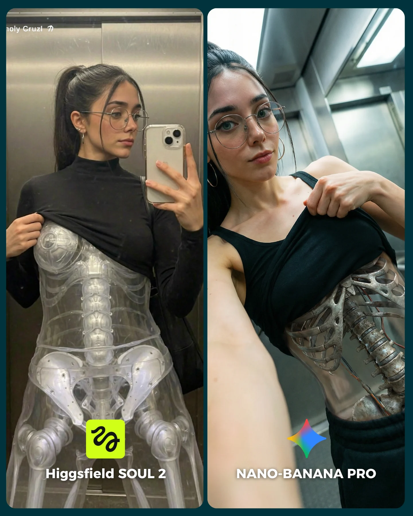
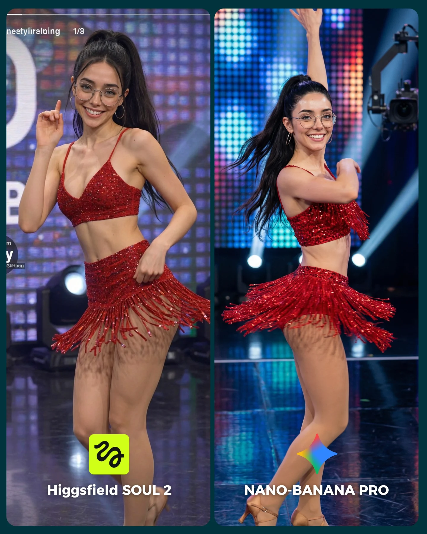
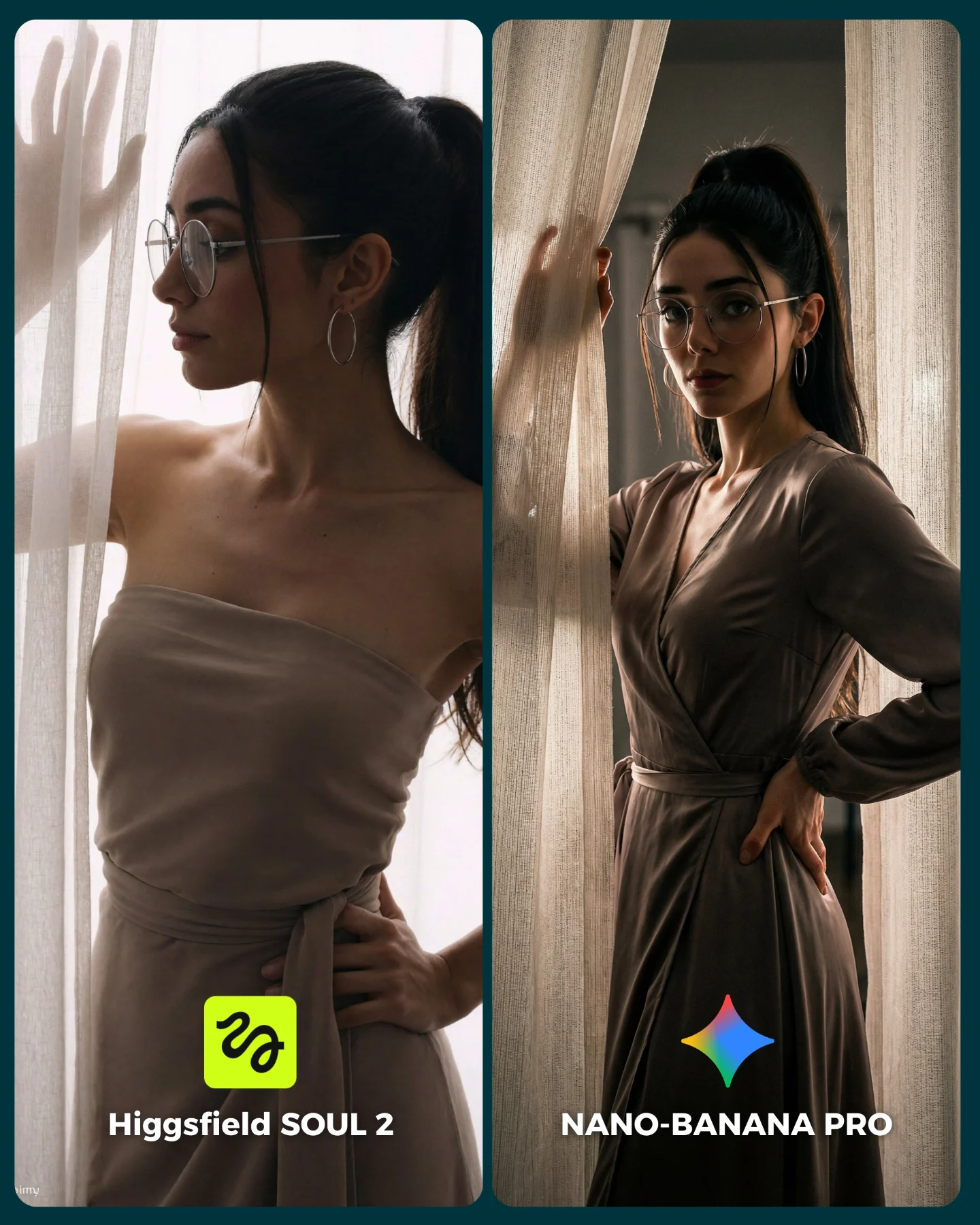
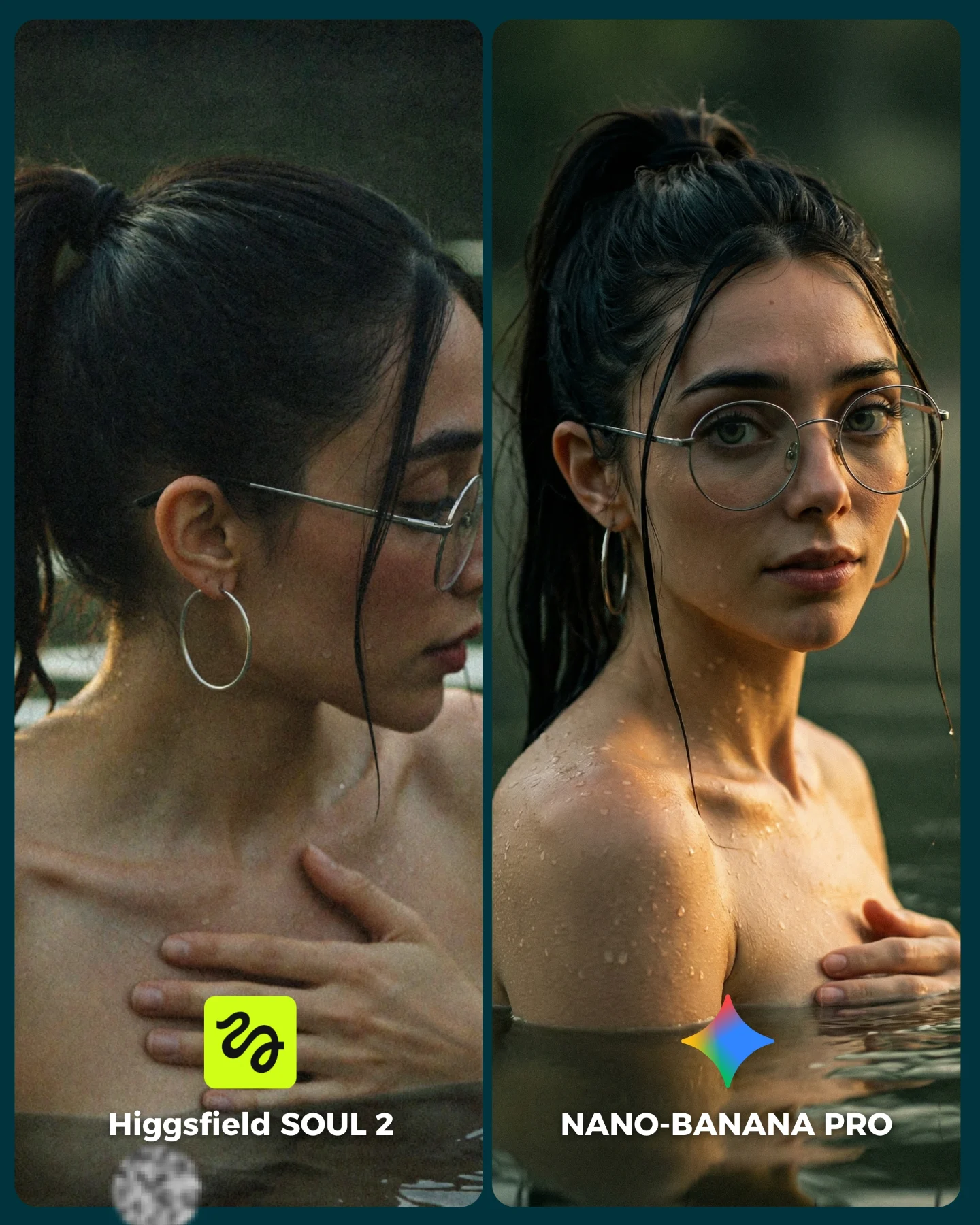
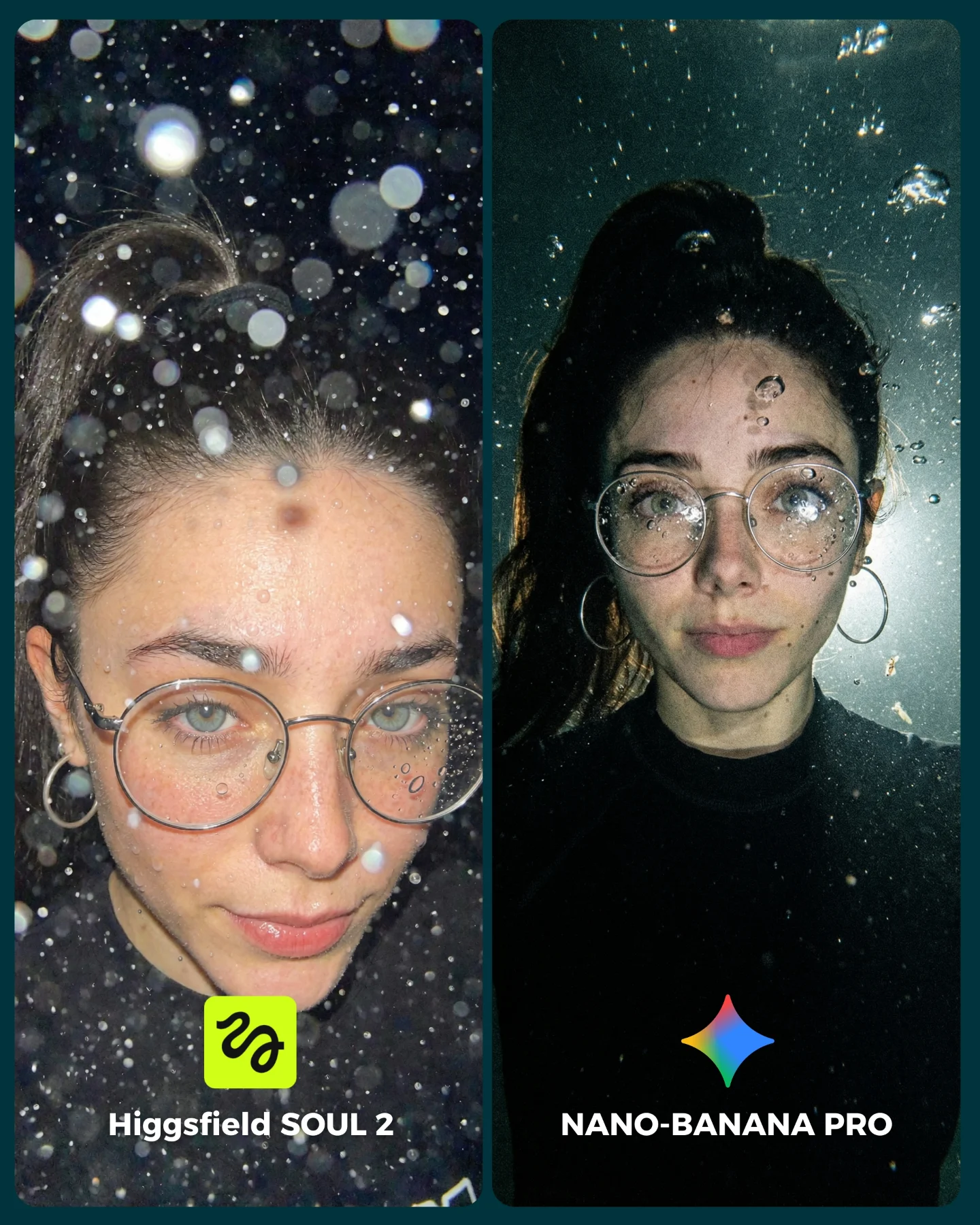
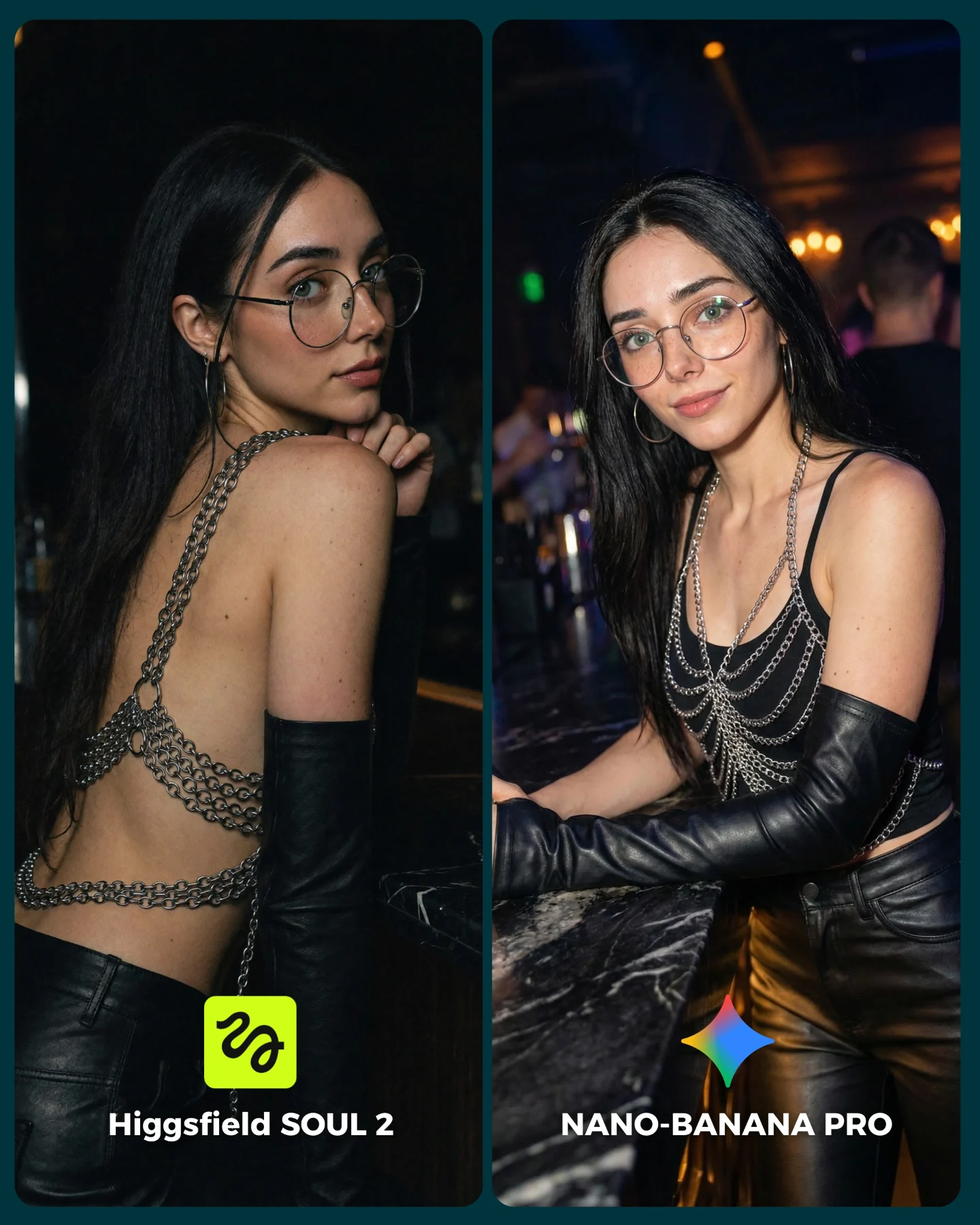
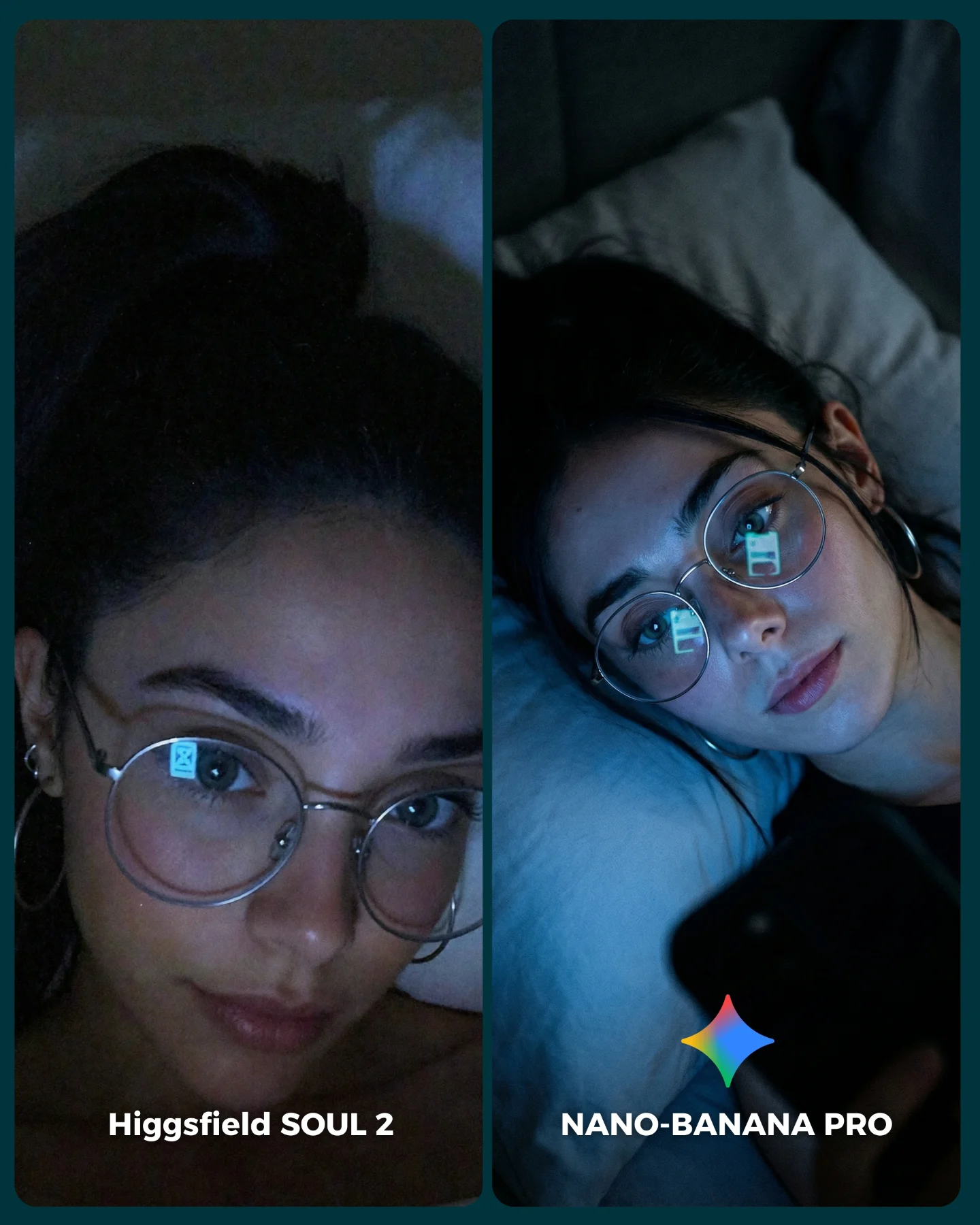
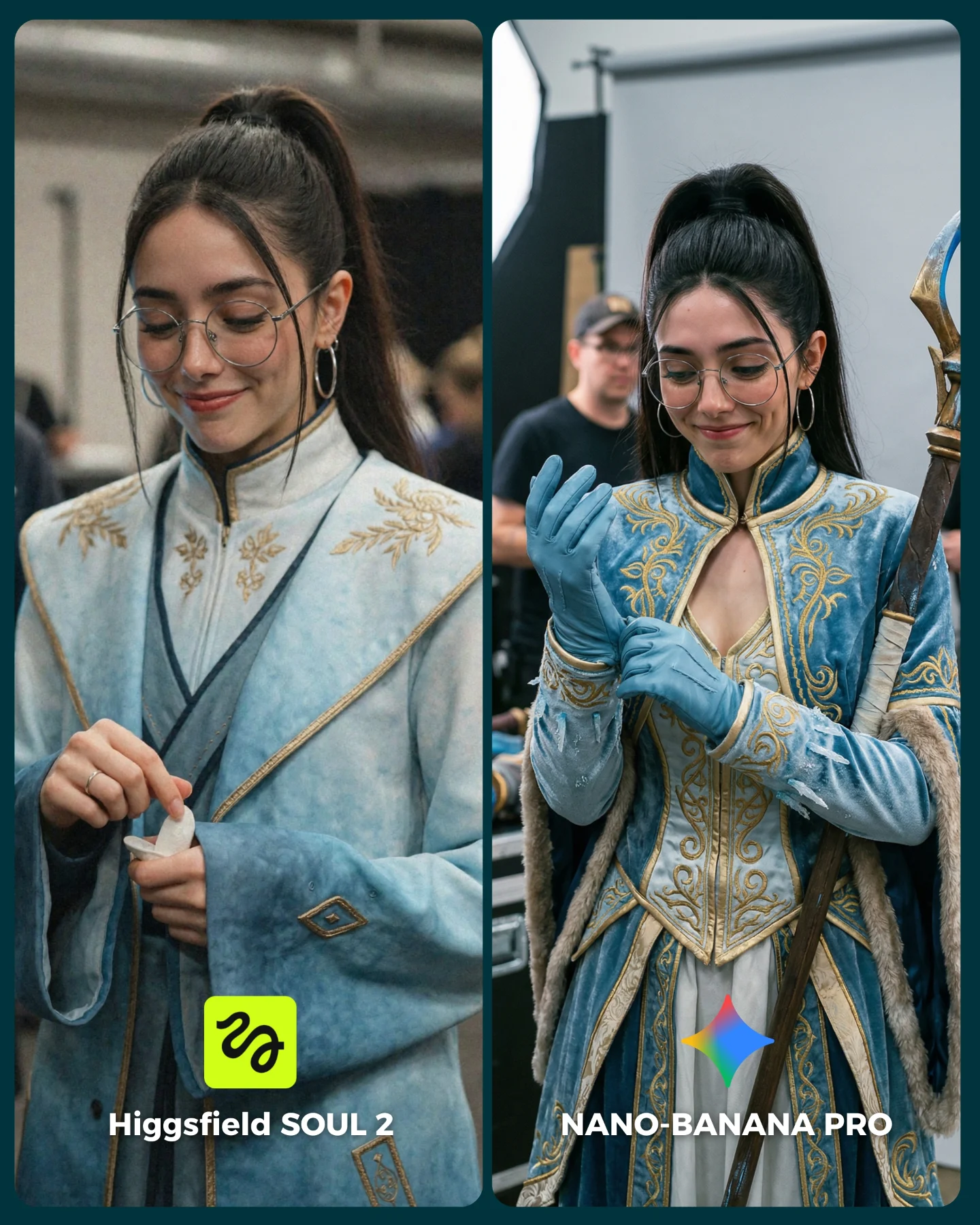
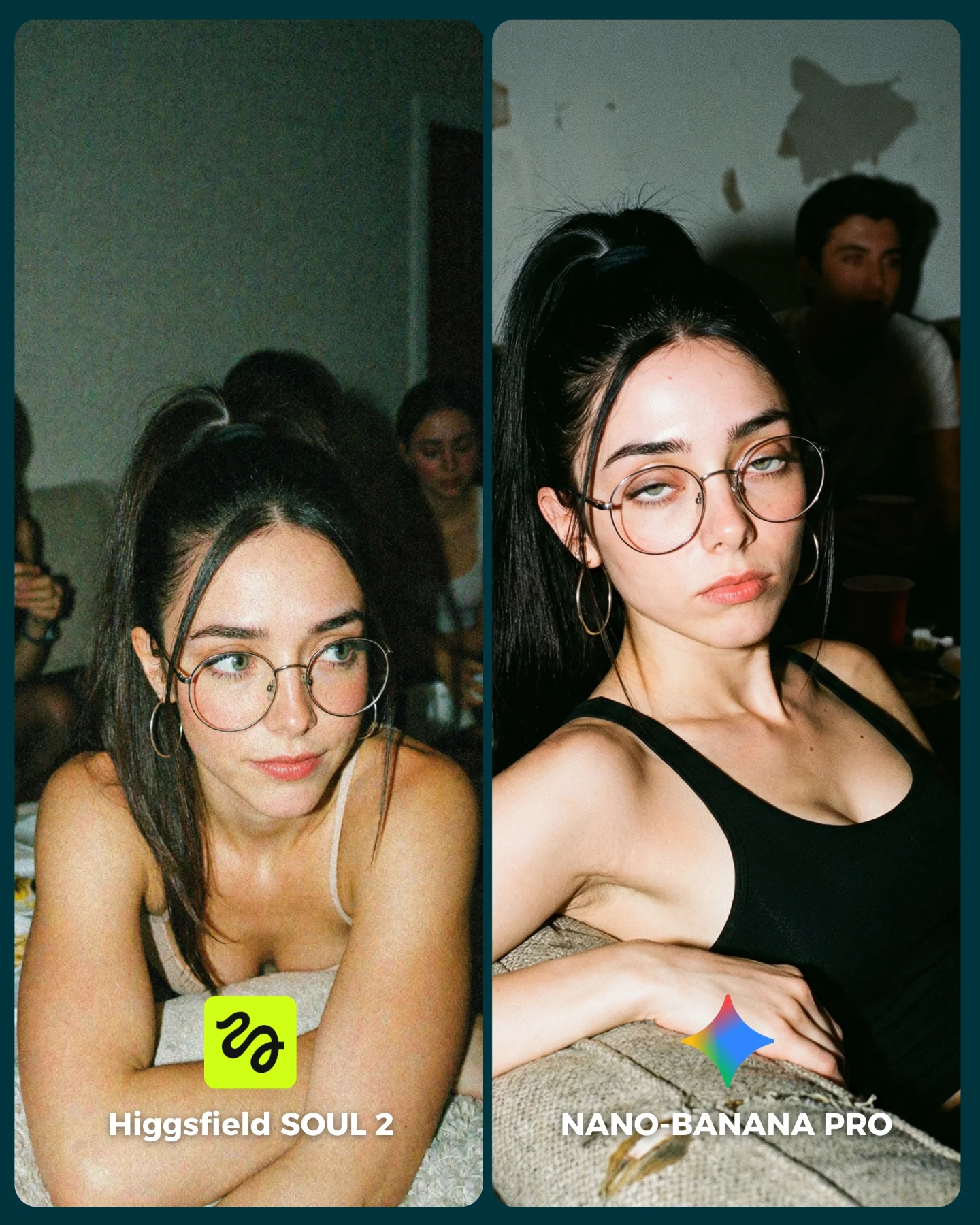
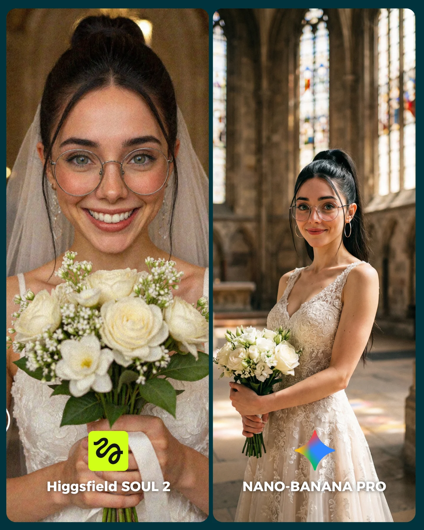
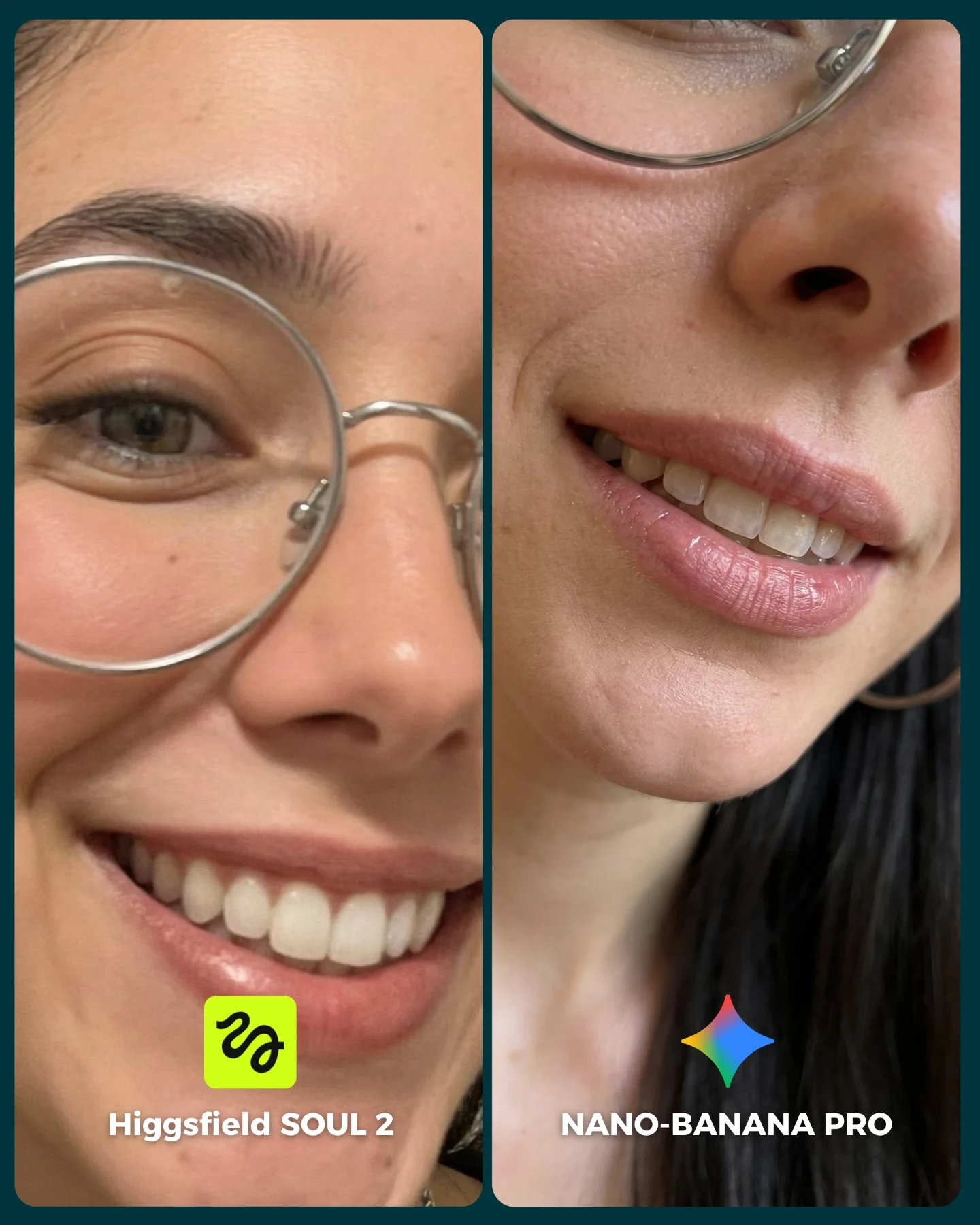
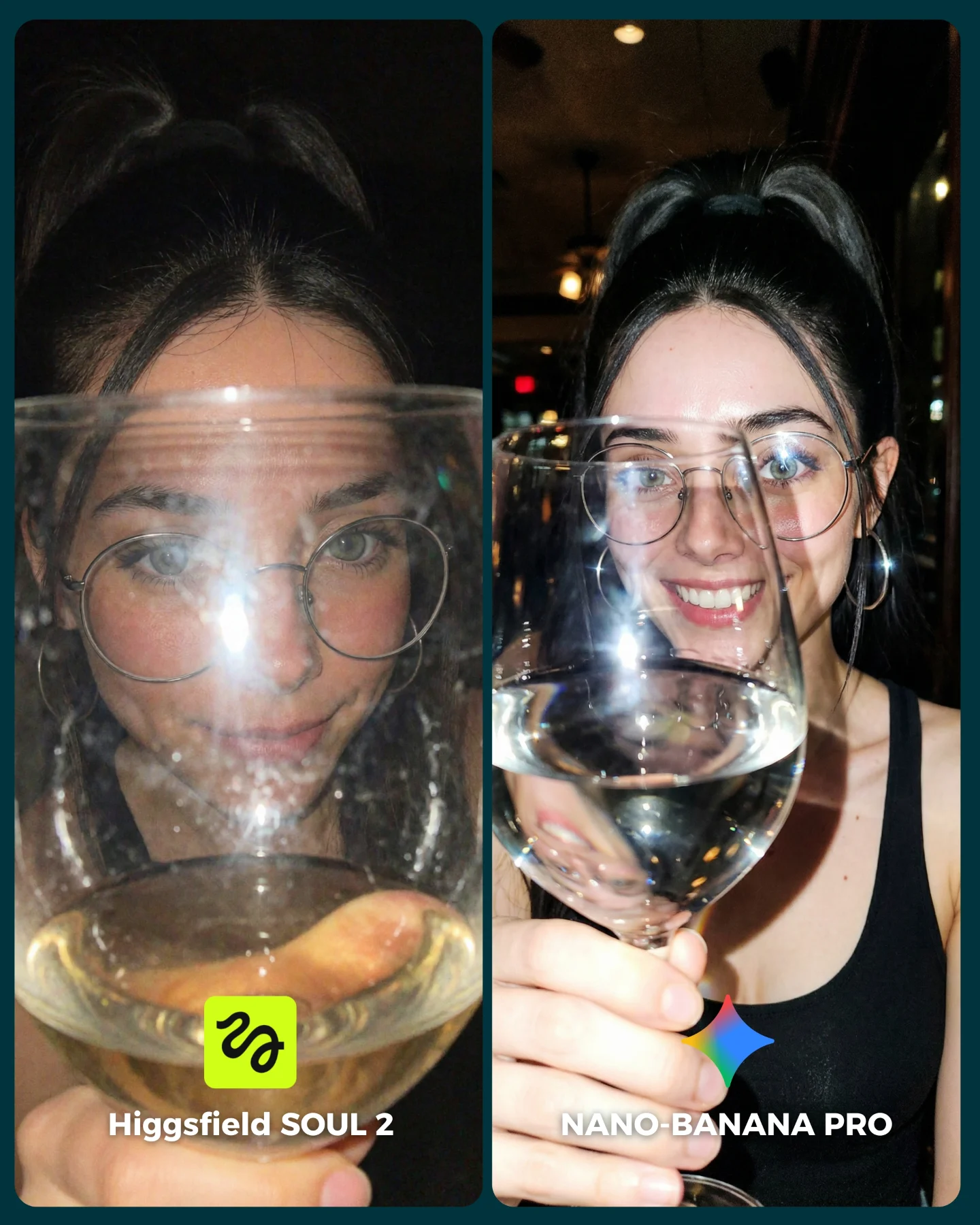
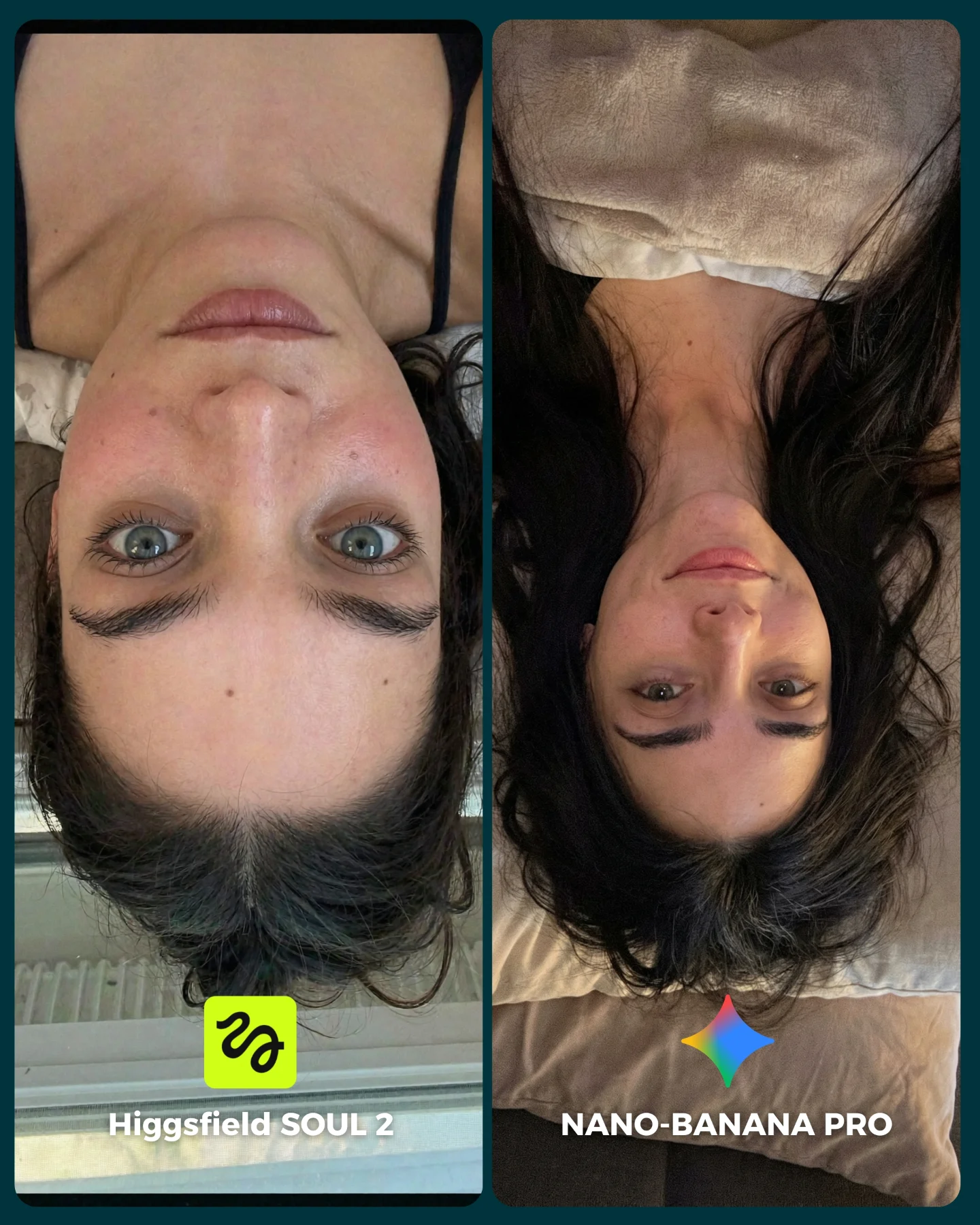
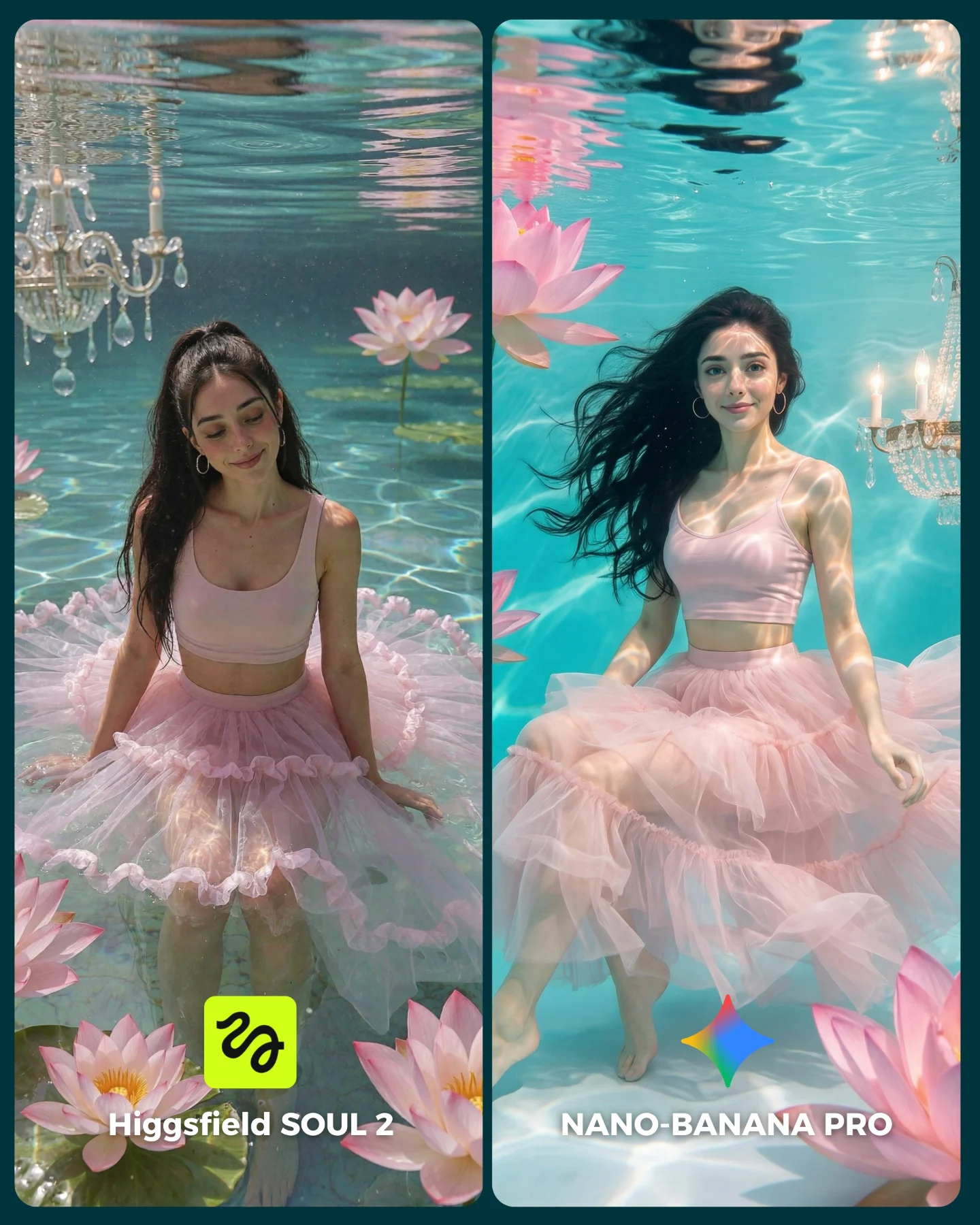
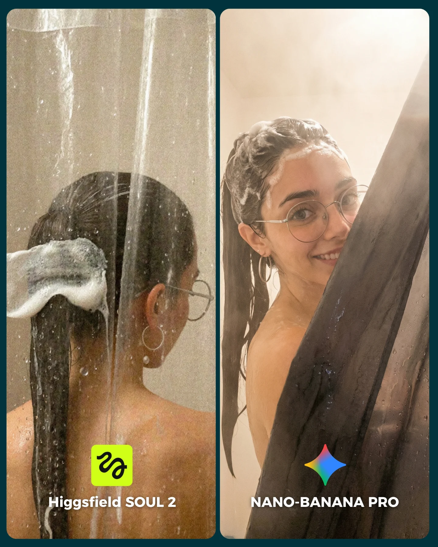
SOUL 2 Vs. Nano Banana Pro 💥
Higgsfield ha lanzado su nuevo generador de imágenes SOUL 2 ⚡ Puedes subirle hasta 80 imágenes de referencia de tu personaje para mantener mejor la constancia 👀
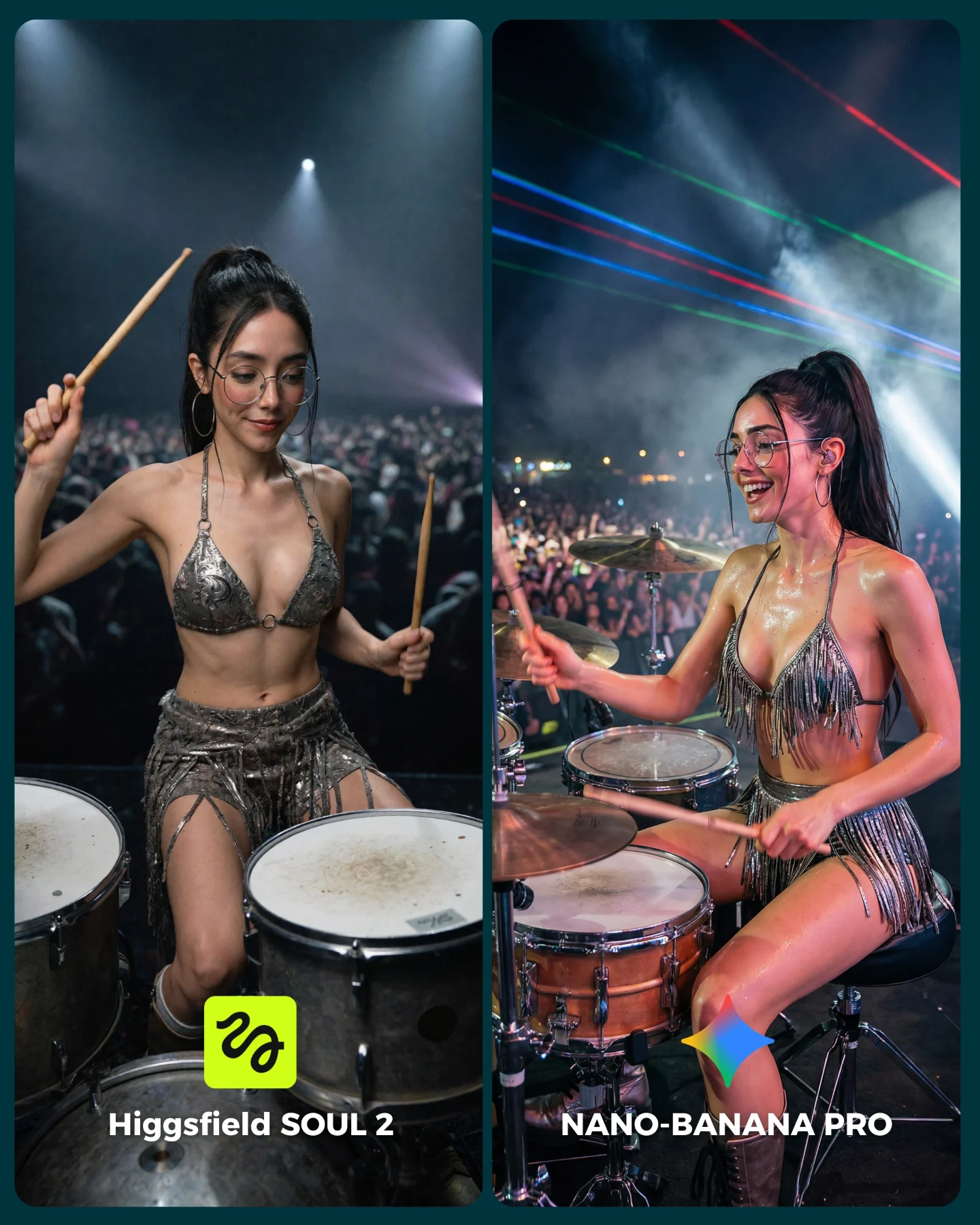
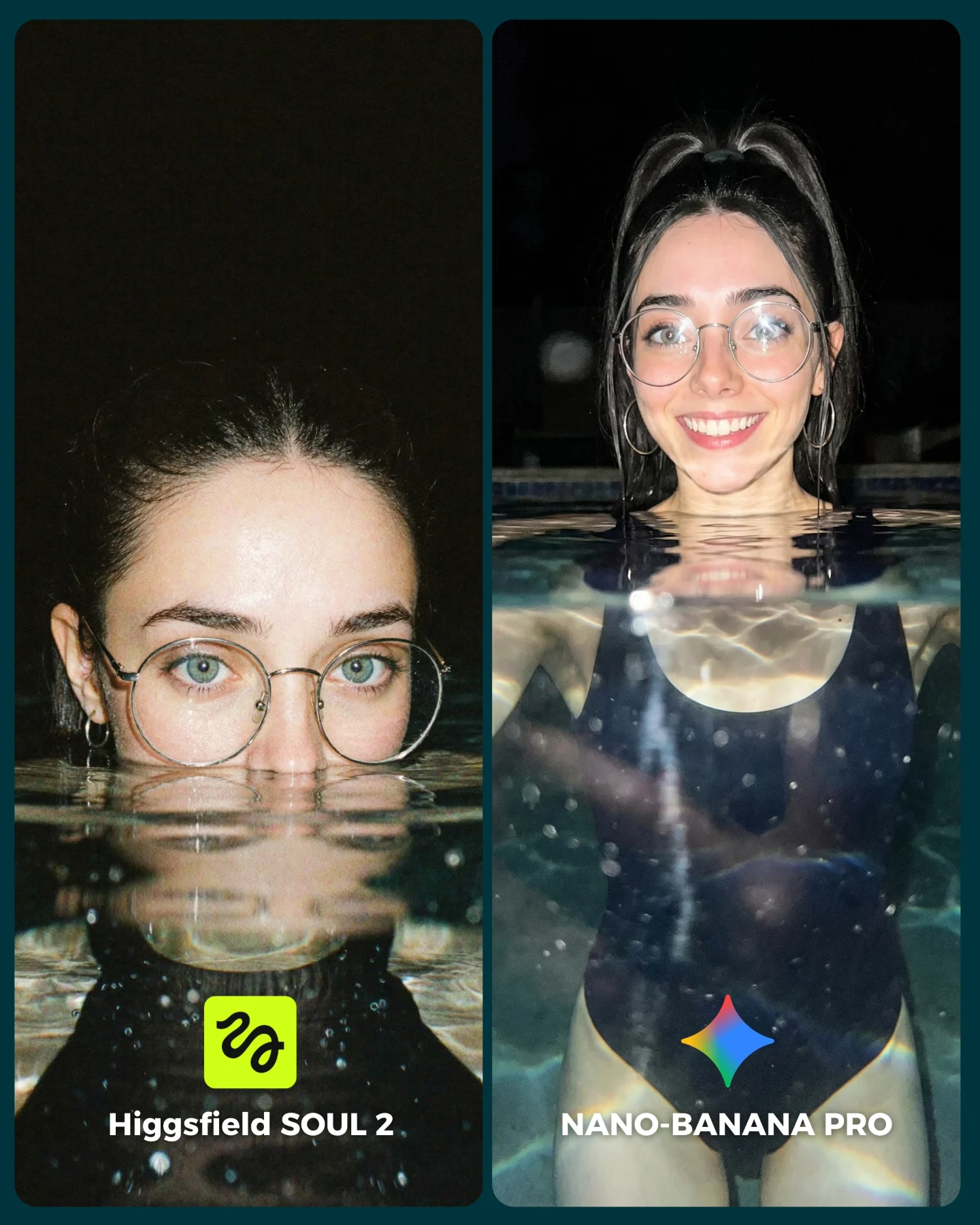
Y para compararlo bien, lo he puesto a prueba junto a Nano Banana Pro que hasta el momento es mi generador de imágenes favorito 💕
La verdad es que hay algunos resultados de SOUL 2 que me han sorprendido bastante... No está nada mal, pero sigo prefiriendo Nano Banana para la mayoría de las ocasiones 😅
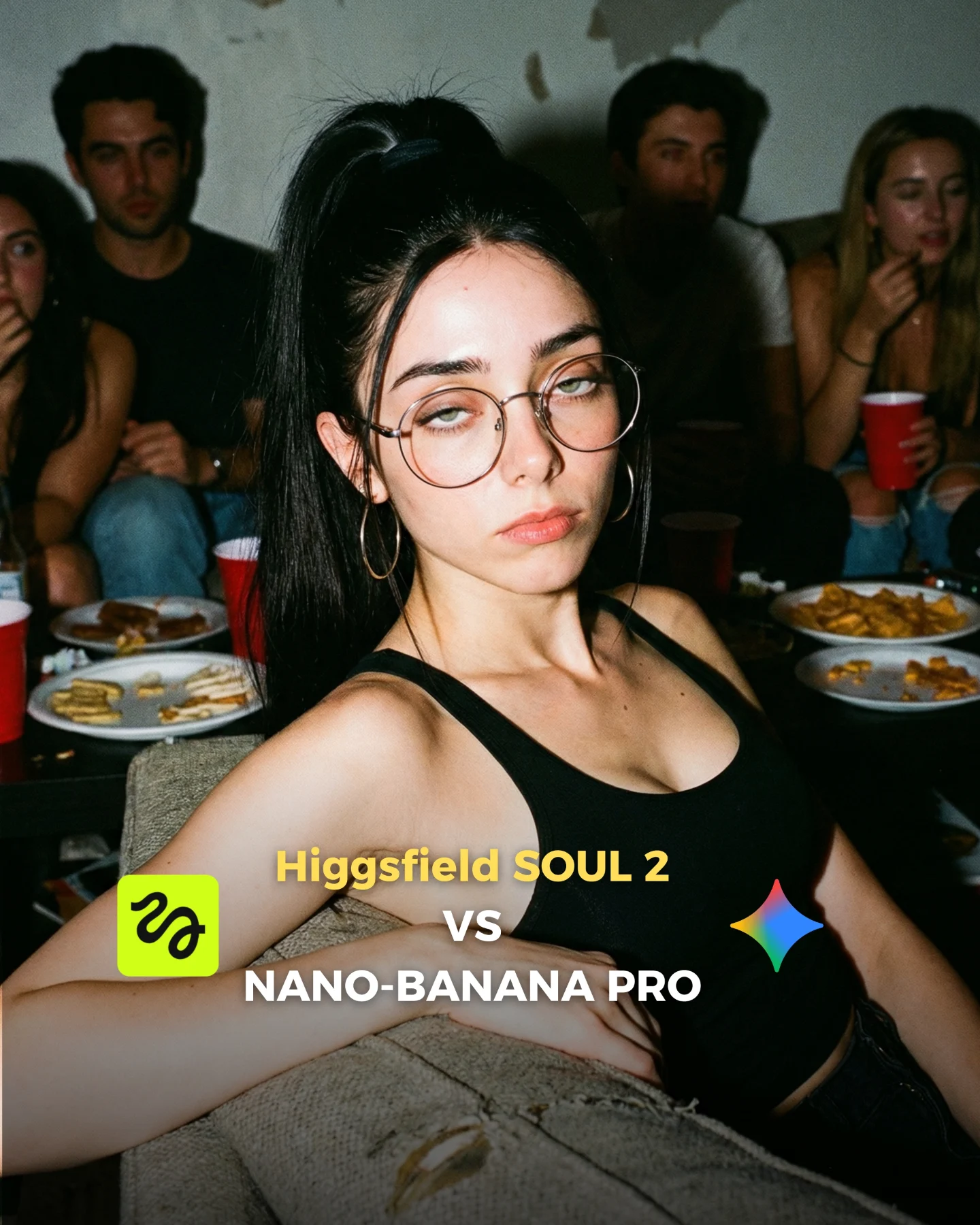
Os dejo algunas imágenes que he generado y espero leer vuestras opiniones en comentarios 💌 Y si quieres los prompts de todas las imágenes comenta "ARIA" y te los mando por mensaje!
How soy_aria_cruz Made This SOUL 2 vs Nano Banana Cyborg AI Art — and How to Recreate It
The image lands because it takes a difficult visual problem and wraps it in an extremely familiar format. Everyone understands an elevator selfie in half a second. That familiarity lowers the barrier to entry. Then the frame introduces the real twist: a believable chrome biomechanical torso hidden under an ordinary black top. The result is a scroll-stopper that feels both intimate and technically ambitious.
What makes the comparison strong is not just the cyborg idea. It is the decision to keep the test grounded in phone-camera behavior. The stainless-steel walls, the overhead lighting, the slight distortion on the right panel, the casual hand pulling up the shirt, and the visible glasses all push the image toward something viewers can imagine actually being posted. That realism matters more than flashy lore. Small creators can borrow the same logic: put the impossible inside a format the audience already trusts.
There is also a built-in curiosity ladder. First, you notice the exposed robotic anatomy. Next, you compare whether the metal structure feels integrated or pasted on. Then you start judging skin, reflections, body proportions, and angle handling between both panels. That layered inspection loop is exactly what drives comments on comparison posts.
Why It Pulls Attention
Signal
Evidence (from this image)
Mechanism
Replication Action
Impossible detail in a casual setting
A chrome exoskeleton torso appears inside a normal elevator selfie rather than a sci-fi battlefield.
The audience gets surprise without needing backstory, so the image reads fast and stays memorable.
Stage one futuristic element inside an everyday capture format like a mirror selfie, dressing-room shot, or phone video frame.
Authentic phone-camera language
The right panel has arm-length distortion and the left panel clearly reads as a mirror shot.
Viewers trust images more when the camera behavior matches real social posting habits.
Prompt for smartphone perspective, visible arm extension, or mirror framing instead of default cinematic camera setups.
Texture stress test
The post asks the viewer to compare polished chrome, black fabric tension, and natural skin in the same frame.
Mixed material challenges create an obvious benchmark for model quality.
Combine one reflective material, one soft fabric, and exposed skin in the same composition to force meaningful quality differences.
Clean visual hierarchy
The mechanical torso is centered, the background is plain metal, and the outfit remains simple.
Nothing distracts from the claim the post is making, so comparison feels effortless.
Reduce props and background clutter when the goal is to showcase one technical reveal.
Aesthetic Read: Why The Image Feels Sharp Instead Of Messy
The strongest choice here is the use of metallic restraint. Chrome is already loud, so the rest of the frame deliberately stays quiet. Black clothing, gray walls, pale skin tones, and neutral lighting stop the concept from drifting into noisy cyberpunk parody. This is why the cyborg reveal feels premium rather than gimmicky. The image does not need extra neon, smoke, or futuristic props to sell the idea.
The other key choice is body framing. Both panels keep the face present and readable, which protects emotional connection. If the portrait were cropped lower, it would become a prop shot. If it were wider, the elevator environment would start competing with the torso detail. By keeping the subject dominant and the background functional, the image makes the metallic anatomy feel like a fashion statement instead of a VFX demo.
Observed
Why it matters for recreation
Neutral-white overhead elevator light
Lets metal reflections look believable without dramatic color contamination.
Black top against silver torso
Creates strong edge separation and keeps the reveal instantly legible.
Minimal background with brushed steel panels
Supports the phone-selfie premise while staying visually quiet.
Face remains large and centered enough to read expression
Preserves creator identity and makes the image feel social, not purely conceptual.
One high-impact reveal with almost no extra props
Concentrates attention on the exact quality benchmark being tested.
Where This Style Transfers Well
AI model comparison posts: Ideal when you want to compare anatomy handling, material realism, or consistency across two generators. Keep the reveal identical and only vary one model.
Character consistency marketing: Strong for showing how a creator avatar can hold identity while wearing new biomechanical variations.
Future-fashion concepts: Useful for creators mixing editorial styling with machine aesthetics. Swap the torso design before changing the camera logic.
High-retention carousel openers: This kind of close comparison works well as slide one because it invites zooming and side-by-side debate.
Not ideal
Product-led ecommerce shots: The body reveal dominates too much if the real goal is to highlight a purchasable item.
Large group scenes: The effect depends on one clearly readable subject and breaks down when the frame gets crowded.
Soft romantic aesthetics: The chrome anatomy introduces a harder emotional register than dreamy or delicate niches usually want.
Three transfer recipes
Luxury biotech mirror shot. Keep: elevator realism, black-vs-silver contrast, phone selfie language. Change: chrome torso to translucent glass organs, top to blazer, location to hotel lift. Slot template: {mirror selfie setting} {wardrobe layer} {internal material reveal} {clean luxury mood}
Streetwear android teaser. Keep: one-hand clothing reveal, face-forward identity, minimal palette. Change: elevator to subway platform, chrome torso to carbon-fiber chest, lighting to cool fluorescent station light. Slot template: {urban location} {streetwear top} {cyborg torso material} {phone-camera realism}
Beauty-tech campaign test. Keep: close framing, glasses or face anchor, industrial simplicity. Change: exposed torso to luminous skeletal corset, black top to white tank, environment to clinical studio corridor. Slot template: {clean interior} {simple garment} {futuristic body insert} {precise neutral lighting}
Prompt Technique Breakdown
Prompt chunk
What it controls
Swap ideas (EN, 2-3 options)
young woman with high ponytail, round glasses, hoop earrings
Locks recognizability and keeps the portrait grounded in creator identity.
Prevents the output from drifting into overproduced sci-fi poster territory.
front camera feel; mirror shot only; handheld iPhone portrait look
Remix Steps That Keep The Image Usable
This style collapses when creators change too many dimensions at once. Do not redesign the character, the metal material, the environment, and the camera angle in a single run. The image works because the viewer can immediately understand what is normal and what is impossible. Preserve that logic while iterating.
Baseline lock
Phone-camera or mirror-selfie framing
One exposed biomechanical torso as the primary reveal
Neutral indoor lighting with uncluttered metallic surroundings
One-change rule sequence
Run 1: stabilize identity first, including face, glasses, ponytail, and believable hand pose.
Run 2: adjust only torso material, choosing between chrome, brushed aluminum, translucent shell, or darker gunmetal.
Run 3: adjust only the garment behavior, deciding how much of the torso is revealed and how the fabric folds under tension.
Run 4: adjust only the location, moving from elevator to another equally believable everyday interior.
Fast fix when outputs look fake
Reduce background detail, lower color drama, and demand stronger integration between skin edges and metal surfaces before adding any extra futuristic ideas.