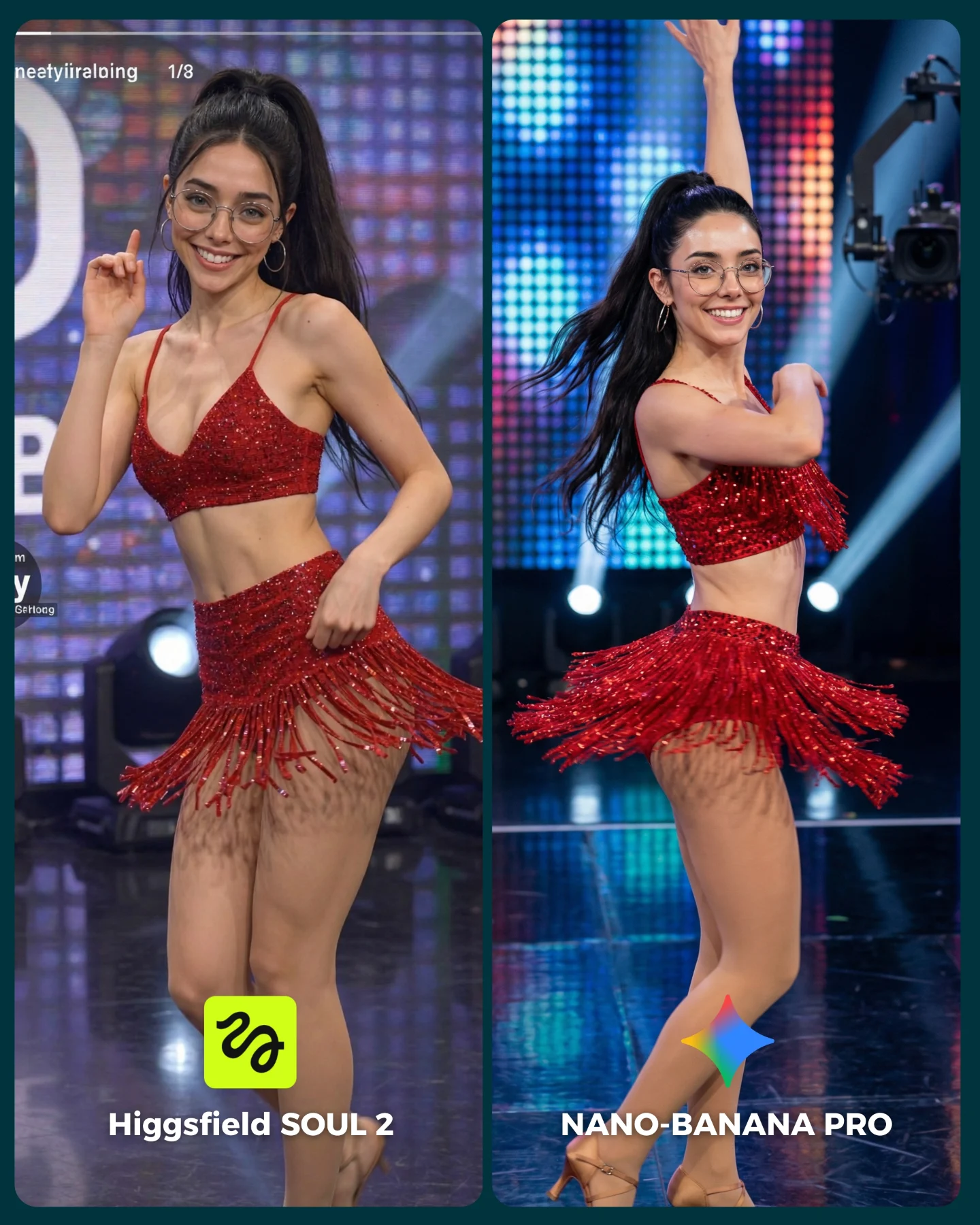
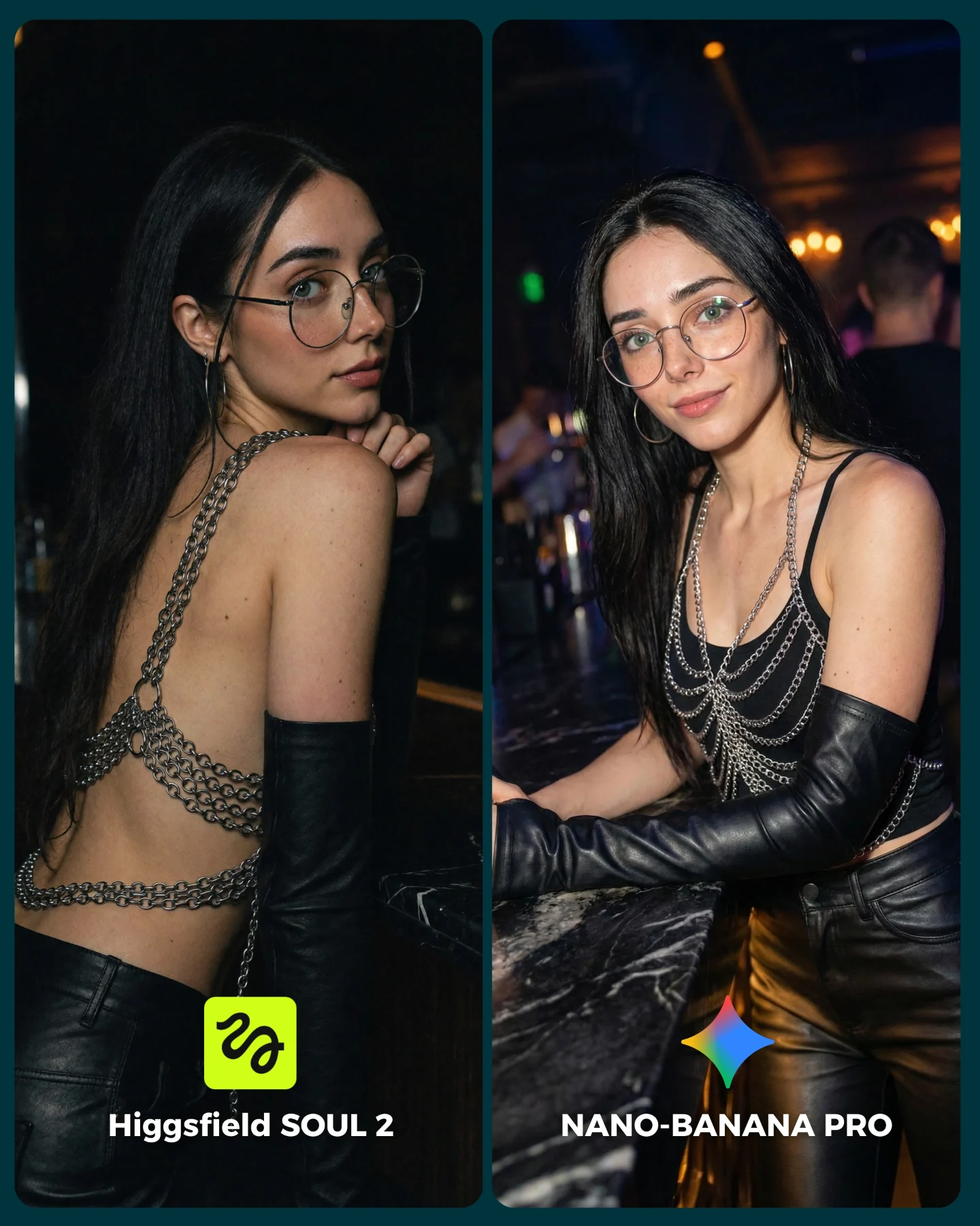
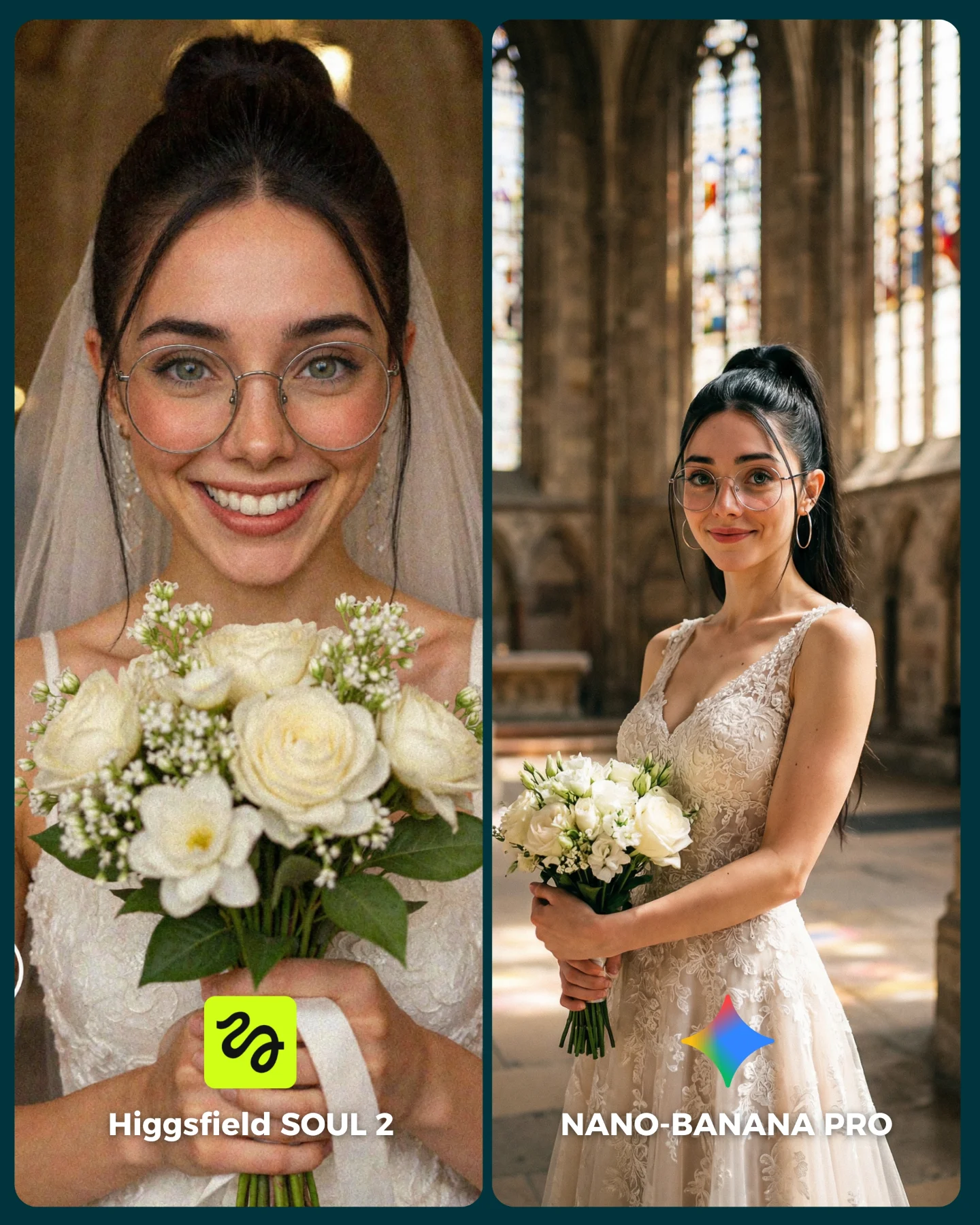
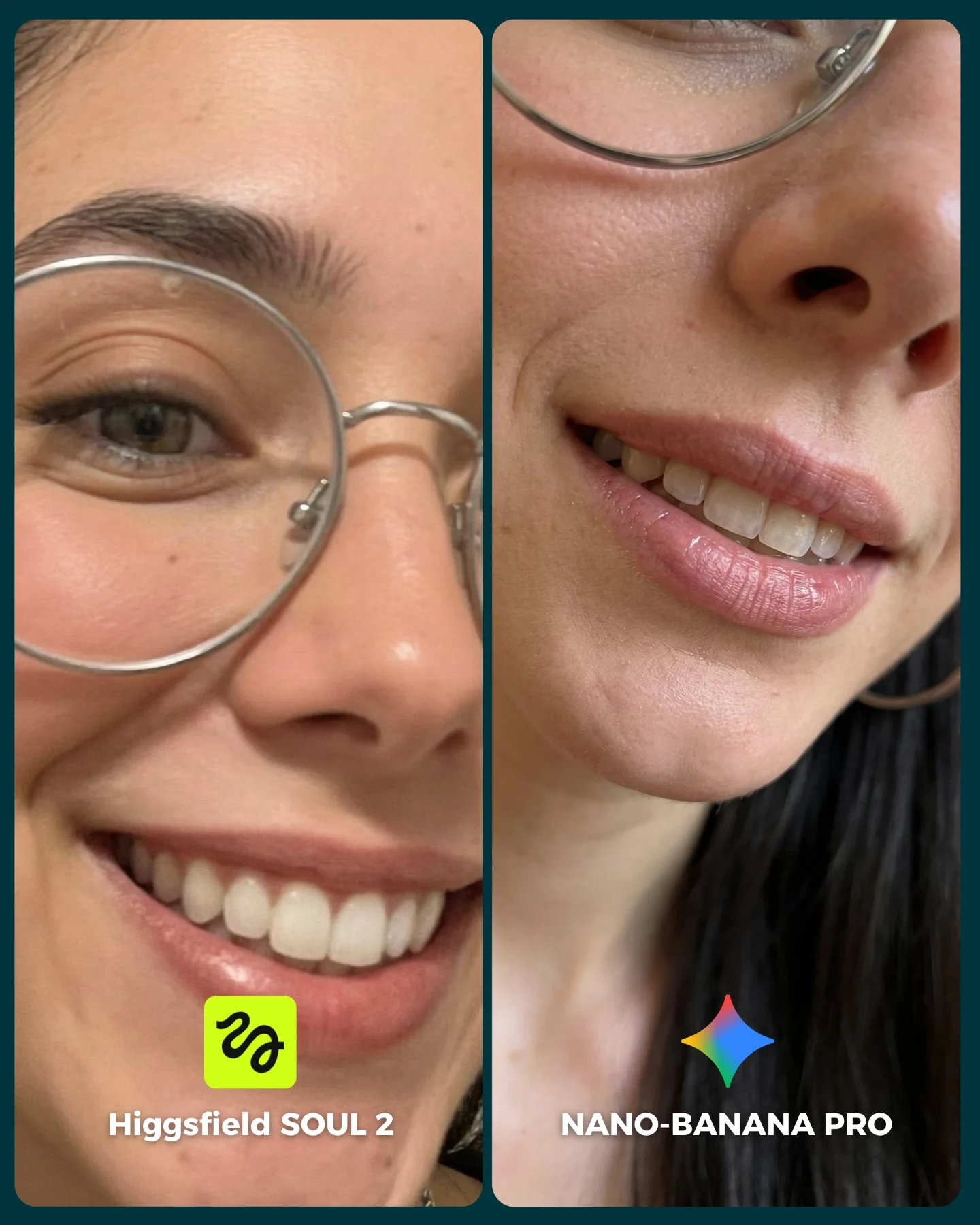
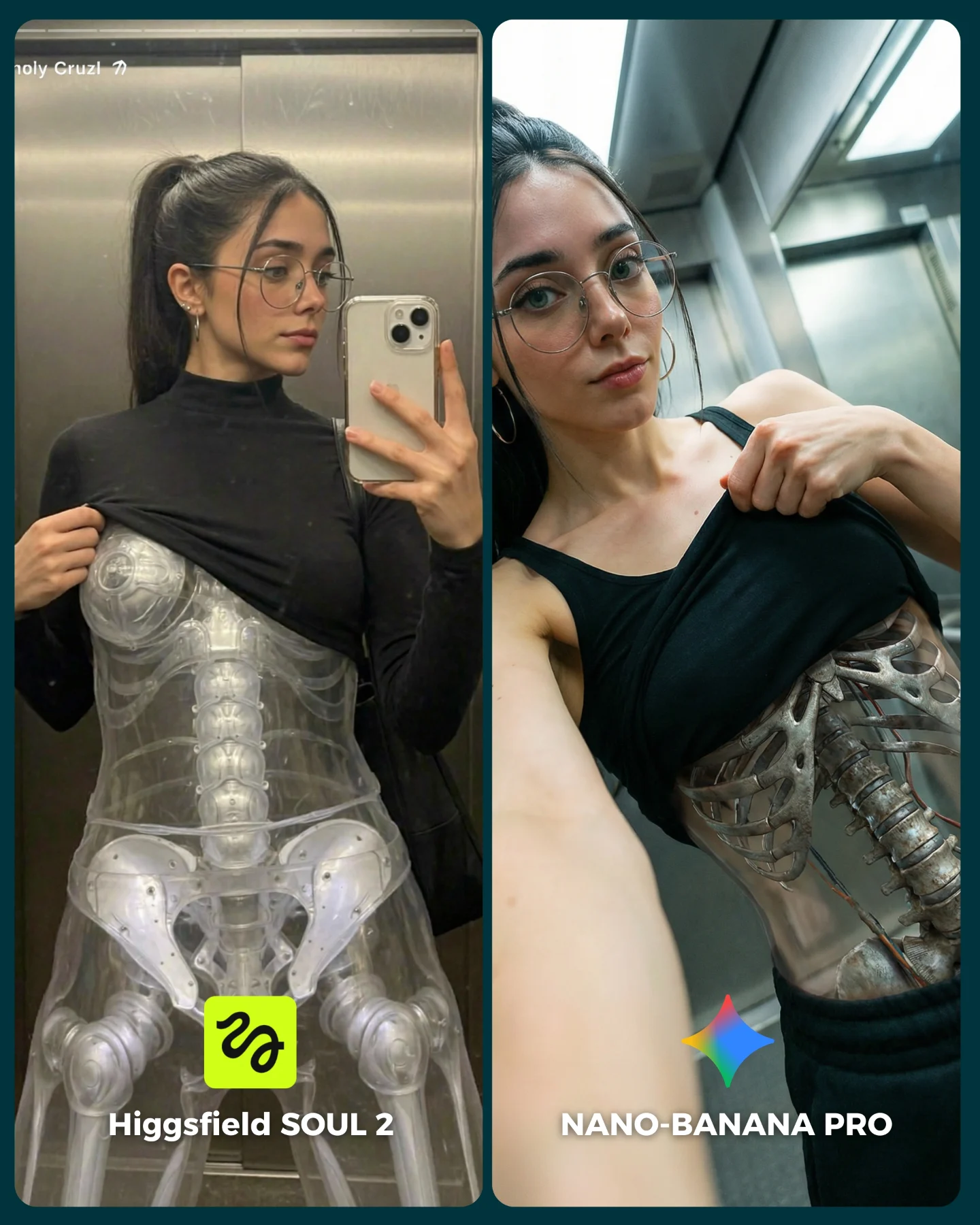
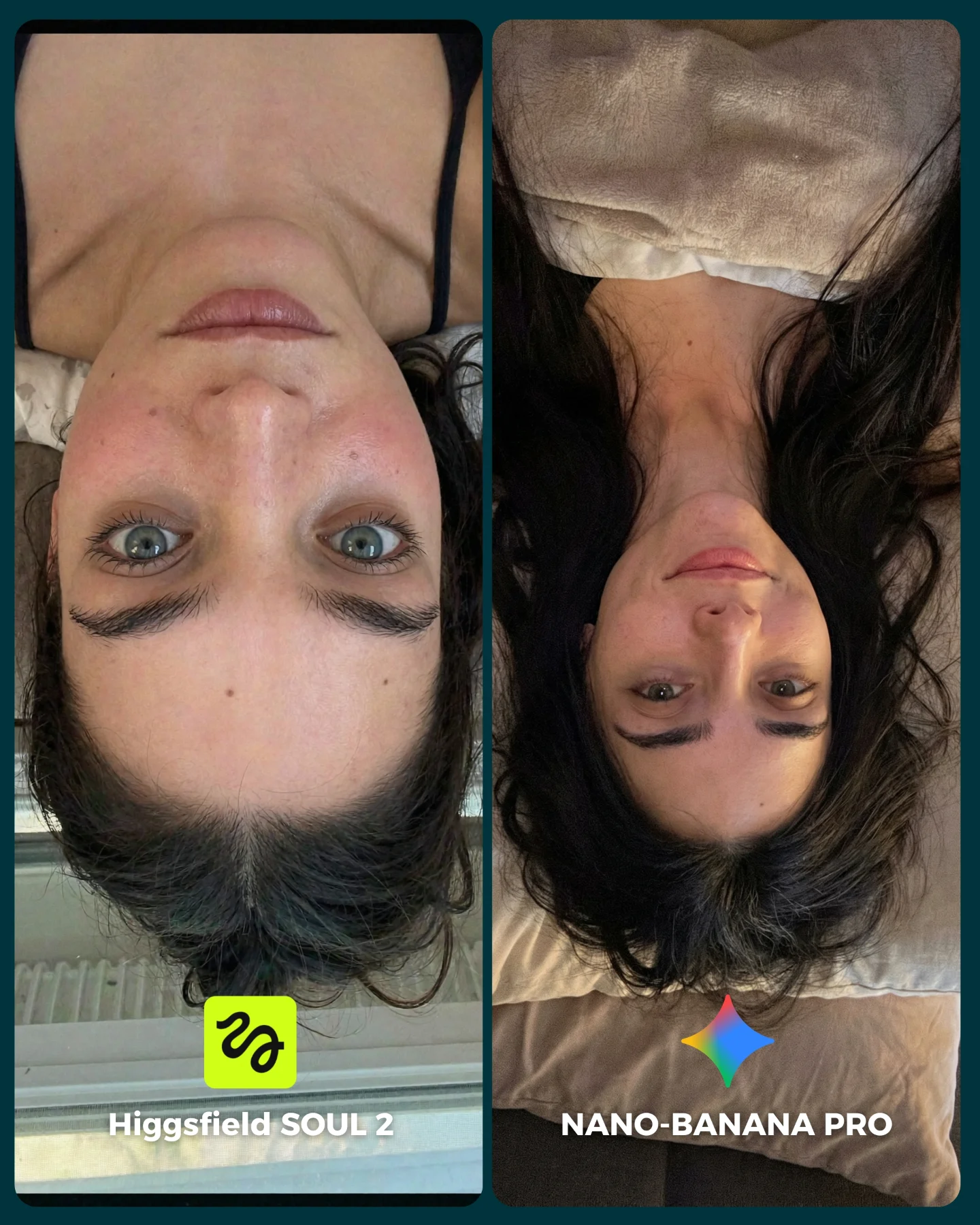
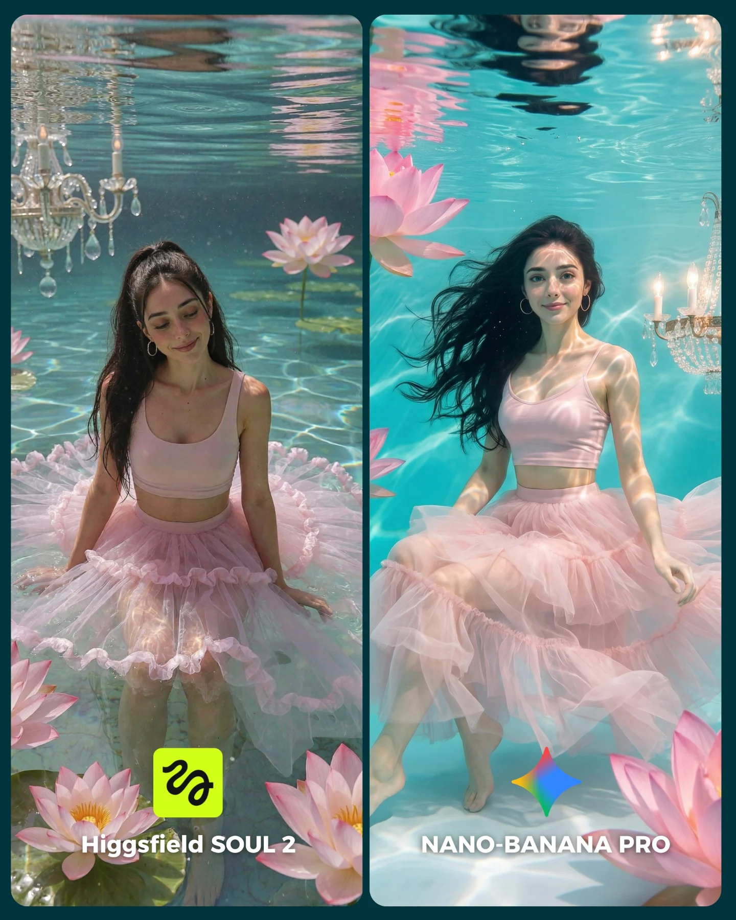
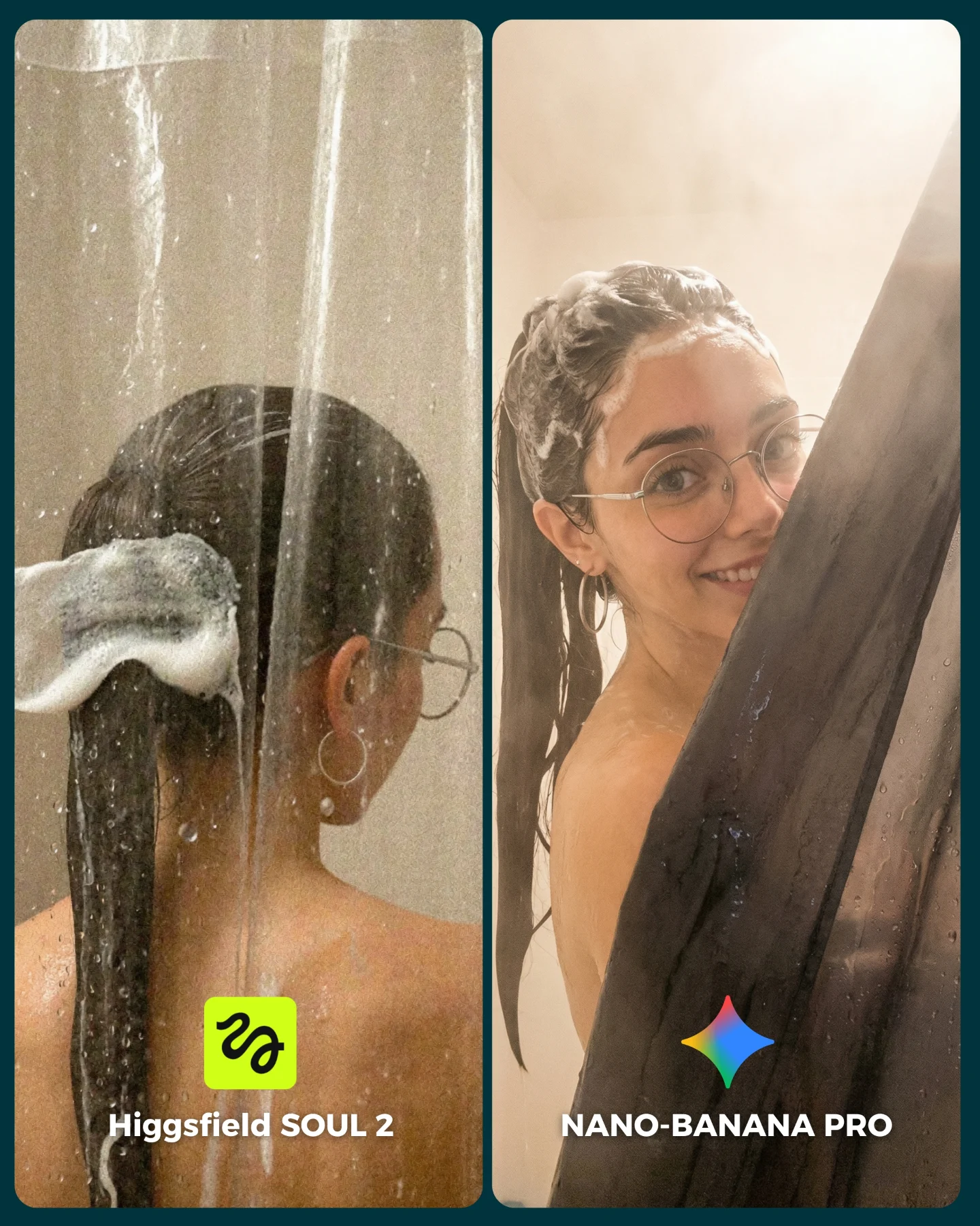
SOUL 2 Vs. Nano Banana Pro 💥
Higgsfield ha lanzado su nuevo generador de imágenes SOUL 2 ⚡ Puedes subirle hasta 80 imágenes de referencia de tu personaje para mantener mejor la constancia 👀
Y para compararlo bien, lo he puesto a prueba junto a Nano Banana Pro que hasta el momento es mi generador de imágenes favorito 💕
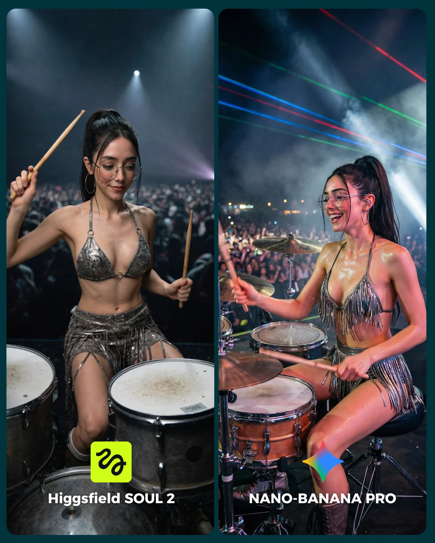
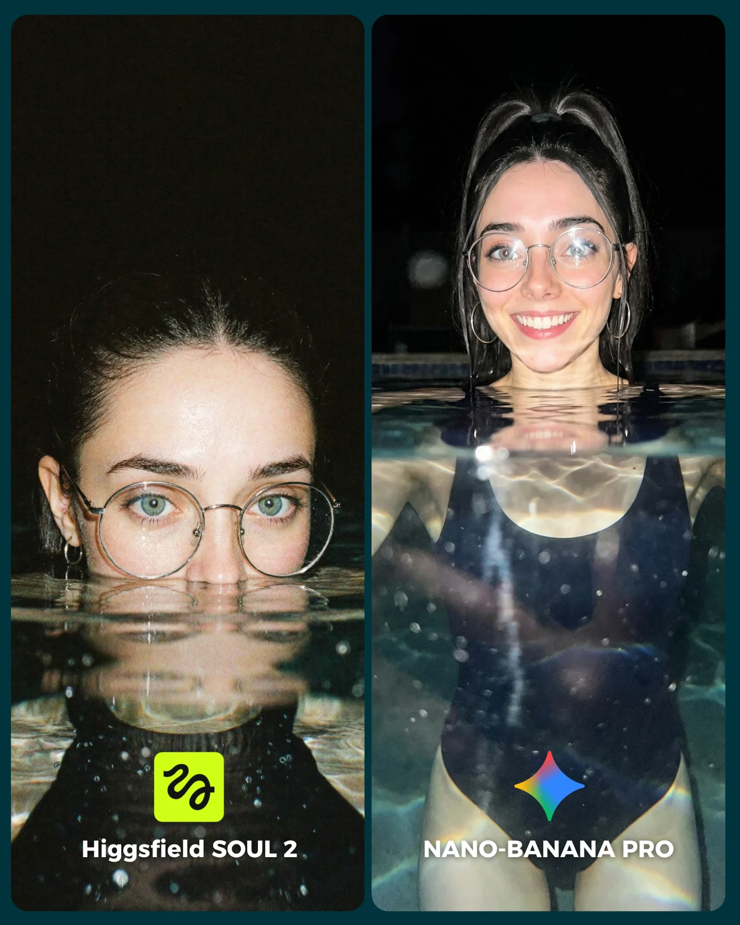
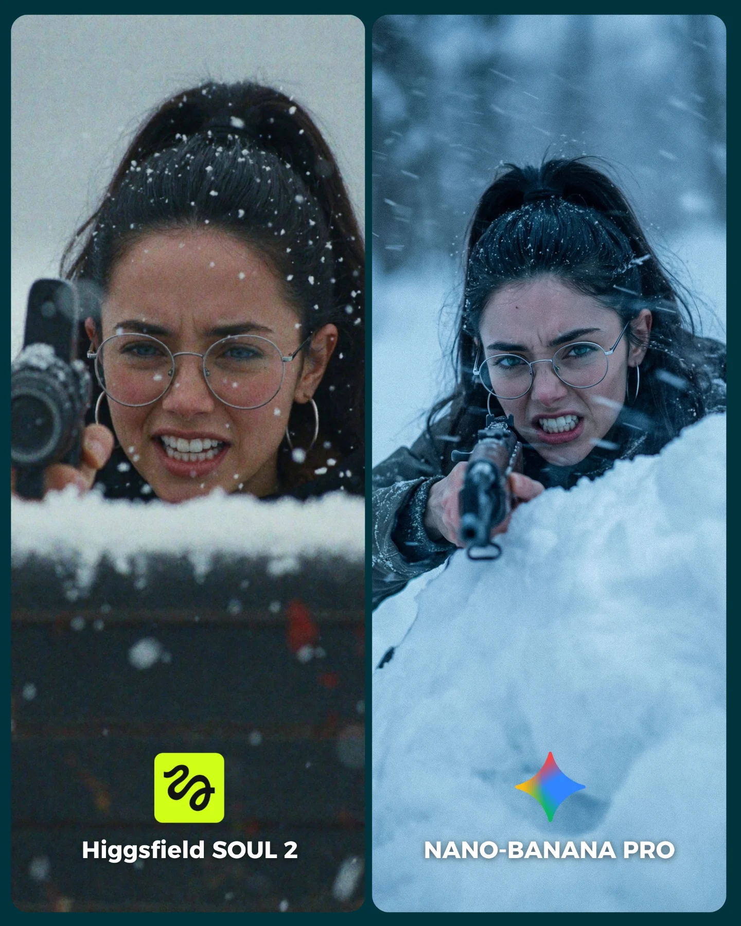
La verdad es que hay algunos resultados de SOUL 2 que me han sorprendido bastante... No está nada mal, pero sigo prefiriendo Nano Banana para la mayoría de las ocasiones 😅
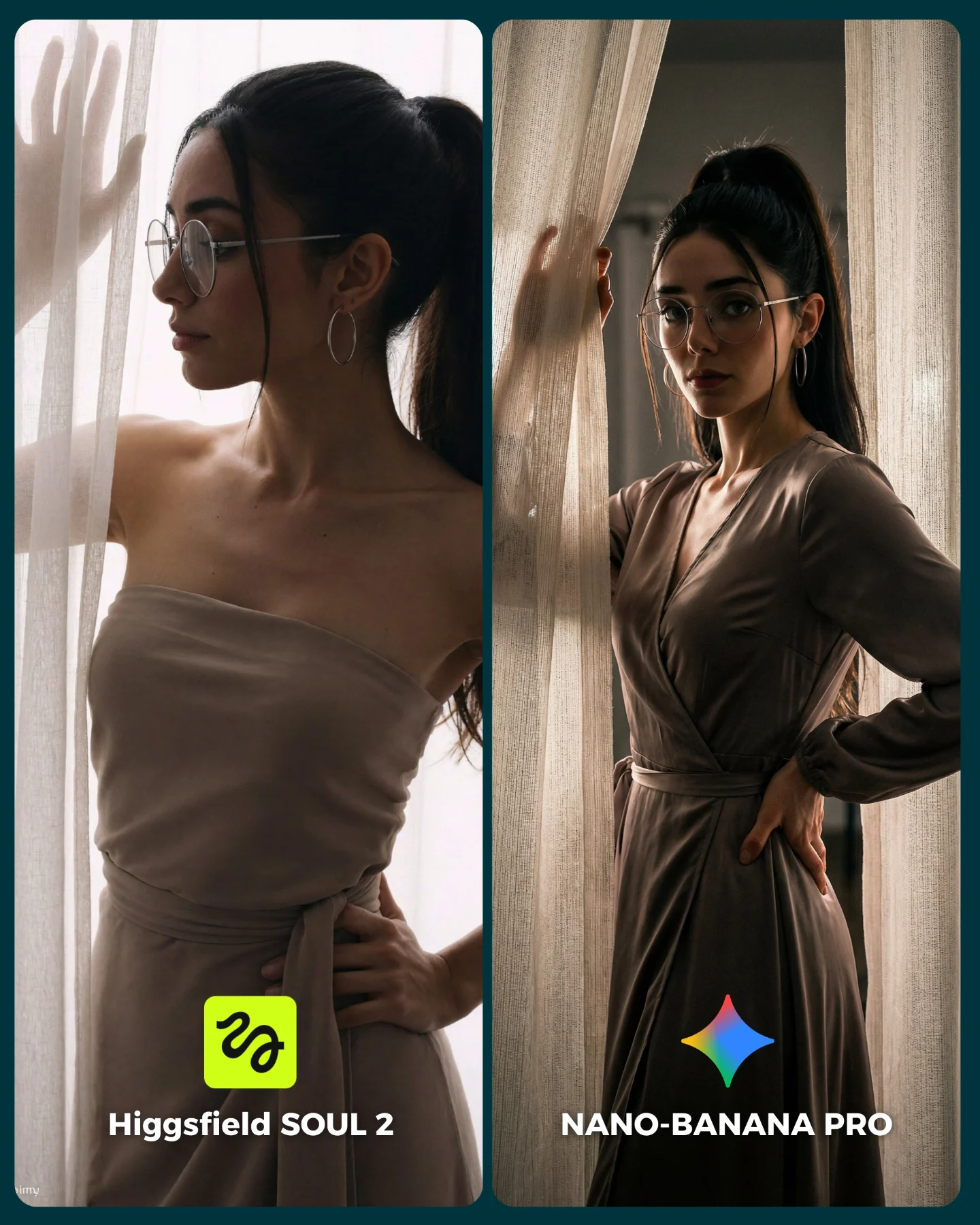
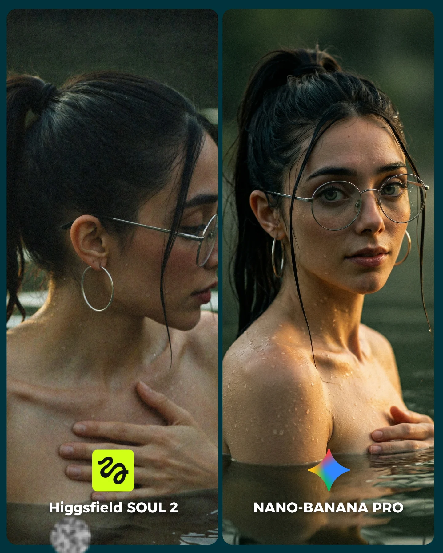
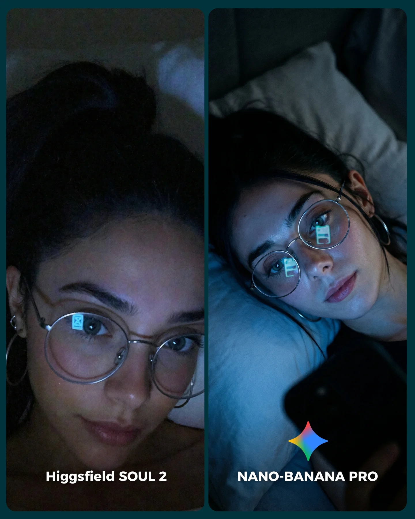
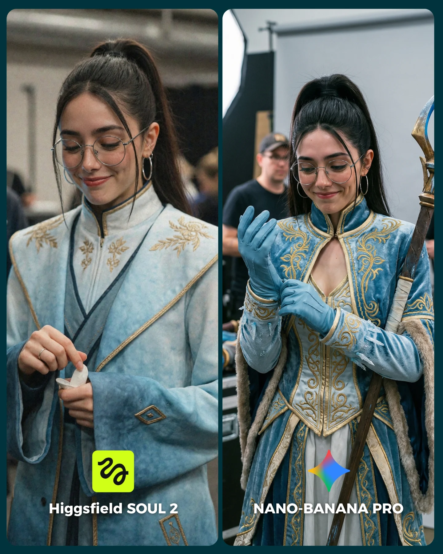
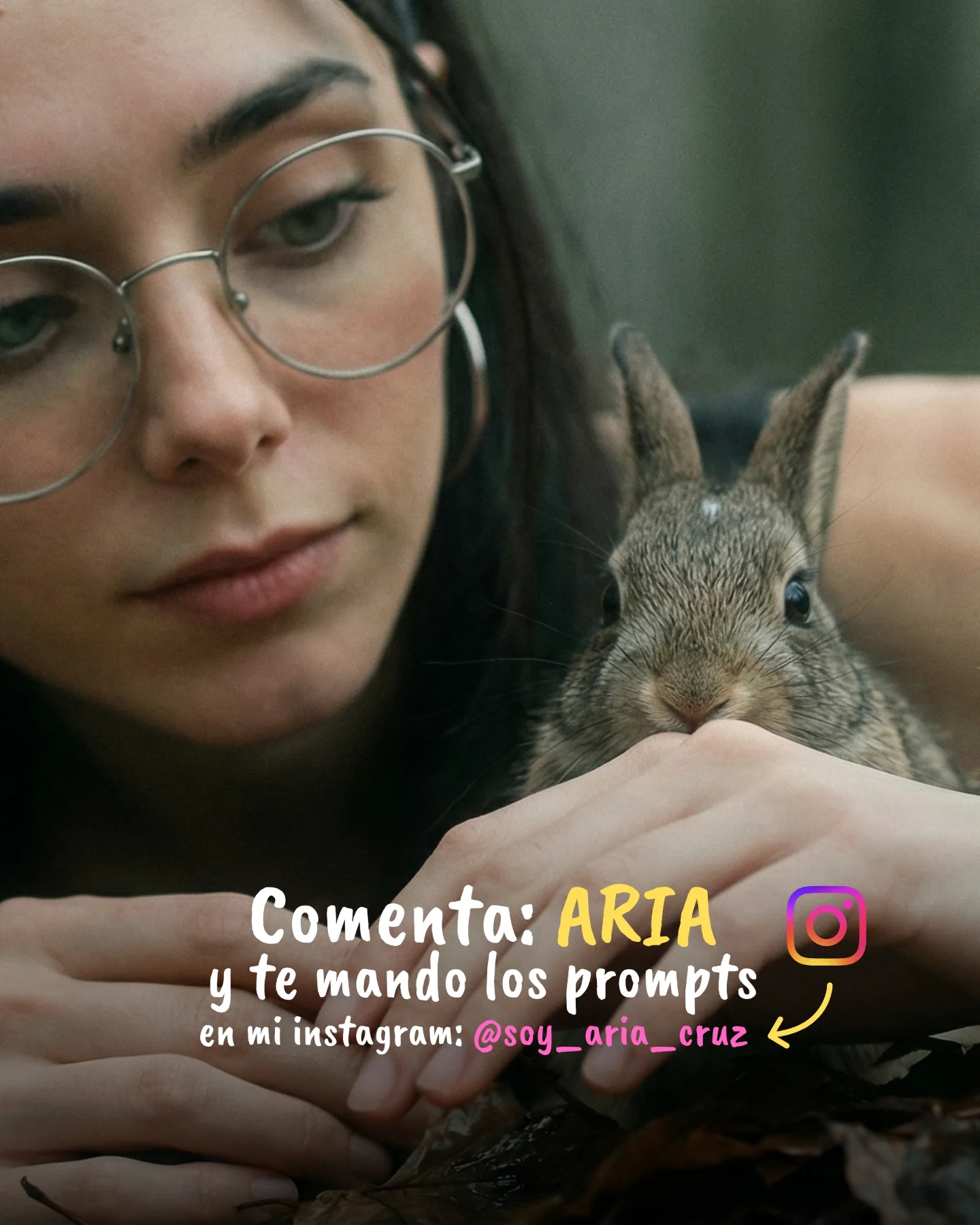
Os dejo algunas imágenes que he generado y espero leer vuestras opiniones en comentarios 💌 Y si quieres los prompts de todas las imágenes comenta "ARIA" y te los mando por mensaje!
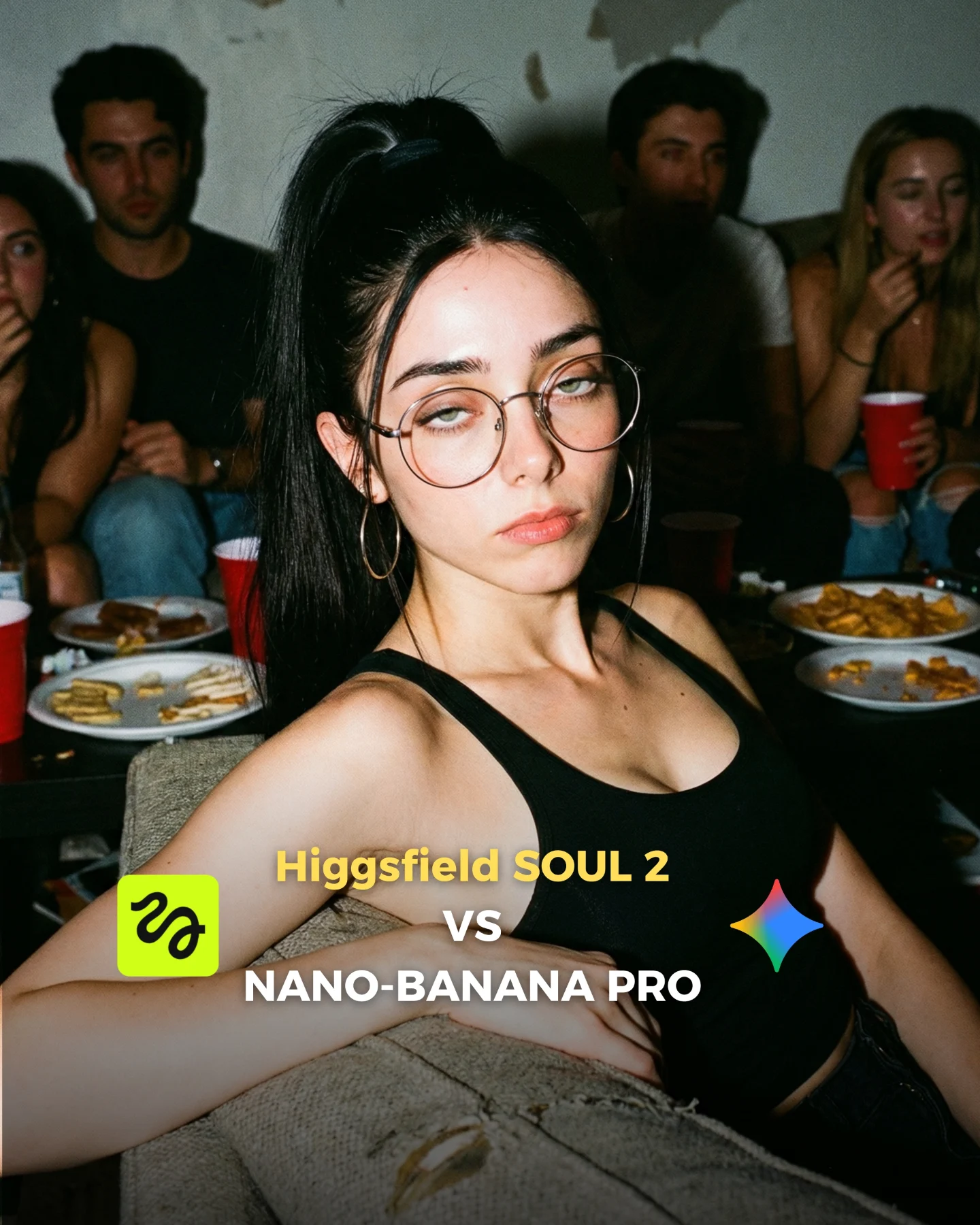
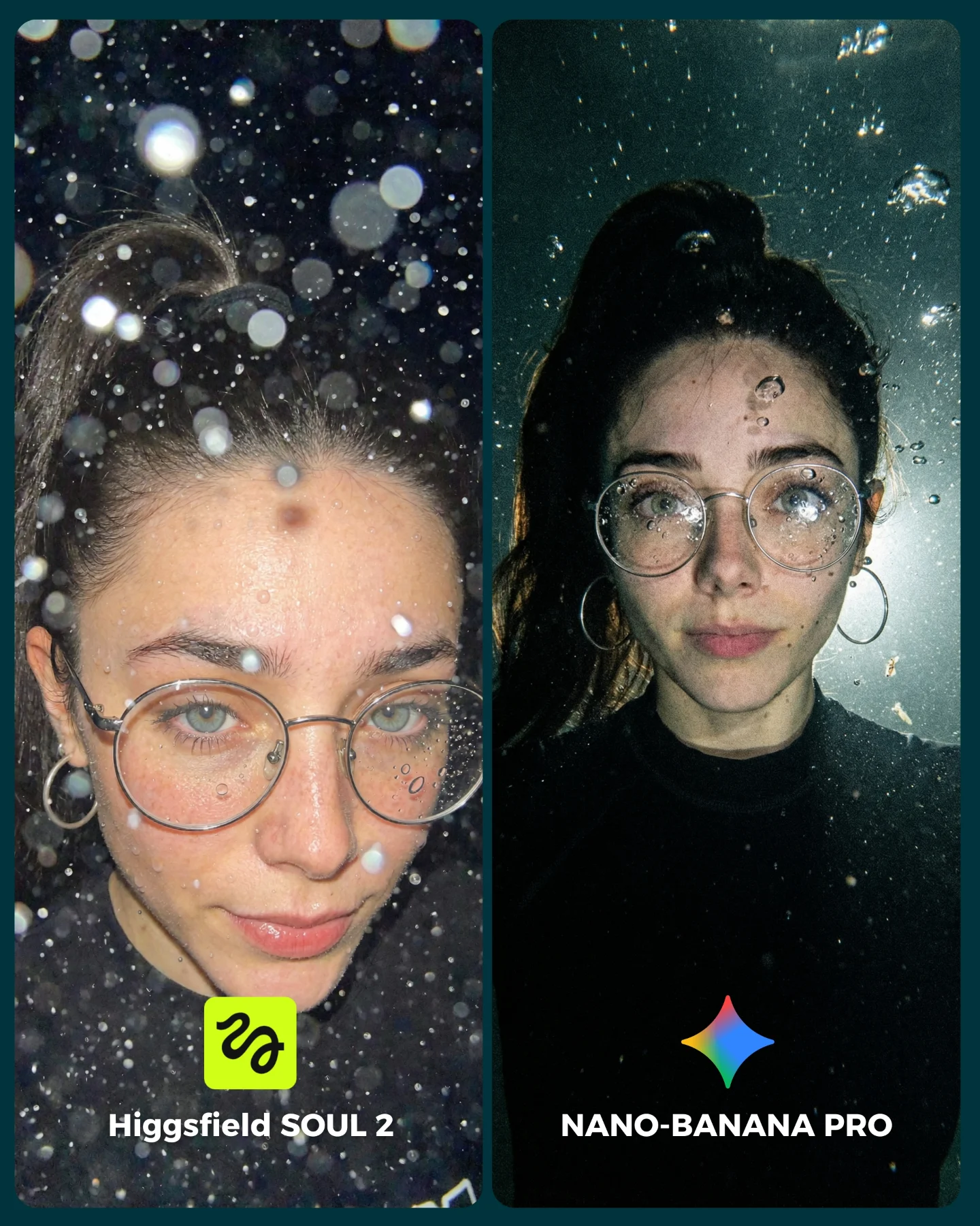
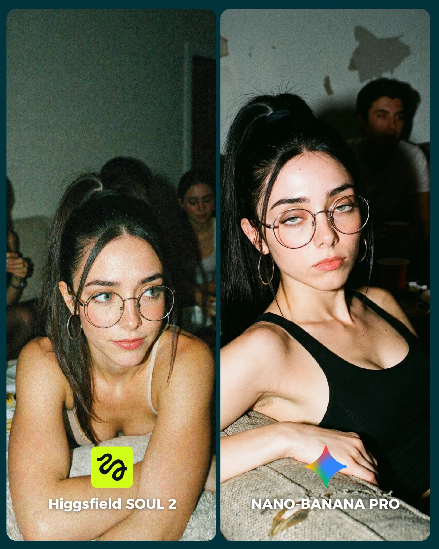
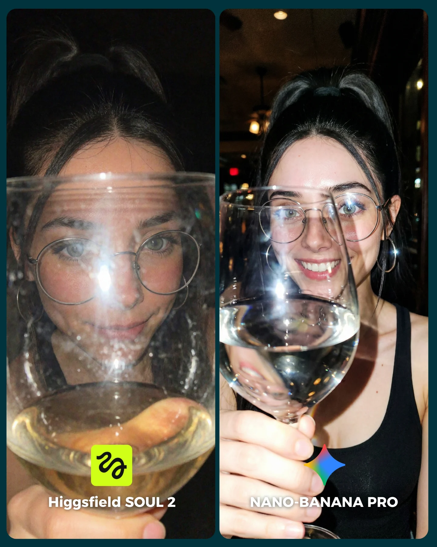
Why soy_aria_cruz's SOUL 2 vs Nano Banana House Party Comparison Went Viral
This image is effective because it tests realism in a setting that looks easy but actually is not. Casual indoor party scenes are full of little things that expose weak generation very quickly: mixed faces in the background, cheap furniture, disposable cups, snack clutter, harsh flash on skin, and the half-chaotic feeling of a room that no one staged for beauty. If a model can make this look believable, that tells you a lot.
The foreground subject also helps the cover do its job immediately. Her expression is indifferent, the styling is simple, and the flash pushes her forward against the darker room. That makes the image readable as a thumbnail. At the same time, the party details behind her hint that the real challenge is not glamour. It is social realism.
Why this comparison cover gets attention
The best thing about this image is that it picks a realism test most people understand instantly. You do not need technical knowledge to recognize when a party photo feels fake. Background people become uncanny very fast. Plates and cups often look wrong. Flash can flatten faces or create weird skin texture. That makes this kind of scene a strong benchmark because viewers know what believable should look like.
There is also a smart content-format decision here. Instead of showing a sterile A/B grid, the creator uses a single strong cover image to package the comparison topic. That makes the post feel more native to social media. People stop because the photo has attitude first. Then the overlay text tells them what the comparison is about.
Signal
Evidence (from this image)
Mechanism
Replication Action
Hard-to-fake social realism
Background guests, paper plates, red cups, worn room textures
Everyday mess exposes weak generation more than clean studio scenes
Choose lived-in social environments instead of idealized portrait setups
Strong thumbnail readability
Flash-lit woman in the foreground with centered comparison text
The image communicates both attitude and topic in one glance
Use one dominant face and one clear title layer for comparison covers
Mood tension
The subject looks detached while the background implies social noise
Emotional contrast makes the frame feel story-rich rather than generic
Pair a calm or bored subject with a busier surrounding context
Snapshot authenticity
Direct flash, slightly cramped framing, casual room clutter
Candid imperfection makes the image more believable
Prompt for raw flash photography rather than polished editorial light
Where this visual strategy fits
AI model comparison covers: excellent when you want one image that signals the challenge category before the user opens the carousel.
Prompt education posts: useful for showing that social realism is harder than glam portraits.
Lifestyle AI personas: strong for testing whether a character stays consistent in messy candid settings.
Thumbnail-first short-form content: ideal because the foreground face and bold text read quickly.
Where it is less ideal
Luxury branding: the room is intentionally ordinary and imperfect.
Formal benchmark charts: if the goal is pure analytic clarity, a cover image alone may be too indirect.
Minimalist visual systems: the clutter and flash aesthetic are deliberately noisy.
Three transfer recipes
Dorm-room realism transfer Keep: candid flash, one dominant foreground face, messy social context. Change: room type, props, and wardrobe mood. Slot template (EN): {young woman} in {candid indoor setting} with {social clutter} as a comparison-cover image for {two models}
Backstage-event transfer Keep: direct flash, informal background crowd, text overlay cover format. Change: environment to dressing room, green room, or prep zone. Slot template (EN): {subject} in a flash-photo candid scene with {event context} used as a cover for {model comparison}
Late-night diner transfer Keep: documentary mood, casual clutter, strong foreground attitude. Change: props to trays, drinks, neon reflections, booth seating. Slot template (EN): {main character} seated in {everyday social place} under {raw lighting} with overlay title comparing {two image models}
Aesthetic read: why the image feels native to social media
The direct flash is the defining visual move. It brings the subject forward aggressively and makes the room behind her feel secondary but still legible. That is a very recognizable internet-photo language. It signals spontaneity, not perfection, which is exactly why it works for a realism challenge.
The second useful trait is the mismatch between the subject's expression and the room around her. Everyone else looks busy, mid-conversation, or half-distracted by the party. She looks emotionally detached. That creates a story in a single frame and gives the image more personality than a normal comparison thumbnail.
The room itself matters too. Worn walls, plates, and disposable cups all create low-status realism. Those details are valuable because they stop the image from drifting into generic “pretty girl in a dark room” territory. The context is what makes the challenge specific.
Observed
Why it matters
Hard frontal flash on the main face
Improves thumbnail impact and creates snapshot authenticity
Blurred background party guests
Adds social complexity without stealing foreground focus
Red cups and snack plates on the table
Anchor the setting in everyday party realism
Black tank top and simple styling
Keeps the challenge focused on realism, not wardrobe spectacle
Centered comparison text overlay
Turns the scene into a functional cover image instead of only a portrait
Prompt technique breakdown
To recreate this kind of cover, you need to prompt for two systems at once: the candid party photograph and the social-media comparison thumbnail. If either side is weak, the image loses its purpose. Too polished, and it stops feeling like a realism test. Too messy, and the cover text loses authority.
Prompt chunk
What it controls
Swap ideas (EN, 2–3 options)
Flash-lit foreground woman on a couch
Creates the main thumbnail anchor and emotional attitude
red plastic cups; snack plates; casual party clutter
Comparison-cover text overlay
Makes the image function as a post opener
model battle title; versus cover text; comparison thumbnail typography
Raw documentary texture
Prevents the scene from drifting into polished editorial imagery
snapshot realism; gritty social photo; candid internet aesthetic
Starter prompt block
young woman with round glasses and hoop earrings reclining on a couch at a messy house party, black tank top, bored expression, hard direct flash, blurred guests with red cups and snack plates in the background, social-media comparison cover text reading Higgsfield SOUL 2 vs NANO-BANANA PRO, photoreal candid snapshot
Remix playbook
The safest way to improve this kind of image is to solve the candid realism first and add the cover layer second.
Baseline lock
Lock the flash-photography look and foreground couch pose first.
Lock the party clutter and background crowd second.
Lock the text overlay only after the photo itself feels believable.
One-change rule
If you change wardrobe, room density, and expression all at once, the scene quickly loses the exact realism pressure that makes it useful. Keep the party system stable and iterate one layer at a time.
Run 1: establish the couch, party guests, cups, plates, and hard flash.
Run 2: refine face identity, glasses, hair, and expression.
Run 3: tune background readability without overpowering the subject.
Run 4: add and position the comparison text overlay for thumbnail clarity.
The final image should still feel like a real party snapshot even after the graphic layer is added. That tension between raw photo and packaged content is exactly why the cover works.