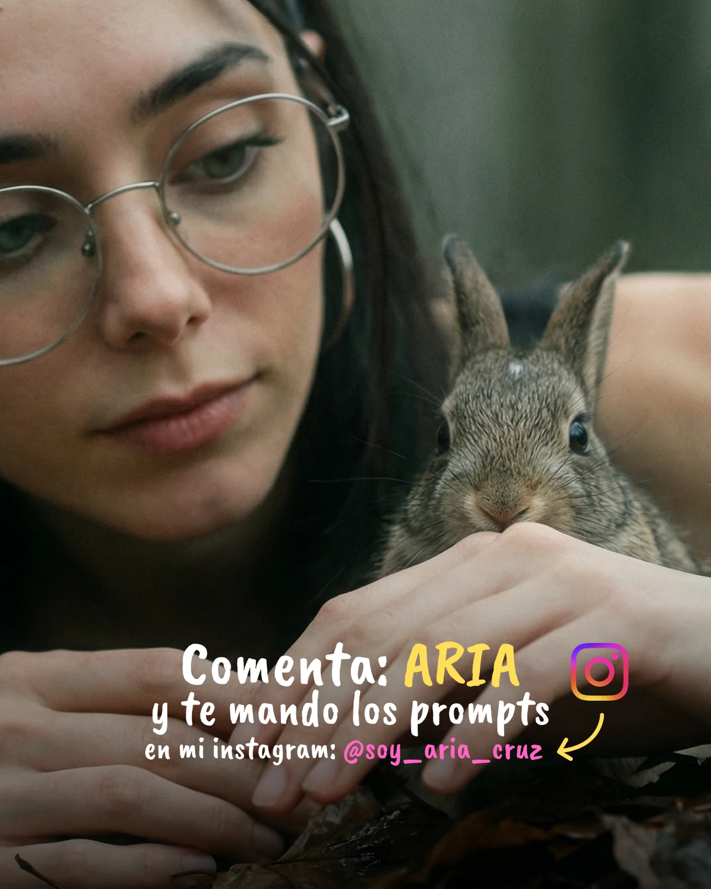
How soy_aria_cruz Made This Rabbit Prompt CTA AI Scene
This image is effective because it blends two things that are often separated: emotional softness and explicit conversion. The close-up of the rabbit and the creator’s face builds tenderness immediately. The overlay text then turns that tenderness into action by telling viewers exactly what to do next. Many creators manage one of those pieces well. Fewer manage both in a single frame without breaking the mood.
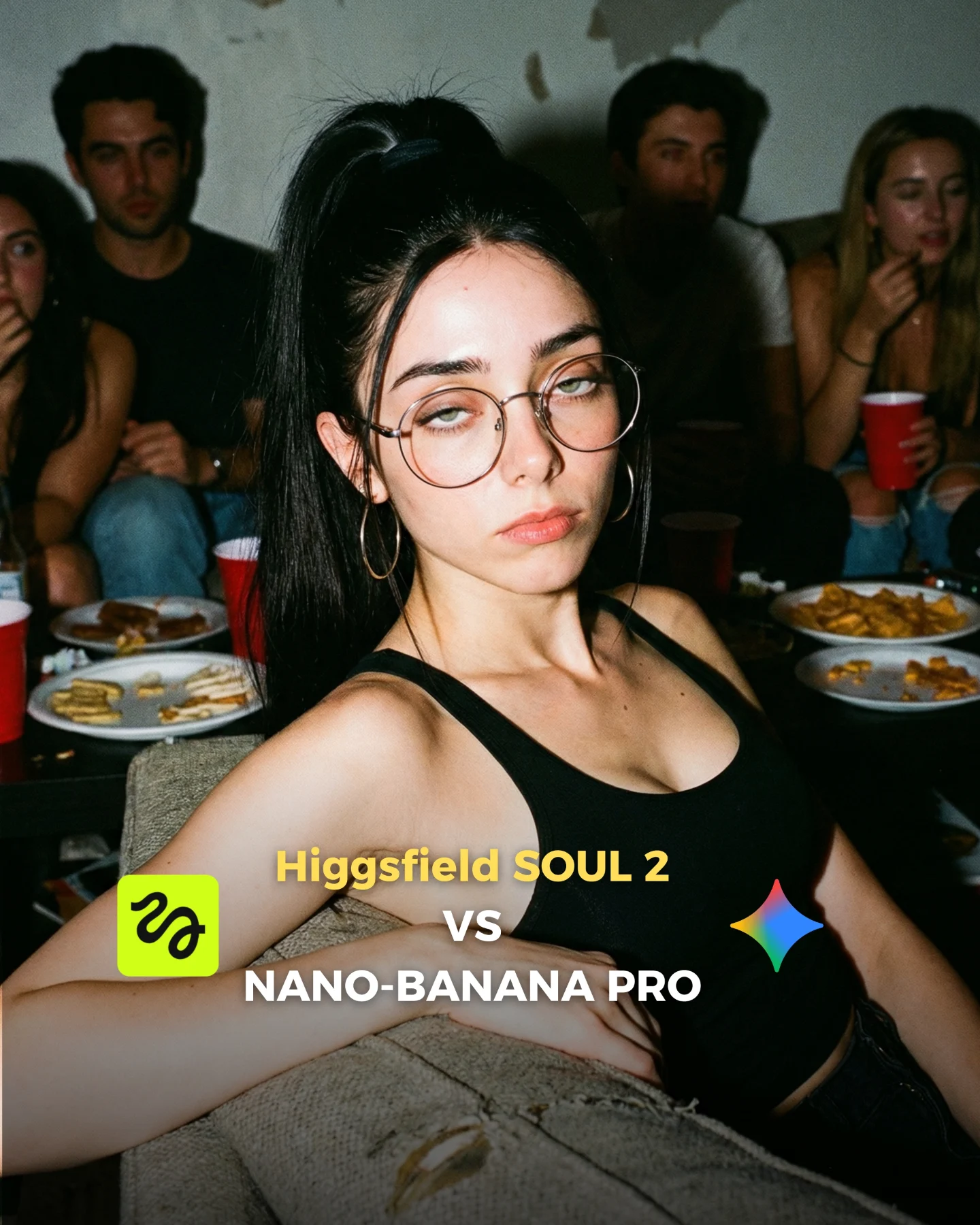
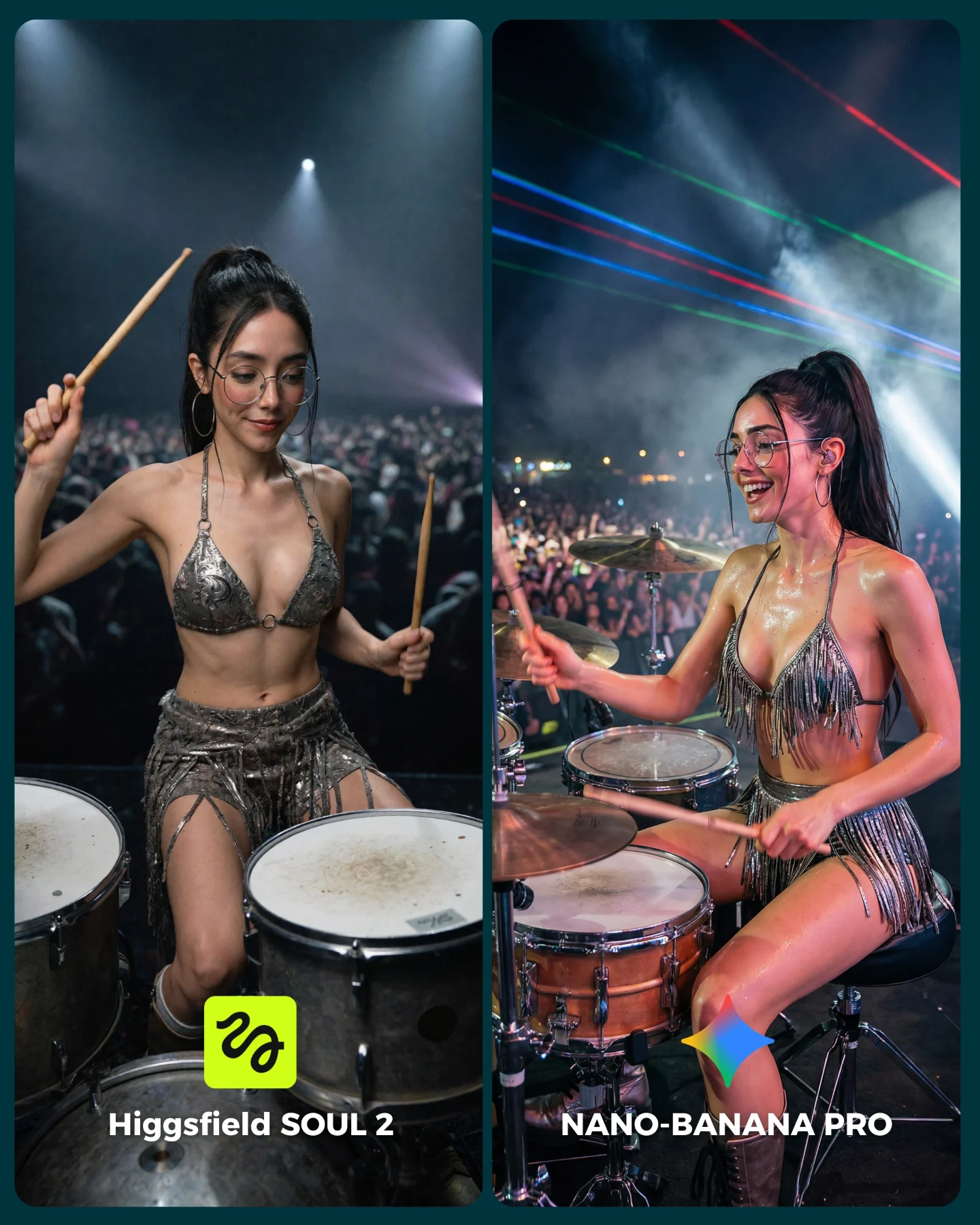
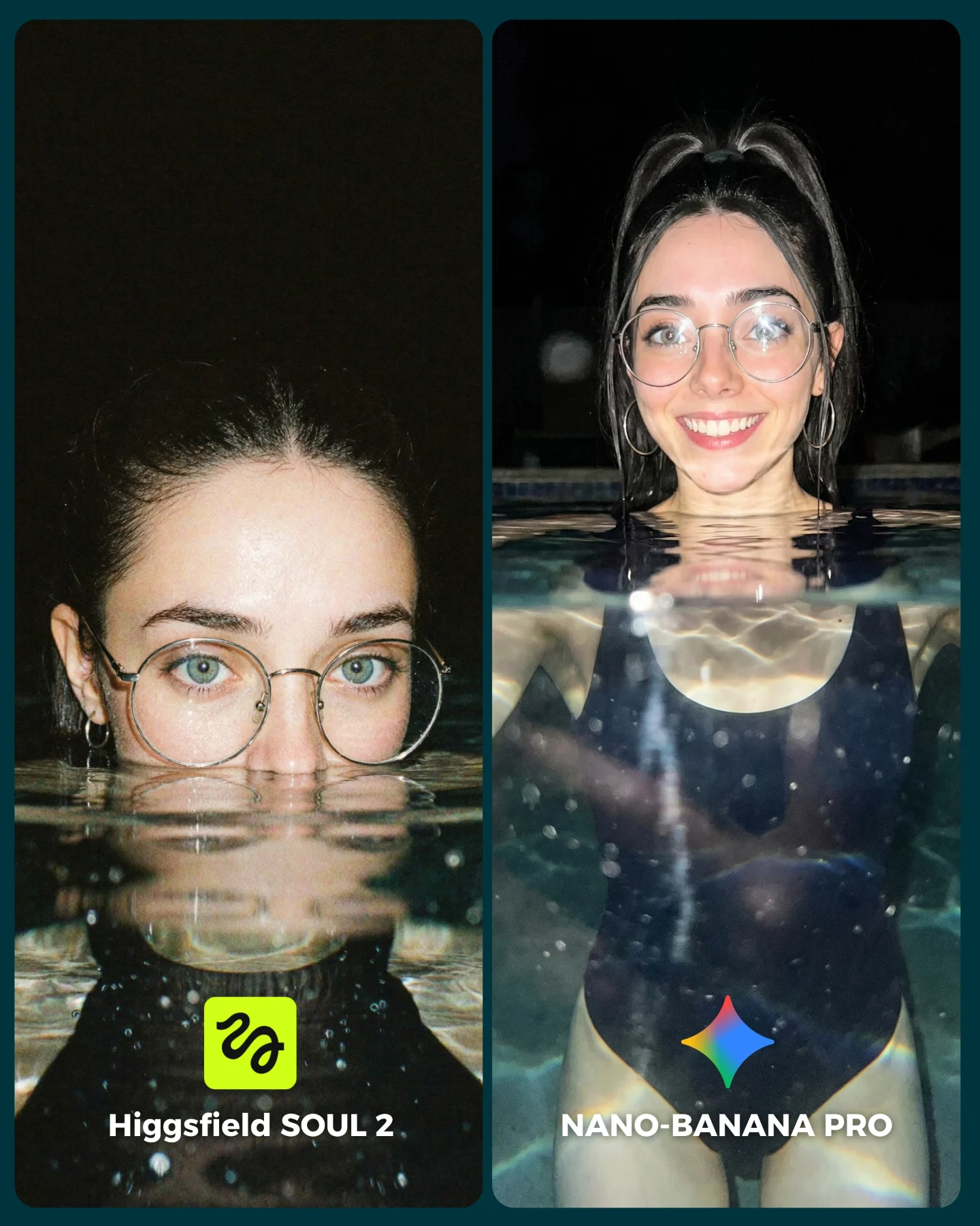
The post caption around this image is about model comparison and prompt sharing, but this visual is doing a different job inside that broader content package. It is a distribution asset. It is not only trying to impress viewers with realism. It is trying to convert interest into comments and Instagram DMs. That makes it especially useful to study, because the design is not accidental. Every choice supports that funnel.
Why It Feels Warm Instead of Salesy
The strongest reason this image works is that the rabbit carries emotional trust. A small animal close-up naturally lowers the commercial temperature of the post. Viewers feel softness before they feel the CTA. That order matters. If the text came first without the emotional image, the asset would read more like an ad. Because the image leads with intimacy, the call to action feels more like an invitation.
The second reason is the crop. The scene is extremely tight, which means the viewer cannot drift into background details. They stay with the woman’s quiet face, the rabbit’s eyes, and the text. This creates a very controlled visual journey: softness, curiosity, instruction. For creator marketing, that is efficient design.
| Signal | Evidence (from this image) | Mechanism | Replication Action |
|---|
| Emotional anchor | The rabbit becomes the immediate focal point and softens the entire frame. | Cute realism lowers resistance and keeps the CTA from feeling pushy. | Use one emotionally disarming subject when the image also needs to sell an action. |
| Human trust cue | The creator’s face is calm, close, and natural rather than heavily posed. | A restrained human presence makes the message feel personal. | Keep expression soft and direct when pairing a portrait with conversion copy. |
| Clear next step | The overlay tells viewers to comment “ARIA” and gives an Instagram handle. | The image does not waste attention; it channels it into a measurable action. | Make the CTA specific, short, and visually impossible to miss. |
Why the Overlay Design Actually Helps
The overlay works because it matches the emotional tone of the image instead of fighting it. The rounded handwritten style, bright yellow highlight on “ARIA,” and playful Instagram icon keep the text from feeling corporate. This is important. A hard-edged sales graphic would have broken the softness of the rabbit portrait. Instead, the text feels like part of the creator’s voice.
The handle placement also matters. It appears as a secondary layer, which means the primary action remains “comment ARIA.” That is smart sequencing. The viewer gets one obvious action first, and then a platform path second. Strong creator graphics often follow this exact pattern: one main ask, one support route.
Where This Format Fits Best
This kind of image is ideal for prompt giveaway posts, DM-trigger campaigns, conversion slides inside a carousel, and creator-brand pages that rely on warm personal aesthetics. It also works well for AI creators who want to soften technical content with emotional or lifestyle imagery before asking for engagement.
- Prompt CTA images: perfect fit because the text tells viewers exactly how to receive the prompts.
- Creator funnel assets: strong fit when the goal is to move viewers from feed interaction to DM or profile visit.
- Animal-adjacent lifestyle content: useful because the softness of the subject increases dwell time.
- Carousel closing slides: effective as the final conversion image after educational or comparison content.
It is less useful for high-volume informational graphics or hard-tech benchmark posts where clarity matters more than emotion. This format wins through warmth and proximity.
Three Transfer Recipes
| Transfer | Keep | Change | Slot Template (EN) |
|---|
| Kitten CTA version | Soft close-up, intimate crop, direct overlay instruction. | Swap the rabbit for a kitten and adjust text color accents to match the fur palette. | {close animal portrait} {soft creator face} {clear CTA overlay} {warm conversion mood} |
| Beauty prompt giveaway version | Tight crop, human trust cue, handwritten-style call to action. | Replace the animal with a makeup detail or skincare prop while preserving softness. | {intimate portrait crop} {natural expression} {comment-to-get-prompts overlay} {gentle creator aesthetic} |
| Nature lifestyle conversion slide | Emotional visual anchor plus one precise next step. | Use a bird, flower, or outdoor object instead of a rabbit and keep the CTA equally short. | {soft natural close-up} {creator presence} {one clear engagement instruction} {low-pressure CTA mood} |
Aesthetic Read
The visual strength here comes from restraint. The palette is mostly muted skin tones, dark hair, silver metal, soft brown fur, and blurred green-gray background. That restraint gives the yellow “ARIA” highlight enormous power. The word becomes the brightest semantic object in the image, which is exactly what the designer wants. This is a very efficient use of color hierarchy.
The rabbit also helps the composition by creating a second face-like focal point. Viewers move between the woman’s features and the bunny’s eyes before landing on the text. That movement keeps the graphic from feeling like a flat CTA banner. It still behaves like an image first, which is why it remains scroll-stopping.
| Observed | Recreate |
|---|
| Muted natural palette with one bright CTA color pop | Keep the base image soft and neutral, then let one keyword carry the strongest accent. |
| Tight crop with almost no background distraction | Fill the frame with face, animal, and text so attention has no escape path. |
| Soft facial expression paired with a cute animal | Lead with tenderness if you want the CTA to feel inviting instead of aggressive. |
| Overlay hierarchy that prioritizes one command | Make the primary action bigger and bolder than the secondary handle or explanation. |
Prompt Technique Breakdown
For images like this, the CTA layer is not an afterthought. It should be prompted as part of the composition strategy.
| Prompt chunk | What it controls | Swap ideas (EN, 2–3 options) |
|---|
| young woman with glasses beside a realistic rabbit | Creates the emotional core and natural trust cue. | woman with kitten; creator with puppy; face beside bird in hand |
| tight outdoor close-up with soft woodland blur | Keeps the frame intimate and removes distraction. | garden close-up; shaded park portrait; natural soft-focus outdoor crop |
| handwritten Spanish CTA overlay with highlighted keyword | Turns attention into a specific action without breaking the mood. | comment-to-get-prompts overlay; DM-me keyword badge; profile-handle prompt note |
| Instagram icon and arrow toward handle | Adds a secondary route for conversion and platform memory. | DM icon; profile arrow; social-handle pointer |
| soft diffused natural light | Preserves warmth and realism for both skin and fur. | overcast daylight; shaded outdoor light; gentle natural portrait light |
Remix Steps
Start by locking the emotional image before you design the CTA. If the underlying photo does not feel warm enough, the overlay will only make it look more transactional.
- Run 1: create the close-up with the woman and rabbit in a soft, intimate composition.
- Run 2: refine eye detail, fur texture, glasses, and hand placement so the realism holds.
- Run 3: add one primary CTA phrase with a highlighted keyword that dominates the lower third.
- Run 4: add the secondary handle, icon, and arrow only after the main action is crystal clear.
The bigger creator lesson is simple: a high-converting image does not need to abandon aesthetics. It just needs to make the path from feeling to action very short.