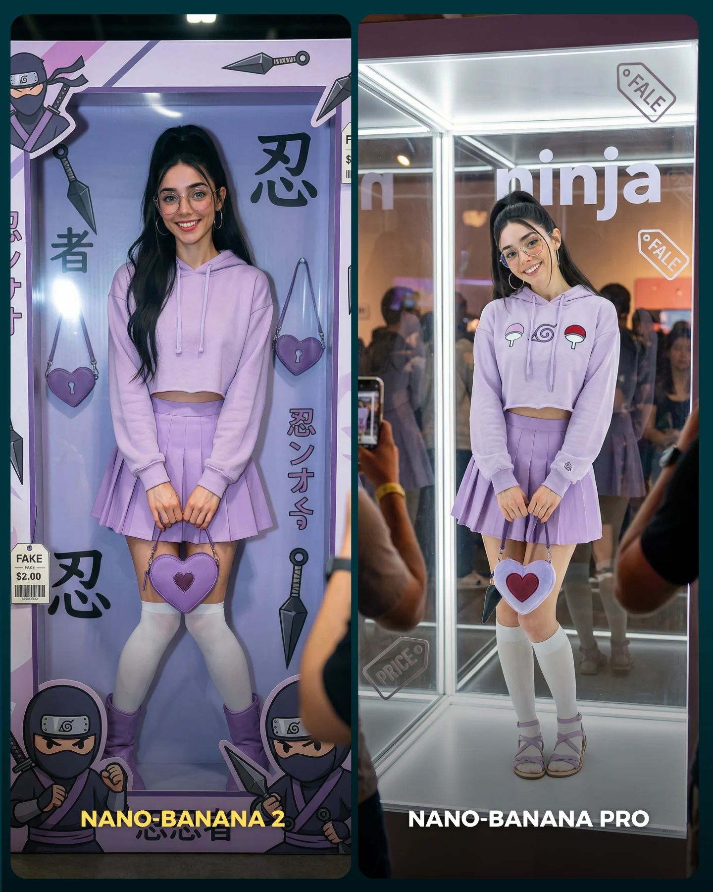
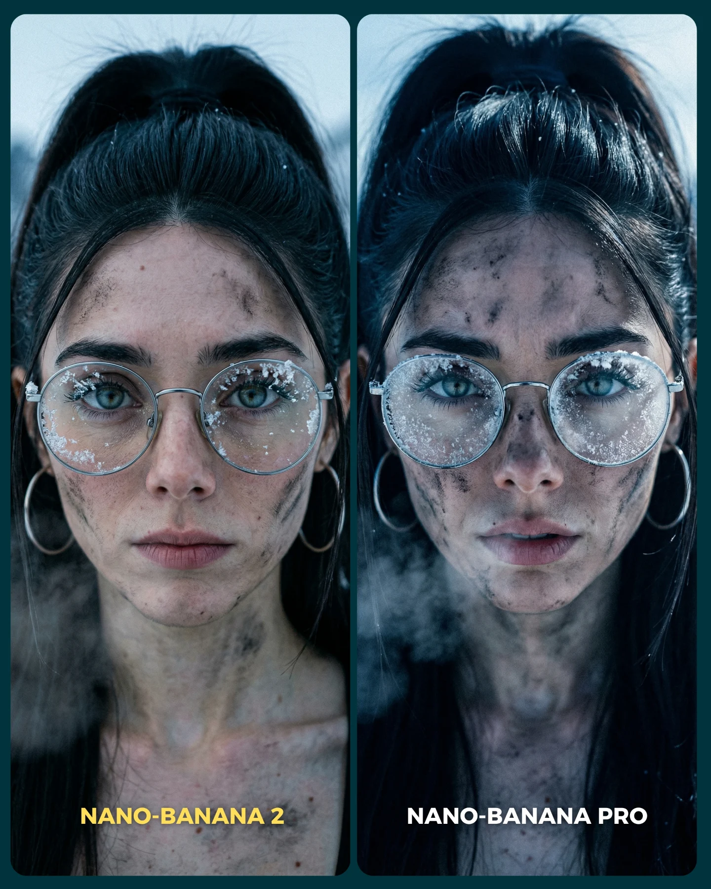
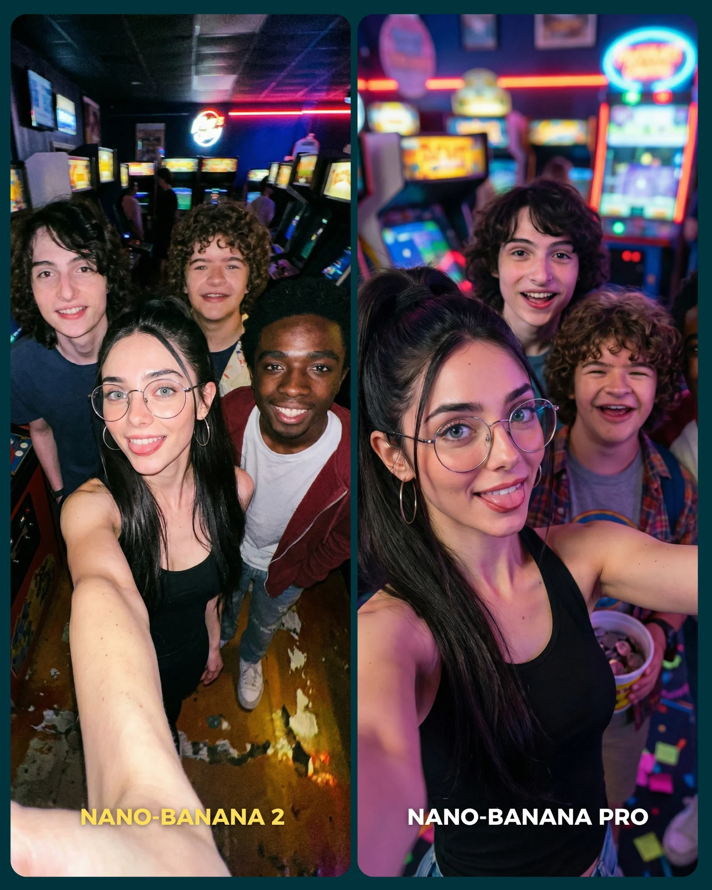
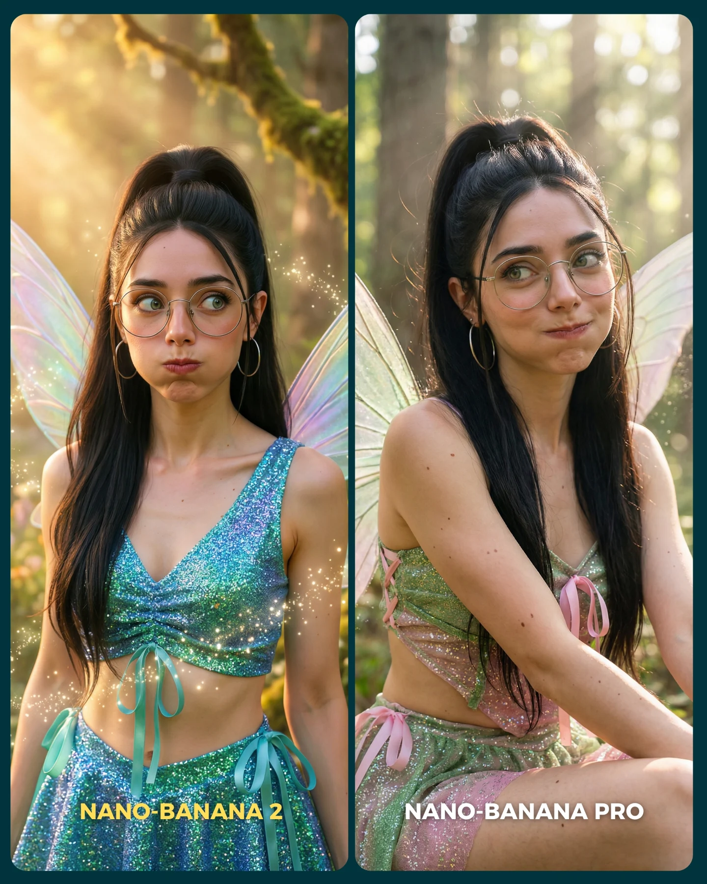
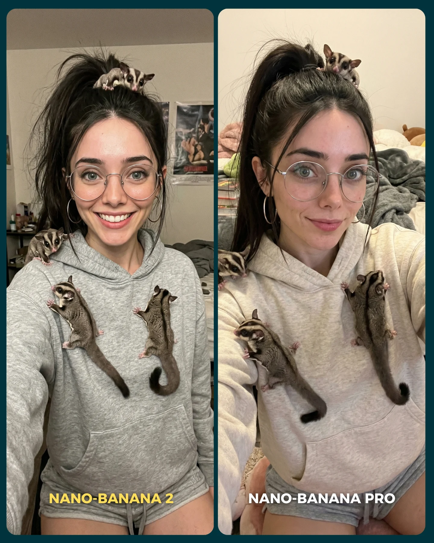
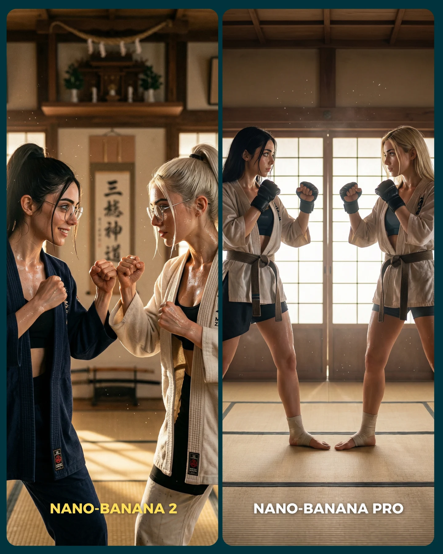
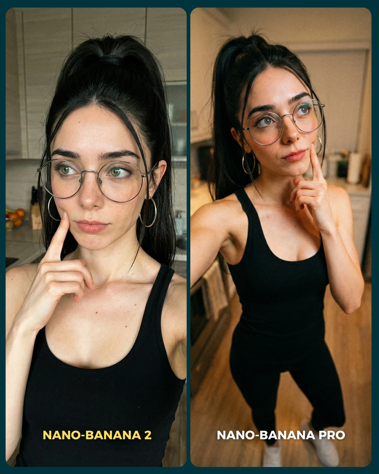
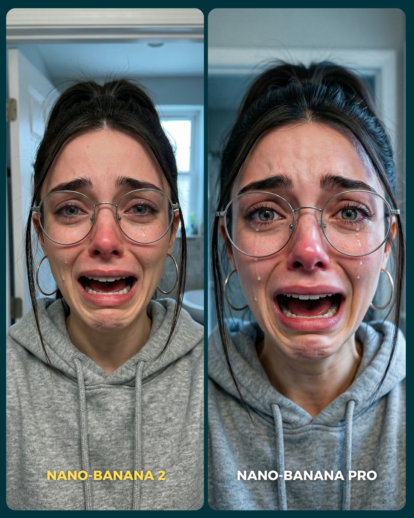
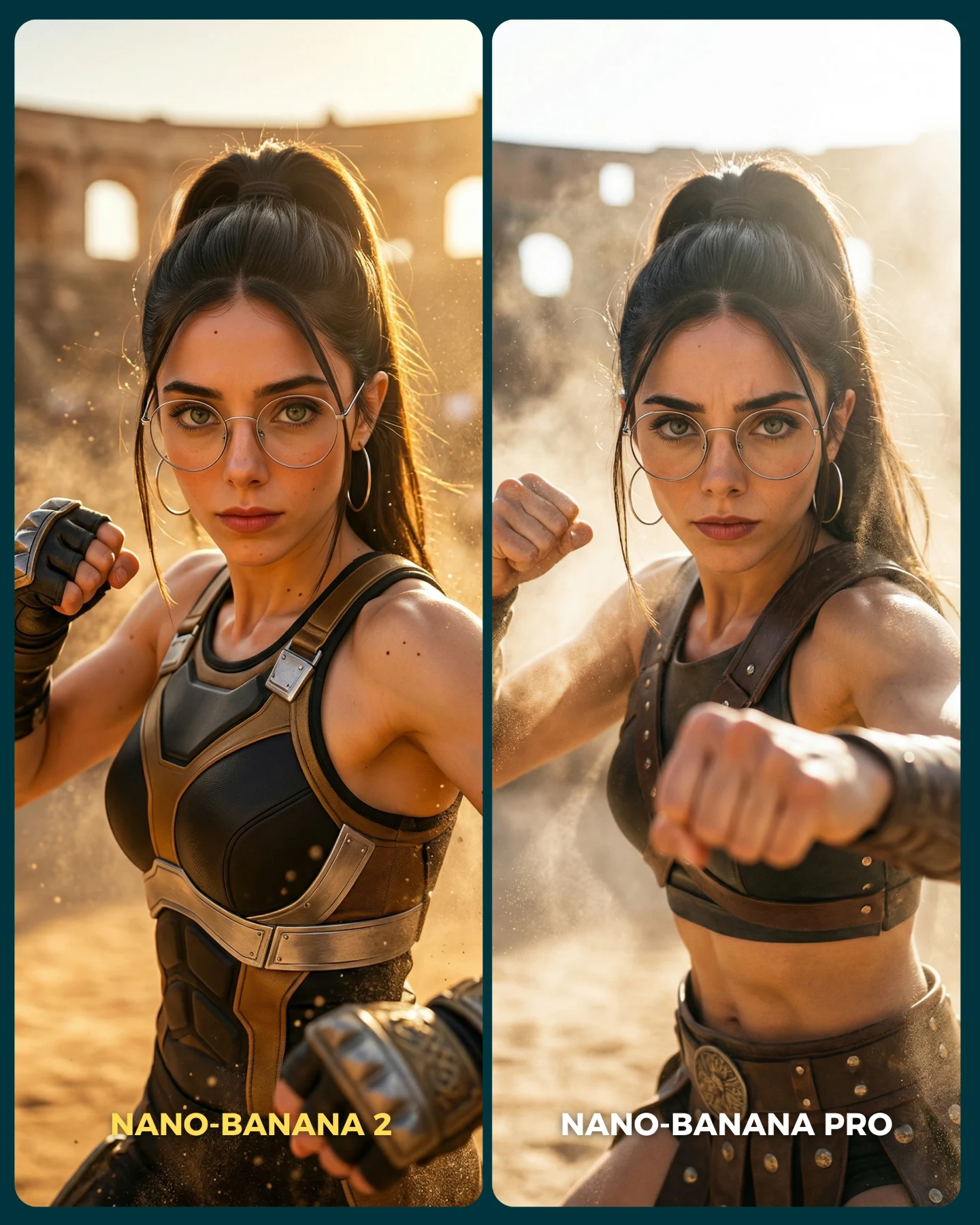
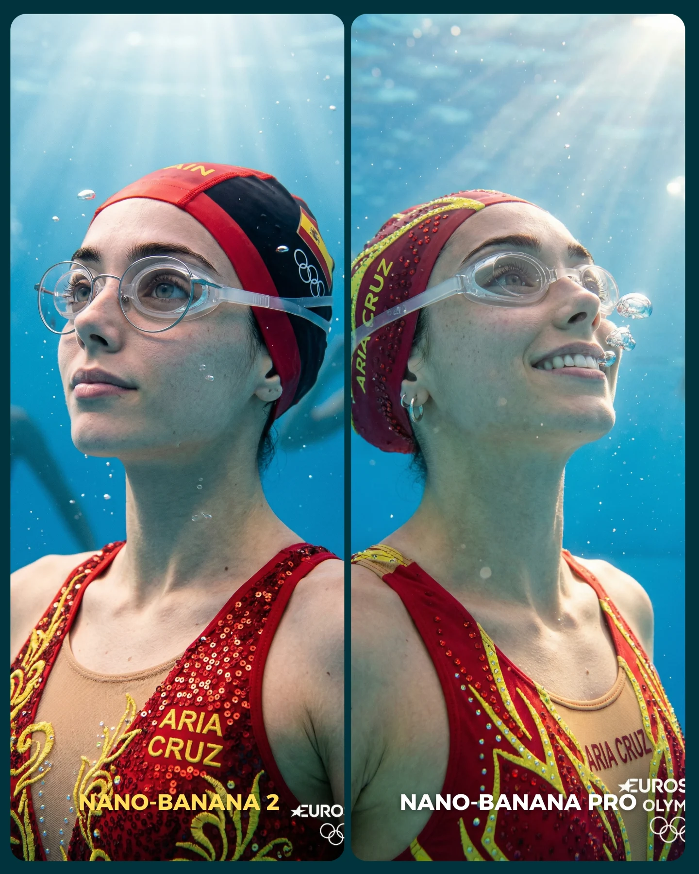
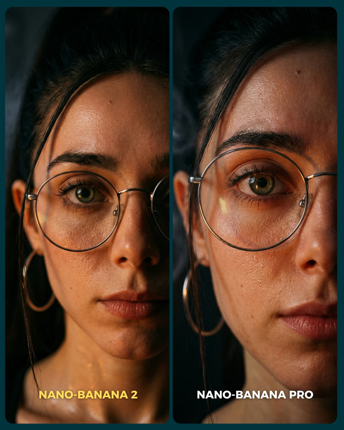
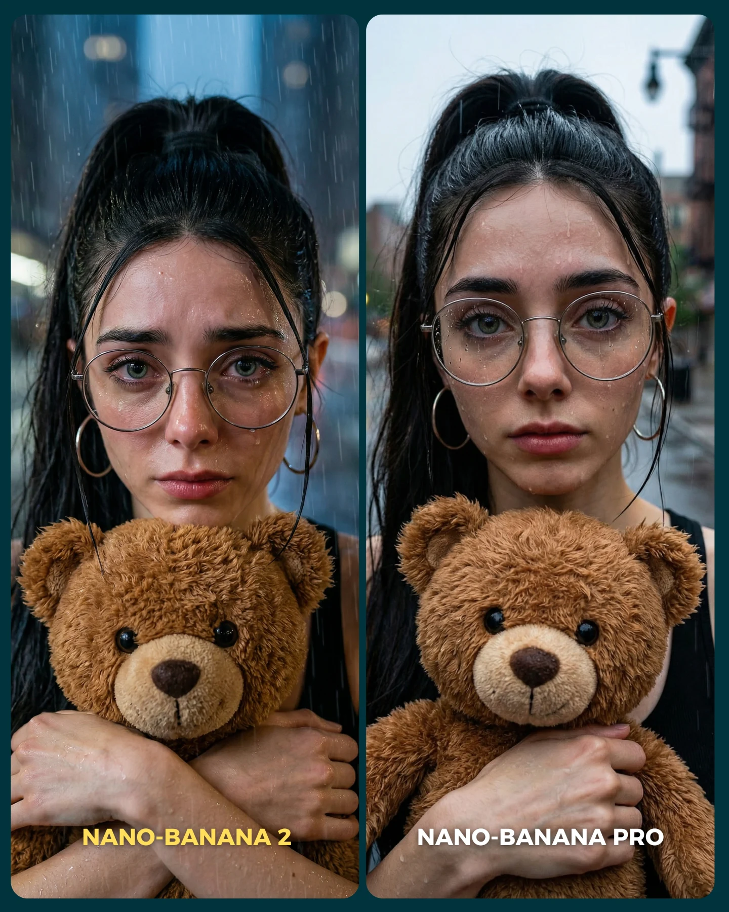
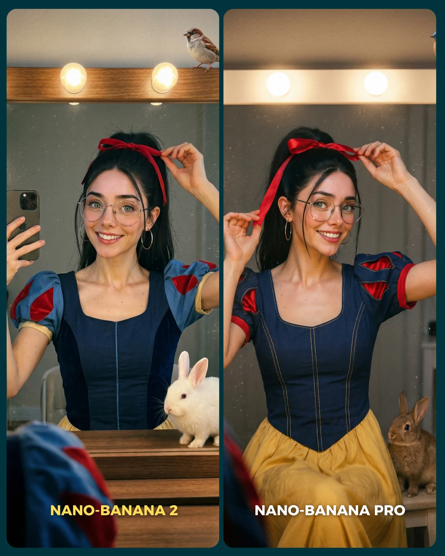
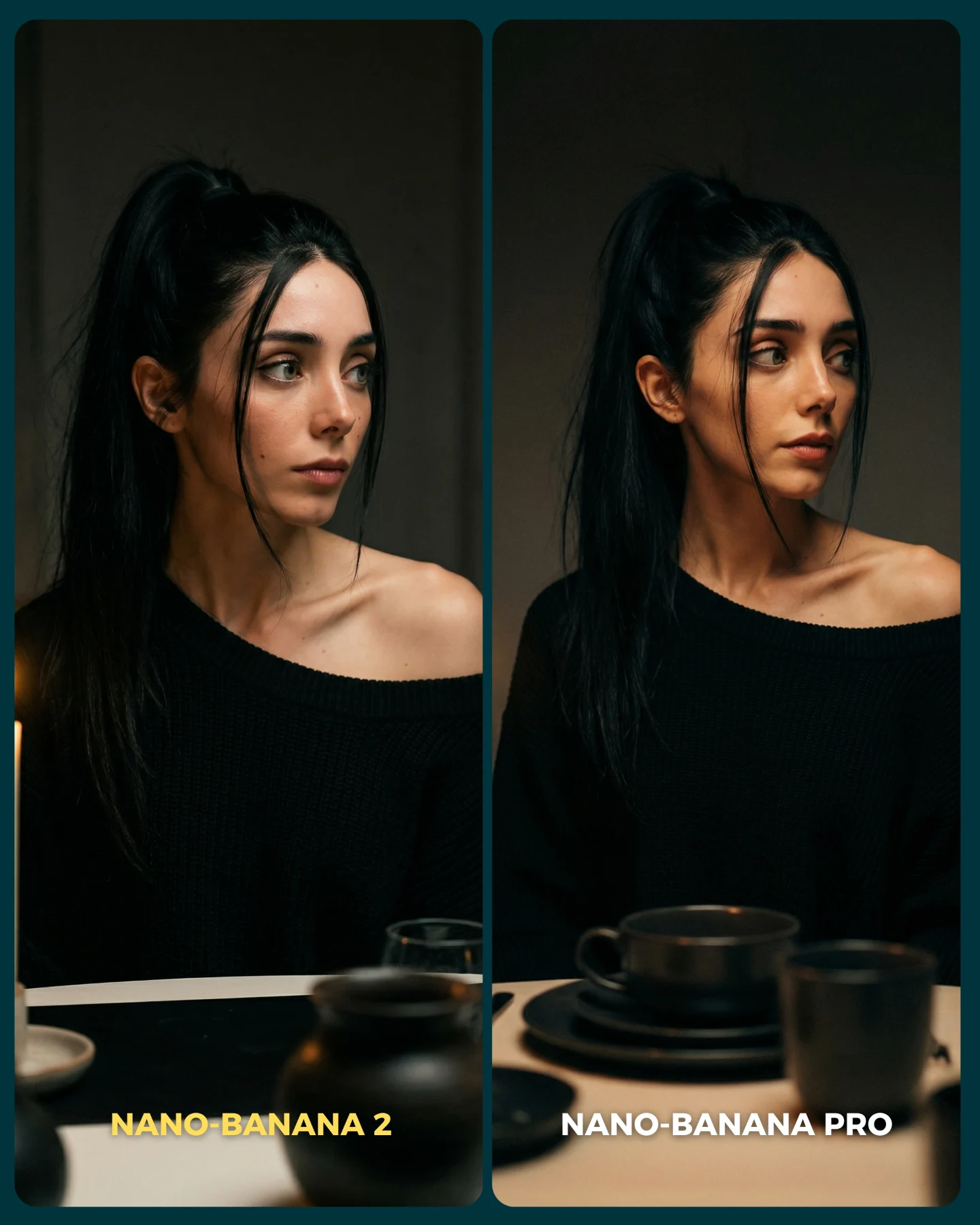
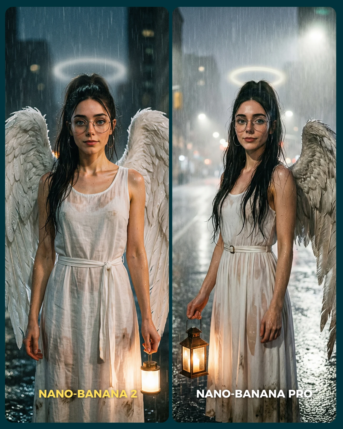
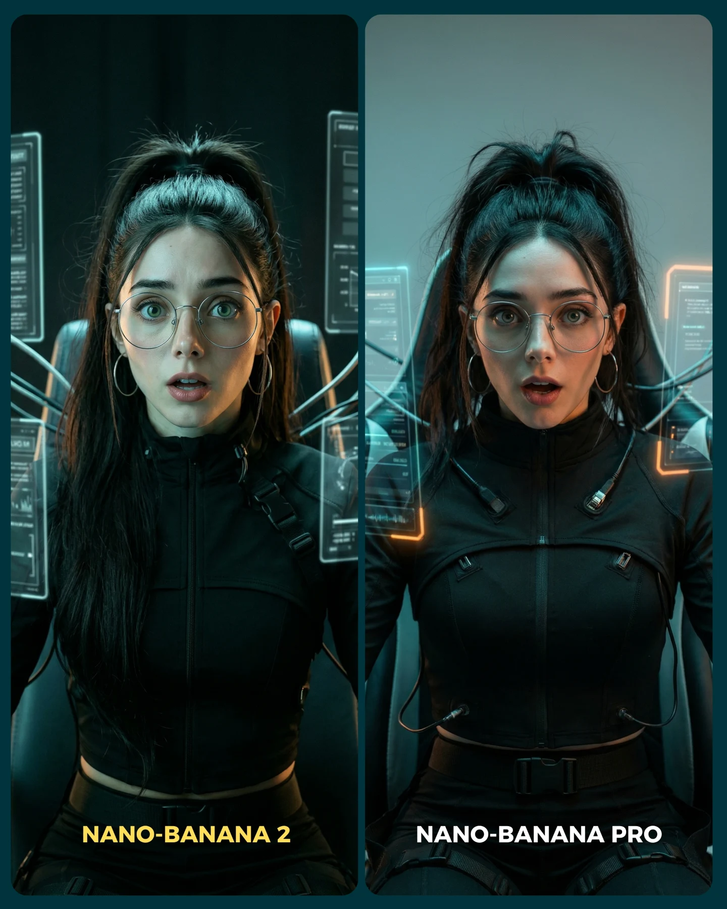
This image is more than a cute character shot. It is a visual argument. The entire frame is built as a direct A/B comparison between two image-generation styles, and that makes it unusually valuable for creators. Instead of explaining quality differences in abstract terms, the image lets viewers see them through one identical setup: same girl, same outfit, same color palette, same basic pose, two different rendering outcomes. That is a much stronger teaching device than a generic “which model is better?” caption.
The concept works because it treats model comparison as content, not as a technical benchmark. The left side is toy-like and flatter, with a packaged anime vibe. The right side feels more physical and event-like, as if the girl is standing inside a real illuminated booth. That realism gap is instantly legible. Even people who do not care about the model names can still understand the visual story.
How soy_aria_cruz Made This Display Box AI Portrait and How to Recreate It
Audiences love frames that ask them to judge something with their own eyes. The split-screen structure creates a built-in game: compare, pick a favorite, comment, debate. The creator does not need to force engagement because the design already invites it. At the same time, the pastel styling and doll-like pose keep the frame soft and fun, so the post does not feel like a dry software review.
| Signal | Evidence (from this image) | Mechanism | Replication Action |
|---|
| Controlled comparison | The same subject, outfit, and pose appear in both panels. | Viewers can isolate quality differences instead of getting distracted by content differences. | Lock identity, wardrobe, and composition before comparing any model or rendering style. |
| Style contrast | The left panel reads flatter and more synthetic, while the right panel reads more spatial and realistic. | The difference becomes visible immediately, which makes the post easy to discuss. | Choose one stylized treatment and one realism-forward treatment, not two similar variants. |
| Comment bait without being cheap | The split frame naturally asks “which one wins?” | Debate emerges from the image design itself rather than from forced engagement tricks. | Use side-by-side layouts when you want audience judgment to become the hook. |
Use cases and transfer logic
This format is ideal for model comparisons, prompt-engine A/B tests, before-and-after render studies, and any creator content where the educational point is easier to show than to explain. It also works for branded prompt packs because each panel can demonstrate a controlled variable while preserving a recognizable hero character.
- Best fit: AI model comparisons. Why it fits: the image makes quality differences obvious without long explanation. What to change: keep the hero identical and swap only the rendering pipeline or realism target.
- Best fit: style transfer demos. Why it fits: viewers can compare packaging aesthetics versus real-world booth aesthetics instantly. What to change: keep the same wardrobe and expression while changing only environment logic.
- Best fit: educational social posts. Why it fits: the image doubles as both proof and thumbnail. What to change: simplify or intensify each side depending on the lesson you want to teach.
- Not ideal: purely emotional storytelling. Reason: the comparison structure dominates the frame and pushes the audience into evaluation mode.
- Not ideal: product-led ecommerce content. Reason: the attention goes to the A/B outcome, not to a single product hierarchy.
Transfer recipe one: keep the split-screen and identical subject lock; change the left side to anime figurine packaging and the right side to real retail display; slot template: {same character} {same outfit} {stylized panel} vs {realistic panel}. Transfer recipe two: keep the pastel fashion character and comparison logic; change the theme from ninja to cyber schoolgirl; slot template: {hero avatar} {controlled wardrobe} {graphic packaging style} vs {physical booth realism}. Transfer recipe three: keep the booth structure and crowd reflections; change the test from realism to luxury photography; slot template: {same subject} {split render test} {synthetic side} vs {premium-real side}.
Aesthetic read
The strongest aesthetic move is the decision to use the same lilac palette on both sides. That color continuity holds the image together, even though the two treatments are doing different things. If the wardrobe changed between panels, the comparison would feel messy and less trustworthy. By keeping the girl, the hoodie, the skirt, the socks, and the heart bag consistent, the creator makes the viewer focus on realism, materials, and spatial depth.
The left panel also succeeds because it is not merely “bad.” It has its own coherent packaging logic. The ninja icons, stickers, and illustrated box edge elements create a toy-like charm. That matters because a good comparison needs two readable visual languages, not one polished side and one meaningless side. The right panel then wins by feeling more embodied: glass reflections, crowd presence, and booth lighting give it physical credibility.
| Observed | Why it matters for recreation |
|---|
| Two equal vertical panels with one subject in each | The comparison only works if both sides feel structurally parallel. |
| Same lilac outfit and heart bag across both sides | Identity lock is what makes the experiment feel valid. |
| Anime-ninja box art and stickers on the left | This gives the synthetic side a clear, intentional visual language. |
| Glowing glass booth and spectator reflections on the right | These are the key realism cues that make the right panel feel stronger. |
| Bottom labels naming both versions | Text anchors the comparison and improves scanability for social feeds. |
Prompt technique breakdown
To remake this image well, the main rule is to prompt the comparison structure before the character styling. If you start only from “cute girl in lavender outfit,” the image will drift into generic cosplay or fashion portrait territory. The split-system comes first.
| Prompt chunk | What it controls | Swap ideas (EN, 2–3 options) |
|---|
| two-panel side-by-side comparison image | Overall structure and comparison readability | split-screen render test; A/B visual comparison; dual-panel model showdown |
| same girl in both panels with identical outfit and pose | Identity lock and experiment fairness | same character duplicated across both panels; consistent avatar comparison; identical hero styling |
| pastel lavender cropped hoodie, pleated skirt, white thigh-high socks, heart bag | Wardrobe signature and softness | lavender schoolgirl set; pastel idol outfit; lilac doll-core fashion look |
| left panel stylized anime-ninja packaging art | The flatter, more synthetic treatment | toy-box anime style; graphic figurine packaging; illustrated kawaii ninja box |
| right panel realistic glass booth with crowd reflections | The realism-forward treatment | event showcase booth; trade-show display case; illuminated transparent exhibit box |
Execution playbook
Start by locking the hero identity, the wardrobe, and the exact split-screen format. Those three controls should not move. Then apply the one-change rule. First run: get both panels aligned structurally. Second run: refine only the left-side graphic packaging details. Third run: refine only the right-side realism cues such as reflections and crowd depth. Fourth run: adjust text labels and sticker details without changing the main comparison.
- Baseline: lock same character, same outfit, same pose, strict two-panel layout.
- Iteration 2: change only the synthetic side’s graphic language.
- Iteration 3: change only the realistic side’s glass, lighting, and crowd behavior.
- Iteration 4: change only labels, decals, or minor accessory motifs.
This sequence works because comparison images fall apart when both sides drift at once. Stability is what gives the contrast meaning.