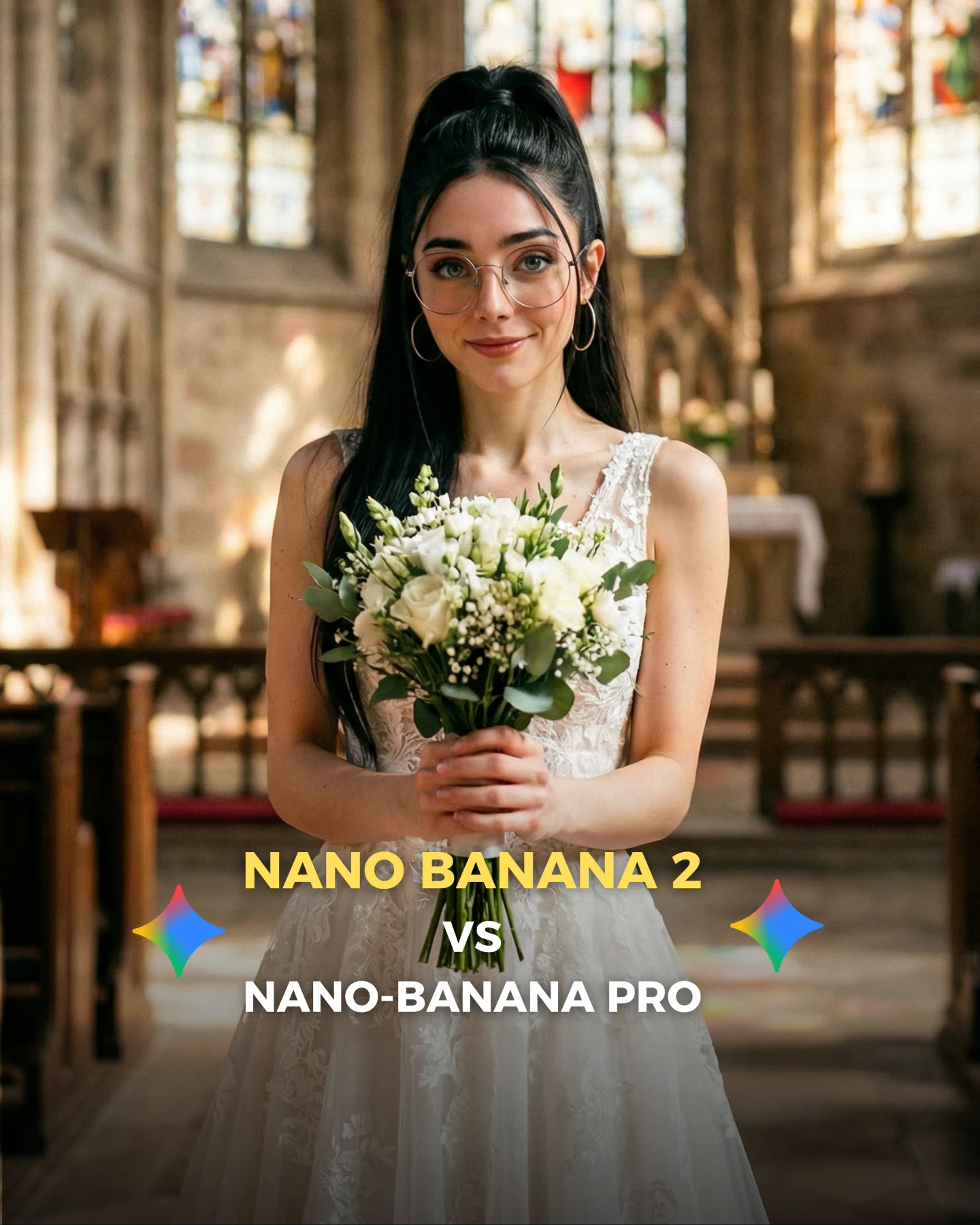
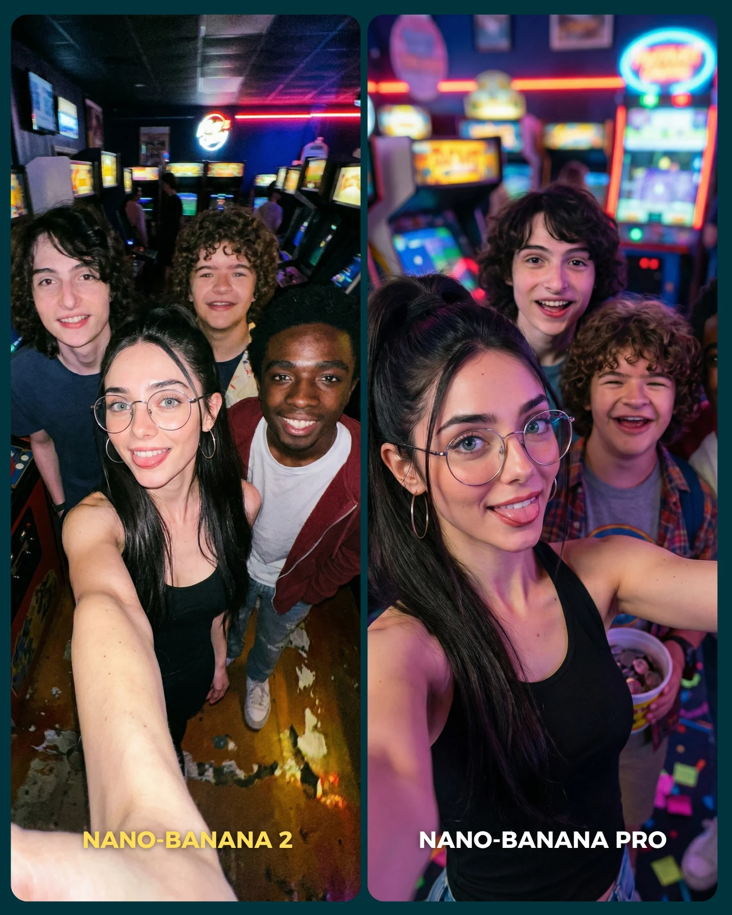
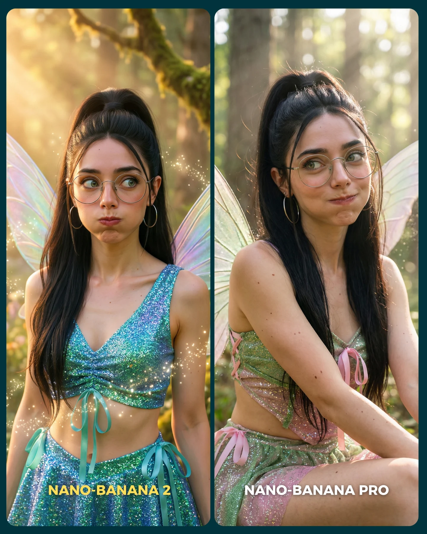
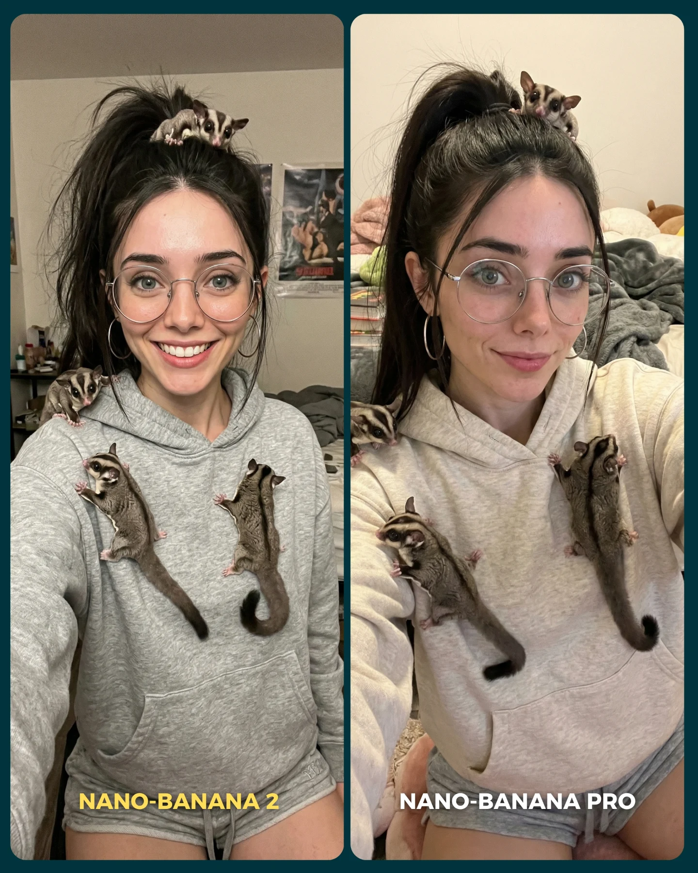
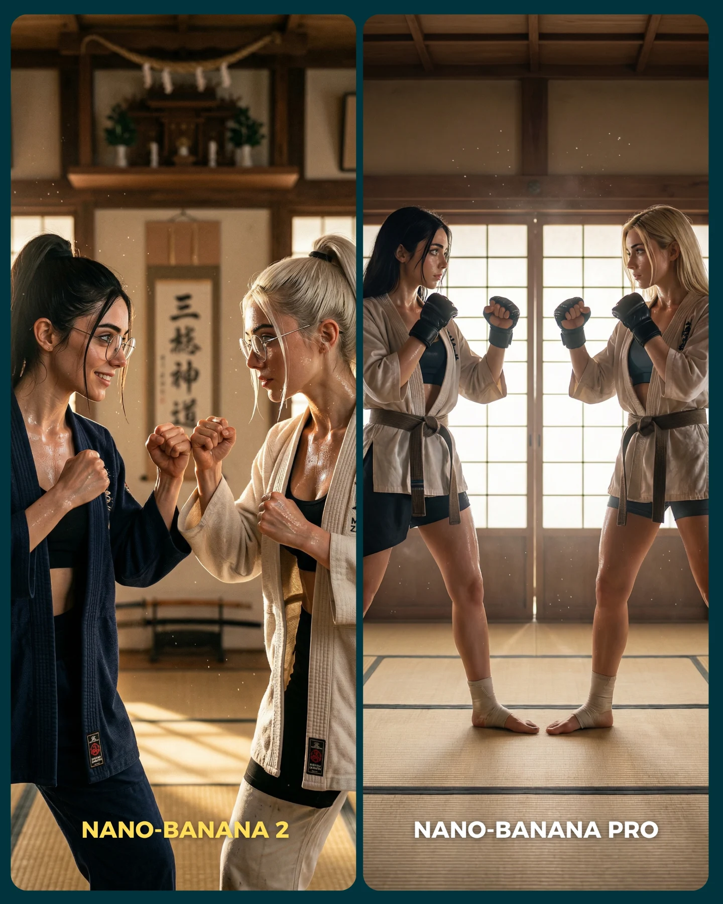
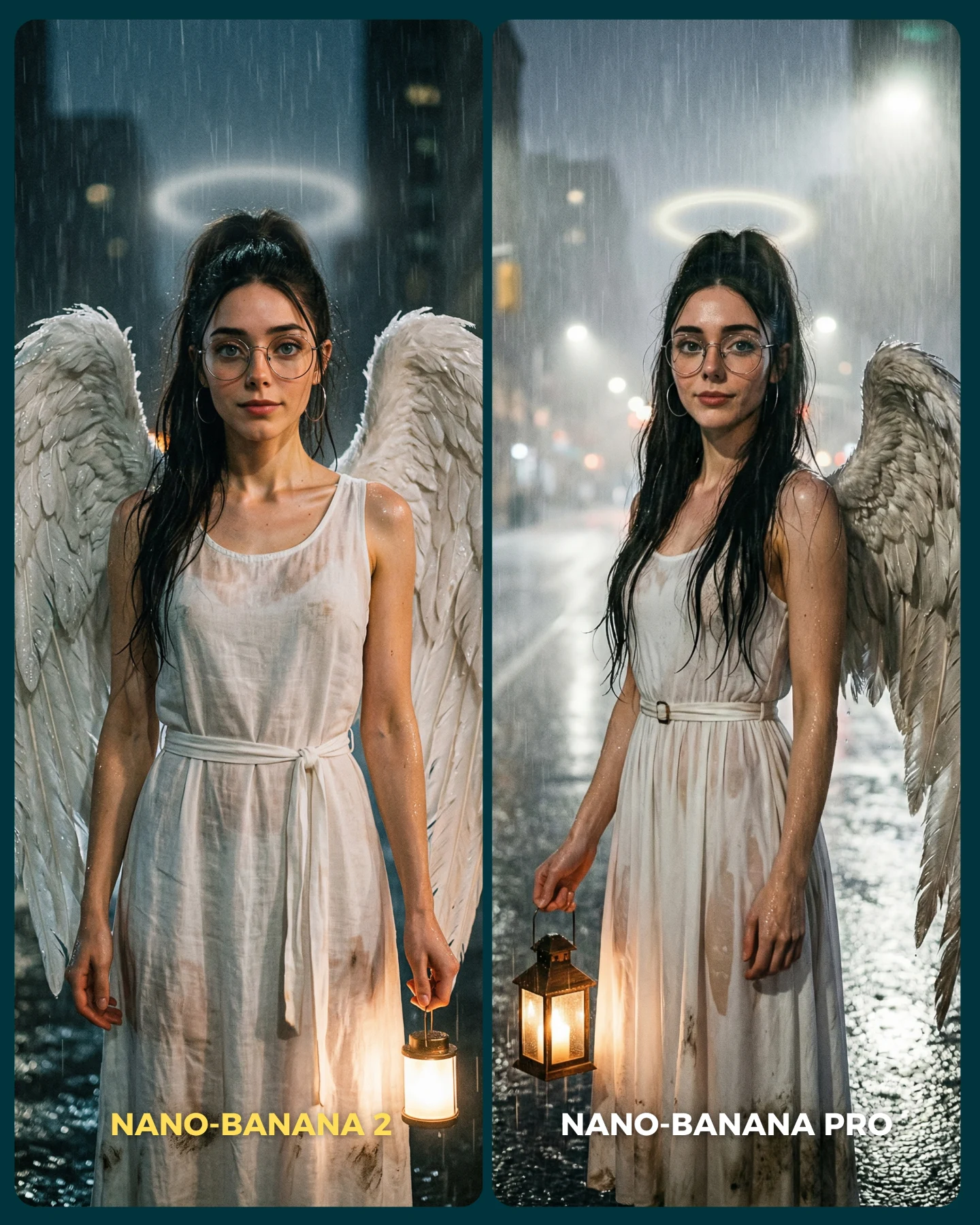
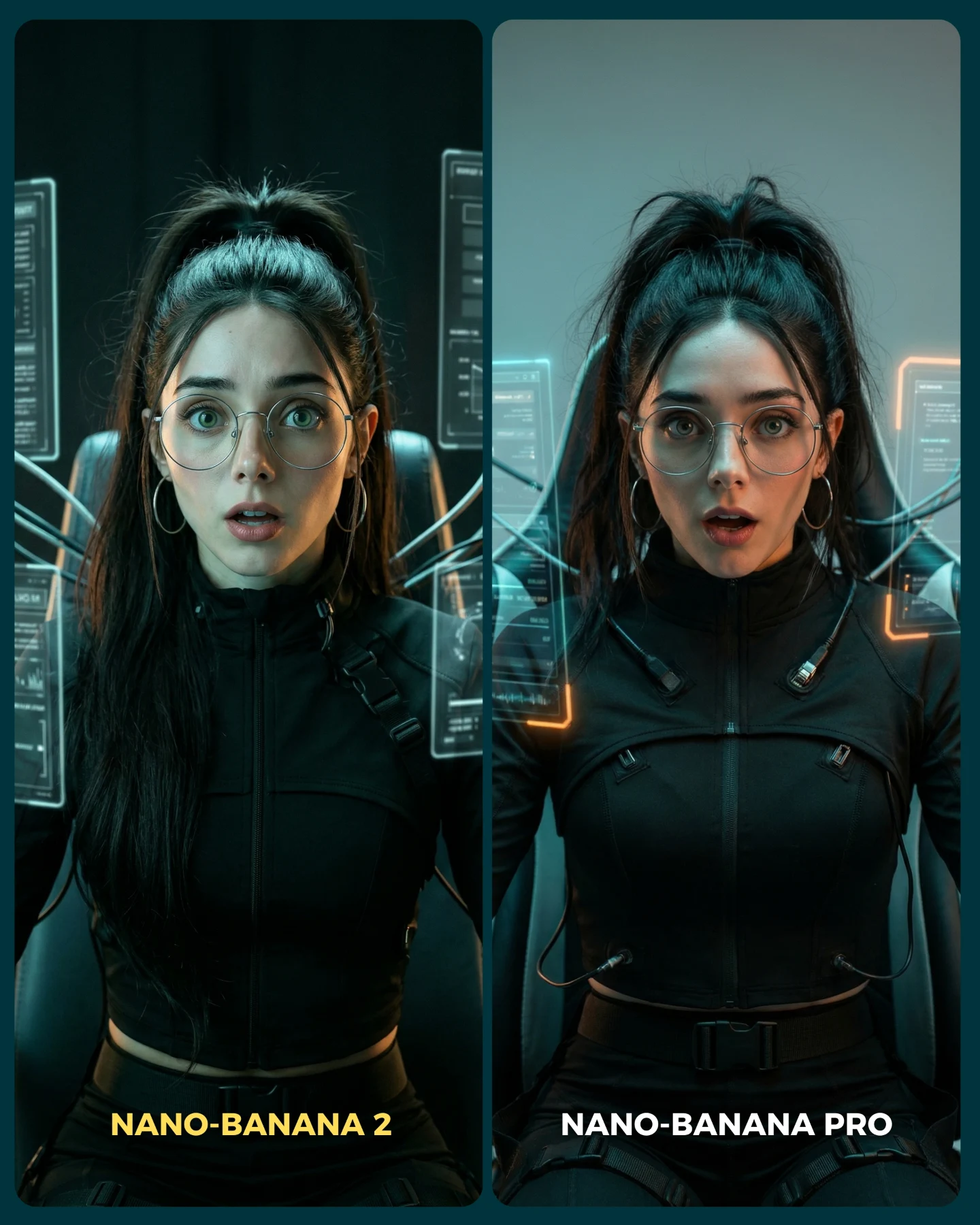
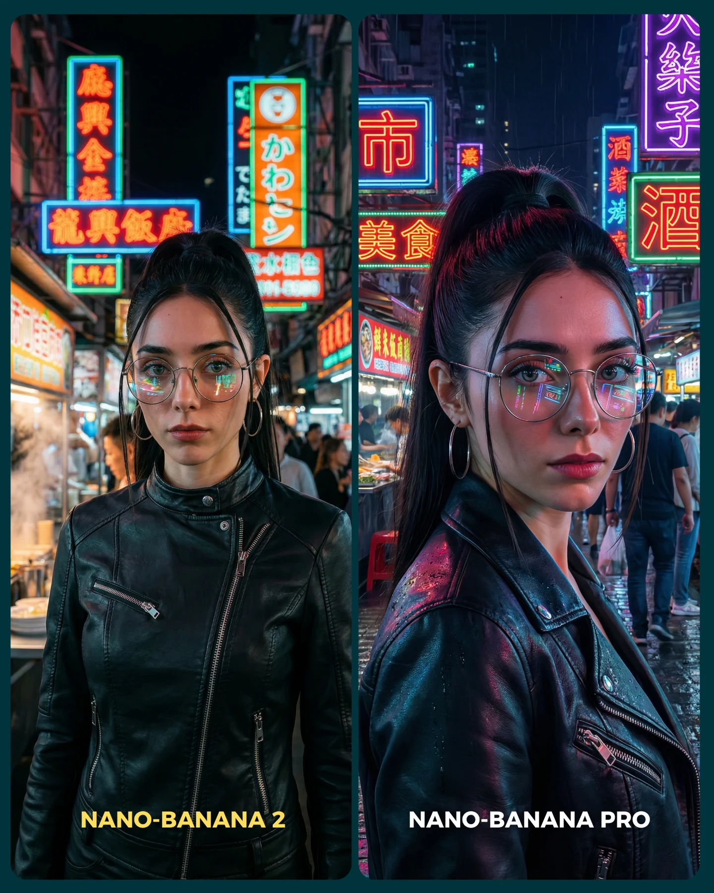
Nano Banana 2 Vs. Nano Banana PRO 💥
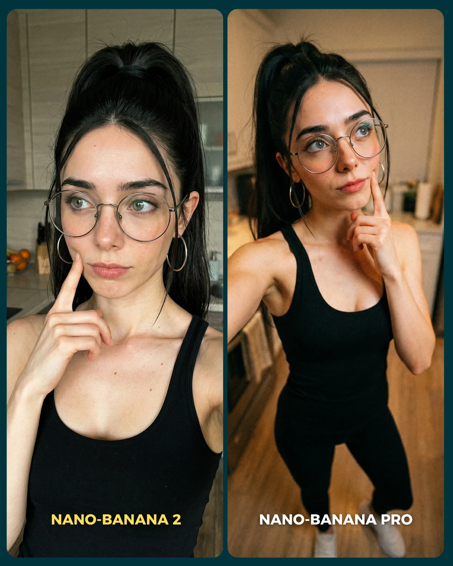
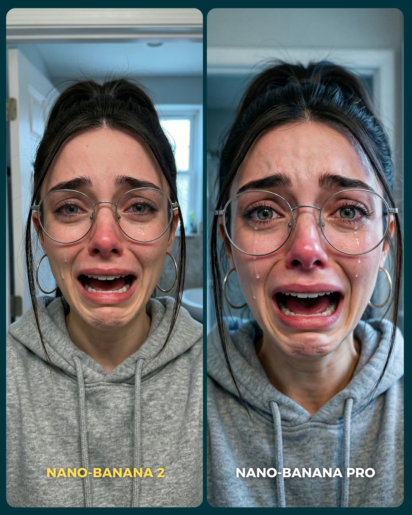
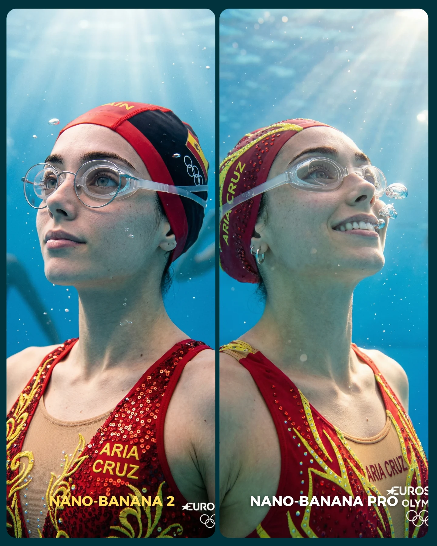
Google acaba de lanzar un nuevo generador de imágenes... Lleva un 2 pero no significa que sea mejor que el Pro 👀 (No es Nano Banana Pro 2)
Para ponerlo realmente a prueba, las imágenes que he seleccionado para testearlo son todas las que Nano Banana Pro me daba "poco realistas"
Tras ver los resultados... Sigo pensando que la versión Pro lo hace mejor que la nueva 😅 Pero si es verdad que en algunas ocasiones no es así!
Igualmente quiero escuchar tu opinión al respecto 💌 Y comenta "ARIA" si quieres que te pase los prompts de todas las imágenes 💕
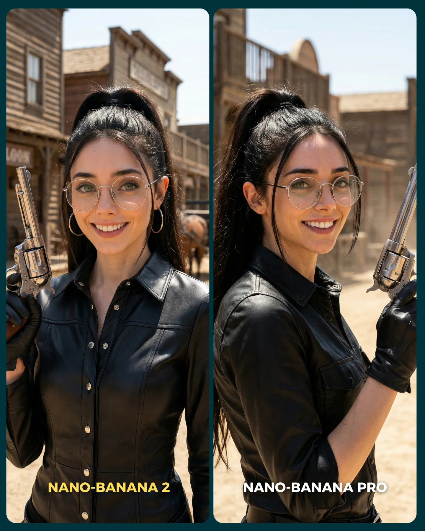
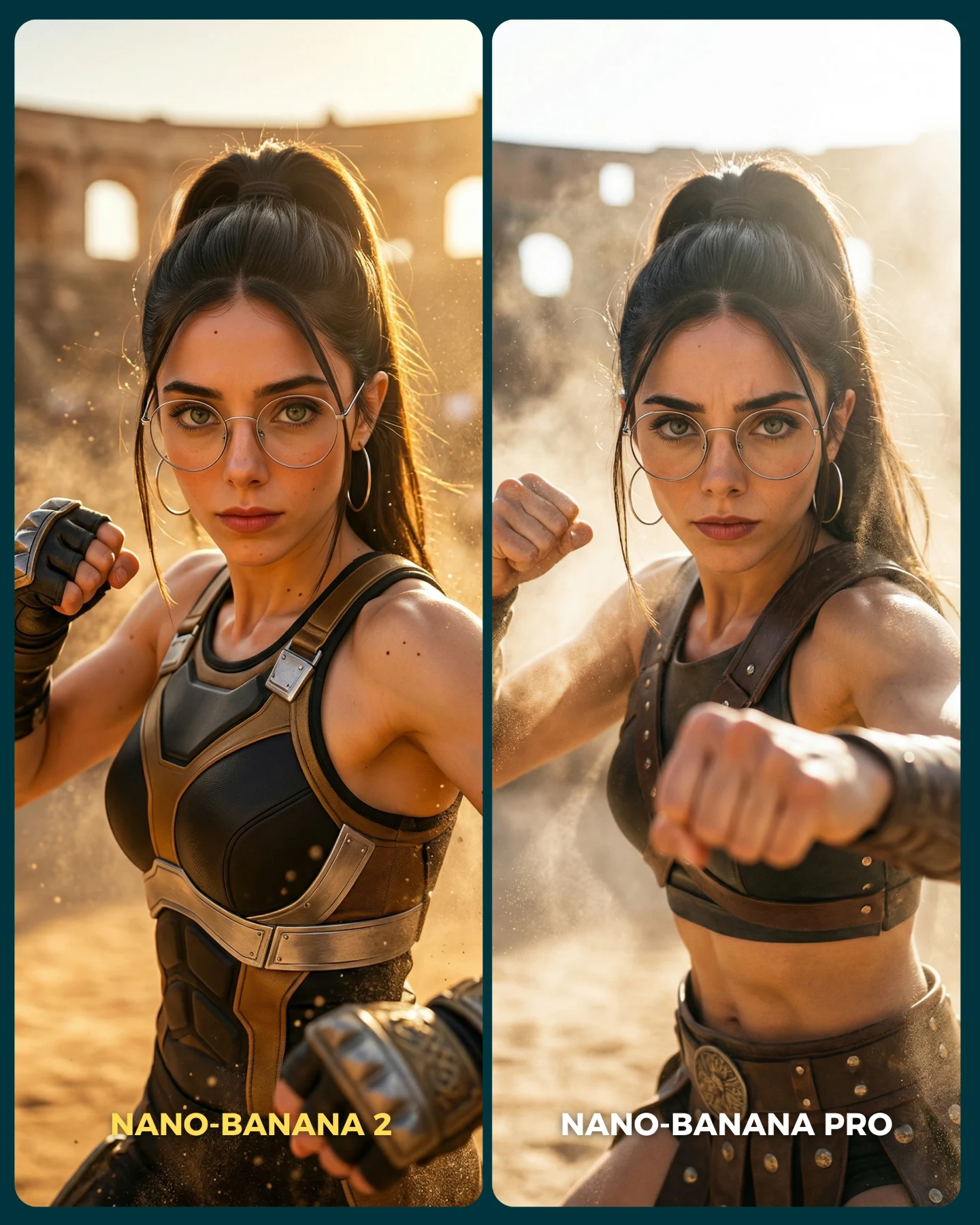
Western Gunslinger Model Comparison AI Photo
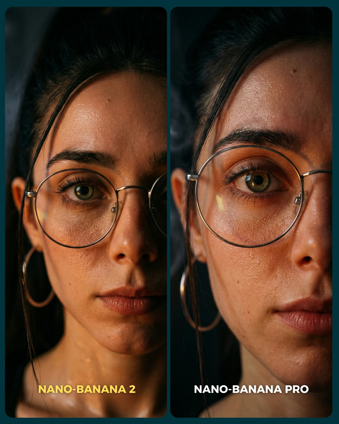
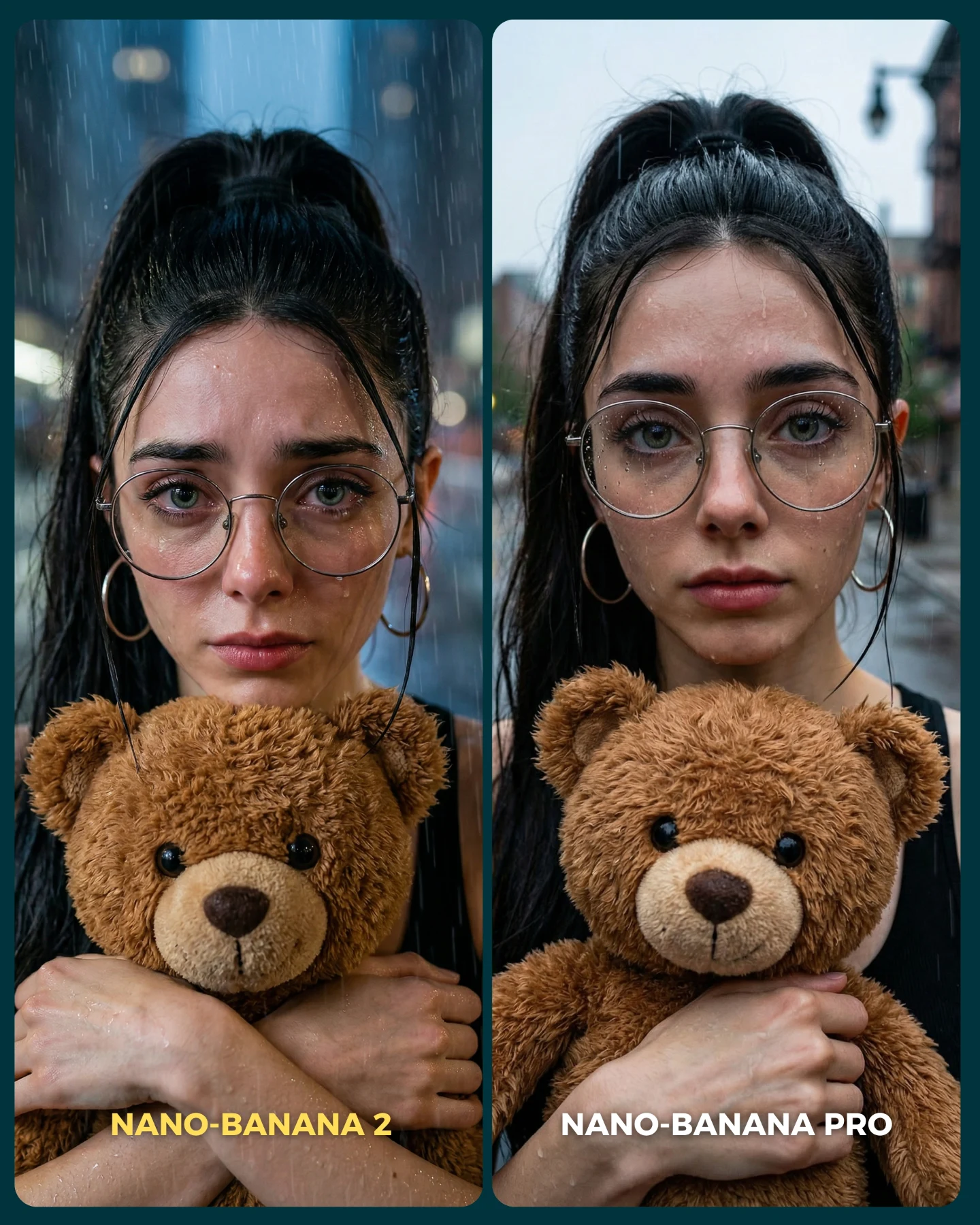
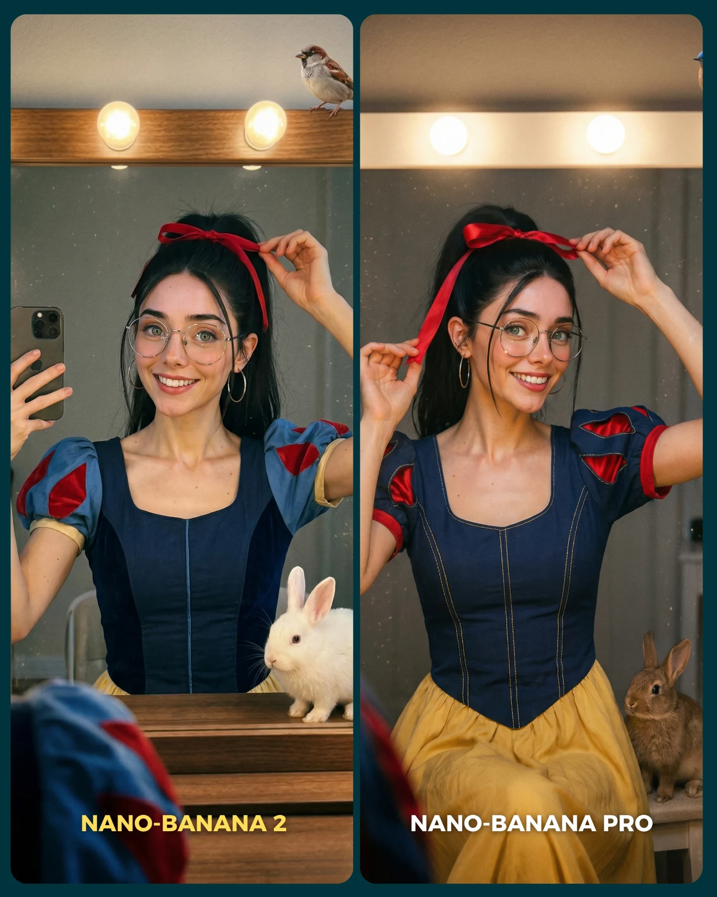
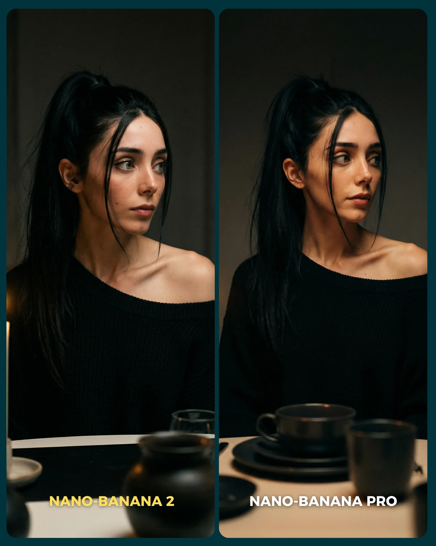
This image is effective because it turns a model benchmark into something instantly legible and entertaining. Instead of comparing invisible prompt settings or abstract claims, it compares two clearly labeled outputs in a scene that naturally reveals realism differences. The western styling gives the image strong genre recognition, and the side-by-side layout gives the audience a reason to judge.
The concept is also smart because it tests multiple difficult things at once: skin realism in hard daylight, glasses placement, reflective metal on the revolver, leather texture, facial consistency, and believable background depth. That means the image can function both as an attractive post and as evidence in a model-quality conversation.
Why viewers engage with this format
The strongest mechanic is visible comparison. The labels at the bottom tell viewers what the question is before they read a single word of caption. Once that happens, the audience starts looking for proof. Which face feels more natural? Which background feels more cinematic? Which pose feels more convincing? That search process increases attention and invites comments.
The western genre also helps because it gives the comparison a memorable costume and prop system. Black leather, dusty streets, wooden facades, and a polished revolver create a strong silhouette. If the same benchmark had used a generic indoor portrait, the differences would feel less exciting to inspect.
Signal
Evidence (from this image)
Mechanism
Replication Action
A/B clarity
Two clearly labeled vertical panels with the same subject and setting
Viewers instantly understand they are meant to compare
Put the benchmark choice directly in the image, not only in the caption
Genre-rich test case
Western town backdrop, black leather styling, silver revolver, bright dust-filled daylight
The scene exposes realism differences through many visible surfaces
Choose settings with varied materials, light, and background depth
Consistent identity across both panels
Same woman, same outfit, same prop, same mood
The audience can judge model quality rather than concept changes
Keep the brief stable while only changing the generation source
Where this style fits best
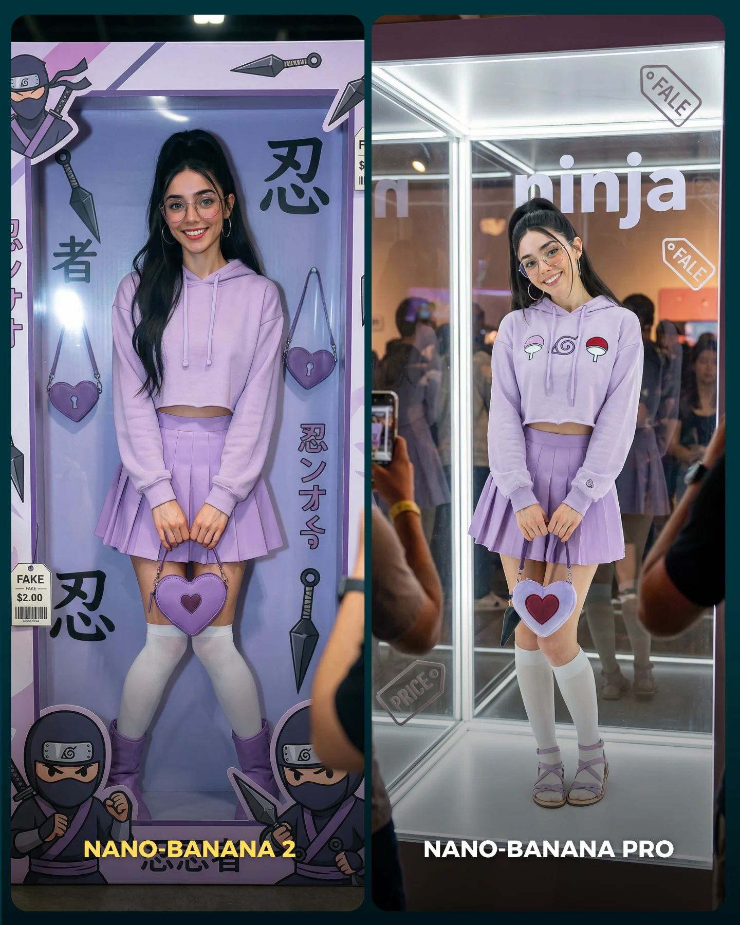
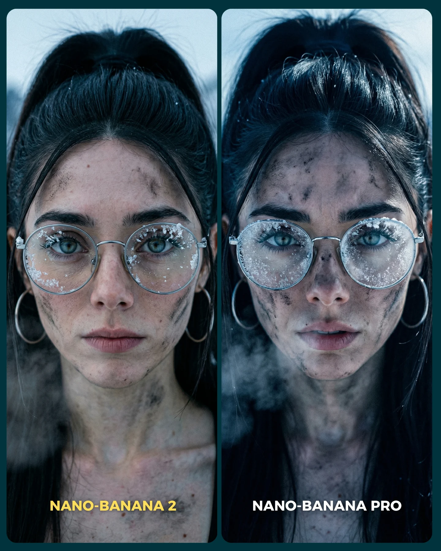
This format is strongest for model comparison posts, prompt-testing content, and creator-led experiments where the audience is invited to pick a winner. It is also useful for niche aesthetic tests, because the genre styling makes the benchmark feel like entertainment rather than homework.
Model showdown posts: The split-screen makes the decision easy and comment-friendly.
Prompt education: Viewers can see how identical concepts render differently across engines.
Genre tests: Western, cyberpunk, fantasy, and noir all work well in this format because they expose model style control.
Series branding: Repeating the same comparison structure can become a recognizable format for the creator.
It is less ideal for intimate storytelling or abstract conceptual art. The power here comes from clarity, not ambiguity. The audience needs to know what they are comparing and why it matters.
Three transfer recipes
Noir detective version: Keep the two-panel comparison and stable character brief, then switch to trench coat, rain, and city-night lighting. Slot template: {shared character brief} {left model output} {right model output} {clear genre labels}
Sci-fi bounty hunter version: Keep the side-by-side structure, but replace western props with futuristic gear and urban neon. Slot template: {benchmark scene} {model A rendering} {model B rendering} {bottom comparison text}
High-fashion editorial version: Keep the same model-testing logic while replacing the western town with runway or rooftop styling. Slot template: {editorial concept} {comparison panel A} {comparison panel B} {direct labels}
Aesthetic read: why the image still feels polished
The scene works because the genre cues are strong without becoming costume-party obvious. The leather outfit, revolver, and backlot buildings quickly establish the western world, but the smiling expression keeps the image accessible. That is a useful lesson for AI benchmarks: they perform better when they still feel shareable as images, not just as tests.
The two crops also help the comparison feel richer. The left panel emphasizes face and outfit polish, while the right panel gives more room to judge background depth and body-angle realism. That makes the viewer feel like they are seeing more than one dimension of the test.
Observed
Why it matters
Bright dusty western backlot setting
Creates strong genre identity and visible realism cues
Reflective silver revolver and black leather outfit
Tests how well each model handles tricky materials
Eyeglasses on the subject
Adds another realism checkpoint that often breaks in generations
Front portrait on left, three-quarter portrait on right
Broadens the comparison beyond a simple duplicate
Readable bottom labels
Turns the visual into a debate-ready benchmark card
Prompt technique breakdown
To make this style work, treat it as a benchmark board first and a portrait second. The split structure, identical identity cues, and genre-rich environment all need to be explicit. If those are vague, the comparison becomes mushy and the audience loses interest.
Prompt chunk
What it controls
Swap ideas (EN, 2-3 options)
two-panel labeled comparison layout
The social A/B test behavior
before/after comparison; v1 vs pro; baseline vs upgraded model
same woman in a western gunslinger portrait
Identity consistency across both outputs
same detective portrait; same racing-driver portrait; same fantasy queen portrait
bright dusty wooden backlot
Genre clarity and environmental realism test
rainy noir street; desert gas station; retro diner strip
black leather outfit, glasses, revolver
Material realism and silhouette recognizability
latex bodysuit and visor; denim jacket and holster; velvet blazer and gloves
left tighter, right more angled and open
Variation without abandoning a fair comparison
close portrait vs waist-up; front view vs side turn; face emphasis vs scene emphasis
How to iterate this kind of image
Baseline lock the split-screen format, the western town environment, and the identity markers first. Then refine only one or two layers at a time. First fix the subject consistency, second fix the revolver and hand realism, third refine the leather texture and glasses reflections, and fourth tune background depth and label readability.
The broader growth lesson is simple: comparison posts win when the image itself carries the argument. This one does that well. It gives the audience a world to enjoy and a decision to make at the same time.