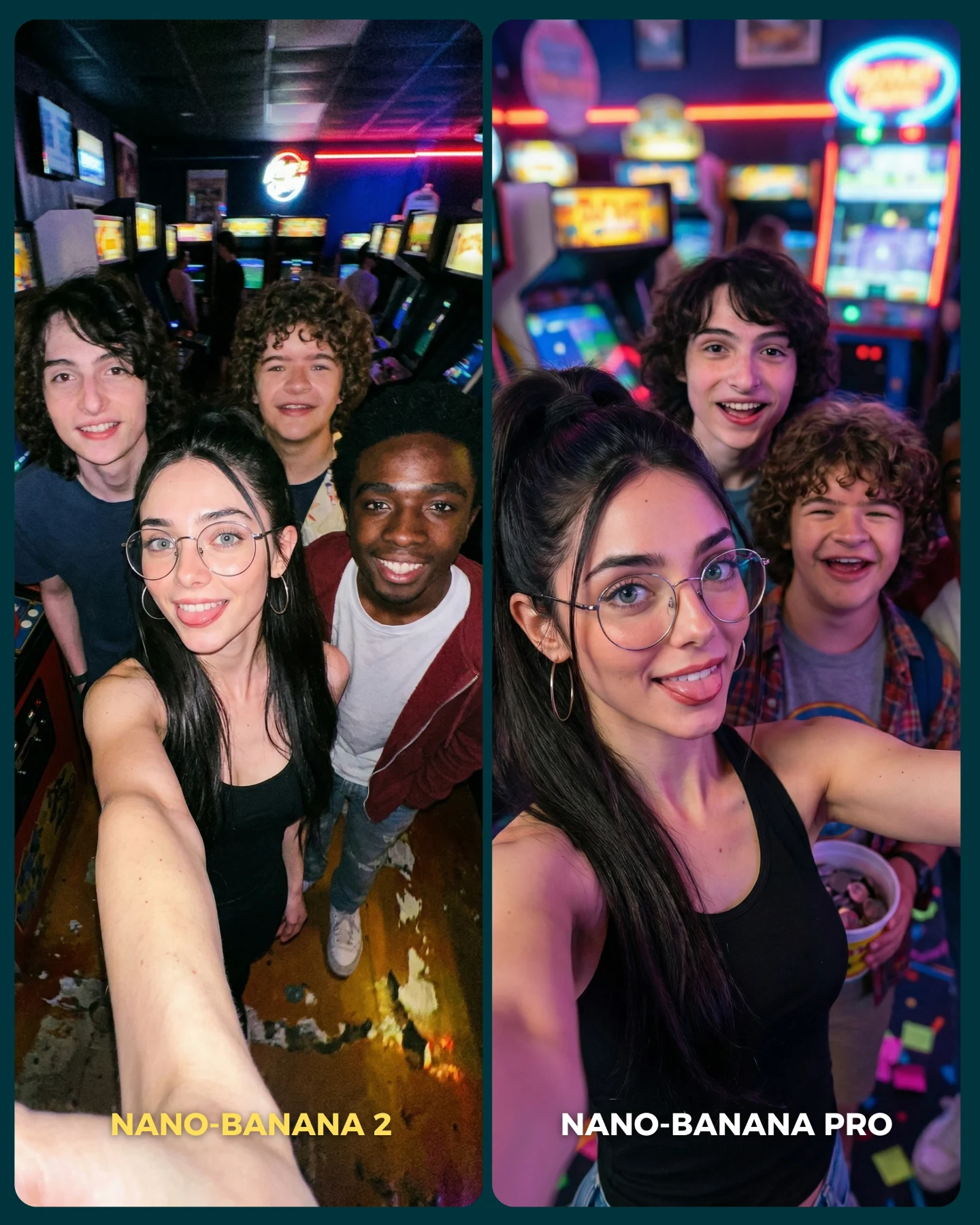
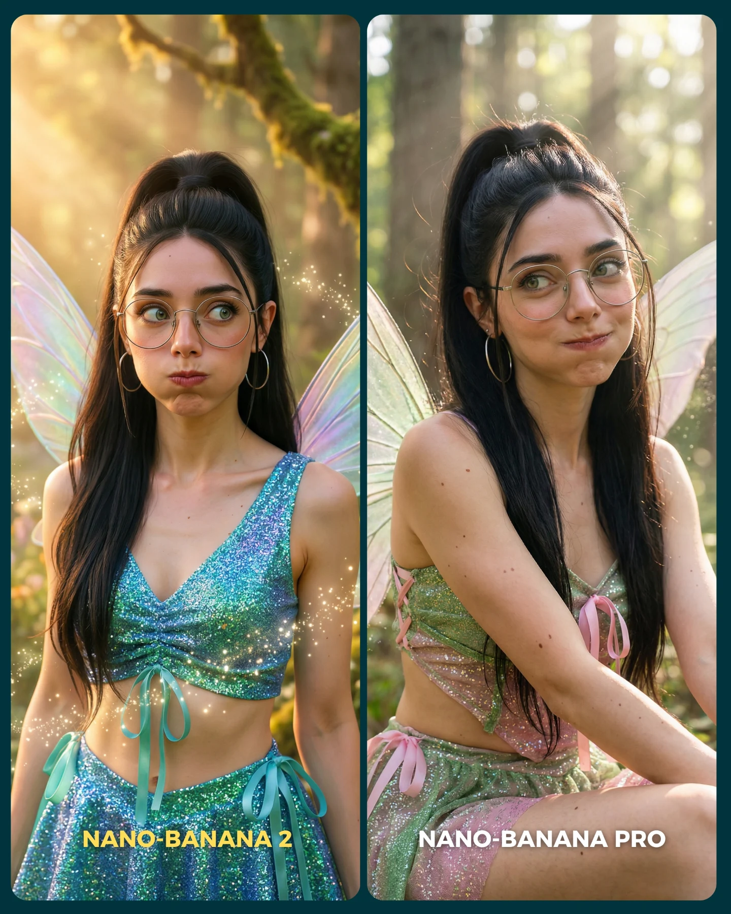
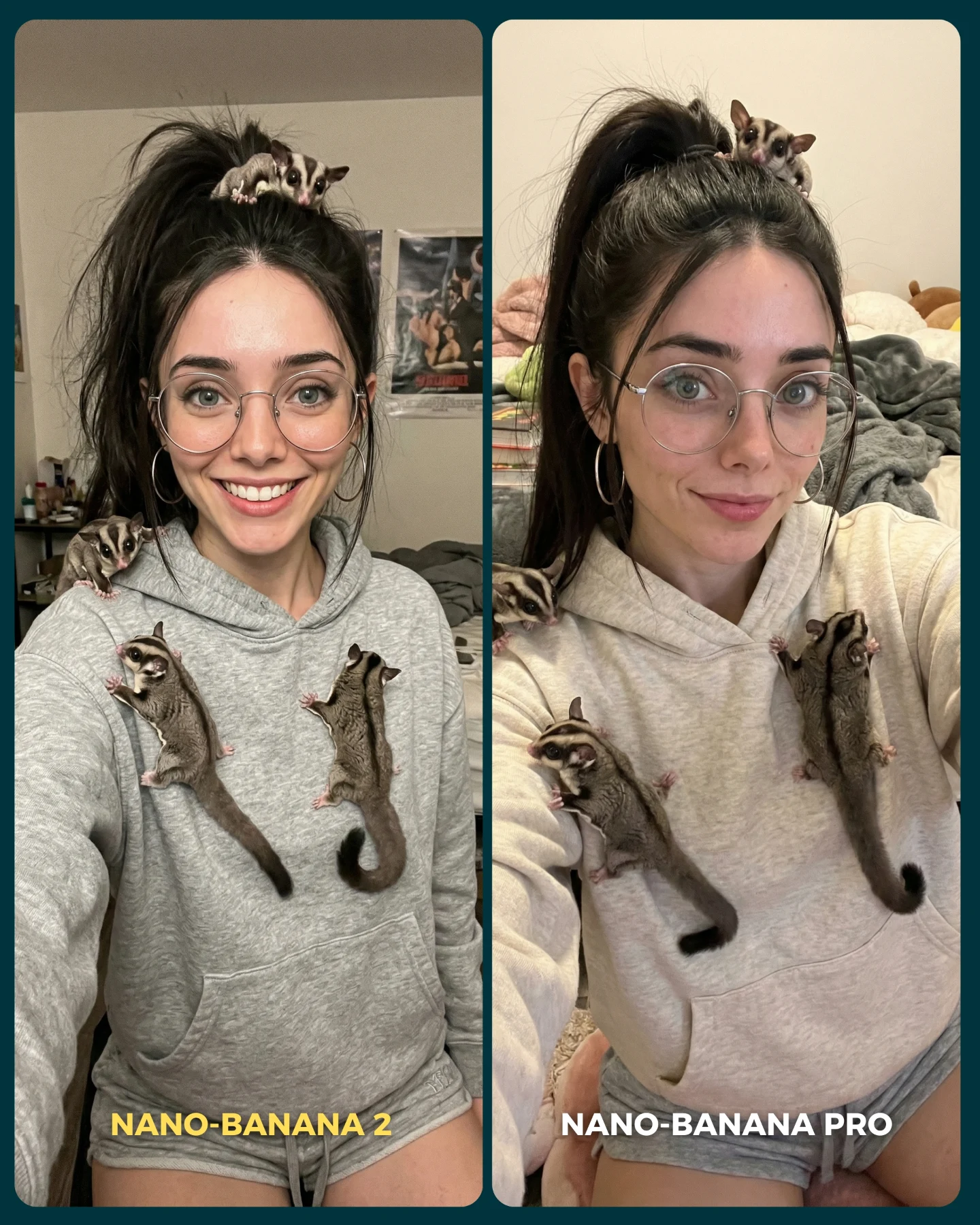
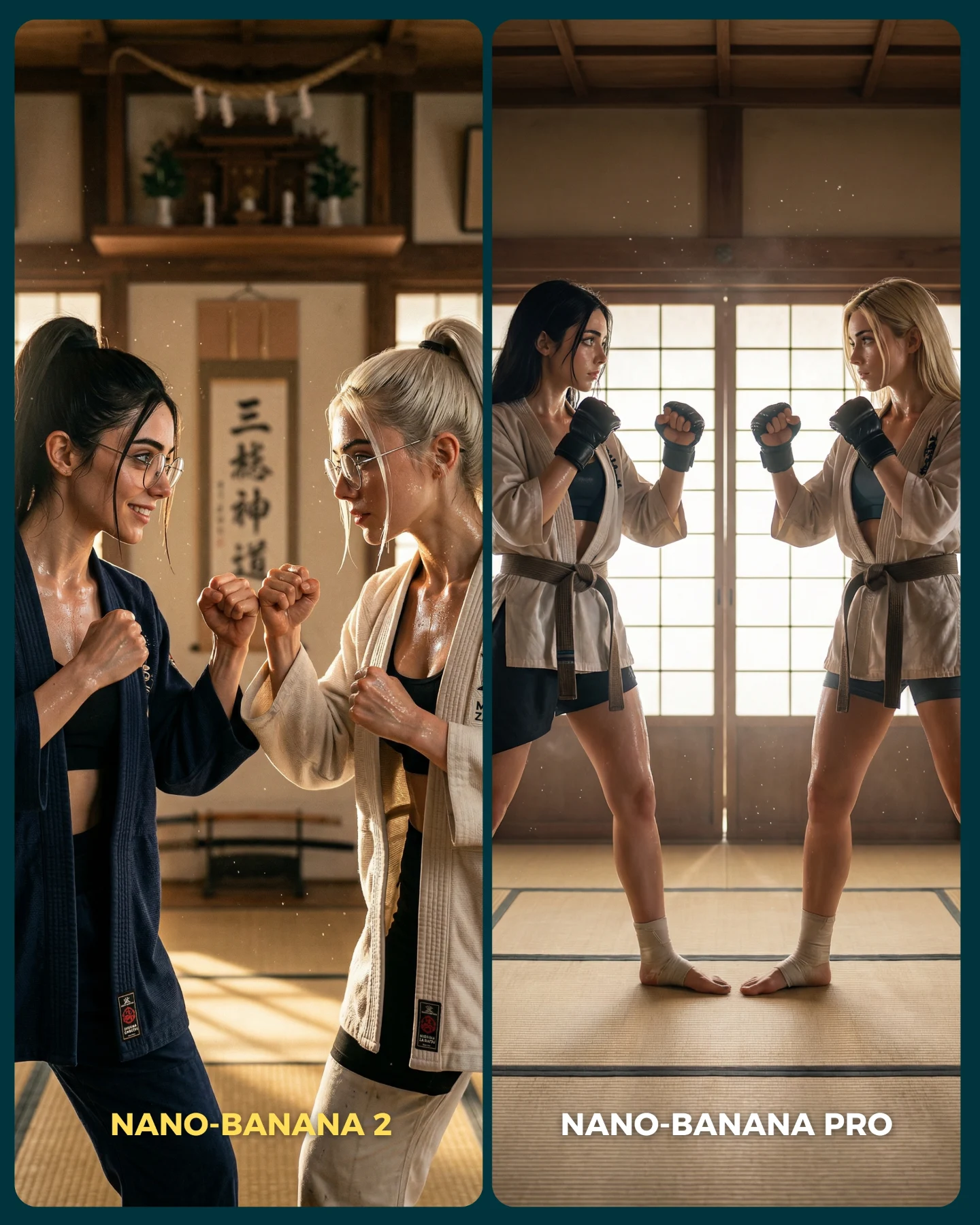
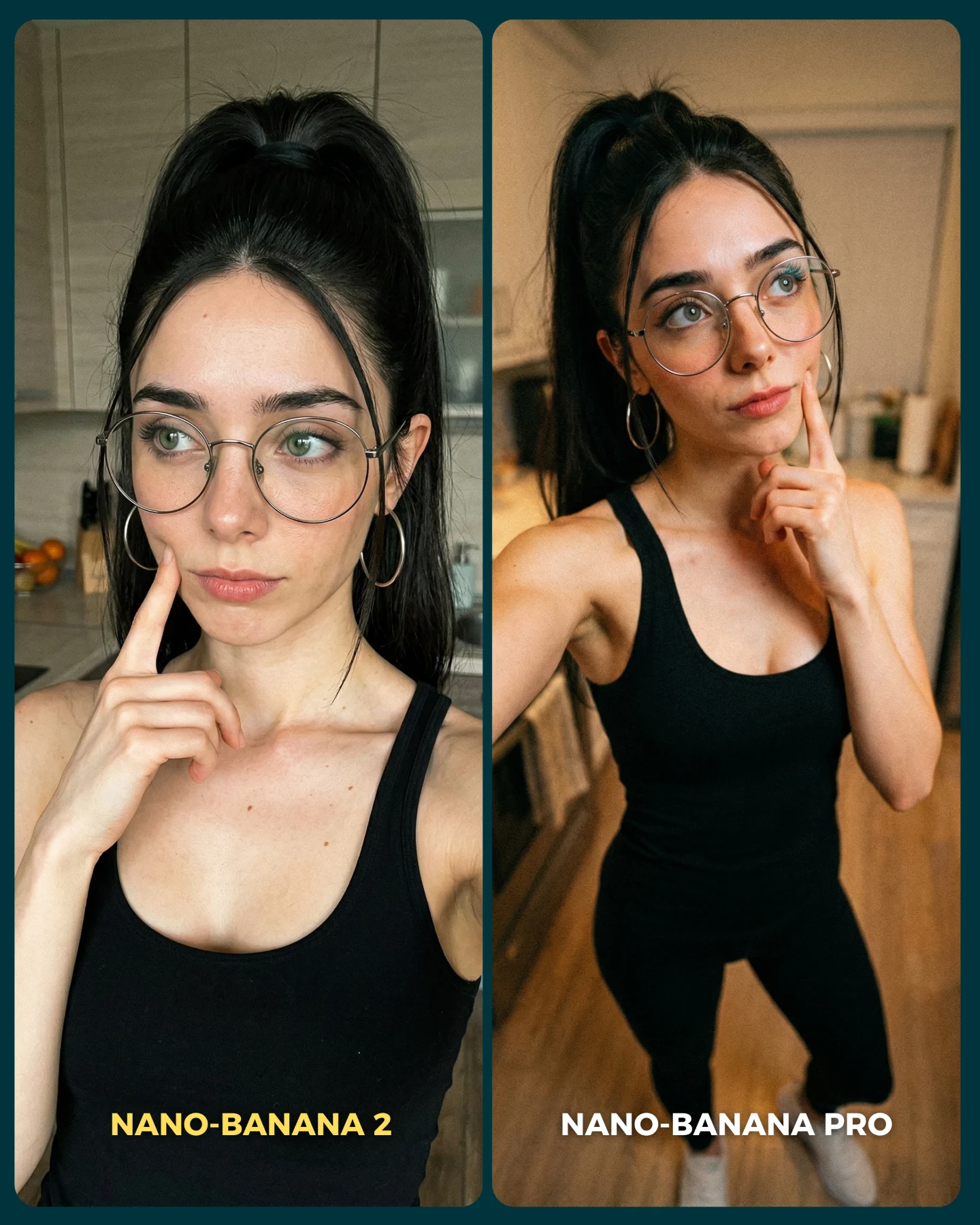
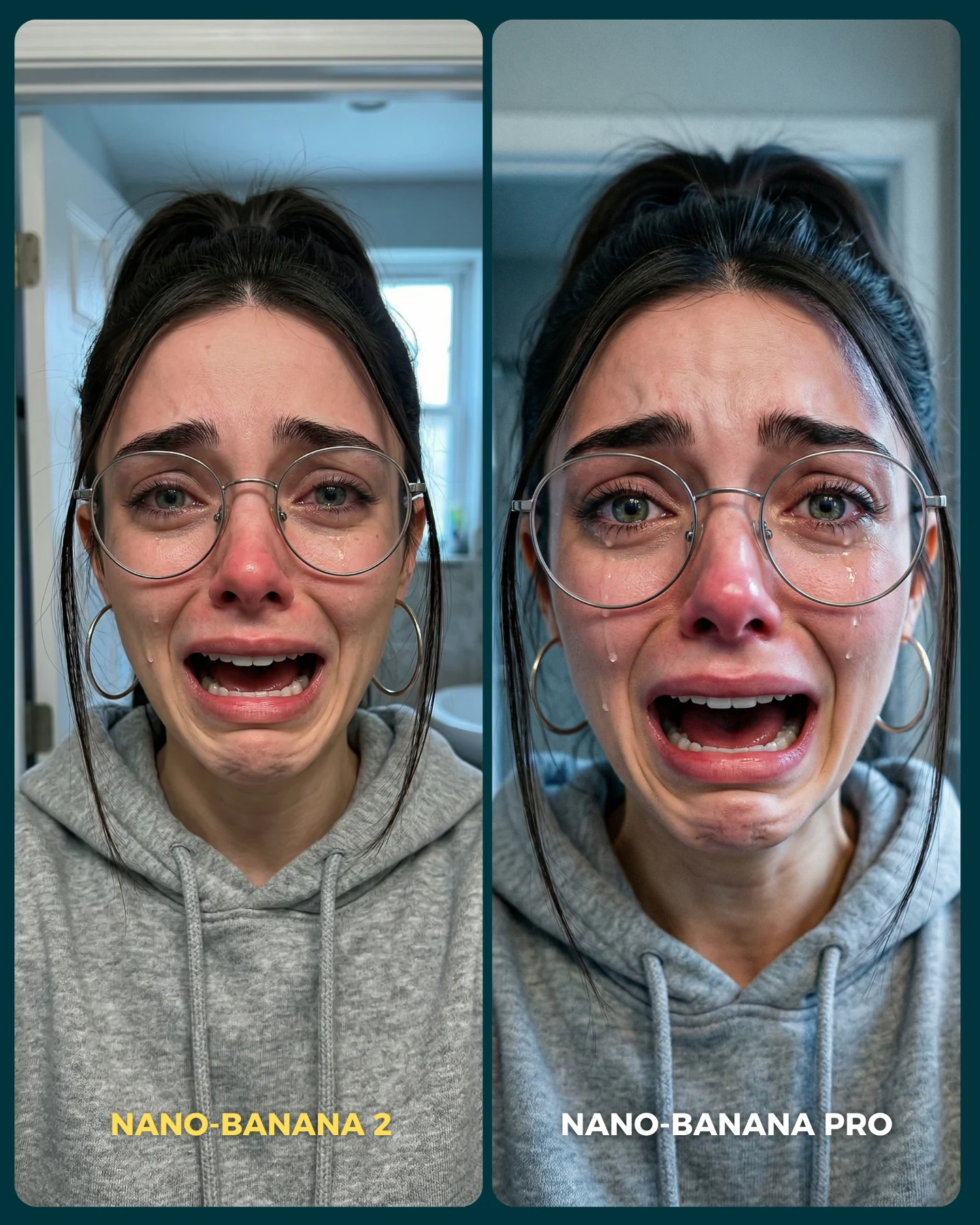
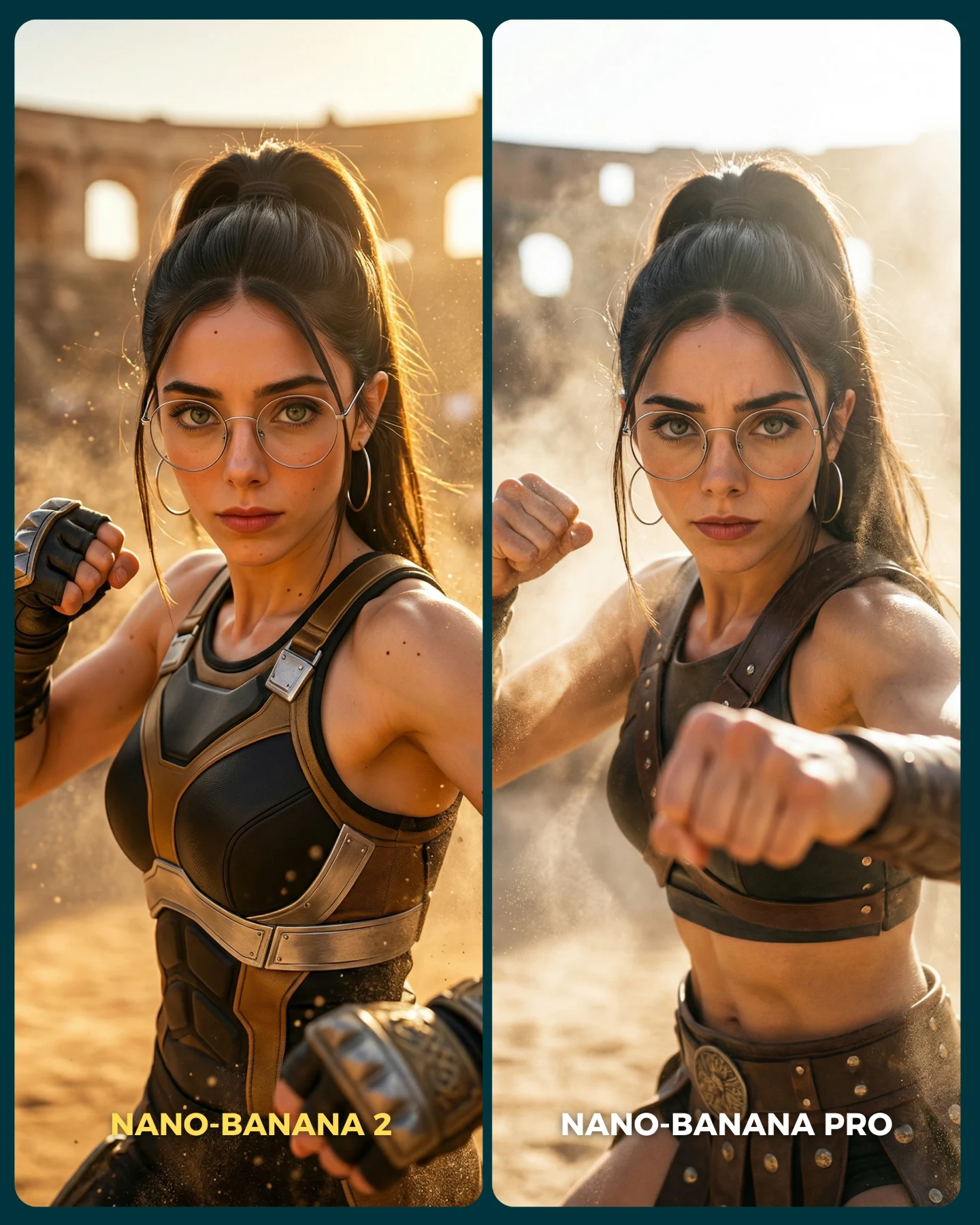
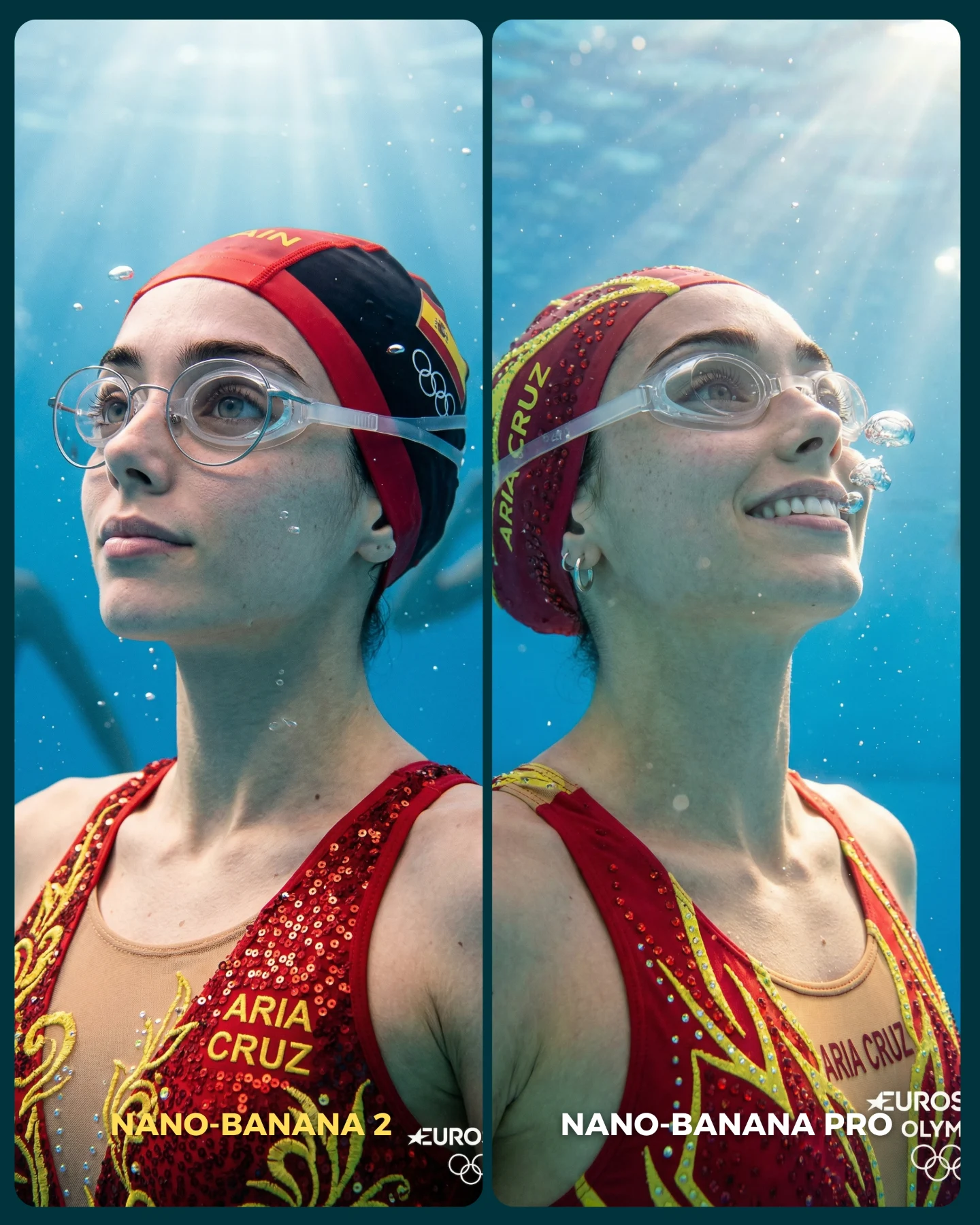
Nano Banana 2 Vs. Nano Banana PRO 💥
Google acaba de lanzar un nuevo generador de imágenes... Lleva un 2 pero no significa que sea mejor que el Pro 👀 (No es Nano Banana Pro 2)
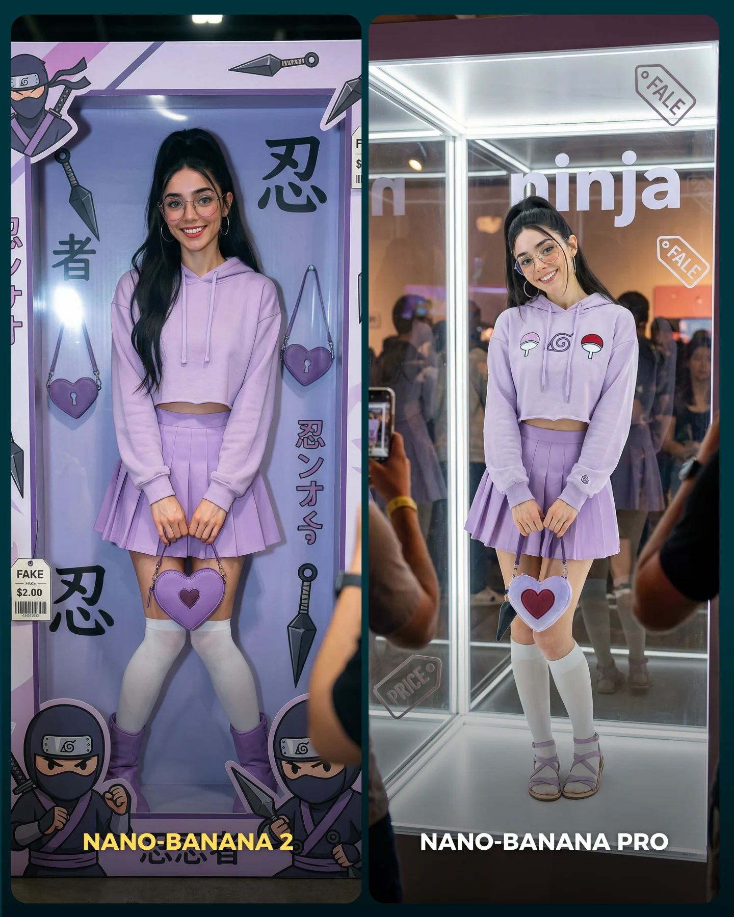
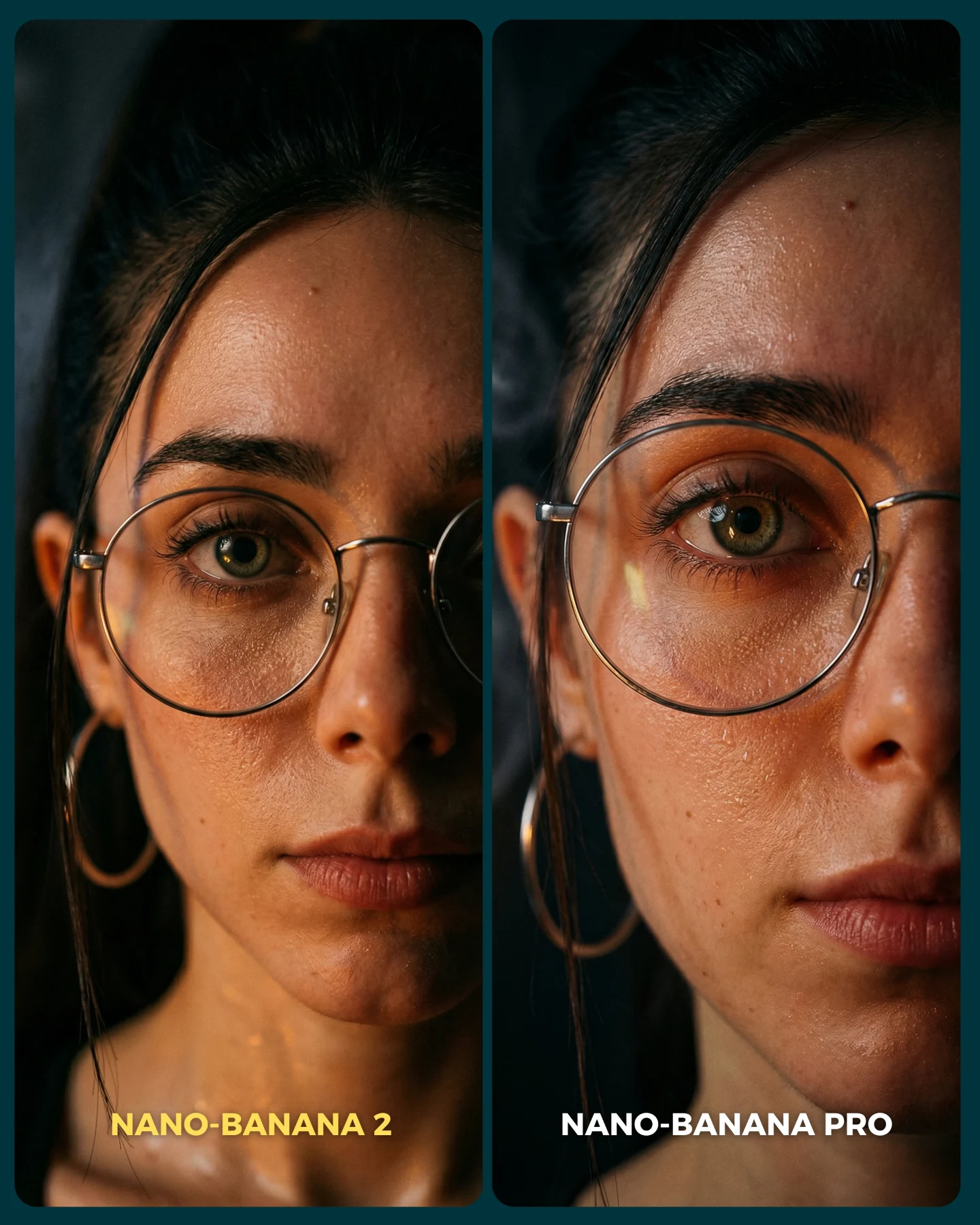
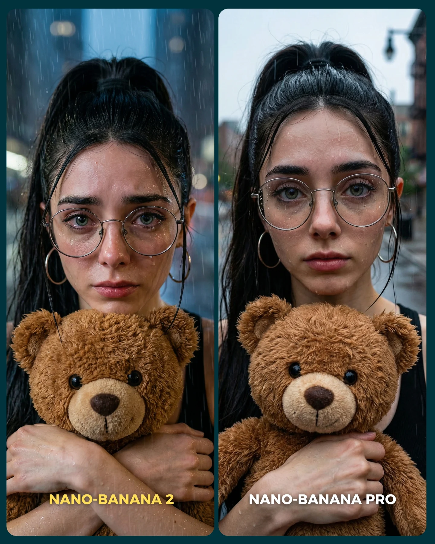
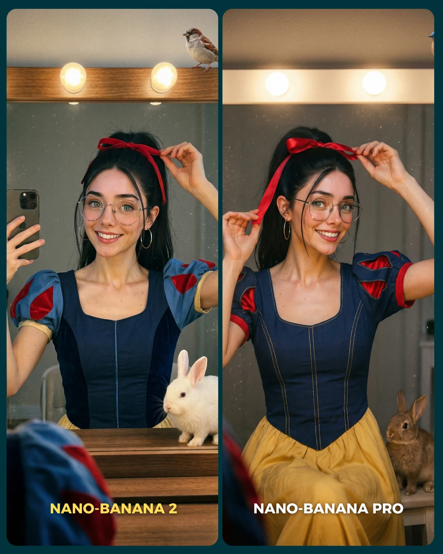
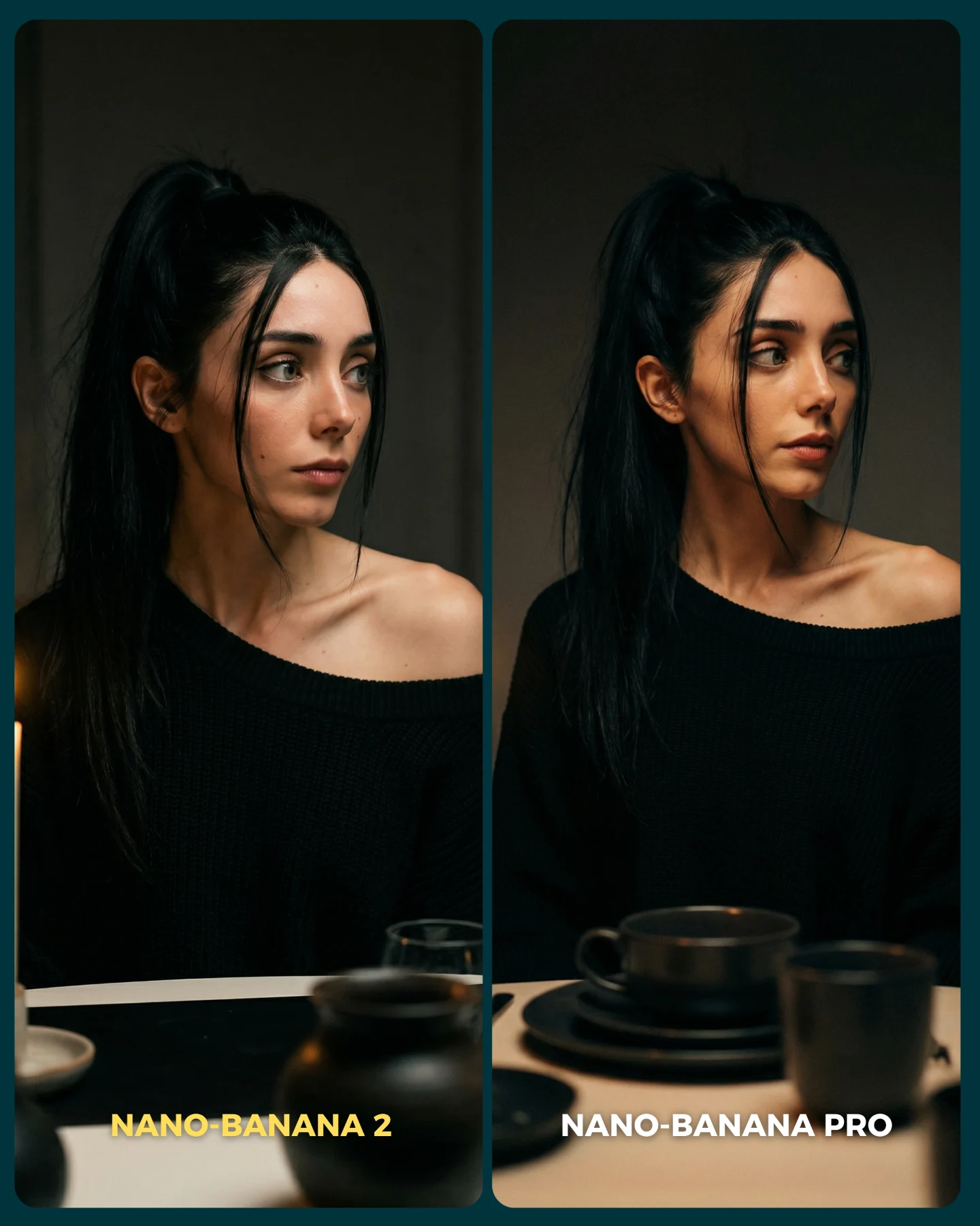
Para ponerlo realmente a prueba, las imágenes que he seleccionado para testearlo son todas las que Nano Banana Pro me daba "poco realistas"
Tras ver los resultados... Sigo pensando que la versión Pro lo hace mejor que la nueva 😅 Pero si es verdad que en algunas ocasiones no es así!
Igualmente quiero escuchar tu opinión al respecto 💌 Y comenta "ARIA" si quieres que te pase los prompts de todas las imágenes 💕
How soy_aria_cruz Made This Street Market AI Portrait and How to Recreate It
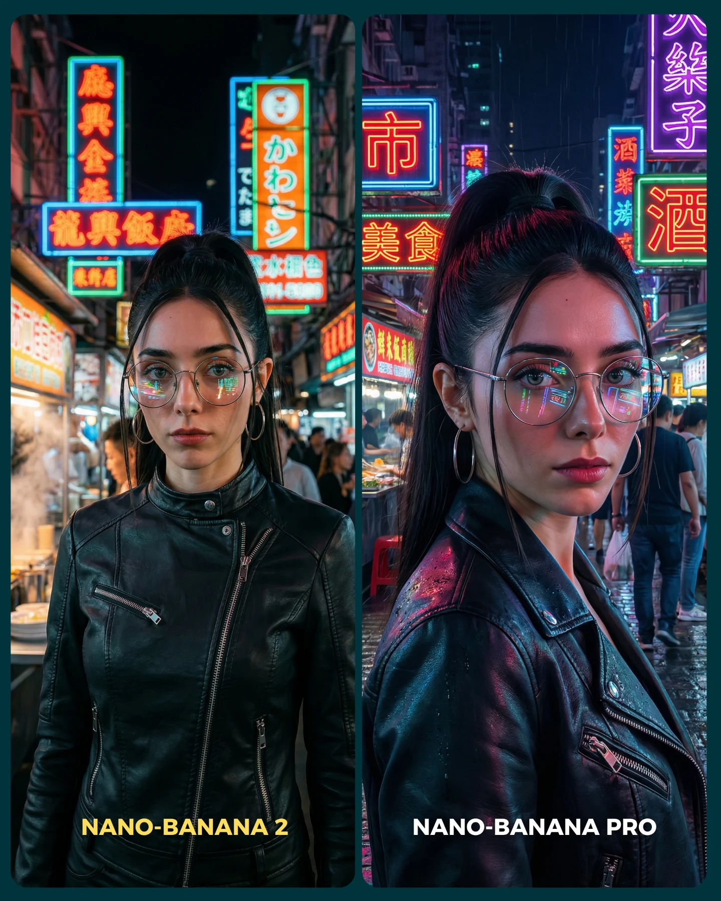
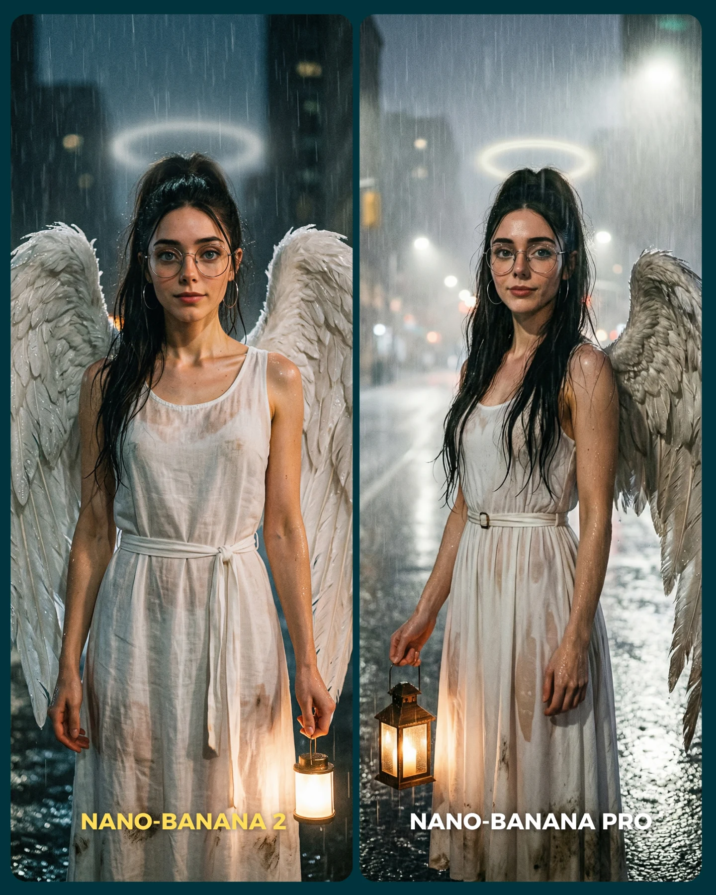
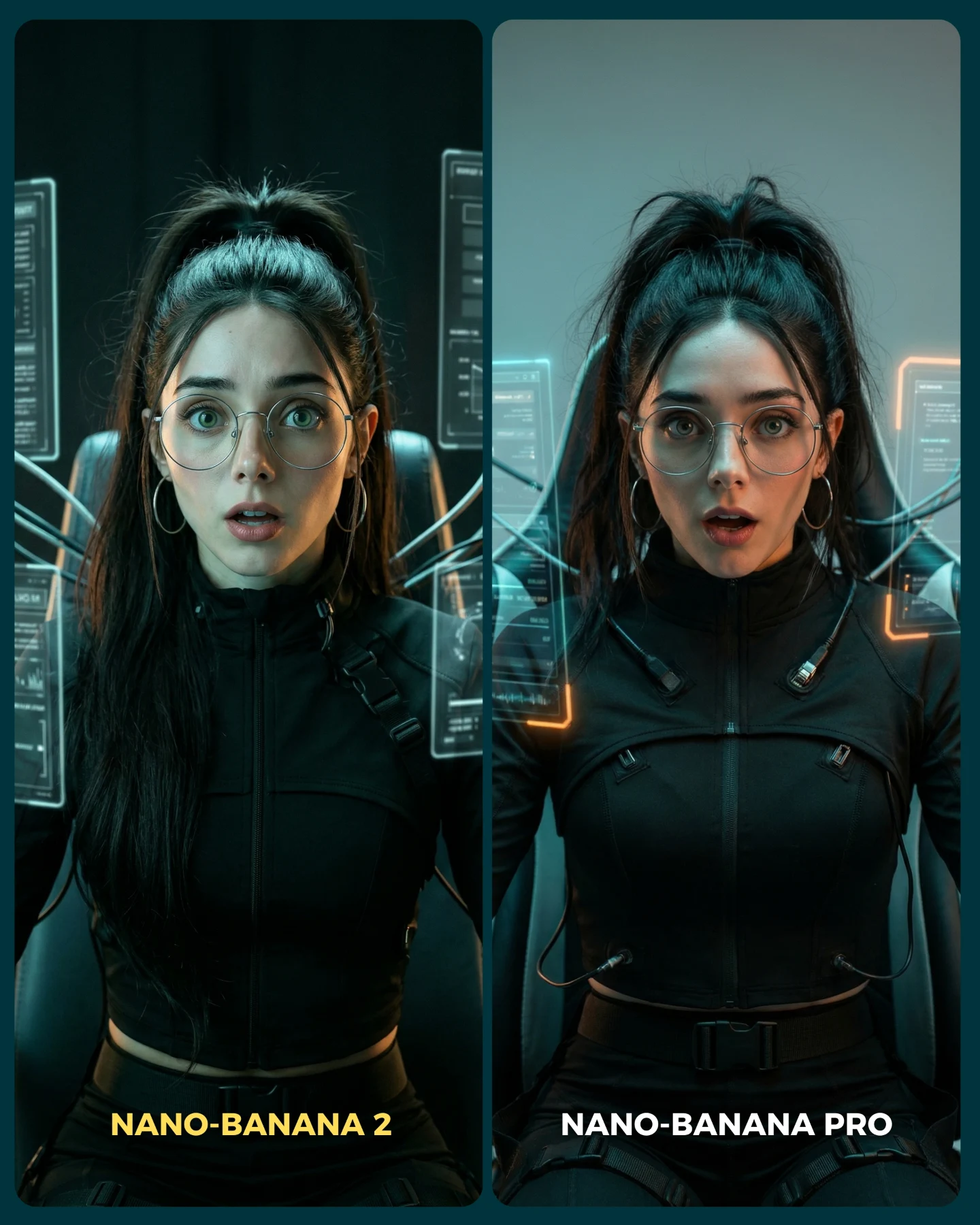
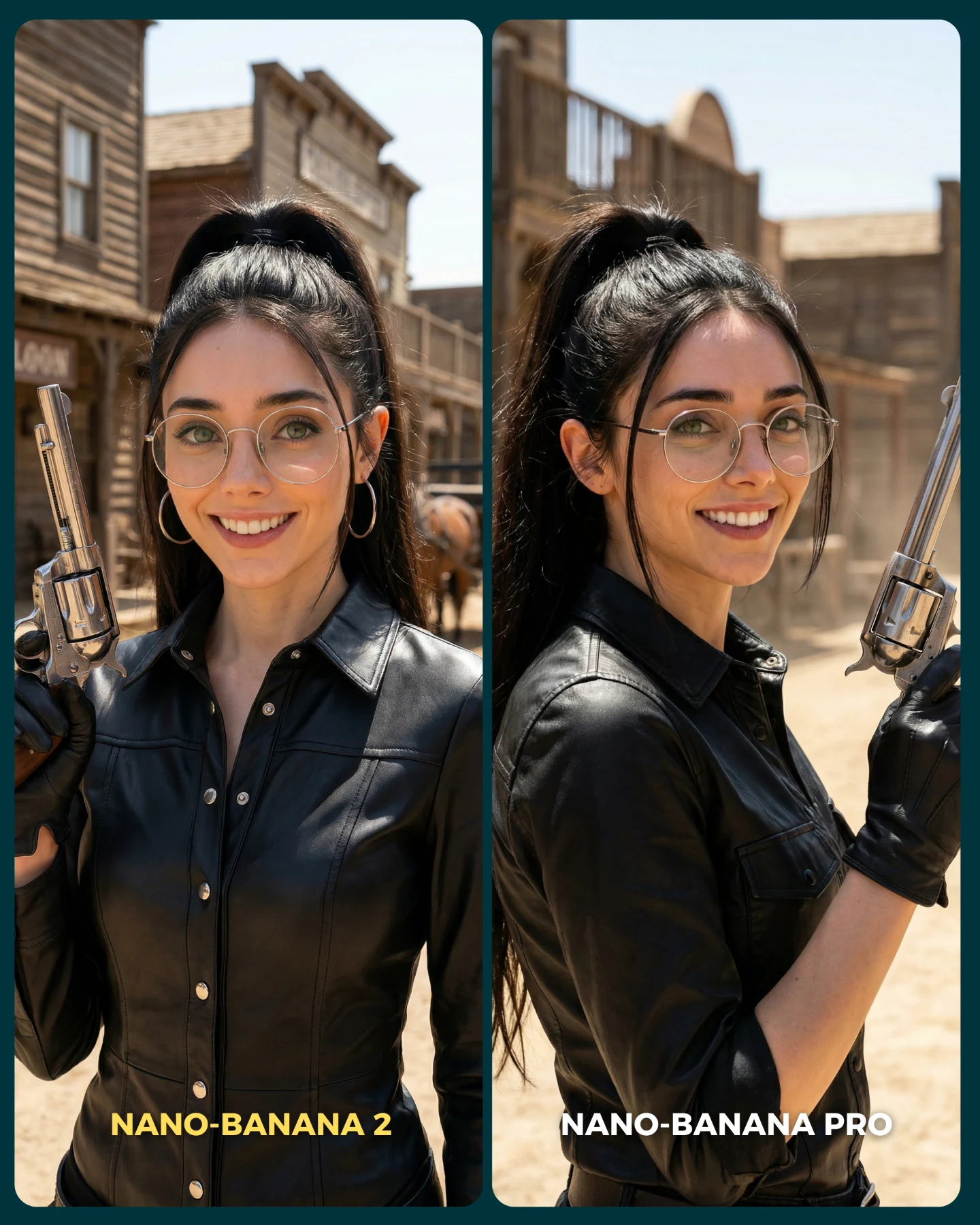
Night portraits are where a lot of image models reveal their limits. It is easy to make something that feels moody in low light. It is much harder to keep identity, glasses, skin realism, reflective leather, readable signage, and believable depth all working at once. That is why this comparison is useful. The scene is attractive, but it is also technically demanding in all the right places.
The post works because the setup is instantly aspirational and instantly difficult. Viewers love neon city imagery, but creators know that neon also exposes weaknesses fast. Skin can turn waxy, signs can become mush, reflections can look fake, and the image can drift from photography into game-art territory. A benchmark like this is strong because it chooses a scene people actually want to make, while also making it obvious which output would be safer to publish.
The right panel feels stronger not because it is louder, but because it is more coherent. The jacket reads more like leather, the glasses catch color without becoming distracting, the face keeps its structure, and the neon environment feels connected to the subject rather than pasted behind her. That kind of coherence is what creators are really buying when they choose one image model over another.
Why The Comparison Is Persuasive
Signal
Evidence (from this image)
Mechanism
Replication Action
High-pressure night scene
Dense neon signs, wet reflections, crowd blur, mixed color light
Difficult lighting exposes realism weaknesses faster than clean studio scenes
Benchmark models on environments with multiple competing light sources
Identity anchor survives style
Same glasses, ponytail, earrings, and facial structure across both panels
The test feels fair because viewers know they are comparing rendering quality, not different subjects
Lock one hairstyle, one accessory, and one wardrobe silhouette before comparing outputs
Material realism
Black leather jacket catches colored reflections and crease detail
Reflective fabric quickly reveals whether lighting and texture logic are believable
Include at least one glossy or reflective material in realism comparisons
Visible winner at a glance
The right panel reads more dimensional and more photographically integrated
Shareable comparison posts need a result the audience can feel immediately
Choose test images where the improvement is legible without zooming in
Another reason this image travels is that it does not feel like lab work. It still looks like a piece of content someone would save for moodboard inspiration. That is an underrated benchmark principle. When the test itself is aesthetically desirable, more people engage with it, and the technical lesson spreads further.
Where This Format Fits Best
This is ideal for creators comparing image models, realism presets, portrait pipelines, or prompt refinements for nightlife content. It is especially useful for people working on AI influencers, fashion mood imagery, or cinematic urban portrait series.
Night portrait model comparisons: perfect for showing which tool handles mixed color light more naturally.
AI influencer identity tests: useful when you need to prove the character stays consistent in difficult city scenes.
Fashion-adjacent benchmark posts: strong for leather, sunglasses, metallic accessories, and other reflective materials.
Prompt education content: great for teaching why environment difficulty matters when judging outputs.
Less ideal are family-friendly softness campaigns, bright ecommerce product pages, or scenes where technical realism is not the main selling point. This format is built around tension, nightlife texture, and visible rendering pressure.
Transfer recipe 1 Keep: same subject identity, same night market mood, same side-by-side format. Change: only the model or version. Slot template (EN): {same neon street portrait} comparison, left {model A}, right {model B}, same identity, visible labels
Transfer recipe 2 Keep: leather jacket, glasses, and mixed neon light. Change: the city type, such as Tokyo alley, Hong Kong food street, or Seoul nightlife lane. Slot template (EN): {subject} in {city-style night street}, neon reflections, leather jacket portrait comparison graphic
Transfer recipe 3 Keep: difficult reflective environment. Change: jacket to satin, latex, or wet trench coat for different material tests. Slot template (EN): {same woman} under neon signage, testing {material type} realism, side-by-side portrait benchmark
The Aesthetic Read
The image feels premium because it balances density and focus. The background is packed with information, but the face remains the decision center. That balance is hard to achieve in neon scenes. If the signs dominate too much, the portrait becomes clutter. If the background falls away too much, the environment stops contributing. Here, the best side keeps both alive.
The glasses are especially important. Transparent reflective surfaces often make night portraits collapse, because the model either overdoes the glow or ignores it entirely. In this comparison, the reflections help describe the world around the subject. They do not just decorate the face. That is a small but meaningful signal of better image logic.
The jacket does similar work. Good leather rendering needs both structure and reflection. The right panel handles the material with more confidence, which is part of why the entire portrait feels more expensive. Night portraits often succeed or fail on these material cues before the viewer can even explain why.
Observed
Why it matters
How to recreate
Vertical neon signage behind the subject
Creates instant urban-night context and color complexity
Fill the background with stacked vertical signs, not just a few abstract light blobs
Glasses reflecting colored light
Shows whether the model understands transparent reflective surfaces
Prompt subtle neon reflections on the lenses
Black leather with colored highlights
Tests material realism under mixed lighting
Use a fitted leather jacket with visible zippers and crease highlights
Tighter right-side portrait crop
Makes the “better” result feel more cinematic and intimate
Change the winning panel angle slightly while keeping the subject identity fixed
Wet street and crowd depth
Adds believable city atmosphere instead of a flat backdrop
Include reflective pavement and soft pedestrian background blur
Prompt Blocks To Control
Prompt chunk
What it controls
Swap ideas (EN, 2-3 options)
same woman in a neon street market at night
Locks the benchmark concept and identity continuity
same woman in a rainy alley; same woman at a night food stall; same woman outside a bar district
round glasses, ponytail, hoop earrings
Preserves recognizable face cues across outputs
cat-eye glasses and braid; silver nose ring and blunt bangs; clear frames and slicked-back bun
black leather biker jacket
Introduces a reflective material test
satin bomber; vinyl trench; dark denim jacket with wet sheen
dense East Asian neon signs and crowd
Builds environmental pressure and visual appeal
ramen alley; night food market; downtown karaoke street
left weaker, right cleaner and more cinematic
Creates a readable result directly inside the comparison
left flatter right richer; left muddier right sharper; left weaker skin detail right stronger skin detail
embedded bottom comparison labels
Makes the visual native to social feeds
Model A / Model B; Base / Pro; Prompt 1 / Prompt 2
What to lock first
Lock the identity markers, the neon environment, and the reflective-material cues first. Those three elements do most of the benchmark work.
How To Iterate On This Benchmark
Baseline Lock: keep the same subject, the same night street category, and the same side-by-side comparison layout. Then rotate one evaluation variable at a time, such as the model, prompt discipline, or material challenge.
Run 1: stabilize the glasses reflections, hairline, and facial proportions across both panels.
Run 2: refine the leather texture and zipper details without changing the overall environment.
Run 3: test alternate neon scenes like rainier streets, tighter alleys, or heavier crowd density.
Run 4: if the series continues, benchmark other hard materials like satin, chrome, or transparent plastic under the same nightlife logic.
The best part of this format is that it teaches viewers how to inspect an image. They stop asking only which side is prettier and start noticing why one side feels more believable. That is exactly the kind of comparison content that earns both saves and discussion.