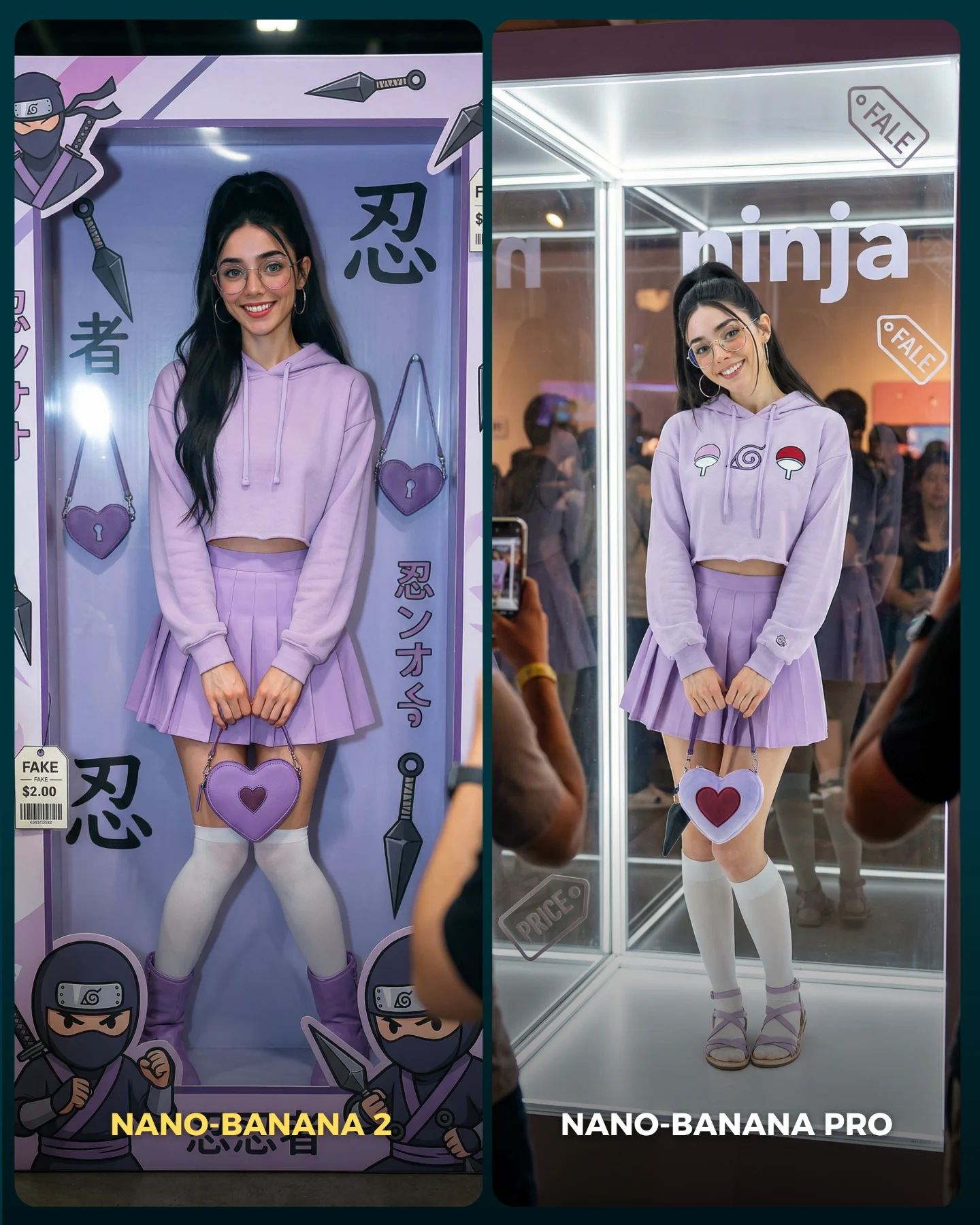
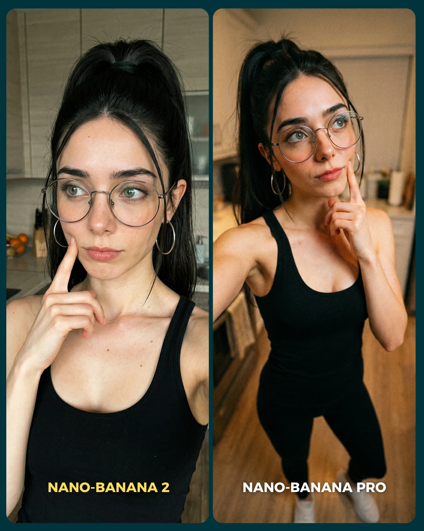
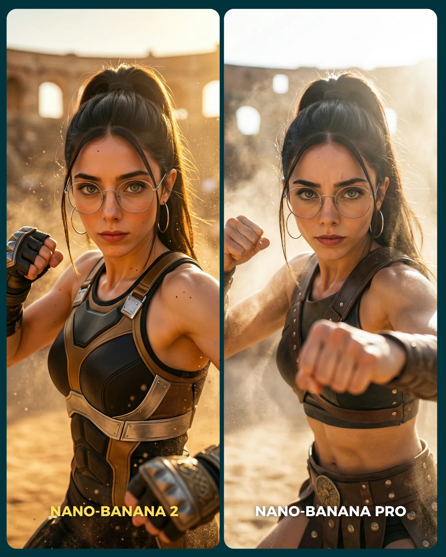
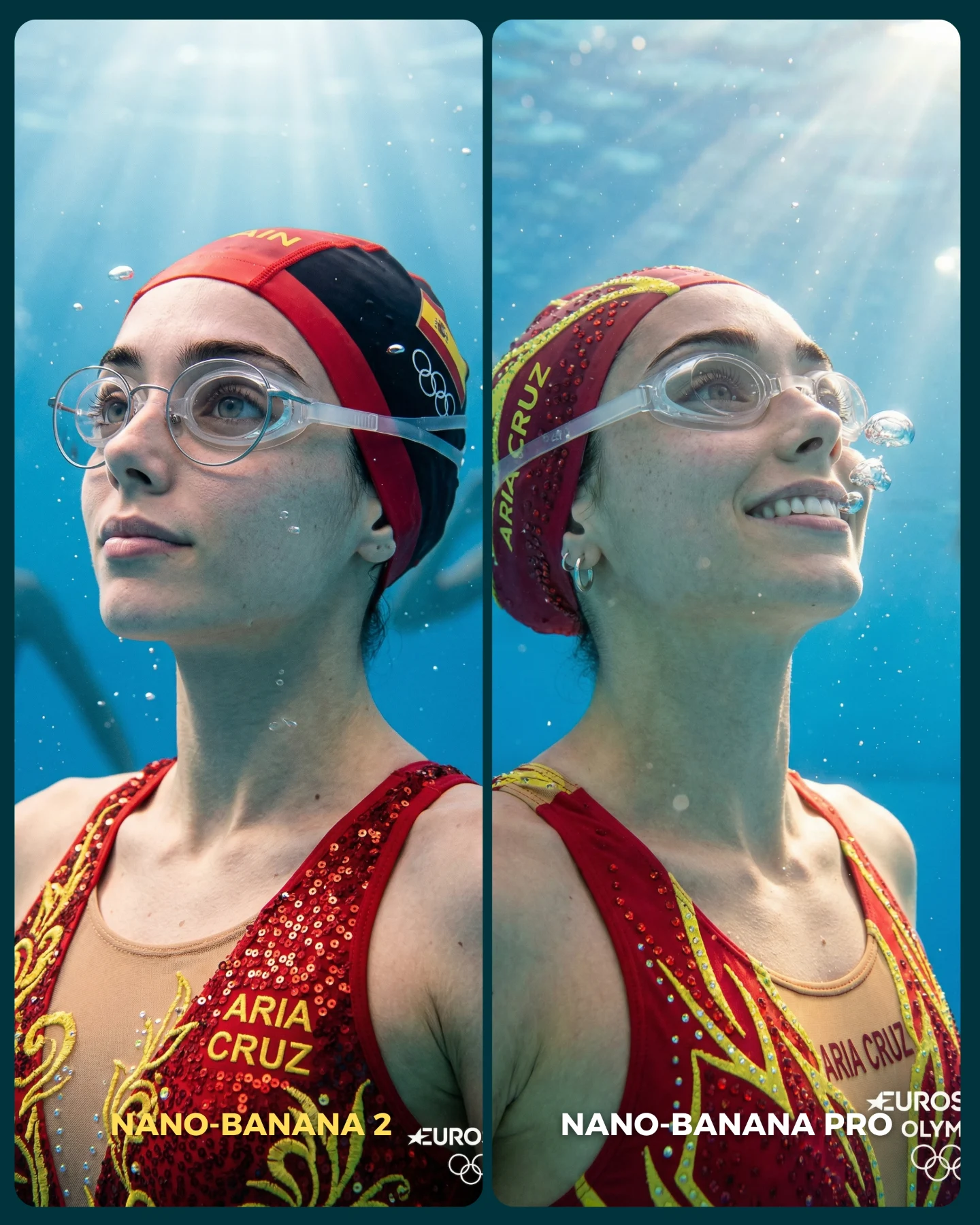
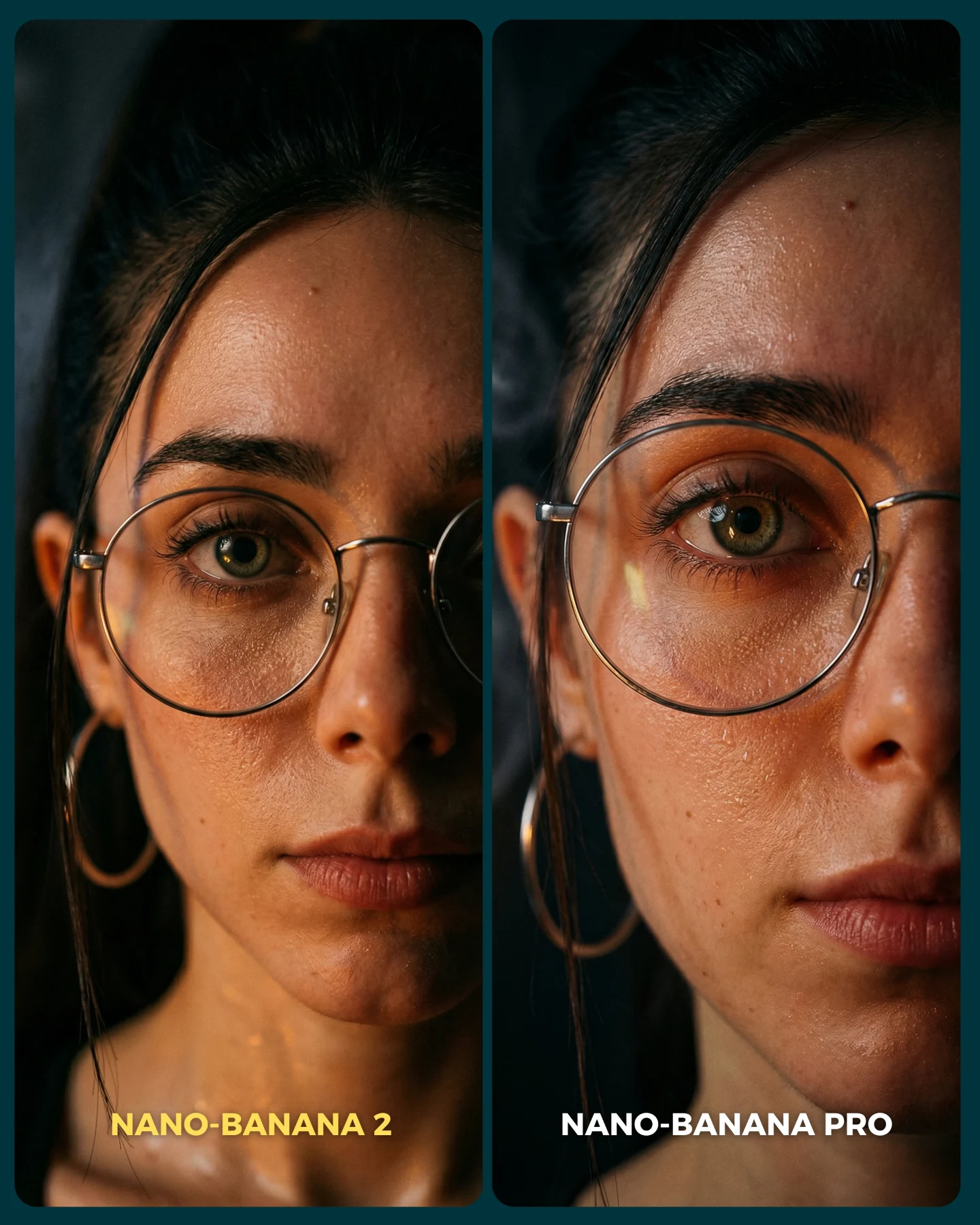
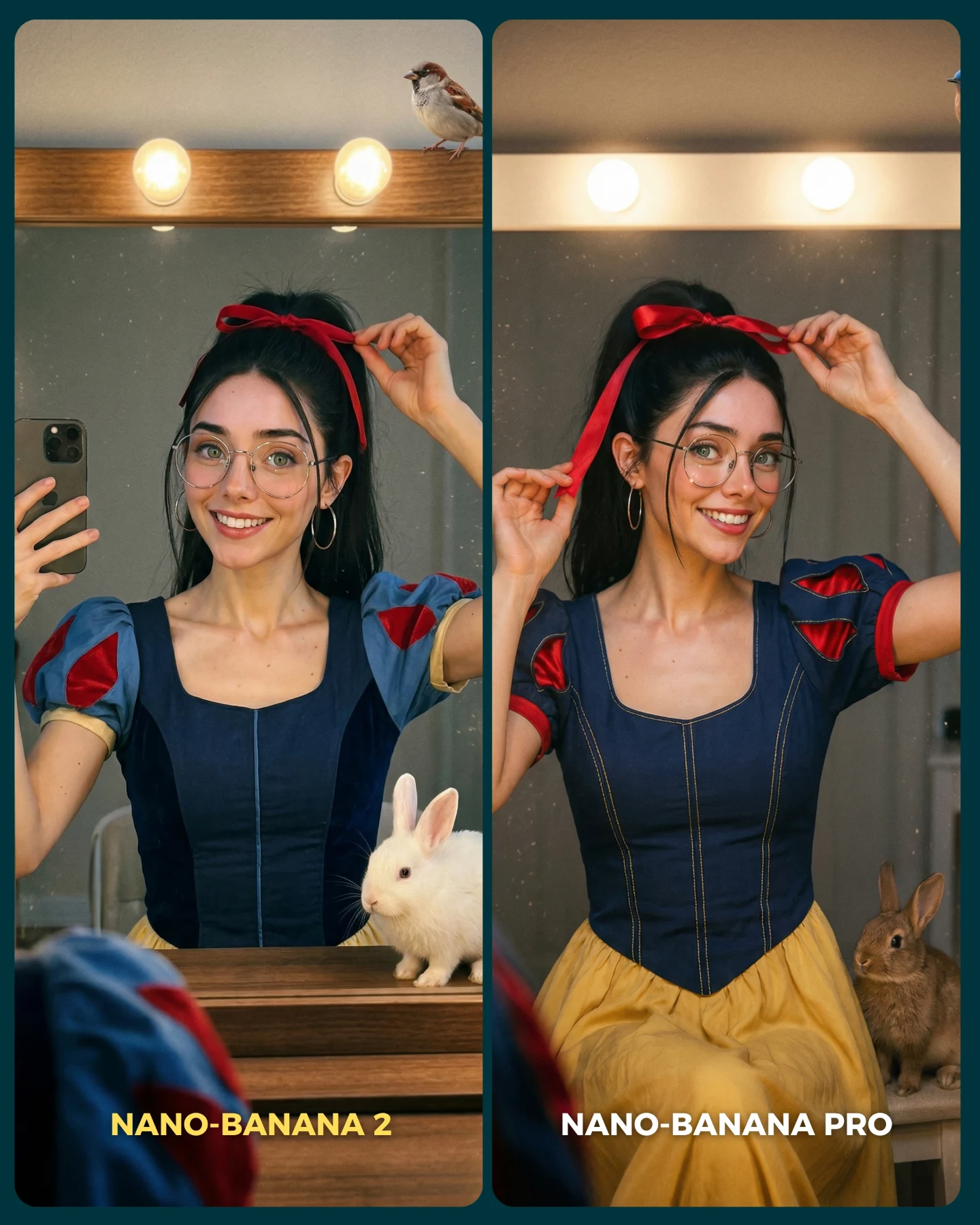
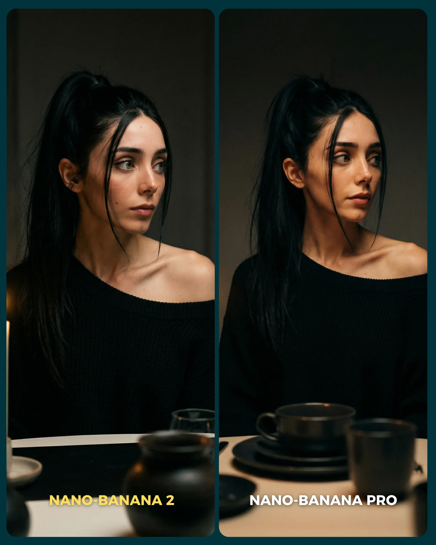
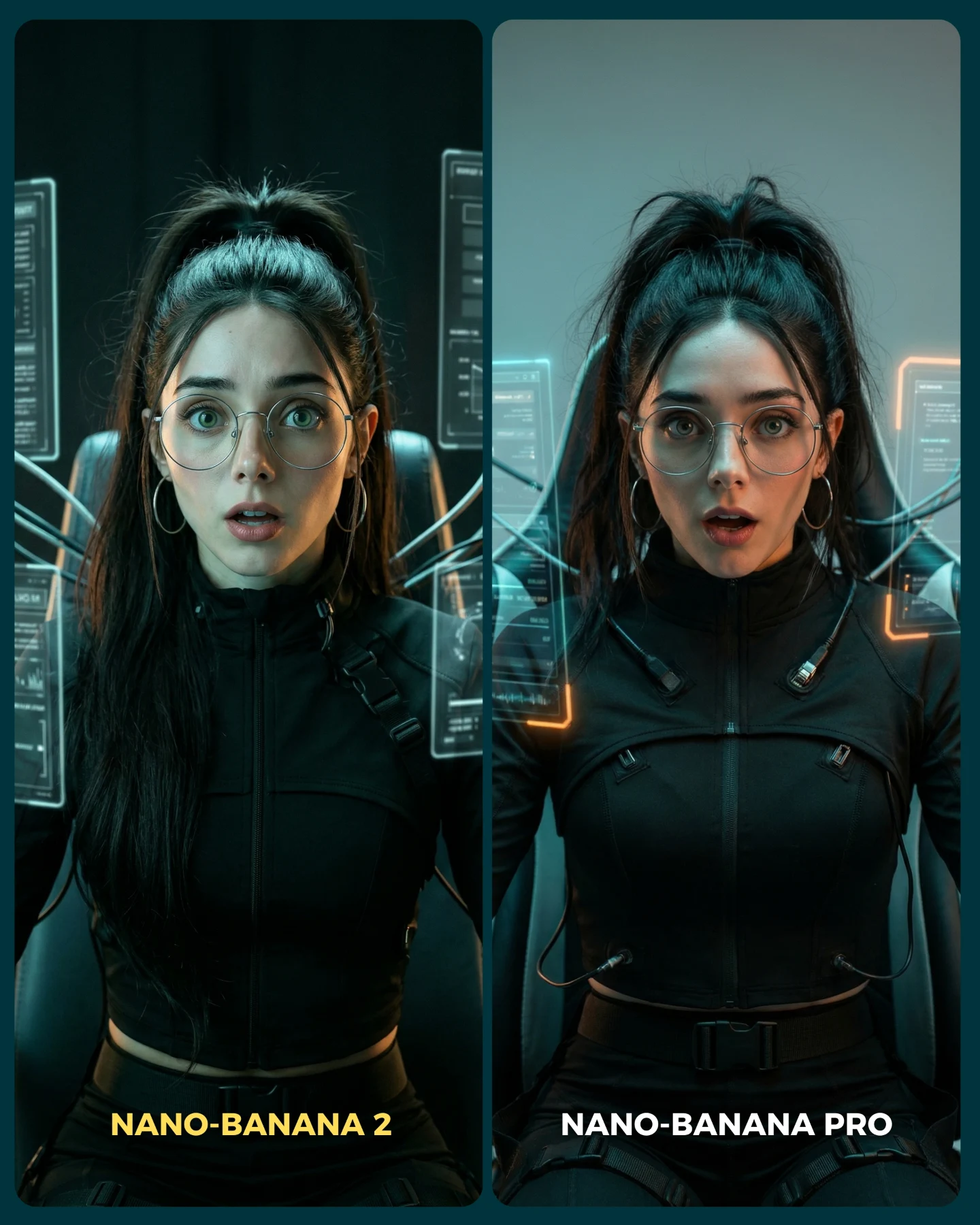
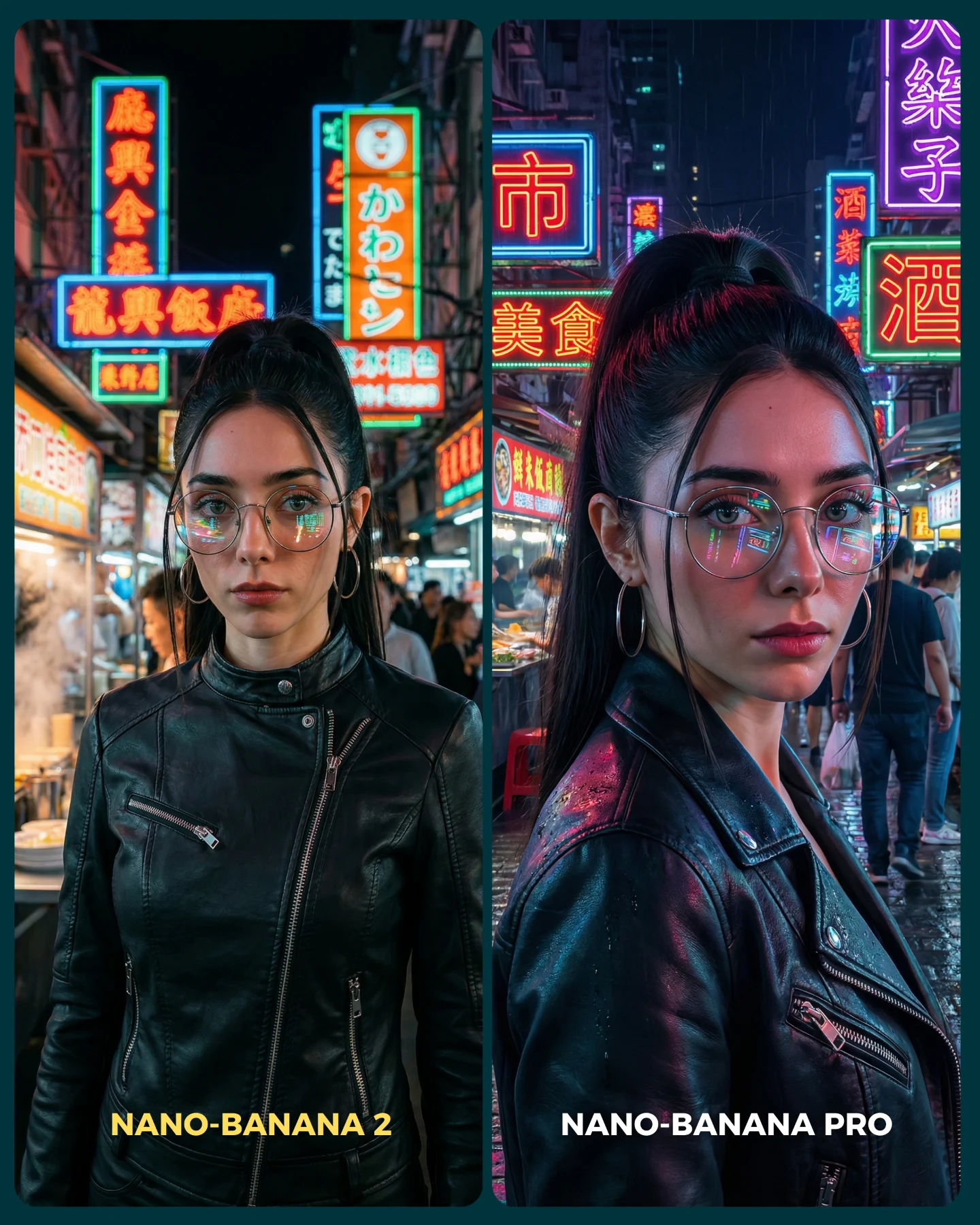
Nano Banana 2 Vs. Nano Banana PRO 💥
Google acaba de lanzar un nuevo generador de imágenes... Lleva un 2 pero no significa que sea mejor que el Pro 👀 (No es Nano Banana Pro 2)
Para ponerlo realmente a prueba, las imágenes que he seleccionado para testearlo son todas las que Nano Banana Pro me daba "poco realistas"
Tras ver los resultados... Sigo pensando que la versión Pro lo hace mejor que la nueva 😅 Pero si es verdad que en algunas ocasiones no es así!
Igualmente quiero escuchar tu opinión al respecto 💌 Y comenta "ARIA" si quieres que te pase los prompts de todas las imágenes 💕
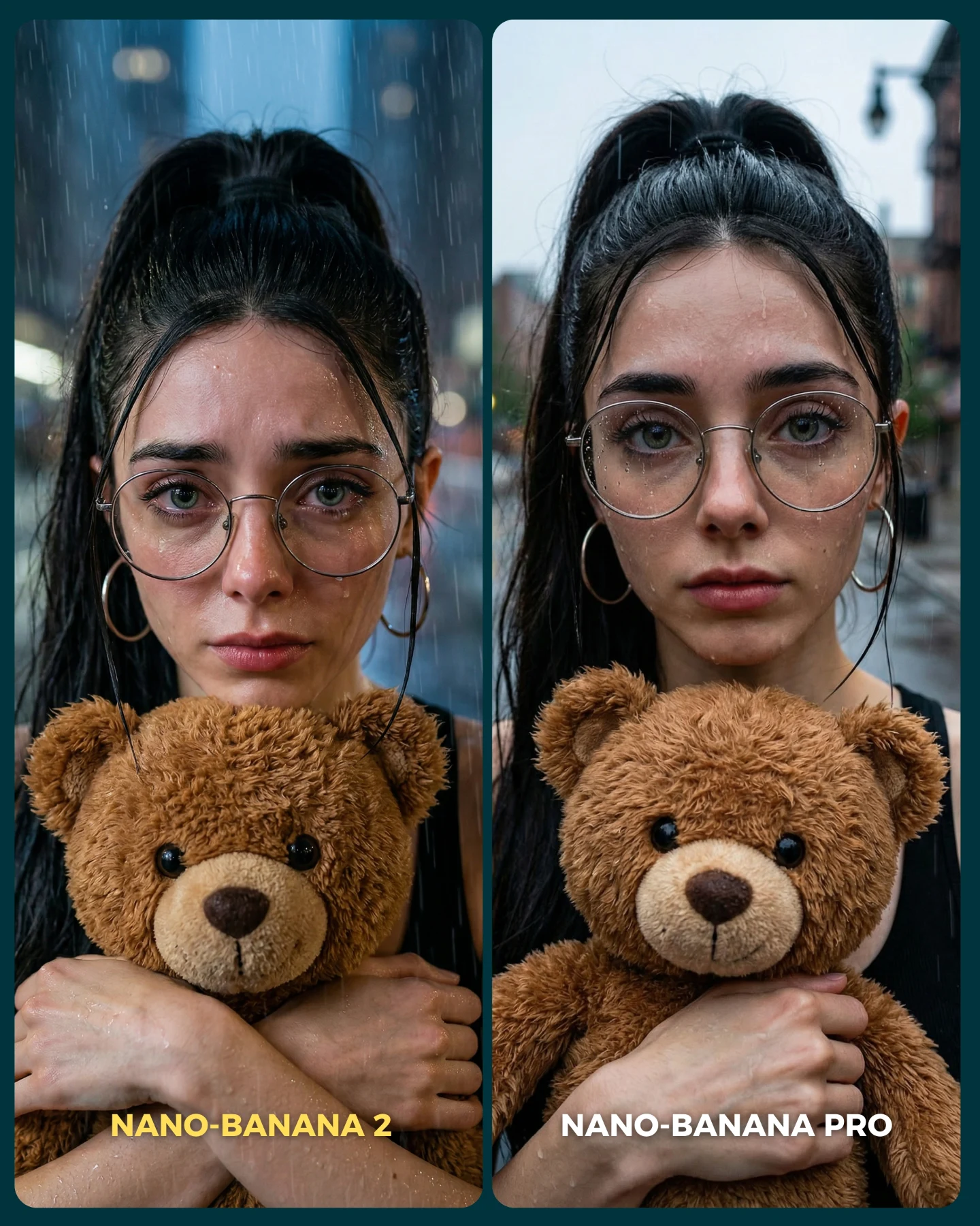
How soy_aria_cruz Made This Nano Banana Crying Face AI Art — and How to Recreate It
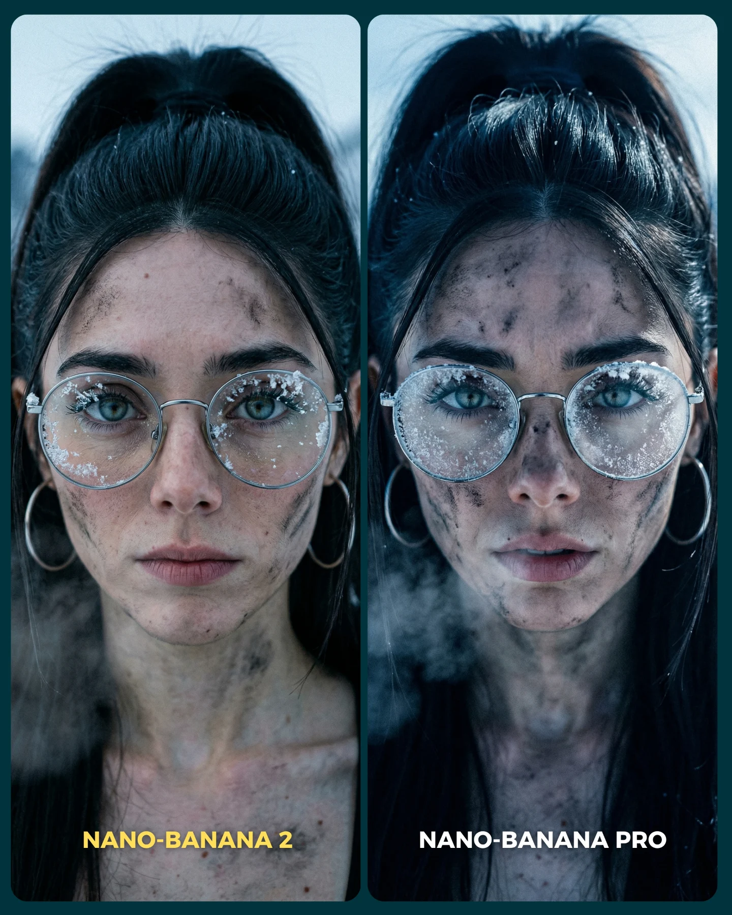
Pretty portraits are easy places for image models to hide. Smooth skin, flattering light, and neutral expressions can make weak realism look passable. This comparison does the opposite. It forces the model into one of the hardest human tasks: an emotionally intense crying face in close-up, with glasses, tears, redness, wet reflections, and distorted mouth shape all visible at once. That is why the image is useful.
The split-screen layout also sharpens the judgment. You are not comparing two unrelated outputs. You are looking at the same identity, same framing, same hoodie, same scene, and nearly the same expression. That setup removes excuses. Any difference you notice is more likely to come from the model’s realism handling than from prompt drift.
Why This Test Format Works So Well
Emotion is one of the fastest ways to expose weak image generation. When a model does not fully understand facial strain, crying turns into performance instead of feeling. The mouth shape becomes theatrical, the tears look pasted on, the skin loses believable wetness, or the eyes fail to carry enough tension. In this comparison, the right panel feels stronger because it holds more of those micro-signals together at once.
That is why side-by-side benchmark posts like this get traction. They let the audience participate in judgment immediately. People do not need technical language to understand realism in tears, redness, or eye moisture. The post invites instinctive comparison, which is perfect for comments and debate.
Signal
Evidence (from this image)
Mechanism
Replication Action
High-difficulty expression
Both panels show an intense crying face with open mouth and red nose
Stress-testing emotional realism exposes weak rendering fast
Use hard facial states such as crying, panic, laughter, or disgust when benchmarking realism
Controlled comparison
The same identity, outfit, framing, and interior setup appear on both sides
Controlled variables make the model difference easier to judge
Lock everything except the model version or generation setting
Instant audience participation
Viewers can tell at a glance which side feels more lifelike
Posts that invite judgment naturally earn comments
Use split layouts that encourage viewers to pick a side without explanation
Visible realism micro-signals
The stronger side shows clearer tear paths, wetness, and skin irritation
Micro-texture cues matter more than general “quality” in face realism tests
Prompt for tears, skin flush, eye gloss, and subtle facial asymmetry instead of generic “high realism” language
Where This Kind Of Comparison Fits Best
This format is strongest for AI creator accounts that want to educate, provoke discussion, or prove why a certain model is worth using. It also works well for prompt sellers and workflow educators because the image itself becomes evidence. A clean A/B test is easier to trust than a long explanation about model quality.
Best for model comparison posts: the side-by-side layout gives viewers an obvious way to evaluate outcomes. Change the emotion, but keep the controlled setup.
Best for realism benchmarks: hard facial expressions reveal more than beauty shots. Change the emotion only if it still stresses anatomy and texture.
Best for comment-driven discussions: viewers can instantly argue for left or right. Change labels and framing, not the one-variable-at-a-time logic.
Best for prompt education: it teaches creators what details matter when they ask a model for emotional realism.
It is less ideal for moodboard content, brand storytelling, or purely inspirational feeds. The image is analytical by design, even though it still looks social-first.
Three Transfer Recipes
Laughter realism test. Keep: split-screen, same framing, same outfit, same identity. Change: crying to uncontrollable laughter with tear-filled eyes and wrinkled nose. Slot template: {same scene} {same identity} {hard emotion A/B} {model label comparison}
Fear reaction test. Keep: close-up face benchmark logic and bottom labels. Change: crying to fear or shock with widened eyes, strained brows, and mouth tension. Slot template: {tight portrait setup} {same wardrobe} {fear realism benchmark} {side-by-side model test}
Age-skin realism test. Keep: matched framing and split layout. Change: emotional stress test to mature skin texture, freckles, pores, and subtle wrinkles. Slot template: {comparison layout} {same face} {texture-heavy realism task} {clean A/B labels}
Aesthetic Read
The design is minimal on purpose. Dark outer framing, rounded portrait cards, and small bottom labels keep all attention on the face. That is the right decision for a benchmark post. If the graphic language were louder, it would interfere with the realism judgment. Instead, the layout acts like a lab bench: simple enough that the emotional rendering becomes the whole event.
The gray hoodie is another smart choice. It removes fashion distraction. The glasses and earrings add just enough complexity to make the test harder, but not enough to turn it into a styling post. Everything here is serving one question: which model handles emotional realism better?
Observed
Why It Matters
How To Recreate
Nearly identical pose and framing in both panels
Prevents viewers from confusing prompt drift with model quality
Use the same crop, head position, and clothing on both sides
Red nose, wet eyes, and tear tracks
These are the signals that make crying feel physically believable
Prompt concrete wetness and irritation details, not just “sad face”
Neutral home background
Keeps the test grounded and avoids atmosphere bias
Use a simple indoor setting with soft daylight and blur it slightly
Small bottom labels instead of heavy title text
Lets the audience compare without visual clutter
Place concise model names low in the frame and keep them secondary
Prompt Technique Breakdown
If you want to build useful comparison content, the prompt needs to be more disciplined than expressive. You are not trying to create two different artworks. You are trying to create a controlled evaluation surface. That means matching identity, camera, clothing, and background first, then pushing the difficult realism feature second.
Prompt chunk
What it controls
Swap ideas (EN, 2-3 options)
same woman, same hoodie, same glasses, same close-up framing in both panels
right panel more lifelike with better tear realism
Comparative outcome clarity
“left more stylized, right more realistic”; “A softer, B sharper”; “baseline vs improved realism”
no glam retouch, no beauty polish
Honesty of the test
“natural skin texture”; “visible pores”; “unflattering but real emotion”
How I Would Iterate It
Baseline lock: the split layout, the identity consistency, and the crying realism cues. Those three things define the usefulness of the post. If one drifts, the comparison becomes weaker or more ambiguous than it needs to be.
Run 1: solve the layout and make sure both panels truly match in crop and identity.
Run 2: tune the emotional anatomy: brows, mouth tension, nostril redness, eyelid wetness.
Run 3: separate the realism levels so the stronger side is clearly more believable without becoming a different person.
Run 4: refine the benchmark presentation with labels, border spacing, and cleaner split-card structure.
Quick remix checklist
One hard realism challenge
One controlled A/B layout
One stable identity across both sides
One clear model difference
One audience question they can answer quickly
The broader insight is simple: if you want creators to care about model quality, give them a test where realism can fail in obvious ways. This image does that. It turns emotion into a benchmark, and that makes the comparison both educational and highly commentable.