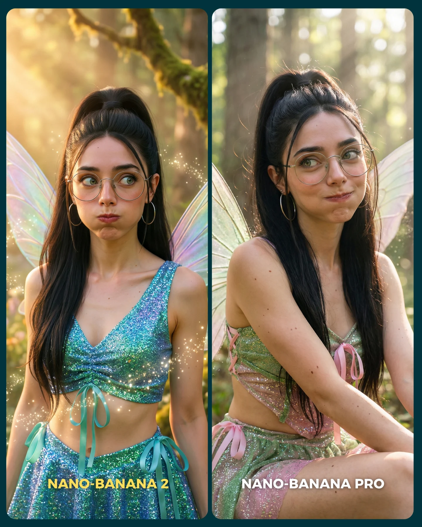
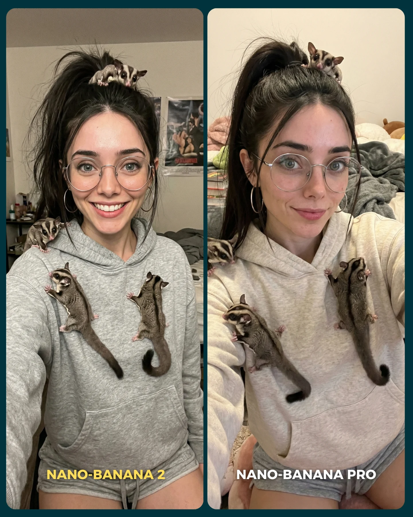
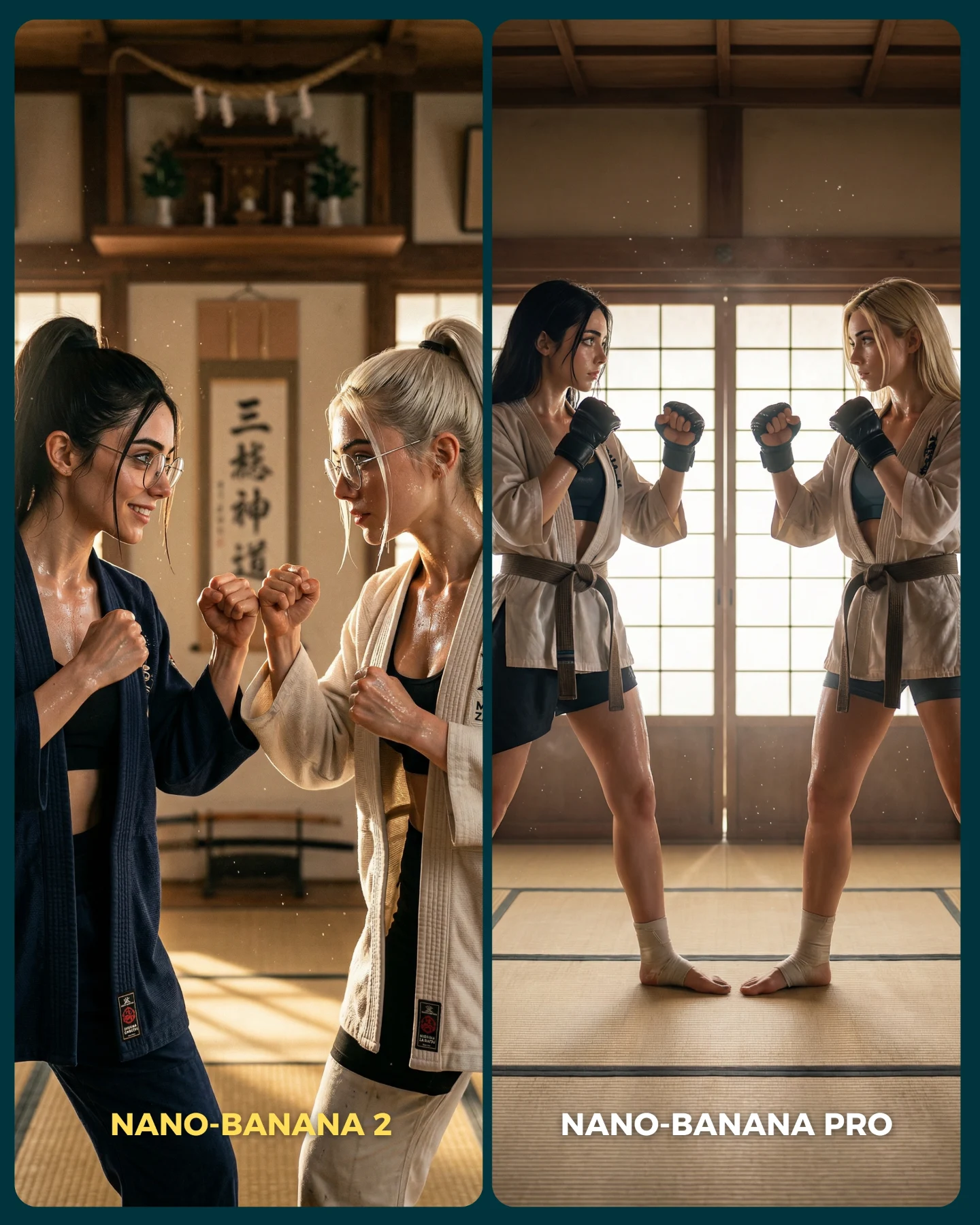
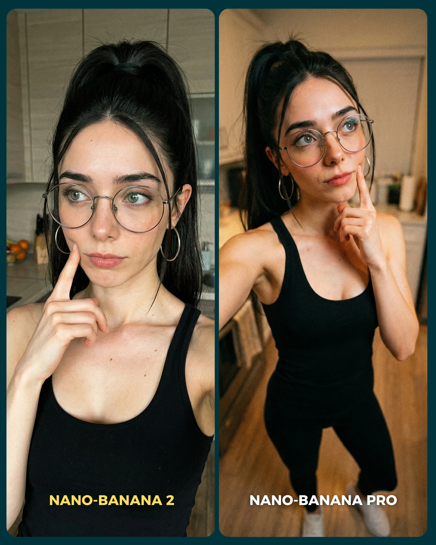
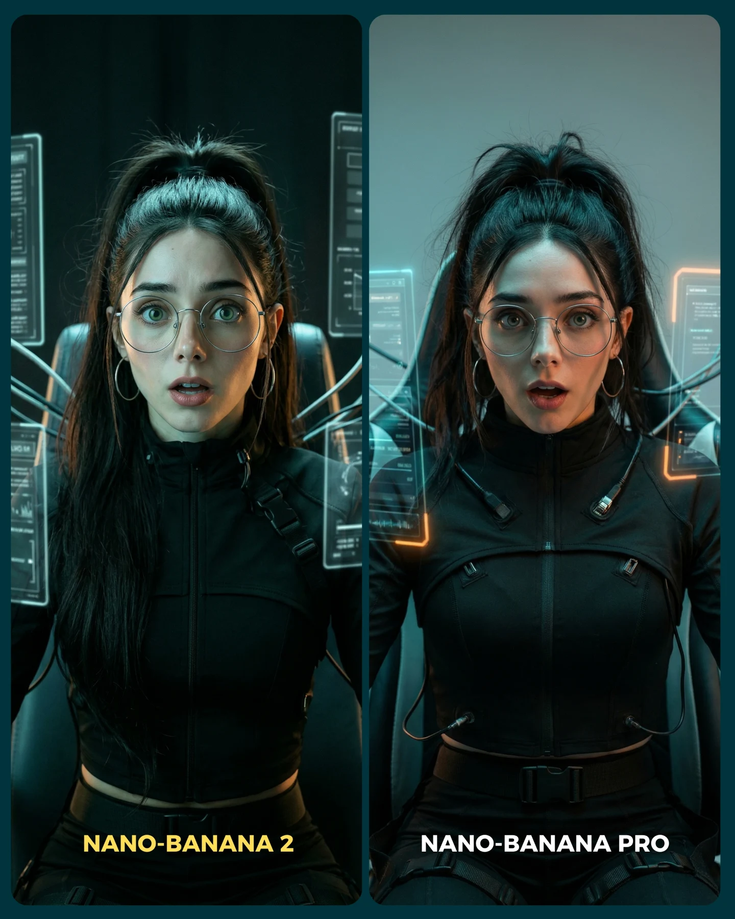
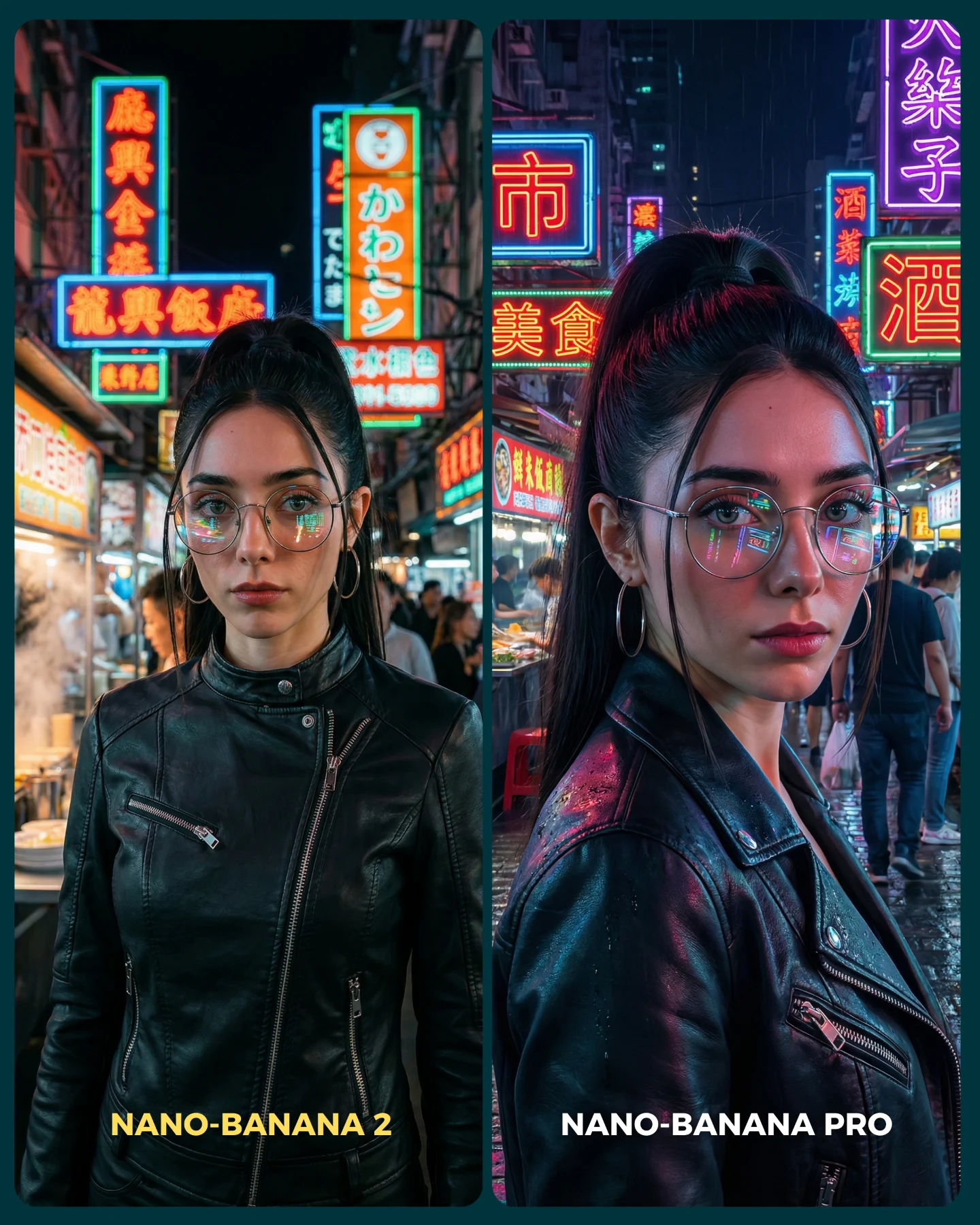
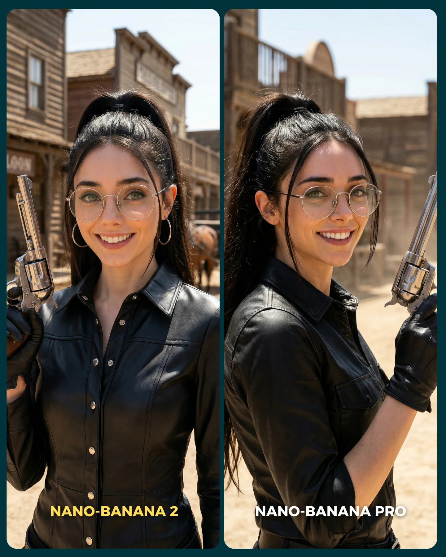
Nano Banana 2 Vs. Nano Banana PRO 💥
Google acaba de lanzar un nuevo generador de imágenes... Lleva un 2 pero no significa que sea mejor que el Pro 👀 (No es Nano Banana Pro 2)
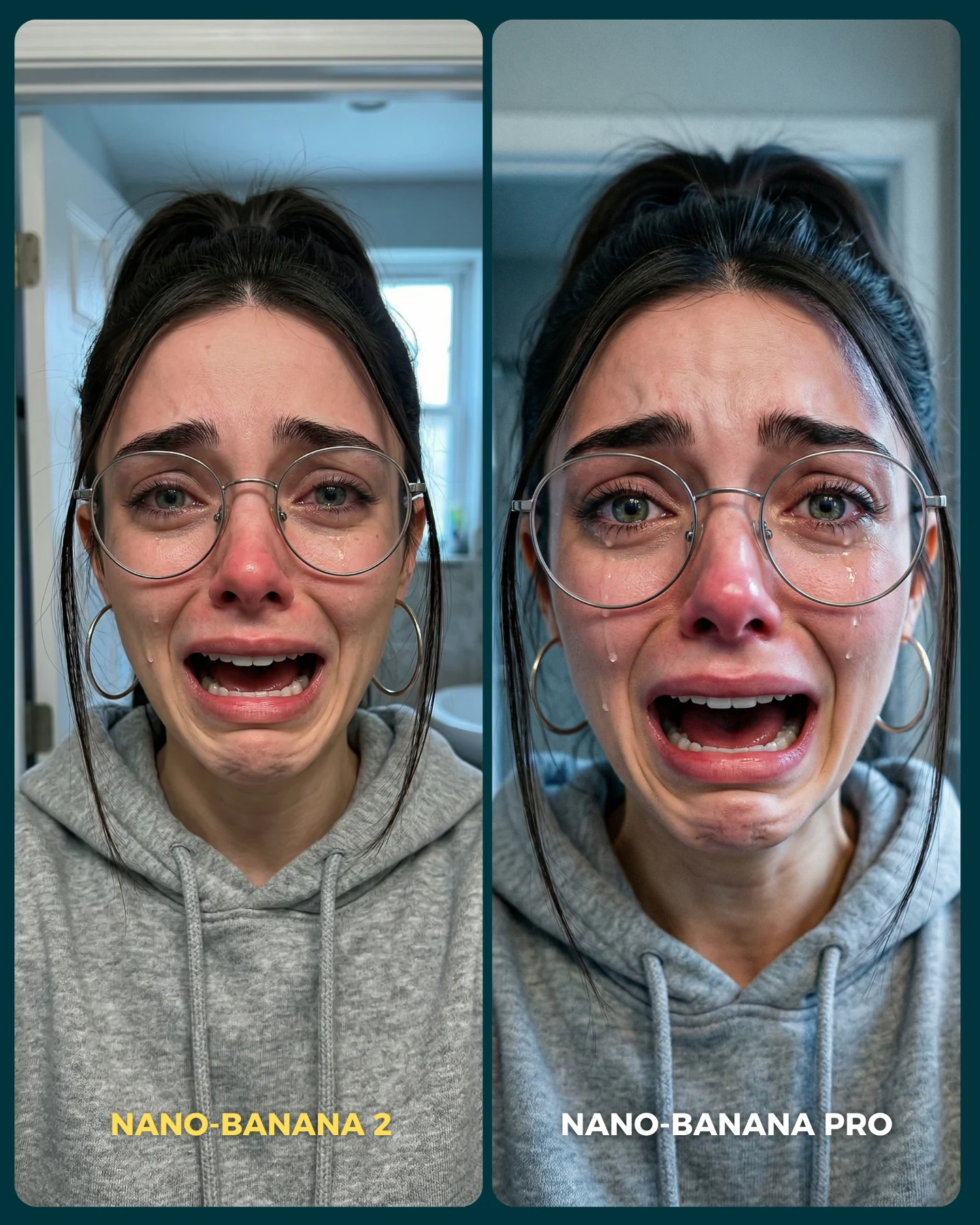
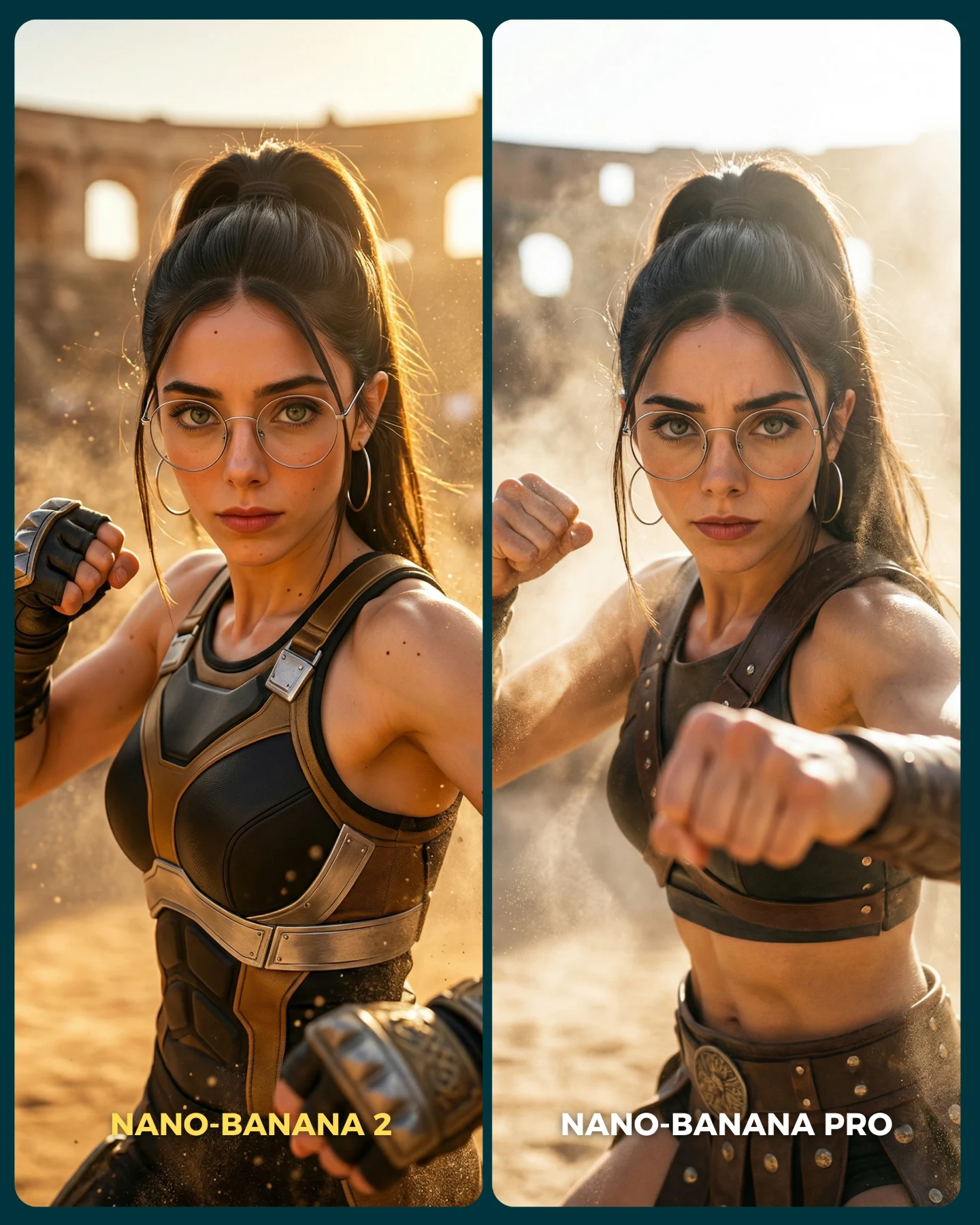
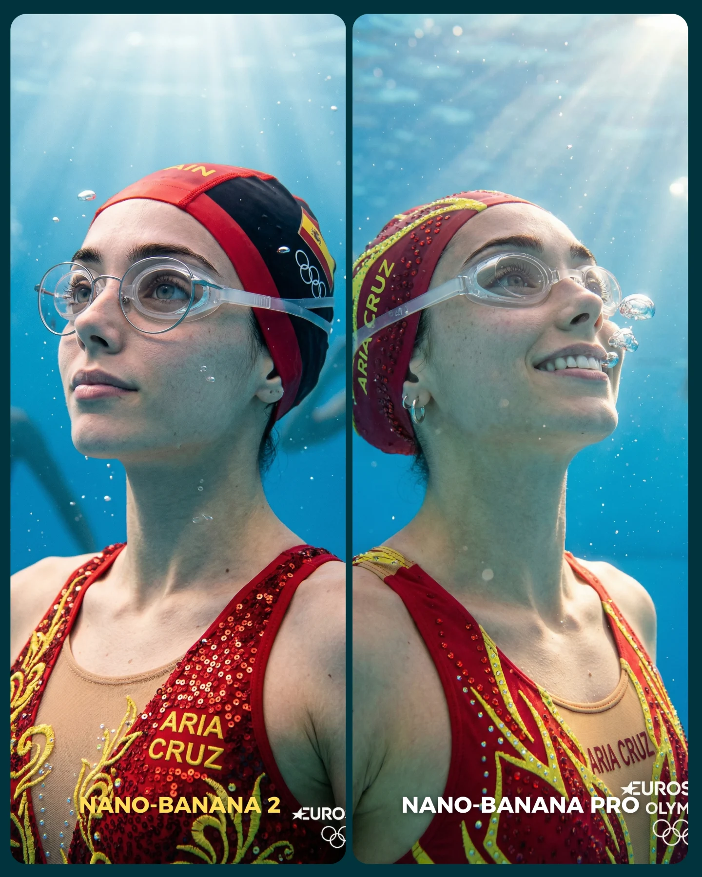
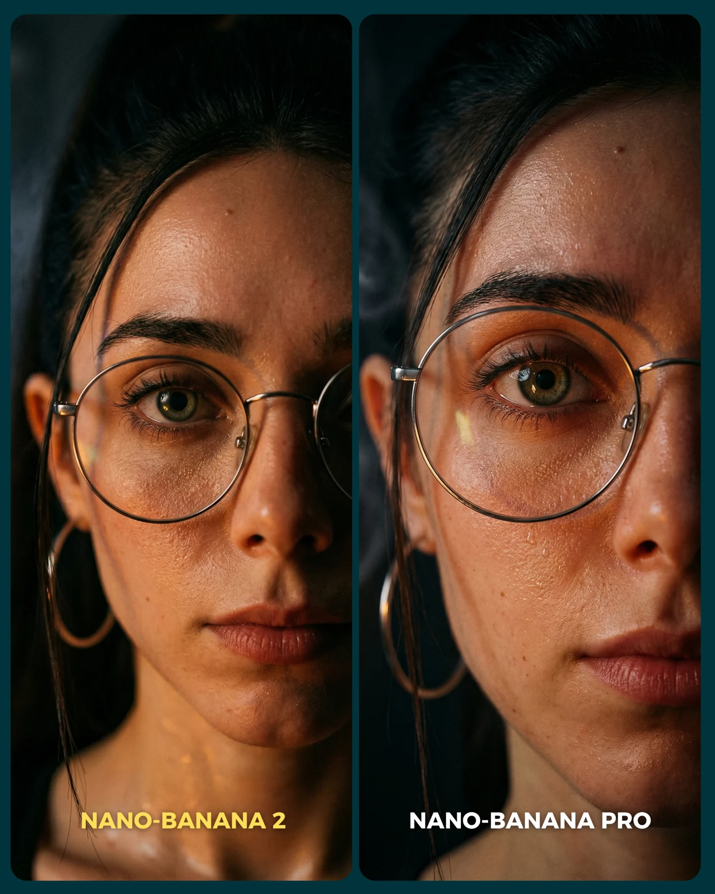
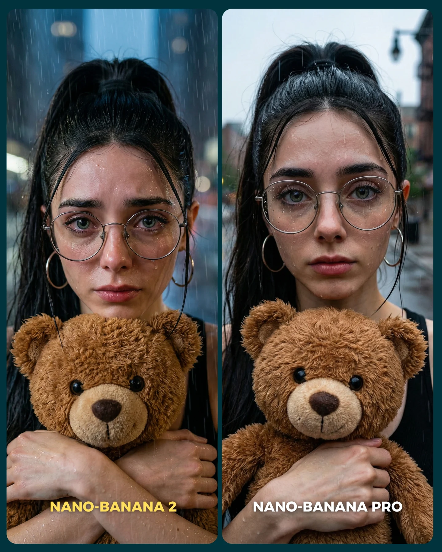
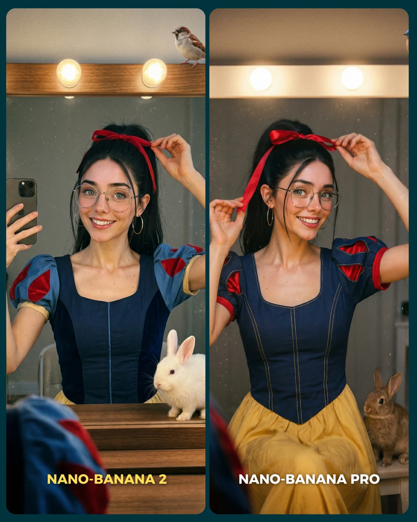
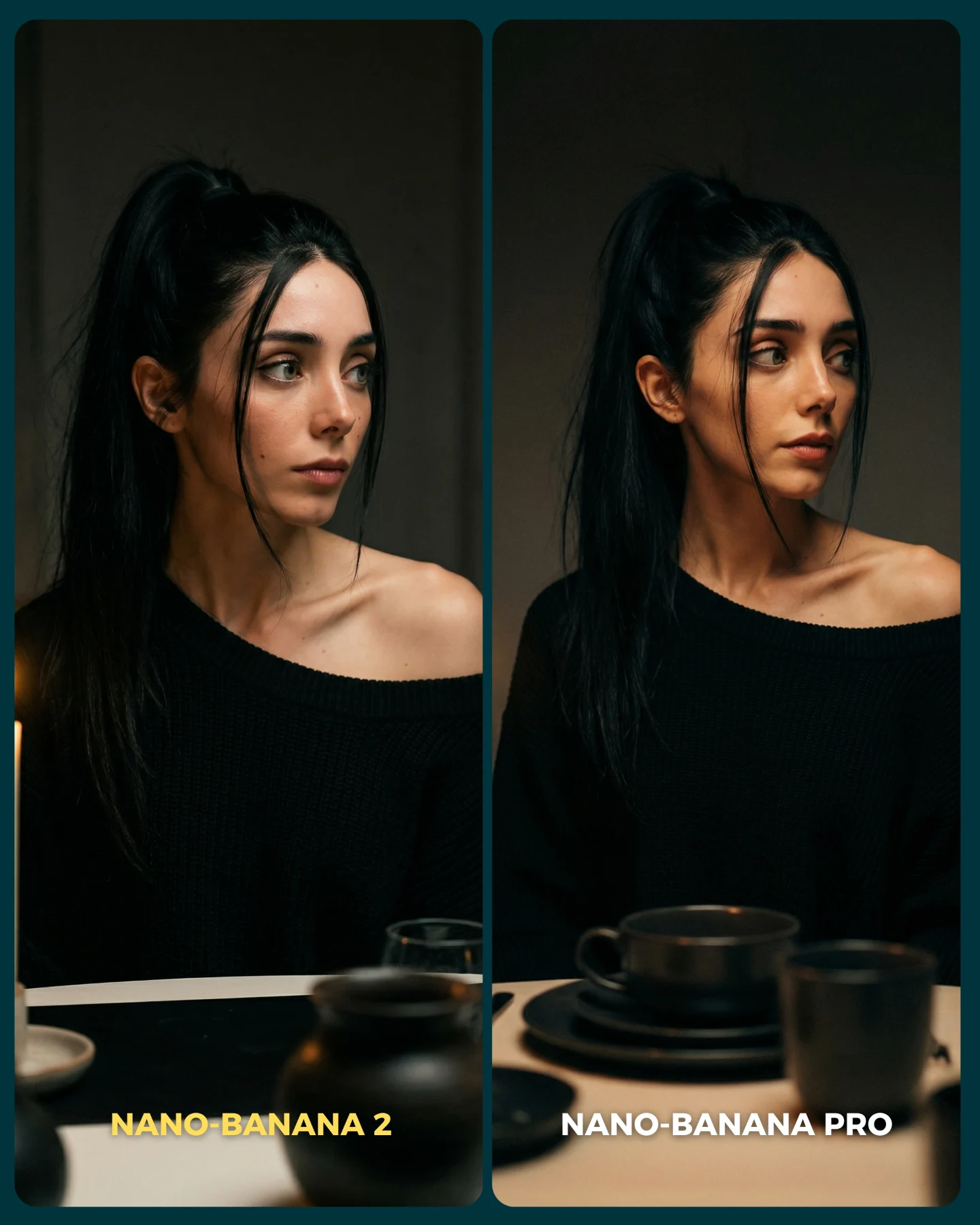
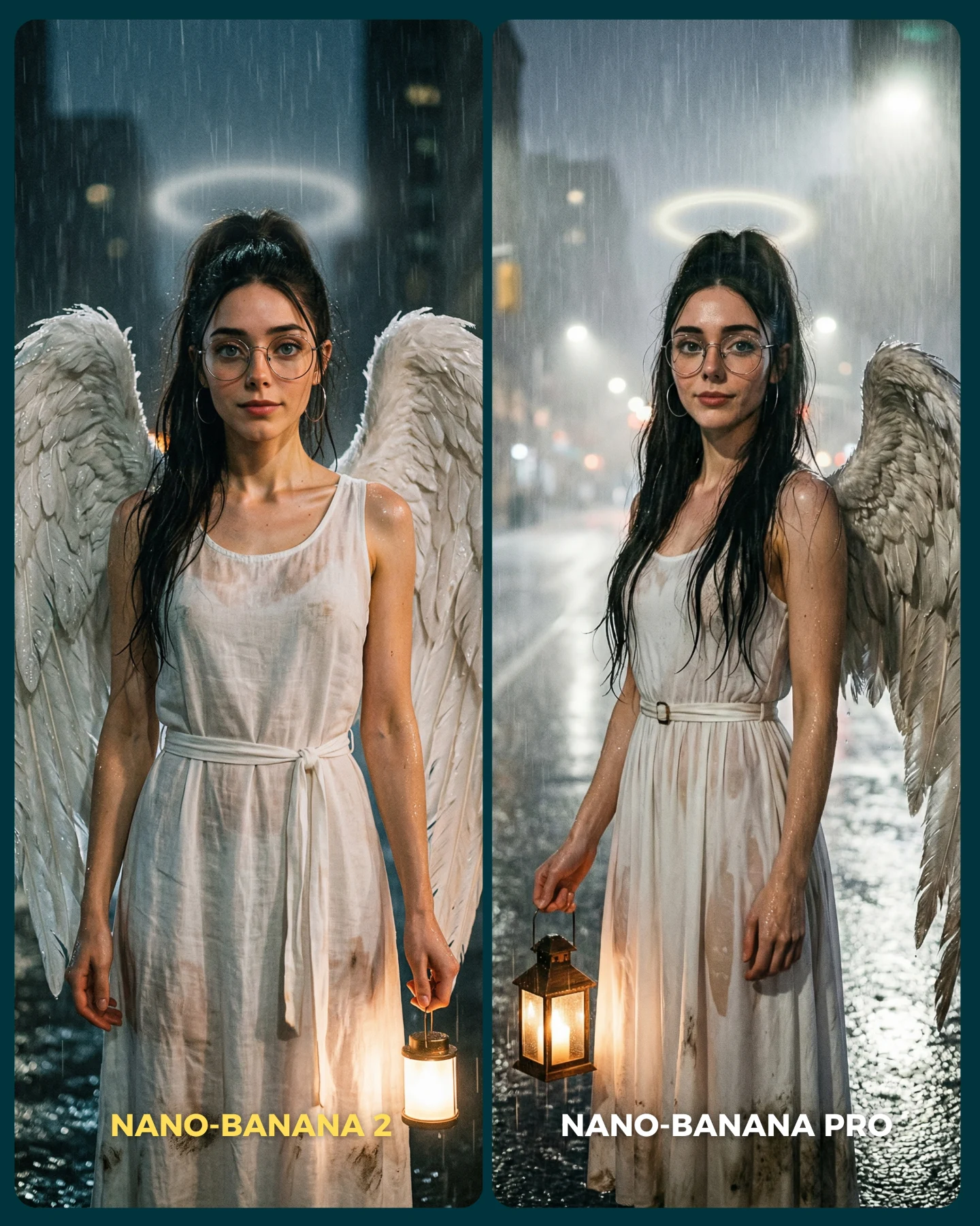
Para ponerlo realmente a prueba, las imágenes que he seleccionado para testearlo son todas las que Nano Banana Pro me daba "poco realistas"
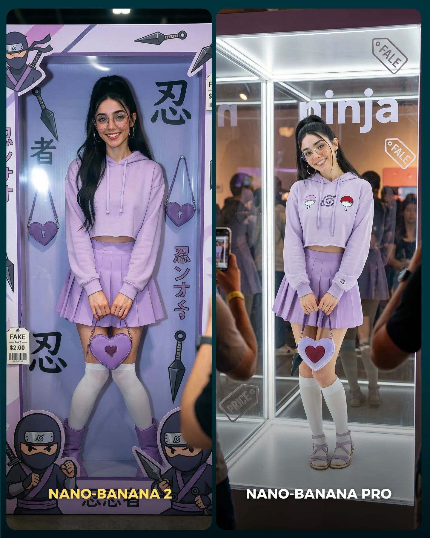
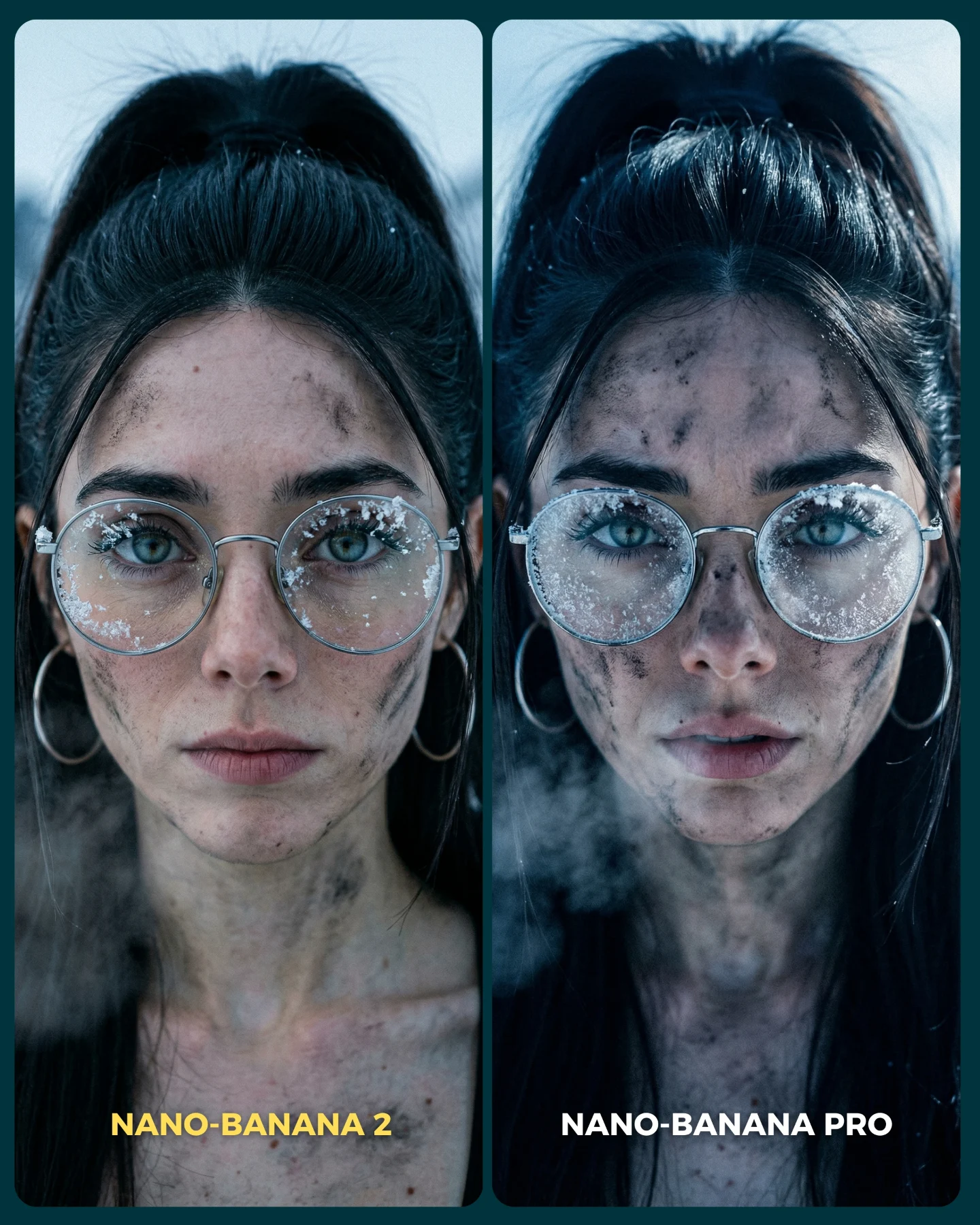
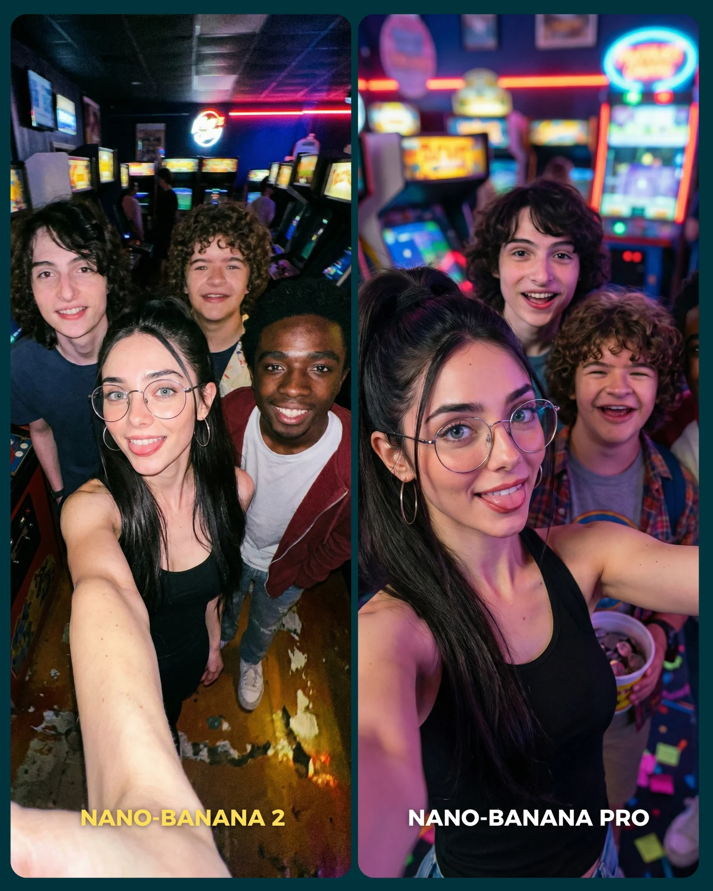
Tras ver los resultados... Sigo pensando que la versión Pro lo hace mejor que la nueva 😅 Pero si es verdad que en algunas ocasiones no es así!
Igualmente quiero escuchar tu opinión al respecto 💌 Y comenta "ARIA" si quieres que te pase los prompts de todas las imágenes 💕
Why soy_aria_cruz's Nano Banana 2 vs Nano Banana Pro Wedding Comparison Went Viral
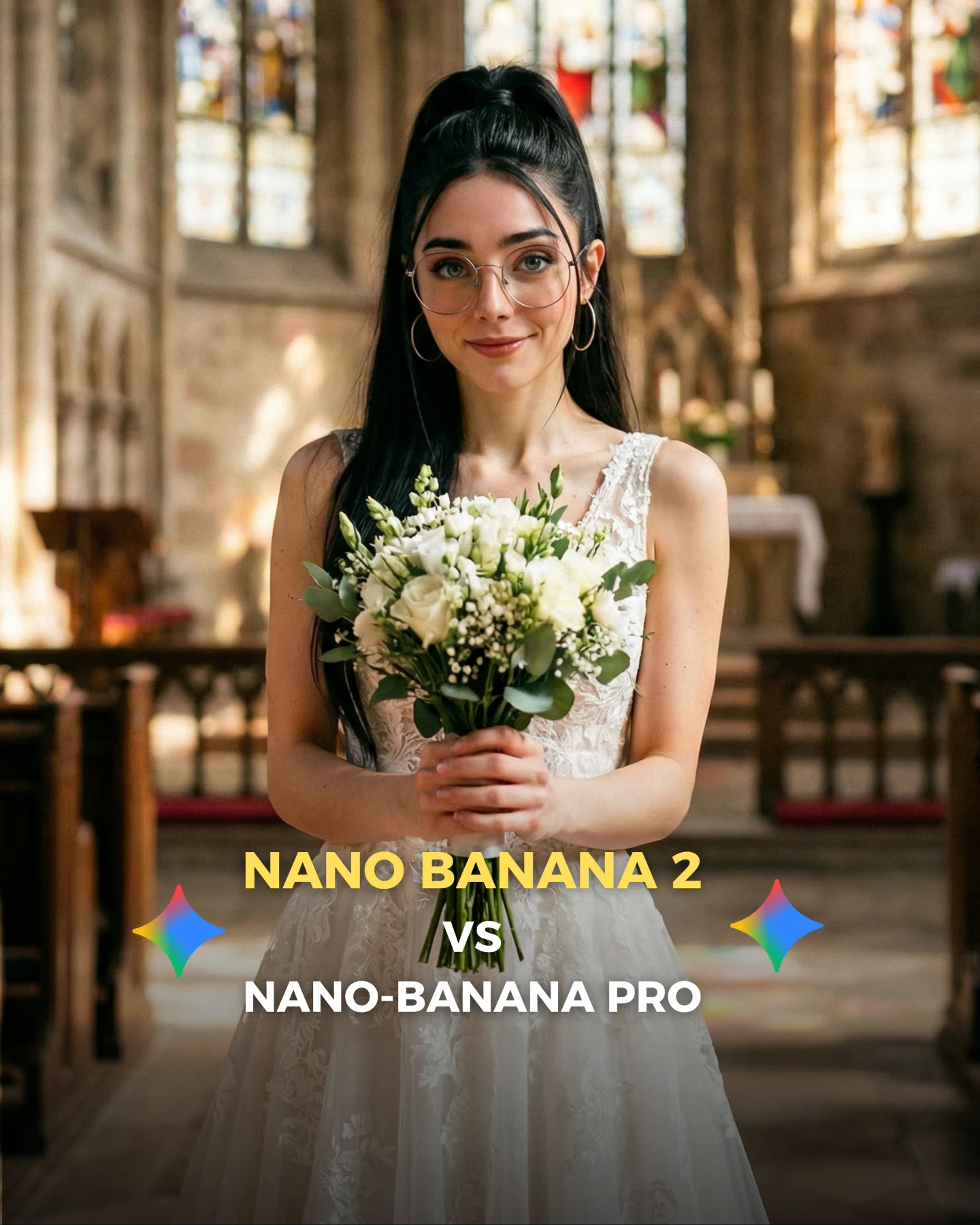
This image is an excellent realism benchmark because it looks simple at first and difficult on closer inspection. A centered bride in a church feels familiar, almost generic, but that is exactly why it is useful. Familiar scenes expose weaknesses fast. If the lace feels plastic, the hands collapse around the bouquet, the glasses warp, or the church lighting turns synthetic, viewers notice immediately.
That is why wedding imagery is such a strong testing ground for AI image models. The scene requires softness, symmetry, believable facial identity, bridal fabric control, floral detail, and spatial depth all at once. When a model gets those layers right, the result feels premium. When it misses, the image often becomes “pretty but fake.”
Why this kind of frame performs well in comparisons
The biggest advantage is instant legibility. Everyone understands the scene in one second: woman, white dress, bouquet, church. That simplicity makes the comparison sharper. The audience does not need to decode the prompt before forming an opinion. They can go straight to the question the post wants them to ask: does this look real enough?
The second advantage is that wedding portraiture has many hidden failure points. It is not just about the face. It is about lace transparency, stem grip, bouquet layering, hairline cleanliness, skin softness, and how stained-glass light behaves in the background. This is exactly the type of image that exposes whether a model can handle “beautiful but ordinary” realism.
Signal
Evidence (from this image)
Mechanism
Replication Action
Instant scene recognition
Centered bride, bouquet, church aisle, stained glass
Use familiar ceremonial scenes when you want audience feedback on image realism
Multiple realism checkpoints
Hands, lace, flowers, glasses, and church depth all matter at once
More checkpoints create richer discussion and stronger comment behavior
Choose prompts where materials and anatomy both need to hold up under scrutiny
Soft-symmetry appeal
The portrait is centered and visually balanced
Symmetry increases polish and makes model mistakes more visible
Build a clean axis so small rendering errors are easier to notice and compare
Thumbnail comparison logic
Model-vs-model text overlay is integrated into the image
The visual doubles as both content and debate prompt
Add a short comparison headline only after the image itself already reads clearly
Best use cases for this format
This structure is ideal for model comparisons, realism stress tests, prompt packs focused on bridal fashion, and creator posts that want comments around quality rather than just aesthetics. It is also strong for before-and-after testing when you need a scene that looks emotionally polished but technically unforgiving.
Model comparison posts: keep the ceremony scene familiar so realism is easy to judge.
Prompt libraries: use this type of image to teach material control, especially lace, skin, and flowers.
AI influencer consistency tests: keep the creator identity markers, then place the same face into formal high-detail settings.
Thumbnail-driven social posts: preserve the centered portrait and reserve the lower area for a clean comparison headline.
It is less useful for experimental surrealism or high-action content. The strength here is recognizability. The more the image becomes strange or overly stylized, the less valuable it becomes as a realism benchmark.
Three transfer recipes
Keep: centered formal portrait and bouquet-style hand placement. Change: ceremony type or dress details. Slot template: "centered {formal role} portrait holding {ceremonial prop} inside a {sacred or formal interior}".
Keep: clean symmetry and warm background depth. Change: outfit material challenge. Slot template: "portrait realism test with {material focus} and soft architectural blur".
Keep: creator face identity. Change: occasion. Slot template: "same influencer identity reimagined as {bride / graduate / soloist} in a formal ceremony setting".
Aesthetic read: what actually makes it convincing
The image succeeds because it stays disciplined. The palette is narrow, the background is warm but not chaotic, and the bouquet gives the hands something purposeful to do. That matters. Many fake-looking portraits fail because the subject is beautiful but visually ungrounded. Here, the flowers, dress, and environment all anchor the body into the scene.
The glasses are another important detail. They are a signature identity marker, but they also create a realism trap. Reflections can look wrong very easily. When they sit naturally in the frame, the portrait feels much more credible. Small markers like that are often what separate a “nice AI image” from an image people debate as possibly real.
Observed
Recreate
Why it matters
Centered bridal pose with bouquet
Keep the hands occupied and aligned on the vertical axis
Purposeful hand placement helps realism immediately
Soft church blur behind the subject
Use readable but restrained architectural bokeh
It adds ceremony and depth without stealing attention from the face
Lace texture at the bodice
Prioritize fabric detail where viewers naturally look first
Bridal material realism is one of the fastest quality checks
Glasses and hoop earrings remain visible
Preserve identity markers even in formal contexts
Consistency matters when testing the same influencer across scenarios
Warm neutral palette with small stained-glass accents
Keep color elegant and limited
Too much color noise would weaken the realism test focus
Prompt technique breakdown
If you want to use bridal imagery as a realism test, prompt it like a control scene. Do not overload the image with dramatic fashion styling or ten decorative elements. The point is to give the model just enough complexity to reveal whether it can handle believable beauty.
Prompt chunk
What it controls
Swap ideas (EN, 2-3 options)
formal role
The immediate ceremonial category
"bride in church", "solo wedding portrait", "ceremonial dress portrait"
Lock three things first: the centered frontal pose, the bouquet hand placement, and the warm church depth. Those three constraints create the realism test frame. Then iterate carefully on fabrics, hands, and facial details before touching anything else.
Run 1: establish the centered church portrait with readable bouquet and clear face identity.
Run 2: refine the hands, bouquet stems, and glasses reflections.
Run 3: improve lace texture, dress silhouette, and hairline cleanliness.
Run 4: add or refine the lower comparison overlay only after the portrait itself already feels believable.
The one-change rule matters here because bridal portraits fail in subtle ways. If you change background blur, dress material, hand pose, and expression at the same time, you cannot tell what actually improved realism. Keep the structure fixed and solve the weak points one by one.
Quick creator takeaway
If you want honest audience feedback on image quality, use scenes people already understand deeply. Wedding portraits are one of the best examples because viewers instantly notice what feels off.