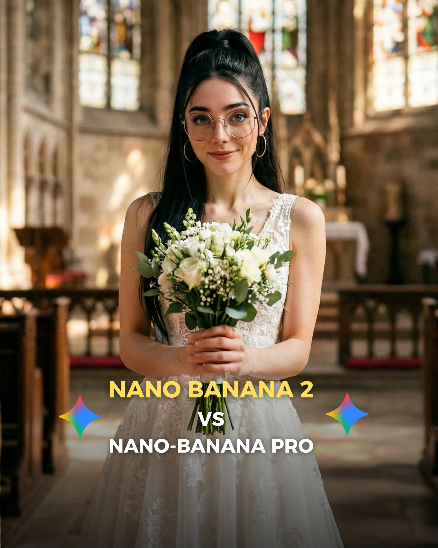
Nano Banana 2 Vs. Nano Banana PRO 💥
Google acaba de lanzar un nuevo generador de imágenes... Lleva un 2 pero no significa que sea mejor que el Pro 👀 (No es Nano Banana Pro 2)
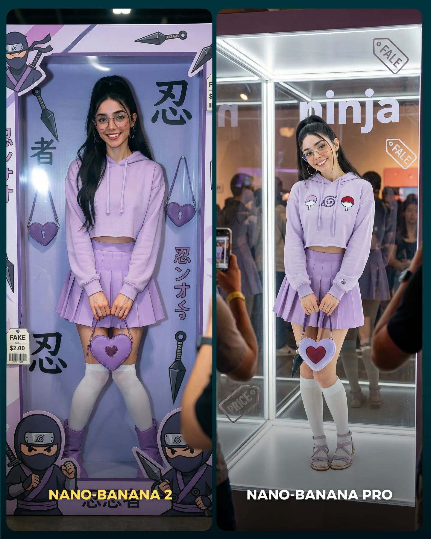
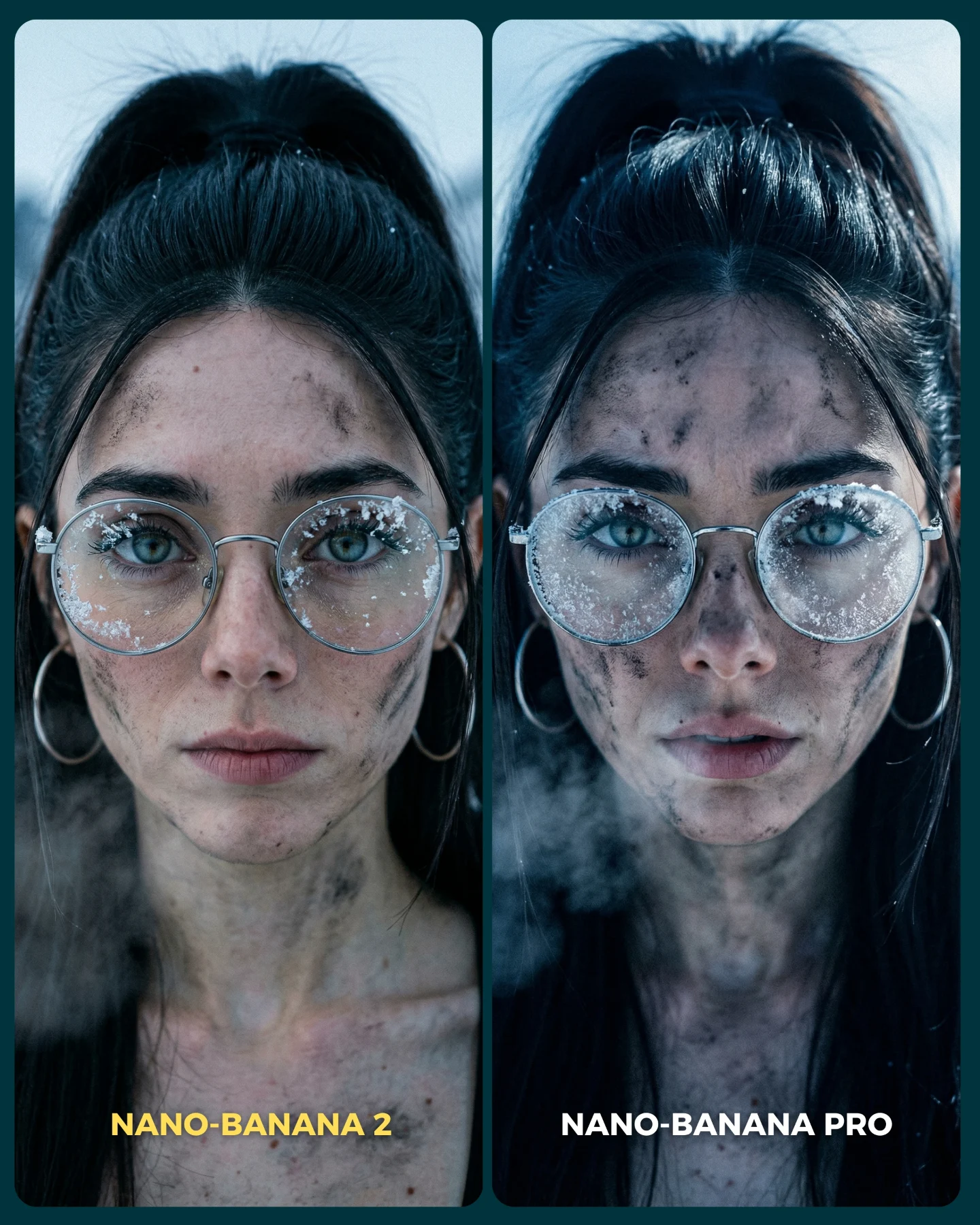
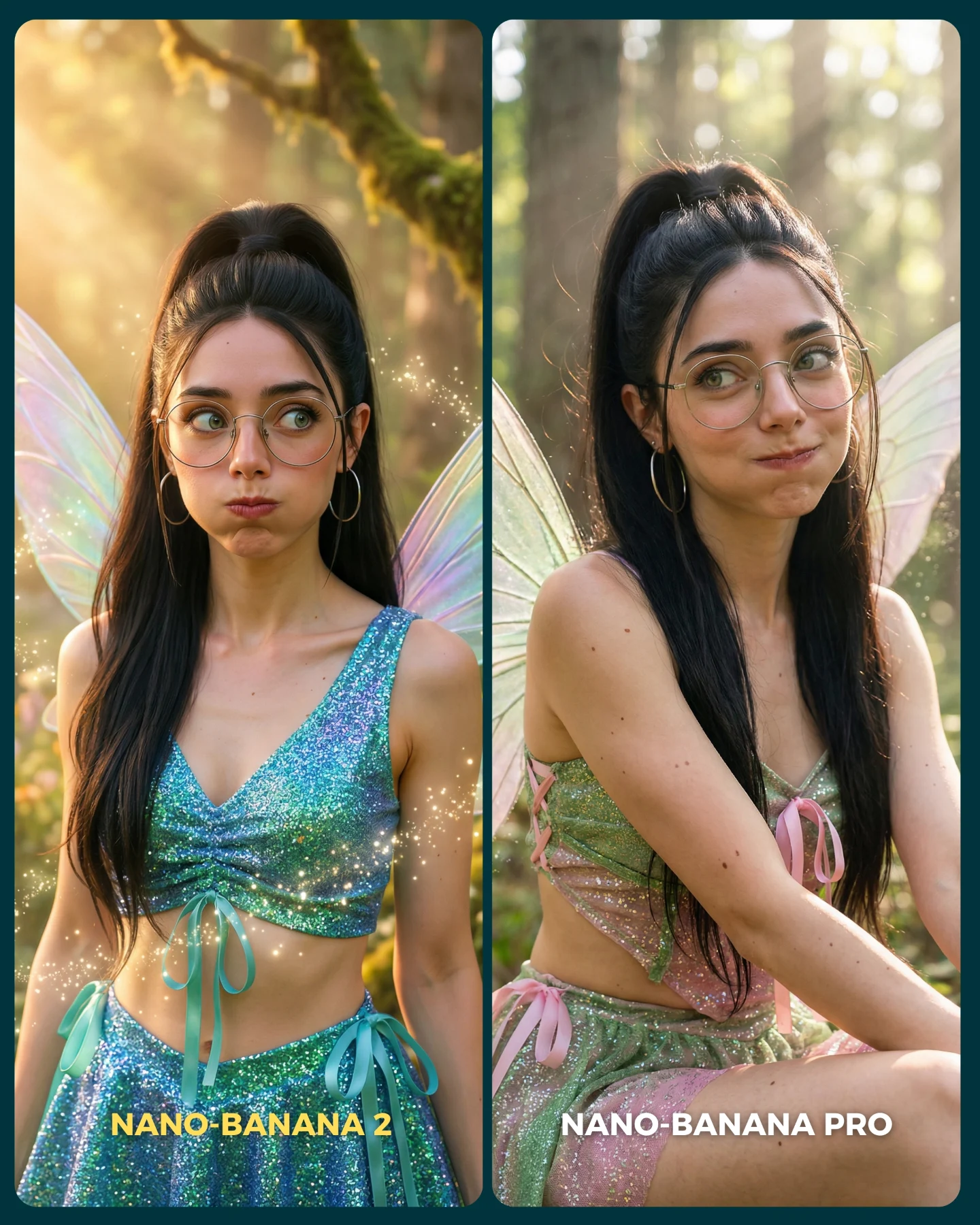
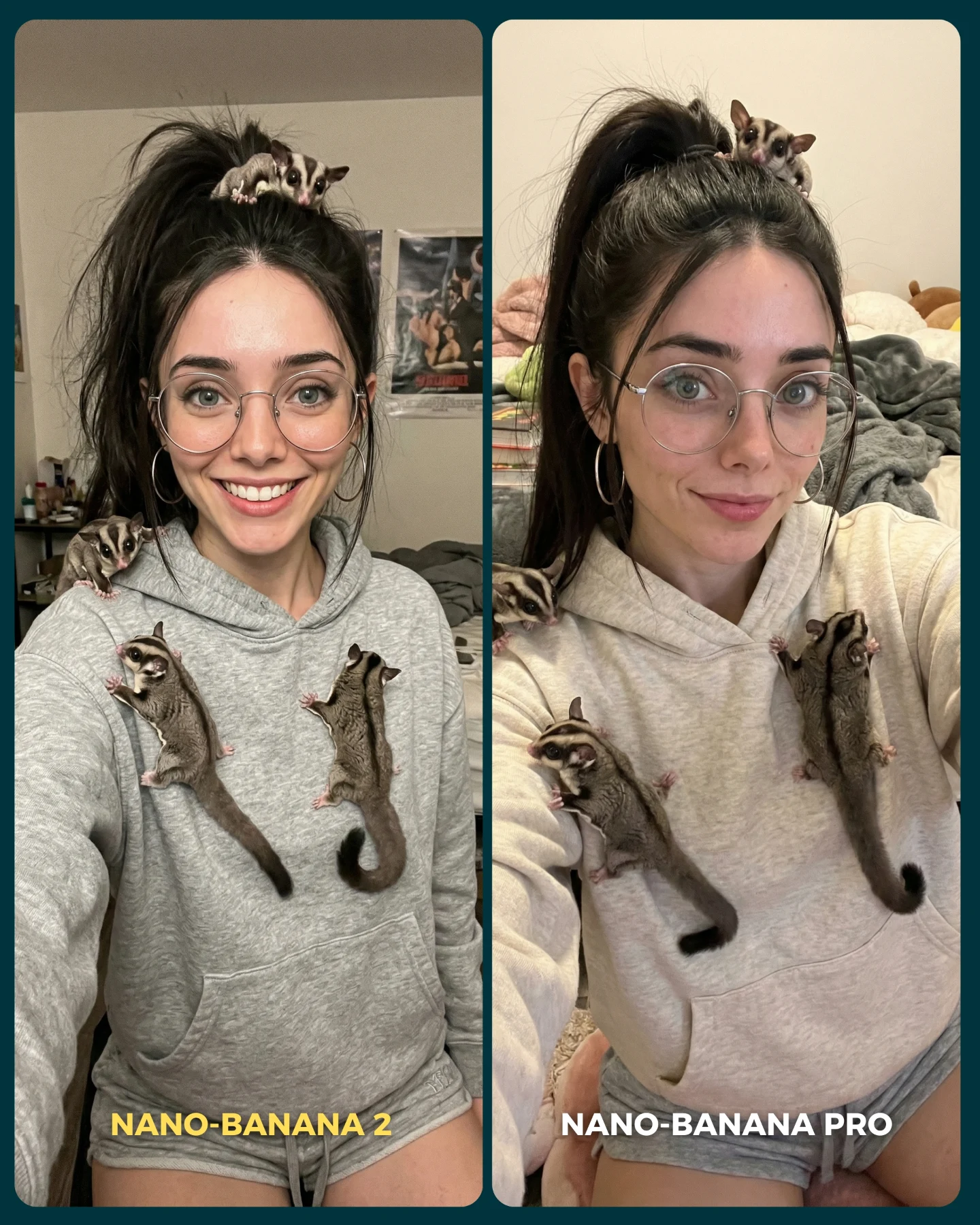
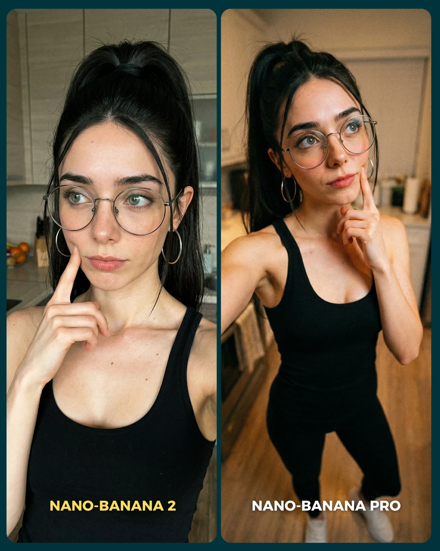
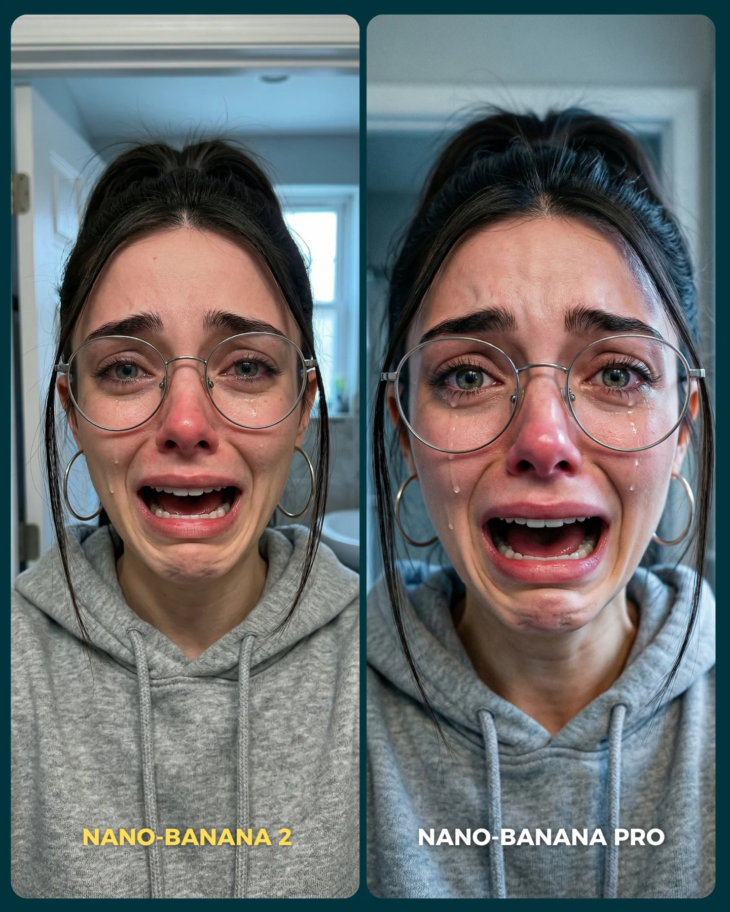
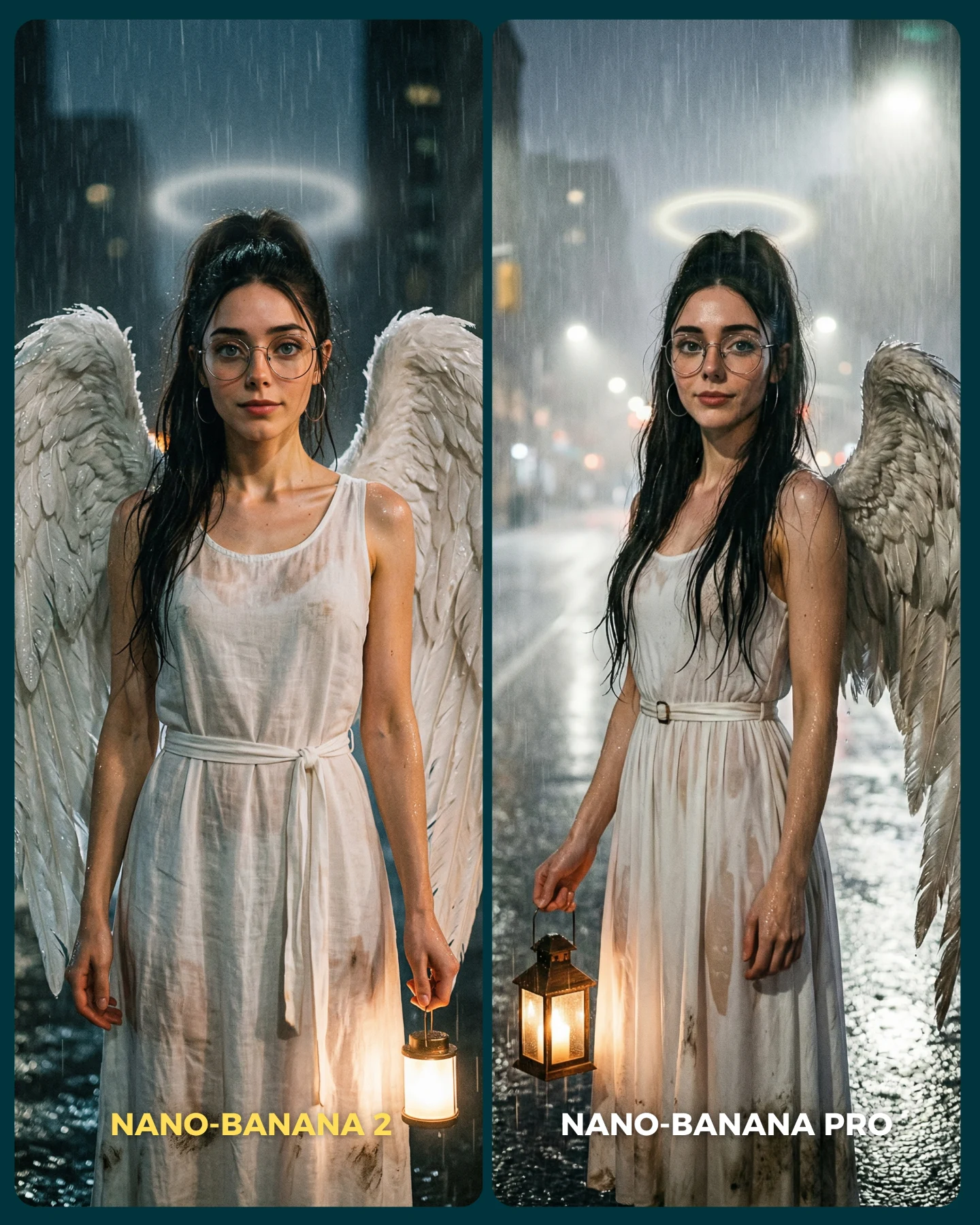
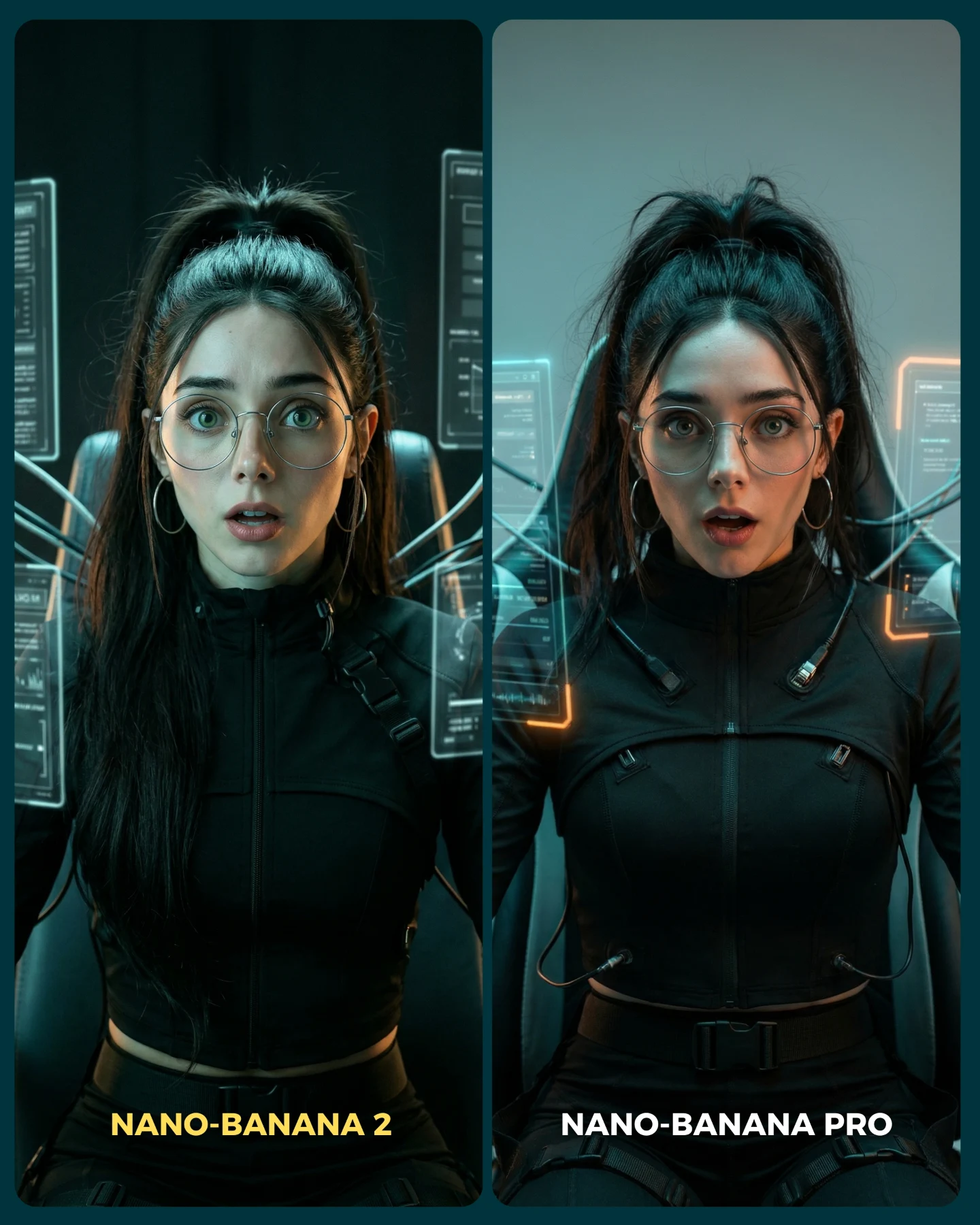
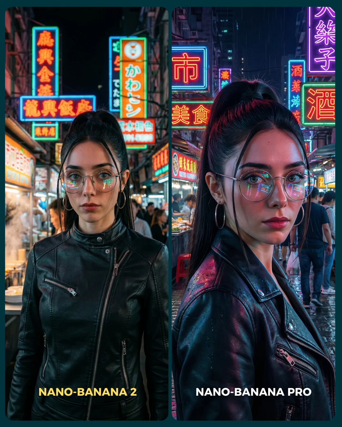
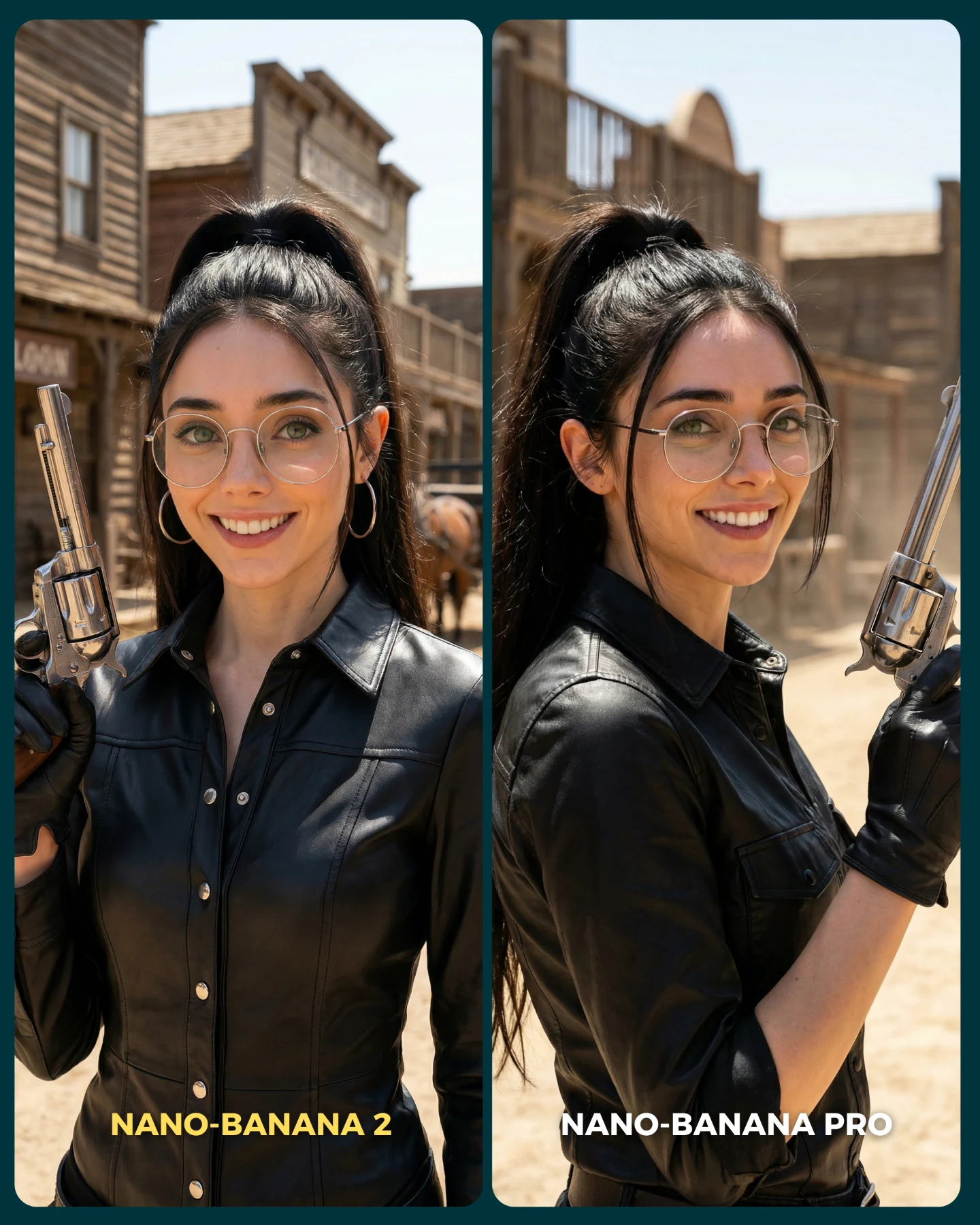
Para ponerlo realmente a prueba, las imágenes que he seleccionado para testearlo son todas las que Nano Banana Pro me daba "poco realistas"
Tras ver los resultados... Sigo pensando que la versión Pro lo hace mejor que la nueva 😅 Pero si es verdad que en algunas ocasiones no es así!
Igualmente quiero escuchar tu opinión al respecto 💌 Y comenta "ARIA" si quieres que te pase los prompts de todas las imágenes 💕
How soy_aria_cruz Made This Face Realism Comparison AI Art - and How to Recreate It
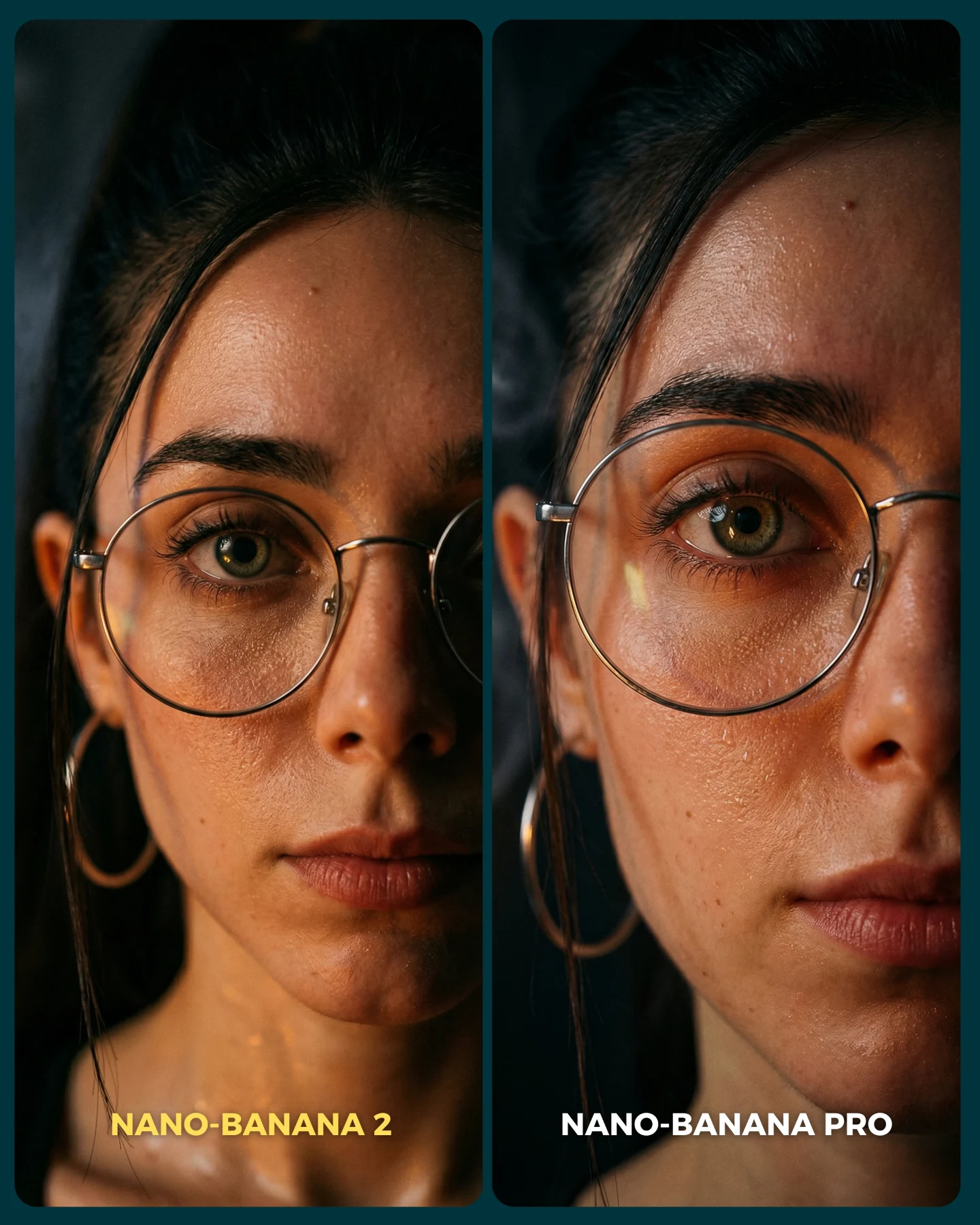
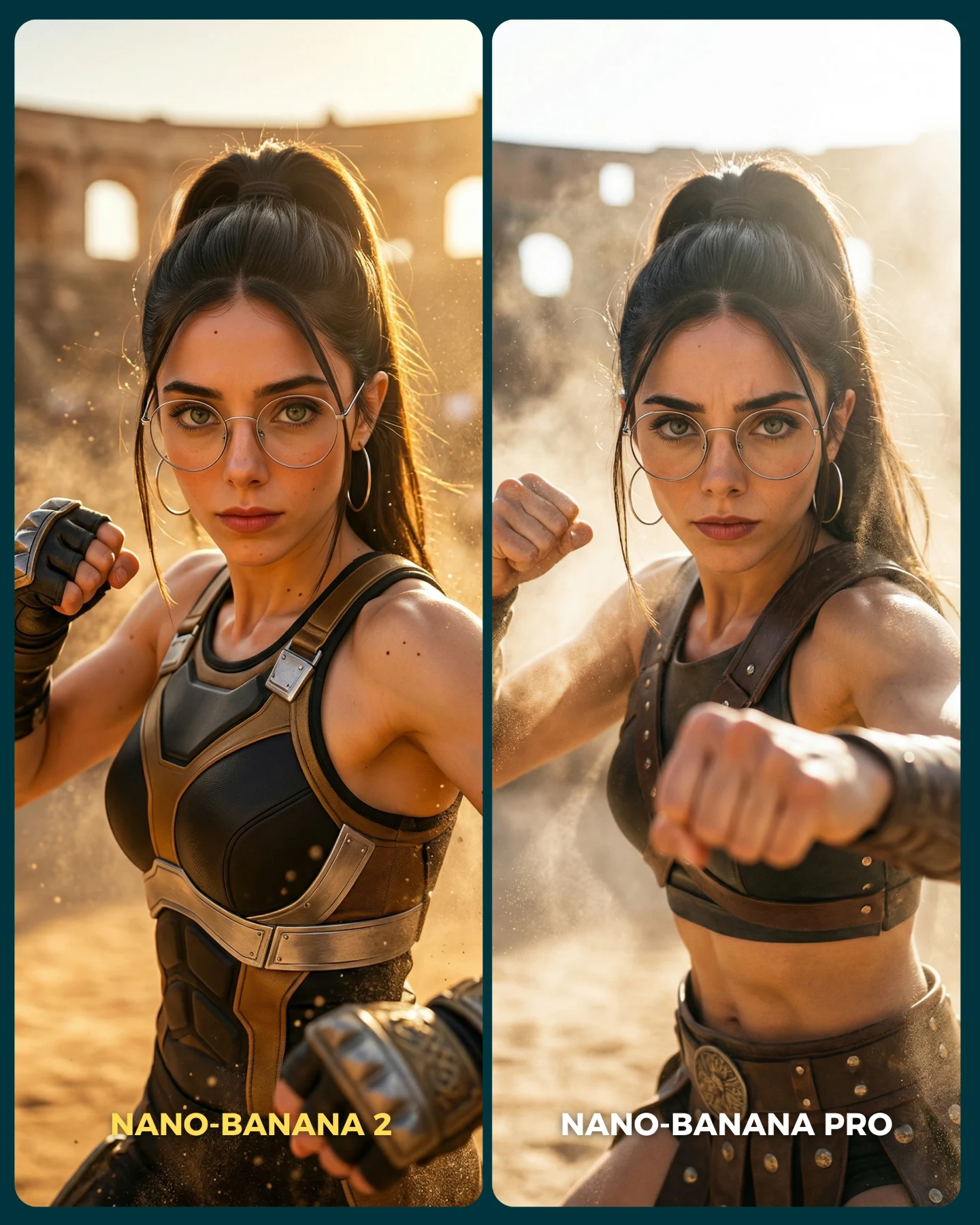
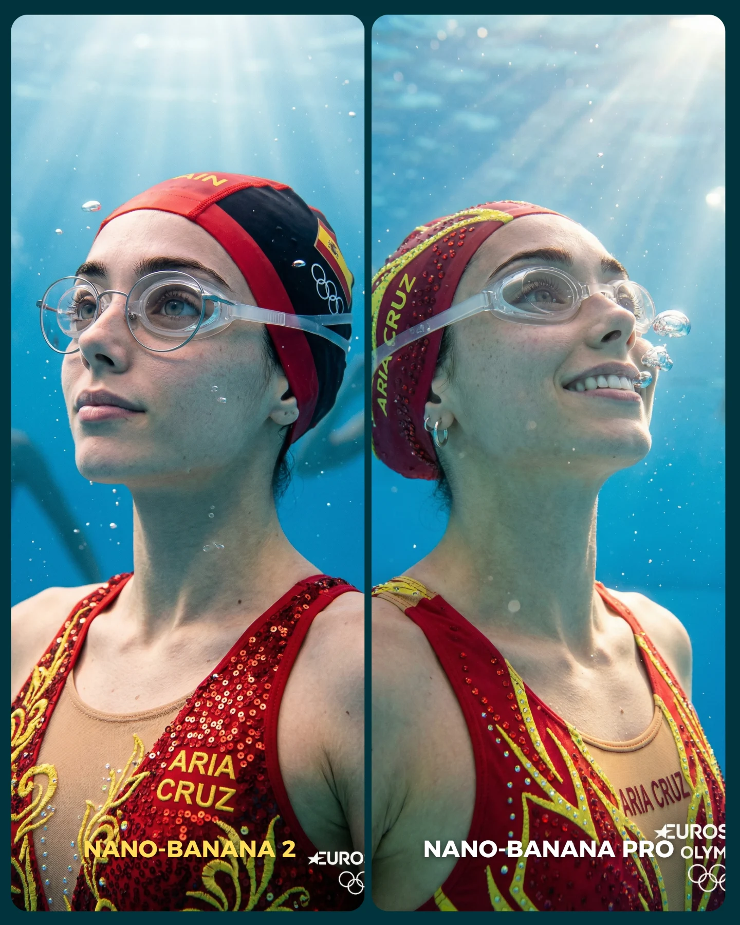
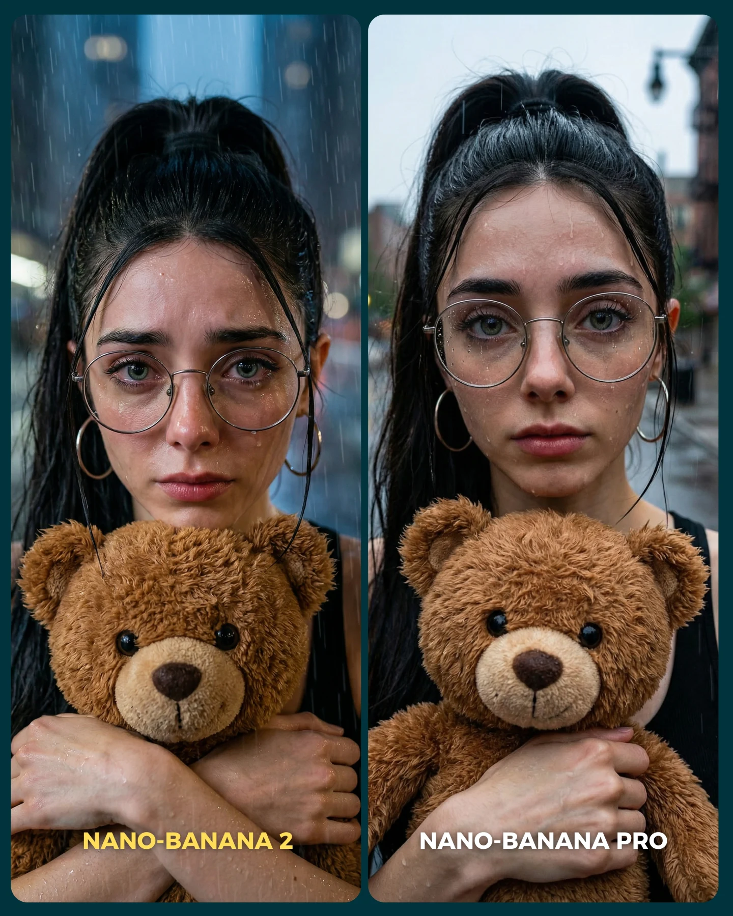
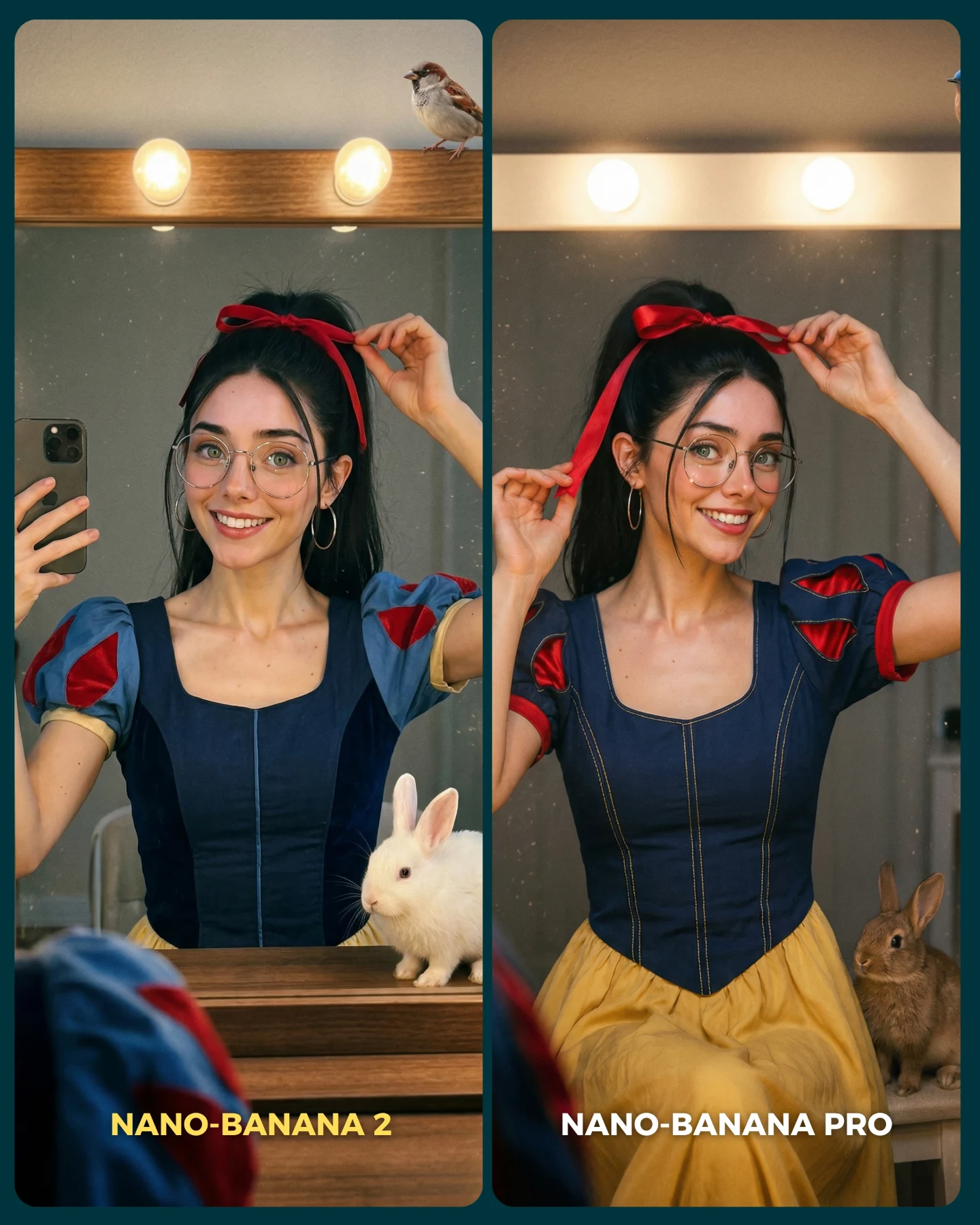
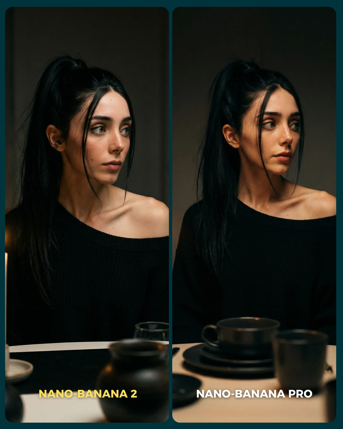
When creators compare image models, they often choose scenes that are too forgiving. A flattering medium shot with soft light can hide a lot of weaknesses. This image does the opposite. It moves the camera so close to the face that every tiny decision becomes visible: pore texture, under-eye rendering, reflections in the glasses, lip edge realism, brow hair separation, and how the light rolls across skin. That is why the comparison feels convincing.
The smartest move here is the restraint. There is no elaborate wardrobe, no background story, and no decorative prop to distract the eye. The entire post is essentially asking one thing: when you get very close, which model still looks like a believable human photograph? That is a much sharper benchmark than generic beauty content because the viewer immediately knows what to inspect.
It also works well on social because it is legible in a split second. Even if someone does not analyze pores or facial fidelity consciously, they can still feel when one side looks more alive. That feeling is enough to trigger comments, disagreement, and curiosity. Good comparison content does not need the audience to speak in technical terms. It just needs them to notice that one image feels more trustworthy.
Why The Comparison Lands
Signal
Evidence (from this image)
Mechanism
Replication Action
Extreme crop
The face fills nearly the entire frame in both panels
Close distance removes distractions and forces realism differences into view
Use an ultra-tight crop whenever your goal is to benchmark skin and eye fidelity
Identity continuity
Same glasses, same earring, same direct gaze, same hairline cues
The test feels fair because viewers are not comparing two different characters
Lock 3-4 identity markers before running comparison outputs
Hard-to-fake skin detail
Visible pores, forehead sheen, under-eye texture, small facial marks
Microtexture is where weaker outputs often look synthetic or overprocessed
Choose lighting that reveals texture instead of flattering it away
Simple visual story
Dark background, minimal styling, only two clear labels
The viewer knows exactly where to look and what the post is claiming
Strip out extra scene complexity when testing one narrow quality axis
There is another subtle advantage here: glasses. Eyewear adds reflections, rim geometry, and facial occlusion, which means the benchmark is not just about skin. It also becomes a test of how well a model handles transparent surfaces on a face. That makes the comparison richer without making it cluttered.
Best Uses For This Format
This style of post is best when your goal is to test realism, beauty-detail fidelity, identity consistency, or close-range portrait quality. It is especially useful for creators who want to educate their audience on what “better” actually means in image generation.
Realism benchmark posts: ideal for proving which model handles skin and eyes more credibly.
Beauty creator education: useful when discussing what makes AI portraits look human instead of airbrushed or synthetic.
Prompt refinement examples: strong for showing how a tighter realism prompt changes output quality.
Launch commentary: effective when a new generator claims better face rendering and you need a sharp visual proof point.
It is less useful for storytelling, lifestyle content, or campaigns that need atmosphere and scene context. This format is intentionally narrow. Its strength comes from focusing all attention on the face, not from building a world around it.
Transfer recipe 1 Keep: same face, same crop, same neutral background. Change: only the model version. Slot template (EN): ultra-close portrait comparison of the same woman, left {model A}, right {model B}, realistic skin detail, clear labels
Transfer recipe 2 Keep: same identity and framing. Change: the lighting instruction, for example soft flat light versus directional cinematic light. Slot template (EN): same close-up face in two panels, different lighting strategies, skin texture benchmark graphic
Transfer recipe 3 Keep: close crop and realism focus. Change: one pressure variable such as freckles, makeup, wet skin, or stronger glasses reflections. Slot template (EN): {identity} extreme close-up comparison, testing {detail variable}, clean benchmark layout
The Aesthetic Read
The image feels premium because the lighting is controlled but not glamorous. There is enough warmth to make the skin feel alive, but not so much that the face turns orange or stylized. The shadows are soft, the reflections on the glasses are present but restrained, and the dark background gives the face nowhere to hide. That is why the right panel can feel more dimensional without becoming louder.
The strongest visual choice is the hierarchy of detail. Your eye lands on the iris and lashes first, then the rim of the glasses, then the skin texture around the cheeks and under-eye area. That path matters. A believable portrait often succeeds because the eye region is convincing enough to support the rest of the face. If the eyes fail, the entire image collapses. This comparison wisely places that test right in front of the viewer.
Another important note is that the image is not perfectly flattering, and that is a good thing. Benchmark content becomes more trustworthy when it allows a little shine, a little unevenness, and a little human imperfection. Over-beautified tests often confuse enhancement with realism. This post avoids that trap.
Observed
Why it matters
How to recreate
Ultra-close face crop
Concentrates all attention on realism details
Push the camera close enough that the face dominates the frame
Warm low-key light
Reveals texture while keeping the image cinematic
Use directional warm light with soft shadow falloff
Visible glasses reflections
Adds a transparent-material challenge
Keep reflections subtle but present on the lens surface
Dark neutral background
Prevents the eye from wandering away from the test area
Remove environmental detail and keep the backdrop nearly black
Natural skin texture
Signals realism instead of beauty-filter polish
Explicitly prompt pores, fine detail, and no retouching
Prompt Blocks To Control
Prompt chunk
What it controls
Swap ideas (EN, 2-3 options)
ultra-close portrait of the same woman in two panels
Sets the comparison structure and fairness
same man in two panels; same beauty look in two panels; before/after realism split
round glasses, hoop earring, dark hair pulled back
Locks identity continuity
freckles and nose ring; white headphones; red lipstick and blunt bangs
charcoal gradient; black studio void; dim neutral wall
real skin pores and subtle shine
Controls whether the face feels human or synthetic
light freckles; minimal makeup; dewy skin with natural texture
left slightly flatter, right more realistic
Builds the winner directly into the visual
left softer right sharper; left less dimensional right more dimensional; left weaker eye detail right stronger eye detail
What to lock first
Lock the crop, the identity markers, and the skin-texture language first. If any of those drift, the comparison becomes noisy and less persuasive.
How To Iterate On This Test
Baseline Lock: keep the same face, same expression, and same lighting family. That gives you a clean benchmark foundation. Then rotate one variable at a time, such as the model, realism strength, or retouching instruction.
Run 1: stabilize the identity and glasses rendering across both panels.
Run 2: increase or reduce skin texture language while keeping the crop unchanged.
Run 3: test a second close-up challenge like wet skin, stronger shadows, or makeup detail.
Run 4: if the format is working, build a series around specific realism pain points such as eyes, hands, jewelry, or hairlines.
The key is to keep the comparison narrow. The more tightly you define what is being judged, the more persuasive the visual becomes. That is exactly why this post works.