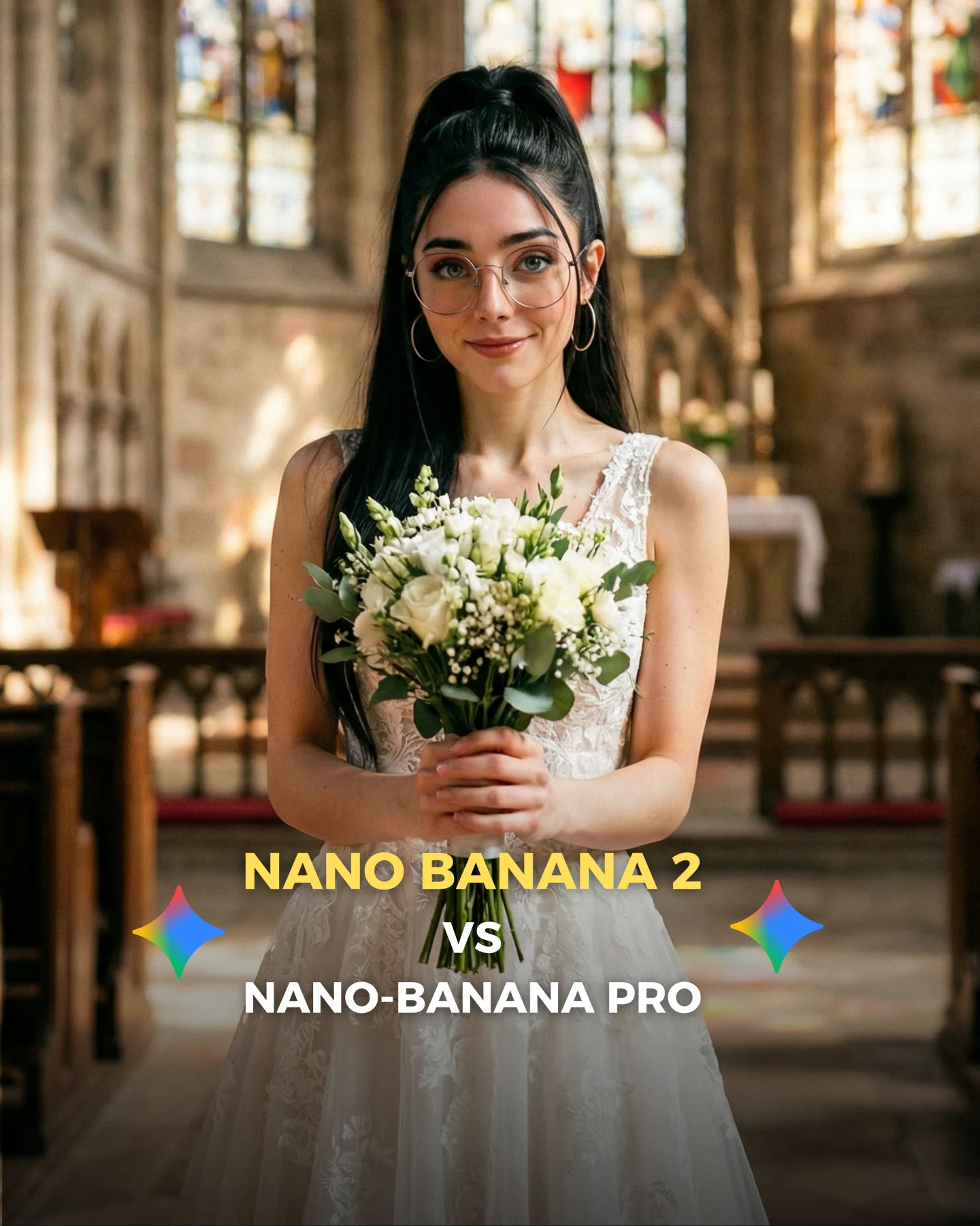
Why soy_aria_cruz's Nano Banana 2 vs Nano Banana Pro Snow White Comparison Went Viral
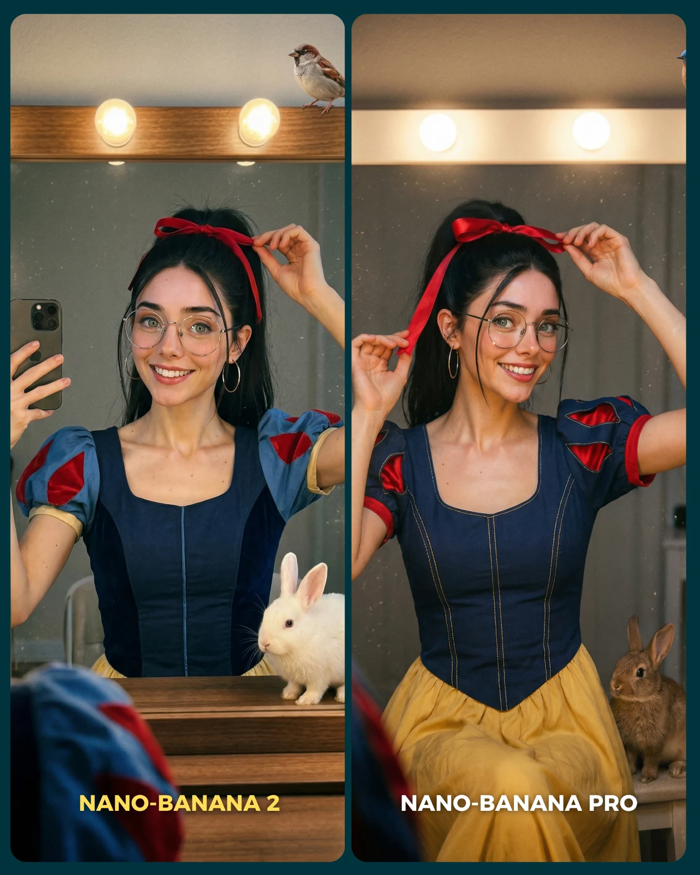
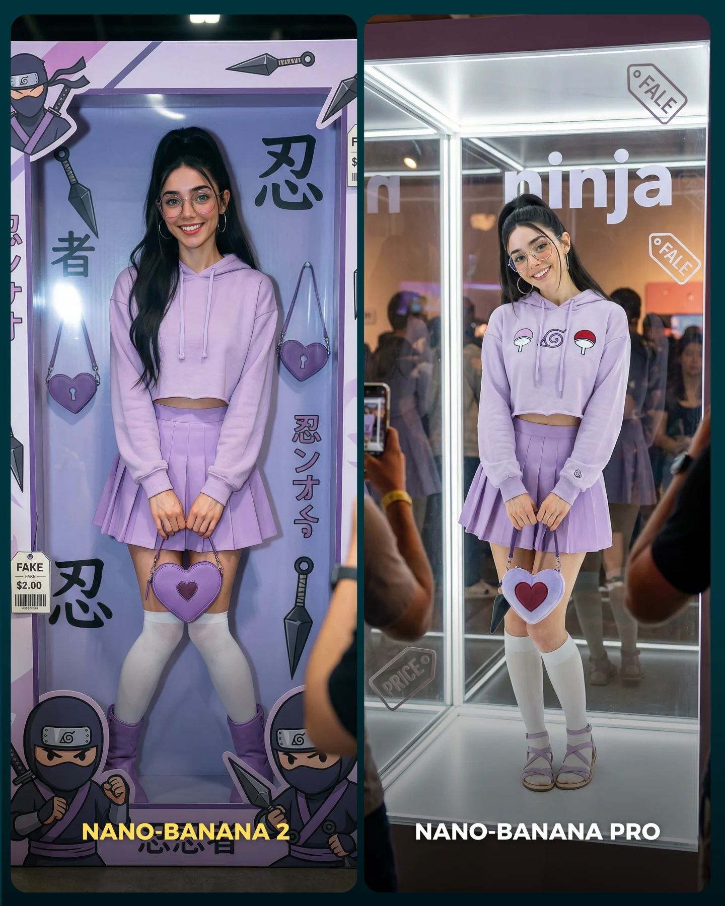
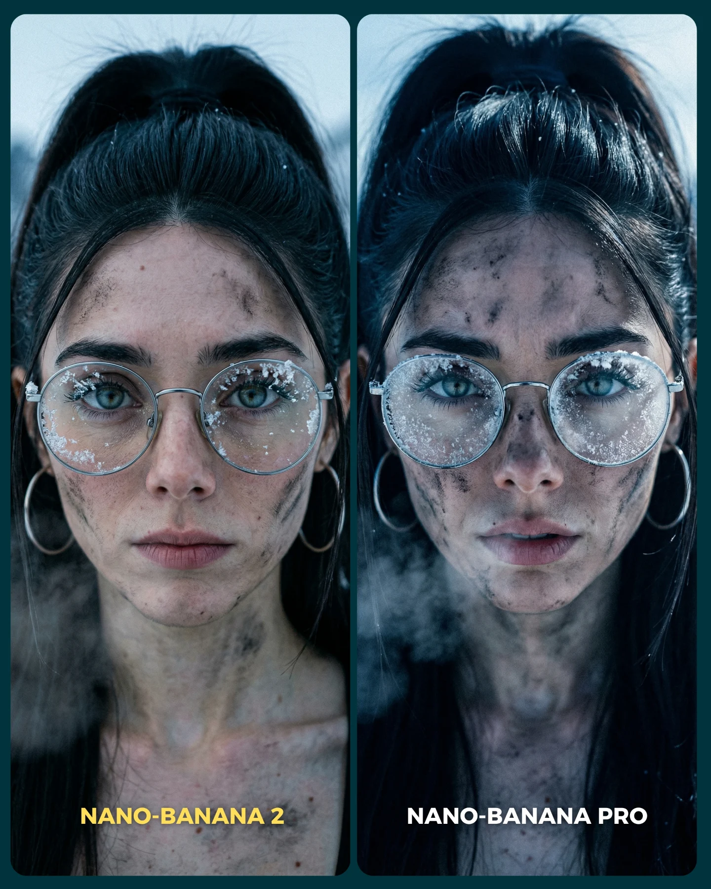
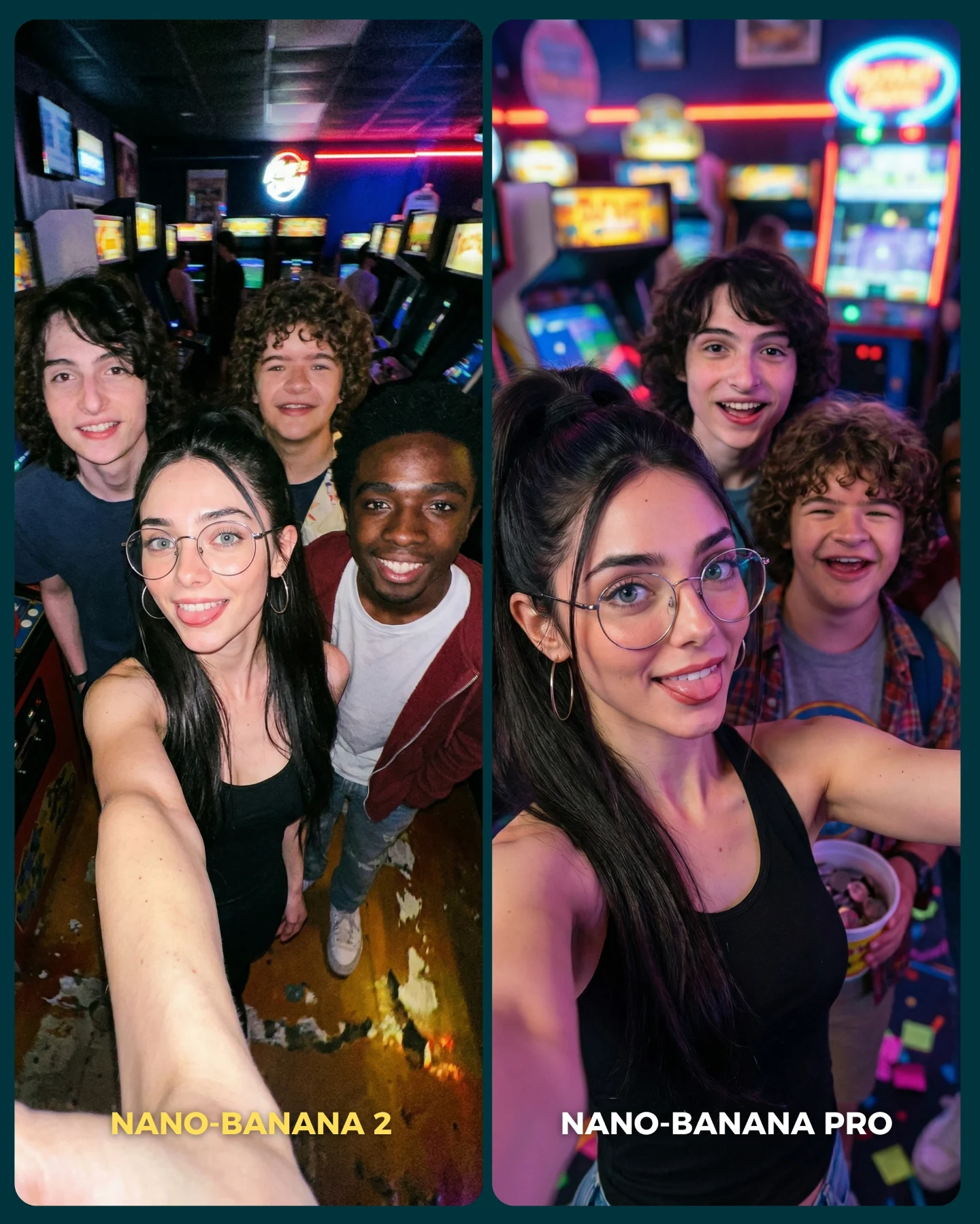
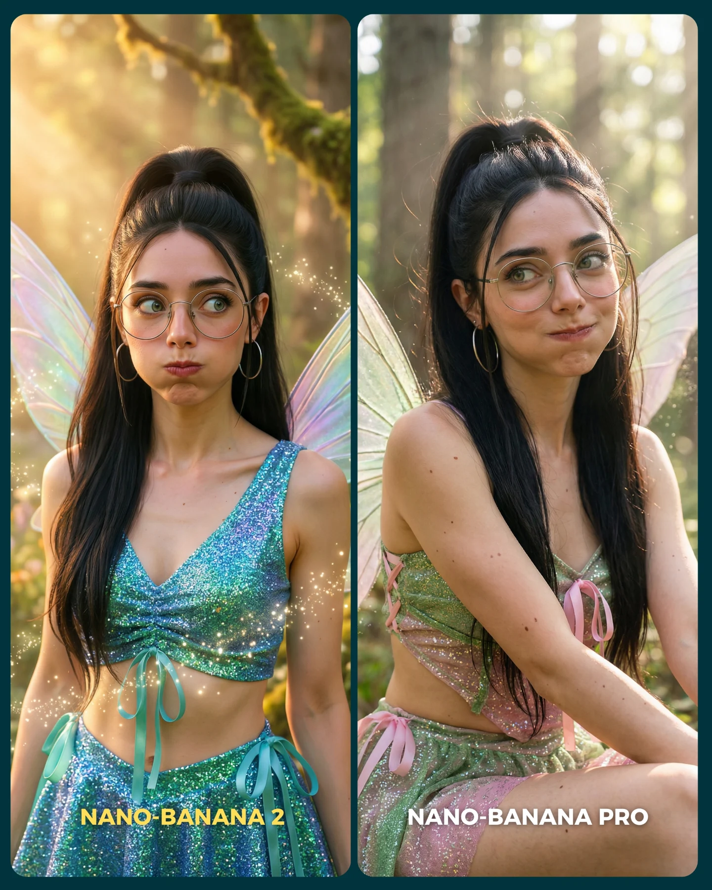
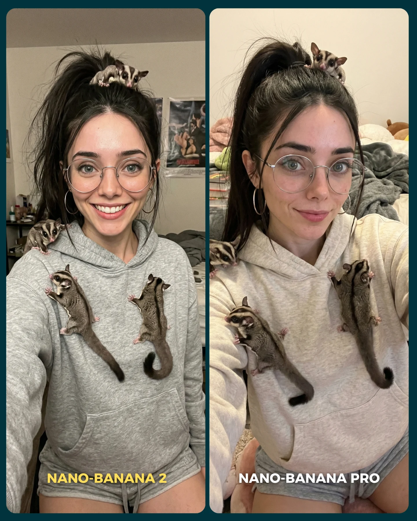
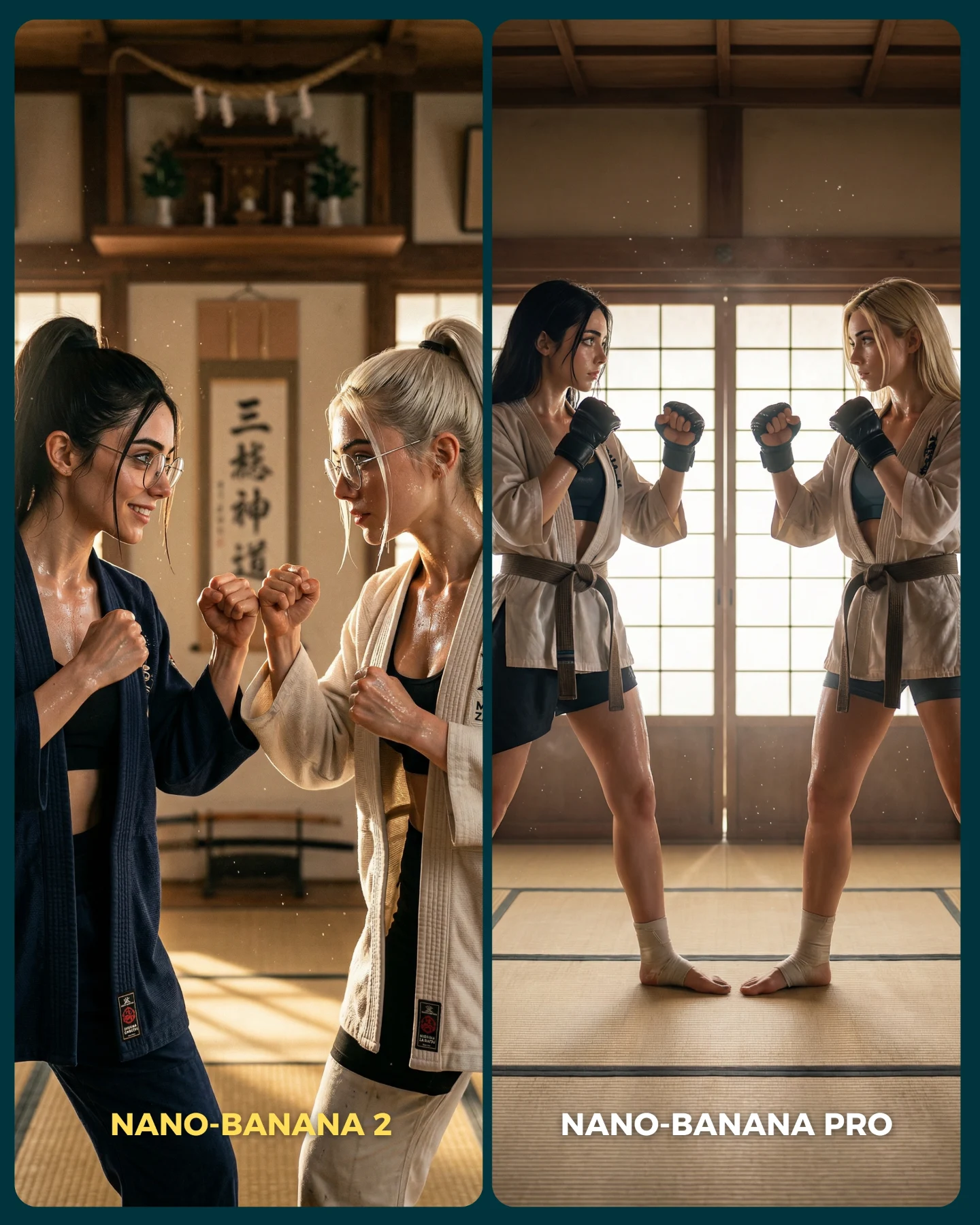
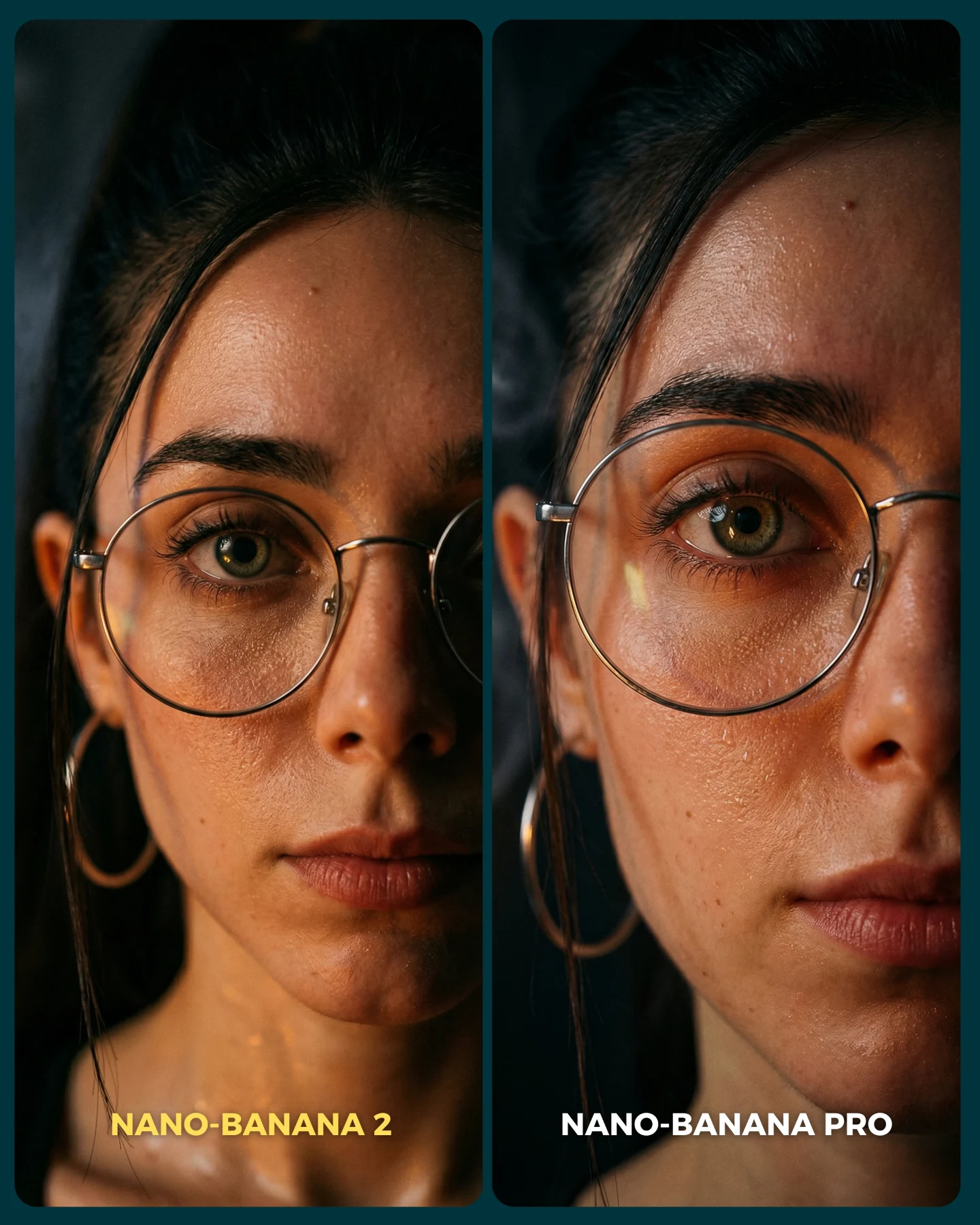
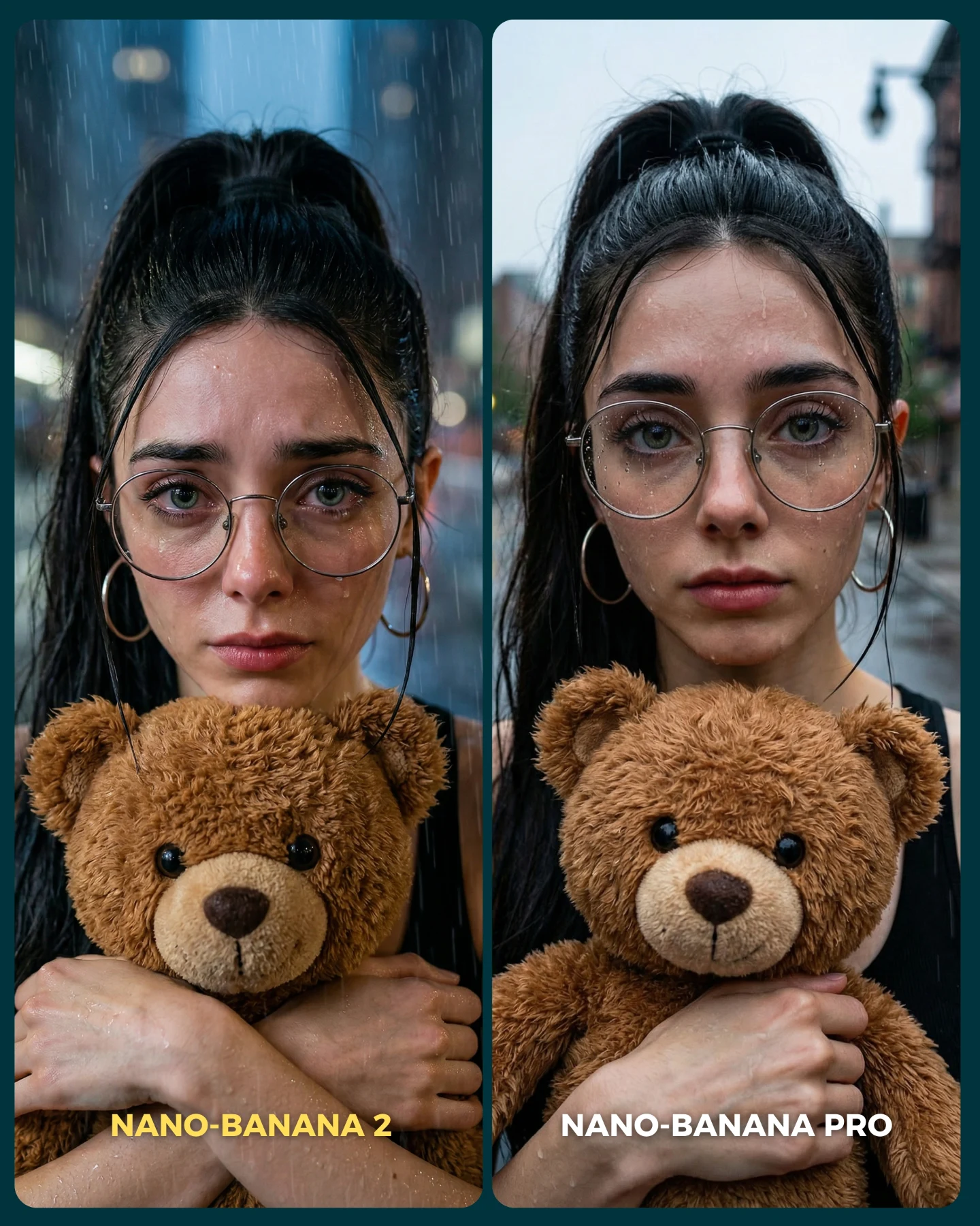
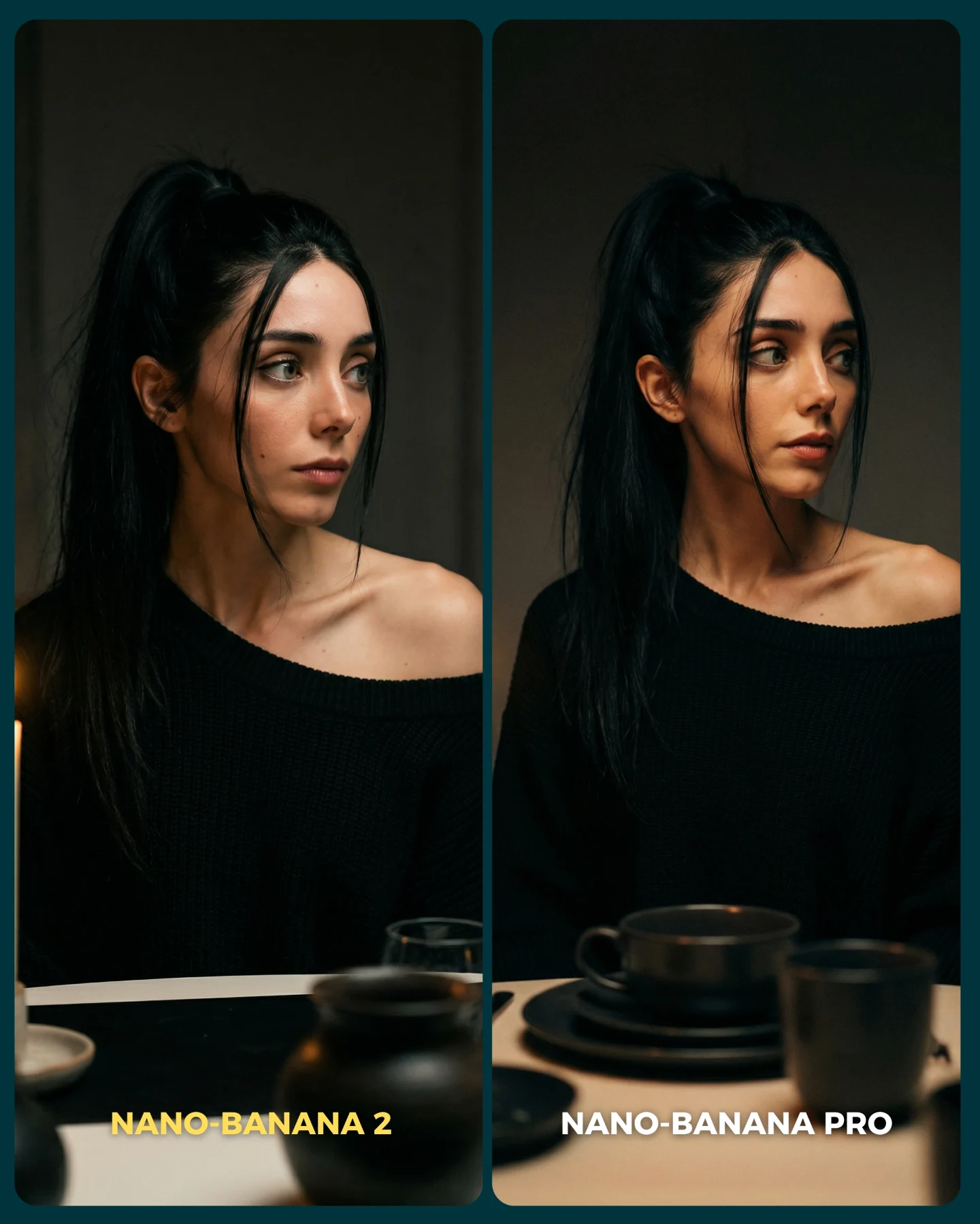
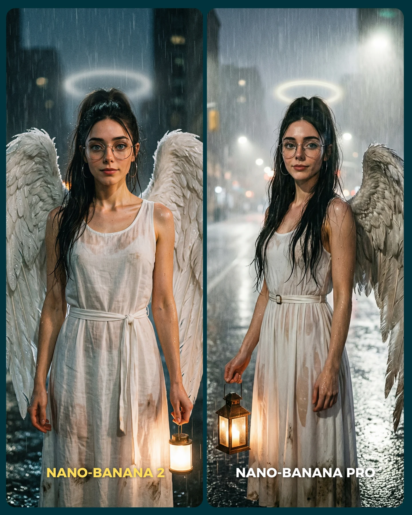
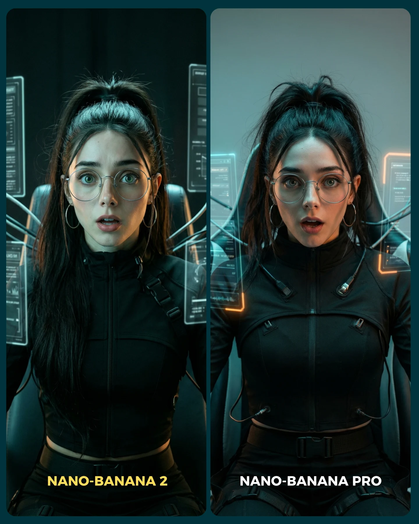
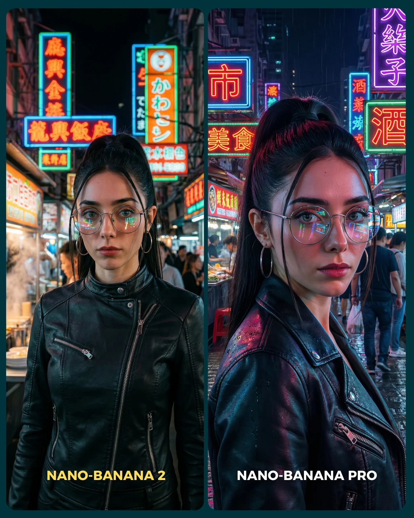
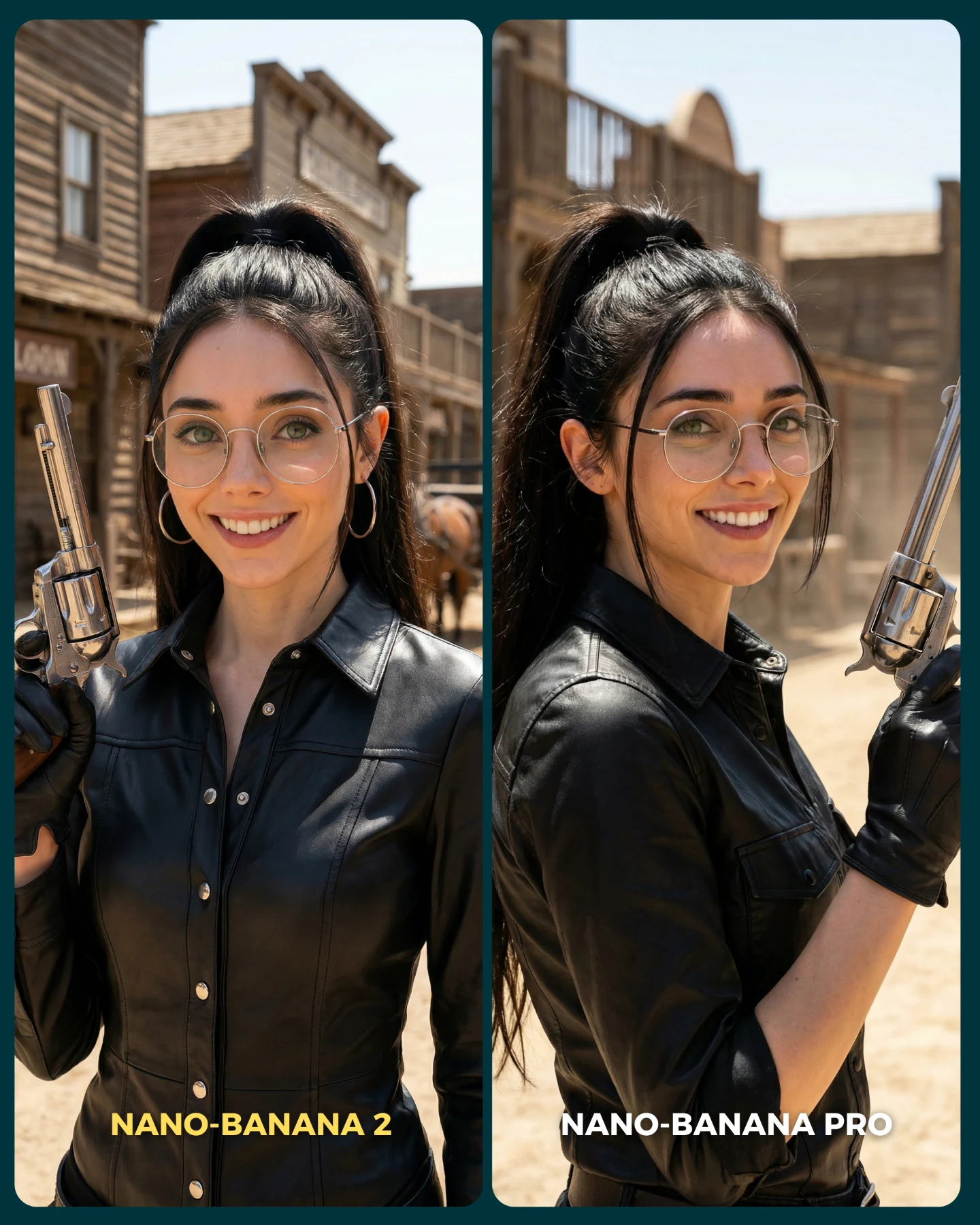
This post is not only about a pretty character render. It is built as an argument. By placing two almost-matching images side by side and labeling them clearly, the creator turns aesthetics into a judgment game. That instantly gives the audience a role: compare, choose, comment, disagree. For growth, that is much more valuable than posting a single image and hoping people leave generic praise.
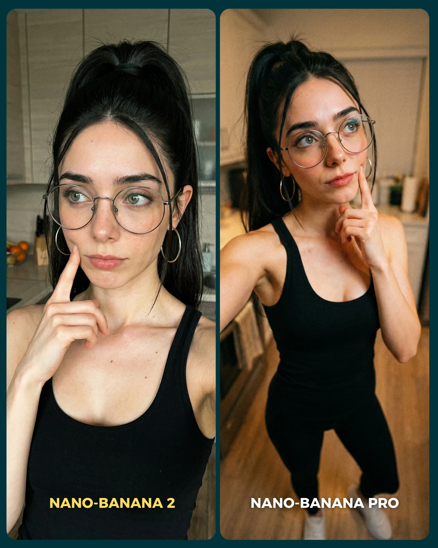
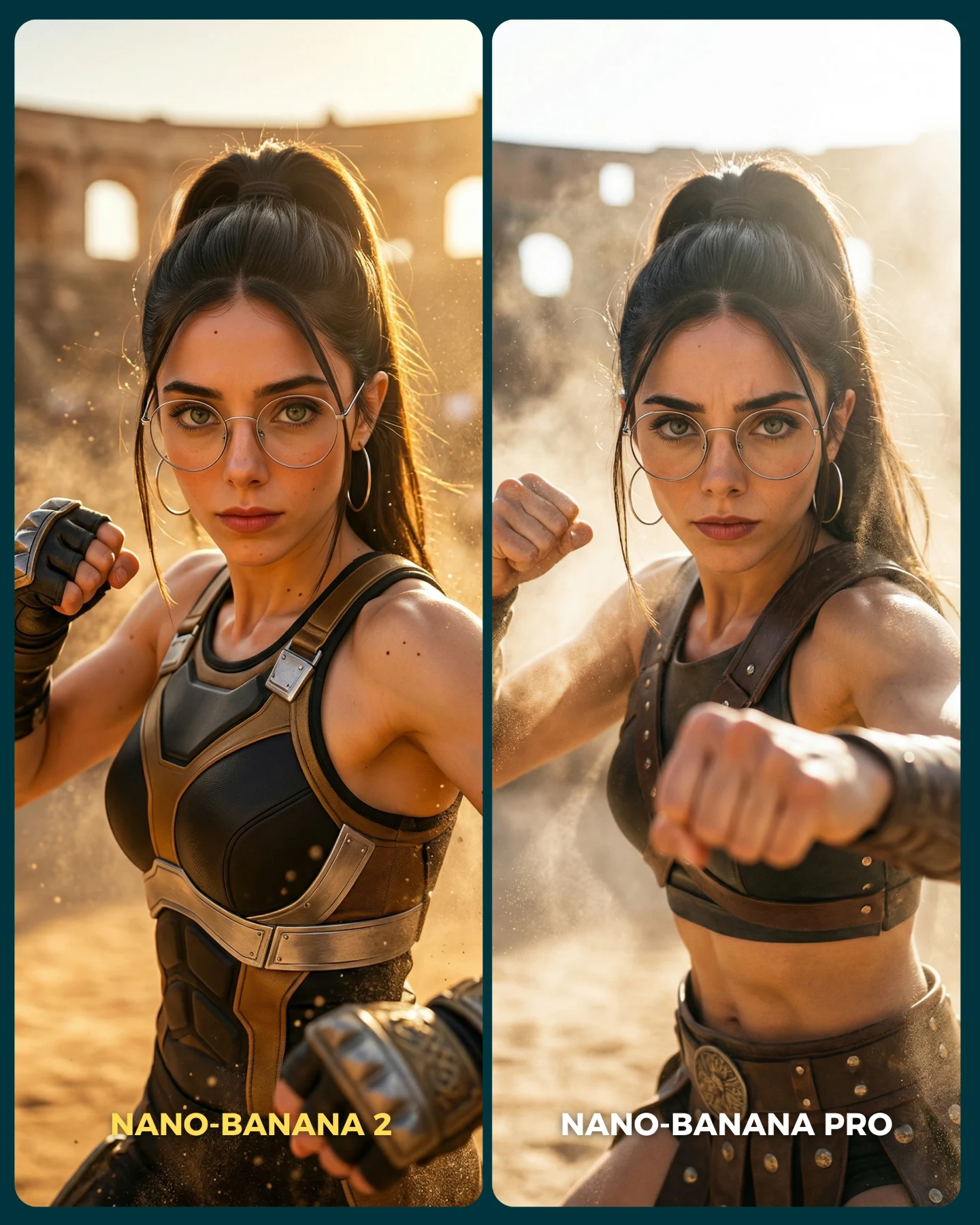
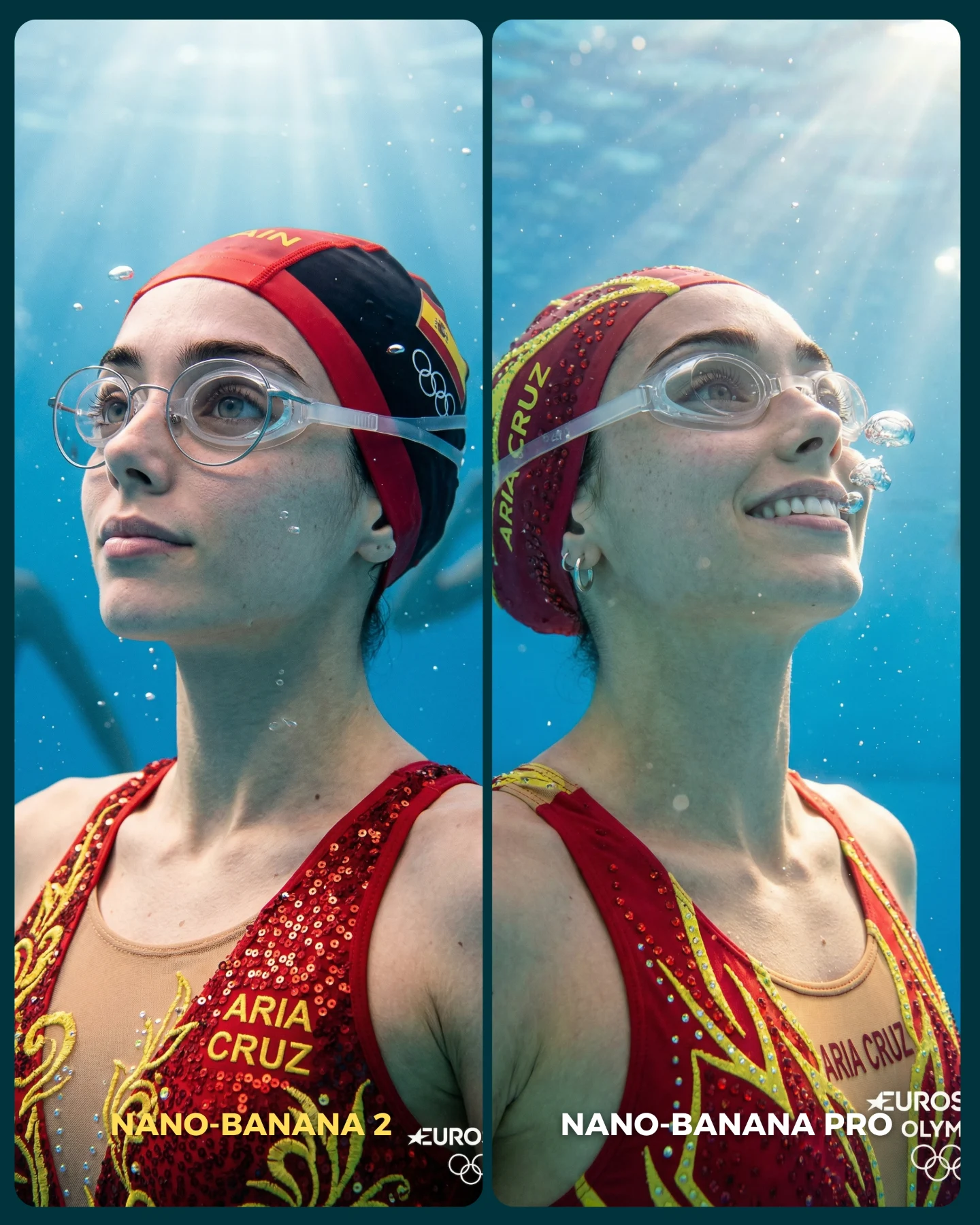
The clever part is that the scene itself is controlled tightly. Same persona, same pose family, same vanity setup, same costume language. That means any realism difference becomes easier to notice. When creators want to trigger debate, the key is not chaos. The key is alignment. The more variables you lock, the louder the one changed variable becomes.
Why it feels viral
Comparison posts travel because they compress opinion into a binary. Viewers do not need to invent a reaction from scratch. They only need to say which side looks better and why. Here, the left-versus-right structure does that work immediately. The Snow White inspired styling adds familiarity, while the warm vanity setting keeps the frame cute and accessible instead of overly technical.
The caption strengthens the mechanism by framing the post as a real benchmark: these are supposedly difficult cases for realism, not random sample outputs. That gives the audience a reason to inspect details more closely. Once people start zooming in on skin, fabric, hands, or animal props, they are far more likely to comment. In practice, the image is functioning like a conversation starter disguised as a beauty post.
| Signal | Evidence (from this image) | Mechanism | Replication Action |
|---|
| Binary decision hook | Two nearly matched panels with different model labels | The audience is invited to judge, not just admire | Lock the scene and change only one meaningful variable between versions |
| High familiarity | Princess-coded costume, vanity bulbs, ribbon, rabbits | Recognizable cues make the test visually sticky and easy to enter | Use one pop-culture or archetype cue without turning the image into parody |
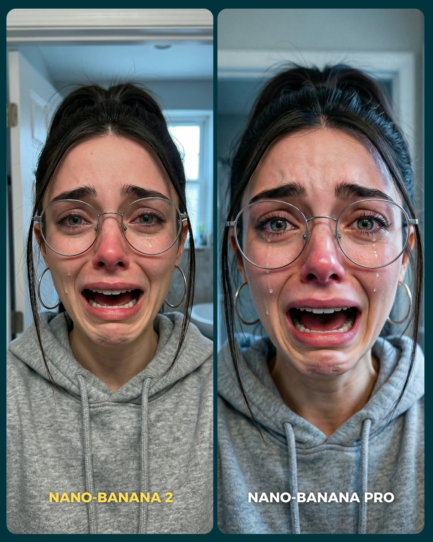
| Evidence-driven realism test | Hands, glasses, mirror, seams, and animal details are all visible | Viewers have concrete proof points for deciding which image wins | Choose scenes where realism can be judged through multiple small details |
Where this format works best
This is one of the best templates for creators who post model tests, prompt comparisons, workflow breakdowns, or product opinions. It is especially useful when you want engagement without writing a long caption, because the structure of the image already implies the question. It also works well for prompt sellers who want to prove they can maintain a stable character while changing the engine.
- Best fit: AI model comparisons with one locked persona.
- Best fit: Feature tests where realism, consistency, or text adherence is the claim.
- Best fit: Community-building posts that invite debate in comments.
- Not ideal: Luxury editorial posts where labels and split frames would cheapen the mood.
- Not ideal: Tutorial images that need a single clean hero frame for thumbnails.
Three transfer recipes
- Keep: side-by-side structure and one locked pose. Change: the model name and one rendering variable. Template: {model A} vs {model B} in the same {scene}
- Keep: familiar character styling and vanity setup. Change: realism challenge details like jewelry, hands, or props. Template: {character archetype} adjusting {signature detail} in {mirror scene}
- Keep: caption framed as a test. Change: the niche, such as fashion, interiors, or food. Template: {tool 1} vs {tool 2} on a scene that stresses {failure mode}
Aesthetic read
The visual success here comes from softness plus precision. The vanity bulbs create a flattering warm envelope, but the objects inside that envelope are chosen carefully: ribbon, glasses, fitted bodice seams, rabbits, and mirror specks. Those details give the audience something to inspect. Without them, the comparison would feel shallow.
The costume choice also matters. It is close enough to Snow White to feel familiar, but still reads as a social-media remix rather than a literal costume-party photo. That balance keeps the image fun without making it childish. For creators, this is a useful prompt lesson: reference the archetype, then modernize the finish.
| Observed | Recreate | Why it matters |
|---|
| Matched left-right pose | Use near-identical gesture and framing in both panels | It isolates the true comparison variable |
| Warm bulb-lit mirror scene | Use flattering vanity lighting instead of flat front light | Beauty details become more readable and inviting |
| Cute but judgeable props | Add one or two small realism stress-tests such as animals or reflective surfaces | They give the audience concrete proof points |
| Readable on-image labels | Place model names directly in the graphic | The comparison works even without reading the caption |
Prompt technique breakdown
Think of this image as a benchmark layout, not a normal portrait prompt. You need to control the structure first, then the character, then the realism probes. If the order is reversed, the result tends to collapse into two unrelated beauty shots.
| Prompt chunk | What it controls | Swap ideas (EN, 2-3 options) |
|---|
| two side-by-side comparison panels | The judgment format and shareable layout | split-screen benchmark; before-vs-after layout; model showdown graphic |
| same woman in both panels adjusting a red ribbon | Character consistency and controlled pose | same woman applying lipstick; same woman fixing glasses; same woman pinning hair |
| warm vanity mirror with round bulbs | Mood and realism stress-test environment | dressing room mirror; backstage makeup station; classic vanity table |
| princess-inspired blue and yellow outfit | Familiarity and visual charm | fairy-tale maid dress; modern princess remix; storybook-inspired costume |
| labels for model names at the bottom | Immediate communication of the comparison claim | Tool A vs Tool B; Old model vs New model; Standard vs Pro |
Iteration playbook
Baseline lock first: keep the split layout, one shared character, and one vanity environment. Then change only one test variable at a time.
- Run 1: solve the left-right pose match before worrying about texture quality.
- Run 2: refine realism probes such as hands, glasses, and costume seams.
- Run 3: add one small prop challenge like an animal or reflective mirror dust.
- Run 4: adjust labels and contrast so the image still reads as a comparison at thumbnail size.
If you change too many things across the two panels, the audience cannot tell what is being judged. The whole power of this format comes from controlled sameness. That is what turns a cute image into a discussion engine.