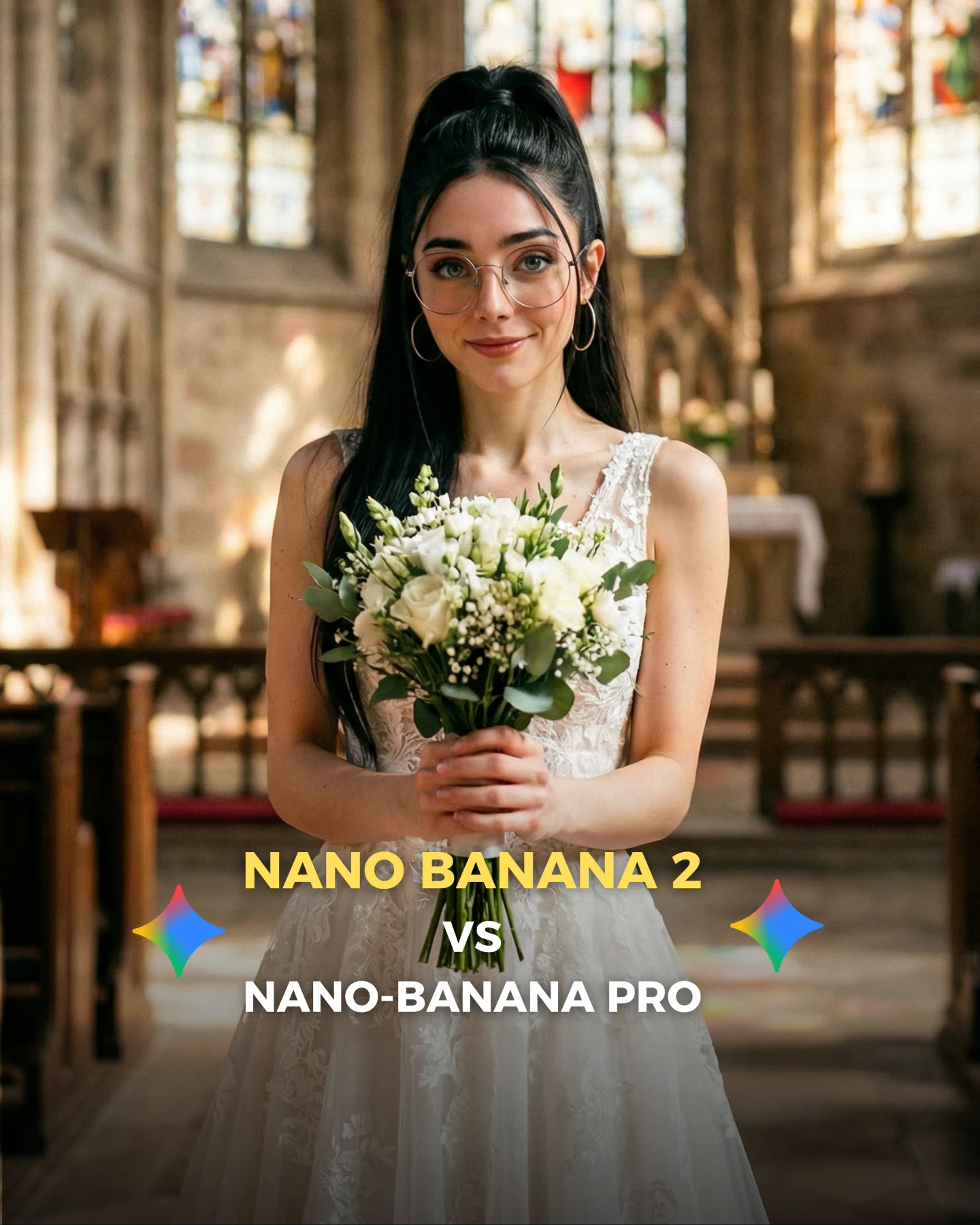
How soy_aria_cruz Compared Nano Banana 2 vs Pro Arcade Selfie AI
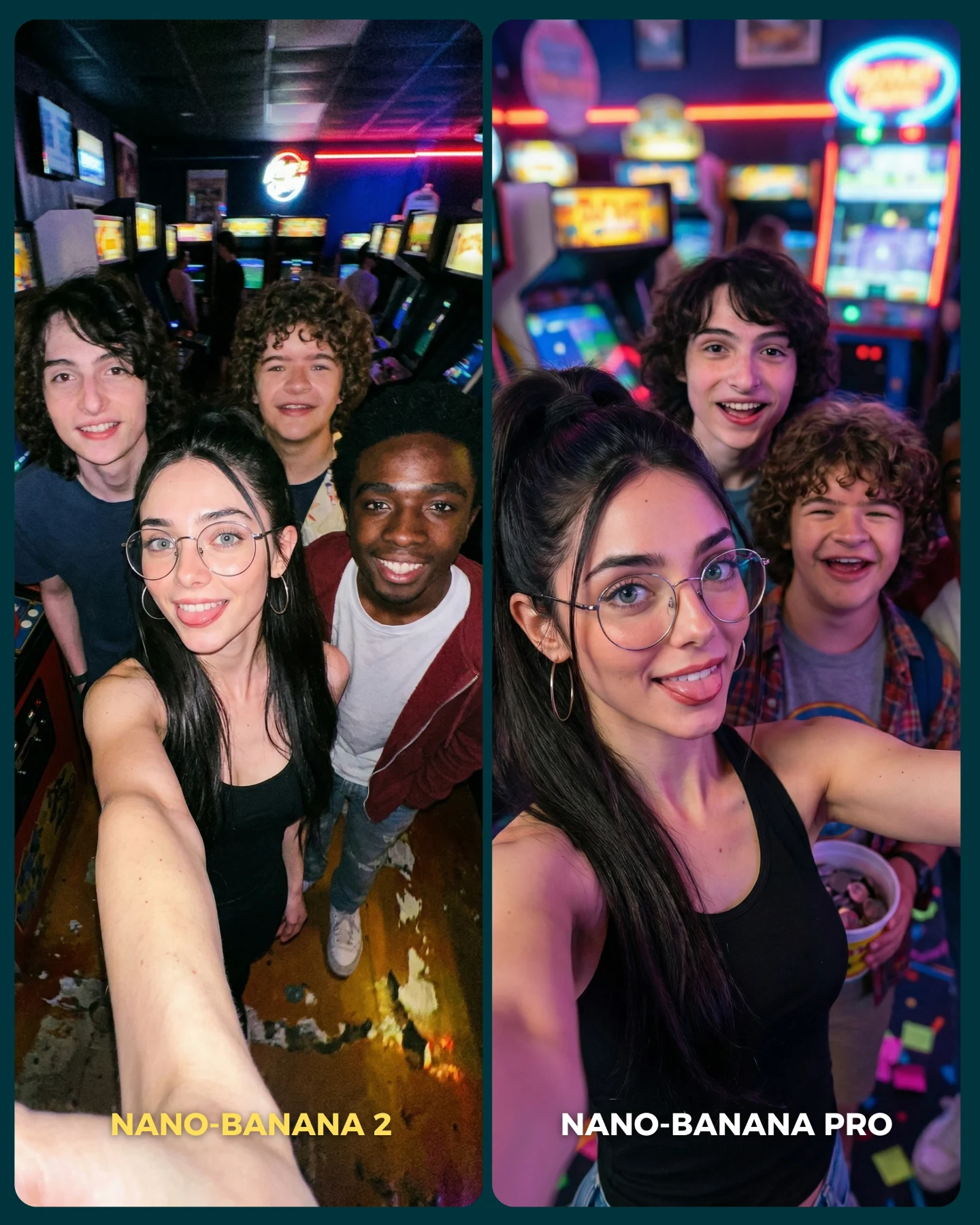
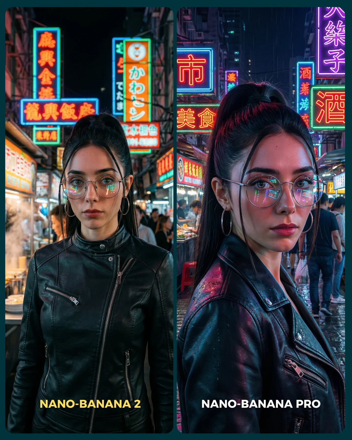
The smartest thing about this image is that it does not argue with technical language first. It argues visually. The creator takes one emotionally readable setup, a neon arcade selfie with a crowded friend group, and lets the viewer feel the difference immediately. That matters because most people do not compare image models by inspecting parameters. They compare by asking one fast question: which one would I actually post?
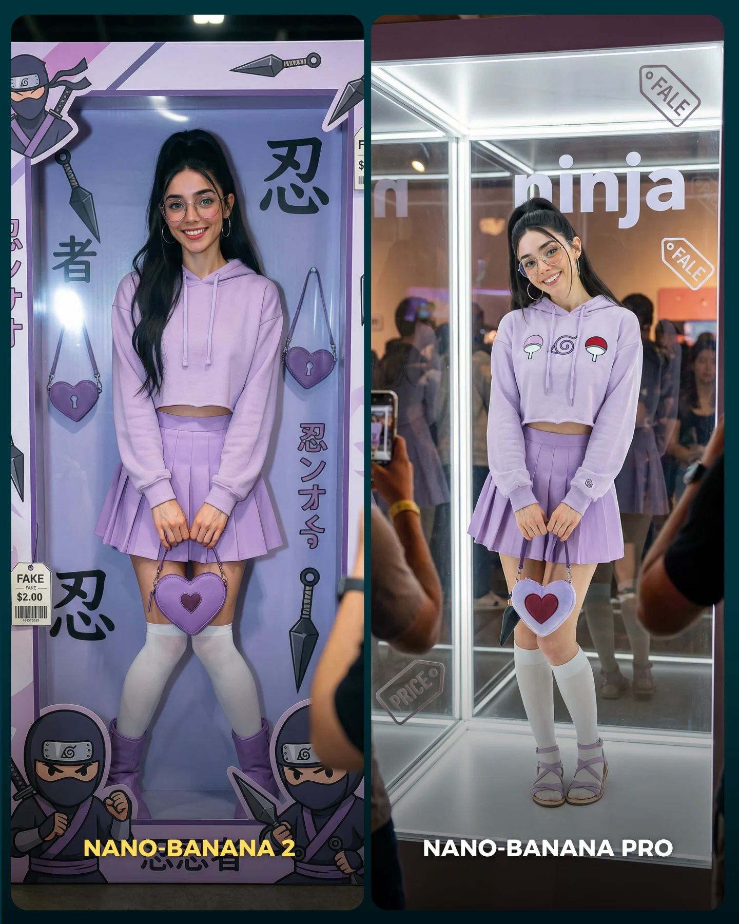
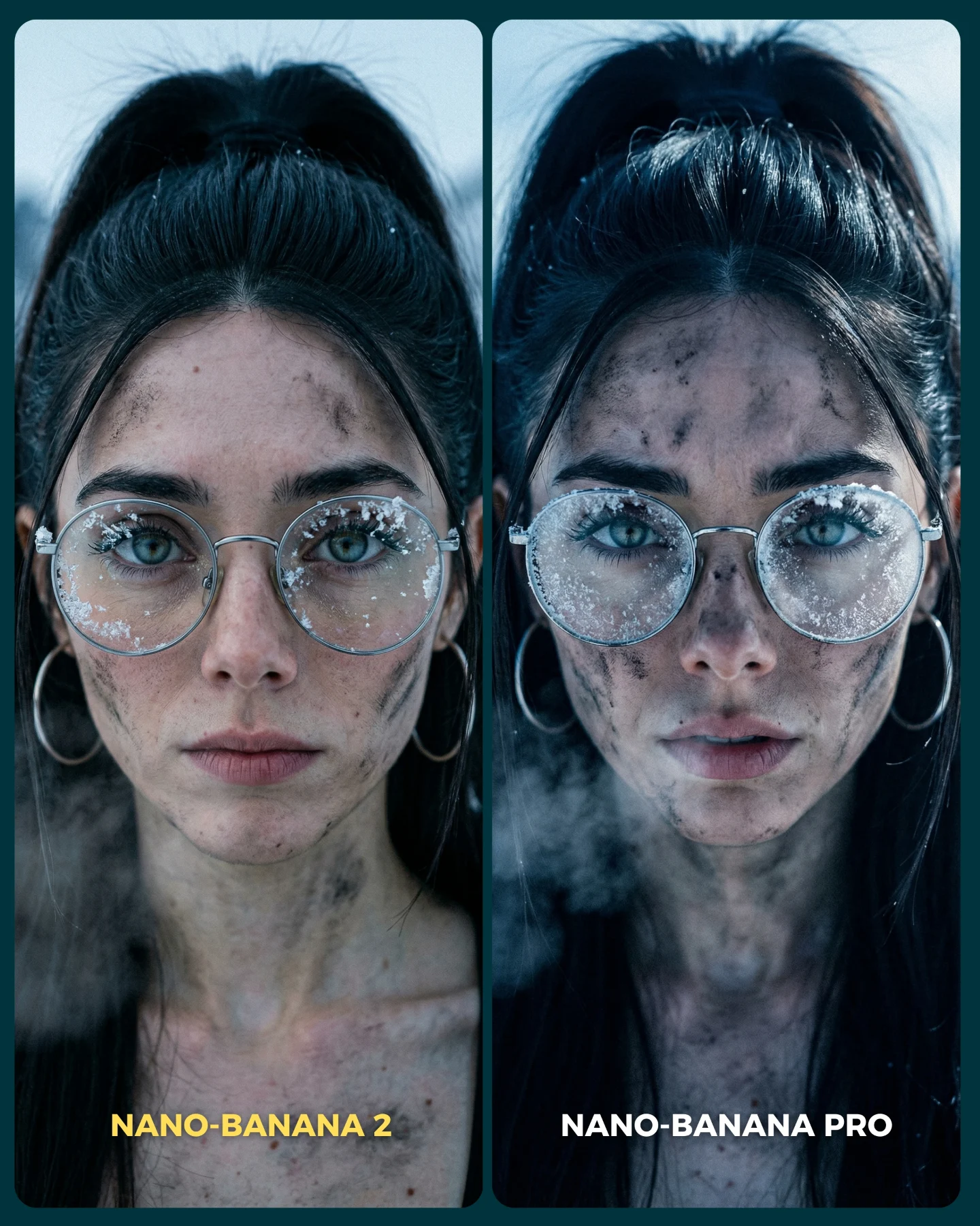
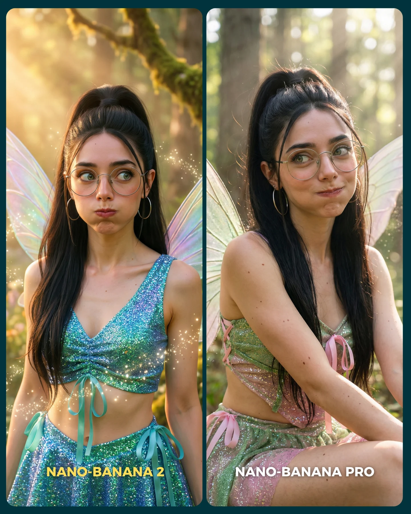
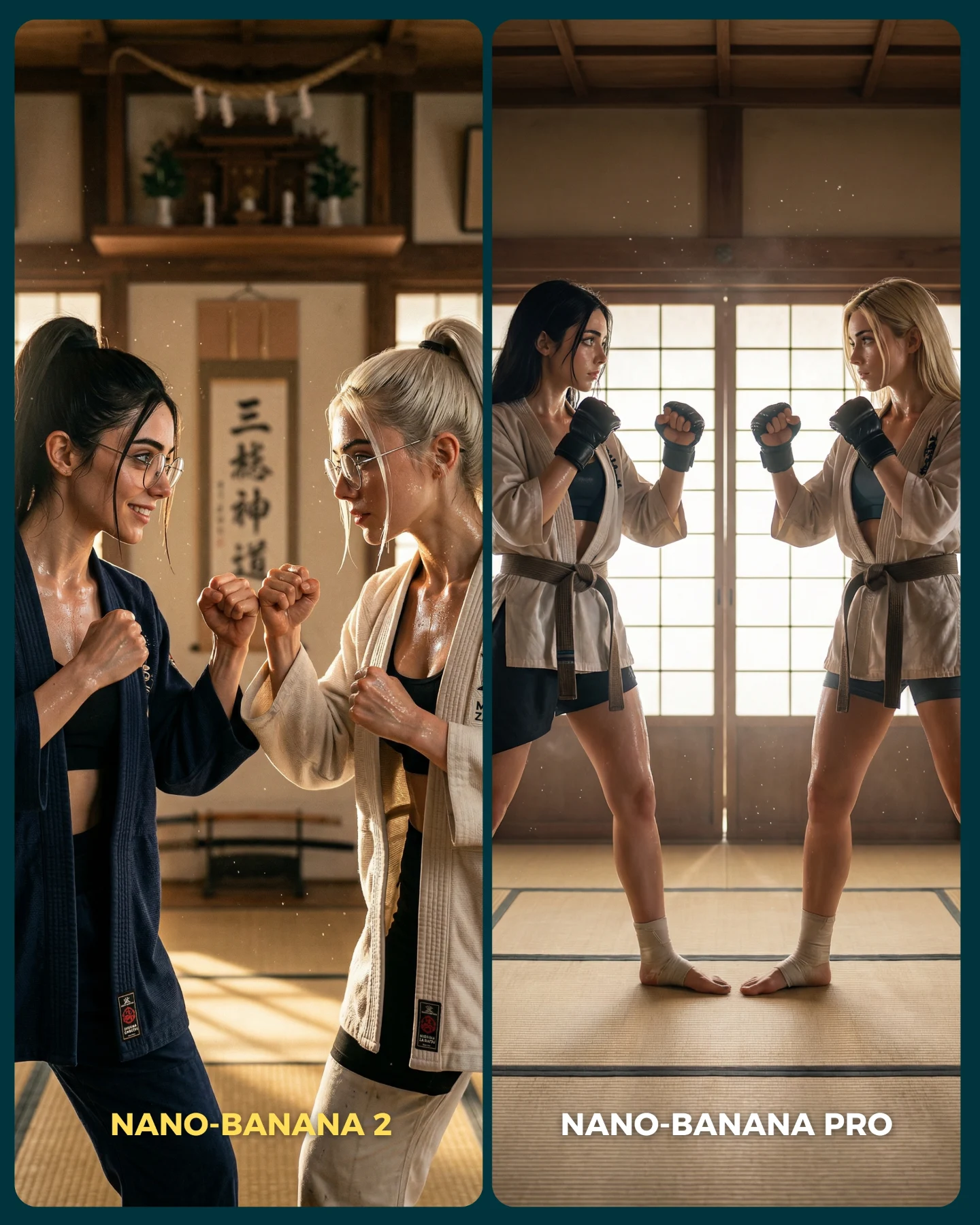
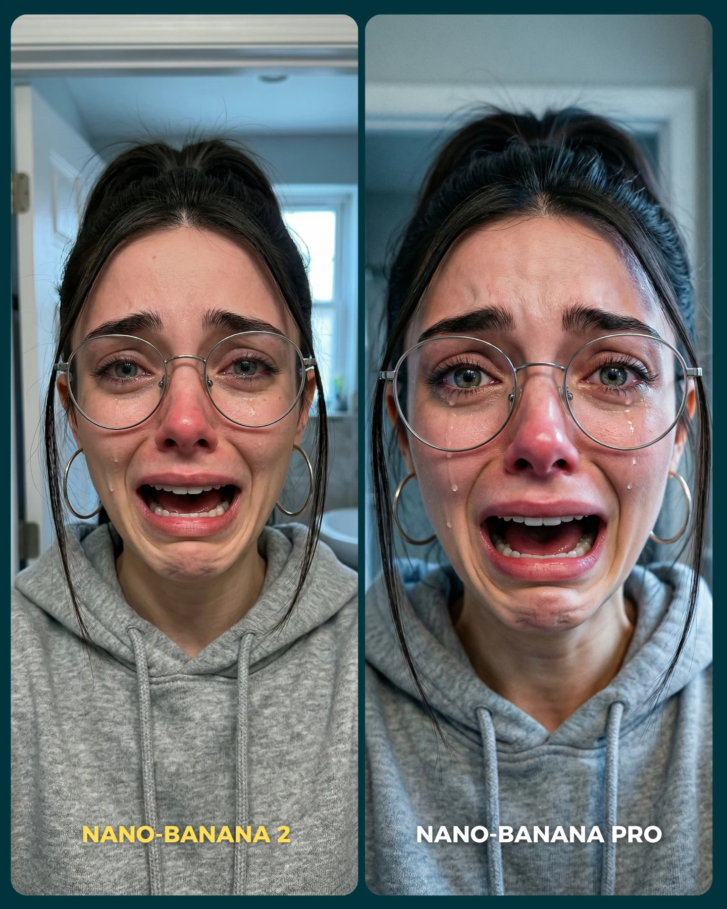
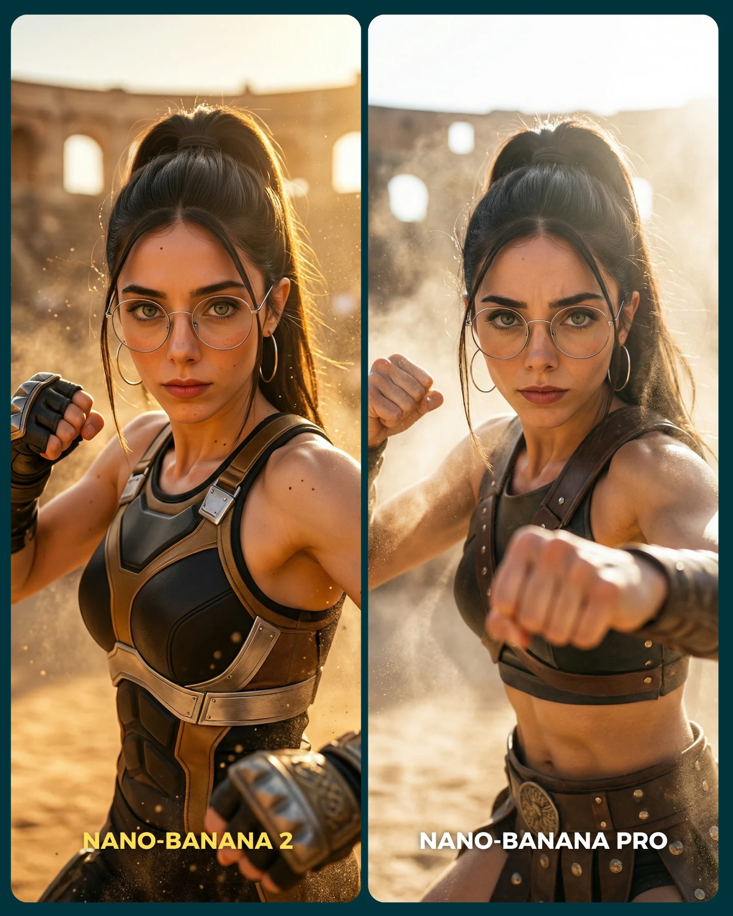
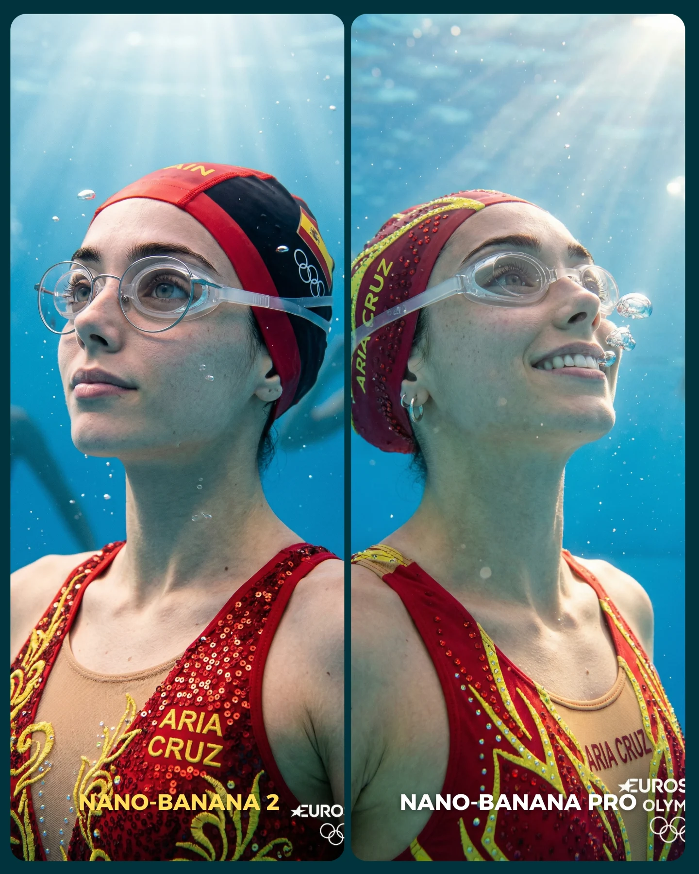
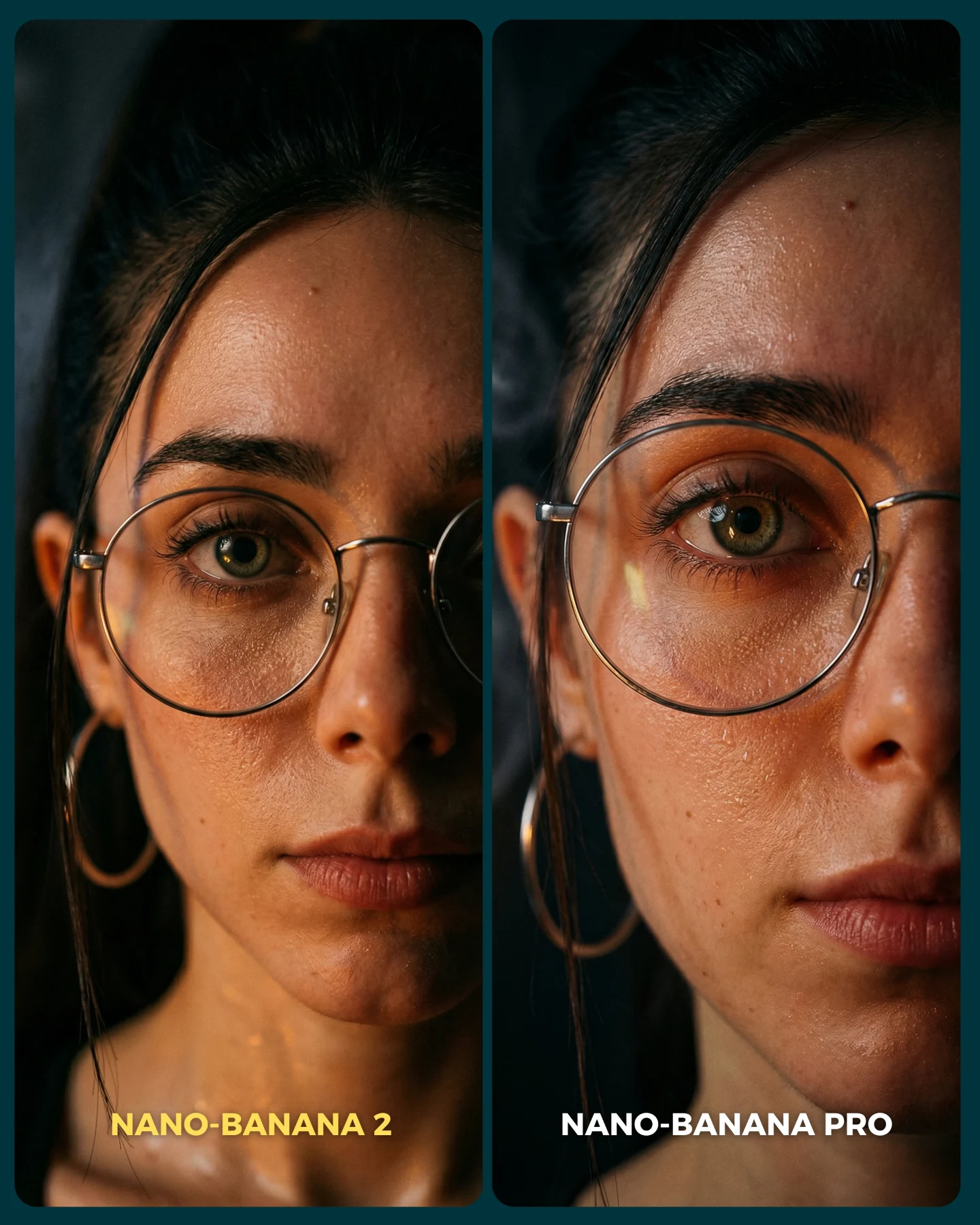
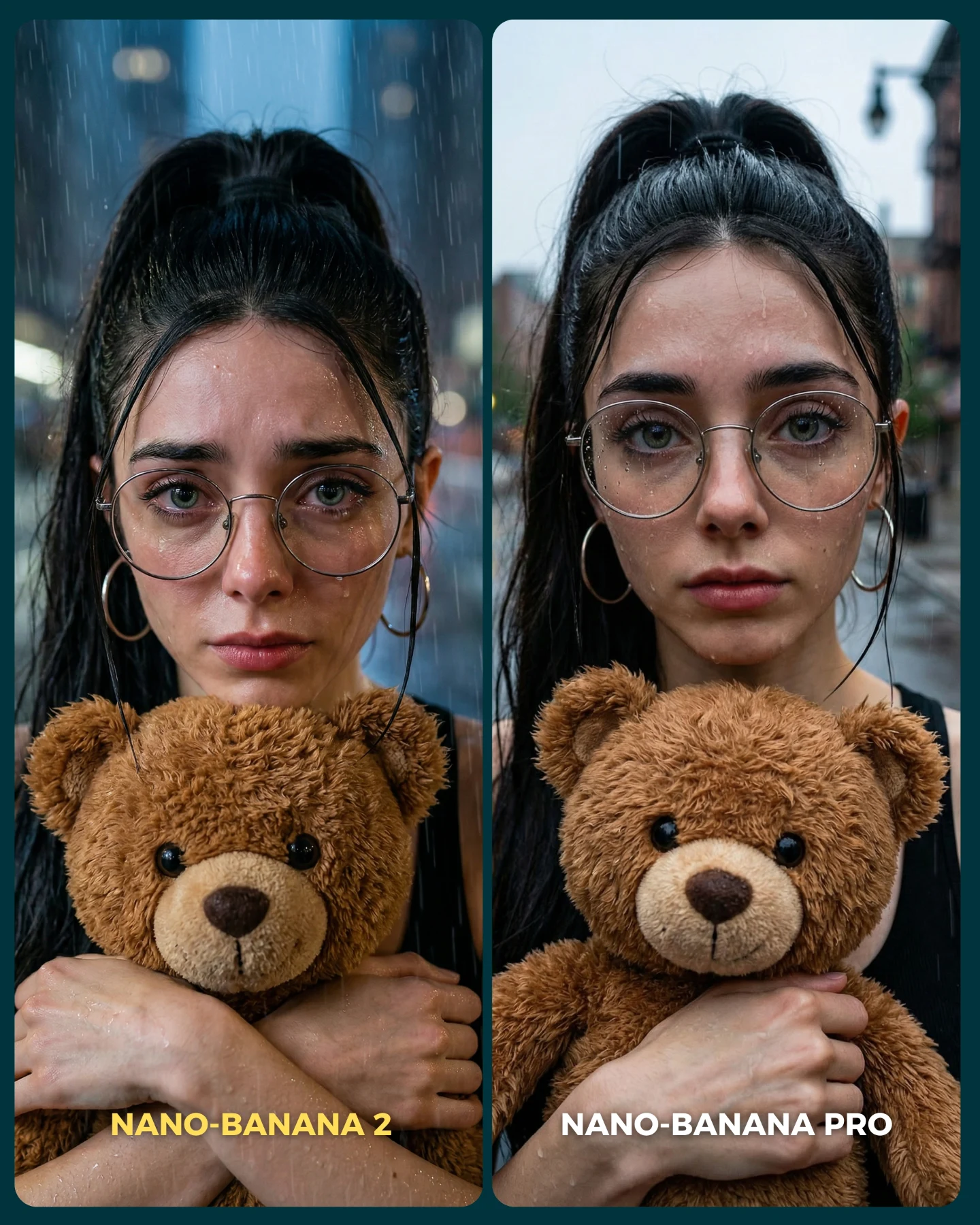
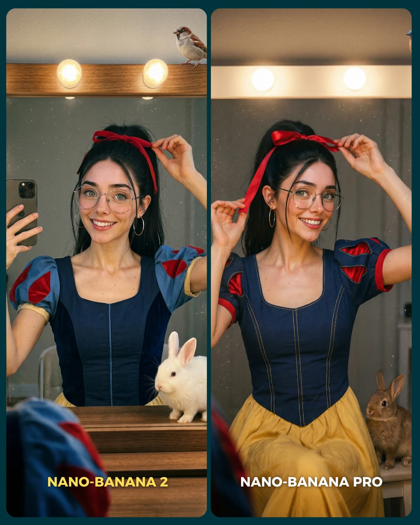
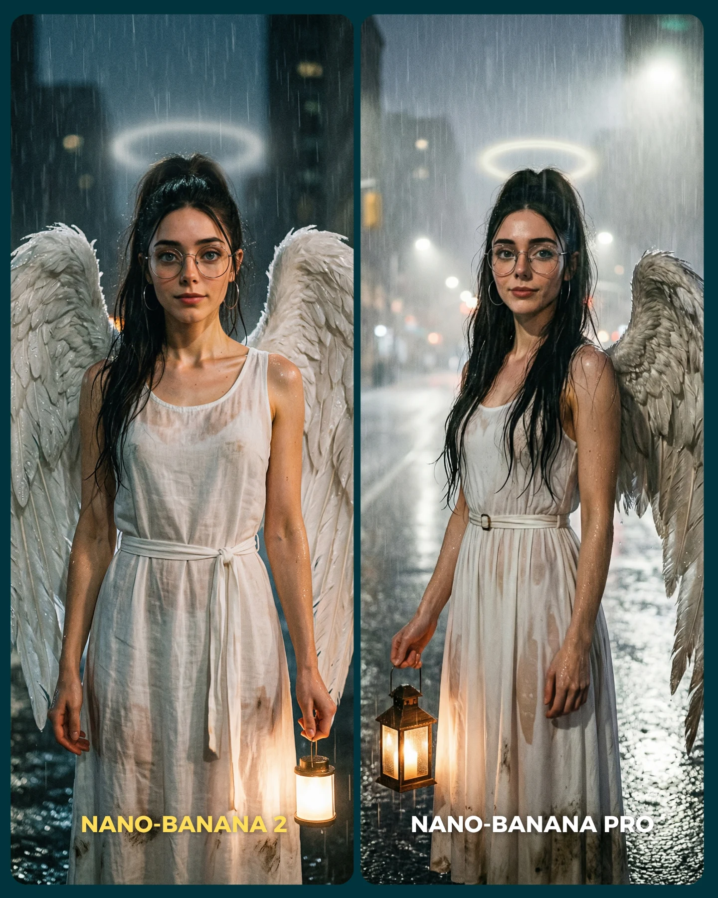
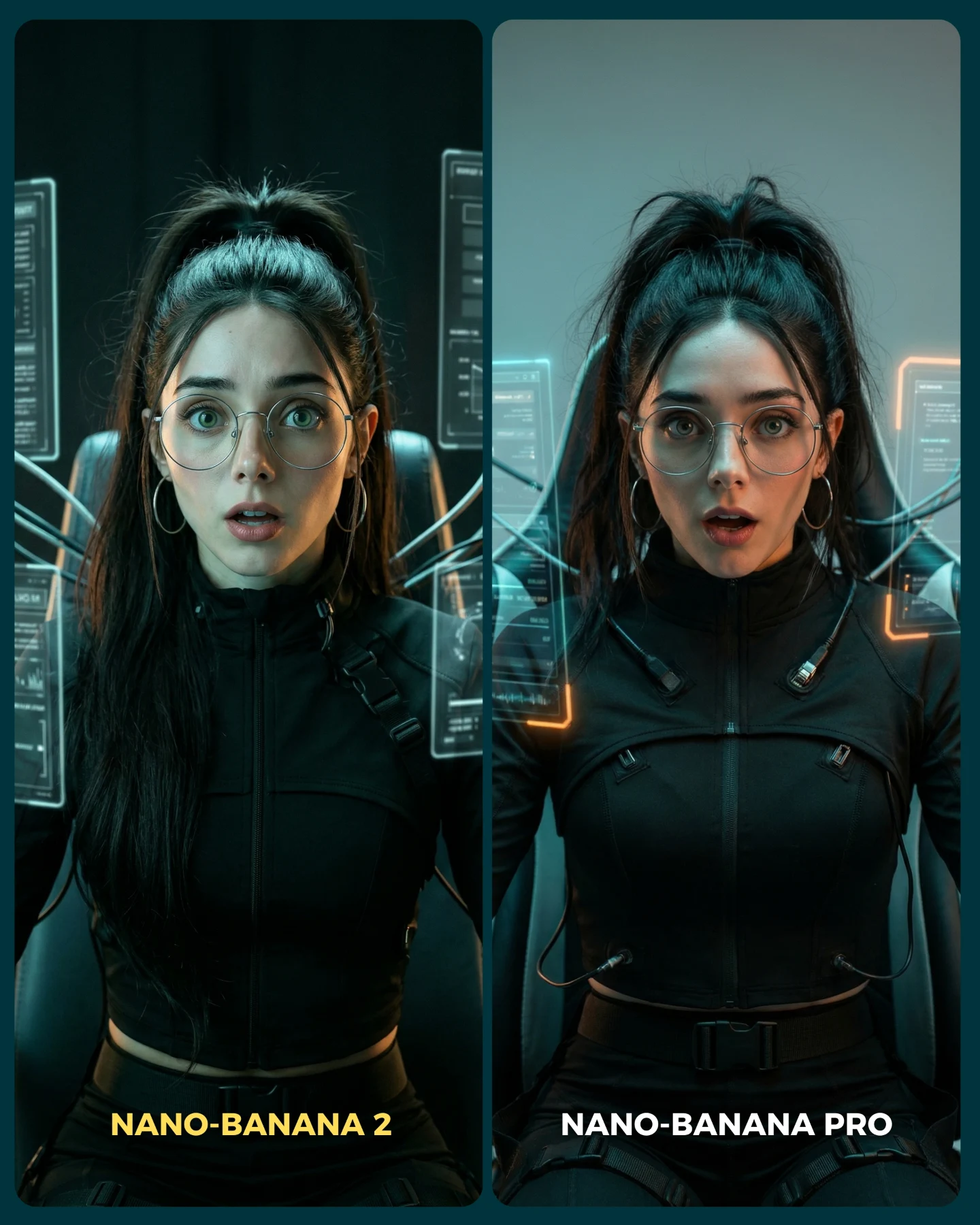
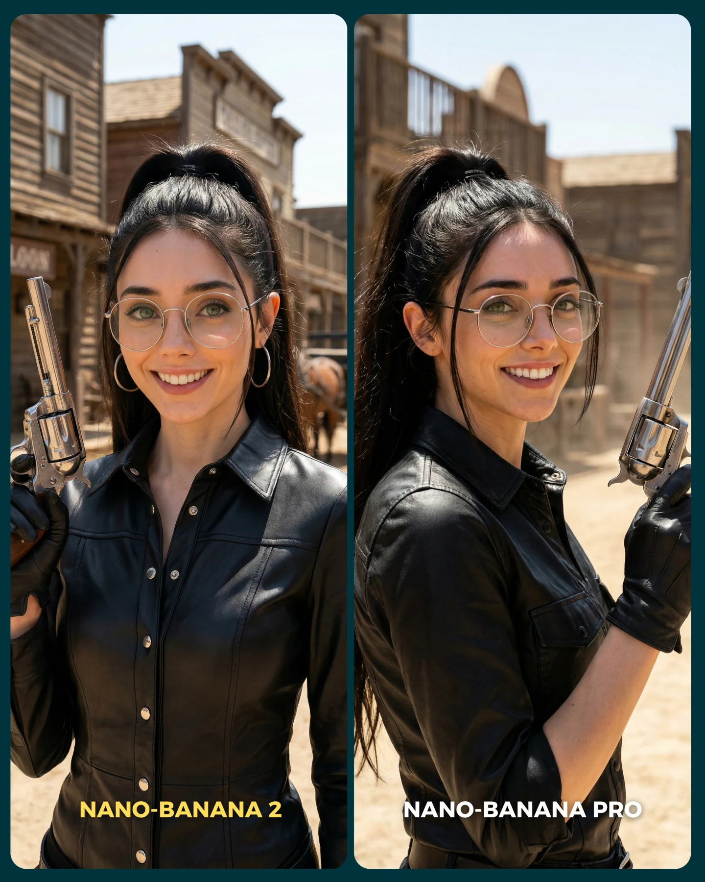
This is why the arcade setting is such a strong test case. It forces the model to solve several difficult things at once: low light, mixed neon color, multiple faces, selfie perspective, glasses, background clutter, and a recognizable main character. A comparison becomes compelling when the prompt stresses the system in visible ways. This one does. The right panel wins because the scene feels more coherent, not because the caption tells us it should.
For creators, that is the real lesson. If you want your benchmark content to spread, do not compare on sterile studio portraits. Compare on scenarios that reveal weaknesses fast. Crowded nightlife, reflective surfaces, hard color shifts, and group composition all create pressure. When one model handles that pressure better, the audience can see the result in seconds.
Why The Post Works So Well
| Signal | Evidence (from this image) | Mechanism | Replication Action |
|---|
| Same concept, visible gap | Both panels show the same arcade selfie idea, but the right side looks cleaner and more believable | The audience can compare quality without being distracted by different compositions | Hold the scene constant and vary only the model output or rendering quality |
| Stress-test scenario | Neon lighting, group selfie, glasses, dark interior, many screens and machines | Difficult conditions expose model weaknesses quickly and make the test feel meaningful | Use prompts with mixed light, multiple faces, and reflective environments |
| Readable winner | The right panel has stronger facial coherence and more attractive color handling | Viewers decide faster when the better image is obvious at a glance | Pick comparison pairs where the upgrade is visible in under two seconds |
| Social-native framing | Selfie pose, friend group energy, bold bottom labels | The benchmark looks like content, not lab work, so it travels better on feeds | Design the test graphic as a native post, not a clinical side-by-side chart |
The post also benefits from emotional familiarity. A lot of benchmark content feels dry because the audience does not care about the scene itself. Here, the scene is already enjoyable: it is youthful, colorful, social, and immediately legible. That means even viewers who do not care about model comparisons can still engage with the image. Then the comparison layer gives them a reason to comment, debate, and choose a side.
Where This Comparison Format Transfers Best
This layout is ideal for creators testing image models, prompt variations, style-transfer systems, or realism upgrades. It also works especially well when your audience likes participating in the judgment. People enjoy choosing winners when the setup is fun and the distinction is concrete.
- Model benchmark posts: perfect for showing why one generator handles realism or identity consistency better than another.
- Prompt A/B testing: useful when you want to show what changes after adjusting lighting, lens feel, or detail constraints.
- Creator education content: strong for teaching followers how to evaluate outputs beyond surface prettiness.
- Launch or feature commentary: works well when a new image model is released and you need one compelling visual proof point.
It is less ideal for luxury editorial presentation, pure portfolio pieces, or image sets where both versions are meant to feel equally good. This format needs contrast. Without a visible winner or at least a visible tradeoff, the post loses its conversation hook.
- Transfer recipe 1 Keep: same subject identity, same setting, same framing. Change: only the model or sampler. Slot template (EN):
{same scene} comparison, left output from {model A}, right output from {model B}, clear labels, social-media A/B graphic - Transfer recipe 2 Keep: hard scenario like nightlife, crowd, or reflections. Change: the prompt strategy, for example loose prompt versus constrained prompt. Slot template (EN):
{difficult environment} selfie comparison, left unconstrained prompt, right controlled prompt, same identity and scene - Transfer recipe 3 Keep: side-by-side format and one fun lifestyle setup. Change: the benchmark domain, such as fashion store, subway, concert, or diner booth. Slot template (EN):
{setting} split-screen comparison with the same influencer and friends, visual quality test, bold bottom labels
The Aesthetic Read
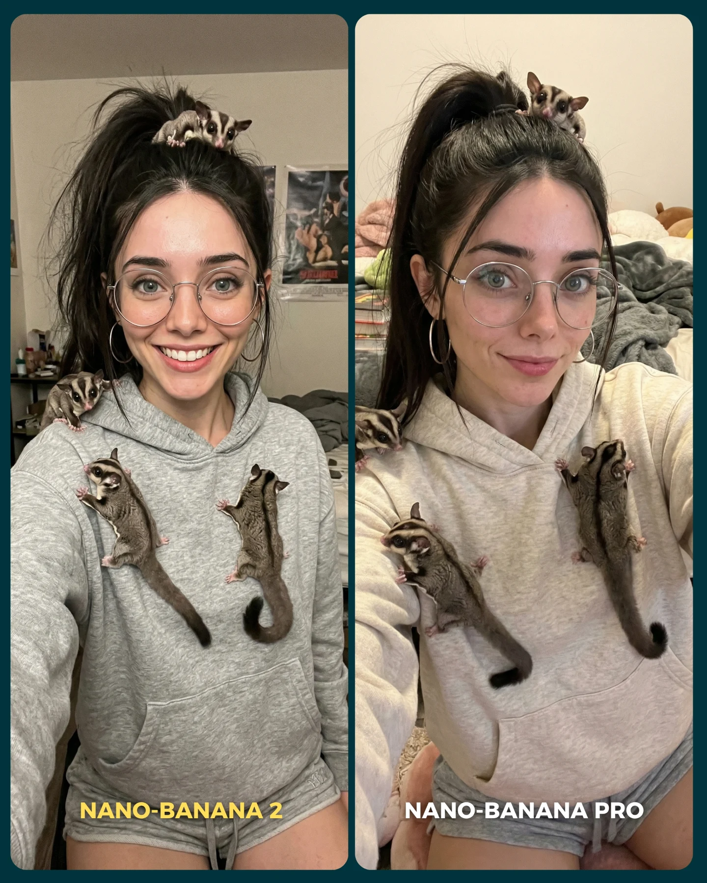
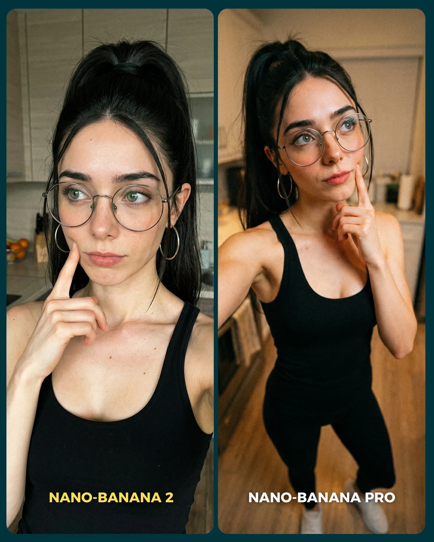
The image succeeds because the scene is loud, but the read is simple. The main subject is always in the front, always closest to the lens, and always easy to identify because of the glasses and dark tank top. That anchor keeps the comparison stable. Without a stable identity marker, the audience would spend too much time checking whether the scene is even comparable.
The second strength is color. Arcade environments are useful because they mix warm machine glow with cool neon edges, and that gives you an immediate realism test. Poor outputs often muddy skin tones or flatten the light into generic pink-and-blue haze. Better outputs preserve facial clarity while still letting the background feel electric. The right panel does that more successfully, which is why it feels more post-ready.
There is also a subtle compositional advantage in the selfie arm. The extended arm is awkward on purpose. It creates a classic smartphone perspective that many models still mishandle. When the anatomy, depth, and group spacing survive that angle, viewers perceive the image as more believable. So even though the scene feels casual, it is actually a very efficient technical benchmark.
| Observed | Why it matters | How to recreate |
|---|
| Side-by-side split layout | Lets viewers compare quickly without needing explanation | Use two matched panels with only a narrow divider |
| Glasses and black tank top as identity anchors | Keeps the subject recognizable across versions | Repeat one accessory and one wardrobe cue in both outputs |
| Neon arcade clutter | Creates a high-pressure realism test | Include cabinets, signage, strip lights, and crowding behind the subject |
| Foreground selfie arm | Adds natural smartphone perspective and anatomical difficulty | Keep the extended arm visible in the lower frame |
| Bottom labels inside the image | Makes the benchmark shareable as native feed content | Add bold readable labels directly into each panel |
Prompt Blocks That Matter Most
| Prompt chunk | What it controls | Swap ideas (EN, 2-3 options) |
|---|
| same influencer taking a group selfie in a neon arcade | Locks the benchmark concept and social-native feeling | same influencer in a diner booth; same influencer in a subway car; same influencer at a concert lobby |
| two comparison panels side by side | Creates the A/B test layout | before/after split; model A vs model B; standard vs pro side-by-side |
| glasses, black tank top, half-up ponytail | Preserves identity continuity | silver necklace and blazer; white headphones and hoodie; red lipstick and denim jacket |
| friends grouped behind her in low light | Introduces facial-coherence pressure | family members; coworkers; concert crowd close-up |
| left muddier, right cleaner and more realistic | Builds a visible conclusion directly into the graphic | left softer right sharper; left flatter right richer; left noisier right more coherent |
| bold bottom labels inside each panel | Makes the image legible in the feed without extra explanation | Model A / Model B; Prompt 1 / Prompt 2; Base / Refined |
What to lock before remixing
Lock the identity anchor, the split layout, and the difficult environment first. If one of those drifts, the comparison loses credibility fast.
How To Iterate On This Format
Baseline Lock: keep the same subject, same camera perspective, and same lifestyle setup. Those three choices make the comparison feel fair. Then change only one evaluation variable per post, such as the model, prompt, realism setting, or lighting instruction.
- Run 1: stabilize the same face and accessory cues across both panels.
- Run 2: make the left and right quality gap more visible without changing the basic scene.
- Run 3: test a second difficult environment, such as a bar, concert, or subway platform, while keeping the split layout constant.
- Run 4: if the series is performing well, rotate through other benchmark categories like fashion mirrors, restaurant tables, or night street selfies.
The reason this works as repeatable content is that viewers start learning how to look. They are not just consuming pretty images. They are participating in a pattern-recognition game, and that makes them more likely to comment, compare, and come back for the next test.