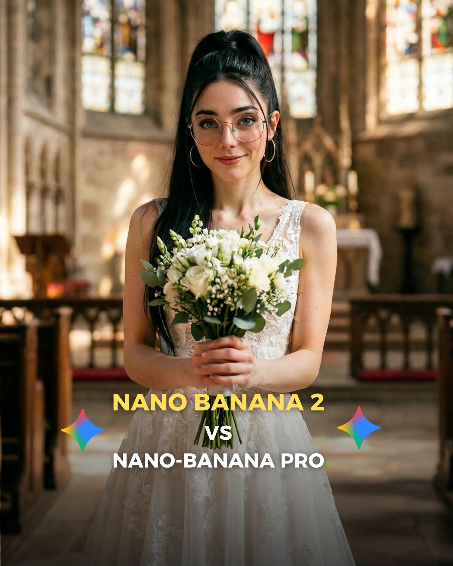
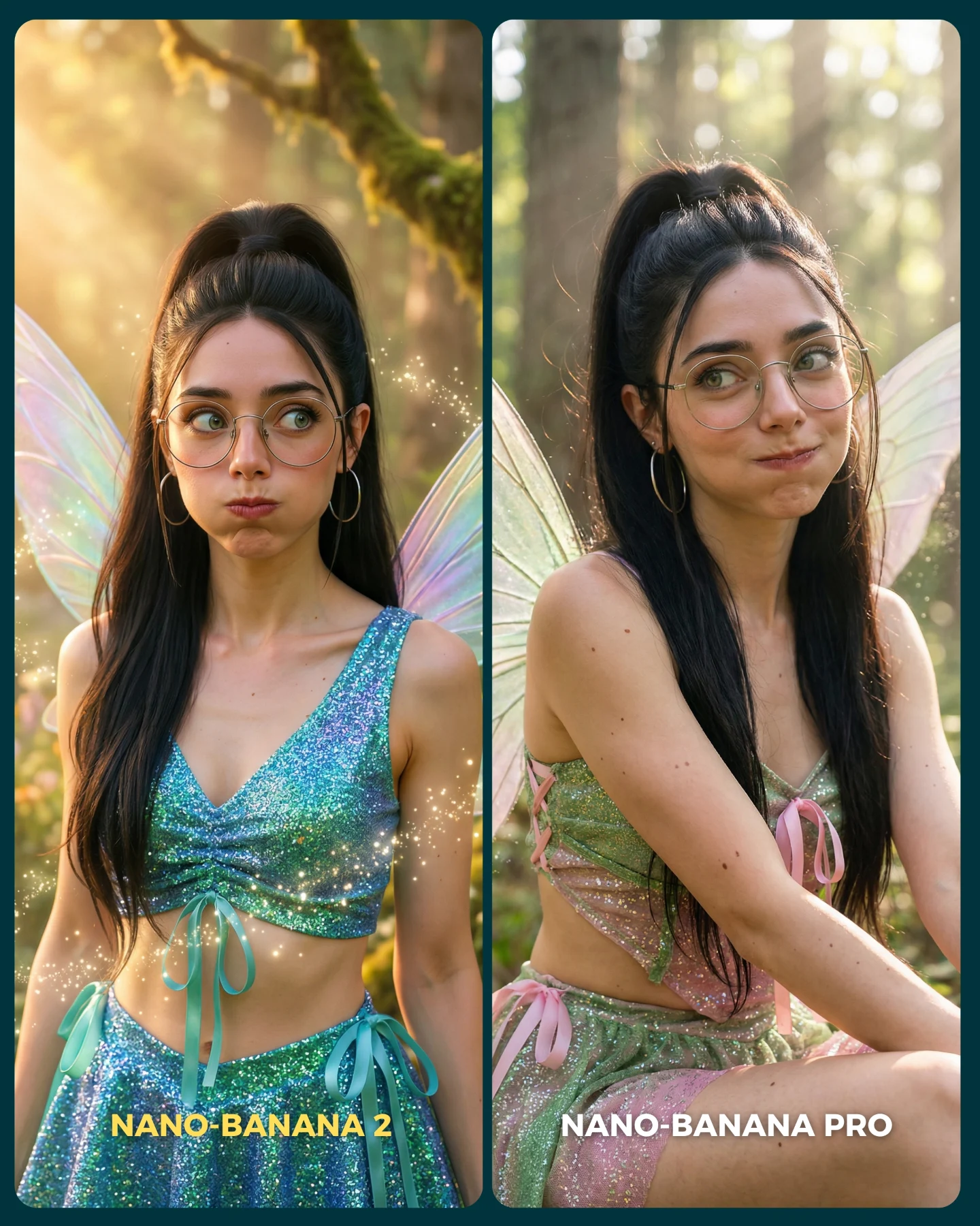
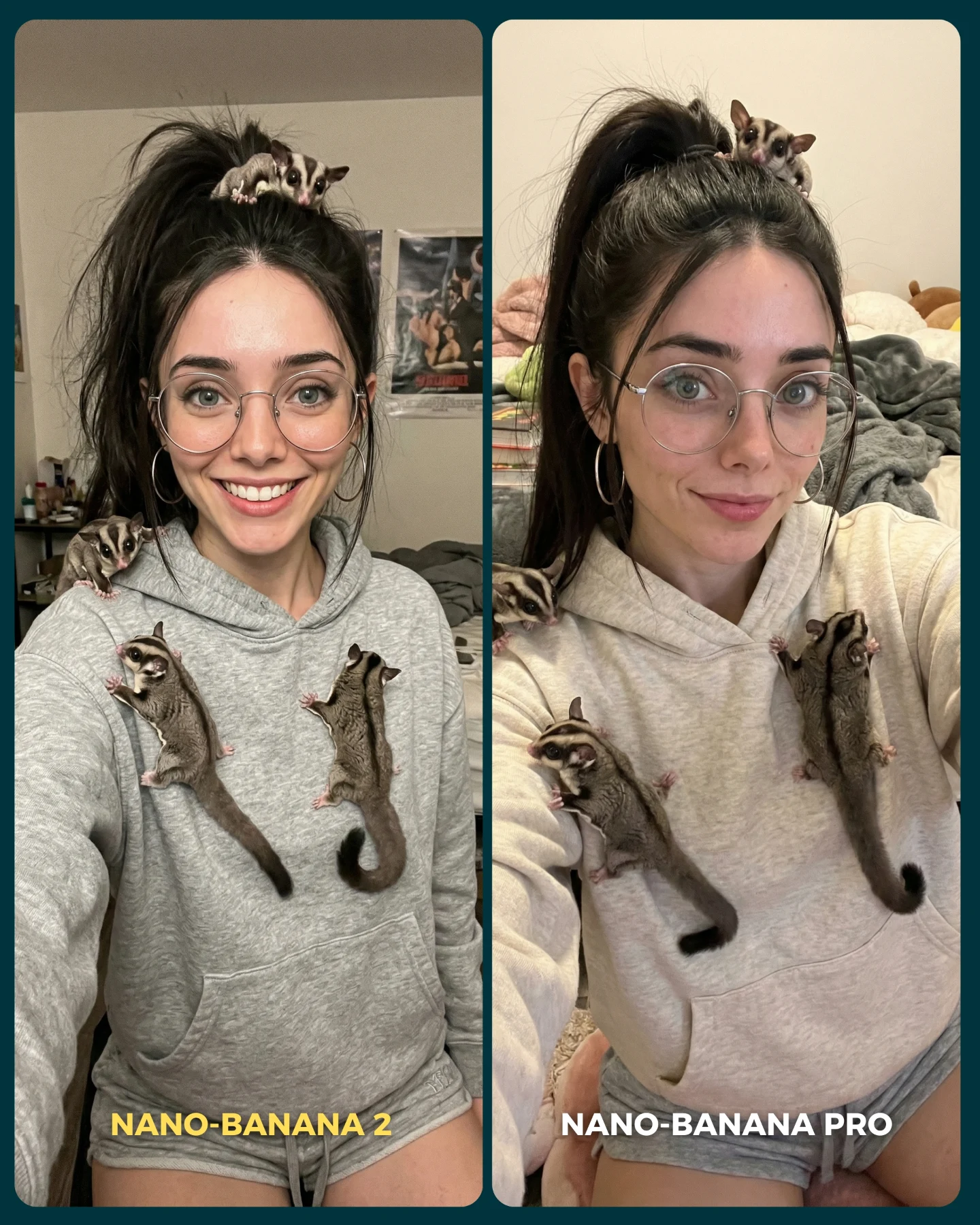
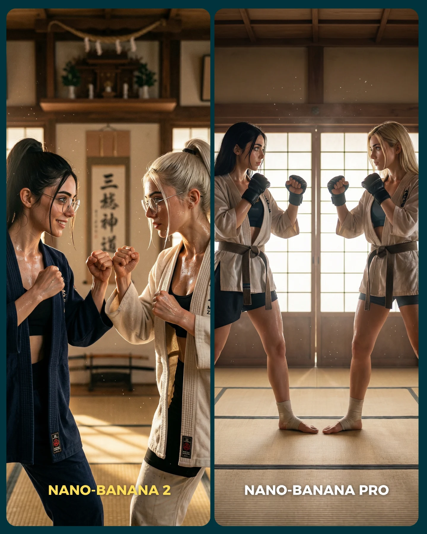
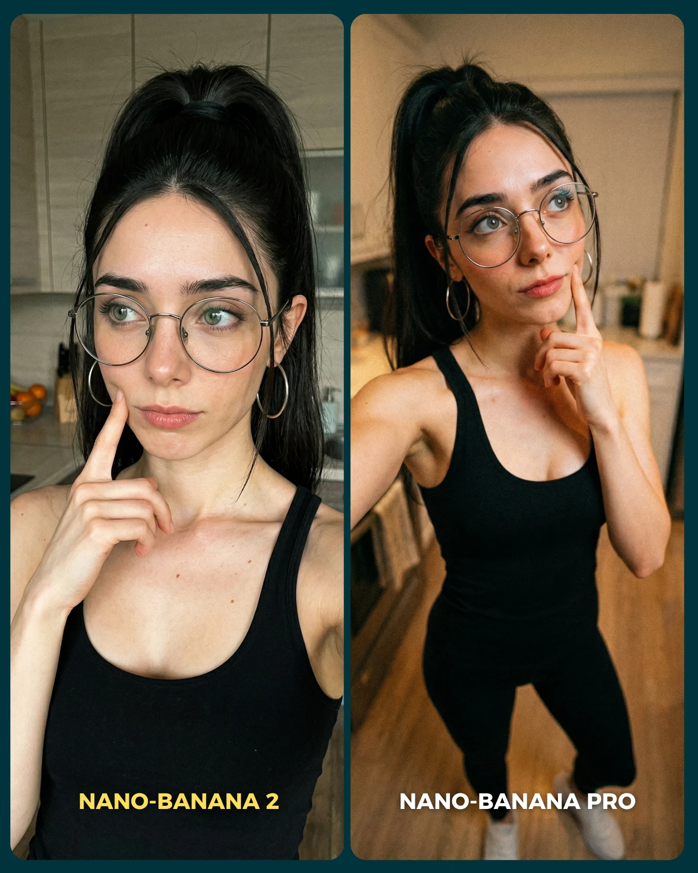
Nano Banana 2 Vs. Nano Banana PRO 💥
Google acaba de lanzar un nuevo generador de imágenes... Lleva un 2 pero no significa que sea mejor que el Pro 👀 (No es Nano Banana Pro 2)
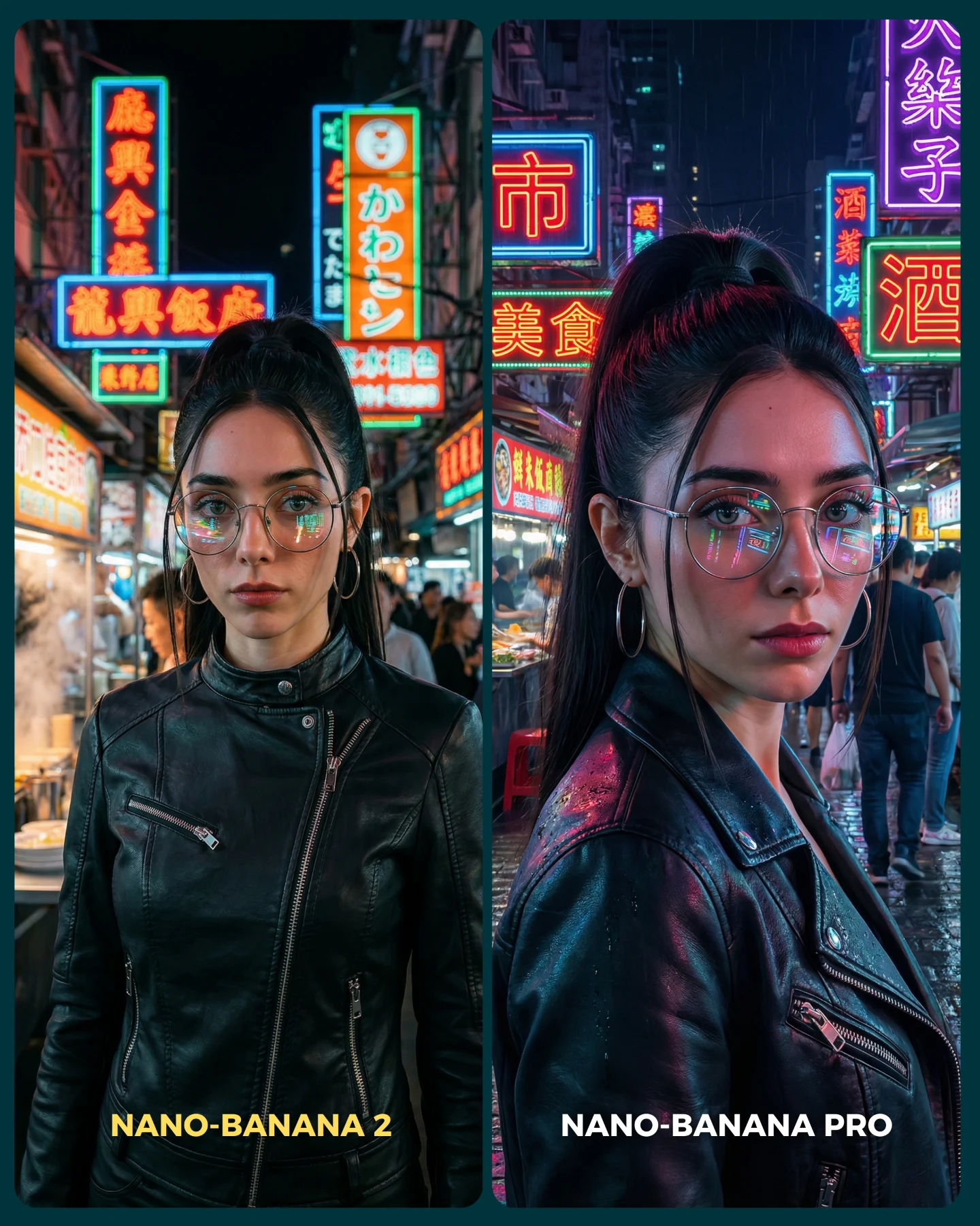
Para ponerlo realmente a prueba, las imágenes que he seleccionado para testearlo son todas las que Nano Banana Pro me daba "poco realistas"
Tras ver los resultados... Sigo pensando que la versión Pro lo hace mejor que la nueva 😅 Pero si es verdad que en algunas ocasiones no es así!
Igualmente quiero escuchar tu opinión al respecto 💌 Y comenta "ARIA" si quieres que te pase los prompts de todas las imágenes 💕
How soy_aria_cruz Made This Nano Banana Frost Portrait AI Art — and How to Recreate It
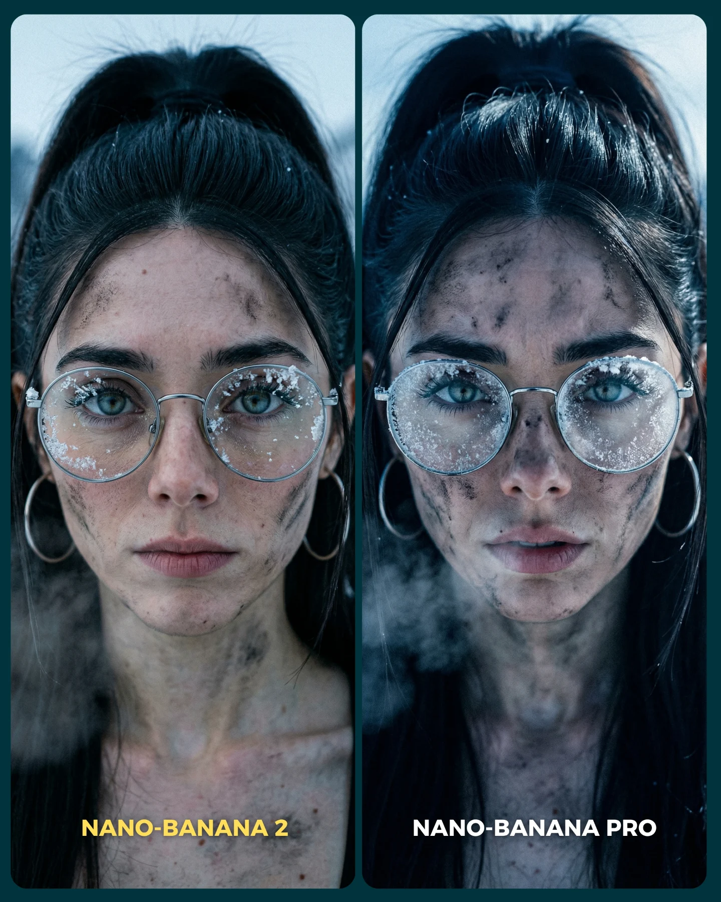
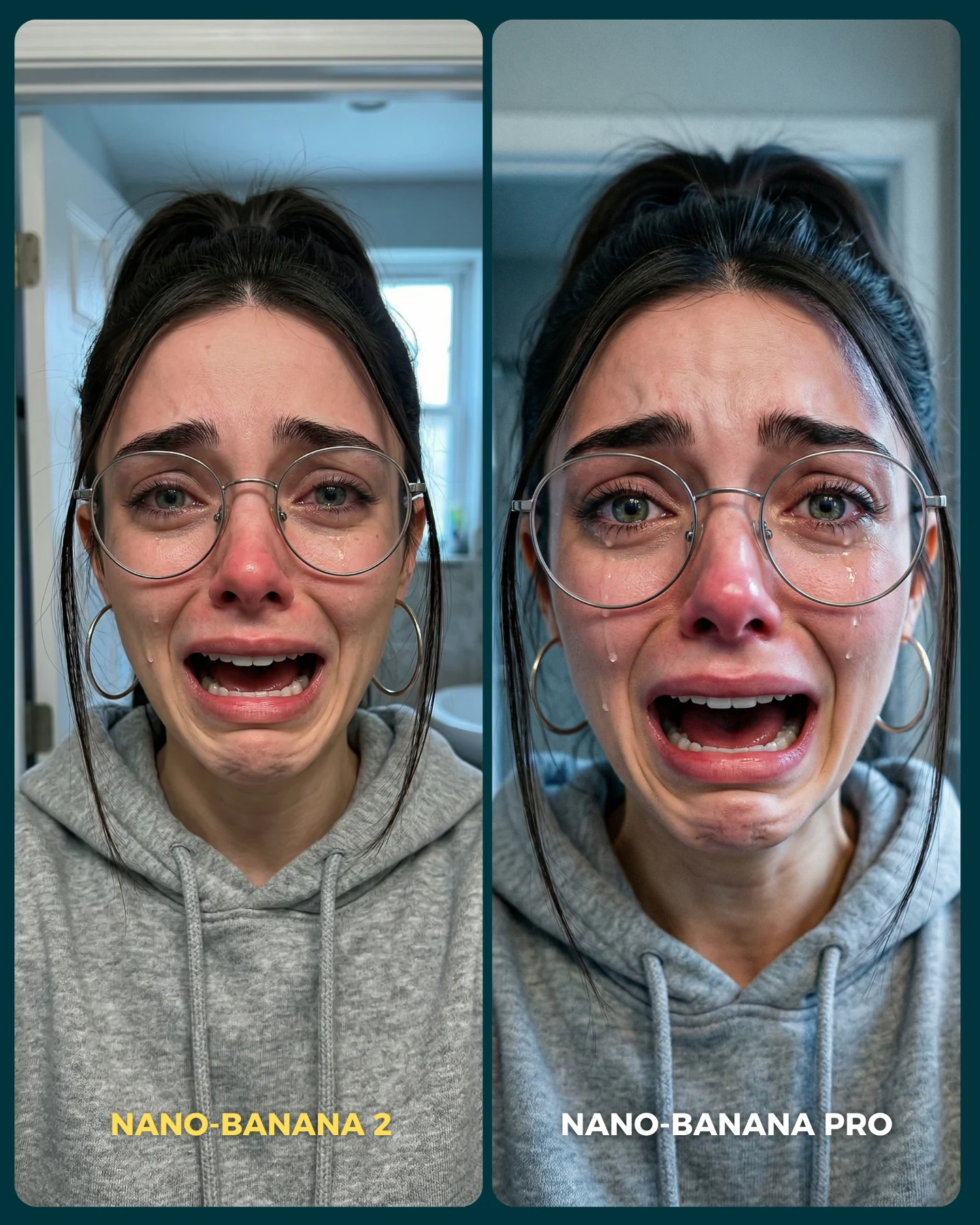
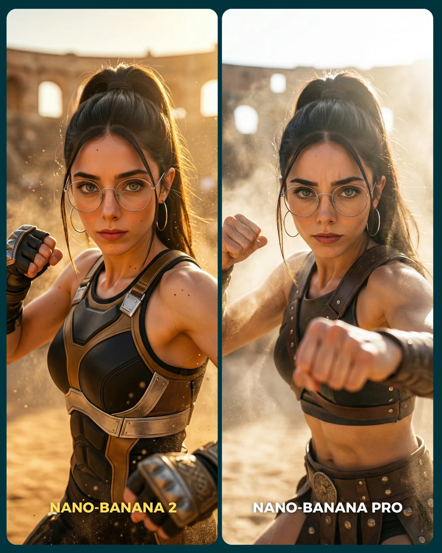
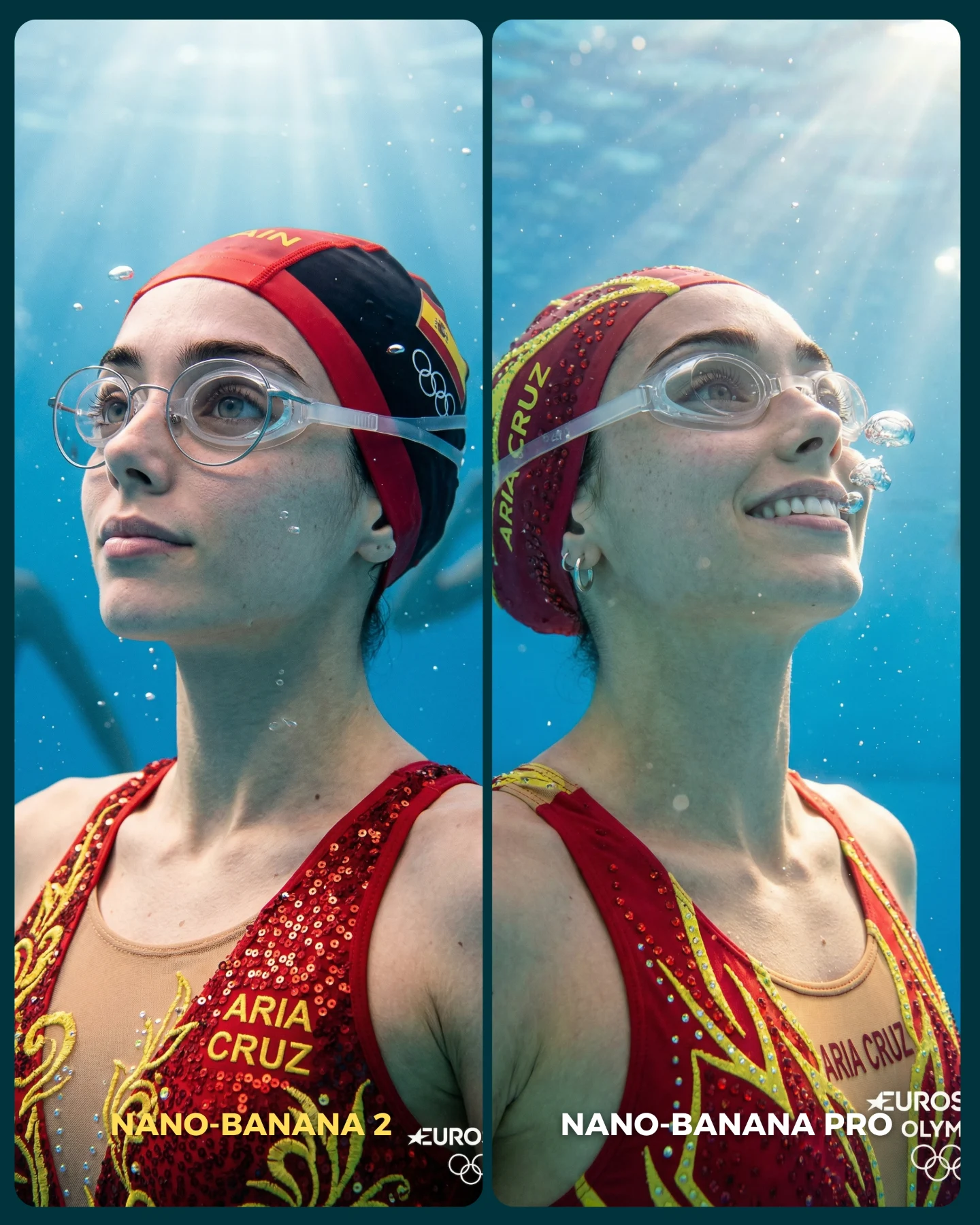
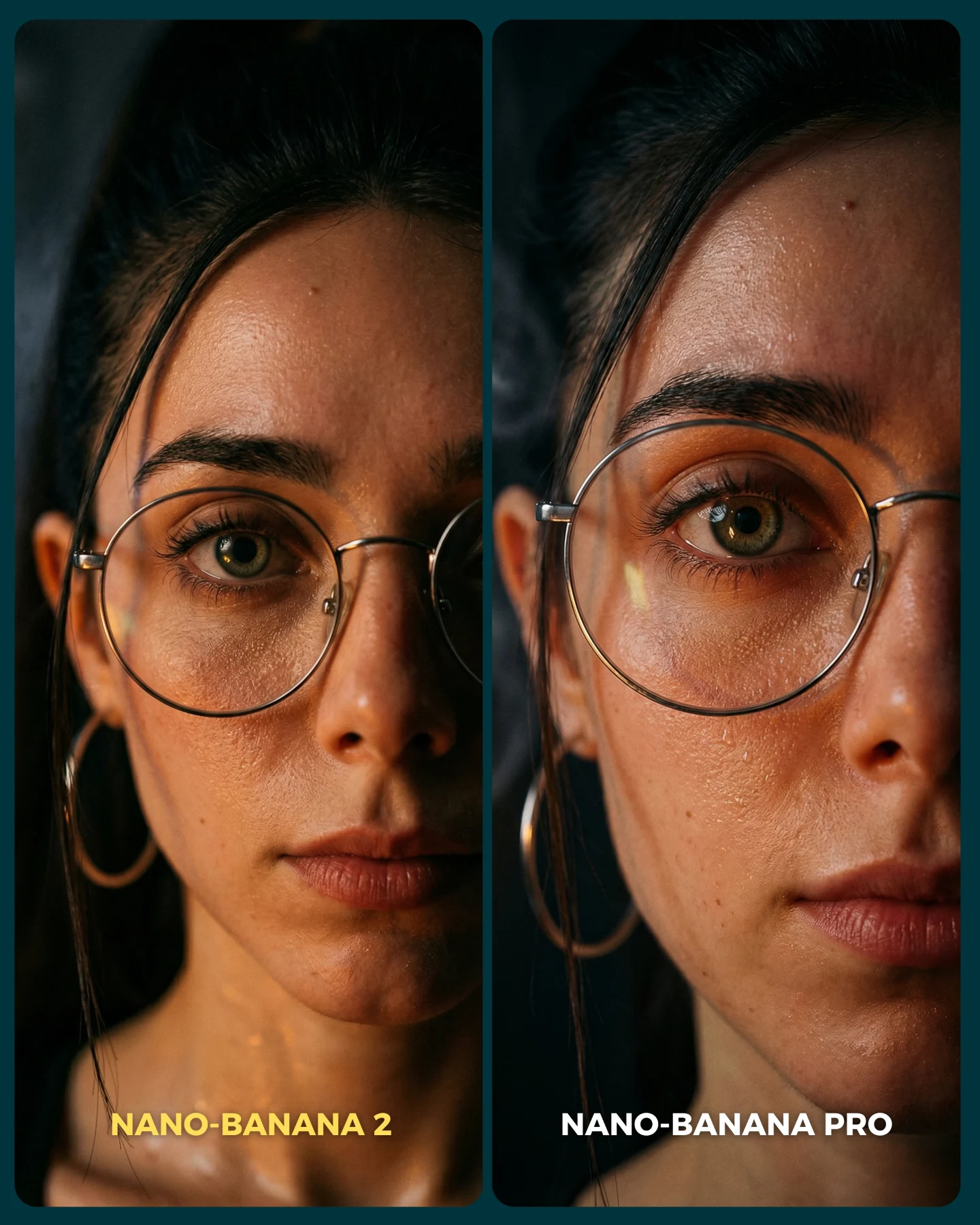
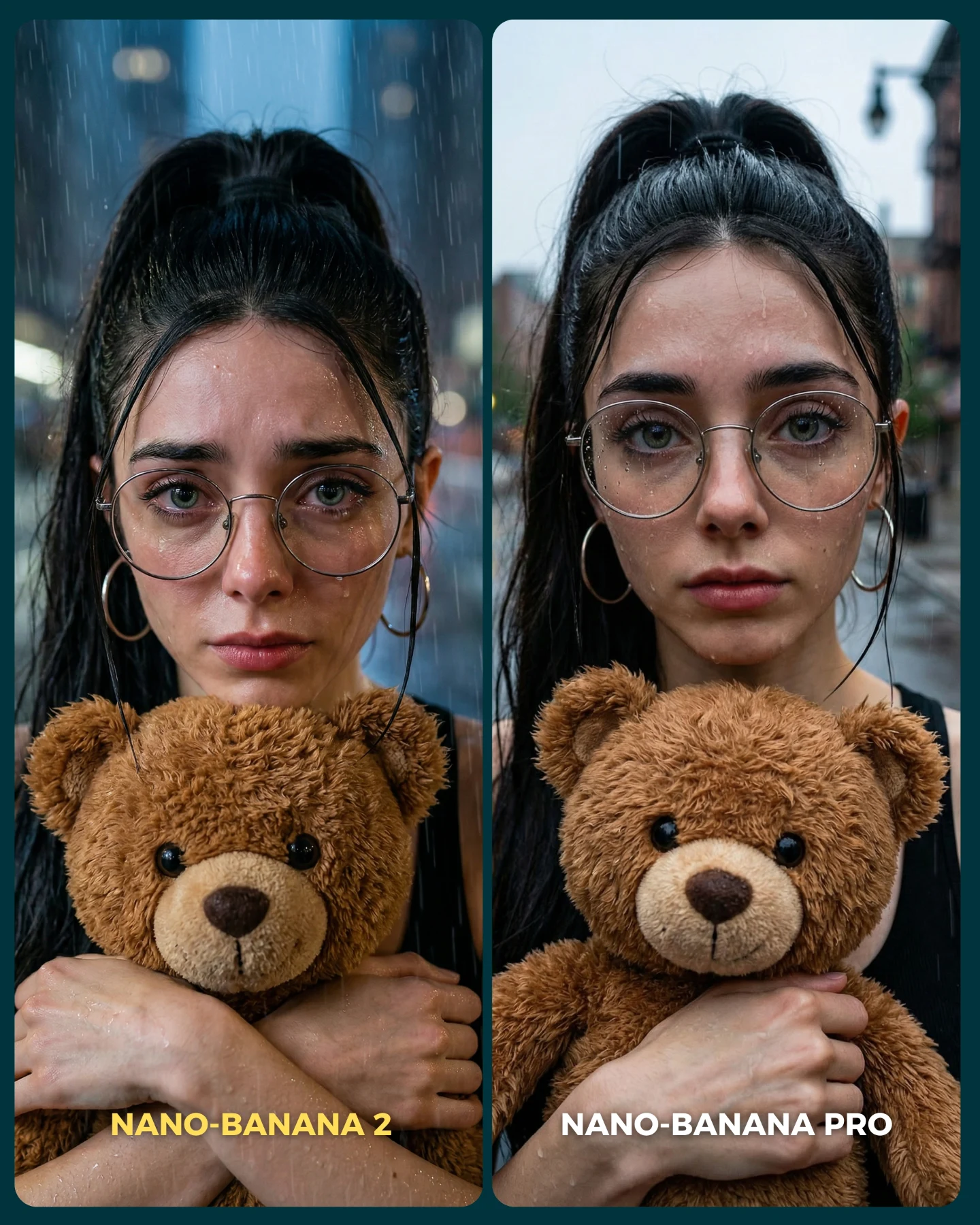
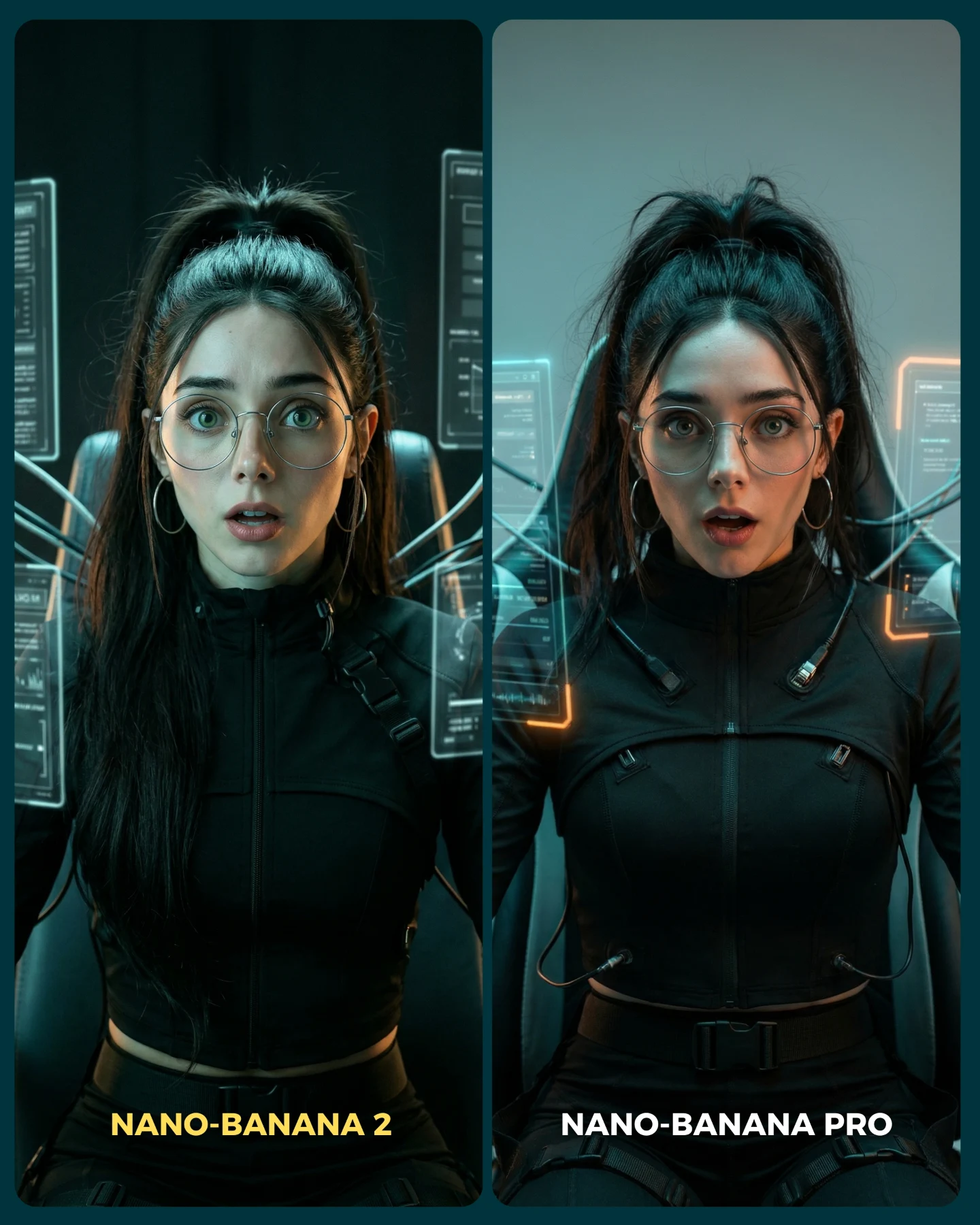
This image does something many AI model comparisons fail to do: it removes almost every distraction. There is no busy scene, no dramatic pose change, and no shift in character design between outputs. The comparison is ruthless because it is controlled. Same woman, same crop, same accessories, same cold mood. That forces the viewer to pay attention to realism itself.
The result is much more useful than a flashy “which one looks better?” post. It becomes a visual audit. You can inspect skin texture, eye clarity, frost behavior on the glasses, facial symmetry, and how convincing the grime feels across the face. When a model test is this controlled, the image stops being content filler and starts becoming evidence.
Why this comparison earns attention
The strongest hook is not just that two model outputs are shown side by side. It is that the subject matter is difficult in exactly the right way. Frosted lenses, dirty skin, cool vapor, and close facial scrutiny are all areas where weak image models tend to break. By choosing a stress-test scenario instead of an easy beauty portrait, the creator makes the comparison meaningful.
There is also a social reason it works. Audiences love binary decisions when the frame is simple. Left versus right is easy to process, easy to comment on, and easy to debate. But the image does not collapse into low-value engagement bait because the visual conditions are genuinely informative. You are not just choosing a favorite. You are seeing where realism holds and where it slips.
Signal
Evidence (from this image)
Mechanism
Replication Action
Controlled A/B setup
Both sides use nearly identical subject identity, crop, and styling
Differences feel attributable to model quality rather than prompt drift
Lock identity, framing, and accessories before comparing models
Difficult realism test
Frost on glasses, soot on skin, cold haze, close facial crop
Challenging details expose weaknesses in rendering fidelity
Choose a prompt that stresses texture, translucency, and facial precision
Immediate readability
Clear split-screen with bottom labels for each model
The viewer knows instantly how to read the image and join the discussion
Use a simple two-panel layout with strong labels and minimal extra design
Emotionally neutral subject
Serious expression and straight-on gaze keep the focus on image quality
Less performance from the subject means more attention on realism itself
Remove exaggerated posing and keep the portrait forensic
Where this format works best
Model comparison posts: ideal for showing meaningful output differences without prompt noise.
Prompt engineering education: useful when teaching how to create fair A/B evaluations.
AI creator trust-building: strong because it signals that the creator is willing to test models under pressure, not only show best-case outputs.
Realism-focused communities: especially effective where audiences care about micro-detail and consistency.
Where it is less effective
Broad lifestyle feeds: the forensic comparison format is less emotionally warm than aspirational content.
Product marketing without context: viewers may need caption support to understand what is being compared.
Highly stylized art pages: the image is about fidelity, not imagination or world-building.
Three transfer recipes
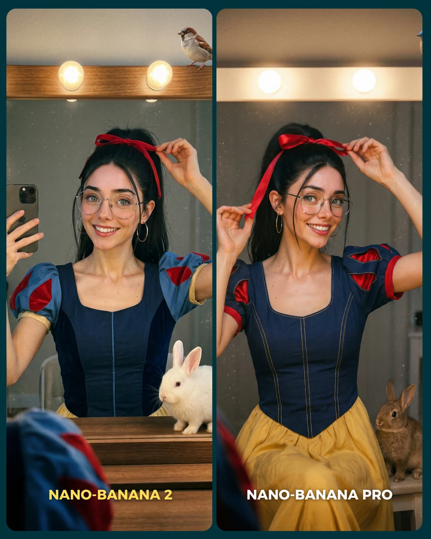
Beauty realism transfer Keep: same face across both panels, same crop, direct gaze. Change: test material such as wet skin, makeup texture, or translucent fabric. Slot template (EN): {same female portrait} compared across {model A} and {model B} with {difficult realism detail}
Fabric-detail transfer Keep: forensic split-screen layout and controlled lighting. Change: velvet, sequins, lace, or knit surfaces instead of frost and soot. Slot template (EN): {same subject} side-by-side with {complex material challenge} to compare realism between {two models}
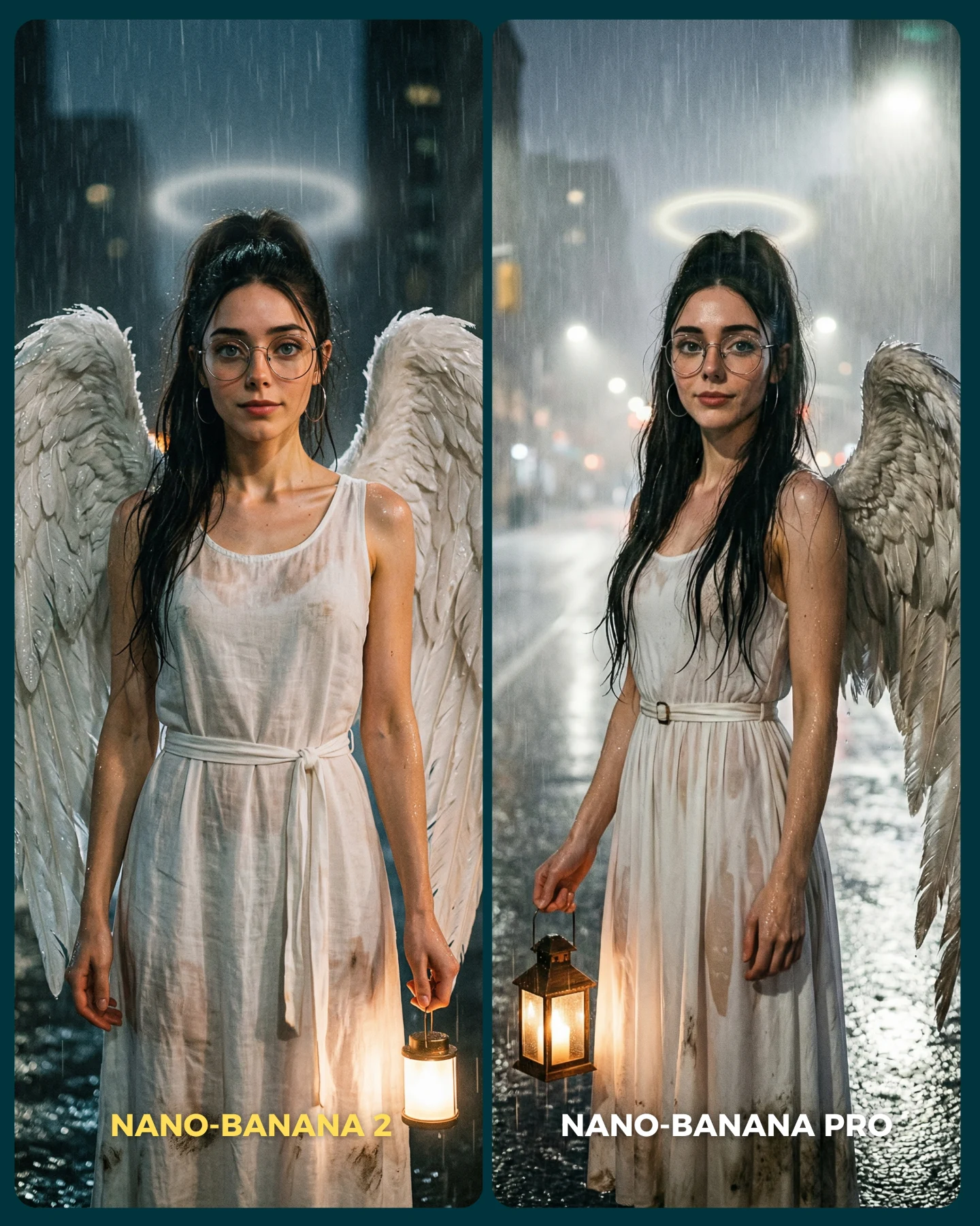
Environmental stress-test transfer Keep: identical subject and crop, minimal background, clear labels. Change: rain, mud, sweat, smoke, or underwater droplets. Slot template (EN): {portrait subject} in {stress-test condition} shown as an A/B comparison between {model names}
Aesthetic read: why the image feels convincing
The image succeeds visually because the cold palette is narrow and disciplined. Blue-gray skin shadows, frosted white highlights, silver metal accessories, and dark hair all stay inside one coherent temperature range. That consistency helps the eye focus on texture differences rather than color chaos.
The frost on the glasses is especially smart. Transparent surfaces are one of the fastest ways to expose bad rendering, and here the glasses carry multiple jobs at once: they define identity, introduce a delicate material challenge, and create a memorable silhouette. The soot marks do something similar for skin. They force the model to render imperfection without turning the face to mush.
The split layout is also aesthetically efficient. Because both portraits are tightly aligned, the viewer can compare micro-details almost without moving the eyes. That makes the image feel analytical, which is exactly the right mood for this kind of post.
Observed
Why it matters
Two nearly identical portraits separated by a narrow divider
Creates a fair comparison structure with low cognitive friction
Frost crystals on round glasses
Introduces a hard material challenge and a strong visual signature
Soot and grime across the face and neck
Tests imperfection rendering and skin realism
Cold blue-gray lighting with faint mist
Unifies the mood and supports the “harsh conditions” concept
Direct gaze and minimal wardrobe information
Keeps attention centered on facial fidelity and texture
Prompt technique breakdown
If you want this kind of comparison to be useful, the prompt must be almost identical on both sides. The only meaningful variable should be the model. That means you have to think of the portrait as a controlled laboratory setup, not an aesthetic freestyle exercise.
Prompt chunk
What it controls
Swap ideas (EN, 2–3 options)
Same woman duplicated across both panels
Locks identity consistency and fairness of comparison
same subject side-by-side; matched identity comparison; duplicated portrait test
Frosted round glasses
Adds difficult transparent and crystalline material detail
Makes the post instantly understandable in the feed
two-panel comparison card; side-by-side model test; A/B portrait layout
Starter prompt block
split-screen portrait comparison of the same young woman with round frosted glasses, soot-smudged skin, cold blue-gray lighting, faint vapor, identical head-and-shoulders crop, left labeled NANO-BANANA 2 and right labeled NANO-BANANA PRO, hyper-real photoreal evaluation graphic
Remix playbook
The biggest mistake in model comparisons is changing too many variables at once. If the right side has better lighting, a different pose, or cleaner styling, you are no longer testing the model fairly.
Baseline lock
Lock the exact same identity, crop, and accessories on both sides first.
Lock the same material challenge, such as frost and grime, second.
Lock the same lighting and background before changing only the model.
One-change rule
The model should be the only major variable. If you need to improve the test, improve the source prompt first, then rerun both models under the same conditions.
Run 1: create the base portrait with matched identity and frontal crop.
Run 2: introduce frost on the glasses and controlled soot marks on the skin.
Run 3: standardize the split layout and panel labels.
Run 4: compare only the rendering quality, not different artistic choices.
That is what turns a comparison post from engagement bait into something genuinely educational. The cleaner the setup, the more trustworthy the conclusion.