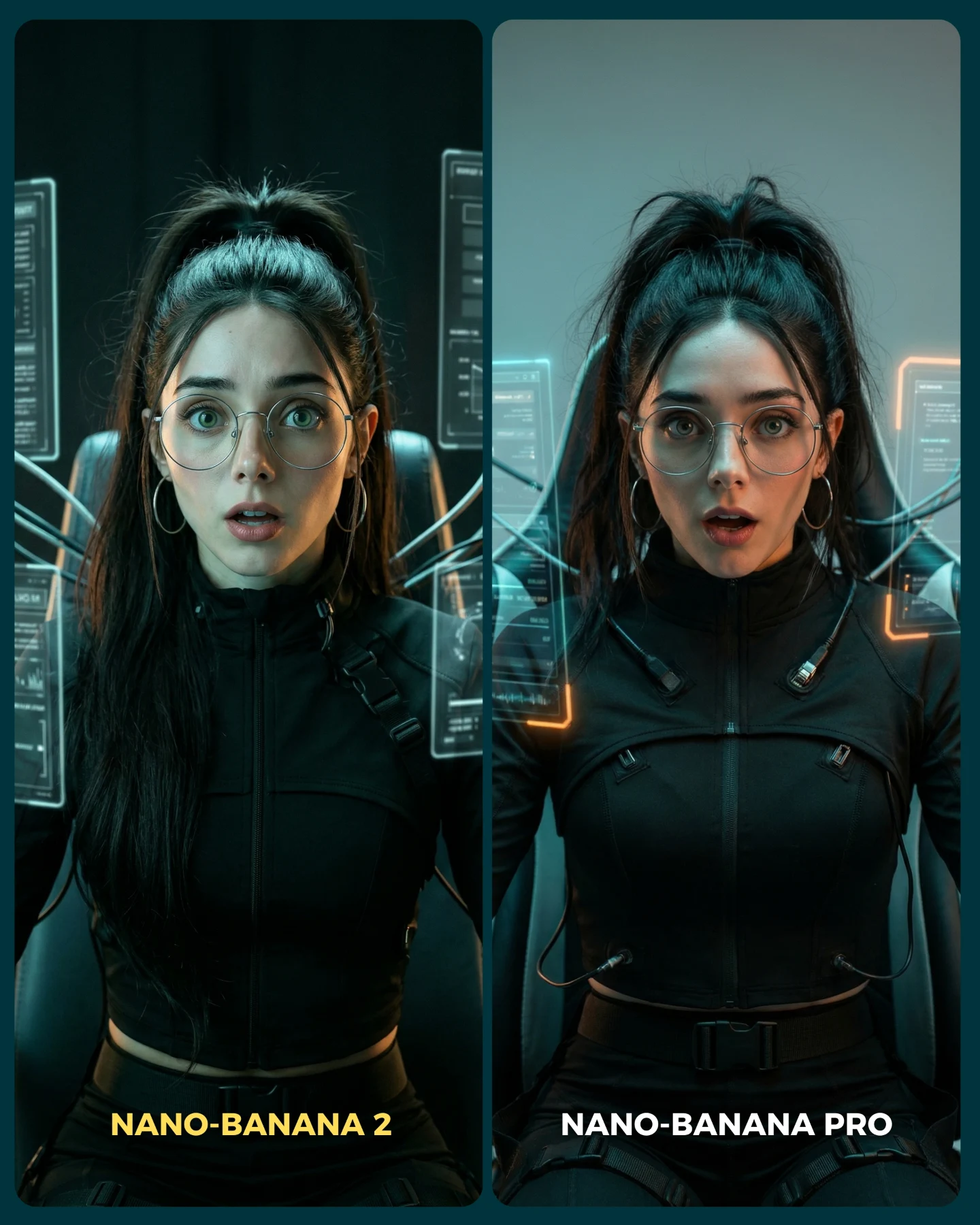
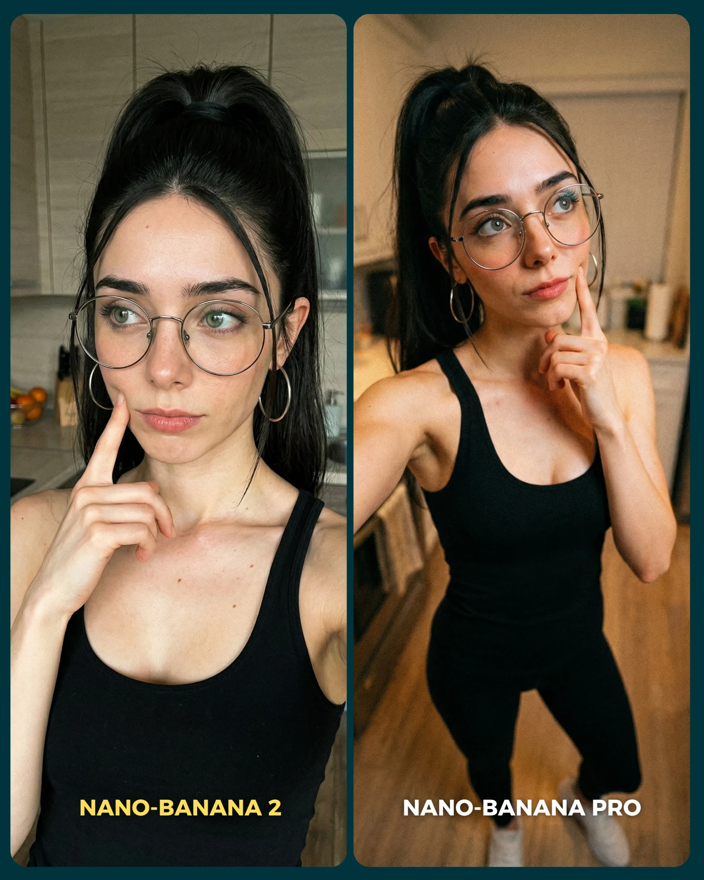
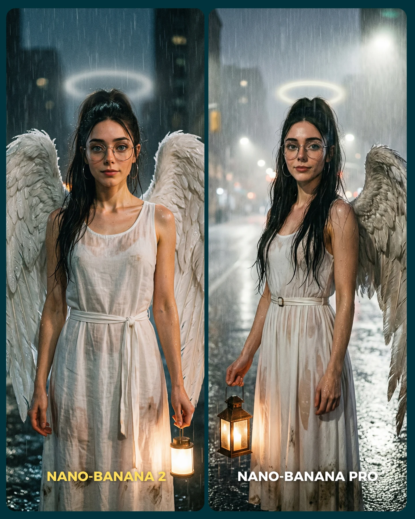
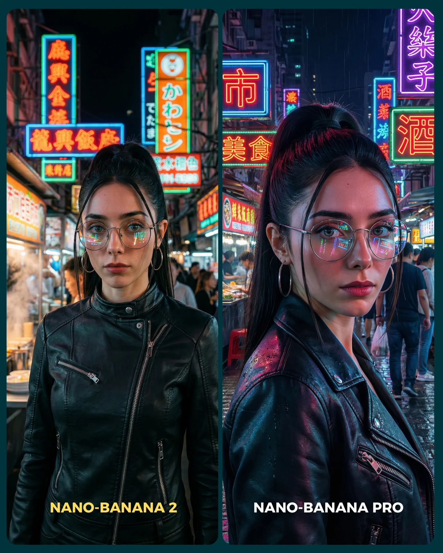
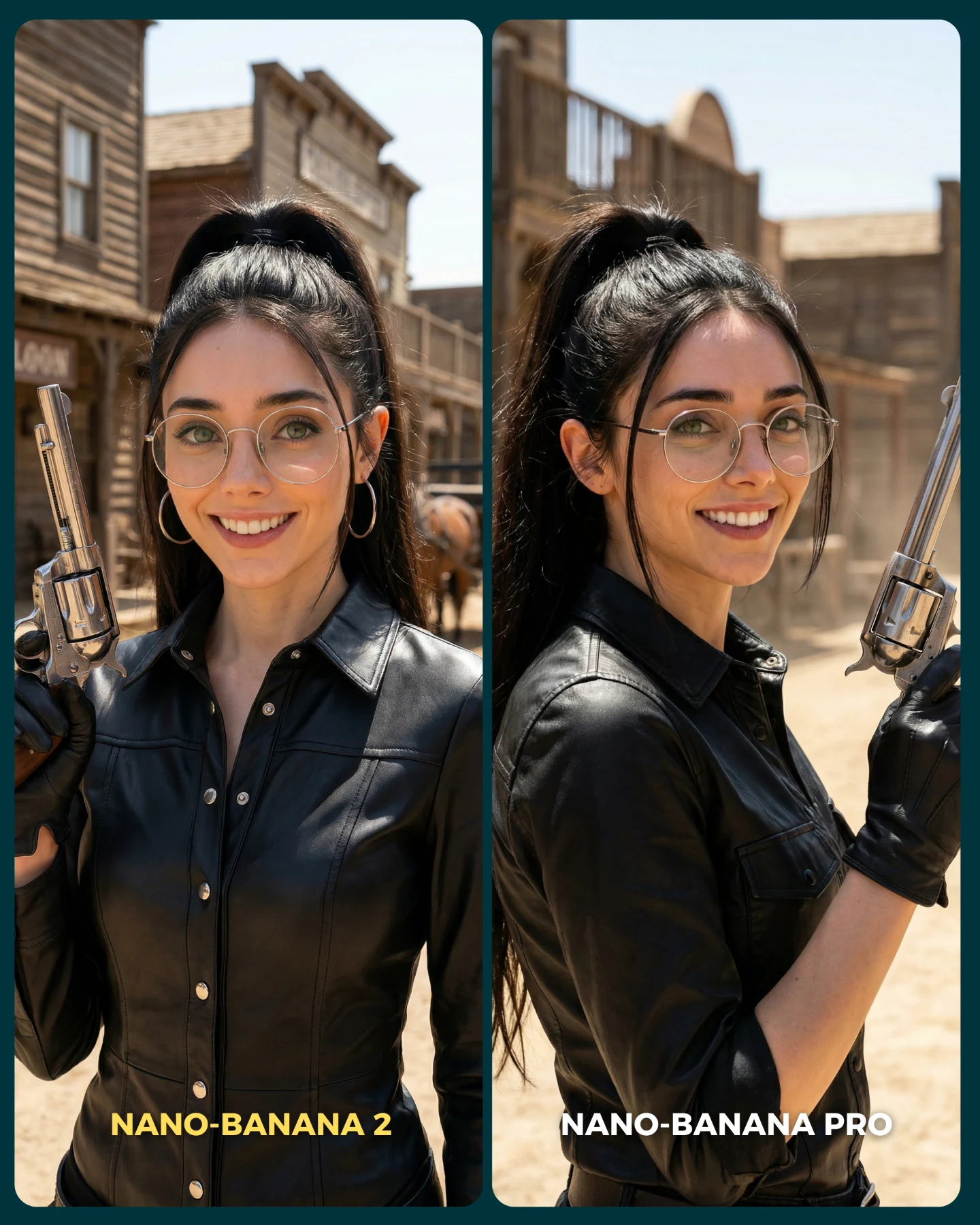
This image is a useful comparison because it chooses a scene that looks simple at first but is actually full of failure points. The subject is centered and stable, which seems easy. But then the frame introduces transparent interface panels, glow interactions, glasses reflections, fitted black clothing, cables behind the chair, and a surprised facial expression. That combination creates a perfect benchmark for model quality. A good output has to handle realism, interface readability, material separation, and facial coherence all at once.
What makes the image effective on social media is that it still looks like content, not a test chart. The woman feels like a futuristic operator or sci-fi protagonist, so the image carries narrative energy. That is exactly the right move for creator-facing AI content: hide the benchmark inside an attractive scene. Viewers come for the vibe, then stay to compare the quality difference.
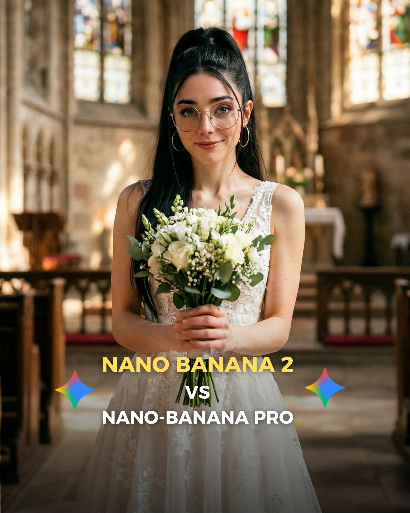
How soy_aria_cruz Made This Futuristic Operator Model Comparison Image and How to Recreate It
The A/B layout gives the audience a very clear job: compare which panel feels more believable. Because the subject remains centered and consistent, even small quality differences become visible. The right panel typically wins if it handles interface glow more naturally, preserves the face under cool lighting, and keeps the black outfit readable without crushing all the detail. Those are exactly the areas where many image models struggle.
| Signal | Evidence (from this image) | Mechanism | Replication Action |
|---|
| Controlled sci-fi stress test | Glowing HUD panels, chair cables, black technical clothing, and glasses all coexist in one shot. | The scene exposes weaknesses in transparency, reflections, lighting, and fabric detail. | Choose comparison scenes where multiple difficult rendering behaviors interact at once. |
| Center lock | The same woman remains front-facing and centered in both panels. | Consistency removes composition noise so viewers focus on model differences. | Keep pose, crop, and gaze fixed across both versions of the test. |
| Narrative wrapper | The subject reads like a futuristic operator instead of a generic portrait test. | A story-coded image feels worth sharing even before people evaluate the benchmark. | Wrap technical comparisons inside a visually complete genre scene. |
Use cases and transfers
This comparison style is especially good for creator posts about realism, prompt tuning, interface-heavy scenes, and futuristic character generation. It also transfers well to cyber control rooms, medical pods, mission command setups, and hacker-console scenes where screen light and glass reflections matter.
- Best fit: model-vs-model realism tests for sci-fi scenes. Why it fits: interface light and dark clothing reveal weaknesses quickly. What to change: keep the subject centered and vary only the renderer or realism target.
- Best fit: prompt education around transparency and glow. Why it fits: the frame shows how hard HUD overlays are to render convincingly. What to change: annotate the lesson in the caption while preserving the exact pose.
- Best fit: futuristic character branding. Why it fits: the image is visually strong enough to function as standalone hero art. What to change: adjust worldbuilding cues such as medical, tactical, or hacker aesthetics.
- Not ideal: warm lifestyle storytelling. Reason: the cool tech environment pushes the viewer into evaluation mode.
- Not ideal: product-centered SaaS ads. Reason: the comparison frame foregrounds render quality more than any single product message.
Transfer recipe one: keep the centered seated operator and holographic panels; change the world to a spaceship cockpit; slot template: {same operator} {same camera} {model A control room} vs {model B realism}. Transfer recipe two: keep the glow-on-glasses benchmark and black tactical outfit; change the theme to cyber investigator; slot template: {front-facing subject} {transparent UI overlays} {teal light} {same identity}. Transfer recipe three: keep the side-by-side fidelity test; change the chair setup to a biotech capsule; slot template: {same woman} {same expression} {stylized sci-fi panel} vs {realistic sci-fi panel}.
Aesthetic read
The strongest visual move is the restrained color system. The image stays mostly inside black, teal, cyan, and a touch of orange. That restraint makes the interface glow feel sharper and more professional. A weaker version of this prompt would drown in random neon colors. This one works because it chooses discipline over spectacle.
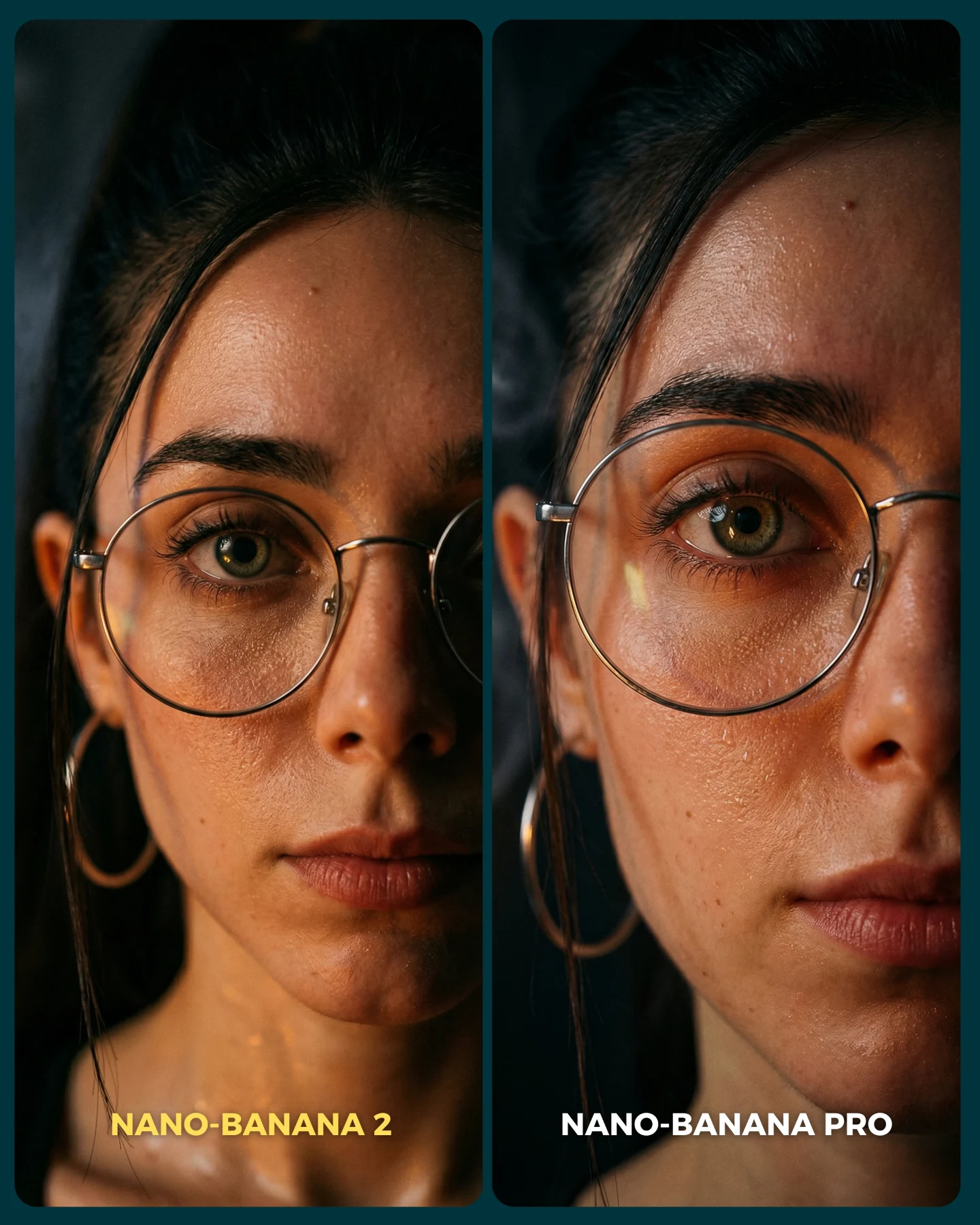
The second key detail is the glasses. Transparent overlays and glasses reflections are both complex image-generation problems, and this frame puts them on top of each other. That is not accidental. It makes the image a better benchmark. At the same time, the glasses make the character feel recognizable and grounded, which keeps the scene from slipping into generic sci-fi anonymity.
| Observed | Why it matters for recreation |
|---|
| Front-facing centered portrait in both panels | Comparison clarity depends on structural consistency. |
| Cyan HUD panels around the face and shoulders | These are the main visual proof points for transparency and glow handling. |
| Black fitted technical clothing | Dark fabric detail is a key realism benchmark in low-light scenes. |
| Round glasses catching cool reflections | Reflections help sell both realism and interface integration. |
| Chair cables and support lines behind the subject | These details make the scene feel functional rather than decorative. |
Prompt technique breakdown
To recreate this image well, begin with the benchmark structure, not with the character archetype. If you only prompt “futuristic girl with holograms,” the image will drift into generic cyber slop. The better order is split-screen first, same-woman identity second, seated control setup third, interface glow fourth.
| Prompt chunk | What it controls | Swap ideas (EN, 2–3 options) |
|---|
| two-panel side-by-side sci-fi comparison | Overall benchmark architecture | A/B futuristic render test; split-screen model comparison; dual-panel realism benchmark |
| same woman with glasses in both panels | Identity lock and fairness of the test | same operator repeated; identical heroine across outputs; same cyber character in both panels |
| black technical zip-up outfit and seated command chair | Character role and material challenge | tactical-tech clothing; sleek operator uniform; minimalist sci-fi bodysuit |
| floating translucent HUD panels and cyan glow | Interface behavior and lighting challenge | transparent holographic screens; UI overlays; control-room glass panels |
| teal low-light environment with subtle orange accents | Palette discipline and mood | cool command-room lighting; restrained neon tech palette; cyan-led sci-fi lighting |
Execution playbook
Lock the two-panel layout, the subject identity, and the seated front-facing crop before changing anything else. Those are your invariants. Then use the one-change rule. First run: establish the full comparison structure. Second run: refine only the HUD panel transparency and glow. Third run: refine only the black outfit detail and zipper/seam fidelity. Fourth run: refine only facial expression and glasses reflections.
- Baseline: lock split-screen, same woman, same expression, same seated command setup.
- Iteration 2: change only hologram transparency, placement, and light spill.
- Iteration 3: change only fabric realism and chair structure.
- Iteration 4: change only face detail, glasses reflections, and eye intensity.
This sequence keeps the benchmark readable. If you change the interface, pose, lighting, and clothing at the same time, the comparison stops teaching anything useful.