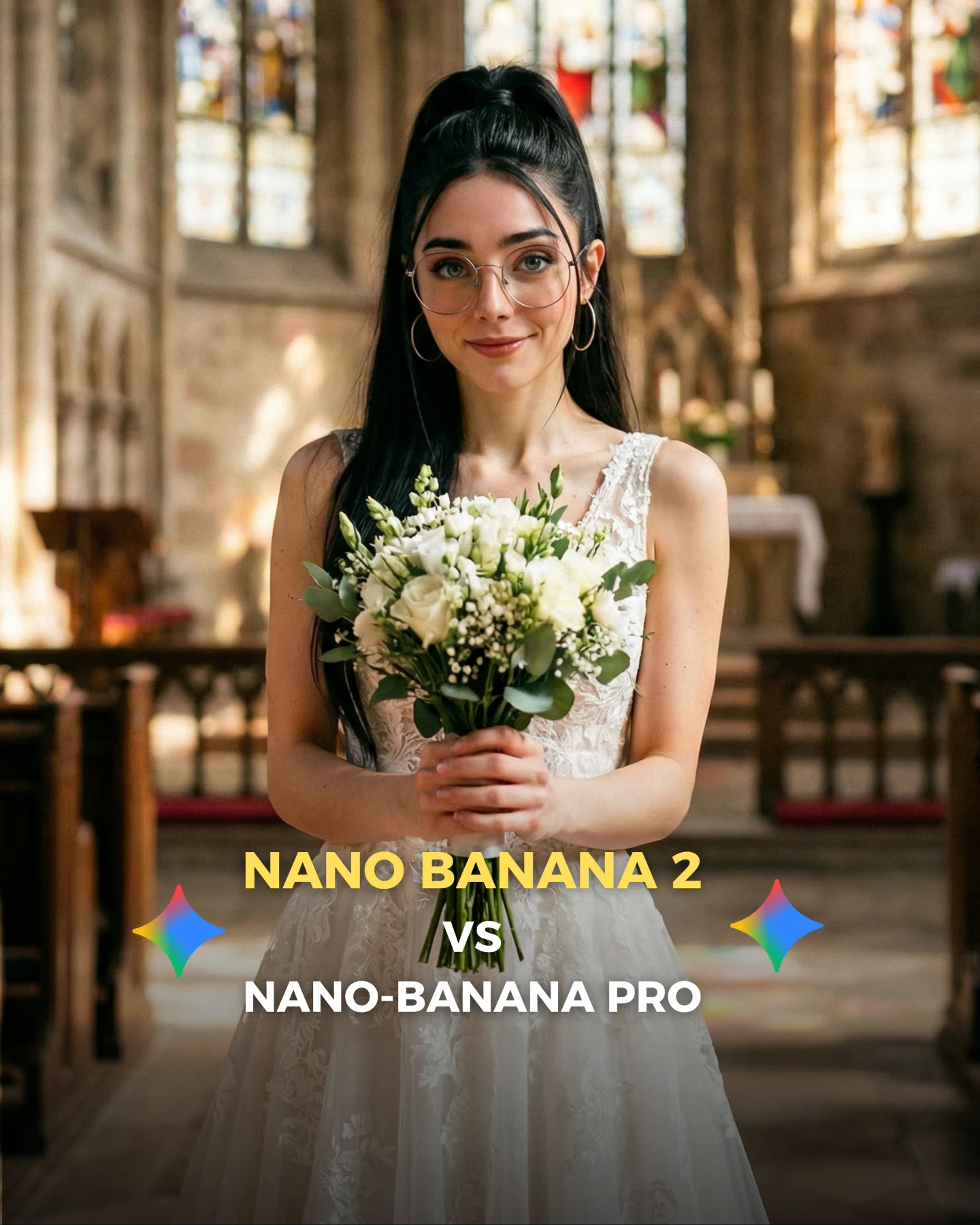
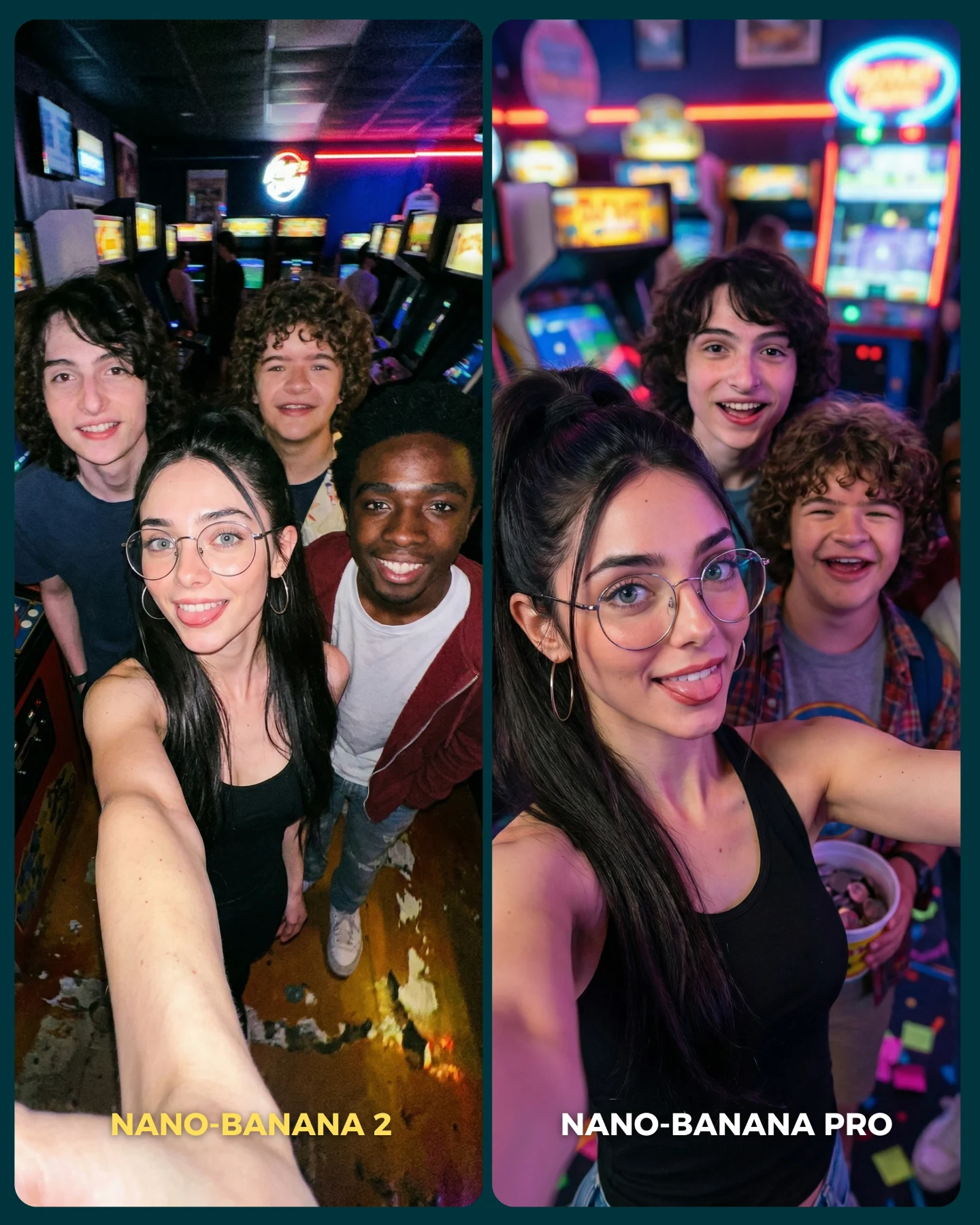
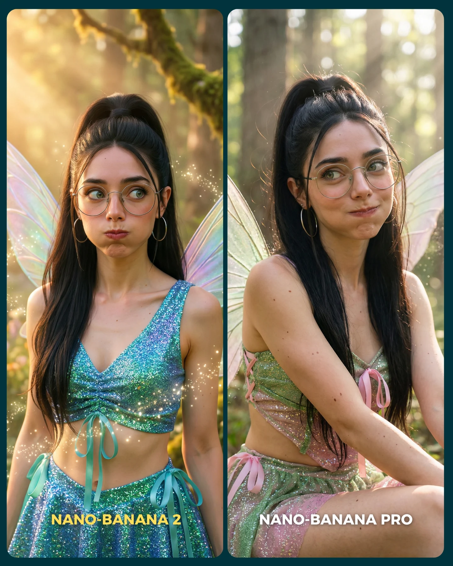
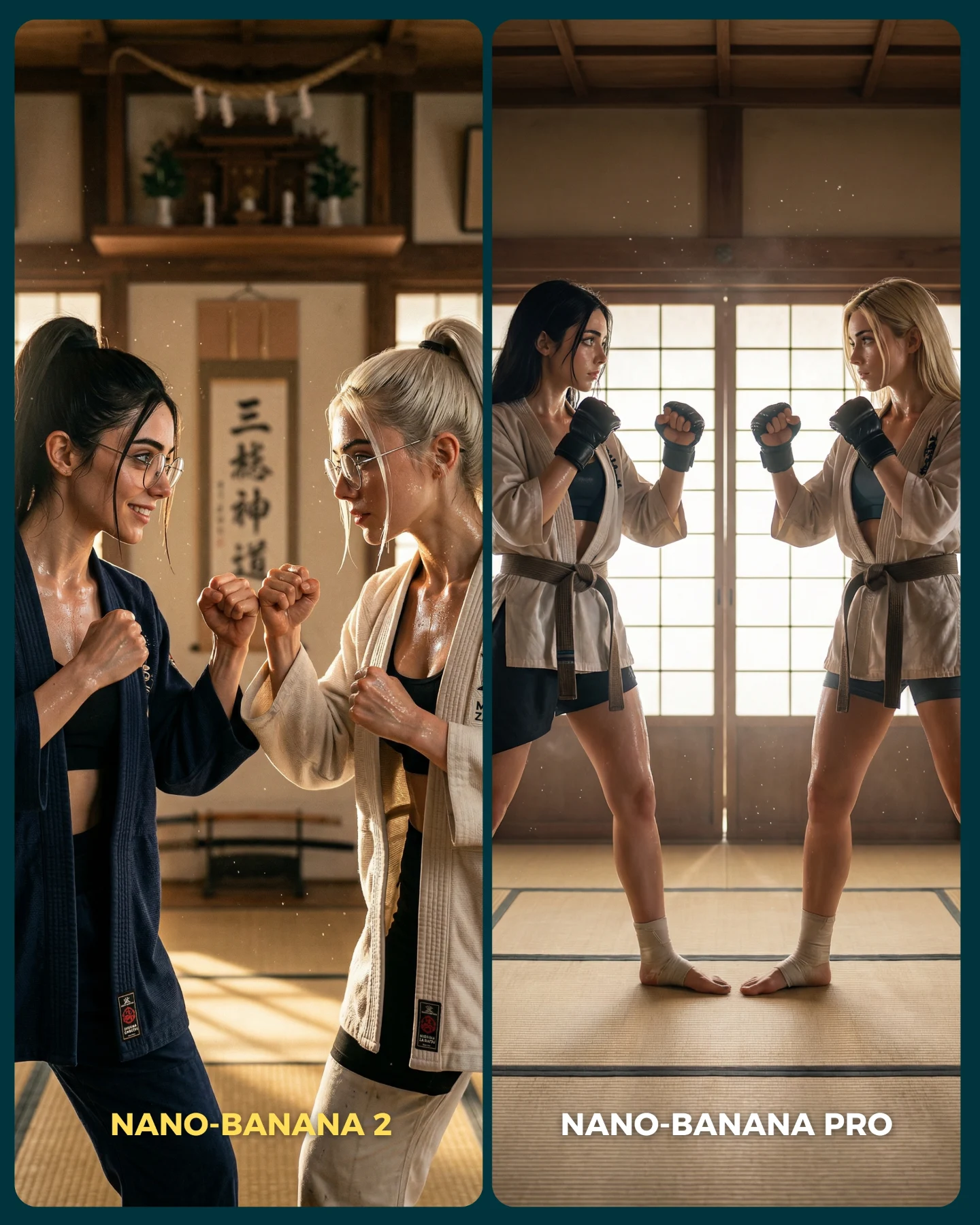
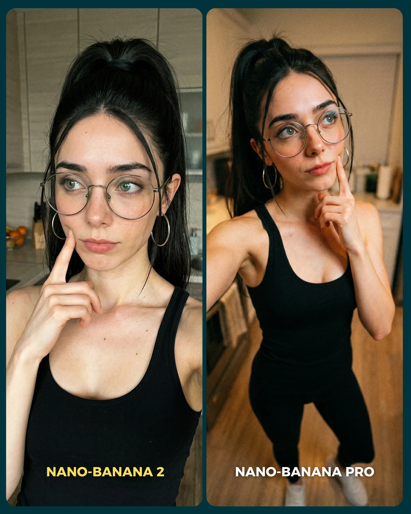
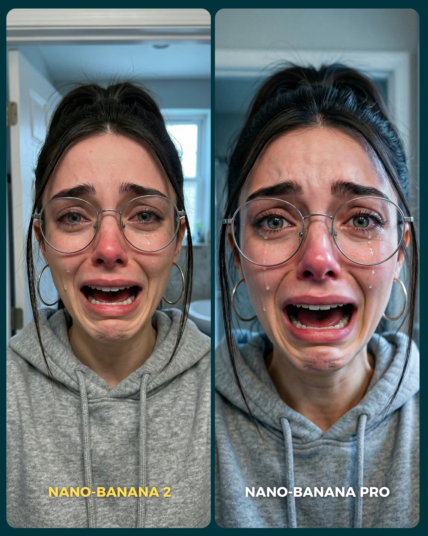
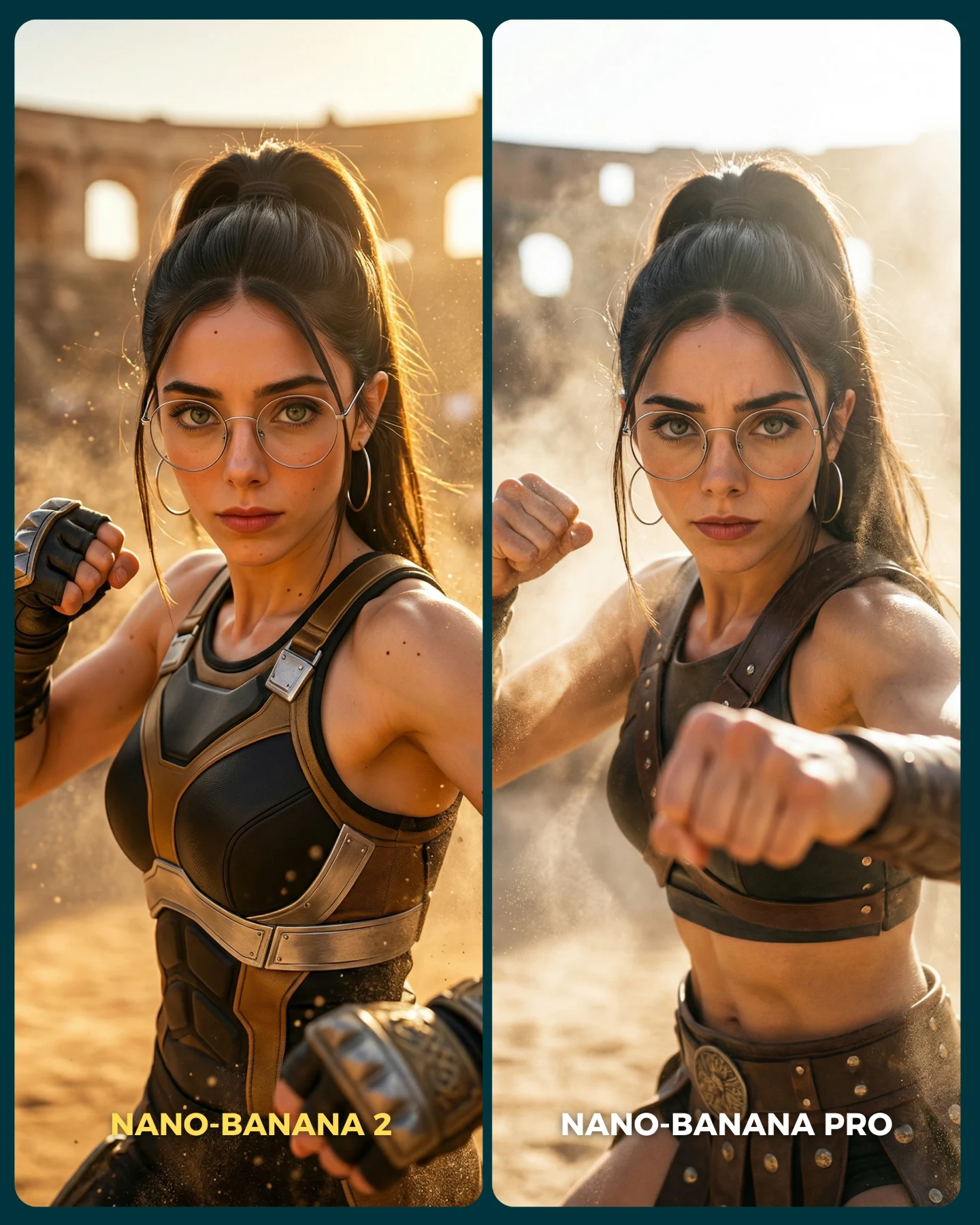
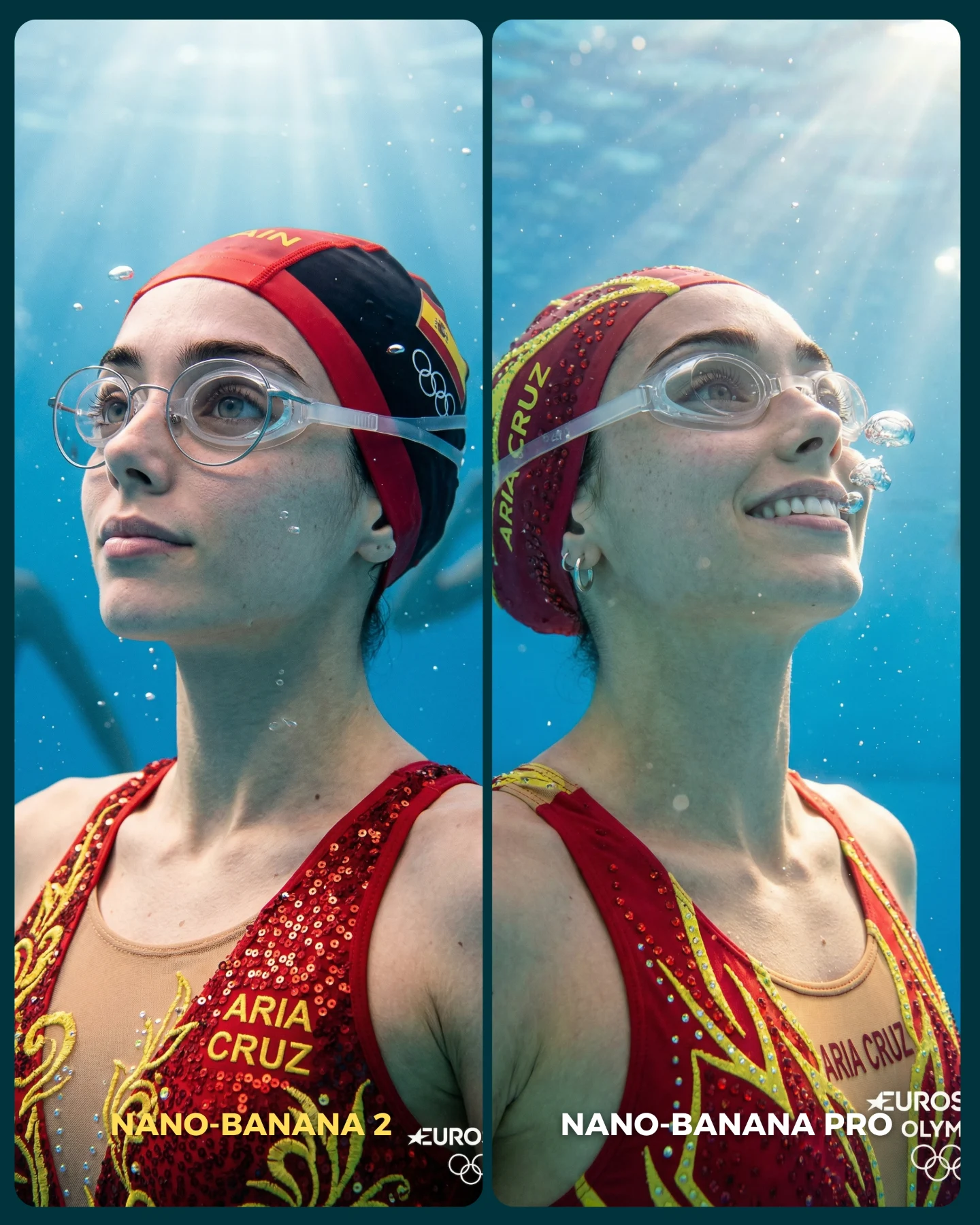
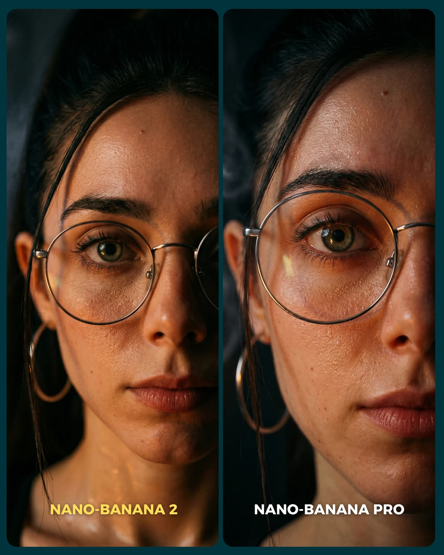
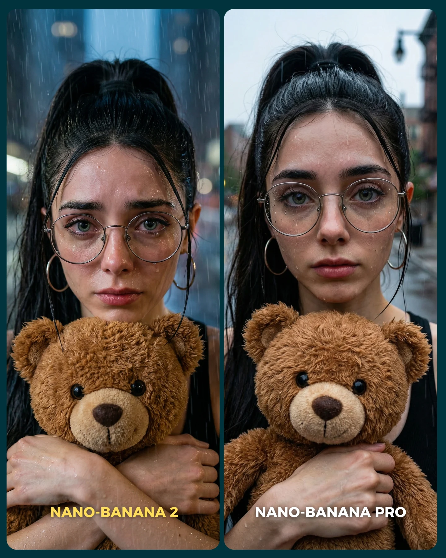
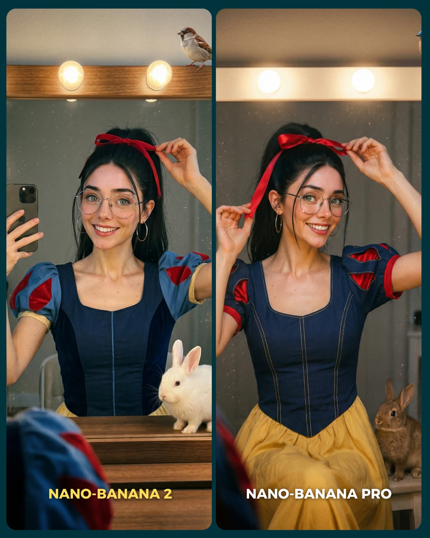
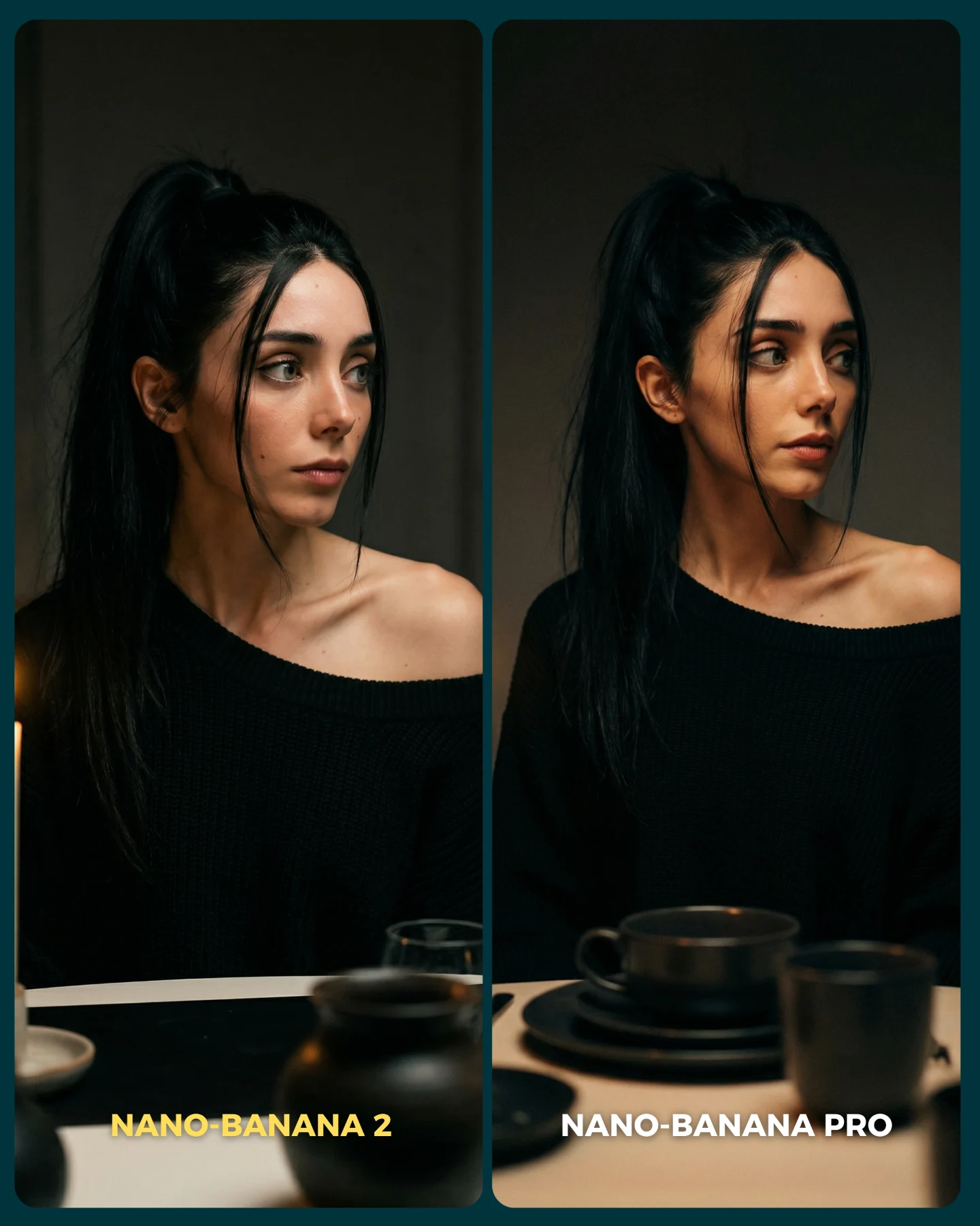
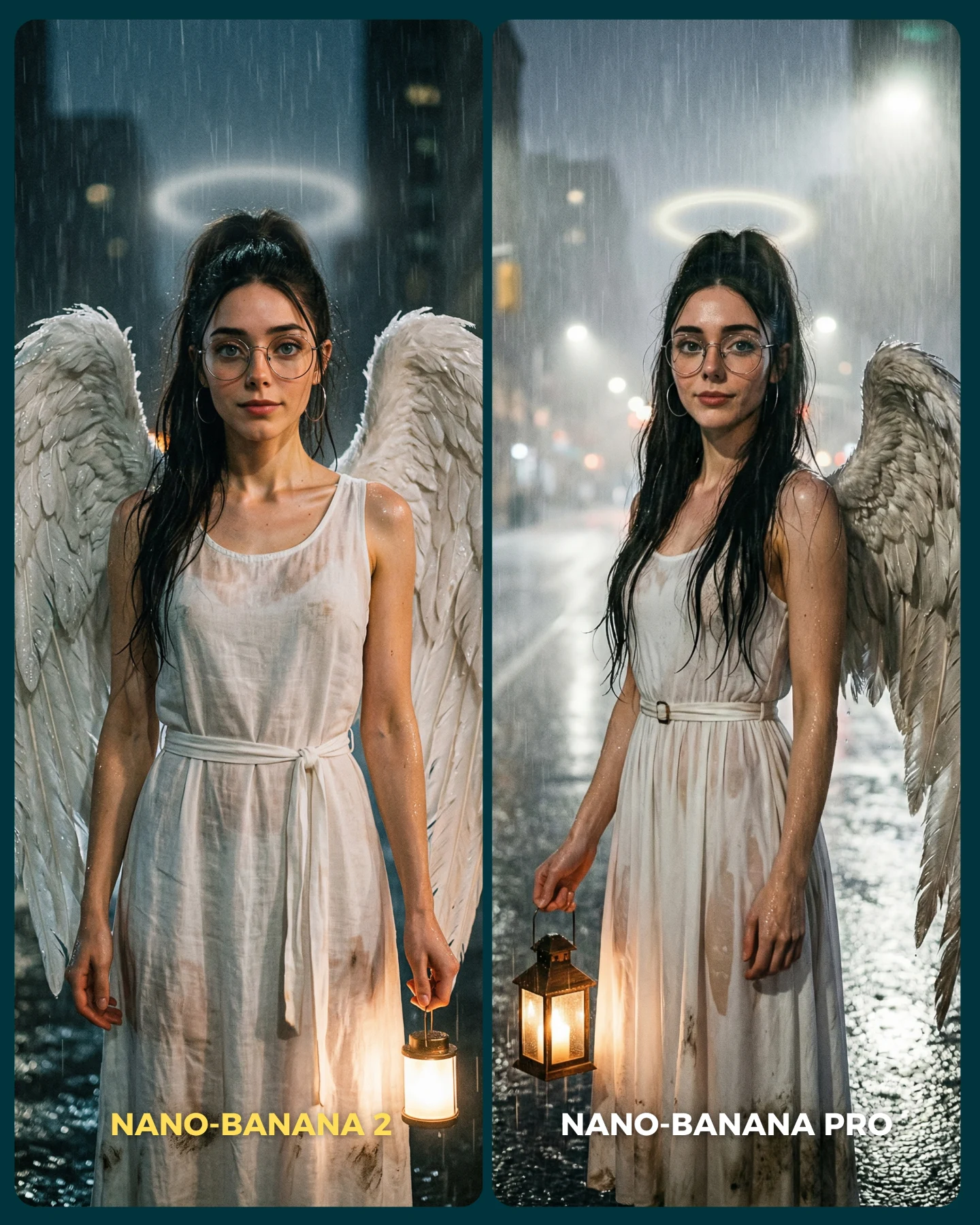
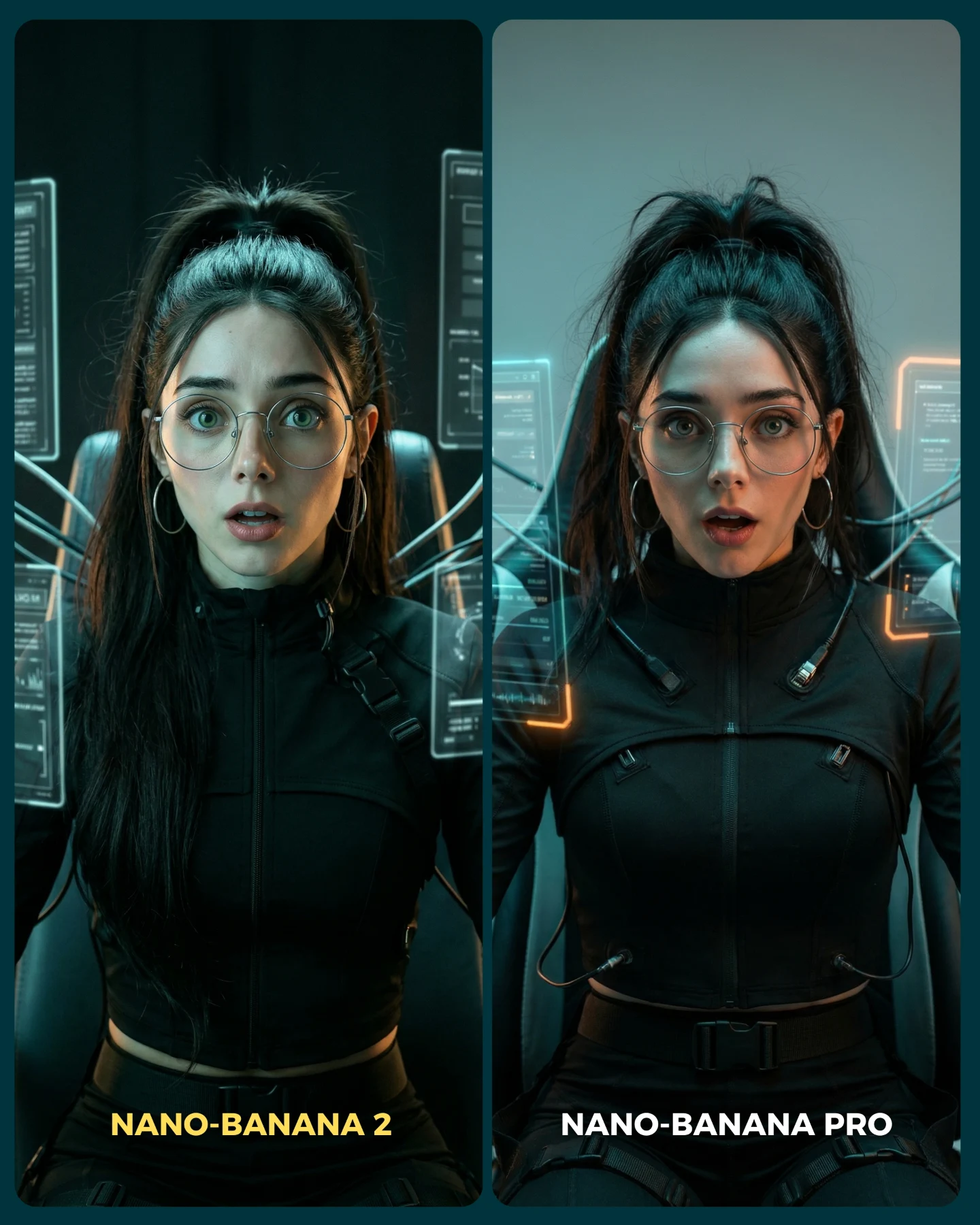
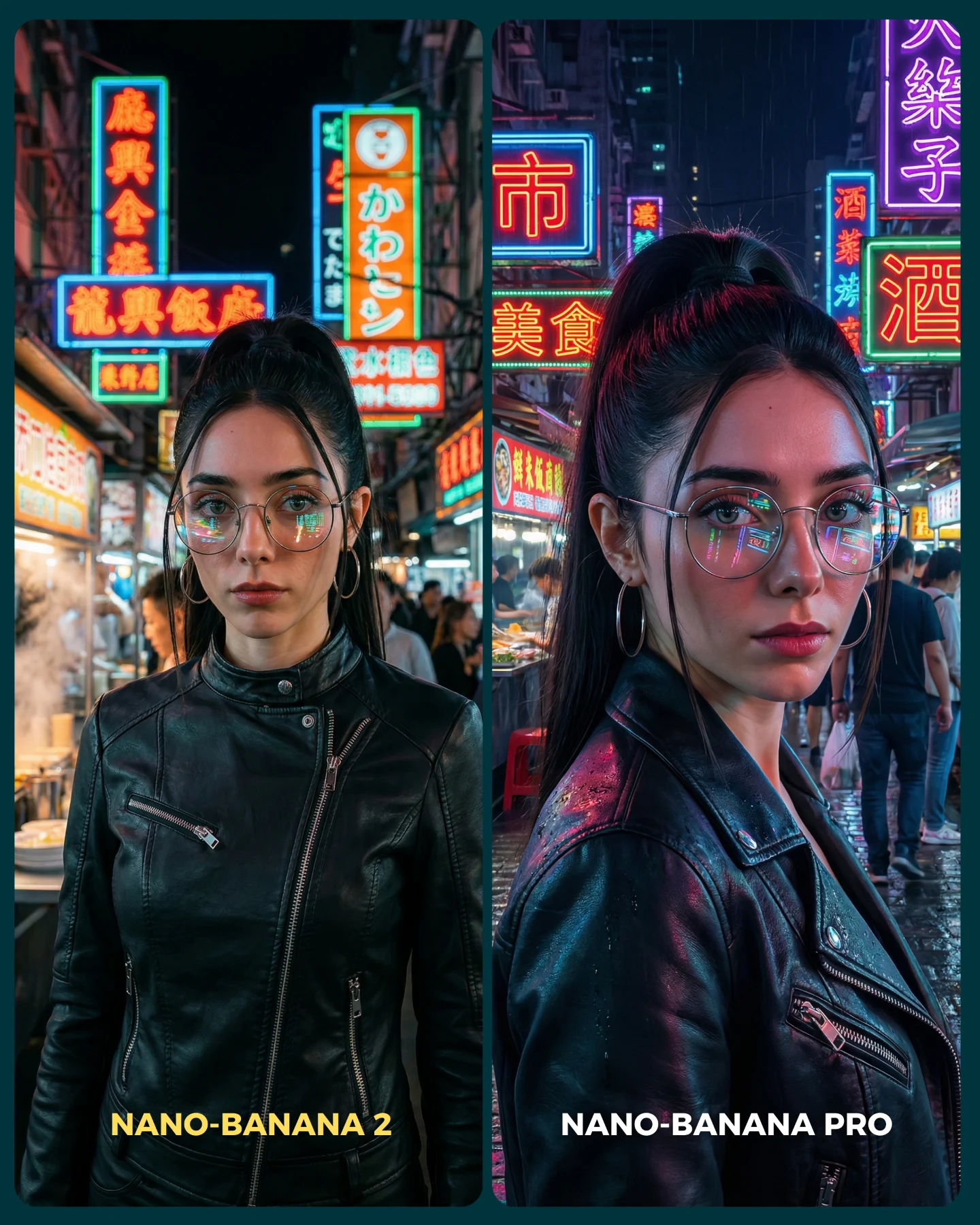
Nano Banana 2 Vs. Nano Banana PRO 💥
Google acaba de lanzar un nuevo generador de imágenes... Lleva un 2 pero no significa que sea mejor que el Pro 👀 (No es Nano Banana Pro 2)
Para ponerlo realmente a prueba, las imágenes que he seleccionado para testearlo son todas las que Nano Banana Pro me daba "poco realistas"
Tras ver los resultados... Sigo pensando que la versión Pro lo hace mejor que la nueva 😅 Pero si es verdad que en algunas ocasiones no es así!
Igualmente quiero escuchar tu opinión al respecto 💌 Y comenta "ARIA" si quieres que te pase los prompts de todas las imágenes 💕
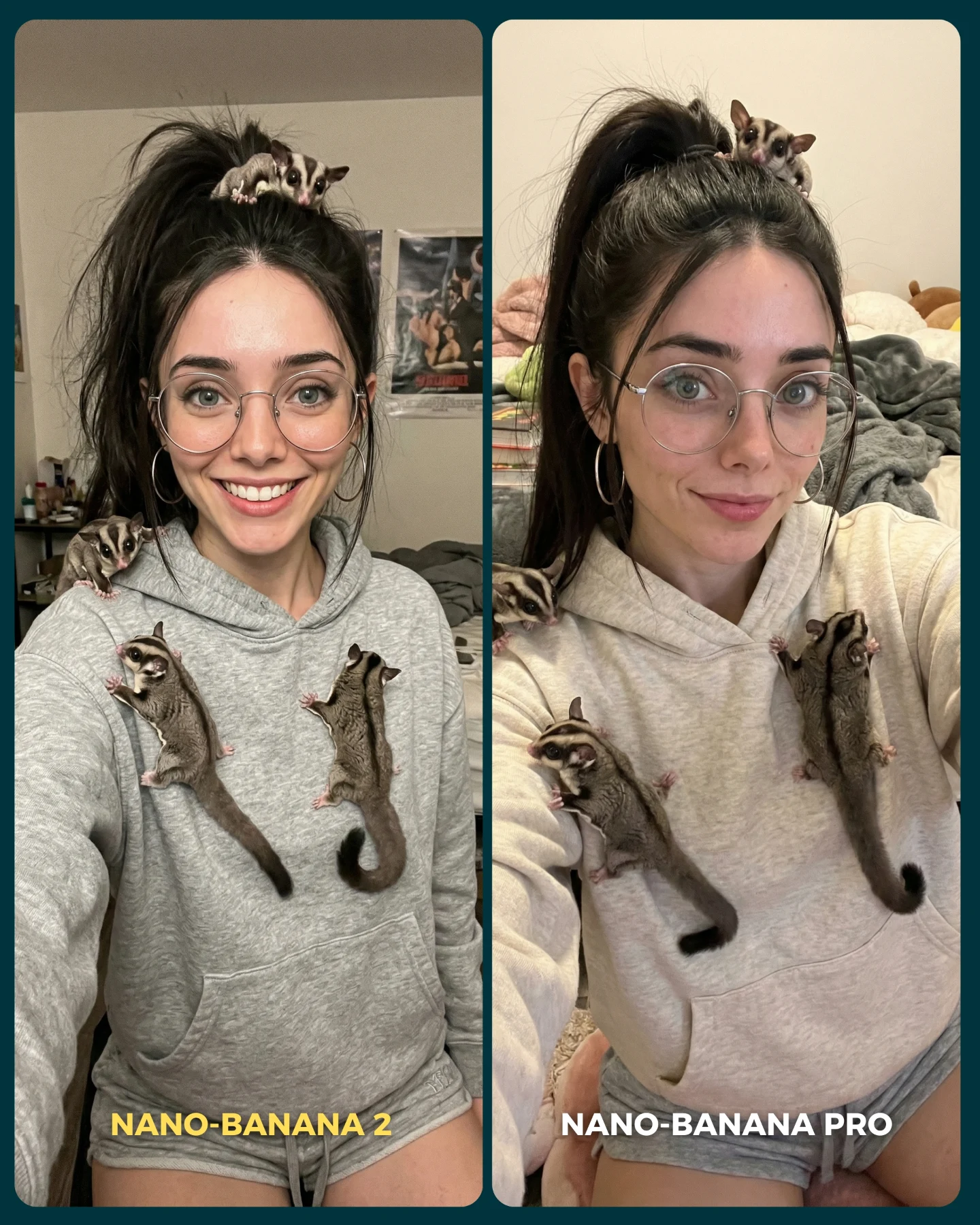
Sugar Glider Selfie Model Comparison AI Photo
This image works because it is not trying to hide the comparison. It leans into it. Two nearly identical selfies sit side by side, the framing is intentionally matched, and the labels make the benchmark explicit. That clarity turns a cute animal selfie into a much stronger creator asset: viewers are not only reacting to the woman and the sugar gliders, they are evaluating model performance in real time.
That is why this format performs so well in AI-native feeds. It combines emotional immediacy with technical auditability. The face, hoodie texture, eyewear, pet count, paw placement, bedroom realism, and subtle lighting differences can all be inspected in one glance. Instead of asking the audience to imagine a result, the post shows two results and invites judgment.
Why This Format Performs
The strongest part of the image is controlled repetition. The same subject appears twice with almost the same pose, same clothes, same pets, and same environment. When a model can hold all of those variables stable, the audience reads it as competence. When small differences appear, the audience reads them as meaningful. That is the exact condition you want for comparison content.
The second reason it works is the animal choice. Sugar gliders are detail-sensitive subjects. They have small paws, thin tails, delicate ears, and a specific way of clinging to fabric and skin. That makes them useful stress-test props. If the model handles them well while also preserving a believable selfie perspective, the image feels impressive without needing any spectacle.
Signal
Evidence (from this image)
Mechanism
Replication Action
Explicit benchmark framing
Both panels are labeled and arranged as a direct A/B test.
Viewers instantly understand that the post is about comparison, not just a single cute photo.
Use matched side-by-side panels with visible version labels and a clear divider.
Identity consistency
The woman keeps the same glasses, ponytail, hoodie, earrings, and room context in both halves.
Stable repeated identity is the main proof point in model-quality discussions.
Lock face, outfit, and environment before experimenting with smaller aesthetic changes.
High-detail prop challenge
Five sugar gliders must remain anatomically believable and naturally attached to the hoodie and shoulders.
Complex small animals expose whether a model can preserve fine structure under repetition.
Pick props that are cute but structurally demanding, then specify their placements.
Approachable creator vibe
The bedroom selfie setup keeps the image intimate and scroll-stopping rather than sterile.
Technical content spreads better when it still feels personal.
Wrap the benchmark inside an everyday social format like a selfie, mirror shot, or couch portrait.
Best Use Cases and Transfers
This pattern is excellent for model-vs-model posts, prompt engineering breakdowns, creator benchmarking carousels, and “which version wins?” engagement hooks. It also scales well across pet types, accessories, or mood shifts as long as the subject identity and composition stay tightly aligned.
Best for tool comparison: the side-by-side structure makes quality differences legible without a long caption.
Best for prompt education: viewers can see exactly which details are stable and which ones drift.
Best for save-and-comment behavior: people bookmark strong benchmark examples and comment with a preferred version.
Best for creator branding: the repeated face keeps the creator at the center even when the post is technically framed.
It is less useful for narrative storytelling, cinematic worldbuilding, or pure lifestyle content. The image is analytical by design. That is a strength here, but it also means the post should not try to pretend it is a spontaneous photo dump.
Not ideal for story-first content: the comparison frame interrupts immersion.
Not ideal for minimalist design feeds: the labels and dual panels add visible information density.
Not ideal for high-action scenes: comparison works best when pose and framing can stay stable.
Three Transfer Recipes
Pet realism benchmark. Keep: repeated selfie framing, same subject identity, challenging animals. Change: species, outfit tone, room styling. Slot template (EN): {same creator in two matched selfie panels} {small realistic animals attached in clear positions} {explicit model labels} {subtle quality differences}
Accessory consistency test. Keep: A/B split and stable face. Change: pets into hats, jewelry, gadgets, or makeup details. Slot template (EN): {same selfie duplicated} {same face and outfit} {detail-heavy accessories preserved across both panels} {comparison layout}
What makes this image appealing is the balance between control and warmth. The layout is rigid, but the actual subject matter is playful. A young woman in a hoodie with sugar gliders on her shoulders would already be an engaging selfie. Turning that into a controlled comparison makes the post feel smarter without making it cold.
The expression difference between the two halves is also useful. One side smiles wider; the other is softer and more reserved. That tiny shift gives the audience something to read beyond technical fidelity. It makes the two panels feel meaningfully different while still remaining comparable. The result is a benchmark image that still has personality.
Observed
Why it matters for recreation
Dark teal outer frame and center divider
The border instantly signals structured comparison instead of a casual photo collage.
Bottom labels inside each panel
Version names are legible without stealing too much attention from the face.
Five sugar gliders in stable positions
The animal count and placements are key proof points for prompt control.
Gray hoodie and glasses
These simple identity anchors make the subject easy to recognize across both outputs.
Messy bedroom background
The room adds realism and prevents the benchmark from feeling like a sterile render demo.
Prompt Technique Breakdown
To recreate this well, you need to prompt both for duplication and for sameness. If you only ask for “split-screen comparison,” the two halves may drift too far apart. If you only ask for “same woman with sugar gliders,” you may get one normal portrait instead of a benchmark graphic. The technique is to define the comparison shell first, then define the identity lock.
Prompt chunk
What it controls
Swap ideas (EN, 2-3 options)
two side-by-side vertical selfie panels with a dark teal border
The benchmark layout and readability
A/B comparison graphic; dual portrait test frame; split-screen model showdown
same young woman with glasses, hoop earrings, high ponytail, gray hoodie
Identity continuity across both outputs
same creator repeated twice; matching selfie subject; stable face and wardrobe across panels
five realistic sugar gliders on head, shoulders, and hoodie
Fine-detail challenge and visual hook
small climbing marsupials; realistic sugar glider placements; pet realism stress test
casual bedroom selfie with bed and soft clutter in the background
slight lighting and expression differences between the two panels
Meaningful variation without breaking comparability
same pose, subtle mood shift; matched framing with gentle output difference; near-identical A/B render pair
bottom labels for each model version
Immediate comprehension of the comparison premise
version tags inside panels; tool names at lower edge; simple benchmark captions
Remix Steps
Lock the panel structure first. Then lock the repeated identity markers: glasses, ponytail, hoodie, earrings, room. After that, focus on the hardest object class in the scene, which is the sugar gliders. Their anatomy and placements will decide whether the benchmark feels convincing.
Run 1: generate the two-panel layout and make sure both halves share the same framing and camera distance.
Run 2: stabilize the woman’s face, eyewear, hairstyle, and hoodie so the identity reads as one repeated subject.
Run 3: correct the sugar gliders until the count, limb placement, tails, and fur texture feel believable.
Run 4: fine-tune label placement, bedroom realism, and subtle lighting difference so the comparison looks intentional rather than accidental.
If the image becomes messy, reduce background noise before reducing the animals. The animals are the main stress test. The room should support the comparison, not compete with it.