How soy_aria_cruz Made This Nano Banana 2 vs Nano Banana Pro AI Art — and How to Recreate It
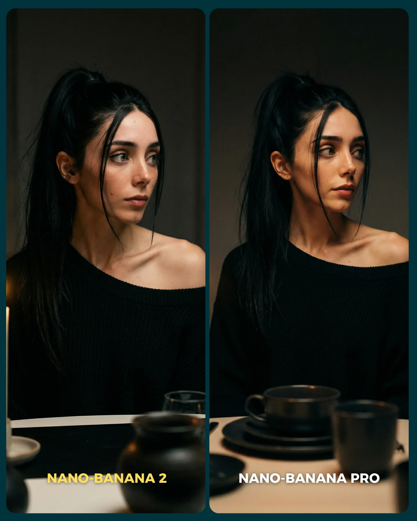
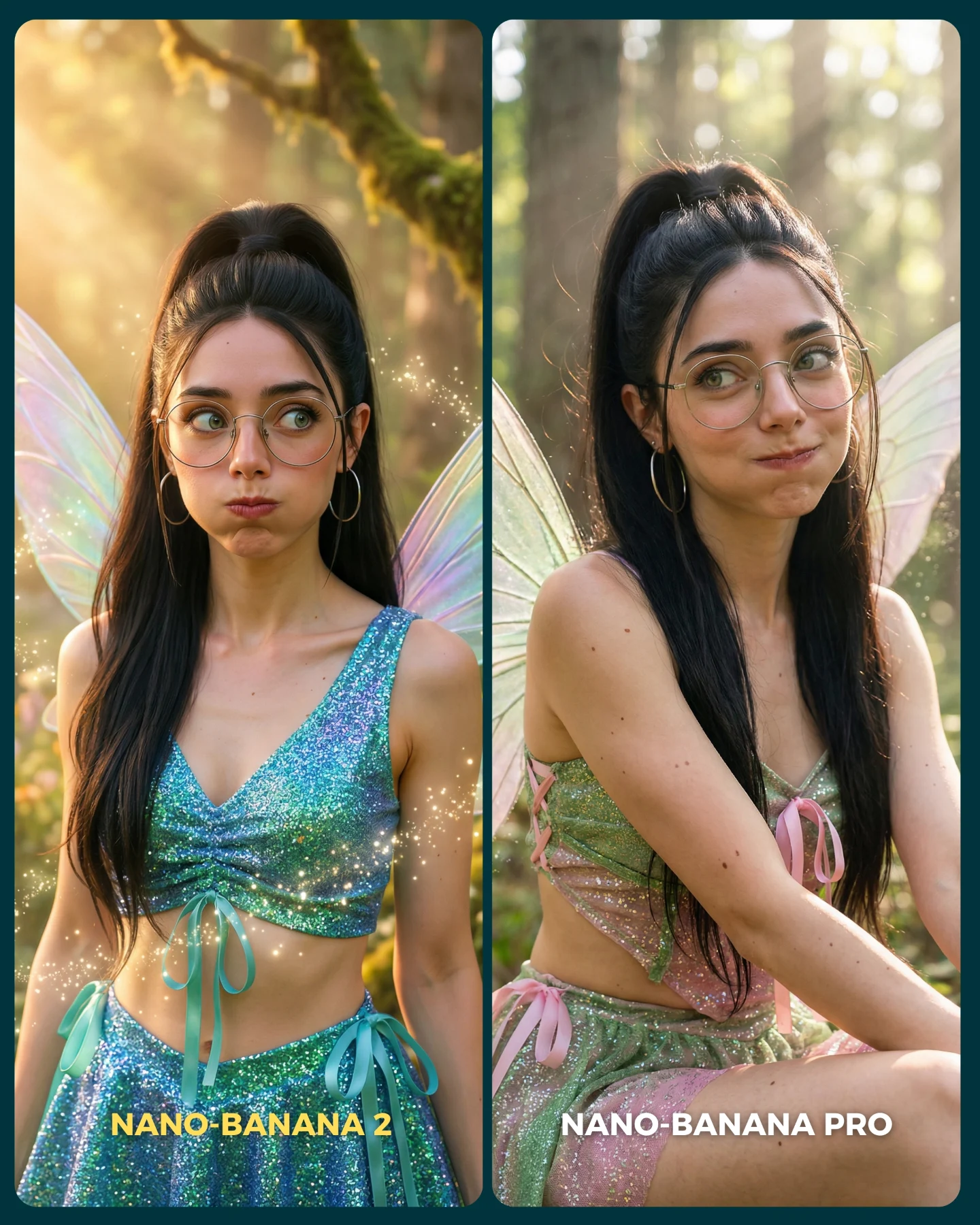
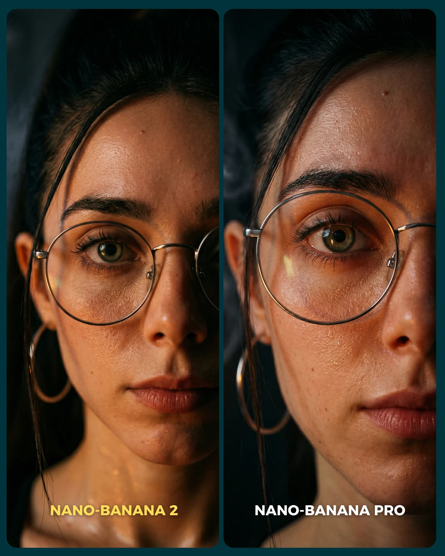
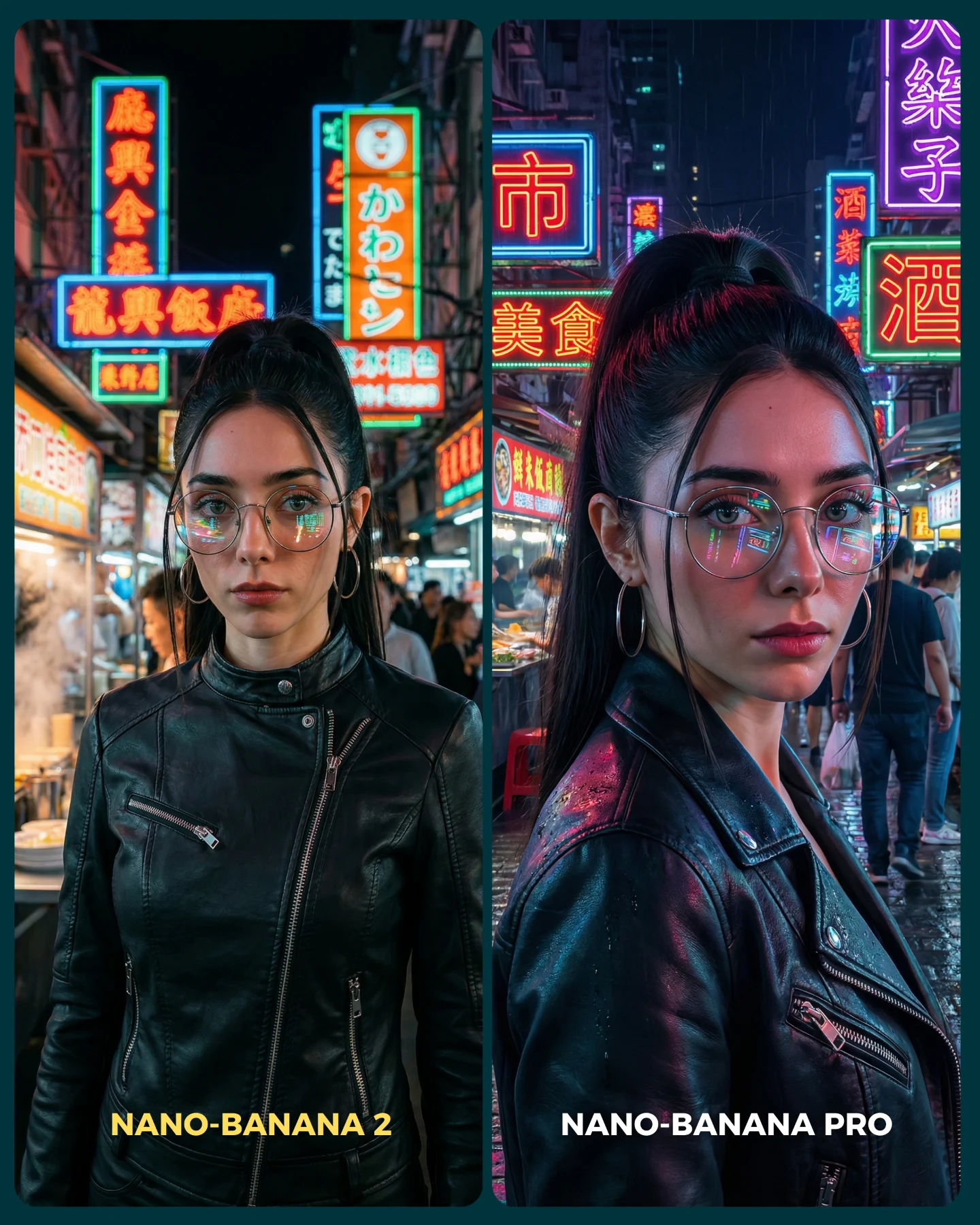
This image is useful because it tests a part of image generation that people often underestimate: restraint. There are no wings, no rainstorm, no big action cue, no emotional theatrics. Instead, the comparison lives in shadow handling, facial structure, knit texture, tableware realism, and whether the scene still feels human when almost nothing dramatic is happening. That is exactly why it is such a good benchmark.
The caption explains that the creator selected prompts where realism tends to fail. A dark indoor portrait like this absolutely belongs in that category. Low light is unforgiving. If shadows collapse too aggressively, the face dies. If skin is smoothed too much, the portrait feels fake. If the table objects become muddy, the scene stops feeling tactile. The best model is not the one that adds more drama. It is the one that keeps the scene believable while staying subtle.
Why the Side-by-Side Works So Well
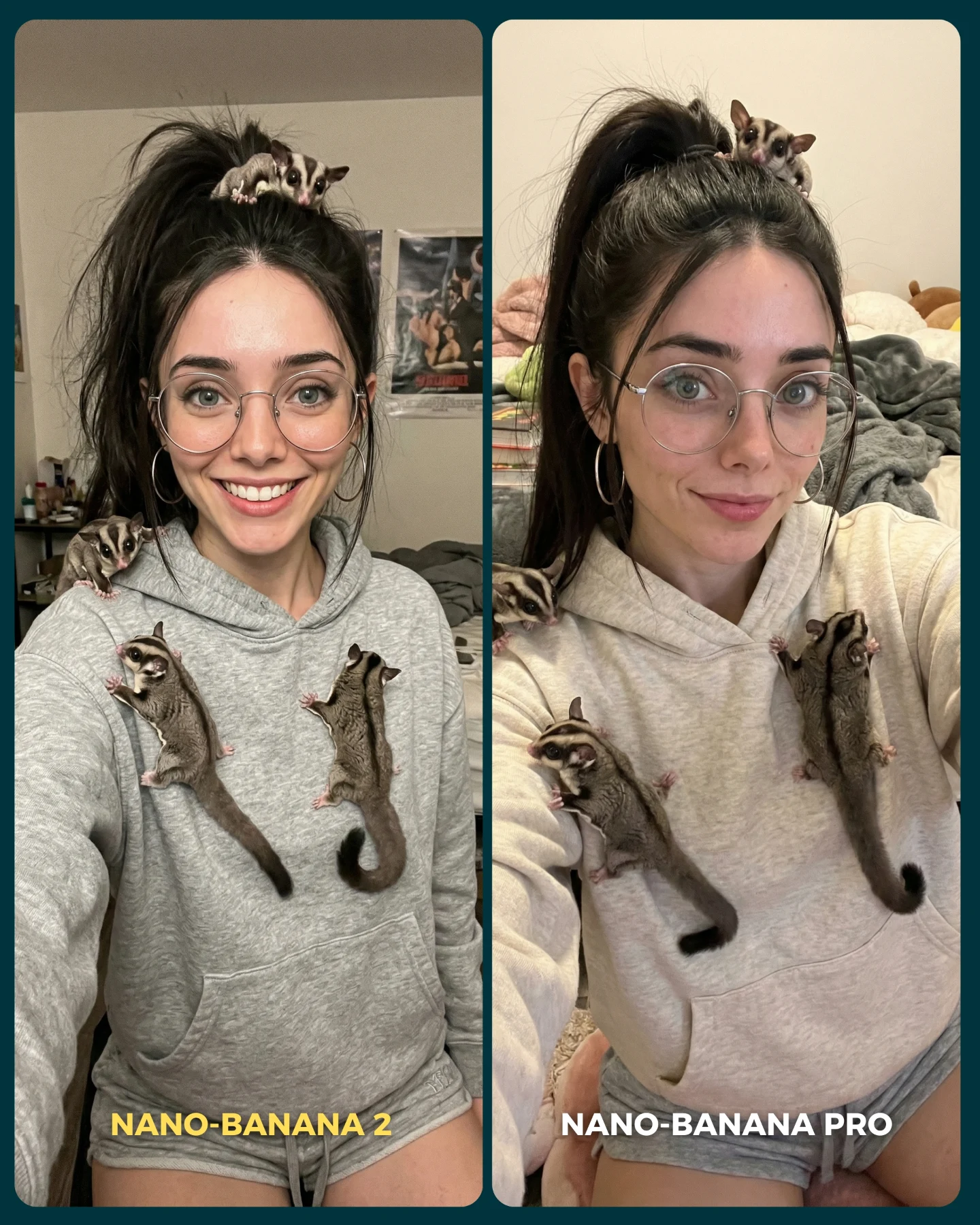
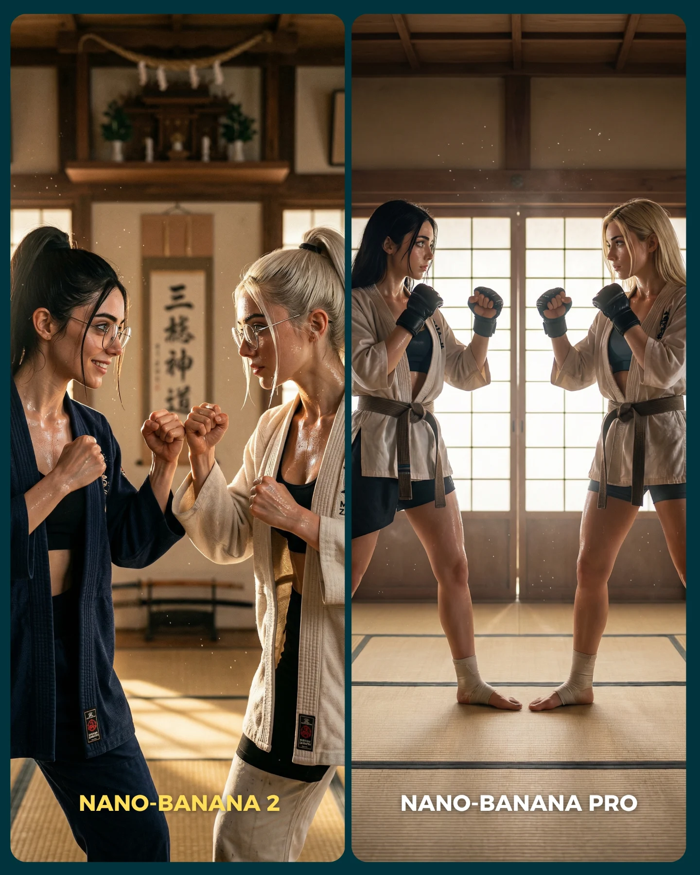
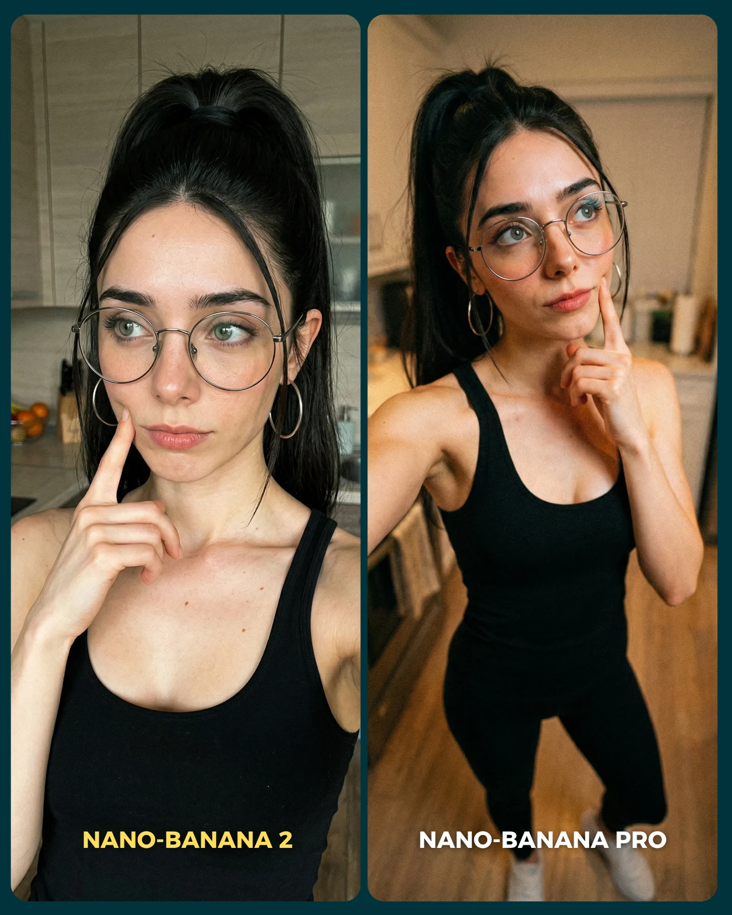
The strongest thing here is control. Both sides hold nearly the same character, pose, and mood, which means viewers can focus on micro-differences instead of being distracted by a different concept. This is what good benchmark content should do. It should remove excuses. When the variables are held steady, the renderer has nowhere to hide.
The tableware also matters more than it first appears. Cups, bowls, and plates are simple shapes, but they reveal whether the model can handle matte surfaces, edge definition, and believable depth in a dark scene. Those objects quietly support the realism test. They act like witnesses. If they feel wrong, the portrait feels wrong too.
| Signal | Evidence (from this image) | Mechanism | Replication Action |
|---|
| Subtle realism benchmark | The scene relies on face shape, skin, knit fabric, and shadow transitions instead of spectacle. | Quiet portraits expose weak rendering choices faster than flashy scenes do. | Test models on low-amplitude scenes where realism must carry the image. |
| Controlled comparison format | Same woman, same pose family, same dark interior, clear bottom labels. | The audience can evaluate render quality directly rather than guessing what changed. | Keep identity and composition locked when comparing models. |
| Material credibility | Black knit sweater and matte ceramic tableware remain visible in low light. | Material handling in shadow is a strong proxy for overall realism quality. | Include 2-3 quiet objects with different surfaces when testing indoor realism. |
What Viewers Are Actually Judging Here
Most people think they are judging beauty, but what they are really judging is coherence. Does the face sit naturally inside the light? Does the shoulder feel anatomically believable? Does the sweater absorb light the way knit fabric should? Do the cups on the table feel like they belong to the same world as the subject? In low-light realism tests, these small agreements matter more than any single detail.
This is also why the more realistic side usually feels calmer. A strong model does not need to oversell the image. It lets the scene breathe. That restraint is often the difference between a render that looks impressive for one second and a portrait that keeps looking credible after ten seconds of scrutiny.
Where This Format Fits Best
This kind of comparison is ideal for model benchmarking, prompt education, quiet-luxury portrait testing, and AI influencer pages that want to prove realism rather than fantasy range. It is especially useful for creators whose audience cares about taste, subtlety, and photographic plausibility.
- Indoor realism benchmarks: perfect fit because low light reveals weakness quickly.
- Prompt analysis content: strong fit because creators can discuss how shadow control changes the result.
- AI influencer identity testing: useful because the character must remain believable without flashy support.
- High-taste comparison posts: effective when the goal is to compare refinement, not spectacle.
It is less useful for purely entertainment-driven posts where viewers want obvious contrast or meme-friendly differences. This is a finer-grained comparison.
Three Transfer Recipes
| Transfer | Keep | Change | Slot Template (EN) |
|---|
| Cafe-night benchmark version | Low-light realism test, same identity anchors, side-by-side labels. | Swap the tableware for coffee cups and window reflections while keeping the moody portrait structure. | {two-panel comparison} {same woman identity} {low-light indoor portrait} {subtle realism benchmark} |
| Restaurant editorial version | Quiet side gaze, dark interior, material realism. | Add elegant glassware or linen while preserving the restrained composition. | {diptych portrait card} {same subject} {dark dining scene} {model realism comparison} |
| Studio-shadow portrait version | Controlled pose and low-amplitude emotion. | Remove tableware and test only face, knitwear, and tonal transitions against a dark backdrop. | {side-by-side benchmark} {same character anchors} {shadow portrait test} {left-right realism contrast} |
Aesthetic Read
The image works visually because it understands negative space. The dark background is not empty in a careless way. It is quiet on purpose. That quietness allows the face, exposed shoulder, and tabletop ceramics to become more sculptural. The off-shoulder sweater is particularly smart because it introduces a clean skin-to-fabric boundary, which is one of the best realism tests available in portrait work.
The palette is also highly disciplined: black knit, pale skin, muted warm shadows, and dark ceramic forms. That limited palette is why the comparison stays elegant. When a benchmark uses too many colors, viewers often respond to styling first. Here, they are forced to respond to rendering quality.
| Observed | Recreate |
|---|
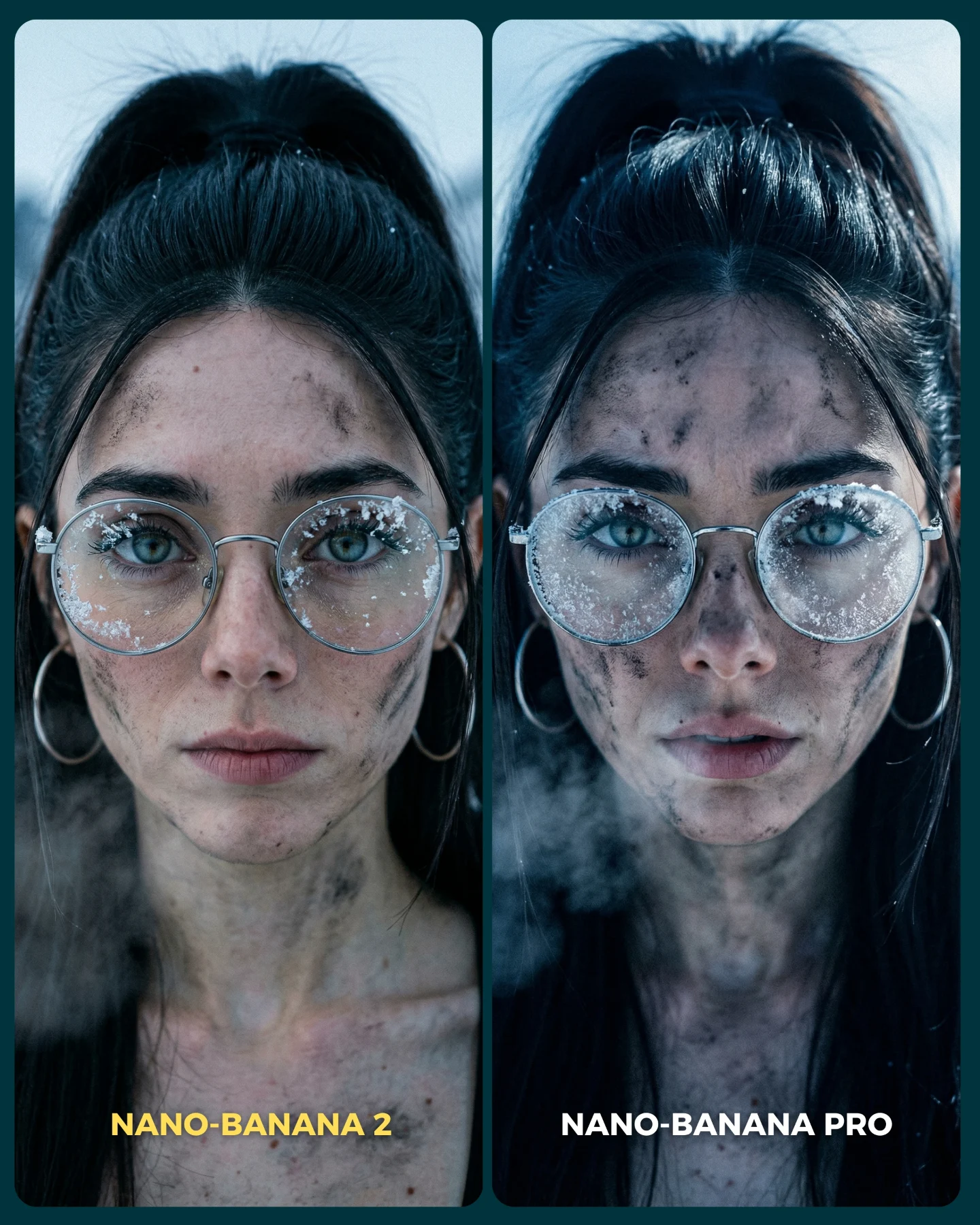
| Moody low-key lighting with readable skin detail | Keep the scene dark, but do not crush the face into shadow. |
| Off-shoulder black knit sweater as a realism test | Use clothing that reveals both soft fabric texture and a clean skin edge. |
| Matte ceramic tableware in the lower frame | Add grounded still-life objects to test shape and material control. |
| Same pose family across both comparison panels | Freeze posture and framing so only renderer quality is under debate. |
Prompt Technique Breakdown
If you want a fair comparison in scenes like this, lock the subtle things first. Quiet images are fragile. Small drift becomes obvious quickly.
| Prompt chunk | What it controls | Swap ideas (EN, 2–3 options) |
|---|
| same woman with high ponytail, side gaze, off-shoulder black sweater | Locks identity, pose, and silhouette. | same bob haircut and black turtleneck; same braid and silk blouse; same face with soft cardigan |
| low-light indoor table portrait with dark ceramic dishes | Creates the realism challenge around shadow and material control. | candlelit cafe table; moody restaurant setup; dark studio dining still life |
| two-panel labeled comparison card | Makes the benchmark readable on social. | model A/B diptych; version comparison layout; side-by-side portrait card |
| left more shadow-heavy, right more naturalistic | Defines the evaluation axis without changing the concept. | left moodier right cleaner; left more stylized right more grounded; left denser shadows right better tonal realism |
| plain dark background | Removes distractions so the viewer judges rendering quality. | minimal wall shadow; soft dark studio backdrop; muted interior void |
Remix Steps
Start by freezing the same woman, same sweater, and same lighting direction across both sides. Then lock the table objects. Only after those are stable should you vary the model.
- Run 1: lock identity anchors, pose direction, and shoulder exposure.
- Run 2: lock low-key lighting and make sure face detail survives inside the shadows.
- Run 3: keep the ceramic tableware constant while switching render methods or models.
- Run 4: add labels and final card styling so viewers can judge the difference immediately.
The larger creator lesson is that good benchmark content is often quiet. When the scene is stripped down to light, skin, fabric, and form, the stronger renderer becomes much easier to recognize.