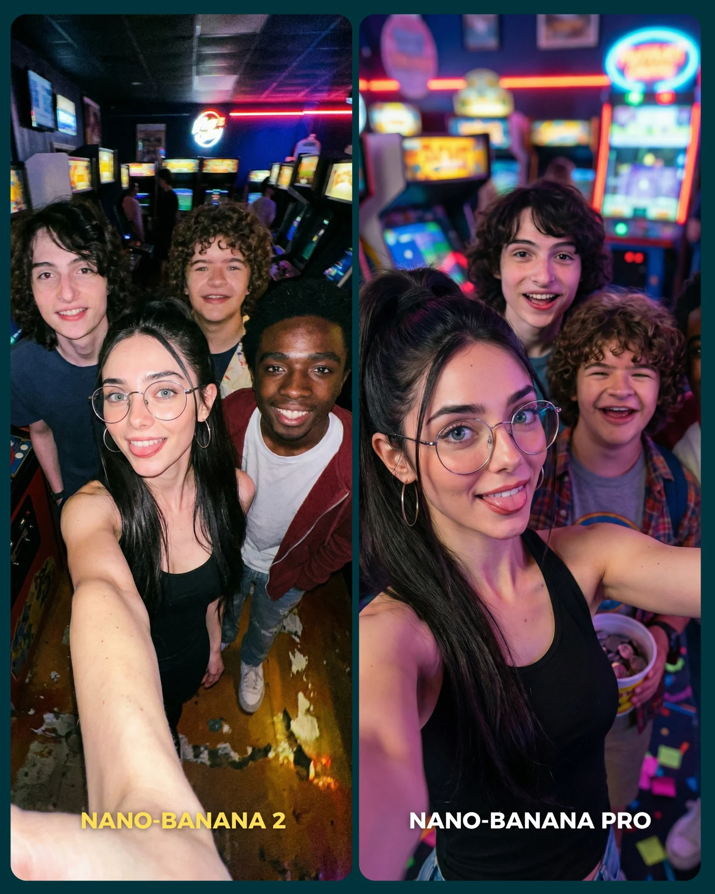
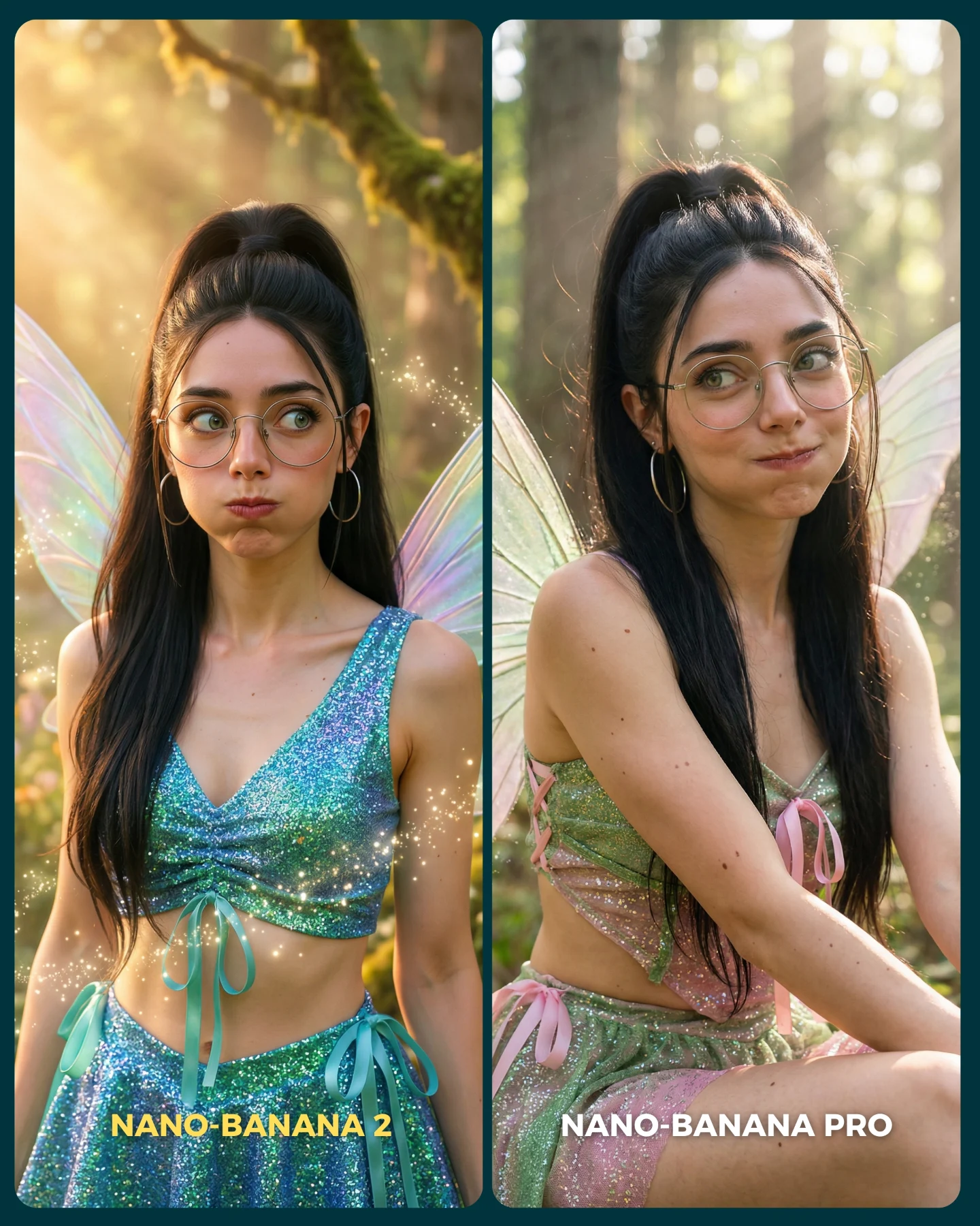
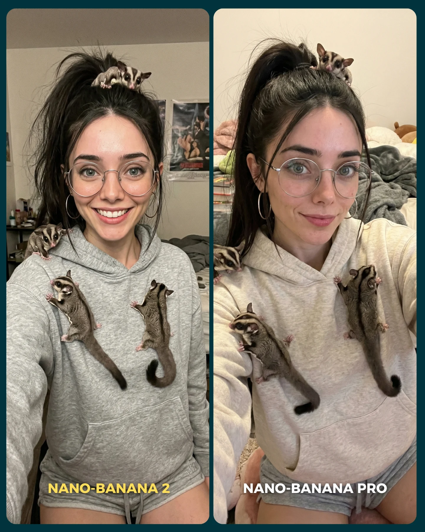
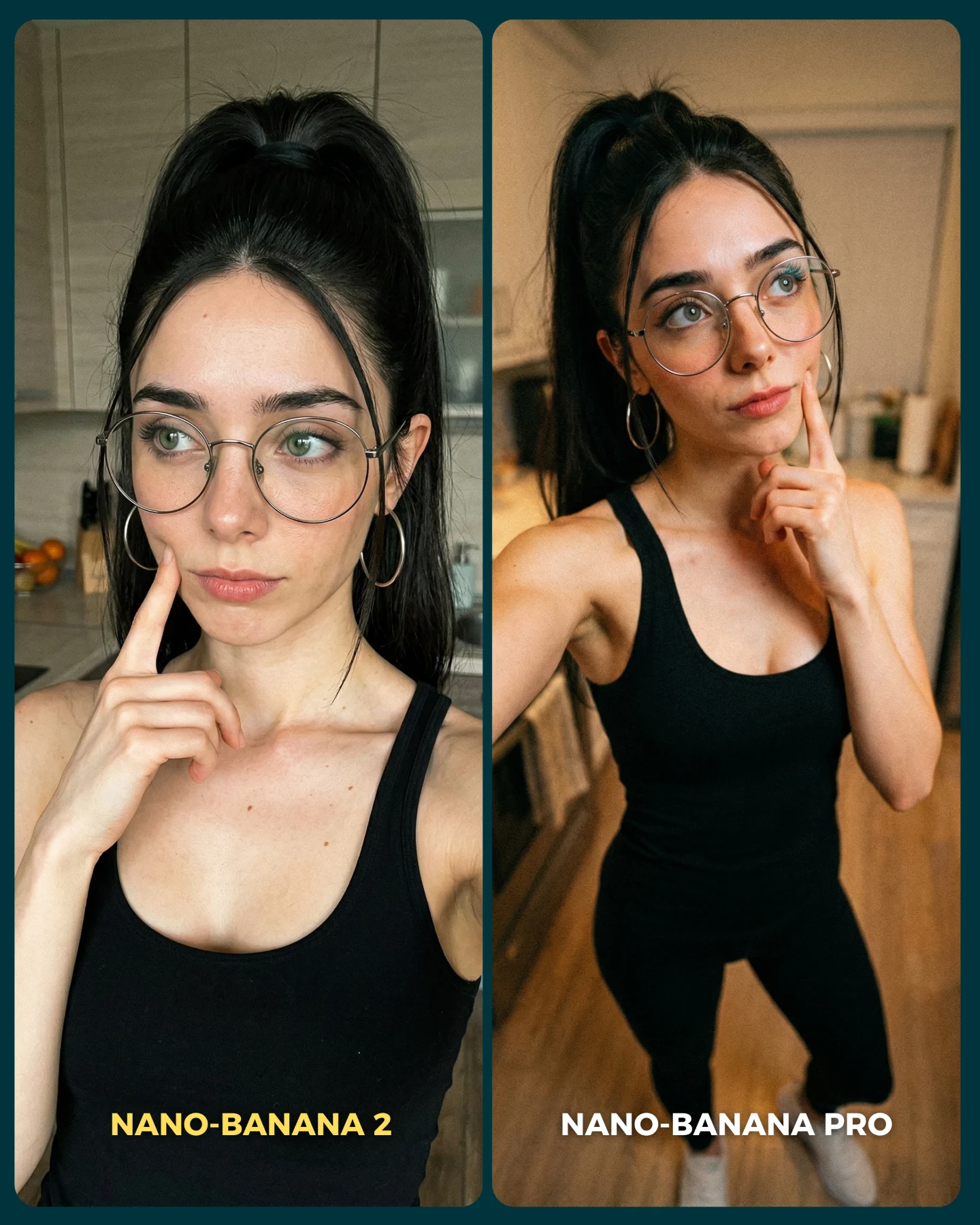
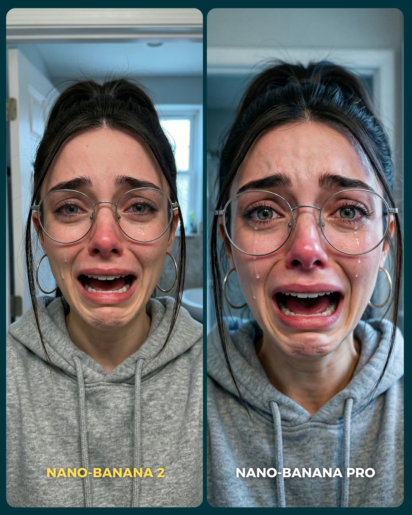
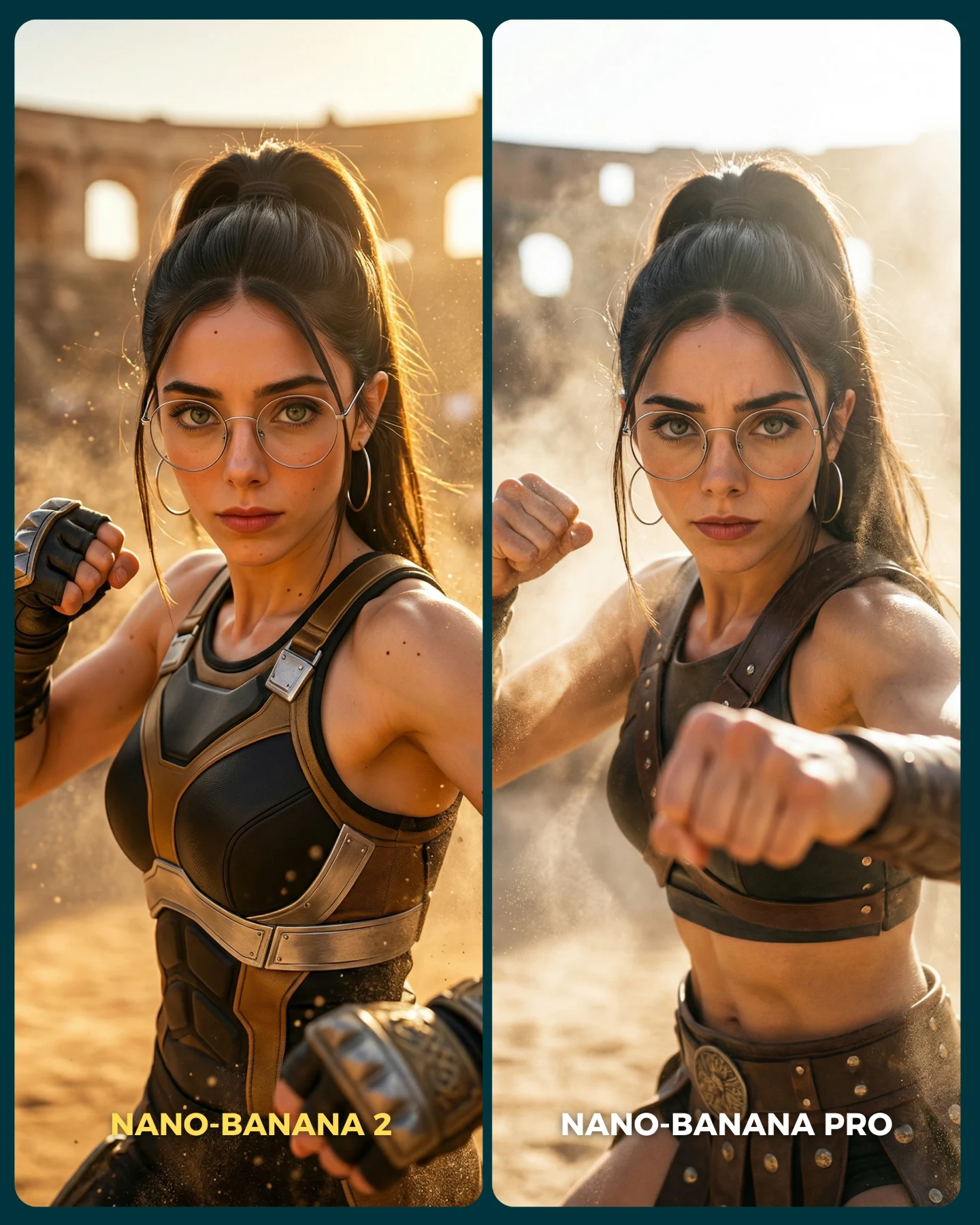
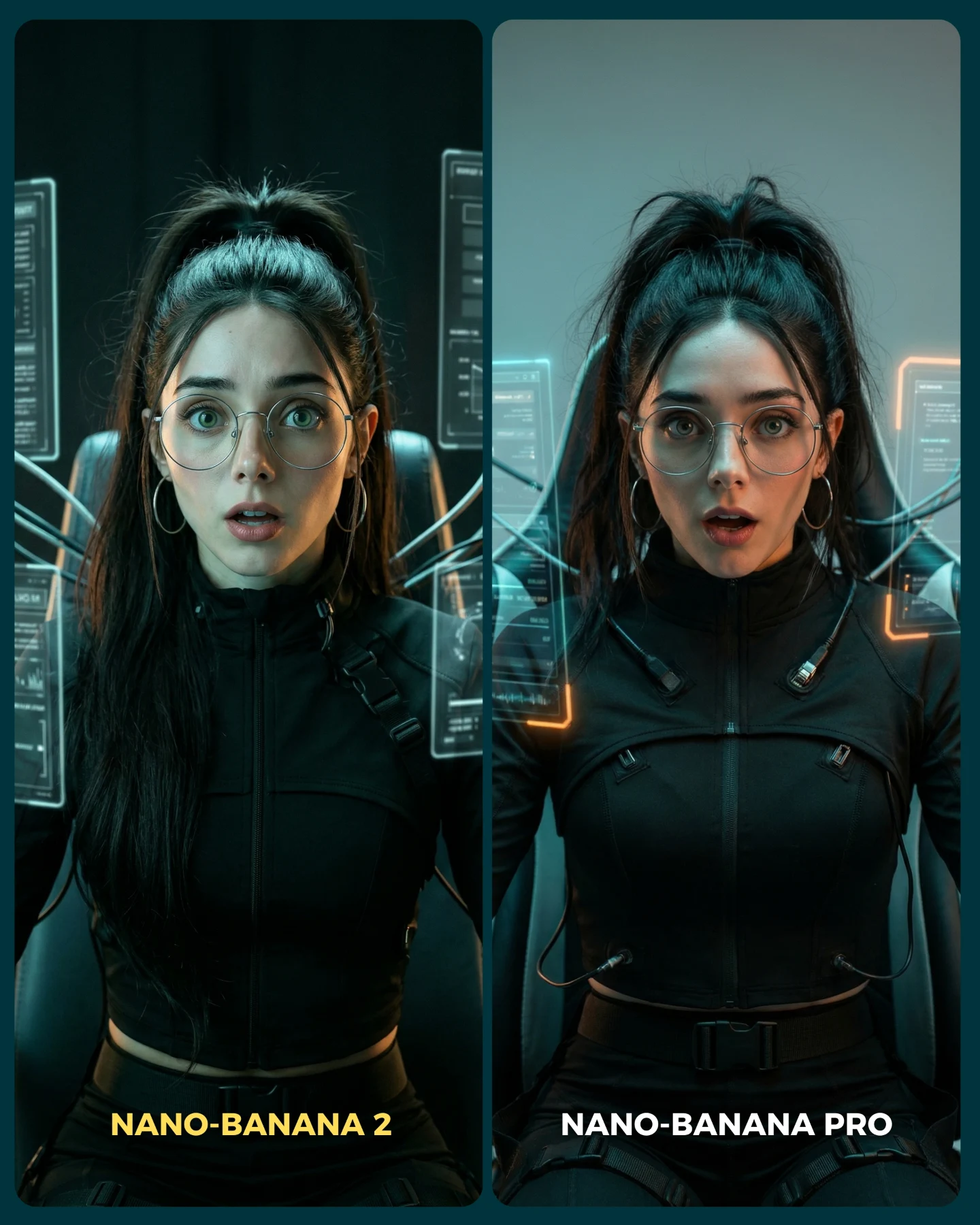
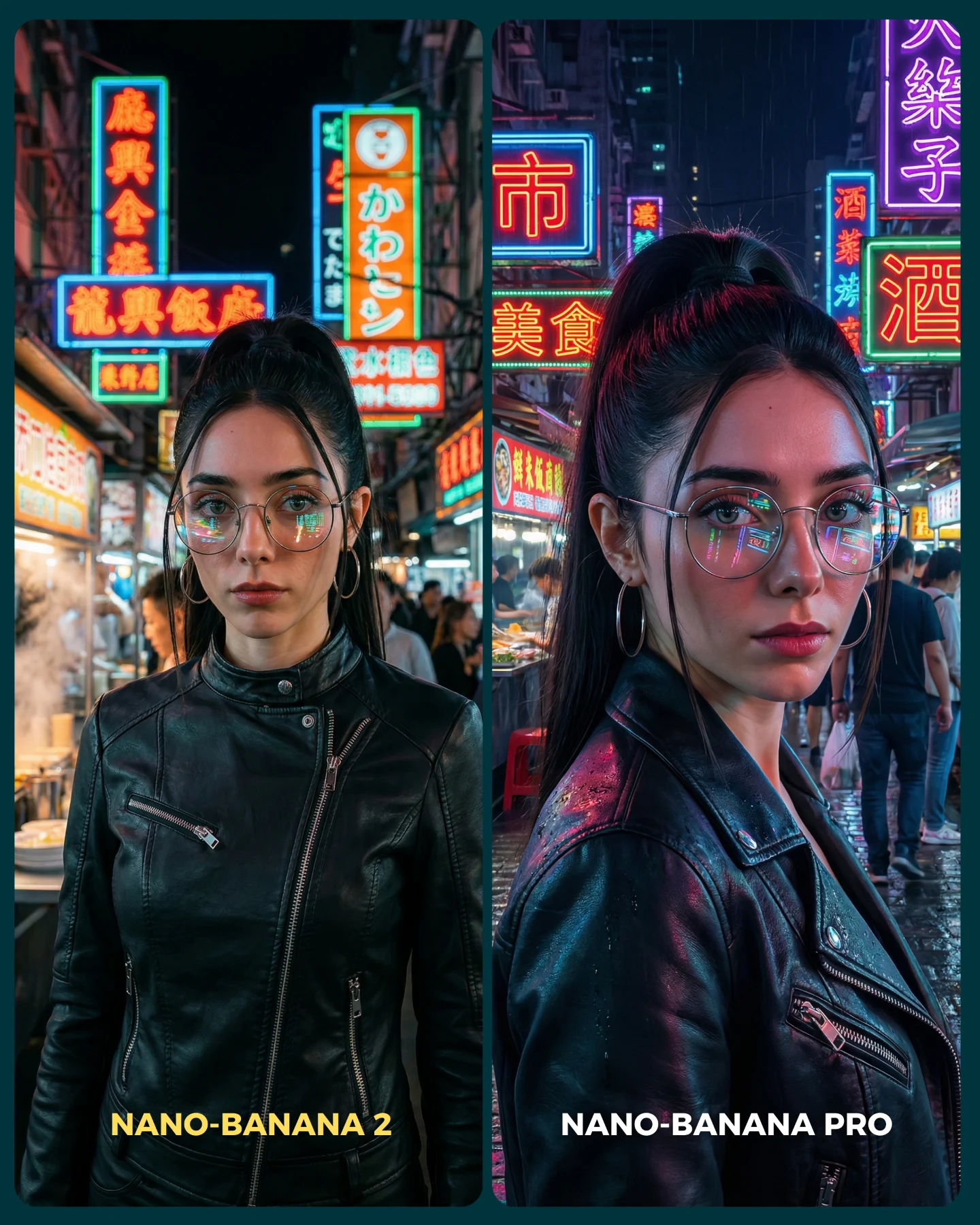
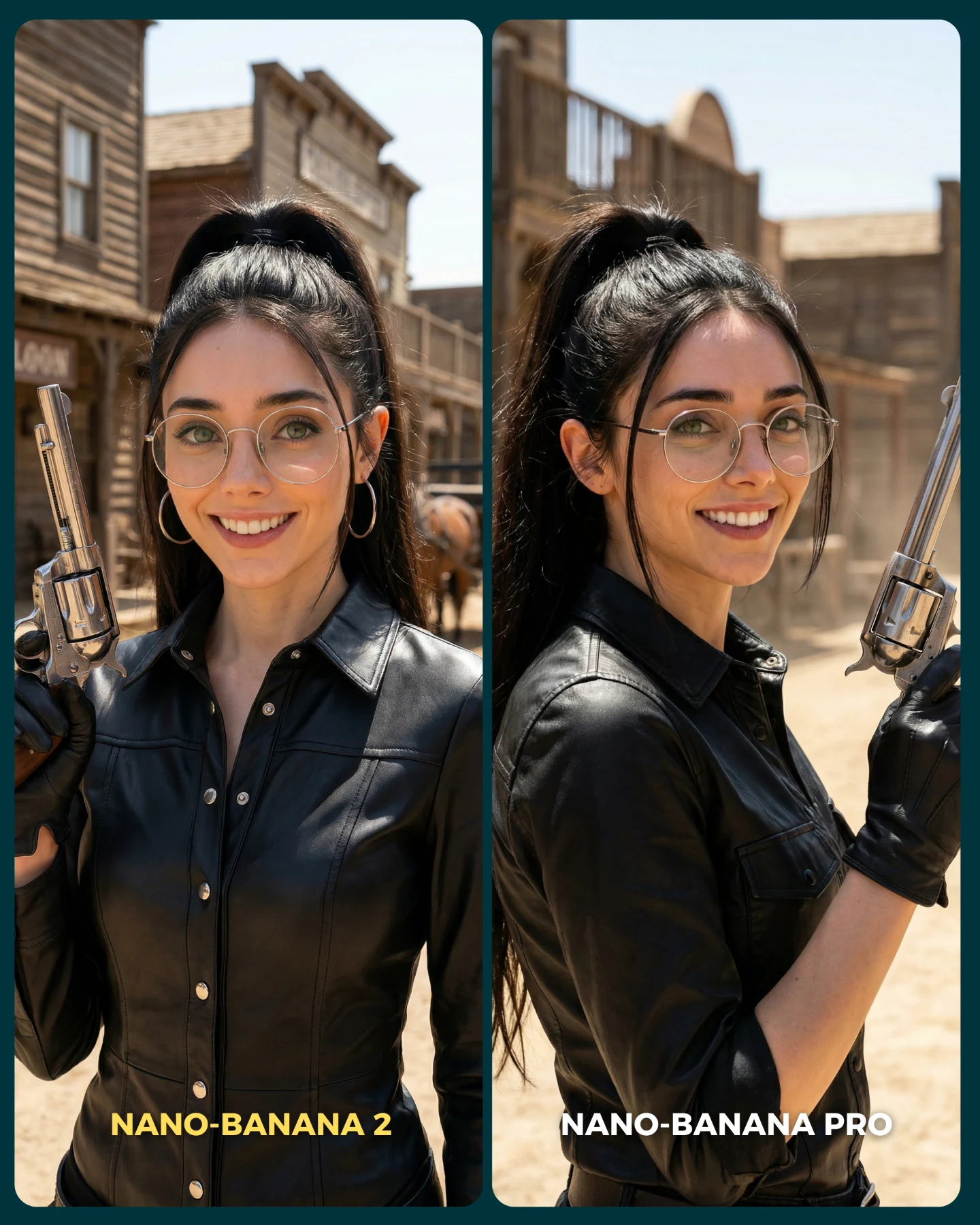
Nano Banana 2 Vs. Nano Banana PRO 💥
Google acaba de lanzar un nuevo generador de imágenes... Lleva un 2 pero no significa que sea mejor que el Pro 👀 (No es Nano Banana Pro 2)
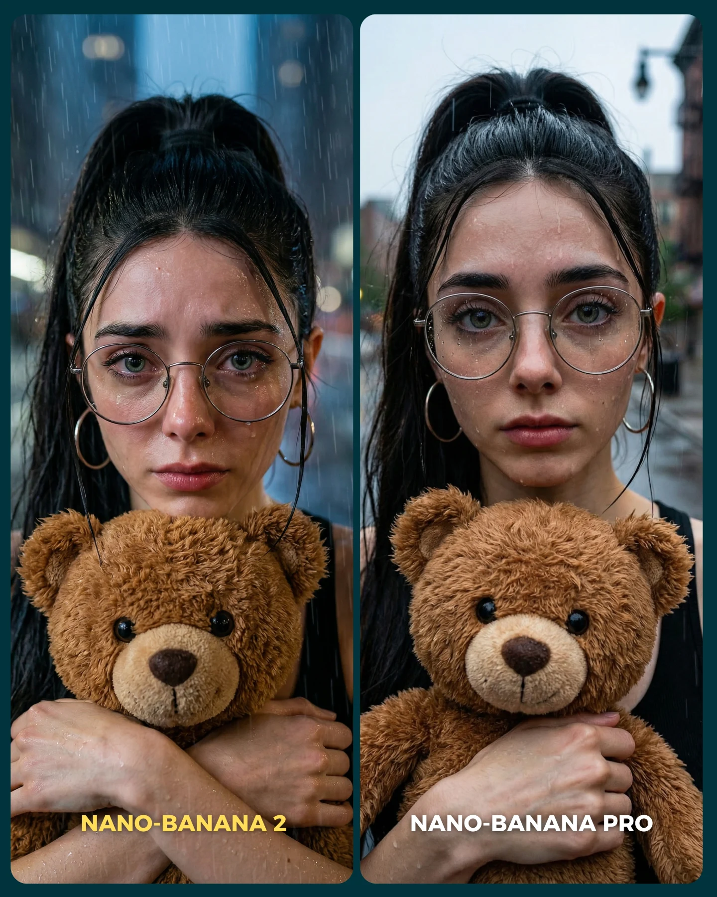
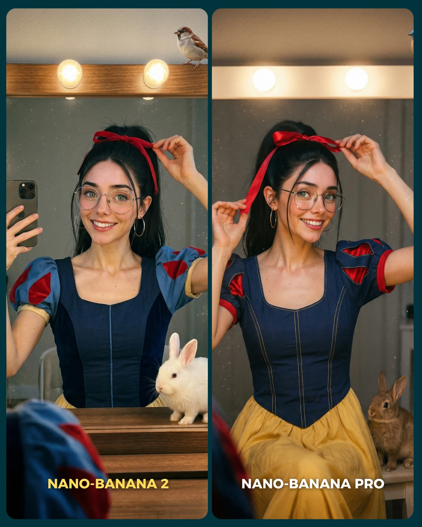
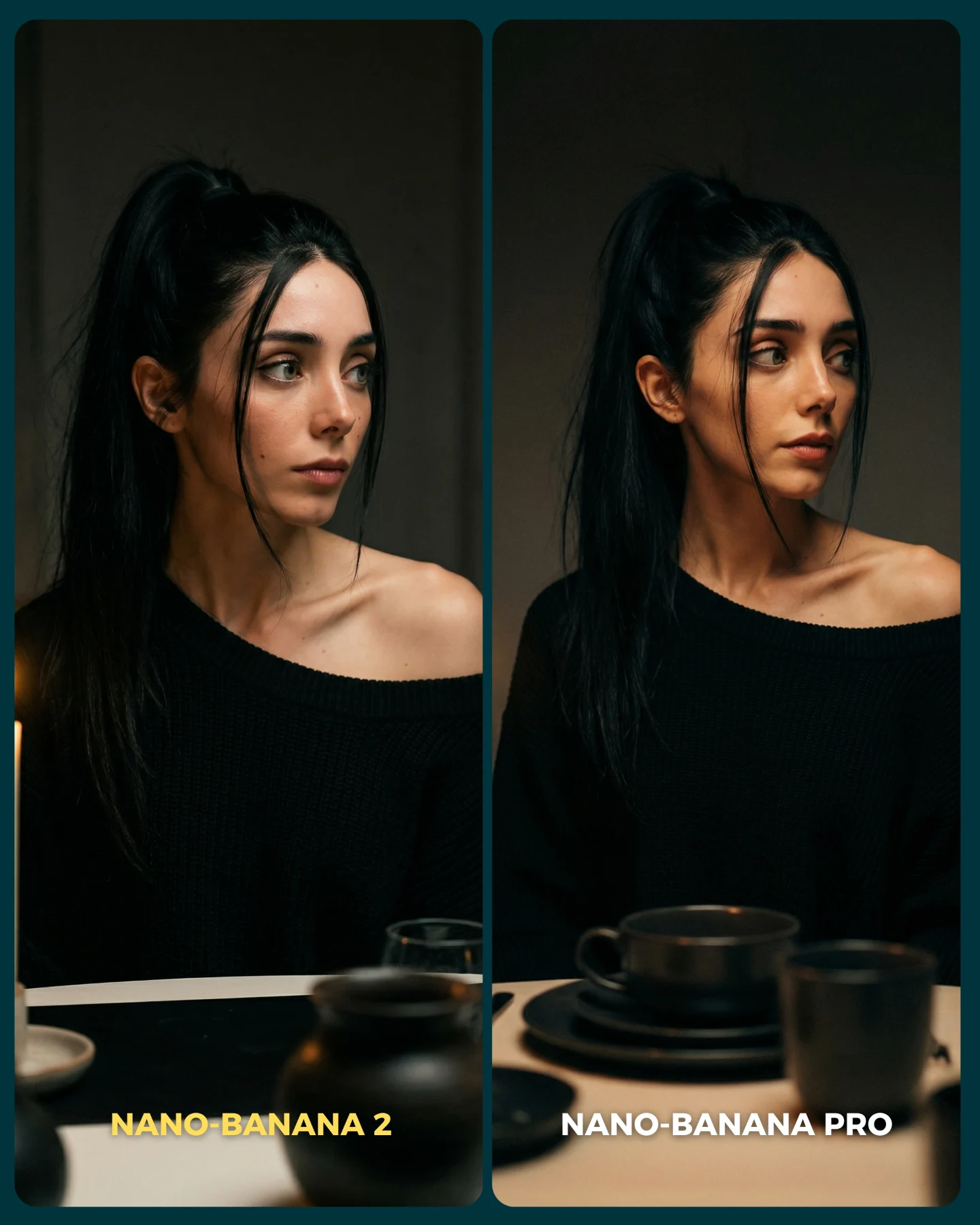
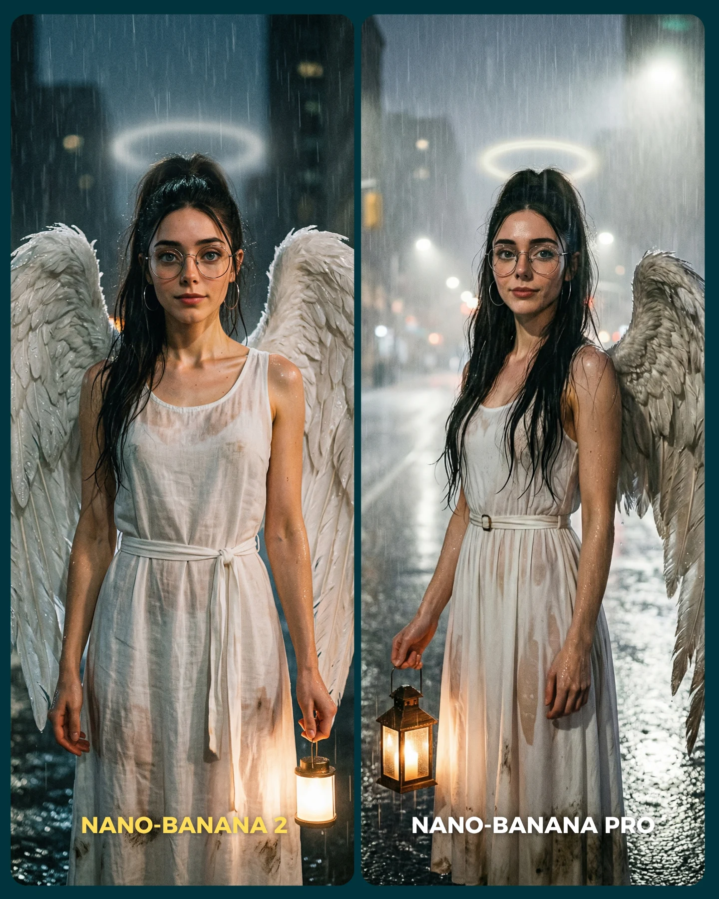
Para ponerlo realmente a prueba, las imágenes que he seleccionado para testearlo son todas las que Nano Banana Pro me daba "poco realistas"
Tras ver los resultados... Sigo pensando que la versión Pro lo hace mejor que la nueva 😅 Pero si es verdad que en algunas ocasiones no es así!
Igualmente quiero escuchar tu opinión al respecto 💌 Y comenta "ARIA" si quieres que te pase los prompts de todas las imágenes 💕
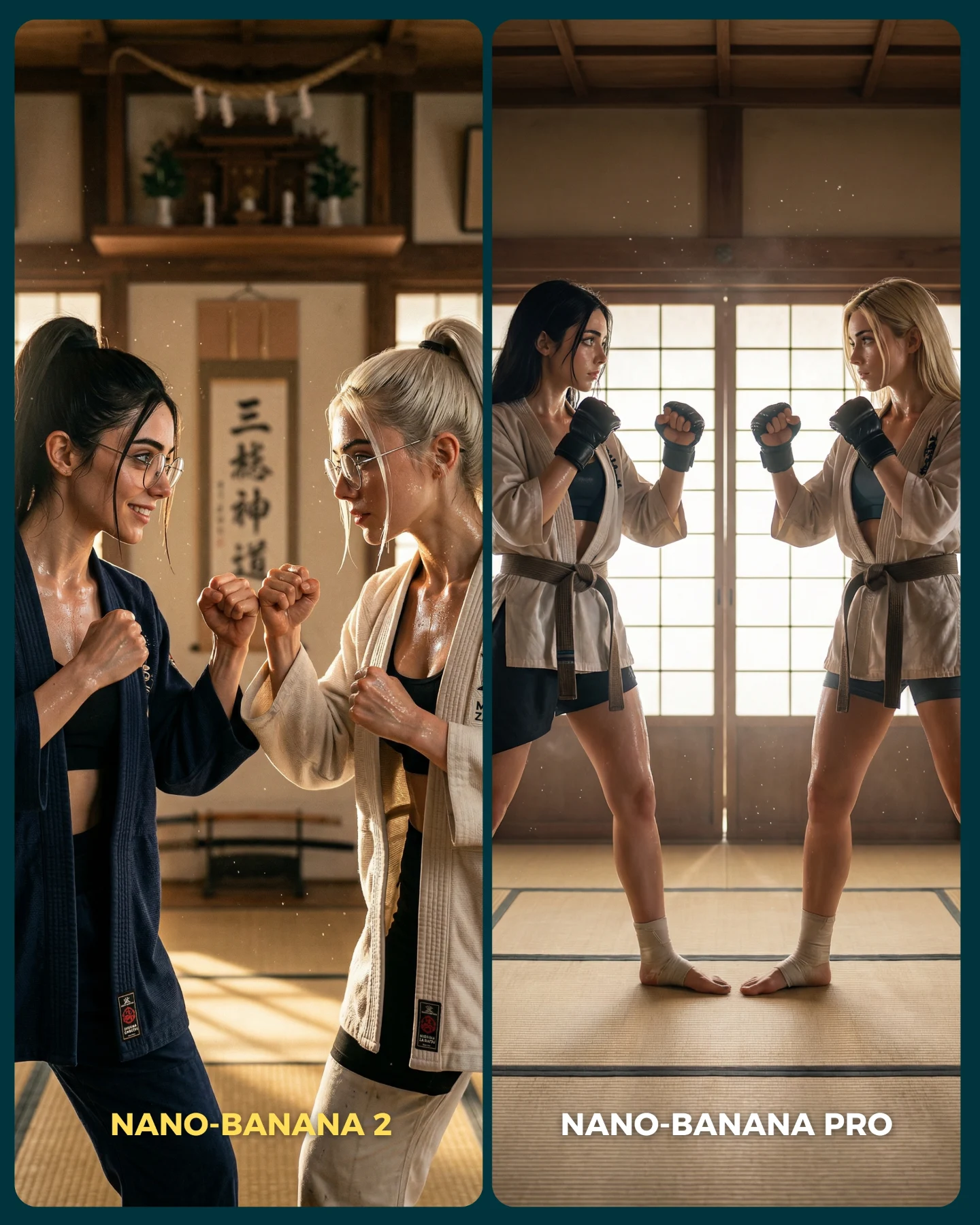
How soy_aria_cruz Made This Nano Banana 2 vs Nano Banana Pro AI Art
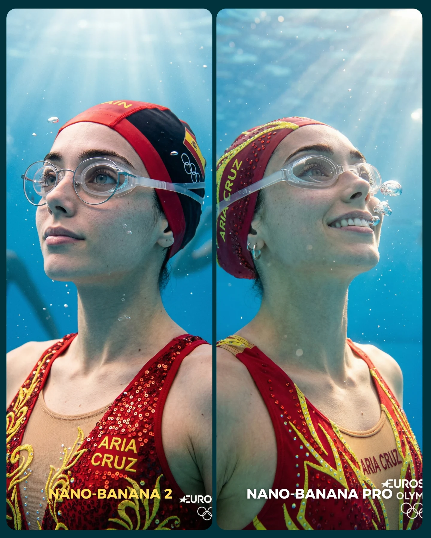
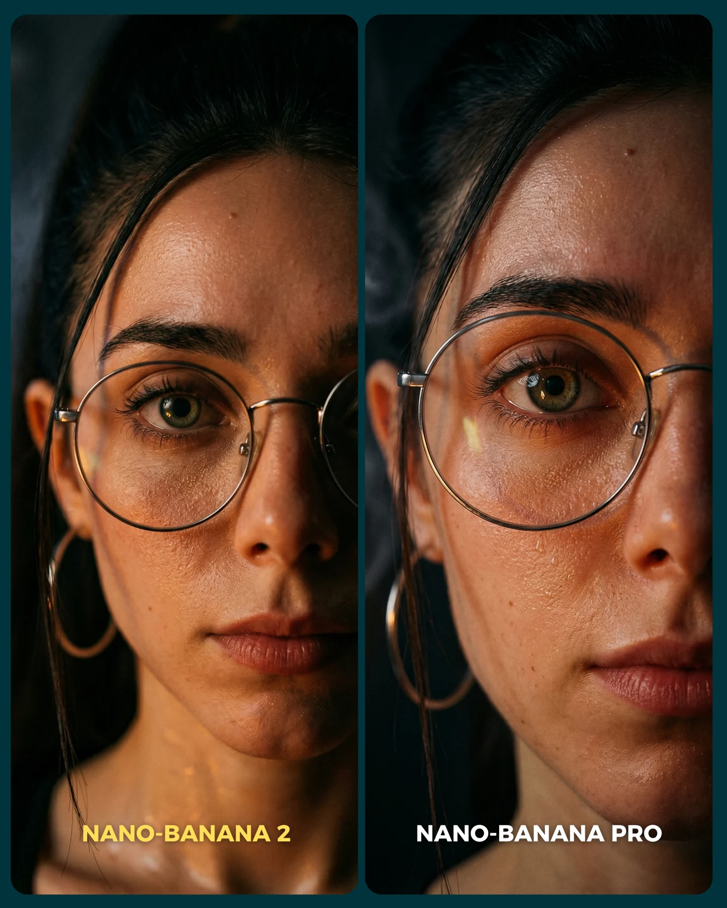
This comparison is strong because it tests one of the hardest environments in image generation: water. Underwater scenes punish weak models very quickly. Refraction, bubbles, skin color shifts, translucent straps, sequins, and facial integrity all have to hold at the same time. That makes this image much more informative than a standard portrait test with easy lighting and dry surfaces.
The creator also made a smart choice by keeping the structure simple. Both panels stay focused on the same swimmer identity, the same costume family, and the same blue pool environment. That means the viewer can judge the real question: which model handles underwater realism with more control? The comparison stays readable, but it does not become shallow.
Why this comparison image earns attention
The first strength is difficulty selection. Water is a high-pressure test because it affects everything at once: skin, contrast, edges, accessories, and atmosphere. If a model can keep the eyes natural, the glasses believable, the costume readable, and the bubbles convincing, that tells you much more than a clean studio portrait ever could.
The second strength is niche clarity. Even before someone reads the caption, the red cap, aquatic lighting, and sequined competition costume immediately place the image inside a synchronized-swimming context. That matters for social distribution, because clear category signals help a post reach the right audience quickly.
Signal
Evidence (from this image)
Mechanism
Replication Action
High-difficulty environment
Underwater lighting, bubbles, refracted clarity, and wet-surface rendering
Stress-testing a model in hard conditions makes the comparison more credible
Use water, smoke, glass, or transparent materials when comparing realism models
Identity consistency
The same swimmer identity appears across both panels
Viewers can judge quality differences without prompt drift confusion
Lock the same face, outfit family, and camera crop across both outputs
Strong niche cue
Red swim cap and sequined synchronized-swim costume
The sport reads instantly and adds context to the challenge
Choose props and wardrobe that anchor the test in a recognizable niche
Simple binary layout
Side-by-side panels clearly labeled for each model
The image is easy to comment on and easy to debate
Keep the comparison design minimal and obvious
Where this format works best
AI model benchmark posts: excellent for showing meaningful differences under difficult rendering conditions.
Prompt engineering tutorials: useful when teaching how to structure fair underwater A/B tests.
Aquatic sports creators: strong because the visual challenge is tied to a real niche, not a random stress test.
Communities focused on realism: especially effective when audiences care about texture, lighting, and material fidelity.
Where it is less effective
Broad entertainment feeds: some viewers may need caption context to understand the comparison goal.
Warm lifestyle pages: the image is analytical and technical rather than intimate.
Fantasy-art audiences: the test is about realism discipline, not imaginative world-building.
Three transfer recipes
Rain realism transfer Keep: same face across both panels, difficult environmental condition, minimal comparison design. Change: water type from underwater to rain, droplets, and wet hair behavior. Slot template (EN): {same portrait subject} shown in {wet environment challenge} as a side-by-side comparison between {two models}
Sweat-and-motion transfer Keep: same athlete identity, same crop, fairness of setup. Change: sport context, lighting, and surface moisture cues. Slot template (EN): {same athlete} rendered under {high-moisture sports condition} in a direct A/B realism comparison
Glass-and-refraction transfer Keep: identity lock, hard material challenge, split-screen layout. Change: underwater bubbles to glass reflections, visors, or condensation. Slot template (EN): {same subject} wearing {hard transparent material} compared across {model A} and {model B}
Aesthetic read: why the image feels polished
The palette is tightly organized: blue water, red cap, red-and-gold costume, skin tones, and clear bubbles. That limited range makes the image easy to scan, even though underwater scenes can easily become mushy. The red cap acts like a visual anchor, while the blue water creates the environmental field around it.
The bubbles and top-down light rays are also doing a lot of work. They make the scene feel underwater immediately, but because they are controlled, they do not obscure the face. That balance is important. Good underwater realism should feel immersive without becoming cloudy or unreadable.
The side-by-side layout helps the viewer compare micro-details efficiently. You can move from one eye line to the other, check the water clarity, and inspect how the costume and straps behave. The image becomes almost diagnostic in the best way.
Observed
Why it matters
Blue underwater environment with visible bubbles and light rays
Immediately establishes a difficult realism context
Same athlete identity in both panels
Keeps the comparison fair and easy to interpret
Red cap and sequined red-gold costume
Adds a memorable niche marker and controlled color contrast
Chest-up crop with direct visual emphasis on face and gear
Makes realism flaws or strengths more visible
Clean black divider and bottom labels
Gives the card immediate comparison readability in-feed
Prompt technique breakdown
To make a comparison like this useful, you have to separate the challenge variables from the design variables. The challenge is underwater realism. The design is the split-screen card. If both are controlled properly, the post becomes both educational and engaging.
Prompt chunk
What it controls
Swap ideas (EN, 2–3 options)
Same underwater swimmer identity in both panels
Ensures the comparison is about model quality, not subject drift
same swimmer A/B test; matched athlete portrait; duplicated underwater subject
Blue pool water with bubbles and rays
Defines the environmental difficulty and realism pressure
clear pool underwater; bubble-filled aquatic scene; sunlit underwater portrait
Red synchronized-swimming cap and sequined suit
Anchors the sport and provides texture stress points
competition swim cap; embellished aquatic costume; red synchro outfit
A/B model card; left-versus-right layout; two-panel benchmark graphic
Right panel slightly more realistic
Creates a meaningful visual conclusion without changing the concept
improved right-side realism; higher-fidelity second panel; more dimensional right output
Starter prompt block
underwater synchronized-swimming portrait comparison of the same young woman in a red cap and sequined red-gold costume, blue pool water, bubbles, clear goggle straps, side-by-side split-screen labeled NANO-BANANA 2 and NANO-BANANA PRO, hyper-real aquatic realism benchmark
Remix playbook
The cleanest way to iterate on this kind of test is to lock fairness before style.
Baseline lock
Lock the same subject identity, cap, and costume first.
Lock the same underwater crop and light direction second.
Lock the same bubble density and panel design before comparing models.
One-change rule
The model should be the only important variable. If one version gets a better angle, better styling, or cleaner water, the comparison stops being trustworthy.
Run 1: establish the base underwater portrait and split layout.
Run 2: refine bubbles, light rays, and water clarity.
Run 3: restore exact identity consistency and costume detail across both sides.
Run 4: compare only the rendering fidelity, not different aesthetic decisions.
That is the difference between a useful benchmark and a decorative collage. The more controlled the setup, the more valuable the result.